19.2.8. The Marker, Picture and North Arrow Items
Along with the map or legend items in the print layout, you may want to decorate your realization with images or annotations. QGIS provides different tools to achieve this:
the picture item: decorates the layout with an image raster or SVG file (e.g. logos, pictures, north arrows, ...)
the north arrow item: a picture item predefined with a north arrow image
the marker item: decorates the layout with QGIS vector symbols. It can be used to place markers over a map item or for creation of advanced custom legends.
19.2.8.1. 画像アイテム
You can add a picture by dragging it from your file manager onto the
canvas, pasting it directly into the layout by using Ctrl+V or
and by using the  Add Picture,
following items creation instructions.
Then you can manipulate it, as explained in
レイアウトアイテムの操作.
Add Picture,
following items creation instructions.
Then you can manipulate it, as explained in
レイアウトアイテムの操作.
When using Add Picture, the picture item will be a
blank frame that you can customize using its
Item Properties panel.
Other than the items common properties,
this feature has the following functionalities:
Main properties
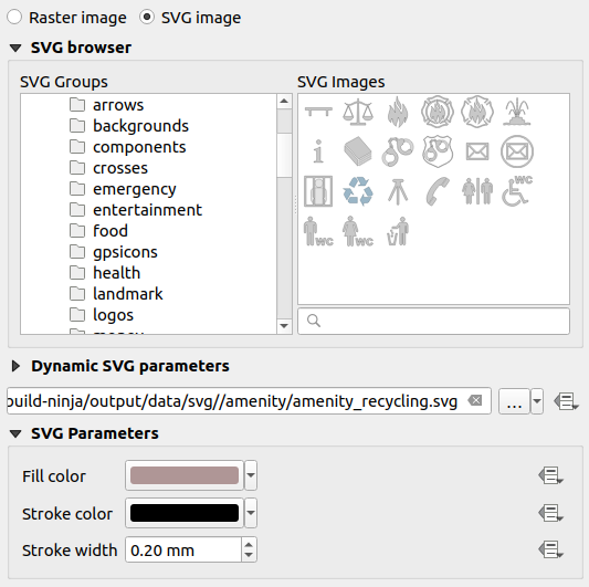
図 19.50 画像アイテムのアイテムプロパティパネル
The picture item supports two types of images:
Raster Image: a file selector widget can be used to fetch the data. Use the ... Browse button to select a file on your computer or enter the path directly in the text field. You can even provide a remote URL that points to a picture. The associated image can also be embedded in the layout.
 データによって定義された上書き ボタンを使用して、地物の属性や正規表現を使用して画像のソースを設定することができます。
SVG Image: using by default the SVG libraries provided in . You can however use any other file, and the file selection follows the same rules as for the raster image. The SVG parameters can as well be set dynamic.
QGISが提供する(デフォルトの)
.SVGファイルはカスタマイズが可能です。つまり、 SVG パラメータ グループ内の対応する機能を使用して、 塗りつぶし色 や ストローク色 (不透明度も含む)、 ストローク幅 にオリジナルとは別の値を簡単に適用させることができます。これらのプロパティは データ定義 とすることもできます。追加した
.SVGファイルでこれらのプロパティが有効でない場合には、不透明度などをサポートするために、以下のタグを追加する必要があります:fill-opacity="param(fill-opacity)"
stroke-opacity="param(outline-opacity)"
More details at パラメータ付きSVG.
注釈
Drag-and-drop an image file (raster or SVG) into the layout page will create a layout picture item with corresponding settings.
Size and placement
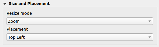
図 19.51 Layout pictures size and placement properties
リサイズモード オプションでは、フレームの大きさを変更したときに画像がどのように表示されるかを設定できます:
ズーム:元のアスペクト比を保ったまま、フレームに合わせて画像を拡大/縮小します。伸ばす:フレーム内部に合わせるように画像を伸縮させます。切り抜く(clip):このモードはラスタ画像でのみ使用できます。このモードでは、画像サイズを拡大縮小なしのオリジナルの画像サイズとし、画像はフレームで切り取られます。従って、フレームの内側にある画像の一部のみが表示されます。ズームしてフレームをリサイズ:画像をフレームに合うように拡大し、それから拡大後の画像の大きさに合わせてフレームの大きさを変更します。フレームを画像サイズにリサイズ:フレームのサイズを(拡大縮小なしの)元の画像サイズに合わせるよう設定します。
Depending on the selected Resize mode, the Placement and Image rotation options may be disabled. Placement lets you select the position of the image inside its frame (top/middle/bottom and left/center/right).
Image rotation
Images can be rotated with the Image rotation field.
Activating the  Sync with map checkbox
synchronizes the rotation of the image with the rotation applied to the
selected map item.
This is a convenient feature to make any picture behave as a north arrow.
The North alignment can be:
Sync with map checkbox
synchronizes the rotation of the image with the rotation applied to the
selected map item.
This is a convenient feature to make any picture behave as a north arrow.
The North alignment can be:
グリッドの北 :国単位/ローカルグリッドの中央子午線に平行なグリッド線の方向
真北 :経度の子午線の方向
画像の回転には、傾きの オフセット を適用することができます。
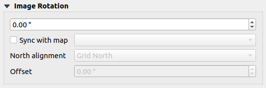
図 19.52 Layout pictures image rotation properties
19.2.8.2. 方位記号アイテム
 方位記号を追加 ボタンを使用して、 アイテムの作成手順 に従えば、方位記号を追加できます。これは、 レイアウトアイテムの操作 と同じ方法で操作できます。
方位記号が画像であるため、 方位記号 アイテムは 画像アイテム と同じプロパティを持っています。主な違いは、
空のフレームの代わりに、デフォルトの北向き矢印記号が使用されます。
方位記号アイテムは、デフォルトで地図アイテムと同期しています。 地図と同期する プロパティは、地図記号アイテムの下にある地図に設定されます。下に地図がない場合には、 参照マップ にフォールバックします。
注釈
方位記号の多くには、北を表す「N」という文字がありません。これは北に「N」を使用しない言語があるため、意図的にそのようになっています。
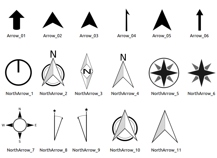
図 19.53 SVGライブラリで提供されている方位記号
19.2.8.3. The Marker Item
To add a marker item, select the  Add Marker button,
and click on the page. A default point marker symbol is added.
Then you can manipulate it, as explained in レイアウトアイテムの操作.
But note that unlike most of the other items, you resize the item
given that its size is controlled by the embedded symbols properties.
Add Marker button,
and click on the page. A default point marker symbol is added.
Then you can manipulate it, as explained in レイアウトアイテムの操作.
But note that unlike most of the other items, you resize the item
given that its size is controlled by the embedded symbols properties.
The marker item can be customized from the Item Properties panel. Other than the items common properties, you can also:
modify the Symbol, relying on all the symbol widget capabilities
sync the marker item rotation with the map's (see Image rotation), acting as a north arrow. The map rotation is added to any existing marker symbol level rotation (so .e.g if you have to rotate the triangle marker 90° to get it pointing straight up, it will still work nicely in north arrow mode!)
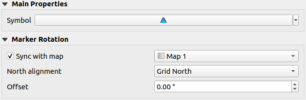
図 19.54 The marker item custom properties