13.1. Raster Properties Dialog
Raster data is made up of pixels (or cells), and each pixel has a value. It is commonly used to store various types of data, including:
Imagery, such as satellite images, digital aerial photographs, scanned maps
Elevation data, such as digital elevation models (DEMs), digital terrain models (DTMs)
Other types of data, such as land cover, soil types, rainfall and many others.
Raster data can be stored in several supported formats, including GeoTIFF, ERDAS Imagine, ArcInfo ASCII GRID, PostgreSQL Raster and others. See more at Opening Data.
To view and set the properties for a raster layer, double click on the layer name in the map legend, or right click on the layer name and choose Properties from the context menu. This will open the Raster Layer Properties dialog.
There are several tabs in the dialog:
External plugins ([2]) tabs |


Tip
Live update rendering
The Layer Styling Panel provides you with some of the common features of the Layer properties dialog and is a good modeless widget that you can use to speed up the configuration of the layer styles and view your changes on the map canvas.
Note
Because properties (symbology, label, actions, default values, forms…) of embedded layers (see Embedding layers from external projects) are pulled from the original project file, and to avoid changes that may break this behavior, the layer properties dialog is made unavailable for these layers.
13.1.1. Information Properties
The  Information tab is read-only and represents
an interesting place to quickly grab summarized information and
metadata for the current layer.
Provided information are:
Information tab is read-only and represents
an interesting place to quickly grab summarized information and
metadata for the current layer.
Provided information are:
general such as name in the project, source path, list of auxiliary files, last save time and size, the used provider
custom properties, used to store in the active project additional information about the layer. Default custom properties include Identify/format, which influences how the results from using the
 Identify features tool over a raster layer are formatted.
More properties can be created and managed using PyQGIS, specifically through
the setCustomProperty() method.
Identify features tool over a raster layer are formatted.
More properties can be created and managed using PyQGIS, specifically through
the setCustomProperty() method.based on the provider of the layer: extent, width and height, data type, GDAL driver, bands statistics
the Coordinate Reference System: name, units, method, accuracy, reference (i.e. whether it’s static or dynamic)
read from layer properties: data type, extent, width/height, compression, pixel size, statistics on bands, number of columns, rows and no-data values of the raster…
picked from the filled metadata: access, extents, links, contacts, history…
13.1.2. Source Properties
The  Source tab displays basic information about
the selected raster, including:
Source tab displays basic information about
the selected raster, including:
the Layer name to display in the Layers Panel;
the Coordinate Reference System: Displays the layer’s Coordinate Reference System (CRS). You can change the layer’s CRS, by selecting a recently used one in the drop-down list or clicking on the
 Select CRS button (see Coordinate Reference System Selector).
Use this process only if the layer CRS is a wrong or not specified.
If you wish to reproject your data, use a reprojection algorithm
from Processing or
Save it as new dataset.
Select CRS button (see Coordinate Reference System Selector).
Use this process only if the layer CRS is a wrong or not specified.
If you wish to reproject your data, use a reprojection algorithm
from Processing or
Save it as new dataset.Depending on the data provider, a Layer source group indicates the path to the source of the dataset and allows for replacing the loaded layer:
When the layer is stored as file on disk, edit the path shown in the text box or press … Browse to select another file on the disk
When the layer is provided by an ArcGIS MapServer service, it is possible to modify its authentication settings, while keeping unchanged the details for connecting to the service.
For an XYZ remote layer, it is possible to modify at the layer level any of its connection details (URL, authentication settings, zoom levels, resolution, …). Modifications are applied to the layer without altering the original connection settings.
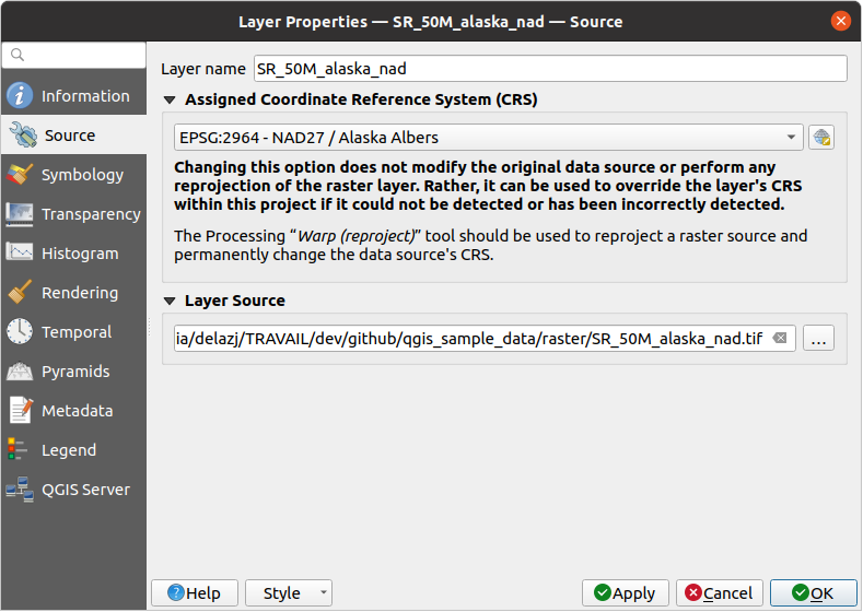
Fig. 13.1 Raster Layer Properties - Source Dialog
13.1.3. Symbology Properties
The raster layer symbology tab is made of three different sections:
The Band rendering where you can control the renderer type to use
The Layer rendering to apply effects on rendered data
The Resampling methods to optimize rendering on map
13.1.3.1. Band rendering
QGIS offers many different Render types. The choice of renderer depends on the data type and the information you’d like to highlight.
Multiband color - if the file comes with several bands (e.g. a satellite image with several bands).
Paletted/Unique values - for single band files that come with an indexed palette (e.g. a digital topographic map) or for general use of palettes for rendering raster layers.
Singleband gray - (one band of) the image will be rendered as gray. QGIS will choose this renderer if the file is neither multiband nor paletted (e.g. a shaded relief map).
Singleband pseudocolor - this renderer can be used for files with a continuous palette or color map (e.g. an elevation map).
Single color - the raster layer will be rendered with a single color.
Hillshade - Creates hillshade from a band.
Contours - Generates contours on the fly for a source raster band.
Multiband color
With the multiband color renderer, three selected bands from the image will be used as the red, green or blue component of the color image. QGIS automatically fetches Min and Max values for each band of the raster and scales the coloring accordingly. You can control the value ranges in the Min/Max Value Settings section.
A Contrast enhancement method can be applied to the values: ‘No enhancement’, ‘Stretch to MinMax’, ‘Stretch and clip to MinMax’ and ‘Clip to min max’.
Note
Contrast enhancement
When adding GRASS rasters, the option Contrast enhancement will always be set automatically to stretch to min max, even if this is set to another value in the QGIS general options.
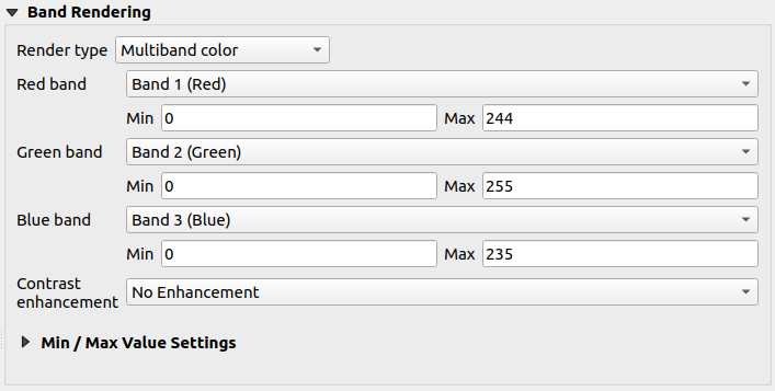
Fig. 13.2 Raster Symbology - Multiband color rendering
Tip
Viewing a Single Band of a Multiband Raster
If you want to view a single band of a multiband image (for example, Red), you might think you would set the Green and Blue bands to Not Set. But the preferred way of doing this is to set the image type to Singleband gray, and then select Red as the Gray band to use.
Paletted/Unique values
This is the standard render option for singleband files that include a color table, where a certain color is assigned to each pixel value. In that case, the palette is rendered automatically.
It can be used for all kinds of raster bands, assigning a color to each unique raster value.
If you want to change a color, just double-click on the color and the Select color dialog appears.
It is also possible to assign labels to the colors. The label will then appear in the legend of the raster layer.
Right-clicking over selected rows in the color table shows a contextual menu to:
Change Color… for the selection
Change Opacity… for the selection
Change Label… for the selection
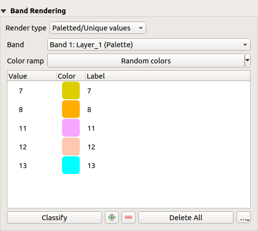
Fig. 13.3 Raster Symbology - Paletted unique value rendering
The pulldown menu, that opens when clicking the … (Advanced options) button below the color map to the right, offers color map loading (Load Color Map from File…) and exporting (Export Color Map to File…), and loading of classes (Load Classes from Layer).
Singleband gray
This renderer allows you to render a layer using only one band with a Color gradient: ‘Black to white’ or ‘White to black’. You can change the range of values to color (Min and Max) in the Min/Max Value Settings.
A Contrast enhancement method can be applied to the values: ‘No enhancement’, ‘Stretch to MinMax’, ‘Stretch and clip to MinMax’ and ‘Clip to min max’.
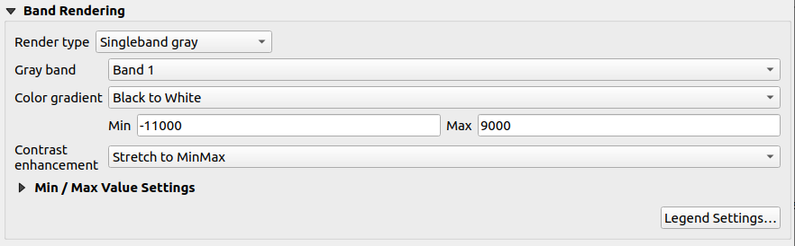
Fig. 13.4 Raster Symbology - Singleband gray rendering
Pixels are assigned a color based on the selected color gradient and the layer’s legend (in the Layers panel and the layout legend item) is displayed using a continuous color ramp. Press Legend settings… if you wish to tweak the settings. More details at Customize raster legend.
Singleband pseudocolor
This is a render option for single-band files that include a continuous palette. You can also create color maps for a band of a multiband raster.
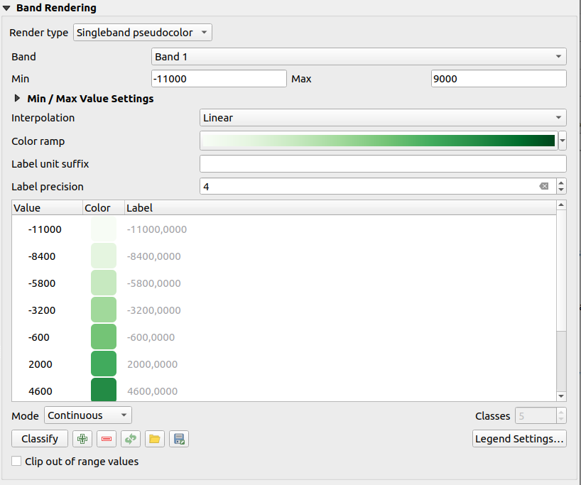
Fig. 13.5 Raster Symbology - Singleband pseudocolor rendering
Using a Band of the layer and a values range, you can now interpolate and assign representation color to pixels within classes. More at Color ramp shader classification.
Pixels are assigned a color based on the selected color ramp and the layer’s legend (in the Layers panel and the layout legend item) is displayed using a continuous color ramp. Press Legend settings… if you wish to tweak the settings or instead use a legend with separated classes (and colors). More details at Customize raster legend.
Single color
This renderer allows you to render a raster layer using Single color. This type of renderer is useful when you want to display a raster layer uniformly, without any variation in color based on pixel values.
The single color renderer can be used with both single-band and multiband raster layers. When used with multiband rasters, you can select which band to apply the single color to, effectively displaying that specific band uniformly across the entire layer.
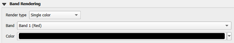
Fig. 13.6 Raster Symbology - Single color rendering
Hillshade
Render a band of the raster layer using hillshading.
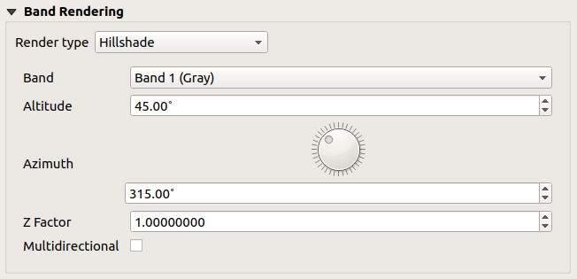
Fig. 13.7 Raster Symbology - Hillshade rendering
Options:
Band: The raster band to use.
Altitude: The elevation angle of the light source (default is
45°).Azimuth: The azimuth of the light source (default is
315°).Z Factor: Scaling factor for the values of the raster band (default is
1). Multidirectional: Specify if multidirectional
hillshading is to be used (default is
Multidirectional: Specify if multidirectional
hillshading is to be used (default is off).
Contours
This renderer draws contour lines that are calculated on the fly from the source raster band.
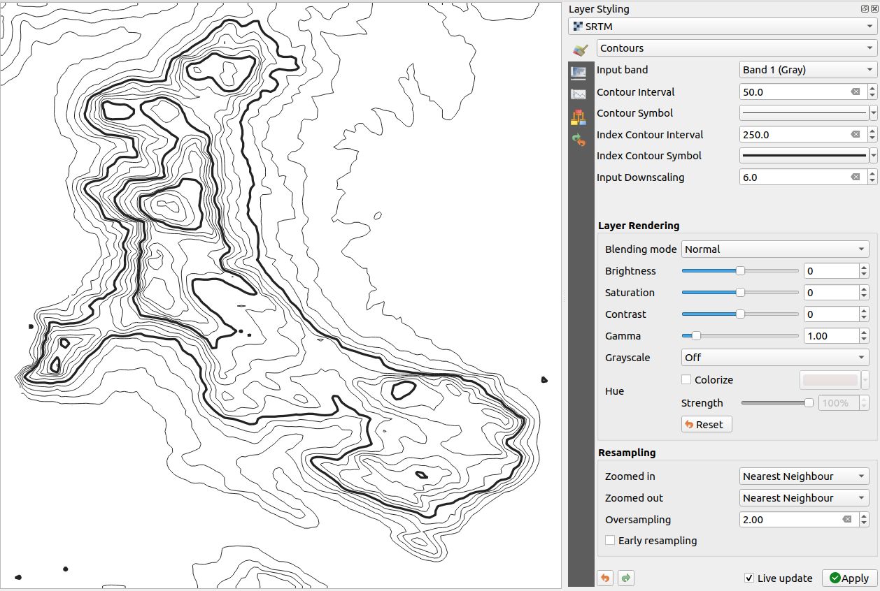
Fig. 13.8 Raster Symbology - Contours rendering
Options:
Input band: the raster band to use.
Contour interval: the distance between two consecutive contour lines
Contour symbol: the symbol to apply to the common contour lines.
Index contour interval: the distance between two consecutive index contours, that is the lines shown in a distinctive manner for ease of identification, being commonly printed more heavily than other contour lines and generally labeled with a value along its course.
Index contour symbol: the symbol to apply to the index contour lines
Input downscaling: Indicates by how much the renderer will scale down the request to the data provider (default is
4.0).For example, if you generate contour lines on input raster block with the same size as the output raster block, the generated lines would contain too much detail. This detail can be reduced by the “downscale” factor, requesting lower resolution of the source raster. For a raster block 1000x500 with downscale 10, the renderer will request raster 100x50 from provider. Higher downscale makes contour lines more simplified (at the expense of losing some detail).
Setting the min and max values
By default, QGIS reports the Min and Max values of the band(s) of the raster. A few very low and/or high values can have a negative impact on the rendering of the raster. The Min/Max Value Settings frame helps you control the rendering.
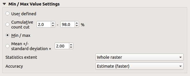
Fig. 13.9 Raster Symbology - Min and Max Value Settings
Available options are:
 User defined: The default
Min and Max values of the band(s) can be
overridden
User defined: The default
Min and Max values of the band(s) can be
overridden- Cumulative count cut: Removes outliers.
The standard range of values is
2%to98%, but it can be adapted manually.  Min / max: Uses the whole range of
values in the image band.
Min / max: Uses the whole range of
values in the image band.- Mean +/- standard deviation x: Creates
a color table that only considers values within the standard
deviation or within multiple standard deviations.
This is useful when you have one or two cells with abnormally
high values in a raster layer that impact the rendering of the
raster negatively.
Calculations of the min and max values of the bands are made based on the:
Statistics extent: it can be Whole raster, Current canvas or Updated canvas. Updated canvas means that min/max values used for the rendering will change with the canvas extent (dynamic stretching).
Accuracy, which can be either Estimate (faster) or Actual (slower).
Note
For some settings, you may need to press the Apply button of the layer properties dialog in order to display the actual min and max values in the widgets.
Color ramp shader classification
This method can be used to classify and represent scalar dataset (raster or mesh contour) based on their values. Given a color ramp and a number of classes, it generates intermediate color map entries for class limits. Each color is mapped with a value interpolated from a range of values and according to a classification mode. The scalar dataset elements are then assigned their color based on their class.
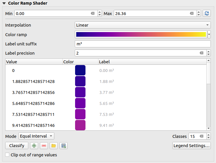
Fig. 13.10 Classifying a dataset with a color ramp shader
A Min and Max values must be defined and used to interpolate classes bounds. By default QGIS detects them from the dataset but they can be modified.
The Interpolation entry defines how scalar elements are assigned their color :
Discrete (a
<=symbol appears in the header of the Value column): The color is taken from the closest color map entry with equal or higher valueLinear: The color is linearly interpolated from the color map entries above and below the pixel value, meaning that to each dataset value corresponds a unique color
Exact (a
=symbol appears in the header of the Value column): Only pixels with value equal to a color map entry are applied a color; others are not rendered.
The Color ramp widget helps you select the color ramp to assign to the dataset. As usual with this widget, you can create a new one and edit or save the currently selected one. The name of the color ramp will be saved in the configuration.
The Label unit suffix adds a label after the value in the legend, and the Label precision controls the number of decimals to display.
The classification Mode helps you define how values are distributed across the classes:
Equal interval: Provided the Number of classes, limits values are defined so that the classes all have the same magnitude.
Continuous: Classes number and color are fetched from the color ramp stops; limits values are set following stops distribution in the color ramp.
Quantile: Provided the Number of classes, limits values are defined so that the classes have the same number of elements. Not available with mesh layers.
You can then Classify or tweak the classes:
The button
 Add values manually adds a value to the table.
The button
 Remove selected row deletes selected values
from the table.
Remove selected row deletes selected values
from the table.Double clicking in the Value column lets you modify the class value.
Double clicking in the Color column opens the dialog Change color, where you can select a color to apply for that value.
Double clicking in the Label column to modify the label of the class, but this value won’t be displayed when you use the identify feature tool.
Right-clicking over selected rows in the color table shows a contextual menu to Change Color… and Change Opacity… for the selection.
You can use the buttons
 Load color map from file
or
Load color map from file
or  Export color map to file to load an existing
color table or to save the color table for later use.
Export color map to file to load an existing
color table or to save the color table for later use.With linear Interpolation, you can also configure:
- Clip out of range values: By default, the linear
method assigns the first class (respectively the last class) color to
values in the dataset that are lower than the set Min
(respectively greater than the set Max) value.
Check this setting if you do not want to render those values.
Legend settings, for display in the Layers panel and the layout legend item. More details at Customize raster legend.
Customize raster legend
When applying a color ramp to a raster or a mesh layer, you may want to display a legend showing the classification. By default, QGIS displays a continuous color ramp with min and max values in the Layers panel and the layout legend item. This can be customized using the Legend settings button in the classification widget.
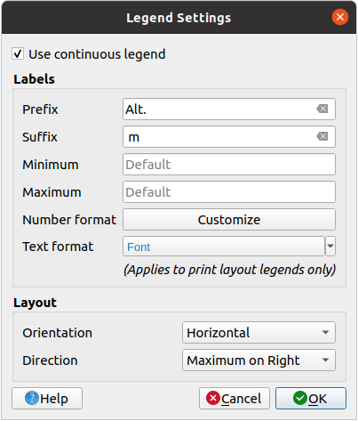
Fig. 13.11 Modifying a raster legend
In this dialog, you can set whether to Use continuous
legend: if unchecked, the legend displays separated colors corresponding to
the different classes applied. This option is not available for raster
singleband gray symbology.
Checking the Use continuous legend allows you to configure both the labels and layout properties of the legend.
Labels
Add a Prefix and a Suffix to the labels
Modify the Minimum and a Maximum values to show in the legend
Customize the Number format
Customize the Text format to use in the print layout legend.
Layout
Control the Orientation of the legend color ramp; it can be Vertical or Horizontal
Control the Direction of the values depending on the orientation:
If vertical, you can display the Maximum on top or the Minimum on top
If horizontal, you can display the Maximum on right or the Minimum on right
13.1.3.2. Layer rendering
Over the symbology type applied to the layer band(s), you can achieve special rendering effects for the whole raster file(s):
Use one of the blending modes (see Blending Modes)
Set custom Brightness, Saturation, Gamma and Contrast to colors.
With the
Invert colors, the layer is rendered with
opposite colors. Handy, for example, to switch out-of-the box OpenStreetMap
tiles to dark mode.Turn the layer to Grayscale option either ‘By lightness’, ‘By luminosity’ or ‘By average’.
Colorize and adjust the Strength of Hue in the color table
Press Reset to remove any custom changes to the layer rendering.
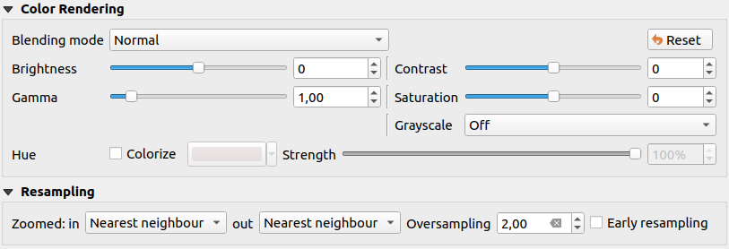
Fig. 13.12 Raster Symbology - Layer rendering and Resampling settings
13.1.3.3. Resampling
The Resampling option has effect when you zoom in and out of an image. Resampling modes can optimize the appearance of the map. They calculate a new gray value matrix through a geometric transformation.
When applying the ‘Nearest neighbour’ method, the map can get a pixelated structure when zooming in. This appearance can be improved by using the ‘Bilinear (2x2 kernel)’ or ‘Cubic (4x4 kernel)’ method, which cause sharp edges to be blurred. The effect is a smoother image. This method can be applied to for instance digital topographic raster maps.
Early resampling: allows to calculate the raster
rendering at the provider level where the resolution of the source is known,
and ensures a better zoom in rendering with QGIS custom styling.
Really convenient for tile rasters loaded using an interpretation method.
13.1.4. Transparency Properties
QGIS provides capabilities to set the  Transparency level
of a raster layer.
Transparency level
of a raster layer.
Use the Global opacity slider to set to what extent the underlying layers (if any) should be visible through the current raster layer. This is very useful if you overlay raster layers (e.g., a shaded relief map overlaid by a classified raster map). This will make the look of the map more three dimensional. The opacity of the raster can be data-defined, and vary e.g. depending on the visibility of another layer, by temporal variables, on different pages of an atlas, …
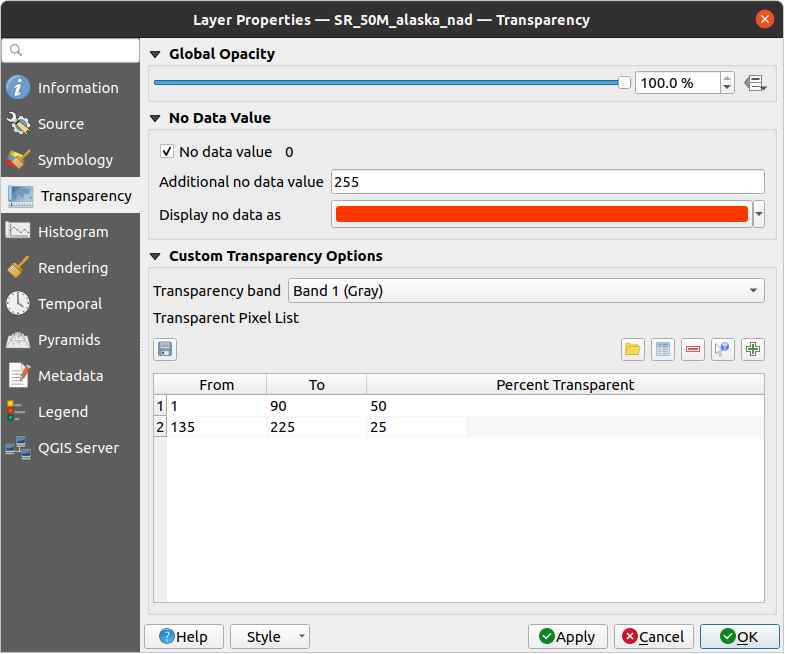
Fig. 13.13 Raster Transparency
With No data value QGIS reports the original source
no data value (if defined) which you can consider as is in the rendering.
Additionally, you can enter a raster value that should be treated as
an Additional no data value.
The Display no data as color selector allows you to apply
a custom color to no data pixels, instead of the default transparent rendering.
An even more flexible way to customize the transparency is available in the Custom transparency options section:
Use Transparency band to apply transparency for an entire band.
Provide a list of pixels to make transparent with corresponding levels of transparency:
Click the
Add values manually button.
A new row will appear in the pixel list.For single-band based symbology (e.g. DEMs), enter the From and To values and adjust the Percent Transparent to apply.
For multiband based symbology (e.g. RGB images) enter the Red, Green and Blue values of the pixel and adjust the Percent Transparent to apply. QGIS supports Tolerance for pixel values, when defining transparency. This means that pixels with color close to the specified RGB values can also be made transparent. Note that this feature applies only to multiband rasters.
Alternatively, you can fetch the pixel values directly from the raster using the
 Add values from display
button.
Then enter the transparency value.
Add values from display
button.
Then enter the transparency value.Repeat the steps to adjust more values with custom transparency.
Press the Apply button and have a look at the map.
As you can see, it is quite easy to set custom transparency, but it can be quite a lot of work. Therefore, you can use the button
 Export to file
to save your transparency list to a file.
The button Import from file loads your transparency
settings and applies them to the current raster layer.
Export to file
to save your transparency list to a file.
The button Import from file loads your transparency
settings and applies them to the current raster layer.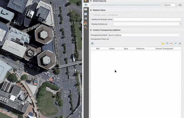
Fig. 13.14 Using tolerances for multiband rasters
13.1.5. Labels Properties
The  Labels properties provides you with all the needed
and appropriate capabilities to configure smart labeling on raster layers.
This dialog can also be accessed from the Layer Styling panel.
Labels properties provides you with all the needed
and appropriate capabilities to configure smart labeling on raster layers.
This dialog can also be accessed from the Layer Styling panel.
At the top of the dialog, you have:
a combobox for selecting the appropriate labeling method for the active layer
the
 Configure project labeling rules button:
helps you control interactions between labels and features across the layers in the project.
More details at Configuring project labeling rules.
Configure project labeling rules button:
helps you control interactions between labels and features across the layers in the project.
More details at Configuring project labeling rules.the
 Automated placement settings (applies to all layers) button:
configure general properties on label placement and conflicts resolution.
More details at Setting the automated placement engine.
Automated placement settings (applies to all layers) button:
configure general properties on label placement and conflicts resolution.
More details at Setting the automated placement engine.
The first step is to choose the labeling method from the drop-down list. Available methods are:
 No labels: the default value, showing no labels
from the layer
No labels: the default value, showing no labels
from the layer- Label with pixel values: Show labels on the map using a band.
Using the Label with pixel values option, the following dialog opens.
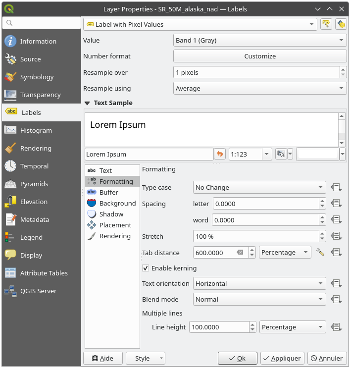
Fig. 13.15 Raster layer labeling settings
At the top of the dialog:
A Value drop-down list allows you to select the band to take the values from
Press Customize to configure a proper number formatting
By default, the displayed value represents individual pixel band value. With Resample over, you can compute the value from the neighbouring pixels (setting
2means2*2=4pixels) using a statistical method set in the Resample using widget.
Fig. 13.16 Pixels labeled using various resampling options
Below are displayed options to customize the labels, under various tabs:


Description of how to set each property is exposed at Setting a label.
13.1.6. Histogram Properties
The  Histogram tab allows you to view
the distribution of the values in your raster.
The histogram is generated when you press the
Compute Histogram button.
All existing bands will be displayed together.
You can save the histogram as an image with the button.
Histogram tab allows you to view
the distribution of the values in your raster.
The histogram is generated when you press the
Compute Histogram button.
All existing bands will be displayed together.
You can save the histogram as an image with the button.
At the bottom of the histogram, you can select a raster band in the
drop-down menu and Set min/max style for it.
The  Prefs/Actions drop-down menu gives you
advanced options to customize the histogram:
Prefs/Actions drop-down menu gives you
advanced options to customize the histogram:
With the Visibility option, you can display histograms for individual bands. You will need to select the option
Show selected band.The Min/max options allow you to ‘Always show min/max markers’, to ‘Zoom to min/max’ and to ‘Update style to min/max’.
The Actions option allows you to ‘Reset’ or ‘Recompute histogram’ after you have changed the min or max values of the band(s).
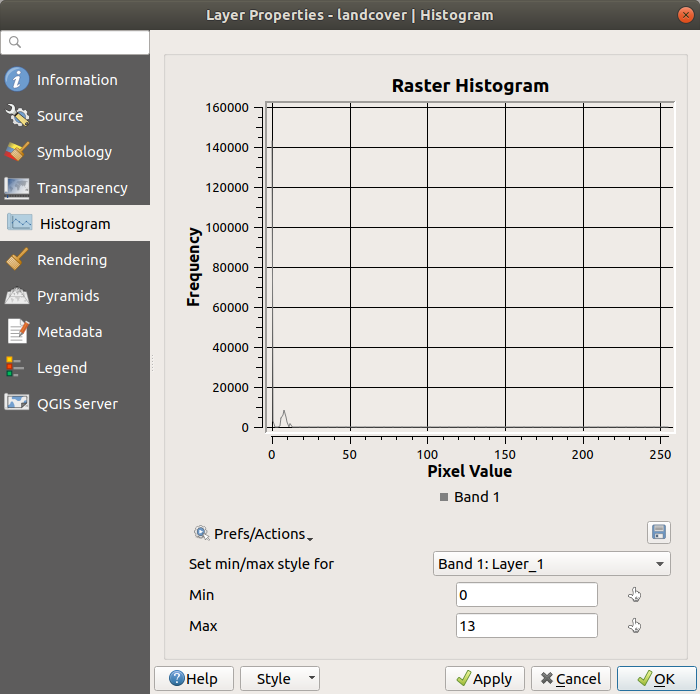
Fig. 13.17 Raster Histogram
13.1.7. Rendering Properties
In the  Rendering tab, it’s possible to:
set Scale dependent visibility for the layer: You can set the Maximum (inclusive) and Minimum (exclusive) scales, defining a range of scales in which the layer will be visible. It will be hidden outside this range. The
 Set to current canvas scale button
helps you use the current map canvas scale as a boundary.
See Visibility Scale Selector for more information.
Set to current canvas scale button
helps you use the current map canvas scale as a boundary.
See Visibility Scale Selector for more information.Note
You can also activate scale dependent visibility on a layer from within the Layers panel: right-click on the layer and in the contextual menu, select Set Layer Scale Visibility.
- Refresh layer at interval: controls whether and how regular a layer can be refreshed.
Available Configuration options are:
Reload data: the layer will be completely refreshed. Any cached data will be discarded and refetched from the provider. This mode may result in slower map refreshes.
Redraw layer only: this mode is useful for animation or when the layer’s style will be updated at regular intervals. Canvas updates are deferred in order to avoid refreshing multiple times if more than one layer has an auto update interval set.
It is also possible to set the Interval (seconds) between consecutive refreshments.
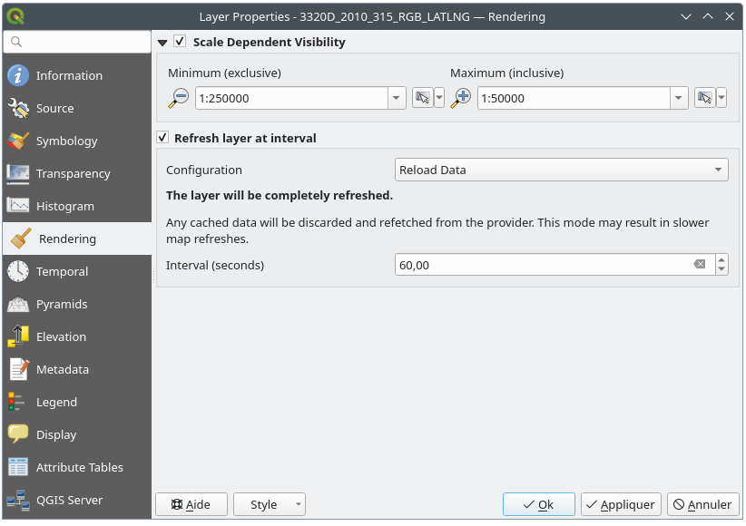
Fig. 13.18 Raster Rendering Properties
13.1.8. Temporal Properties
The  Temporal tab provides options to control
the rendering of the layer over time. Such dynamic rendering requires the
temporal navigation to be enabled over the map canvas.
Temporal tab provides options to control
the rendering of the layer over time. Such dynamic rendering requires the
temporal navigation to be enabled over the map canvas.
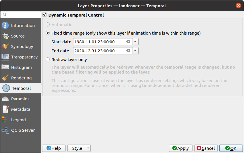
Fig. 13.19 Raster Temporal Properties
Check the Dynamic Temporal Control option and
set whether the layer redraw should be:
Automatic: the rendering is controlled by the underlying data provider if it supports temporal data handling. E.g. this can be used with WMS-T layers or PostgreSQL rasters.
Fixed Date/Time: only show the raster layer at a single, specific date/time. This avoids having to enter the same value for both the start and end of the temporal range.
Fixed time range: only show the raster layer if the animation time is within a Start date and End date range.
Fixed Time Range Per Band: only shows a band when the current animation time is between its Begin and End date range. This option allows you to either manually set these time ranges for each band or use the
 button
to automatically generate datetime values, enabling detailed temporal analysis and visualization.
This mode is particularly useful for working with raster layers where each band corresponds to a specific time
period, such as NetCDF files.
button
to automatically generate datetime values, enabling detailed temporal analysis and visualization.
This mode is particularly useful for working with raster layers where each band corresponds to a specific time
period, such as NetCDF files.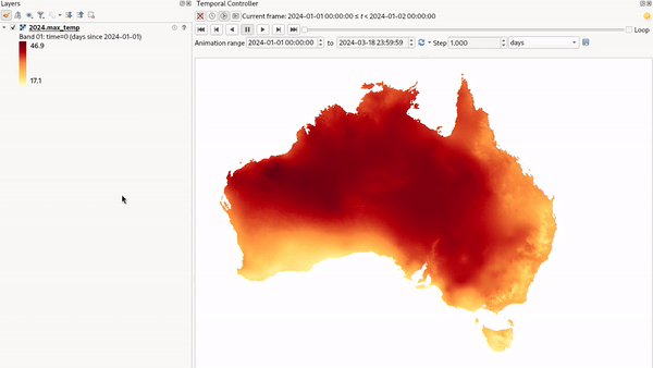
Fig. 13.20 Example of using the Fixed Time Range Per Band mode
Represents Temporal Values: interprets each pixel in the raster layer as a datetime value. When this temporal mode is active, pixels that do not fall within the temporal range specified in the render context will be hidden, ensuring that only temporally relevant data is displayed.
Use
Accumulate pixels over time to control how pixels are displayed during
temporal navigation. When unchecked, only pixels matching the current temporal
range are visible, pixels appear and disappear as you move through time. When
checked, all pixels from the start time through the current position remain
visible, creating a cumulative view.Represents Temporal Values mode is effective for:
Analyzing land use changes, like observing deforestation patterns.
Studying flooding by comparing water coverage across different times.
Evaluating movement costs in terrain analysis, for example, using GRASS GIS’s r.walk tool to calculate travel costs across a landscape.
Fig. 13.21 Application of the Represents Temporal Values mode - analyzing GLAD deforestation alerts
Redraw layer only: the layer is redrawn at each new animation frame. It’s useful when the layer uses time-based expression values for renderer settings (e.g. data-defined renderer opacity, to fade in/out a raster layer).
13.1.9. Pyramids Properties
High resolution raster layers can slow navigation in QGIS. By creating lower resolution copies of the data (pyramids), performance can be considerably improved, as QGIS selects the most suitable resolution to use depending on the zoom level.
You must have write access in the directory where the original data is stored to build pyramids.
From the Resolutions list, select resolutions at which you want to create pyramid levels by clicking on them.
If you choose Internal (if possible) from the Overview format drop-down menu, QGIS tries to build pyramids internally.
Note
Please note that building pyramids may alter the original data file, and once created they cannot be removed. If you wish to preserve a ‘non-pyramided’ version of your raster, make a backup copy prior to pyramid building.
If you choose External and External (Erdas Imagine) the
pyramids will be created in a file next to the original raster with
the same name and a .ovr extension.
Several Resampling methods can be used for pyramid calculation:
Nearest Neighbour
Average
Gauss
Cubic
Cubic Spline
Laczos
Mode
None
Finally, click Build Pyramids to start the process.
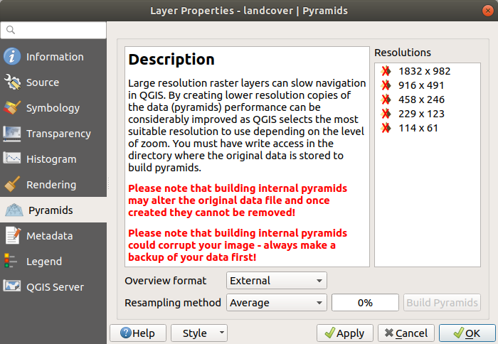
Fig. 13.22 Raster Pyramids
13.1.10. Elevation Properties
The  Elevation tab provides options to control
the layer elevation properties within a 3D map view
and its appearance in the profile tool charts.
Specifically, you can choose to Disable this configuration if the layer
does not contain elevation data or you can set:
Elevation tab provides options to control
the layer elevation properties within a 3D map view
and its appearance in the profile tool charts.
Specifically, you can choose to Disable this configuration if the layer
does not contain elevation data or you can set:
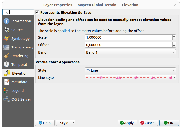
Fig. 13.23 Raster Elevation Properties
Represents Elevation Surface: whether the raster layer represents a height surface (e.g DEM) and the pixel values should be interpreted as elevations. Choose this option if you want to display a raster in an elevation profile view. You will also need to fill in the Band to pick values from and can apply a Scale factor and an Offset.
Fixed Elevation Range: The raster layer (or selected raster band) is associated with a fixed elevation range. This mode can be used when a layer has a single fixed elevation or a range (slice) of elevation values. If a range is specified, pixels will be extruded over this range. You can set the Lower and Upper elevation range values for the layer, and specify whether the lower or upper Limits are inclusive or exclusive.
Fixed Elevation Range Per Band: Each band in the raster can have a fixed elevation range associated with it. This is designed for data sources that expose elevation-related data in bands, such as NetCDF files. For example, a raster with temperature data at different ocean depths. When rendering, the uppermost matching band will be selected and used for the layer’s data. This feature is exposed as a user-editable table for raster bands with lower and upper values. Users can either populate the lower and upper values manually or use an
Expression to auto-fill all band values based on expression.
The expression-based fill allows you to design expressions that extract useful information from band names.
For example, extracting the depth value from a band name like “Band 001: depth=-5500 (meters)”.Dynamic Elevation Range Per Band: This mode calculates elevation ranges for raster bands dynamically using QGIS expressions. It’s ideal for datasets where elevation values follow a consistent pattern across bands (like equally spaced vertical layers), eliminating the need to manually assign fixed elevations. Instead of entering individual values for each band, you define expressions for the Lower and Upper elevation bounds. These expressions can use variables like
@band,@band_name, or@band_descriptionautomatically computing the elevation range based on each band’s properties.Profile Chart Appearance: controls the rendering of the raster elevation data in the profile chart. The profile Style can be set as:
a Line with a specific Line style
an elevation surface rendered using a fill symbol either above (Fill above) or below (Fill below) the elevation curve line. The surface symbology is represented using:
and a Limit: the maximum (respectively minimum) altitude determining how high the fill surface will be
13.1.11. Metadata Properties
The  Metadata tab provides you with options
to create and edit a metadata report on your layer.
See Metadata for more information.
Metadata tab provides you with options
to create and edit a metadata report on your layer.
See Metadata for more information.
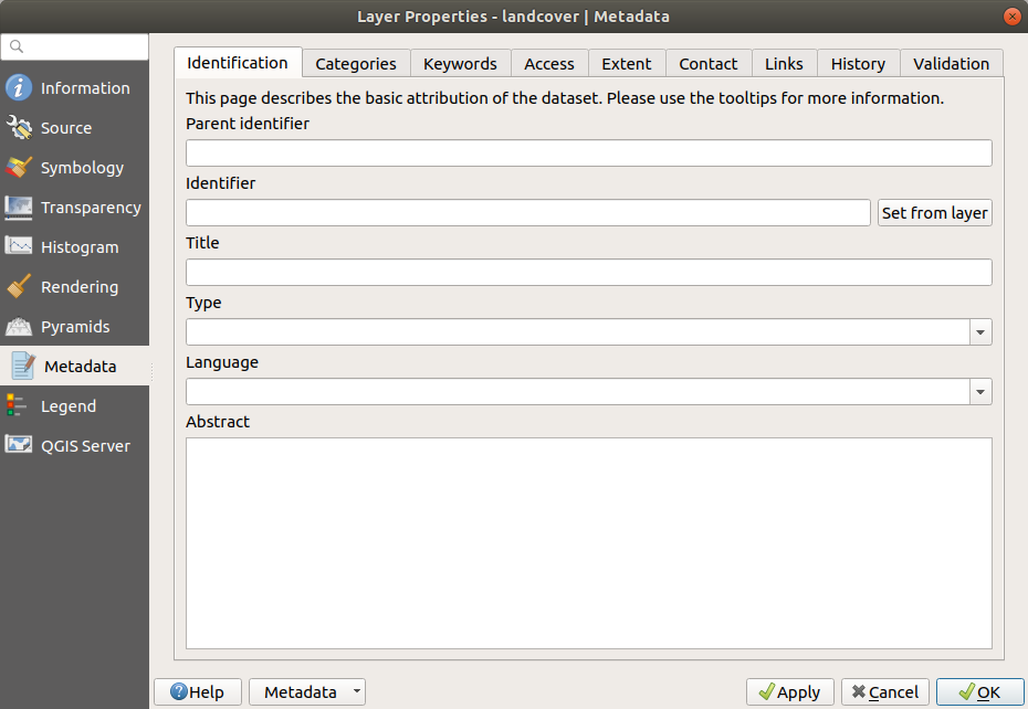
Fig. 13.24 Raster Metadata
13.1.12. Legend Properties
The  Legend tab provides you with advanced
settings for the Layers panel and/or the print
layout legend. These options include:
Legend tab provides you with advanced
settings for the Layers panel and/or the print
layout legend. These options include:
Under General settings:
- Include automatically in print layout legend items:
uncheck this option if you want to hide by default the layer from the print layout legends.
Depending on the symbology applied to the layer, you may end up with several entries in the legend, not necessarily readable/useful to display. The Legend placeholder image helps you select an image for replacement, displayed both in the Layers panel and the print layout legend.
The
Embedded widgets in Legend provides you with a list
of widgets you can embed within the layer tree in the Layers panel.
The idea is to have a way to quickly access some actions that are
often used with the layer (setup transparency, filtering, selection,
style or other stuff…).By default, QGIS provides a transparency widget but this can be extended by plugins that register their own widgets and assign custom actions to layers they manage.
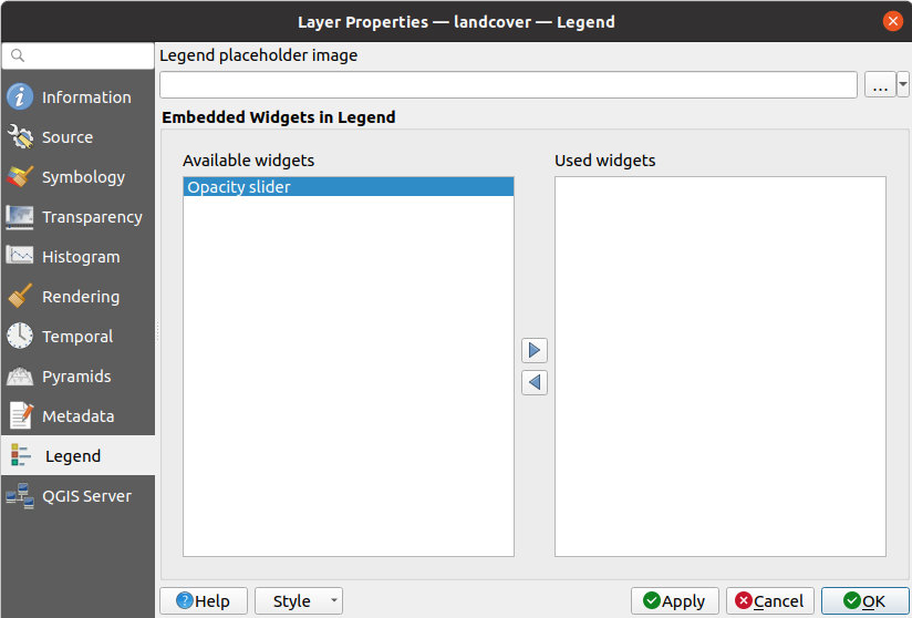
Fig. 13.25 Raster Legend
13.1.13. Display Properties
The  Display tab helps you configure map tips to use for
pixels identification.
Display tab helps you configure map tips to use for
pixels identification.
Enable Map Tips controls whether to display map tips for the layer.
If enabled, provides a complex and full HTML text editor for map tips,
mixing QGIS expressions and html styles and tags (multiline, fonts, images, hyperlink, tables, …).
You can check the result of your code sample in the Maps Tips Preview frame. You can also select and
edit existing expressions using the Insert/Edit Expression button.
You might look for expressions located in Rasters group or
the @layer_cursor_point variable in the Expressions dialog.
Note
Understanding the Insert/Edit Expression button behavior
If you select some text within an expression (between “[%” and “%]”), or if no text is selected but the cursor is inside an expression, the whole expression will be automatically selected for editing. If the cursor or a selected text is outside an expression, the dialog opens with the selection.
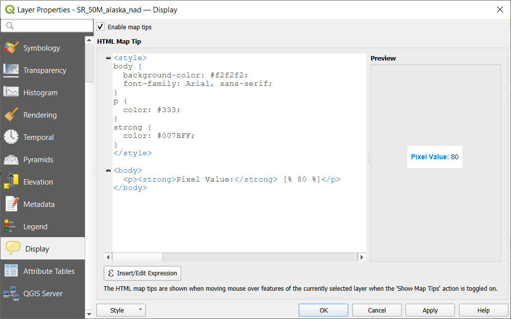
Fig. 13.26 Map tips with raster layer
To display map tips:
Select the menu option or click on the
 Show Map Tips icon of the Attributes Toolbar.
Make sure that the layer you target is active and has the
Enable Map Tips property checked.Move over a pixel, and the corresponding information will be displayed over.
Map tip is a cross-layer feature meaning that once activated, it stays on and applies to any map tip enabled layer in the project until it is toggled off.
13.1.14. QGIS Server Properties
The  QGIS Server tab helps you configure
settings of the data when published by QGIS Server.
The configuration concerns:
QGIS Server tab helps you configure
settings of the data when published by QGIS Server.
The configuration concerns:
Description: provides information to describe the data, such as Short name, Title, Abstract, a Keyword list, and a Data URL whose Format can be in
text/html,text/plainorapplication/pdf.Attribution: a Title and URL to identify who provides the data
Metadata URL: a list of URL for the metadata that can be of
FGDCorTC211Type, and intext/plainortext/xmlFormatLegend URL: a URL for the legend, in either
image/pngorimage/jpegFormat
Note
When the raster layer you want to publish is already provided by a web service, further properties are available for setting.
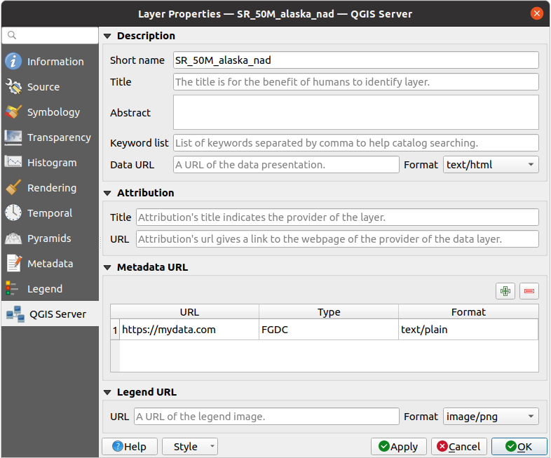
Fig. 13.27 QGIS Server in Raster Properties
13.1.15. Attribute Tables
Similar to vector layers, raster layers in QGIS can have associated Raster Attribute Tables (RATs) that store additional information about raster pixel values.
A Raster Attribute Table links raster values (or value ranges) to descriptive attributes such as class names, pixel counts, and colors. RATs are commonly used for classified rasters, color tables, and histogram information, helping QGIS interpret how raster values should be displayed and classified.
The Attribute Tables tab allows you to view and edit raster attribute data. To access the attribute table of a raster layer, right-click the layer in the layers panel, open Properties… and select Attribute Tables.
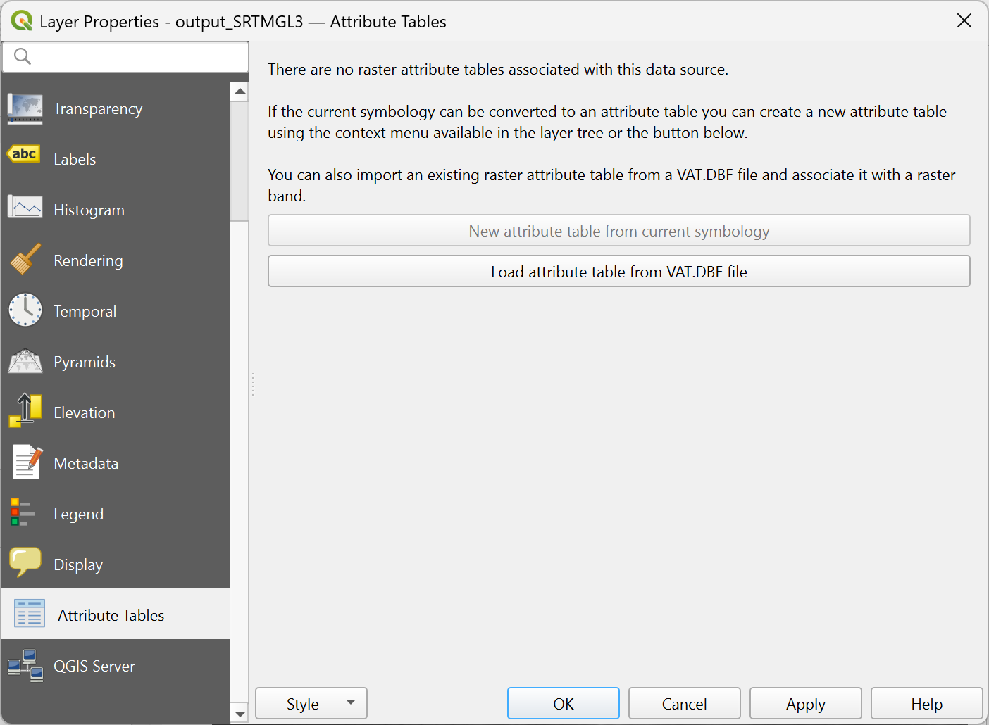
Fig. 13.28 Accessing the raster attribute table
When opening the Attribute Tables for a raster layer that does not have an associated Raster Attribute Table, QGIS displays a notice informing that no attribute table is currently linked to the data source. In this state, the interface provides two options to define and associate a new attribute table:
New attribute table from current symbology: will appear if your raster layer has a classified symbology applied. Otherwise, this option is disabled. Applying classified symbology also triggers an option in the layer context menu to
 Create Raster Attribute Table.
Click this button and set the following options in the New Raster Attribute Table dialog.
Create Raster Attribute Table.
Click this button and set the following options in the New Raster Attribute Table dialog.Managed by the data provider: the attribute table will be saved and managed by the data provider (if supported), overwriting any existing table for the raster band used by the current style. Depending on the data provider, the attribute table will be embedded in the main raster file or saved into a sidecar file managed by the data provider.
Sidecar VAT.DBF file: saves the attribute table into a sidecar VAT.DBF file. The resulting file will not be associated with any particular band.
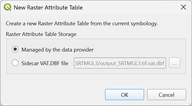
Fig. 13.29 Create new attribute table from current symbology
Load attribute table from VAT.DBF file: retrieves the attribute table from an external DBF file. Load Raster Attribute Table dialog will appear to let you browse and select the DBF file and associate it with the raster band. The action also can be done by right-clicking the raster layer in the layers panel and selecting
 Load Raster Attribute Table from VAT.DBF.
Open the newly loaded attribute table allows you to
directly open the attribute table editor after loading the table.
Load Raster Attribute Table from VAT.DBF.
Open the newly loaded attribute table allows you to
directly open the attribute table editor after loading the table.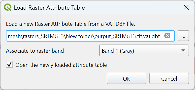
Fig. 13.30 Load attribute table from VAT.DBF file
13.1.15.1. Editing raster attribute tables
When set, a raster attribute table can be accessed from the Attribute tables tab of the layer properties dialog or by selecting Open raster attribute table from the layer contextual menu in Layers panel. This dialog shows a table whose rows correspond to the different pixel values or value ranges classified in a given band of the raster layer. Depending on the type of classification, a row is described by:
for an exact values classification (e.g., paletted/unique values): the band name and the applied Color. Additional fields of the Red, Green, Blue and Opacity of the color are displayed.
for range values classification (e.g., singleband pseudocolor): the range of values defined by their Min, Max, the associated label (Class) and color ramp interpolated over the values (Color). Additional fields of the minimum and maximum of Red, Green, Blue and Opacity of the color ramp are displayed.
You can also customize the raster attribute table by adding new fields for classification and group different value ranges accordingly, modifying value ranges and their associated colors or labels, adding new rows, … The new attribute table can be used to update the current layer symbology.
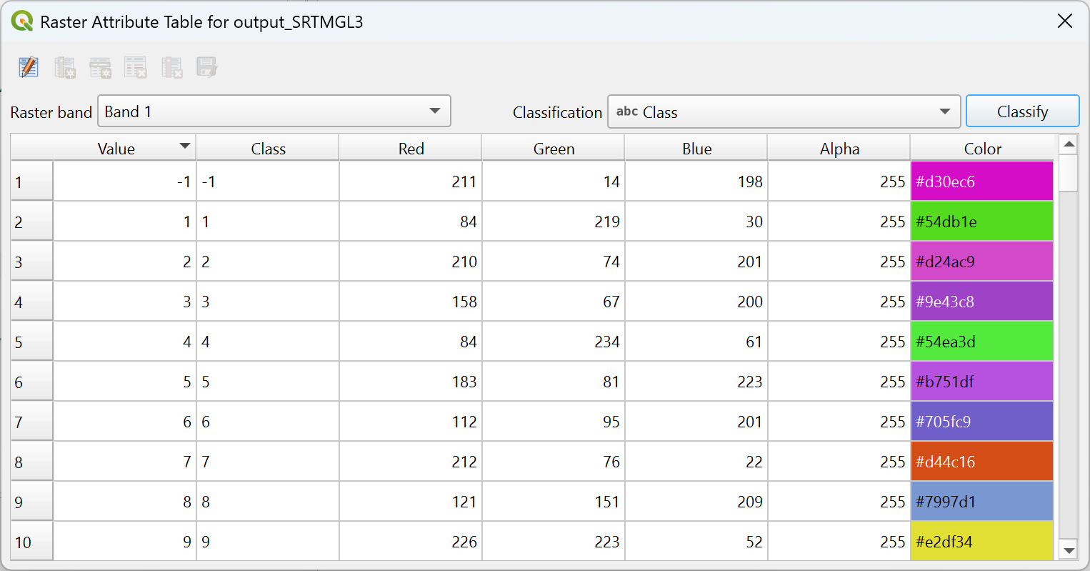
Fig. 13.31 Raster Attribute Table
At the top of the dialog, a set of tools allows to edit and save changes to the attribute table:
 Edit Attribute Table turns the table into edit mode.
If no specific row or field is selected, only the
Edit Attribute Table turns the table into edit mode.
If no specific row or field is selected, only the  Add Column… option is available.
- Add Column… opens the Add Column dialog to add a new
column to the raster attribute table. The dialog lets you define:
Column Type, which can be:
- Standard column
- Color RGBA
- Color ramp (RGBA minimum and RGBA maximum)
Column Definition, including:
Name of the column (mandatory)
Usage, which can be:
Pixel Count: stores the number of pixels belonging to a given value or value range.
Generic: general-purpose column with no predefined meaning.
Name: stores the class name or label associated with a raster value or range.
Data type, which can be:
String
Integer
Long Integer
Double
Insertion point, defining whether the new column is inserted
Before or After
a selected existing column.
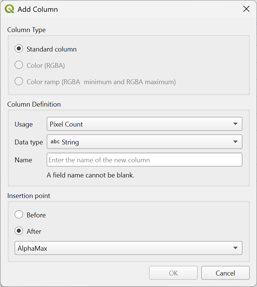
Fig. 13.32 Add Column dialog
 Add Row… opens the Add Row dialog to add a new row
to the raster attribute table. Choose the Insertion point as Before current row
or After current row.
Add Row… opens the Add Row dialog to add a new row
to the raster attribute table. Choose the Insertion point as Before current row
or After current row. Remove Row removes the selected row from the raster attribute table.
 Remove Column removes the selected column from the raster attribute table.
 Save Changes saves any modifications made to the raster attribute table.
The next row provides options for controlling the displayed information in the table:
Raster band: allows selecting which raster band the attribute table applies to. Raster layers may contain multiple bands (e.g., multispectral data). Each band can have its own Raster Attribute Table.
Classification: allows selecting the fields used for classifying the raster layer. Keep in mind that the existing symbology for the raster will be replaced by a new symbology from the attribute table and any unsaved changes to the current symbology will be lost. Make sure to save your symbology style if needed before applying a classification.
13.1.16. Identify raster cells
The identify features tool allows you to get information about
specific points in a raster layer.
To use the Identify features tool:
Select the raster layer in the Layers panel.
Click on the Identify features tool in the toolbar or press Ctrl+Shift+I.
Click on the point in the raster layer that you want to identify. The pixel will get highlighted.
The Identify Results panel will open in its default Tree view
and display information about the clicked point.
Formatting of the results vary depending on the provider of the layer. For example:
For a local raster layer: below the name of the layer, you have on the left the band(s) of the clicked pixel, and on the right their respective value.
For a remote layer such as WMS, a Format menu allows you to select whether the information should be displayed as HTML, Feature or Text.
These values can also be rendered (from the View menu located at the bottom of the panel) in:
a
Tableview - organizes the information about the identified features and their values in a table.a
Graphview - organizes the information about the identified features and their values in a graph.
Under the pixel attributes, you will find the Derived information, such as:
XandYcoordinate values of the point clickedColumn and row of the point clicked (pixel) when compatible