10.3. Setting a label
Labels are textual information you can display on maps. They add details you could not necessarily represent using symbols, and may refer to vector features, raster cells, mesh elements, or simple annotations on the map… Two types of text-related items are available in QGIS:
Text Format: defines the appearance of the text, including font, size, colors, shadow, background, buffer, …
They can be used to render texts over the map (layout/map title, decorations, scale bar, …), usually through the font widget.
To create a Text Format item:
Open the
 Style Manager dialog
Activate the Text format tab
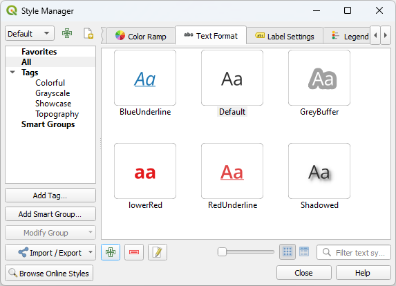
Fig. 10.25 Text formats in Style Manager dialog
Press the
 Add item button. The Text Format
dialog opens for configuration.
As usual, these properties are data-definable.
Add item button. The Text Format
dialog opens for configuration.
As usual, these properties are data-definable.
Label Settings: extend the text format settings with properties related to the location or the interaction with other texts or features (callouts, placement, overlay, scale visibility, mask …).
They are used to configure smart labelling for vector and mesh layers through the
 Labels tab of the vector or mesh Layer Properties
dialog or Layer Styling panel or using the Layer
Labeling Options button of the Label toolbar.
Labels tab of the vector or mesh Layer Properties
dialog or Layer Styling panel or using the Layer
Labeling Options button of the Label toolbar.To create a Label Settings item:
Open the
Style Manager dialogActivate the Label Settings tab
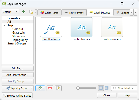
Fig. 10.26 Label Settings in Style Manager dialog
Press the
Add item menu and select the entry corresponding
to the geometry type of the features you want to label.
The Label Settings dialog opens with the following properties. As usual, these properties are data-definable.
10.3.1. Formatting the label text
Whether you are configuring a Text Format or Label Settings item, and depending on the type of layer you are configuring, you will be given the following options:
Properties tab |
Text format |
Label settings |
Vector or mesh layer |
Raster layer |
|---|---|---|---|---|
Text |
|
|
|
|
Formatting |
|
|
|
|
Buffer |
|
|
|
|
Mask |
|
|
||
Background |
|
|
|
|
Shadow |
|
|
|
|
Callout |
|
|
||
Placement |
|
|
|
|
Rendering |
|
|
|
Attention
While for legibility, “feature” is the name used below to indicate the item being labeled, depending on the underlying layer type, it can be replaced by “pixel”, “face” or “vertex”.
10.3.1.1. Text tab
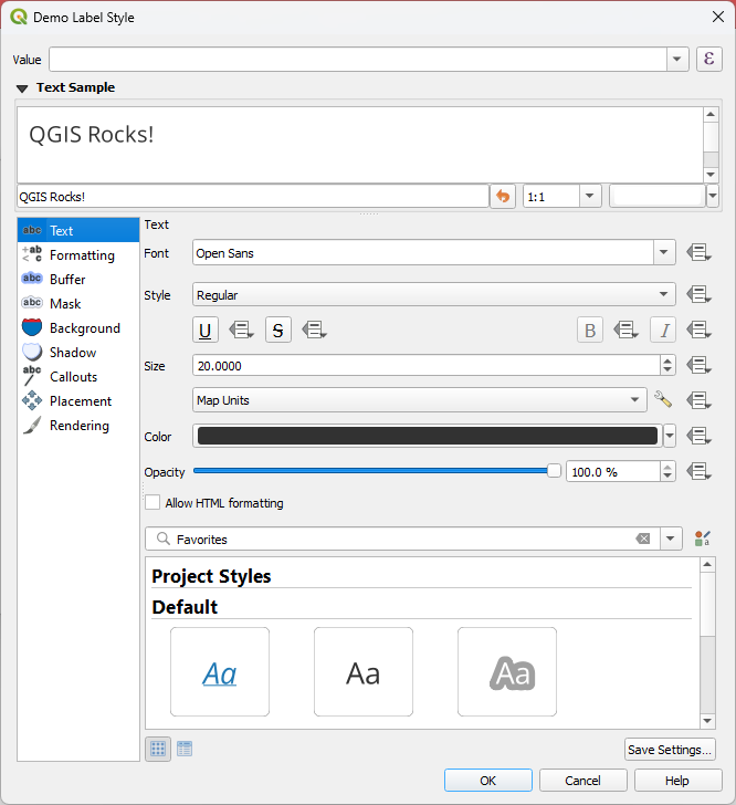
Fig. 10.27 Labels settings - Text tab
In the  Text tab, you can set:
the Font, from the ones available on your machine
the Style: along with the common styles of the font, you can set whether the text should be underlined or striked through
the Size in any supported unit
the Color
the Opacity
and Allow HTML Formatting enables the use of a subset of HTML tags and CSS rules to customize the label.
At the bottom of the tab, a widget shows a filterable list of compatible items stored in your style manager database. This allows you to easily configure the current text format or label setting based on an existing one, and also save a new item to the style database: Press the Save format… or Save settings… button and provide a name and tag(s).
Note
When configuring a Label Settings item, text format items are also available in this widget. Select one to quickly overwrite the current textual properties of the label. Likewise, you can create/overwrite a text format from there.
Allow HTML Formatting
With Allow HTML Formatting enabled, you need to provide the HTML code in the Value field. Use whitespaces instead of tabs for any kind of indentation. The expression is parsed and any supported HTML tag overrides its corresponding setting in the labels properties. Because it is impossible to list and detail every HTML tag and CSS property that QGIS currently supports, we invite you to explore and test in your labels the ones supported by the underlying Qt library.
Examples of supported HTML tags:
Text formatting, such as italic or bold, e.g.:
<i>QGIS</i> <b>rocks!</b>
Superscript and subscript, where the text will be vertically super or sub aligned and automatically sized to 2/3 of the parent font size. You can also set a fixed font size for the superscript/subscript by including css rules, e.g.:
<sup style="font-size:33pt">my superscript text</sup>
Text horizontal alignment, using either HTML the
align="xxx"attribute orcentertag. For HTML5 compatibility, prefer using the CSS propertytext-align.Attention
Horizontal alignment can not be used for curved labels.
Structuring a block of text using header tags (such as
h1,h2, …), or paragraphs (withp,div,br):<div class="myDiv"> <h2>QGIS always rocks!!</h2> <p align="center">Let's dive into details of its nice features.</p> </div>
Image insertion: any image format readable by QGIS can be used in HTML label content. It can be served from local file paths, HTTP links, or base64 embedded content, using the
src="xxx"attribute. Image sizes can be specified via thewidth="##"andheight="##"attributes, inpointsunit. If width or height is not specified it will automatically be calculated from the original image size. Images are placed inline only, not as floating images, and not on curved text labels.<img src="qgis.png" width=40 height=60>
Examples of supported CSS properties:
Font properties (
color,font-family,font-size,font-weight,font-style,word-spacing). Note thatword-spacingwill always use unit points.Text decorations such as underline, overline and line-through (
text-decoration)Text alignment (
vertical-align,text-align). Horizontal alignment can not be used for curved labels.Line height, in
pointsorpercentunit, e.g. “line-height: 40pt” or “line-height: 40%”Background properties such as
background-colorandbackground-image. They are supported for block type items (e.g.div) or inline items (e.g.span). For images, the CSS should be formatted asbackground-image: url(xx)and supports local file paths, HTTP links, or base64 embedded content.Attention
Backgrounds are not supported for curved text and are always rendered above any background shape for the label, and below drop shadows/buffers properties.
Margin properties, available for block type items only, such as
div,p,h1,… They can be specified in either the longhand or shorthand way, inpointsunit only. Negative values can be set for the bottom margin.<div class="myDiv"> <h2 style="margin-left: 5pt; margin-right: 10pt">QGIS still rocks...</h2> <p style="margin: 5pt 0pt -10pt 0pt">Thanks to you!!</p> </div>
CSS properties can be set on HTML tags with the style attribute.
The HTML tag span does not apply any formatting to text by itself
and is ideal if you just want to apply CSS styling.
A CSS property name and its value are separated by a colon (:).
Multiple CSS properties are separated by semicolon (;), e.g.:
<span style="text-decoration:underline;text-align:center;color:blue;word-spacing:20">I will be displayed as blue underlined and centered text with increased space between words</span>
Below an example of a HTML-based expression and rendering (applies different colors and underline to the same label):
format(
  '<span style="color:blue">%1</span> ( <span style="color:red"><u>%2 ft</u></span> )',
  title( lower( "Name" ) ),
  round($length)
)
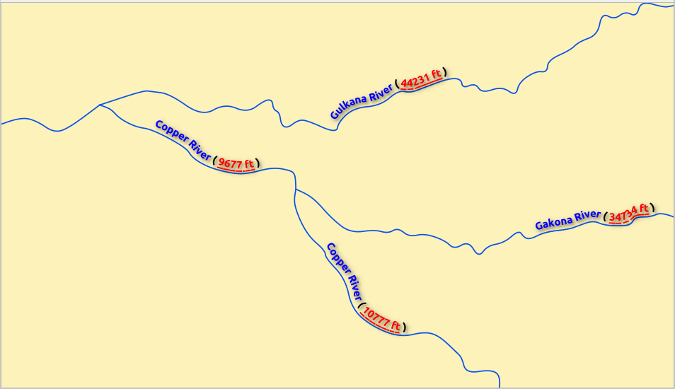
Fig. 10.28 Labeling with HTML formatting enabled
10.3.1.2. Formatting tab
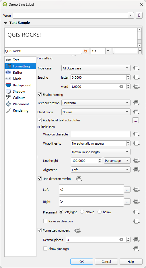
Fig. 10.29 Label settings - Formatting tab
In the  Formatting tab, you can:
Use the Type case option to change the capitalization style of the text. You have the possibility to render the text as:
No change
All uppercase
All lowercase
Small Caps: renders lowercase characters as small caps.
All Small Caps: renders all characters as small caps regardless of their original case.
Title case: modifies the first letter of each word into capital, and turns the other letters into lower case if the original text is using a single type case. In case of mixed type cases in the text, the other letters are left untouched.
Force first letter to capital: modifies the first letter of each word into capital and leaves the other letters in the text untouched.
Under Spacing, change the space between words and between individual letters.
With Tab distance you can adjust the replacement spacing for Tab characters in the label, in any supported unit. This allows e.g. to properly separate or vertically align elements of a layout legend text.
Pressing the
 Configure tab stops button on the right,
you can add a list of tab positions, instead of a single distance.
This allows e.g. the creation of table-like multiline labels,
where texts are split over different “columns” and lined up nicely,
based on the Tab characters.
Configure tab stops button on the right,
you can add a list of tab positions, instead of a single distance.
This allows e.g. the creation of table-like multiline labels,
where texts are split over different “columns” and lined up nicely,
based on the Tab characters.Stretch ratio: allows text to be horizontally stretched or condensed by a factor. Handy for tweaking the widths of fonts to fit a bit of extra text into labels.
 Enable kerning of the text font
Set the Text orientation which can be Horizontal or Vertical. It can also be Rotation-based when setting a label (e.g., to properly label line features in parallel placement mode).
Use the Blend mode option to determine how your labels will mix with the map features below them (more details at Blending Modes).
The
 Apply label text substitutes option allows you
to specify a list of texts to substitute to texts in feature labels (e.g.,
abbreviating street types). Replacement texts are used when displaying
labels on the map. Users can also export and import lists of
substitutes to make reuse and sharing easier.
Apply label text substitutes option allows you
to specify a list of texts to substitute to texts in feature labels (e.g.,
abbreviating street types). Replacement texts are used when displaying
labels on the map. Users can also export and import lists of
substitutes to make reuse and sharing easier.Configure Multiple lines:
Set a character that will force a line break in the text with the Wrap on character option
Set an ideal line size for auto-wrapping using the Wrap lines to option. The size can represent either the Maximum line length or the Minimum line length.
Decide the Line Height: values can be set to be in Millimeters, Points, Pixels, Percentage, or Inches. When line height is set to percentage it is the percentage of the default text line spacing of that font family. Typically 1.2 to 1.5 times the text size.
Format the Alignment: typical values available are Left, Right, Justify and Center.
When setting point labels properties, the text alignment can also be Follow label placement. In that case, the alignment will depend on the final placement of the label relative to the point. E.g., if the label is placed to the left of the point, then the label will be right aligned, while if it is placed to the right, it will be left aligned.
Note
The Multiple lines formatting is not yet supported by curve based label placement. The options will then be deactivated.
For line labels you can include Line direction symbol to help determine the line directions, with symbols to use to indicate the Left or Right. They work particularly well when used with the curved or Parallel placement options from the Placement tab. There are options to set the symbols position, and to
Reverse direction.Use the
Formatted numbers option to format numeric
texts. You can set the number of Decimal places. By default, 3decimal places will be used. Use the Show plus sign if
you want to show the plus sign for positive numbers.
10.3.1.3. Buffer tab
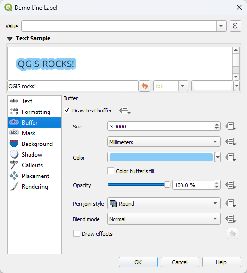
Fig. 10.30 Label settings - Buffer tab
To create a buffer around the label, activate the Draw
text buffer checkbox in the  Buffer tab. Then you can:
Set the buffer’s Size in any supported unit
Select the buffer’s Color
- Color buffer’s fill: The buffer expands from the
label’s outline, so, if the option is activated, the label’s interior is
filled. This may be relevant when using partially transparent labels or with
non-normal blending modes, which will allow seeing behind the label’s text.
Unchecking the option (while using totally transparent labels) will allow you
to create outlined text labels.
Define the buffer’s Opacity
Apply a Pen join style: it can be Round, Miter or Bevel
Use the Blend mode option to determine how your label’s buffer will mix with the map components below them (more details at Blending Modes).
Check
Draw effects to add advanced  paint effects for improving text readability,
eg through outer glows and blurs.
paint effects for improving text readability,
eg through outer glows and blurs.
10.3.1.4. Background tab
The  Background tab allows you to configure a
shape that stays below each label. To add a background, activate
the Draw Background checkbox and select
the Shape type. It can be:
Background tab allows you to configure a
shape that stays below each label. To add a background, activate
the Draw Background checkbox and select
the Shape type. It can be:
a regular shape such as Rectangle, Square, Circle or Ellipse using full properties of a fill symbol
an SVG symbol from a file, a URL or embedded in the project or style database (more details)
or a Marker Symbol you can create or select from the symbol library.
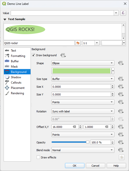
Fig. 10.31 Label settings - Background tab
Depending on the selected shape, you need to configure some of the following properties:
The Size type of the frame, which can be:
Fixed: using the same size for all the labels, regardless the size of the text
or a Buffer over the text’s bounding box
The Size of the frame in X and Y directions, using any supported units
A Rotation of the background, between Sync with label, Offset of label and Fixed. The last two require an angle in degrees.
An Offset X,Y to shift the background item in the X and/or Y directions
A Radius X,Y to round the corners of the background shape (applies to rectangle and square shapes only)
An Opacity of the background
A Blend mode to mix the background with the other items in the rendering (see Blending Modes).
For SVG symbol, you can use its default properties (Load symbol parameters) or set a custom Fill color, Stroke color and Stroke width.
- Draw effects to add advanced
paint effects for improving text readability,
eg through outer glows and blurs.
10.3.1.5. Shadow tab
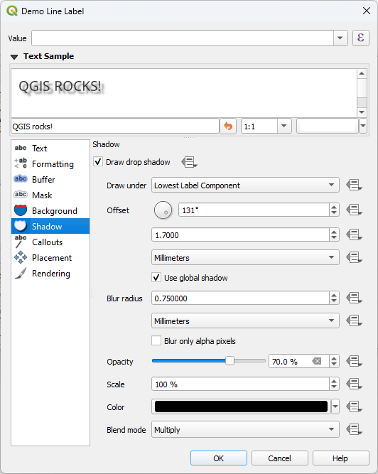
Fig. 10.32 Label settings - Shadow tab
To add a shadow to the text, enable the  Shadow
tab and activate the Draw drop shadow. Then you can:
Shadow
tab and activate the Draw drop shadow. Then you can:
Indicate the item used to generate the shadow with Draw under. It can be the Lowest label component or a particular component such as the Text itself, the Buffer or the Background.
Set the shadow’s Offset from the item being shadowed, ie:
The angle: clockwise, it depends on the underlying item orientation
The distance of offset from the item being shadowed
The units of the offset
If you tick the
Use global shadow checkbox,
then the zero point of the angle is always oriented to the north and
doesn’t depend on the orientation of the label’s item.Influence the appearance of the shadow with the Blur radius. The higher the number, the softer the shadows, in the units of your choice.
Define the shadow’s Opacity
Rescale the shadow’s size using the Scale factor
Choose the shadow’s Color
Use the Blend mode option to determine how your label’s shadow will mix with the map components below them (more details at Blending Modes).
10.3.2. Configuring interaction with labels
Other than the text formatting settings exposed above, you can also set how labels interact with each others or with the features.
10.3.2.1. Mask tab
The  Mask tab allows you to define a mask area around
the labels. This feature is very useful when you have overlapping symbols and
labels with similar colors, and you want to make the labels visible. A label mask
prevents specified features from drawing within the boundary set for the mask.
For example, you could set a label mask so that a specified layer does not draw
within 2mm of the label, but allow features from another layer to still show.
Label masks are similar to label buffers in that they allow control of the legibility
of labels that cover other features. The label buffer draws on top of any underlying
features, while the label mask selectively stops other layers from drawing.
Mask tab allows you to define a mask area around
the labels. This feature is very useful when you have overlapping symbols and
labels with similar colors, and you want to make the labels visible. A label mask
prevents specified features from drawing within the boundary set for the mask.
For example, you could set a label mask so that a specified layer does not draw
within 2mm of the label, but allow features from another layer to still show.
Label masks are similar to label buffers in that they allow control of the legibility
of labels that cover other features. The label buffer draws on top of any underlying
features, while the label mask selectively stops other layers from drawing.
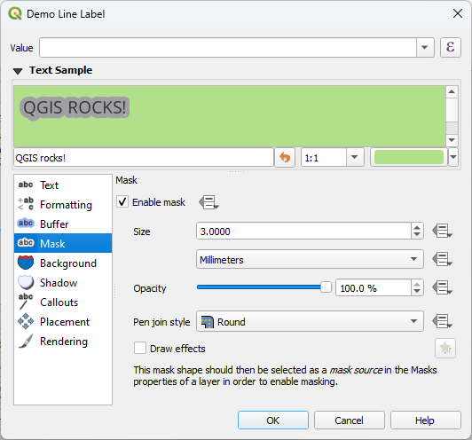
Fig. 10.33 Labels settings - Mask tab (with the text sample showing a green background representing another layer being excluded)
To create masking effects on labels:
Activate the
Enable mask checkbox in the tab.Then you can set:
the mask’s Size in the supported units
the Opacity of the mask area around the label
a Pen Join Style
paint effects through the
Draw effects checkbox.
Select this mask shape as a mask source in the overlapping layer properties
Mask tab (see Masks Properties).
10.3.2.2. Callouts tab
A common practice when placing labels on a crowded map is to use callouts - labels which are placed outside (or displaced from) their associated feature are identified with a dynamic line connecting the label and the feature. If one of the two endings (either the label or the feature) is moved, the shape of the connector is recomputed.
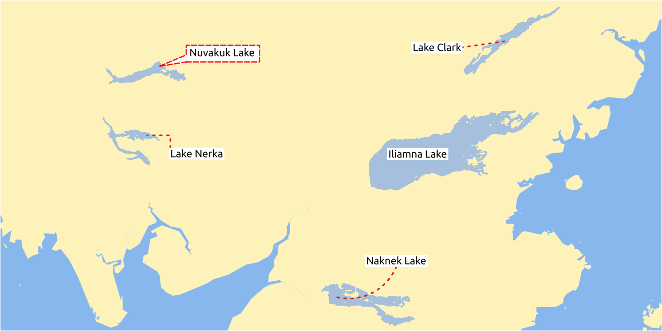
Fig. 10.34 Labels with various callouts settings
To add a callout to a label, enable the  Callouts
tab and activate the Draw callouts. Then you can:
Callouts
tab and activate the Draw callouts. Then you can:
Select the Style of connector, one of:
Simple lines: a straight line, the shortest path
Manhattan style: a 90° broken line
Curved lines: a curved line
Balloons: a speech bubble surrounding the label and pointing to the feature. It can have rounded corners.
Set the properties of the callout. The following table shows the different properties, with description and compatible connector style.
Table 10.5 Label callout properties Property
Style of callout
Description
Fill style
Balloons
A fill symbol with full display capabilities, including layer effects, data-defined settings, … for drawing the balloon shape.
Corner radius
Corner radius of the speech bubble
Wedge width
Sets how large the bubble speech connection with feature’s pointer should be
Margins
Margins around the label’s text, in the unit of your choice
Line style
All but balloons
A line symbol with full display capabilities, including layer effects, data-defined settings, … for drawing the connector line.
Curvature
Curved lines
The percentage of curvature of the connection line
Orientation
Orientation, starting from the label to the feature. It can be Clockwise, Counter-clockwise, or Automatic (determining an optimal orientation for each label).
Minimum length
All but balloons
Minimum length of the connector line
Draw lines to all feature parts
In case of a multi-part feature, indicates whether a connector line should be drawn from the label to each geometry part.
Label anchor point
Controls where the connector line should join to the label text. Available options:
Closest point
Centroid
Fixed position at the edge (Top left, Top center, Top right, Left middle, Right middle, Bottom left, Bottom center and Bottom right).
Offset from label area
Controls the distance from the label anchor point (where the callout line ends). This avoids drawing lines right up against the text.
Offset from feature
All
Controls the distance from the feature (or its anchor point if a polygon) where callout lines end. E.g., this avoids drawing lines right up against the edges of the features.
Feature anchor point
Where the connector line ends on the (polygon) feature. Available options:
Pole of inaccessibility
Point on exterior
Point on surface
Centroid
End point marker
Balloons
A marker symbol with full display capabilities including layer effects, data-defined, … for rendering a marker symbol below the endpoint of the balloon callout.
Blend mode
All
Controls the blending of the callout.
Under the Data defined placement group, coordinates of the Origin (on the label side) and/or Destination (on the feature side) points of the callout can be controlled. Callouts can also be controlled manually by using the
 Move Label, Diagram or Callout tool in the Labeling Toolbar.
The start and end points of each callout can be moved this way.
The nodes should be highlighted when the mouse pointer is nearby.
If needed the Shift Key can be held during the movement.
This will snap the point in a way that the angle between the two callout points increments by 15 degrees.
Move Label, Diagram or Callout tool in the Labeling Toolbar.
The start and end points of each callout can be moved this way.
The nodes should be highlighted when the mouse pointer is nearby.
If needed the Shift Key can be held during the movement.
This will snap the point in a way that the angle between the two callout points increments by 15 degrees.
10.3.2.3. Placement tab
Choose the  Placement tab for configuring label placement
and labeling priority. Note that the placement options differ according to the
type of vector or mesh layer, namely point, line or polygon, and are affected by
the global PAL setting.
Placement tab for configuring label placement
and labeling priority. Note that the placement options differ according to the
type of vector or mesh layer, namely point, line or polygon, and are affected by
the global PAL setting.
Placement for point layers
Point labels placement modes available are:
Cartographic: point labels are generated with a better visual relationship with the point feature, following ideal cartographic placement rules. Labels can be placed:
at a set Distance in supported units, either from the point feature itself or from the bounds of the symbol used to represent the feature (set in Distance offset from). The latter option is especially useful when the symbol size isn’t fixed, e.g. if it’s set by a data defined size or when using different symbols in a categorized renderer.
within a Maximum Distance from the feature, which is an optional setting that allows you to control how far a label can be placed from the feature it’s labeling. This works alongside the Distance setting to create a range for label placement, adding flexibility to position labels more effectively, especially on busy maps, ensuring they fit neatly around their corresponding features.
using the Prioritize Placement option, which decides what’s more important when placing labels. There are two options:
Prefer closer labels: By default, labels are kept close to the feature.
Prefer position ordering: The label will try to stay in a specific position (like top left or top right), even if it’s a bit farther away from the feature. The label only moves to other positions if there’s no room within the maximum distance at your preferred position.
following a Position priority which dictates placement candidates for anchoring labels around and (centered) over the point feature, and the order in which the positions are tested. The default order, based on guidelines from Krygier and Wood (2011) and other cartographic textbooks, is as follows:
top right
top left
bottom right
bottom left
middle right
middle left
top, slightly right
bottom, slightly left.
Using the
 Data-defined override button,
you can provide a comma separated list of placements in order of priority.
This also allows only certain placements to be used, for certain features only,
so e.g., for coastal features you can prevent labels being placed over the land.
Data-defined override button,
you can provide a comma separated list of placements in order of priority.
This also allows only certain placements to be used, for certain features only,
so e.g., for coastal features you can prevent labels being placed over the land.
Around Point: labels are placed in a circle around the feature with an equal radius set in Distance. Additionally you can set Maximum Distance from the feature, to control how far a label can be placed from the feature it’s labeling. The placement priority is clockwise from the “top right”. The position can be constrained using the data-defined Quadrant option.
Offset from Point: labels are placed at an Offset X,Y distance from the point feature, in various units, or preferably over the feature. You can use a data-defined Quadrant to constrain the placement and can assign a Rotation to the label.
Placement for line layers
Label modes for line layers include:
Parallel: draws the label parallel to a generalised line representing the feature, with preference for placement over straighter portions of the line. You can define:
Allowed positions: Above line, On line, Below line and Line orientation dependent position (placing the label at the left or the right of the line). It’s possible to select several options at once. In that case, QGIS will look for the optimal label position.
Distance between the label and the line.
Curved: draws the label following the curvature of the line feature. In addition to the parameters available with the Parallel mode, you can set the Maximum angle between curved characters, either inside or outside.
To control how the text is positioned, select Character placement and set one of the following:
Default: applies stretching and spacing options from the Formatting tab to the label.
Stretch Word Spacing: stretches (or shrinks) word spacing so that the curved label fits the whole line.
Stretch Character Spacing: stretches (or shrinks) character spacing so that the curved label fits the whole line.
Characters at Vertices: places individual characters from the label at each corresponding vertex in the line. If the curved line geometry does not contain sufficient vertices for the characters present in the label text then the excess characters are ignored and will not be rendered. If the label’s distance setting is non-zero, then the character will be vertically offset from the vertex position by this distance. Characters are rotated to follow the line angle at the vertex.
The
Ignore label whitespace when detecting collisions option
controls how QGIS treats whitespace (i.e., spaces or tabs) in label text when determining
whether two labels collide (or when a label collides with an obstacle feature).
If unchecked, spaces are treated the same as text characters,
and a label or feature is not permitted to overlap spaces in another feature’s label.
Check the option to allow spaces overlap.Horizontal: draws labels horizontally along the length of the line feature.
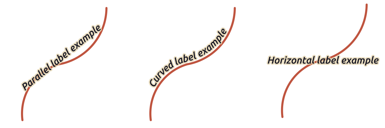
Fig. 10.35 Label placement examples for lines
Next to placement modes, you can set:
Repeating Labels Distance to display multiple times the label over the length of the feature. The distance can be in
Millimeters,Points,Pixels,Meters at scale,Map UnitsandInches.A Label Overrun Distance (not available for horizontal mode): specifies the maximal allowable distance a label may run past the end (or start) of line features. Increasing this value can allow for labels to be shown for shorter line features.
Label Anchoring: controls the placement of the labels along the line feature they refer to. Click on Settings … to choose:
the position along the line (as a ratio) which labels will be placed close to. It can be data-defined and possible values are:
 Center of Line
 Start of Line
 End of Line
or
 Custom….
Clipping: Determines how the label placement on a line is calculated. By default only the visible extent of the line is used but the whole extent can be used to have more consistent results.
Anchor text: controls which part of the text (start, center or end) will line up with the anchor point. Using Automatic anchoring means that:
For labels anchored near the start of the line (0-25%), the anchor placement will be the start of the label text
For labels anchored near the end of the line (75-100%), the anchor placement will be the end of the label text
For labels anchored near the center of the line (25-75%), the anchor placement will be the center of the label text
Placement Behavior: use Preferred Placement Hint to treat the label anchor only as a hint for the label placement. By choosing Strict, labels are placed exactly on the label anchor.
Placement for polygon layers
You can choose one of the following modes for placing labels of polygons:
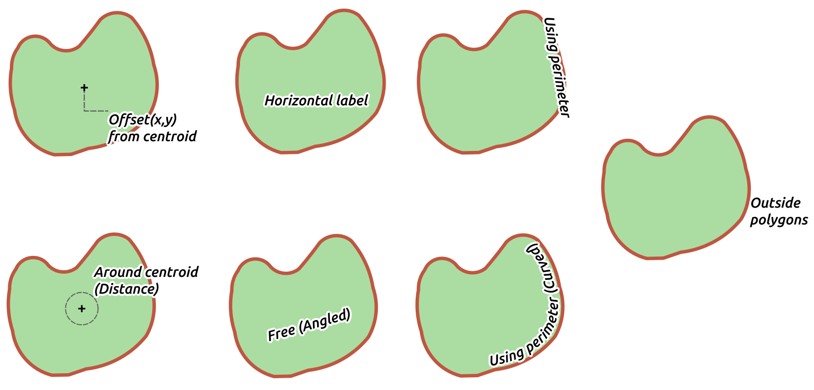
Fig. 10.36 Label placement examples for polygons
Offset from Centroid: labels are placed over the feature centroid or at a fixed Offset X,Y distance (in supported units) from the centroid. The reference centroid can be determined based on the part of the polygon rendered in the map canvas (visible polygon) or the whole polygon, no matter if you can see it. You can also:
force the centroid point to lay inside their polygon
place the label within a specific quadrant
assign a rotation
Allow placing labels outside of polygons when it is not possible to place them inside the polygon. Thanks to data-defined properties, this makes possible to either allow outside labels, prevent outside labels, or force outside labels on a feature-by-feature basis.
Around Centroid: places the label within a preset distance around the centroid, with a preference for the placement directly over the centroid. Again, you can define whether the centroid is the one of the visible polygon or the whole polygon, and whether to force the centroid point inside the polygon.
Horizontal: places at the best position a horizontal label inside the polygon. The preferred placement is further from the edges of the polygon. It’s possible to Allow placing labels outside of polygons.
Free (Angled): places at the best position a rotated label inside the polygon. The rotation respects the polygon’s orientation and the preferred placement is further from the edges of the polygon. It’s possible to Allow placing labels outside of polygons.
Using Perimeter: draws the label parallel to a generalised line representing the polygon boundary, with preference for straighter portions of the perimeter. You can define:
Allowed positions: Above line, On line, Below line and Line orientation dependent position (placing the label at the left or the right of the polygon’s boundary). It’s possible to select several options at once. In that case, QGIS will look for the optimal label position.
Distance between the label and the polygon’s outline
the Repeating Labels Distance to display multiple times the label over the length of the perimeter.
Using Perimeter (Curved): draws the label following the curvature of the polygon’s boundary. In addition to the parameters available with the Using Perimeter mode, you can set the Maximum angle between curved characters polygon, either inside or outside.
Outside Polygons: always places labels outside the polygons, at a set Distance
Common placement settings
Some label placement settings are available for all layer geometry types:
Label Spacing
The Label Spacing option allows you to set the margin around the label,
preventing all other labels from being placed within that area.
You can dynamically control Margin around label using
the Data-defined override button.
Choose unit from the unit selector, and there you can also adjust scaling range.
Attention
This option is only available on QGIS installed with GEOS >= 3.10 (see menu).
Duplicate Labels
Use Avoid duplicate labels to improve label appearance in situations like road networks,
where features such as dual carriageways or service roads can result in many identical labels appearing close together.
When active, it prevents placing labels with the exact same text (case-sensitive)
closer than the minimum distance defined in the Settings… option.
The setting applies across layers, so duplicate text from any layer will be considered.
Attention
This option is only available on QGIS installed with GEOS >= 3.10 (see menu).
Geometry Generator
The Geometry Generator section allows a user to alter the underlying geometry used to place and render the label, by using expressions. This can be useful to perform displacement of the geometry dynamically or to convert it to another geometry (type).
In order to use the geometry generator:
Check the
Geometry generator optionEnter the expression generating the geometry to rely on
If relevant, select the geometry type of the expression output: the label geometry-based settings such as placement or rendering are updated to match the new geometry type capabilities.
Some use cases include:
Use a geometry which is saved in another field “label_position”
Use the generated geometry from the symbology also for labeling
Use the @map_scale variable to calculate distances / sizes be zoom level independent.
Combined with the curved placement mode, creates a circular label around a point feature:
exterior_ring(make_circle($geometry, 20))
Add a label at the start and the end of a line feature:
collect_geometries( start_point($geometry), end_point($geometry) )
Rely on a smoothed line of a river to get more room for label placement:
smooth( $geometry, iterations:=30, offset:=0.25, min_length:=10 )
Data Defined
The Data Defined group provides direct control on labels placement, on a feature-by-feature basis. It relies on their attributes or an expression to set:
the X and Y coordinate
the text alignment over the custom position set above:
Horizontal: it can be Left, Center or Right
the text Vertical: it can be Bottom, Base, Half, Cap or Top
the text Rotation. Rotation is defined as clockwise angle with 0° pointing in the direction of East for
Horizontaloriented text and with 0° pointing in North direction forVerticaloriented text. Different units can be defined for the labeling rotation (e.g.degrees,minutes of arc,turns). QGIS prioritizes screen display rotation angles by default and always rotates text to be most readable on screen, so “upside-down” rotation angles are overridden while rendering. To change this behavior and force QGIS to render exact data-defined rotation angles there is an option in Rendering tab, under
Show upside-down labels.
Check the Preserve data rotation values entry if you want to keep
the rotation value in the associated field and apply it to the label, whether
the label is pinned or not. If unchecked, unpinning the label rotation is
reset and its value cleared from the attribute table.
Rendering tab, under
Show upside-down labels.
Check the Preserve data rotation values entry if you want to keep
the rotation value in the associated field and apply it to the label, whether
the label is pinned or not. If unchecked, unpinning the label rotation is
reset and its value cleared from the attribute table.Note
Data-defined rotation with polygon features is currently supported only with the Around centroid placement mode.
Note
Expressions can not be used in combination with the labels map tools (ie the Rotate label and Move label tools) to data-define labels placement. The widget will be reset to the corresponding auxiliary storage field.
Priority
In the Priority section you can define the placement priority rank of each label, ie if there are different diagrams or labels candidates for the same location, the item with the higher priority will be displayed and the others could be left out.
The priority rank is also used to evaluate whether a label could be omitted due to a greater weighted obstacle feature.
Obstacles
In some contexts (eg, high density labels, overlapping features…), the labels placement can result in labels being placed over unrelated features.
An obstacle is a feature over which QGIS avoids placing other features’ labels or diagrams. This can be controlled from the Obstacles section:
Activate the
Features act as obstacles
option to decide that features of the layer should act as obstacles for
any label and diagram (including items from other features in the same layer).Instead of the whole layer, you can select a subset of features to use as obstacles, using the
Data-defined override control next
to the option.Use the Settings button to tweak the obstacle’s weighting.
For every potential obstacle feature you can assign an Obstacle weight: any label or diagram whose placement priority rank is greater than this value can be placed over. Labels or diagrams with lower rank will be omitted if no other placement is possible.
This weighting can also be data-defined, so that within the same layer, certain features are more likely to be covered than others.
For polygon layers, you can choose the kind of obstacle the feature is:
over the feature’s interior: avoids placing labels over the interior of the polygon (prefers placing labels totally outside or just slightly inside the polygon)
or over the feature’s boundary: avoids placing labels over the boundary of the polygon (prefers placing labels outside or completely inside the polygon). This can be useful for layers where the features cover the whole area (administrative units, categorical coverages, …). In this case, it is impossible to avoid placing labels within these features, and it looks much better when placing them over the boundaries between features is avoided.
10.3.2.4. Rendering tab
In the Rendering tab, you can tune when the labels can
be rendered and their interaction with other labels and features.
Label options
Under Label options:
You find the scale-based and the Pixel size-based visibility settings.
The Label z-index determines the order in which labels are rendered, as well in relation with other feature labels in the layer (using data-defined override expression), as with labels from other layers. Labels with a higher z-index are rendered on top of labels (from any layer) with lower z-index.
Additionally, the logic has been tweaked so that if two labels have matching z-indexes, then:
if they are from the same layer, the smaller label will be drawn above the larger label
if they are from different layers, the labels will be drawn in the same order as their layers themselves (ie respecting the order set in the map legend).
Note
This setting doesn’t make labels to be drawn below the features from other layers, it just controls the order in which labels are drawn on top of all the layers’ features.
Allow inferior fallback placements: By default QGIS tries to render labels at their best placement, following your settings. Check this mode to allow features to fallback to worse placement options when there’s no other choice, e.g. when a line is too short to fit a curved label text then the label may be placed horizontally just over the feature’s center point.
With data-defined expressions in Show label and Always Show you can fine tune which labels should be rendered.
Allow to Show upside-down labels: alternatives are never, when rotation defined or always.
never - default setting, screen readability is prioritized,
when rotation defined - label rotation should be defined under
Placement tab,
within the Data Defined groupalways - upside-down labels are allowed
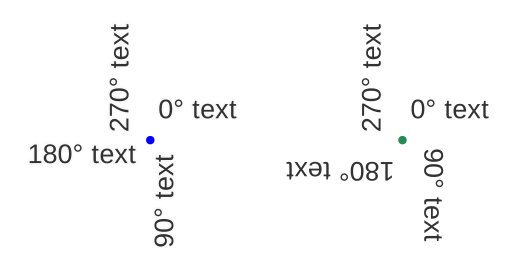
Fig. 10.37 Data defined label rotation with show upside-down labels option set to: “never” (left), “when rotation defined” (right)
The Overlapping labels group allows you to control whether overlapping labels are permitted for features in the layer and how each of them should be handled:
Never overlap: never ever place overlapping labels for the layer, even if it means some labels will be missing
Allow overlaps if required: if the label can’t otherwise be placed, draw an overlapping label. This mode will cause the label to be moved to a less ideal placement if possible, e.g. moving the label further from the center of a line or polygon, IF doing so will avoid overlapping labels. But if there’s no other positions possible, then draw the label overlapping.
Allow overlaps without penalty: It doesn’t matter at all if the label overlaps other labels or obstacles, that’s fine to do and the best placement (e.g most central placement) should always be used even if an alternate further placement is possible which avoids overlaps entirely.
Allowing both overlapping labels and fallback placements options will guarantee that all features in the layer are labeled… not necessarily at their best rendering!
Feature options
Under Feature options:
For multipart geometry labeling, you can choose the following:
Label Largest Part Only to label only the largest visible part of the feature within the current map view.
Label Every Part with Entire Label to label each part of a multipart geometry with the entire label text.
Split Label Text Lines over Parts to label each part of a multipart geometry with a corresponding line of the label text. If the multipart geometry has fewer parts than the number of text lines, any remaining lines will be ignored, while if it has more parts than text lines, the remaining parts will not be labeled. Split Label Text Lines over Parts operates on the final multiline label text. Line breaks can be introduced either by using explicit line breaks (e.g., ‘n’) or by configuring the Wrap on character option in the Formatting tab. If the label text does not contain line breaks (explicit or generated by wrapping), the split option will have no visible effect.
Check the
Limit number of features to be labeled to
to restrict the total number of features in the layer which will receive labels.Both line and polygon layers offer the option to set a minimum size for the features to be labeled, using Suppress labeling of features smaller than.
For polygon features, you can also filter the labels to show according to whether they completely fit within their feature or not.
For line features, you can choose to Merge connected lines to avoid duplicate labels, rendering a quite airy map in conjunction with the Distance or Repeat options in the Placement tab.