18.2.12. The Chart Item
The Chart item is used to display data as a chart within the
layout. You can add a chart using the  Add Chart
button following items creation instructions.
You can manipulate it the same way as exposed in Interacting with layout items.
By default, a new Chart item is empty.
You can set the data source and customize its appearance in the
Item Properties panel.
In addition to the
common properties, this feature
has the following functionalities (Fig. 18.71):
Add Chart
button following items creation instructions.
You can manipulate it the same way as exposed in Interacting with layout items.
By default, a new Chart item is empty.
You can set the data source and customize its appearance in the
Item Properties panel.
In addition to the
common properties, this feature
has the following functionalities (Fig. 18.71):
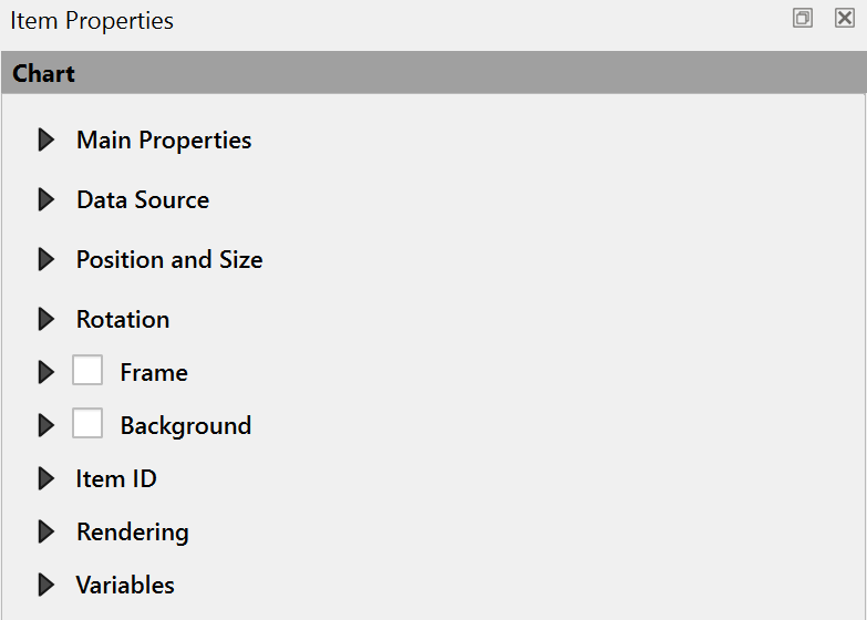
Fig. 18.71 Chart Item Properties
18.2.12.1. Main properties
The Main Properties group of the chart Item Properties panel provides the following functionalities (see Fig. 18.72):
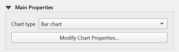
Fig. 18.72 Chart Main Properties group
In the Main Properties you can select the Chart type from the drop-down list. Available types are:
Bar chart,
Line chart,
and Pie chart.
Modify the chart through the Modify Chart Properties… button. Depending on the selected type, available options may vary.
The Flip Axes option allows reversing the direction of the X or Y axis for charts such as bar charts, line charts, and XY plots. This can be useful when creating horizontal bar charts or when a reversed axis orientation is needed for data visualization.
Chart Ranges
Set the minimum and maximum values for the axes to determine how the data is displayed. By default, the Minimum X axis and Minimum Y axis are set to 0, while the Maximum X axis and Maximum Y axis are set to 10. You can adjust these values to fit your data range and improve the chart’s readability. For pie charts, these options are not available.
Symbols List
The Symbols List allows you to customize the appearance of each data series in the chart. You can change the color, shape, pattern, or other visual properties for individual series to improve readability and match your layout style.
Note
Symbol and color assignment
For bar and line charts, symbols are assigned to series in the order they are listed. Make sure to have at least as many symbols as data series; otherwise, the last series will reuse the last available symbol.
For pie charts, colors are assigned to slices following the order defined by the color ramp rather than the series. If you use a discrete color ramp, ensure it contains enough distinct colors for all slices. Otherwise, some slices may share the same color.
Axes
For the X Axis and Y Axis, the following can be set:
Axis type: choose between Interval and Categorical axis types. If your X axis contains string values (e.g. category names like “A”, “B”, “C”), make sure to set the axis type to Categorical. Otherwise, the chart may not display correctly.
Major interval: defines the primary spacing between axis lines.
Major grid lines: customizes the appearance of major grid lines.
Minor interval: defines the secondary, smaller spacing between axis lines.
Minor grid lines: customizes the appearance of minor grid lines.
Label interval: sets how frequently labels appear along the axis.
Label format: customizes the label appearance, including number formatting.
Label font: sets the font style and size for axis labels.
Label placement: determines where labels are positioned relative to the axis.
Chart Area
Further customization of the chart appearance can be done in the Chart Area. You can set the background color, border style, and margin.
If you select the Pie chart type, you can set the label type, font, and numerical format. The Label type defines what kind of information is displayed on each pie slice. It can be set to:
None: no labels are shown.
Category label: displays the category name for each slice.
Value label: displays the numerical value associated with each category.
Configure the margin to adjust the spacing around the pie chart.
18.2.12.2. Data source
In this section, select and configure the layer and fields you want to display in the chart.
Select the Layer to use as the chart’s data source.
Check the
 Sort by option to sort data based on selected fields or expressions,
and choose the sort direction (ascending or descending).
Sort by option to sort data based on selected fields or expressions,
and choose the sort direction (ascending or descending).Use the
 and
and  buttons to add or delete series from the chart.
Double-click a series name to rename it.
Click Modify Series… button and define the X-axis and Y-axis fields using the drop-down lists. Optionally, add a filter expression to display only specific data in the chart.
Check the
Use only features visible within a map option to include only features that are currently visible
in a layout map item. From the Linked map drop-down list, select the map to link the chart to.Check the
Use only features intersecting atlas features option to include only features that intersect
with the atlas feature.
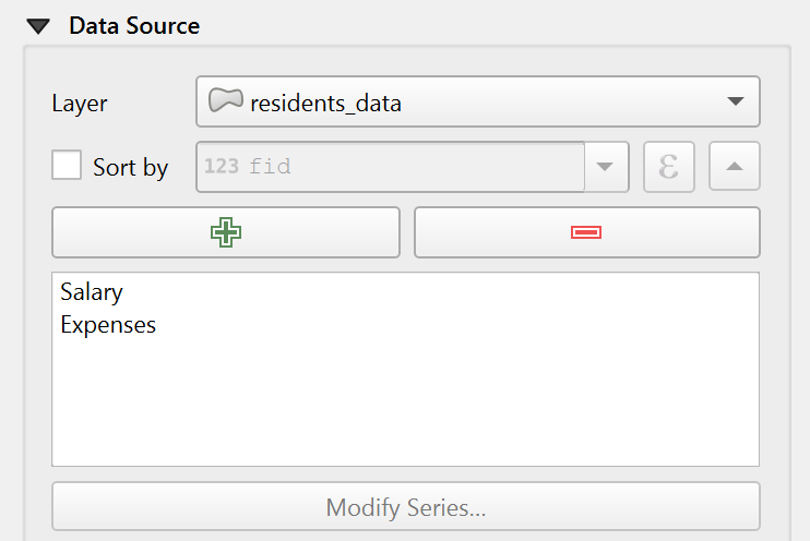
Fig. 18.73 Chart Data Source group