12. Ferramentas Gerais
12.1. Conteúdo da ajuda
Sempre que precisar de ajuda sobre um tópico específico, você pode acessar a página correspondente no Manual do Usuário atual, através do botão Ajuda, disponível na maioria das caixas de diálogo — por favor, observe que plugins de terceiros podem apontar para páginas da web dedicadas.
12.2. Painéis
Por padrão, o QGIS apresenta muitos painéis para o usuário trabalhar. Alguns desses painéis estão descritos abaixo, enquanto outros podem ser encontrados em diferentes partes do documento. Uma lista completa dos painéis aprentados pelo QGIS está disponível em menu and mentioned at Painéis.
12.2.1. Painel Camadas
O painel Layers (também chamado de ``legenda do mapa`) lista todas as camadas no projeto e ajuda a gerenciar a visibilidade e forma do mapa. Você pode mostrar ou esconder o painel presssionando Ctrl+1.
No topo do painel Layers , uma barra de ferramentas permite:
 Open the layer styling dock (F7): alterna o painel Layer Styling entre ligado e desligado.
 Add new group: veja Interagir com grupos e camadas
 Manage Map Themes: controla a visibilidade das camadas e as arranja em diferentes map themes.
 filtra camadas na árvore da legenda:
Filter Legend by Map Content: only the layers that are set visible and whose features intersect the current map canvas have their style rendered in the layers panel. Otherwise, a generic NULL symbol is applied to the layer. Based on the layer symbology, this is a convenient way to identify which kind of features from which layers cover your area of interest.
Show Private Layers: a convenient shortcut to display and interact with private layers in the Layers panel without modifying the project settings.
 Filter Legend by Expression: apply an
expression to remove styles from the selected layer tree that have no feature
satisfying the condition. This can be used to highlight features
that are within a given area/feature of another layer.
From the drop-down list, you can edit and clear the expression currently applied.
 Expand All or
  Collapse All
layers and groups in the layers panel.

Fig. 12.1 Barra de Ferramentas de Camadas no Painel de Camadas
Nota
Tools to manage the layers panel are also available for map and legend items in print layouts
12.2.1.1. Configurando temas de mapas
The  Manage Map Themes drop-down button provides access to
convenient shortcuts to manipulate visibility of the layers in the Layers
panel:
 Toggle Selected Layers: changes the visibility of
the first selected layer in the panel, and applies that state to the other selected
layers. Also accesible through Space shortcut.
Toggle Selected Layers: changes the visibility of
the first selected layer in the panel, and applies that state to the other selected
layers. Also accesible through Space shortcut.Toggle Selected Layers Independently: changes the visibility status of each selected layer
Beyond the simple control of layer visibility,
the  Manage Map Themes menu allows you to configure
Map Themes in the legend and switch from one map theme to another.
A map theme is a snapshot of the current map legend that records:
the layers set as visible in the Layers panel
e para cada camada visível:
a referência ao estilo aplicado à camada
the visible classes of the style, ie the layer checked node items in the Layers panel. This applies to symbologies other than the single symbol rendering
the collapsed/expanded state of the layer node(s) and the group(s) it’s placed inside
Para criar um tema de mapa:
Marcar uma camada que você deseja mostrar
Configurar as propriedades da camada (simbologia, diagrama, etiquetas…) como de costume
Expand the menu at the bottom and click on Add… to store the settings as a new style embedded in the project
Nota
Um tema de mapa não lembra os detalhes atuais das propriedades: apenas uma referência ao nome do estilo é salva, portanto, sempre que você aplicar modificações na camada enquanto este estilo estiver ativado (por exemplo, alterar a renderização da simbologia), o tema do mapa será atualizado com nova informação.
Repetir as etapas anteriores conforme necessário para as outras camadas
If applicable, expand or collapse groups or visible layer nodes in the Layers panel
Click on the
 Manage Map Themes button on top of the panel,
and Add Theme…
Manage Map Themes button on top of the panel,
and Add Theme…Digite o nome do tema do mapa e clique em OK.
The new theme is listed in the lower part of the  drop-down menu.
You can create as many map themes as you need: whenever the current combination in the map legend (visible layers, their active style, the map legend nodes) does not match any existing map theme contents as defined above, click on Add Theme… to create a new map theme, or use to update a map theme. You can rename the active map theme with Rename Current Theme… or use the Remove Current Theme button to delete it.
Map themes are helpful to switch quickly between different preconfigured combinations: select a map theme in the list to restore its combination. All configured themes are also accessible in the print layout, allowing you to create different map items based on specific themes and independent of the current main canvas rendering (see Map item layers).
12.2.1.3. Interagir com grupos e camadas
Layers in the legend window can be organized into groups. There are different ways to do this:
Press the
 icon to add a new group. Type in a name for
the group and press Enter. Now click on an existing layer and
drag it onto the group.
icon to add a new group. Type in a name for
the group and press Enter. Now click on an existing layer and
drag it onto the group.Select more than one layer, then press the
 icon.
The selected layers are automatically inserted into the new group.
icon.
The selected layers are automatically inserted into the new group.Select some layers, right-click in the legend window and choose Group Selected. The selected layers will automatically be placed in a new group.
To move a layer out of a group, drag it out, or right-click on it and choose Move Out of Group: the layer is moved from the group and placed above it. Groups can also be nested inside other groups. If a layer is placed in a nested group, Move Out of Group will move the layer out of all nested groups.
To move a group or layer to the top of the layer panel, either drag it to the top, or choose Move to Top. If you use this option on a layer nested in a group, the layer is moved to the top in its current group. The Move to Bottom option follows the same logic to move layers and groups down.
The checkbox for a group will show or hide the checked layers in the group with one click. With Ctrl pressed, the checkbox will also turn on or off all the layers in the group and its sub-groups.
Ctrl-click on a checked / unchecked layer will uncheck / check the layer and all its parents.
Enabling the Mutually Exclusive Group option means you can make a group have only one layer visible at the same time. Whenever a layer within the group is set visible the others will be toggled not visible.
É possível selecionar mais de uma camada ou grupo ao mesmo tempo mantendo pressionada a tecla Ctrl enquanto clica em camadas adicionais. Você pode mover todas as camadas selecionadas para um novo grupo ao mesmo tempo.
You may also delete more than one layer or group at once by selecting several items with the Ctrl key and then pressing Ctrl+D: all selected layers or groups will be removed from the layers list.
Mais informações sobre camadas e grupos usando o ícone do indicador
In some circumstances, formatting or icons next to the layer or group in the Layers panel change to give more information about the layer/group. These elements are:
 to indicate that the layer is in edit mode and you can modify
the data
 to indicate that the layer being edited has some unsaved changes
 to indicate a filter applied
to the layer. Hover over the icon to see the filter expression and double-click
to update the query
 to identify layers that are
required in the project, hence non removable
 to identify an embedded group or layer and the path to their original project file
 to identify a layer whose data source was not available
at the project file opening (see Manipulação de caminhos de arquivos quebrados).
Click the icon to update the source path or select Repair Data Source…
entry from the layer contextual menu.
 to remind you that the layer is a temporary scratch
layer and its content will be discarded when you
close this project. To avoid data loss and make the layer permanent, click
the icon to store the layer in any of the GDAL vector formats supported by QGIS.
 to identify a layer used in offline editing mode.
 for layers with coordinates stored in a coordinate
reference system which is inherently low accuracy (requires the
corresponding setting to be enabled)
 to identify a layer that has notes associated
A grayed name, when the map canvas current scale is outside the layer’s visibility scale range (as set in its properties). Select the contextual menu Zoom to Visible Scale option to zoom the map to the layer’s nearest visibility scale bound.
Control layers rendering through grouping
Groups are a means of structuring layers within a tree in the project but they can also impact how their component layers are rendered, namely as a single flattened object during map renders.
The option for such a rendering is available within the Layer Styling panel whenever a group is selected.
Under the  Symbology tab, check
  Render Layers as a Group
to enable a set of options to control the appearance of the child layers as a whole, instead of individual layers:
Opacity: Features from child layers which are obscured by other child layers remain obscured, and the opacity applies to the “whole of group” only.

Fig. 12.2 Setting opacity on layers vs on a group
The image on the left shows two layers being rendered at 50% opacity (underlying features are visible, but semi-masked by the 50% red feature on top). The second image shows the result of setting the opacity on the group (parts of the blue underlying child layer is completely obscured by the red layer on top and then the result is rendered at 50% opacity).
Blend modes: Just like opacity, setting a blend mode (like multiply, overlay, …) for an entire group results first in flattening features of child layers, with upper ones obscuring lower. The rendering is then obtained by blending the flat group and the layers sitting below the group.
When the child layers have blend modes assigned, it is applied before flattening but the scope is restricted to only affecting other child layers from that group, and not other layers sitting below the whole group.
Some more blending modes options are available for child layers in groups, in their Symbology tab which perform “clipping” style operations on other child layers during the render. You can e.g. clip the render of one layer’s content by the content in a second “mask” layer.
Layer effects: applies effects only to the flattened render of the child layers; So e.g. a drop shadow effect applied to the group would not be visible for obscured child layers.
When a group is set to Render layers as a group, then only the group will be shown in the Layer Order panel list. Group children will not be visible in this order list, as their ordering is determined by the placement of the group layer.
12.2.1.4. Editing layer style
From the Layers panel, you have shortcuts to change the layer rendering quickly and easily.
Right-click on a layer and select in the list in order to:
see the styles currently available for the layer. If you defined many styles for the layer, you can switch from one to another and your layer rendering will automatically be updated on the map canvas.
copy part or all of the current style, and when applicable, paste a copied style from another layer
Rename current… style
Add a new style (which is actually a copy of the current one)
or Remove current style (only when multiple styles are available).
Dica
Compartilhe rapidamente um estilo de camada
From the context menu, copy the style of a layer and paste it to a group or a selection of layers: the style is applied to all the layers that are of the same type (vector, raster, mesh, point cloud, …) as the original layer and, for vector layers, have the same geometry type (point, line or polygon).
When using a symbology based on features classification (e.g. categorized, graduated or rule-based for vector layers, or classification for point clouds), right-clicking a class entry in the Layers panels makes it possible to edit the visibility of the classes (and their features) and avoid (un)checking them one by one:
With vector layer, the contextual menu of a class leaf entry also gives access to:
 Select features: selects in the layer all the features matching that class
 Show in attribute table: opens an attribute table
filtered to only the features matching that class
Show in attribute table: opens an attribute table
filtered to only the features matching that classupdate the symbol color using a Color Wheel. For convenience, the recently used colors are also available at the bottom of the color wheel.
Edit Symbol…: opens the Symbol Selector dialog to change feature symbol (symbol, size, color…).
Copy Symbol
Paste Symbol
Dica
Clicar duas vezes em uma entrada de folha de classe também abre a caixa de diálogo Seletor de Símbolos.
12.2.2. Painel de Estilo de Camada
O painel Estilo de Camada (também ativado com Ctrl+3) é um atalho para algumas das funcionalidades da caixa de diálogo Pripriedades da Camada. Ele fornece uma maneira rápida e fácil de definir a renderização e o comportamento de uma camada e visualizar seus efeitos sem precisar abrir a caixa de diálogo de propriedades da camada.
Além de evitar a caixa de diálogo de propriedades de camada de bloqueio (ou “modal”), o painel de estilo de camada também evita sobrecarregar a tela com caixas de diálogo e contém a maioria das funções de estilo (seletor de cores, propriedades de efeitos, edição de regras, substituição de rótulos…): Por exemplo, clicar nos botões de cor dentro do painel de estilo de camada faz com que a caixa de diálogo do seletor de cores seja aberta dentro do próprio painel de estilo de camada, e não como uma caixa de diálogo separada.
Em uma lista suspensa de camadas atuais no painel de camadas, selecione um item e:
Depending on the active item, set:
 Symbology for groups (see Control layers rendering through grouping)
 Symbology,
  Transparency,
and
  Histogram properties for raster layer.
These options are the same as in the Caixa de Diálogo de Propriedades do Raster.
 Symbology,
  Labels,
  Mask and
  3D View properties for vector layer.
These options are the same as in the Janela de Propriedades de Vetor
and can be extended by custom properties introduced by third-party plugins.
 Symbology and
  3D View properties
for mesh layer.
These options are the same as in the Mesh Dataset Properties.
 Symbology,
  3D View
and
  Elevation properties for point cloud layer.
These options are the same as in the Point Clouds Properties.
Manage the associated style(s) in the
 Style Manager
(more details at Gerenciar Estilos Personalizados).
Style Manager
(more details at Gerenciar Estilos Personalizados).See the
 History of changes you applied to the
layer style in the current project: you can therefore cancel or restore to any
state by selecting it in the list and clicking Apply.
Another powerful feature of this panel is the  Live update checkbox.
Tick it to render your changes immediately on the map canvas:
you no longer need to click the Apply button.
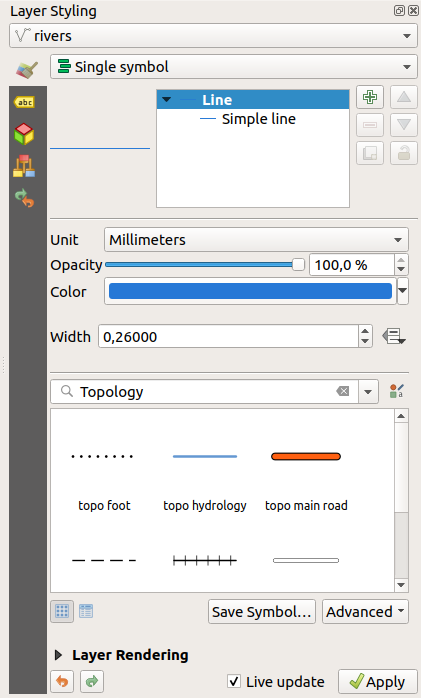
Fig. 12.3 Defining a layer’s symbology from the layer styling panel
12.2.3. O painel Ordem das Camadas
By default, layers shown on the QGIS map canvas are drawn following their order in the Layers panel: the higher a layer is in the panel, the higher (hence, more visible) it’ll be in the map view.
You can define a drawing order for the layers independent of the order in the
layers panel with the Layer Order panel enabled
in menu or with Ctrl+9.
Check  Control rendering order underneath
the list of layers and reorganize the layers in the panel as you want. This
order becomes the one applied to the map canvas.
For example, in Fig. 12.4, you can see that the
 airports
features are displayed over the alaska polygon despite those layers’
respective placement in the Layers panel.
Unchecking  Control rendering order will
revert to default behavior.
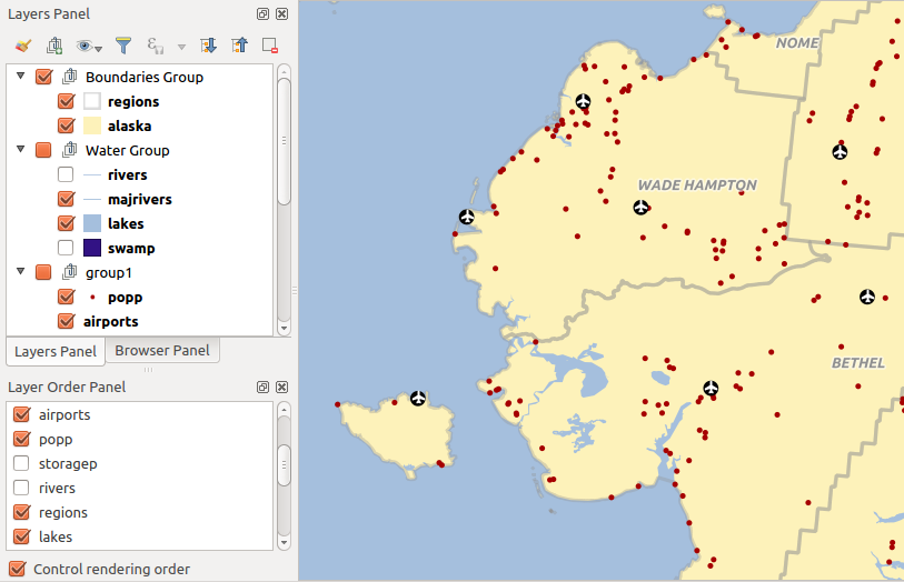
Fig. 12.4 Define a ordem das camadas independente da legenda
12.2.4. Painel geral
The Overview panel (Ctrl+8) displays a map with a full extent view of some of the layers. The Overview map is filled with layers using the Show in Overview option from the menu or in the layer contextual menu. Within the view, a red rectangle shows the current map canvas extent, helping you quickly to determine which area of the whole map you are currently viewing. If you click-and-drag the red rectangle in the overview frame, the main map view extent will update accordingly.
Observe que as rótulos não são renderizados para a visão geral do mapa, mesmo que as camadas usadas na visão geral do mapa tenham sido criadas para rotulagem.
12.2.5. O painel Registo de Mensagens
When loading or processing some operations, you can track and follow messages
that appear in different tabs using the  Log Messages Panel.
It can be activated using the most right icon in the bottom status bar.
12.2.6. O painel Desfazer/Refazer
For each layer being edited, the Undo/Redo (Ctrl+5) panel shows the list of actions carried out, allowing you quickly to undo a set of actions by selecting the action listed above. More details at Undo and Redo edits.
12.2.7. O painel Estatísticas
The Statistics panel (Ctrl+6) provides summarized information on any vector layer. This panel allows you to select:
the vector layer to compute the statistics on: it can be selected from the top drop-down menu, or synced with the active layer in the Layers panel using the Follow selected layer checkbox at the bottom of the statistics drop-down list
the field or
 expression to use:
for each layer, the last entry is remembered and automatically computed
upon layer reselection.
expression to use:
for each layer, the last entry is remembered and automatically computed
upon layer reselection.the statistics to return using the drop-down button at the bottom-right of the dialog. Depending on the field’s (or expression’s values) type, available statistics are:
Estatísticas |
String |
Número inteiro |
Float |
Data |
|---|---|---|---|---|
Contagem |
||||
Contagem de Valor Distinto |
||||
Contagem de Valor Ausente |
||||
Soma |
||||
Média |
||||
Desvio Padrão |
||||
Desvio Padrão na Amostra |
||||
Valor mínimo |
||||
Valor máximo |
||||
Intervalo |
||||
Minoria |
||||
Maioria |
||||
Variedade |
||||
Primeiro Quartil |
||||
Terceiro Quartil |
||||
Inter Quartile Range |
||||
Comprimento Mínimo |
||||
Comprimento Máximo |
||||
Comprimento Médio |
O resumo estatístico pode ser:
 copied to the clipboard and pasted as a table in another application
recalculated using the
 button when the underlying data source changes
(eg, new or removed features/fields, attribute modification)
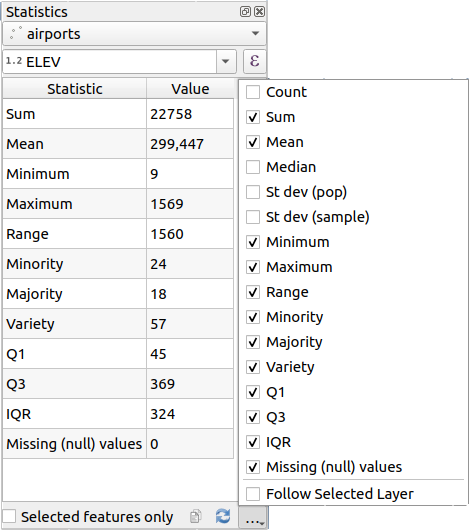
Fig. 12.5 Mostrar estatísticas em um campo
12.2.8. Debugging/Development Tools Panel
The Debugging/Development Tools panel (F12) provides a unified place for handling and debugging actions within QGIS. Available tools are organized under following tabs:
Nota
Plugin authors can extend the panel with custom tabs
for debugging and developping their own plugins.
This is done using registerDevToolWidgetFactory method.
12.2.8.1. Network Logger
The  Network Logger tab helps you record
and display network requests, along with a whole load of useful details
like request and reply status, header, errors, SSL configuration errors,
timeouts, cache status, etc.
From its top toolbar, you can:
 Save Log…: will first show a big warning that
the log is sensitive and should be treated as confidential and then
allow you to save the log.
Save Log…: will first show a big warning that
the log is sensitive and should be treated as confidential and then
allow you to save the log.Press the
 Settings drop-down menu to select whether
to Show Successful Requests, Show Timeouts and
Show Replies Served from Cache.
 Disable cache: will disable the cache so that
every request has to be performed.
 Filter requests based on URL string subsets
or request status
Ao clicar com o botão direito do mouse em uma solicitação, você pode:
Open URL which will open the URL in your default browser.
Copiar URL
Copy As cURL to use it in the terminal.
Copy as JSON: copies the tree values as a json string to the clipboard, for easy pasting in bug reports or for remote assistance.
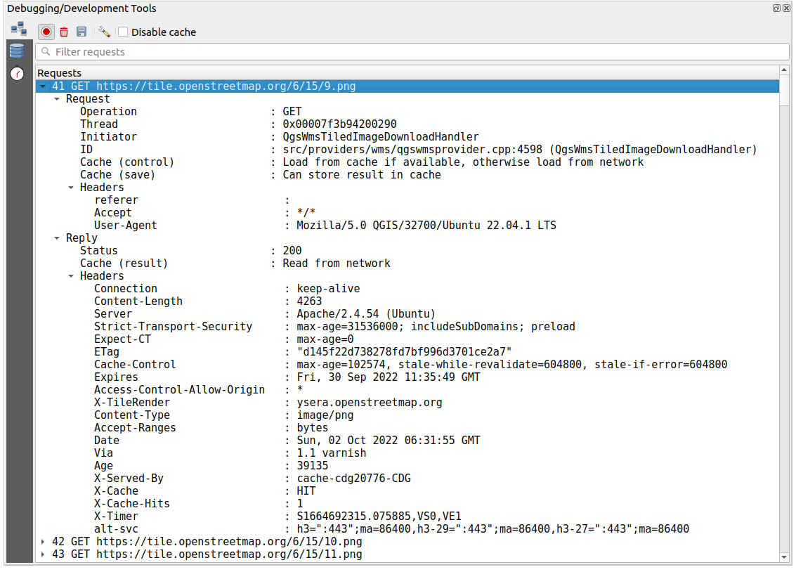
Fig. 12.6 Network Logger output for GET Request
12.2.8.2. Query Logger
The  Query Logger is the place to log the SQL commands
sent by the data provider and the connections API to the backend database,
together with their execution time as measured by QGIS (i.e. in the client
that sent the commands).
This can be useful when investigating performances of a particular layer
during debugging or development of a QGIS algorithm or plugin.
From its top toolbar, you can:
 Save Log…: will first show a big warning that
the log is sensitive and should be treated as confidential and then
allow you to save the log.
 Filter queries based on the query string subsets
or details such as provider type, start time, initiator, …
Right-click on a reported query, and you can:
Copy SQL command called by QGIS on the database
Copy as JSON: copies the tree values as a json string to the clipboard, for easy pasting in bug reports or for remote assistance.
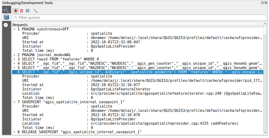
Fig. 12.7 Query Logger output
12.2.8.3. Profiler
The ![]() Profiler tab allows to get load times for every
single operation involved in actions requested by the user. Depending on
the context, these operations can be settings reading, menu, map canvas or 3D
views creation, resolving map layers reference, bookmark or layout loading, …
This helps identify causes of slow load times.
Profiler tab allows to get load times for every
single operation involved in actions requested by the user. Depending on
the context, these operations can be settings reading, menu, map canvas or 3D
views creation, resolving map layers reference, bookmark or layout loading, …
This helps identify causes of slow load times.
Default supported actions can be selected from the Categories drop-down menu:
QGIS Startup
Project Load
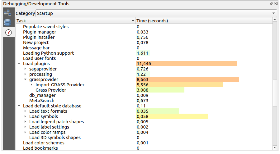
Fig. 12.8 Profiler for QGIS Startup
12.3. Incorporando camadas de projetos externos
Sometimes, you’d like to keep some layers in different projects, but with the same style. You can either create a default style for these layers or embed them from another project to save time and effort.
A incorporação de camadas e grupos de um projeto existente tem algumas vantagens sobre o estilo:
Todos os tipos de camadas (vetor ou raster, local ou online…)
Fetching groups and layers, you can keep the same tree structure of the “background” layers in your different projects
While the embedded layers are editable, you can’t change their properties such as symbology, labels, forms, default values and actions, ensuring consistency across projects
Modifique os itens no projeto original e as alterações são propagadas para todos os outros projetos
If you want to embed content from other project files into your project, select :
Click the … button to look for a project: you can see the content of the project (see Fig. 12.9)
Hold down Ctrl ( or
 Cmd) and click on the layers and
groups you wish to retrieve
Cmd) and click on the layers and
groups you wish to retrieveClique OK.
The selected layers and groups are embedded in the Layers
panel and displayed on the map canvas. An  icon is added next to their name for recognition and hovering over displays
a tooltip with the original project file path.
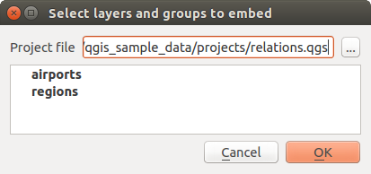
Fig. 12.9 Selecione camadas e grupos para incorporar
Like any other layer, an embedded layer can be removed from the project by
right-clicking on the layer and clicking  Remove.
Dica
Alterar a renderização de uma camada incorporada
It’s not possible to change the rendering of an embedded layer, unless you make the changes in the original project file. However, right-clicking on a layer and selecting Duplicate creates a layer which is fully-featured and not dependent on the original project. You can then safely remove the linked layer.
12.4. Interagindo com feições
12.4.1. Selecionando características
QGIS provides several tools to select features on the map canvas. Selection tools are available in the menu or in the Selection Toolbar.
Nota
As ferramentas de seleção trabalham com a camada atualmente ativa.
12.4.1.1. Seleção manual na tela do mapa
Para selecionar uma ou mais características com o mouse, você pode usar uma das seguintes ferramentas:
Nota
Other than  Select Features by Polygon, these
manual selection tools allow you to select feature(s) on the map canvas with a
single click.
Nota
Use the  Select Features by Polygon tool
to use an existing polygon feature (from any layer) to select overlapping features
in the active layer.
Right-click in the polygon and choose it from the context menu that shows a
list of all the polygons that contain the clicked point.
All the overlapping features from the active layer are selected.
Dica
Use the tool to redo your latest selection. Very useful when you have painstakingly made a selection, and then click somewhere else accidentally and clear your selection.
While using the  Select Feature(s) tool,
holding Shift or Ctrl toggles whether a feature is selected
(ie either adds to the current selection or remove from it).
For the other tools, different behaviors can be performed by holding down:
Shift: adicionar características à seleção atual
Ctrl: subtrai feições da seleção atual
Ctrl+Shift: intersect with current selection, ie only keep overlapping features from the current selection
Alt: select features that are totally within the selection shape. Combined with Shift or Ctrl keys, you can add or substract features to/from the current selection.
12.4.1.2. Seleção automática
The other selection tools, most of them available from the Attribute table, perform a selection based on a feature’s attribute or its selection state (note that attribute table and map canvas show the same information, so if you select one feature in the attribute table, it will be selected on the map canvas too):
 Select By Expression… select
features using expression dialog
 Deselect Features from All Layers or press
Ctrl+Alt+A to deselect all selected features in all layers
 Deselect Features from the Current Active Layer
or press Ctrl+Shift+A
 Select All Features or press Ctrl+A to select all
features in the current layer
 Inverter seleção de características para inverter a seleção na camada atual
 Select by Location to select the features
based on their spatial relationship with other features (in the same or
another layer - see Selecionar pela localização)
For example, if you want to find regions that are boroughs from
regions.shp of the QGIS sample data, you can:
Expandir o grupo Campos e Valores
Clique duas vezes no campo que você deseja consultar (“TIPO_2”)
Click All Unique in the panel that shows up on the right
From the list, double-click ‘Borough’. In the Expression editor field, write the following query:
"TYPE_2" = 'Borough'
Click Select Features
From the expression builder dialog, you can also use to make a selection that you have used before. The dialog remembers the last 20 expressions used. See Expressões for more information and examples.
Dica
Salve sua seleção em um novo arquivo
Users can save selected features into a New Temporary Scratch Layer or a New Vector Layer using and in the desired format.
12.4.1.3. Selecionar Feições Por Valor
This selection tool opens the layer’s feature form allowing the user to choose which value to look for for each field, whether the search should be case-sensitive, and the operation that should be used. The tool has also autocompletes, automatically filling the search box with existing values.
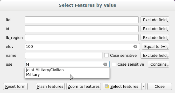
Fig. 12.10 Filter/Select features using form dialog
Alongside each field, there is a drop-down list with options to control the search behaviour:
Field search option |
String |
Numérico |
Data |
|---|---|---|---|
Exclude Field from the search |
|||
Equal to (=) |
|||
Not equal to (≠) |
|||
Greater than (>) |
|||
Less than (<) |
|||
Greater than or equal to (≥) |
|||
Less than or equal to (≤) |
|||
Between (inclusive) |
|||
Not between (inclusive) |
|||
Contains |
|||
Does not contain |
|||
Is missing (null) |
|||
Is not missing (not null) |
|||
Starts with |
|||
Ends with |
For string comparisons, it is also possible to use the  Case sensitive option.
After setting all search options, click Select features to select the matching features. The drop-down options are:
Selecionar feições
Add to current selection
Remove from current selection
Filtrar seleção atual
You can also clear all search options using the Reset form button.
Uma vez que as condições são definidas, você também pode:
Zoom to features on the map canvas without the need of a preselection
Flash features, highlighting the matching features. This is a handy way to identify a feature without selection or using the Identify tool. Note that the flash does not alter the map canvas extent and would be visible only if the feature is within the bounds of the current map canvas.
12.4.2. Identificando Feições
The Identify tool allows you to interact with the map canvas and get information on features in a pop-up window. To identify features, use:
12.4.2.1. Usando a ferramenta Identificar Feições
QGIS offers several ways to identify features with the  Identify Features tool:
left click identifies features according to the selection mode and the selection mask set in the Identify Results panel
right click with Identify Feature(s) as selection mode set in the Identify Results panel fetches all snapped features from all visible layers. This opens a context menu, allowing the user to choose more precisely the features to identify or the action to execute on them.
right click with Identify Features by Polygon as selection mode in the Identify Results panel identifies the features that overlap with the chosen existing polygon, according to the selection mask set in the Identify Results panel
Dica
Filter the layers to query with the Identify Features tool
Under Layer Capabilities in , uncheck the Identifiable column next to a
layer to avoid it
being queried when using the  Identify Features tool in a mode
other than Current Layer. This is a handy way to return features from
only layers that are of interest for you.
If you click on feature(s), the Identify Results dialog will list information about the feature(s) clicked. The default view is a tree view in which the first item is the name of the layer and its children are its identified feature(s). Each feature is described by the name of a field along with its value. This field is the one set in . All the other information about the feature follows.
12.4.2.2. Informações da feição
The Identify Results dialog can be customized to display custom fields, but by default it will display the following information:
The feature display name;
Actions: Actions can be added to the identify feature windows. The action is run by clicking on the action label. By default, only one action is added, namely
View feature formfor editing. You can define more actions in the layer’s properties dialog (see Propriedades de Ações).Derived: This information is calculated or derived from other information. It includes:
informações gerais sobre a geometria da feição:
depending on the geometry type, the cartesian measurements of length, perimeter or area in the layer’s CRS units. For 3D line vectors the cartesian line length is available.
depending on the geometry type and if an ellipsoid is set in the project properties dialog for Measurements, the ellipsoidal values of length, perimeter or area using the specified units
the count of geometry parts in the feature and the number of the part clicked
a contagem de vértices na feição
coordinate information, using the project properties Coordinates display settings:
Valores das coordenadas
XeYdo ponto clicadoo número do vértice mais próximo do ponto clicado
Valores de coordenadas
XeYdo vértice mais próximo (eZ/Mse aplicável)se você clicar em um segmento curvo, o raio dessa seção também será mostrado.
Data attributes: This is the list of attribute fields and values for the feature that has been clicked.
information about the related child feature if you defined a relation:
o nome da relação
the entry in reference field, e.g. the name of the related child feature
Actions: lists actions defined in the layer’s properties dialog (see Propriedades de Ações) and the default action is
View feature form.Data attributes: This is the list of attributes fields and values of the related child feature.
Nota
Links in the feature’s attributes are clickable from the Identify Results panel and will open in your default web browser.
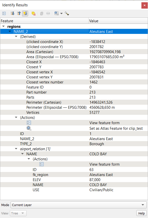
Fig. 12.11 Identify Results dialog
12.4.2.3. The Identify Results dialog
At the top of the window, you have a handful of tools:
 Expand New Results by Default to define whether the next
identified feature’s information should be collapsed or expanded
selection mode to use to fetch features to identify:
At the bottom of the window are the Mode and View combo boxes. Mode defines from which layers features should be identified:
Current layer: only features from the selected layers are identified. If a group is selected, features from its visible layers are identified. If there is no selection then only the current layer is identified.
Top down, stop at first: only features from the upper visible layer.
Top down: all features from the visible layers. The results are shown in the panel.
Layer selection: opens a context menu where the user selects the layer to identify features from, similar to a right-click. Only the chosen features will be shown in the result panel.
The View can be set as Tree, Table or Graph. ‘Table’ and ‘Graph’ views can only be set for raster layers.
The identify tool allows you to  Auto open form for single feature results, found under
  Identify Settings.
If checked, each time a single feature is identified, a form opens
showing its attributes. This is a handy way to quickly edit a feature’s attributes.
Outras funções podem ser encontrados no menu de contexto do item identificado. Por exemplo, do menu de contexto, você pode:
Ver o formulário da feição
Zoom para feição
Copiar feição: Copiar todos os atributos e a geometria da feição
Toggle feature selection: Add identified feature to selection
Copiar o valor do atributo: Copiar apenas o valor do atributo que clicou.
Copiar atributos do elemento: Copia todos os atributos do elemento
Select features by attribute value: Select all features in the layer that match the selected attribute
Limpar resultados: apaga os resultados na janela
Limpar destaques: Remover feiçõesdestacadas no mapa
Destaque todos
Destaque a camada
Ativar camada: escolha uma camada a ser ativada
Propriedades da camada: Abre a janela de propriedades da camada
Estender tudo
Encolher tudo
12.6. Documentando seus dados
Além de exibir e simbolizar os dados nas camadas, o QGIS permite preencher:
metadata: information to help people find and understand the dataset, how they can access and use it… these are properties of the datasource and can live out of the QGIS project.
notas: instruções e comentários sobre a camada no projeto atual
12.6.1. Metadados
In the layer properties dialog, the  Metadata tab
provides you with options to create and edit a metadata report on your layer.
Information to fill concern:
the data Identification: basic attribution of the dataset (parent, identifier, title, abstract, language…);
the Categories the data belongs to. Alongside the ISO categories, you can add custom ones;
the Keywords to retrieve the data and associated concepts following a standard based vocabulary;
the Access to the dataset (licenses, rights, fees, and constraints);
the Extent of the dataset, either spatial one (CRS, map extent, altitudes) or temporal;
the Contact of the owner(s) of the dataset;
the Links to ancillary resources and related information;
the History of the dataset.
A summary of the filled information is provided in the Validation tab and helps you identify potential issues related to the form. You can then either fix them or ignore them.
Metadata are saved in the project file by default, the Metadata drop-down
offers options for loading/saving metadata from .qmd file
and for loading/saving metadata in the “Default” location.
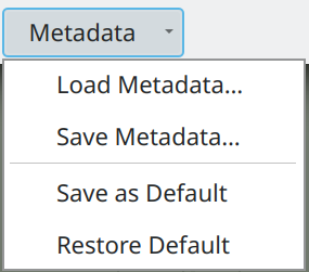
Fig. 12.14 Metadata load/save options
The “Default” location used by Save as Default and Restore Default changes depending on the underlying data source and on its configuration:
For PostgreSQL data sources if the configuration option Allow saving/loading QGIS layer metadata in the database is checked the metadata are stored inside a dedicated table in the database.
For GeoPackage data sources Save as Default always saves the metadata in the internal metadata tables of the GeoPackage.
When metadata are saved into the internal tables of PostgreSQL or GeoPackage they become available for search and filtering in the browser and in the layer metadata search panel.
For all other file based data sources Save as Default saves the metadata in a
.qmdfile alongside the file.In all other cases Save as Default saves the metadata in a local
.sqlitedatabase.
12.6.2. Notas de camadas
Layer notes allow you to document the layer within the current project. They can be place to store important messages for users of the project like to do lists, instructions, warnings, …
From the layer’s contextual menu in Layers panel, select Add layer notes… and fill the open dialog with necessary texts.
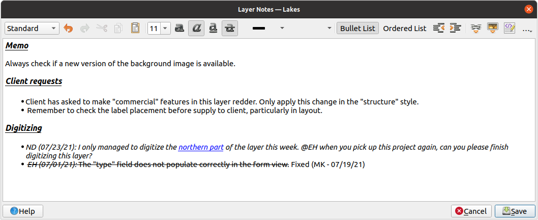
Fig. 12.15 Adicionando notas a uma camada
The Add layer notes dialog provides a html-based multiline text box with a complete set of tools for:
manipulação de texto: cortar, copiar, colar, desfazer, refazer
characters formatting, applied to all or parts of the contents: font size and color, bold, italic, underline, strikethrough, background color, URL highlighting
paragraph structuring: bullet and numbered lists, indentation, predefined headings
file insertion, even with drag-and-drop
edição com codificação HTML
From the … drop-down at the far right of the toolbar, you can:
Remove all formatting
Remove character formatting
Clear all content
In the Layers panel, a layer with a note is assigned
the  icon which, upon hover, displays the note.
Click the icon to edit the note. You can as well right-click the layer and
Edit layer note… or Remove layer note.
Nota
Notes are part of the layer style and
can be saved in the .qml or .qlr file. They can also be
transferred from one layer to another while copy-pasting the layer style.
12.7. Armazenando valores em Variáveis
In QGIS, you can use variables to store useful recurrent values (e.g. the
project’s title, or the user’s full name) that can be used in expressions.
Variables can be defined at the application’s global level, project level,
layer level, processing modeler level, layout level, and layout item’s level.
Just like CSS cascading rules, variables can be overwritten - e.g., a project level
variable will overwrite any application global level variables set with
the same name. You can use these variables to build text strings or other
custom expressions using the @ character before the variable name. For
example in print layout creating a label with this content:
This map was made using QGIS [% @qgis_version %]. The project file for this
map is: [% @project_path %]
Renderizará a etiqueta assim:
This map was made using QGIS 3.4.4-Madeira. The project file for this map is:
/gis/qgis-user-conference-2019.qgs
Besides the preset read-only variables, you can define your own custom variables for any of the levels mentioned above. You can manage:
global variables from the menu
project variables from the Project Properties dialog (see Propriedades do Projeto)
vector layer variables from the Layer Properties dialog (see Janela de Propriedades de Vetor);
modeler variables from the Model Designer dialog (see The model designer);
layout variables do Layout painel no layout de impressão (veja O Painel de Layout);
and layout item variables from the Item Properties panel in the Print layout (see Opções comuns de itens de esquema).
To differentiate from editable variables, read-only variable names and values are displayed in italic. On the other hand, higher level variables overwritten by lower level ones are strike through.
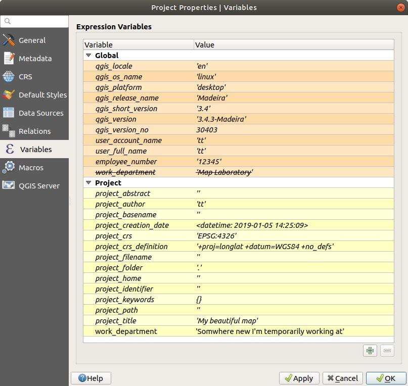
Fig. 12.16 Editor de variáveis no nível do projeto
Nota
You can read more about variables and find some examples in Nyall Dawson’s Exploring variables in QGIS 2.12, part 1, part 2 and part 3 blog posts.
12.8. Autenticação
QGIS has the facility to store/retrieve authentication credentials in a secure manner. Users can securely save credentials into authentication configurations, which are stored in a portable database, can be applied to server or database connections, and are safely referenced by their ID tokens in project or settings files. For more information see Sistema de Autenticação.
A master password needs to be set up when initializing the authentication system and its portable database.
12.9. Elementos comuns
In QGIS, there are some options you’ll often have to work with. For convenience, QGIS provides you with special widgets that are presented below.
12.9.1. Seletor de Cor
12.9.1.1. The color dialog
A caixa de diálogo Selecionar Cor aparecerá sempre que você clicar no ícone  para escolher uma cor. Os recursos desta caixa de diálogo dependem do estado da caixa de seleção do parâmetro Usar caixas de diálogo do seletor de cores nativas em . Quando marcada, a caixa de diálogo colorida usada é a nativa do SO no qual o QGIS está sendo executado. Caso contrário, o seletor de cores personalizado QGIS é usado.
The custom color chooser dialog has four different tabs which allow you to
select colors by ![]() Color ramp,
Color ramp, ![]() Color wheel,
Color wheel,
![]() Color swatches or
Color swatches or ![]() Color picker.
With the first two tabs, you can browse to all possible color combinations and
apply your choice to the item.
Color picker.
With the first two tabs, you can browse to all possible color combinations and
apply your choice to the item.
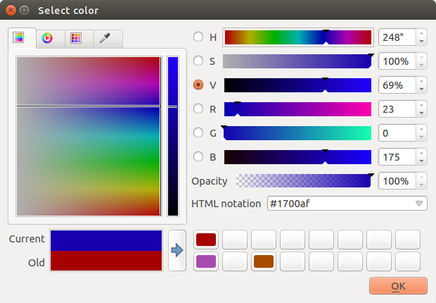
Fig. 12.17 Color selector ramp tab
In the ![]() Color swatches tab, you can choose from a
list of color palettes (see Configurações de cores for details).
All but the Recent colors palette can be modified with the
Color swatches tab, you can choose from a
list of color palettes (see Configurações de cores for details).
All but the Recent colors palette can be modified with the
 Add current color and
  Remove selected color
buttons at the bottom of the frame.
The … button next to the palette combo box also offers several options to:
copiar, colar, importar ou exportar cores
criar, importar ou remover paletas de cores
add the custom palette to the color selector widget with the Show in Color Buttons item (see Fig. 12.19)
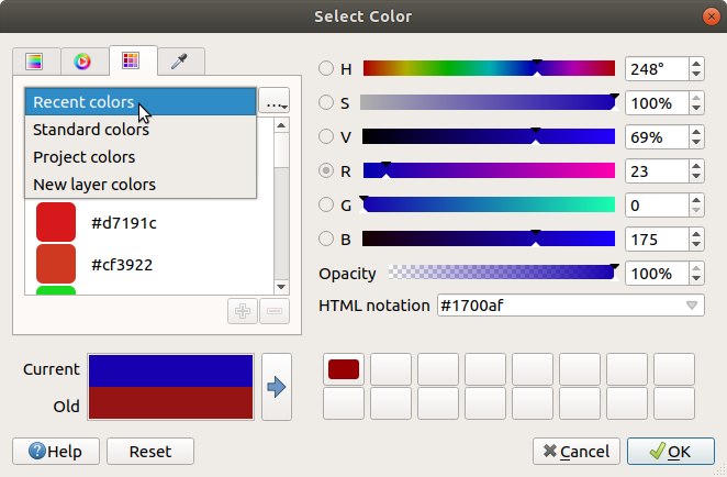
Fig. 12.18 Color selector swatches tab
Another option is to use the ![]() Color picker which allows
you to sample a color from under your mouse cursor at any part of the QGIS UI or even
from another application: press the space bar while the tab is active, move the
mouse over the desired color and click on it or press the space bar again. You
can also click the Sample Color button to activate the picker.
Color picker which allows
you to sample a color from under your mouse cursor at any part of the QGIS UI or even
from another application: press the space bar while the tab is active, move the
mouse over the desired color and click on it or press the space bar again. You
can also click the Sample Color button to activate the picker.
Whatever method you use, the selected color is always described through color
sliders for HSV (Hue, Saturation, Value) and RGB (Red, Green, Blue)
values. The color is also identifiable in HTML notation.
Modifying a color is as simple as clicking on the color wheel or ramp or on any of the color parameters sliders. You can adjust such parameters with the spinbox beside or by scrolling the mouse wheel over the corresponding slider. You can also type the color in HTML notation. Finally, there is an Opacity slider to set transparency level.
The dialog also provides a visual comparison between the
Old color (applied to object) and the Current one (being selected).
Using drag-and-drop or pressing the  Add color to
swatch button, any of these colors can be saved in a slot for easy access.
Dica
Alteração rápida da cor
Drag-and-drop a color selector widget onto another one to apply its color.
12.9.1.2. The color drop-down shortcut
Click the drop-down arrow to the right of the  color button
to display a widget for quick color selection. This shortcut provides access
to:
a color wheel to pick a color from
an alpha slider to change color opacity
the color palettes previously set to Show in Color Buttons
copiar a cor atual e colar em outro elemento
escolha uma cor em qualquer lugar na tela do computador
choose a color from the color selector dialog
drag-and-drop the color from one widget to another for quick modification
Dica
Scroll the mouse wheel over a color selector widget to quickly modify the opacity of the associated color.
Nota
When the color widget is set to a project color through the data-defined override properties, the above functions for changing the color are unavailable. You’d first need to Unlink color or Clear the definition.
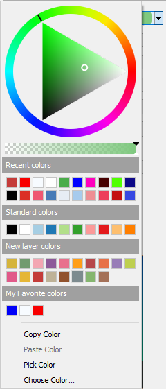
Fig. 12.19 Quick color selector menu
12.9.1.3. The color ramp drop-down shortcut
Color ramps are a practical way to apply a set of colors to one or many features.
Their creation is described in the Setting a Color Ramp section. As for the colors,
pressing the  color ramp button opens the corresponding color
ramp type dialog allowing you to change its properties.
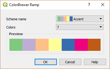
Fig. 12.20 Customizing a colorbrewer ramp
The drop-down menu to the right of the button gives quick access to a wider set of color ramps and options:
Inverter rampa de cor
Clear Current Ramp to unset any assigned color ramp to the widget (available only in some contexts)
 Random Colors: available only in some contexts
(e.g., when a color ramp is being used for a layer symbology),
checking this entry creates and applies a color ramp with random colors.
It also enables a Shuffle random colors entry to regenerate
a new random color ramp if the current one is not satisfactory.
Random Colors: available only in some contexts
(e.g., when a color ramp is being used for a layer symbology),
checking this entry creates and applies a color ramp with random colors.
It also enables a Shuffle random colors entry to regenerate
a new random color ramp if the current one is not satisfactory.a preview of the
gradientorcatalog: cpt-citycolor ramps flagged as Favorites in the Style Manager dialogAll Color Ramps to access the compatible color ramps database
guilabel:Criar nova rampa de cor… de qualquer tipo suportado que possa ser utilizado no elemtento atual (note que esta rampa de cor não estará disponível em outro lugar, a menos que você a salve na biblioteca)
Edit Color Ramp…, the same as clicking the whole color ramp button
Save Color Ramp…, to save the current color ramp with its customizations in the style library
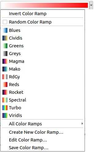
Fig. 12.21 Quick color ramp selection widget
12.9.2. Symbol Widget
The Symbol selector widget is a convenient shortcut when you want to set symbol properties of a feature. Clicking the drop-down arrow shows the following symbol options, together with the features of the color drop-down widget:
Configure Symbol…: the same as pressing the symbol selector widget. It opens a dialog to set the symbol parameters.
Copiar Símbolo do item atual
Colar Símbolo para o item atual, configuração de velocidade
Clear Current Symbol to unset any assigned symbol to the widget (available only in some contexts)
Dica
Scroll the mouse wheel over a marker or line symbol widget to quickly modify the size of the associated symbol.
12.9.3. Seletor de arquivos remoto ou incorporado
Along with the file selector widget, the … button will sometimes show a drop-down arrow. This is usually available when using:
um arquivo SVG em um símbolo ou rótulo
uma imagem matricial para personalizar símbolos, etiquetas, texturas ou decorações
Pressionar a seta fornecerá um menu para:
load the file from the file system: the file is identified through the file path and QGIS needs to resolve the path in order to display the corresponding image
load the file from a remote URL: as above, the image will only be loaded on successful retrieval of the remote resource
embed the file into the item: the file is embedded inside the current project, style database, or print layout template. The file is then always rendered as part of the item. This is a convenient way to create self-contained projects with custom symbols which can be easily shared amongst different users and installations of QGIS.
extract the embedded file from the widget and save it on disk.
12.9.4. Visibility Scale Selector
The visibility scale selector provides options to control the scales at which an element will be made visible in the map canvas. Out of the specified range of scales, the elements are not displayed. It can be applied e.g. to layers, labels or diagrams, from their Rendering properties tab.
Fill the Minimum (exclusive) box with the most zoomed out desired scale, typing the value or selecting it from the predefined scales
and/or fill the Maximum (inclusive) box with the most zoomed in desired scale
The
 Set to current canvas scale button next to
the scale boxes sets the current map canvas scale as boundary of the range visibility.
Press the arrow next to the button to access scales from layouts’ maps
and reuse them to fill the box.

Fig. 12.22 Visibility scale selector widget
12.9.5. Seletor de Extensão Espacial
The Extent selector widget is a convenient shortcut when you want to select a spatial extent to assign to a layer or to limit the actions to run on. Depending on the context, it offers selection between:
Current Layer Extent: e.g. when exporting a layer
: uses extent of a layer loaded in the current project
Use current Map Canvas Extent
Draw on Canvas: a rectangle whose coordinates are then used
Calculate from Bookmark: uses extent of a saved bookmark
Calculate from Layout Map: uses extent of a layout map
Insira as coordenadas como
xmin, xmax, ymin, ymax
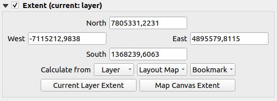
Fig. 12.23 Extent selector widget
12.9.6. Seletor de Fonte
The Font selector widget is a convenient shortcut when you want to set font properties for textual information (feature labels, decoration labels, map legend text, …). Clicking the drop-down arrow shows some or all of the following options:
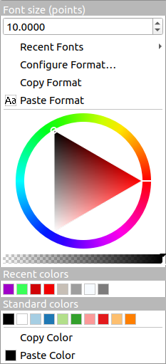
Fig. 12.24 Font selector drop-down menu
Clear Current Text Format to unset any assigned text format to the widget (available only in some contexts)
Font Size in the associated unit
menu with the active font checked (at the top)
Configure Format…: same as pressing the font selector widget. It opens a dialog to set text format parameters. Depending on the context, it can be the OS default Text format dialog or the QGIS custom dialog with advanced formatting options (opacity, orientation, buffer, background, shadow, …) as described in section Formatando o texto do rótulo.
guilabel:Copiar Formato do texto
Paste Format to the text, speeding configuration
the color widget for quick color setting
Dica
Scroll the mouse wheel over a font selector widget to quickly modify the font size of the associated text.
12.9.7. Seletor de Unidade
Size properties of the items (labels, symbols, layout elements, …) in QGIS are not necessarily bound to either the project units or the units of a particular layer. For a large set of properties, the Unit selector drop-down menu allows you to tweak their values according to the rendering you want (based on screen resolution, paper size, or the terrain). Available units are:
Milímetros
Pontos
Pixels
Polegadas
Percentage: allows you to set some properties as a percent of another one. For example, this is useful for creation of text formats where the components (buffer size, shadow radius…) nicely scale as the text size is changed, instead of having constant buffer/shadow sizes. So you don’t need to adjust those sizes, when the text size changes.
Meters at Scale: This allows you to always set the size in meters, regardless of what the underlying map units are (e.g. they can be in inches, feet, geographic degrees, …). The size in meters is calculated based on the current project ellipsoid setting and a projection of the distances in meters at the center of the current map extent. For maps in a projected coordinate system this is calculated using projected units. For maps in a geographic (latitude/longitude) based system the size is approximated by calculating meter sizes using ellipsoidal calculations for the vertical scale of the map.
and Map Units: The size is scaled according to the map view scale. Because this can lead to too big or too small values, use the
 button
next to the entry to constrain the size to a range of values based on:
button
next to the entry to constrain the size to a range of values based on:The Minimum scale and the Maximum scale: The value is scaled based on the map view scale until you reach any of these scale limits. Out of the range of scale, the value at the nearest scale limit is kept.
and/or The Minimum size and the Maximum size in
mm: The value is scaled based on the map view scale until it reaches any of these limits; Then the limit size is kept.
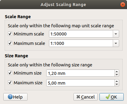
Fig. 12.25 Adjust scaling range dialog
12.9.8. Formatação de números
Numeric formatters allow formatting of numeric values for display, using a variety of different formatting techniques (for instance scientific notation, currency values, percentage values, etc). One use of this is to set text in a layout scale bar or fixed table.
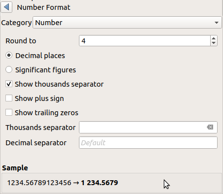
Fig. 12.26 Formatando valor numérico
Diferentes categorias de formatos são suportadas. Para a maioria, você pode definir parte ou todas as seguintes opções numéricas:
Mas eles também podem ter seus ajustes personalizados. Desde que as categorias sejam:
General, the default category: has no setting and displays values as set in the parent widget properties or using the global settings.
Número
The value can be Round to a self defined number of Decimal places or their Significant figures
personalizar o Separador de milhas e Separador decimal.
Bearing for a text representation of a direction/bearing using:
Format: possible ranges of values are
0 to 180°, with E/W suffix,-180 to +180°and0 to 360°número de :guilabel:`Casas decimais’.
Currency for a text representation of a currency value.
Prefixo
Sufixo
número de :guilabel:`Casas decimais’.
Fraction for a vulgar fractional representation of a decimal value (e.g. 1/2 instead of 0.5)
guilabel:
Porcentagem` - anexa ``%aos valores, com configuração de:número de :guilabel:`Casas decimais’.
Scaling to indicate whether the actual values already represent percentages (then they will be kept as is) or fractions (then they are converted)
guilabel:Notação científica no formulário
2,56e+03. O número de Casas decimais pode ser definido.
A live preview of the settings is displayed under the Sample section.
12.9.9. Modos de Mistura
QGIS offers different options for special rendering effects with these tools that you may previously only know from graphics programs. Blending modes can be applied on layers and features, and also on print layout items:
Normal: This is the standard blend mode, which uses the alpha channel of the top pixel to blend with the pixel beneath it. The colors aren’t mixed.
Lighten: This selects the maximum of each component from the foreground and background pixels. Be aware that the results tend to be jagged and harsh.
Screen: Light pixels from the source are painted over the destination, while dark pixels are not. This mode is most useful for mixing the texture of one item with another item (such as using a hillshade to texture another layer).
Dodge: Brighten and saturate underlying pixels based on the lightness of the top pixel. Brighter top pixels cause the saturation and brightness of the underlying pixels to increase. This works best if the top pixels aren’t too bright. Otherwise the effect is too extreme.
Addition: Adds pixel values of one item to the other. In case of values above the maximum value (in the case of RGB), white is displayed. This mode is suitable for highlighting features.
Darken: Retains the lowest values of each component of the foreground and background pixels. Like lighten, the results tend to be jagged and harsh.
Multiply: Pixel values of the top item are multiplied with the corresponding values for the bottom item. The results are darker.
Burn: Darker colors in the top item cause the underlying items to darken. Burn can be used to tweak and colorize underlying layers.
Overlay: Combines multiply and screen blending modes. Light parts become lighter and dark parts become darker.
Soft light: Very similar to overlay, but instead of using multiply/screen it uses color burn/dodge. This is supposed to emulate shining a soft light onto an image.
Hard light: Hard light is also very similar to the overlay mode. It’s supposed to emulate projecting a very intense light onto an image.
Difference: Subtracts the top pixel from the bottom pixel, or the other way around, in order always to get a positive value. Blending with black produces no change, as the difference with all colors is zero.
Subtract: Subtracts pixel values of one item from the other. In the case of negative values, black is displayed.
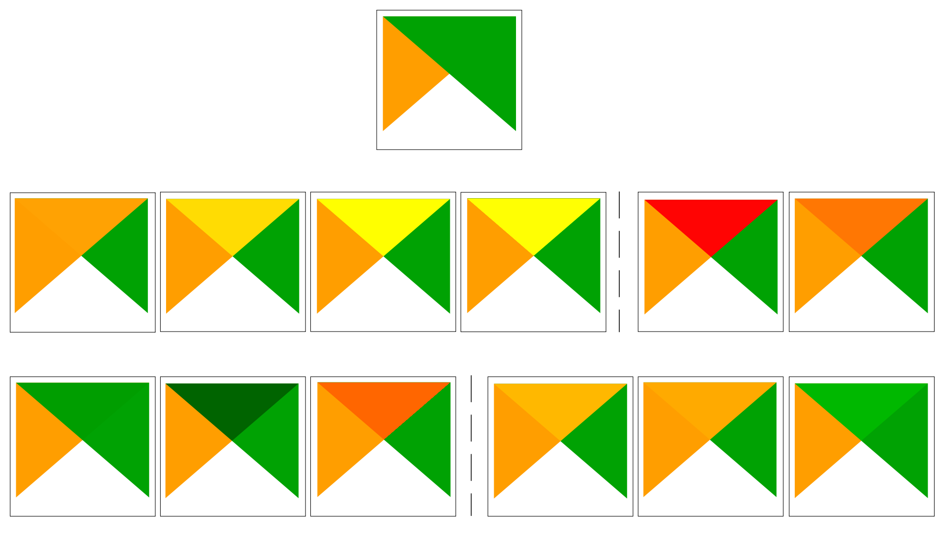
Fig. 12.27 Examples of blend modes applied to a green feature over an orange
From top to bottom, left to right: Normal – Lighten, Screen, Dodge, Addition – Difference, Subtract – Darken, Multiply, Burn – Overlay, Soft light, Hard light
When a layer is part of a group that renders layers as a group, additional blending modes are available for the rendering. They provide methods to clip the render of one layer’s content by the content in a second “mask” layer.
Masked By Below: The output is the top pixel, where the opacity is reduced by that of the bottom pixel.
Mask Below: The output is the bottom pixel, where the opacity is reduced by that of the top pixel.
Inverse Masked By Below: The output is the top pixel, where the opacity is reduced by the inverse of the bottom pixel.
Inverse Mask Below: The output is the bottom pixel, where the opacity is reduced by the inverse of the top pixel.
Paint Inside Below: The top pixel is blended on top of the bottom pixel, with the opacity of the top pixel reduced by the opacity of the bottom pixel.
Paint Below Inside: The bottom pixel is blended on top of the top pixel, with the opacity of the bottom pixel reduced by the opacity of the top pixel.
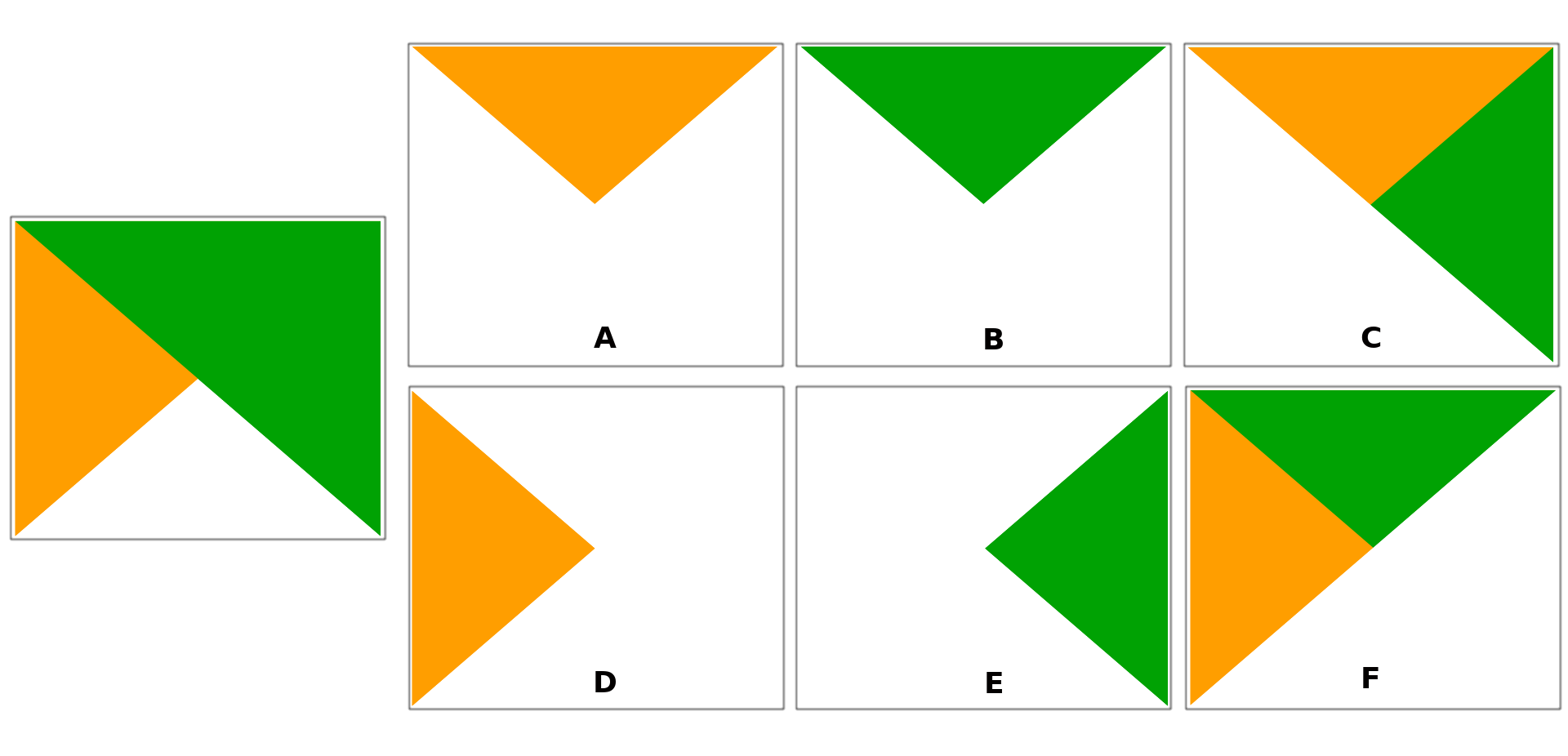
Fig. 12.28 Examples of blend clipping mode applied to top green layer in a group
A: Mask Below B: Masked By Below C: Paint Below Inside D: Inverse Mask Below E: Inverse Masked By Below F: Paint Inside Below
12.9.10. Data defined override setup
Next to many options in the vector layer properties dialog or settings in the print
layout, you will find a ![]() Data defined override icon.
Using expressions based on layer attributes or item
settings, prebuilt or custom functions and variables,
this tool allows you to set dynamic values for parameters. When enabled,
the value returned by this widget is applied to the parameter regardless of its normal
value (checkbox, textbox, slider…).
Data defined override icon.
Using expressions based on layer attributes or item
settings, prebuilt or custom functions and variables,
this tool allows you to set dynamic values for parameters. When enabled,
the value returned by this widget is applied to the parameter regardless of its normal
value (checkbox, textbox, slider…).
12.9.10.1. The data defined override widget
Clicking the ![]() Data defined override icon shows the following entries:
Data defined override icon shows the following entries:
Description… that indicates if the option is enabled, which input is expected, the valid input type and the current definition. Hovering over the widget also pops up this information.
Store data in the project: a button allowing the property to be stored using to the Propriedades de armazenamento auxiliar mechanism.
Field type: an entry to select from the layer’s fields that match the valid input type.
Color: when the widget is linked to a color property, this menu gives access to the colors defined as part of the current project’s colors scheme.
Variable: a menu to access the available user-defined variables
Edit… button to create or edit the expression to apply, using the Expression String Builder dialog. To help you correctly fill in the expression, a reminder of the expected output’s format is provided in the dialog.
botões Colar e Copiar.
guilabel:Limpar botão para remover a configuração.
For numeric and color properties, Assistant… to rescale how the feature data is applied to the property (more details below)
Dica
Use right-click to (de)activate the data override
When the data-defined override option is set up correctly the
icon is yellow ![]() or
or ![]() . If it is broken,
the icon is red
. If it is broken,
the icon is red ![]() or
or ![]() .
.
You can enable or disable a configured ![]() Data-defined
override button by simply clicking the widget with the right mouse button.
Data-defined
override button by simply clicking the widget with the right mouse button.
12.9.10.2. Using the data-defined assistant interface
When the ![]() Data-defined override button is associated with a
size, a rotation, an opacity or a color property, it has an Assistant…
option that helps you change how the data is applied to the parameter for each
feature. The assistant allows you to:
Data-defined override button is associated with a
size, a rotation, an opacity or a color property, it has an Assistant…
option that helps you change how the data is applied to the parameter for each
feature. The assistant allows you to:
Define the Input data, ie:
Source: the attribute to represent, using a field or an
 expression
the range of values to represent: you can manually enter the values or use the
 Fetch value range from layer button to fill
these fields automatically with the minimum and maximum values returned by
the Source expression applied to your data
 Apply transform curve: by default, output values (see
below for setting) are applied to input features following a linear scale.
You can override this logic: enable the transform option, click on the
graphic to add break point(s) and drag the point(s) to apply a custom
distribution.
Apply transform curve: by default, output values (see
below for setting) are applied to input features following a linear scale.
You can override this logic: enable the transform option, click on the
graphic to add break point(s) and drag the point(s) to apply a custom
distribution.Define the Output values: the options vary according to the parameter to define. You can globally set:
for a color setting, the color ramp to apply to values and the single color to use for NULL values
para os outros, os valores mínimo e máximo a serem aplicados à propriedade selecionada, bem como o valor de tamanho/ângulo/opacidade para feições de origem ignoradas ou NULO
for size properties, the Scale method of representation which can be Flannery, Exponential, Surface, Radius or Linear
the Exponent to use for data scaling when the Scale method is of exponential type or when tweaking the opacity
When compatible with the property, a live-update preview is displayed in the right-hand side of the dialog to help you control the value scaling.
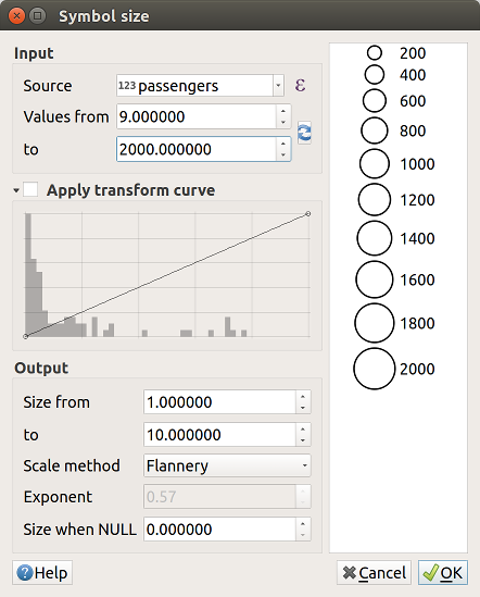
Fig. 12.29 Scaling feature size based on passengers field’s value
The values presented in the varying size assistant above will set the size ‘Data-defined override’ with:
coalesce(scale_exp("passengers", 9, 2000, 1, 10, 0.57), 0)


