Viktigt
Översättning är en gemenskapsinsats du kan gå med i. Den här sidan är för närvarande översatt till 61.11%.
17.14. Exempel på första analys
Observera
I den här lektionen kommer vi att utföra några riktiga analyser med hjälp av bara verktygslådan, så att du kan bli mer bekant med ramverkselementen för bearbetning.
Now that everything is configured and we can use external algorithms, we have a very powerful tool to perform spatial analysis. It is time to work out a larger exercise with some real world data.
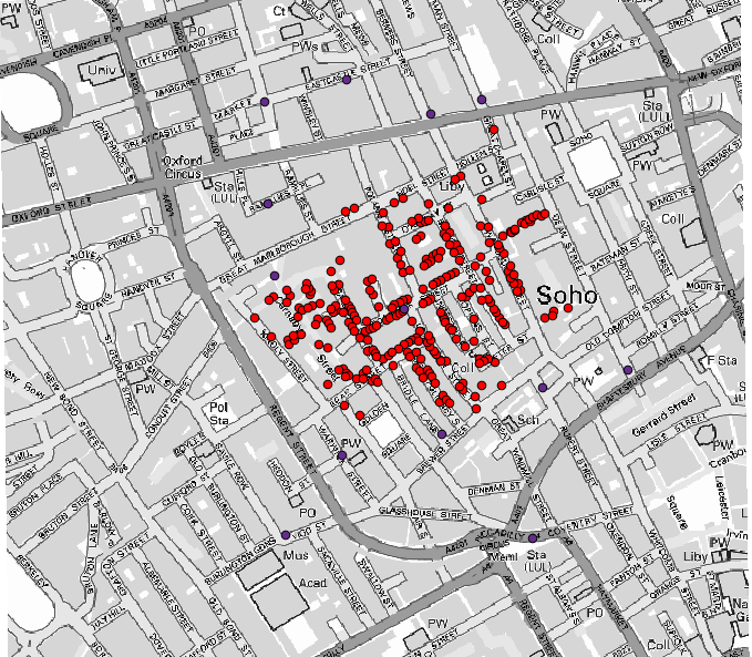
Vi kommer att använda det välkända dataset som John Snow använde 1854 i sitt banbrytande arbete (https://en.wikipedia.org/wiki/John_Snow_%28physician%29), och vi kommer att få några intressanta resultat. Analysen av det här datasetet är ganska uppenbar och det behövs inga sofistikerade GIS-tekniker för att få bra resultat och slutsatser, men det är ett bra sätt att visa hur dessa spatiala problem kan analyseras och lösas med hjälp av olika bearbetningsverktyg.
Datasetet innehåller shapefiler med koleradödsfall och pumplägen, och en OSM-renderad karta i TIFF-format. Öppna motsvarande QGIS-projekt för den här lektionen.
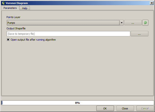
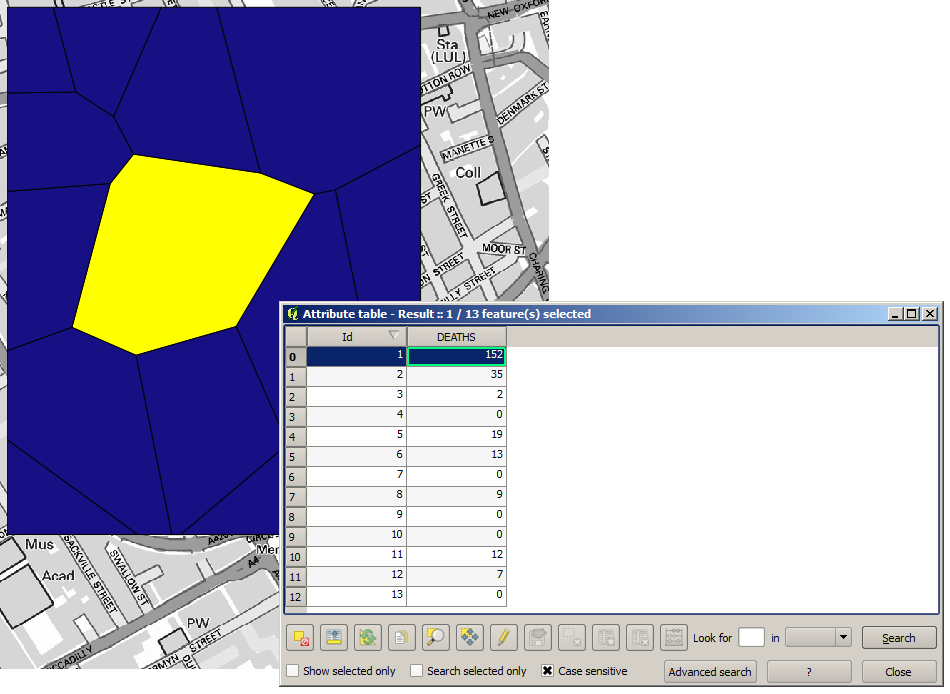
The first thing to do is to calculate the Voronoi diagram (a.k.a. Thiessen polygons) of the pumps layer, to get the influence zone of each pump. The Voronoi polygons algorithm can be used for that.
Ganska enkelt, men det kommer redan att ge oss intressant information.
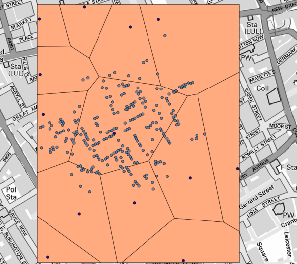
Det är uppenbart att de flesta fall ligger inom någon av polygonerna
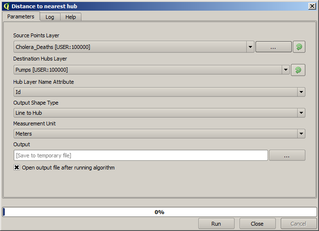
To get a more quantitative result, we can count the number of deaths in each polygon. Since each point represents a building where deaths occurred, and the number of deaths is stored in an attribute, we cannot just count the points. We need a weighted count, so we will use the Count points in polygon tool.
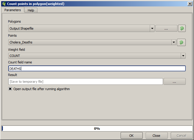
The new field will be called DEATHS, and we use the COUNT field as weighting field.
The resulting table clearly reflects that the number of deaths in the polygon
corresponding to the first pump is much larger than the other ones.
Another good way of visualizing the dependence of each point in the Cholera_deaths layer
with a point in the Pumps layer is to draw a line to the closest one.
This can be done with the Distance to nearest hub tool, and using the configuration shown next.
Resultatet ser ut så här:
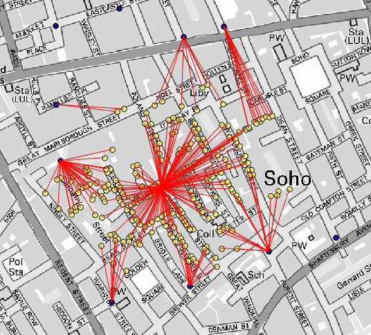
Även om antalet rader är större när det gäller den centrala pumpen, får man inte glömma att detta inte representerar antalet dödsfall, utan antalet platser där kolerafall påträffades. Det är en representativ parameter, men den tar inte hänsyn till att vissa platser kan ha fler fall än andra.
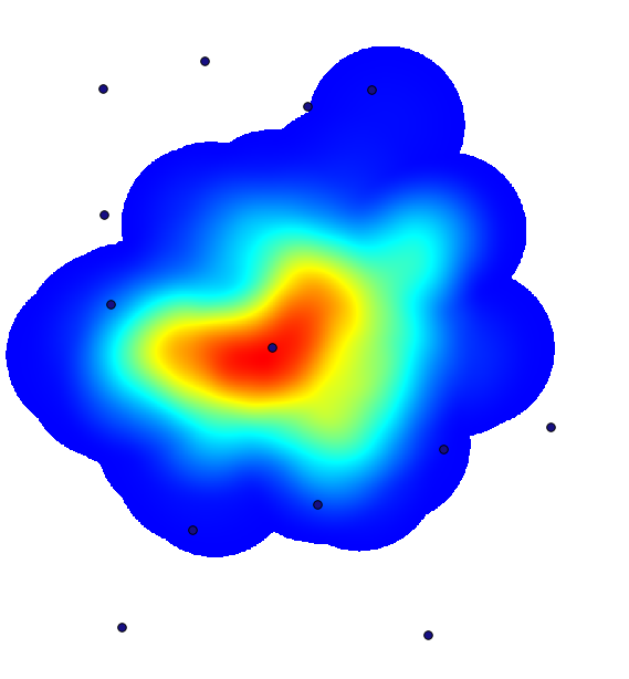
A density layer will also give us a very clear view of what is happening.
We can create it with the Heatmap (Kernel density estimation) algorithm.
Using the Cholera_deaths layer, its COUNT field as weight field, with a radius of 100,
the extent and cell size of the streets raster layer, we get something like this.
Remember that, to get the output extent, you do not have to type it. Click on the button on the right-hand side and select Use layer/canvas extent.
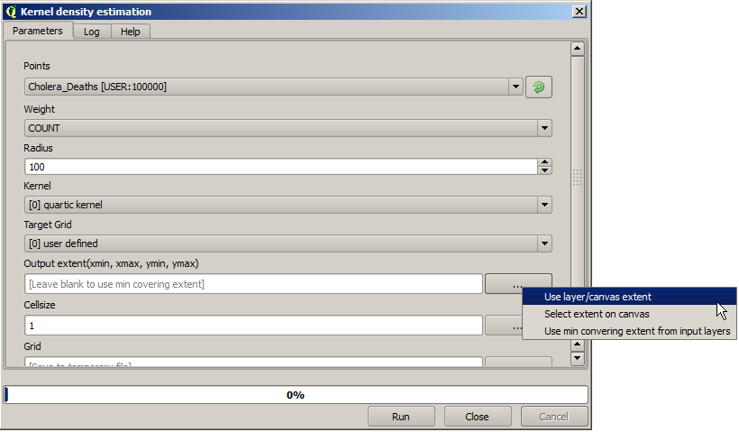
Välj rasterlagret för gatorna så läggs dess utsträckning automatiskt till i textfältet. Du måste göra samma sak med cellstorleken genom att välja cellstorleken för det lagret också.
I kombination med pumplagret ser vi att det finns en pump tydligt i den hotspot där den maximala tätheten av dödsfall finns.