Importante
A tradução é um esforço comunitário você pode contribuir. Esta página está atualmente traduzida em 61.11%.
17.14. Primeiro exemplo de análise
Nota
Nesta lição vamos fazer uma análise real utilizando apenas a caixa de ferramentas para que possa ter mais familiaridade com os elementos da área de trabalho de processamento.
Now that everything is configured and we can use external algorithms, we have a very powerful tool to perform spatial analysis. It is time to work out a larger exercise with some real world data.
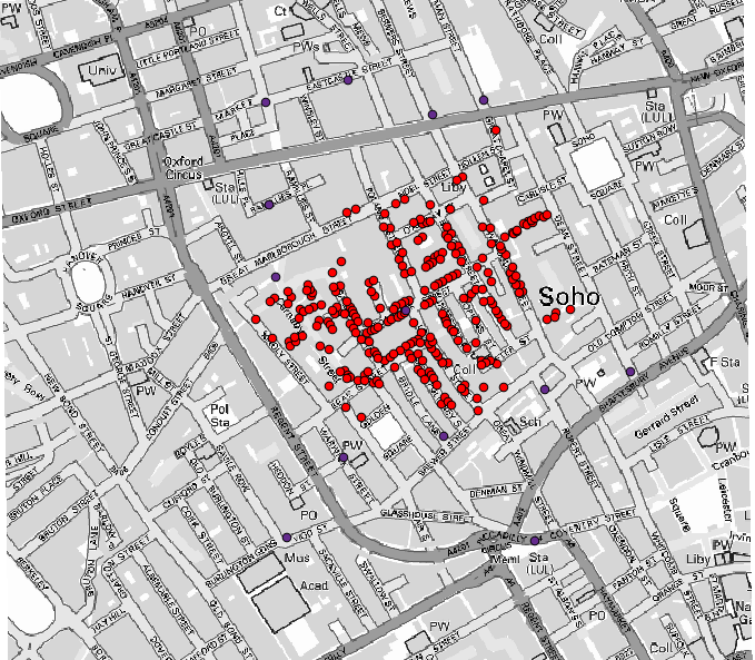
Usaremos o conhecido conjunto de dados que John Snow usou em 1854, em seu trabalho inovador (https://en.wikipedia.org/wiki/John_Snow_%28physician%29), e teremos alguns resultados interessantes. A análise desse conjunto de dados é bastante óbvia e não há necessidade de técnicas sofisticadas de SIG para obter bons resultados e conclusões, mas é uma boa maneira de mostrar como esses problemas espaciais podem ser analisados e resolvidos usando diferentes ferramentas de processamento.
O conjunto de dados contém shapefiles com mortes por cólera e locais de bombas de água, e um mapa OSM renderizado no formato TIFF. Abra o projeto QGIS correspondente para esta lição.
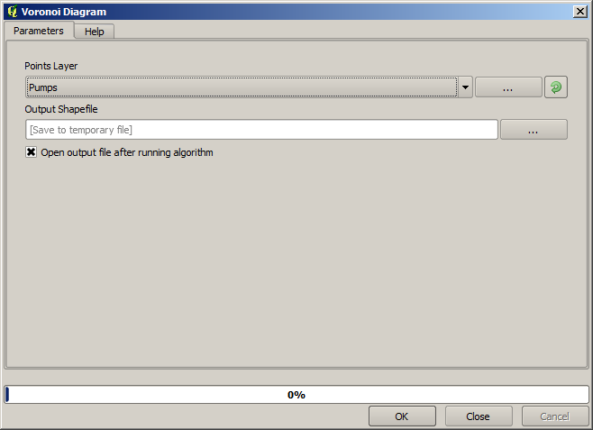
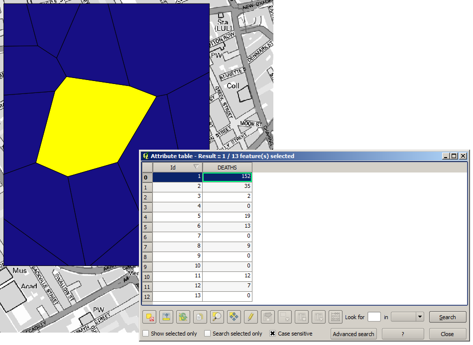
The first thing to do is to calculate the Voronoi diagram (a.k.a. Thiessen polygons) of the pumps layer, to get the influence zone of each pump. The Voronoi polygons algorithm can be used for that.
Muito fácil, porém ele nos dará informação interessantes.
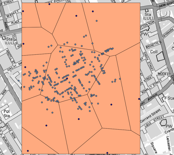
Claramente, muitos casos estão dentro de um dos polígonos
To get a more quantitative result, we can count the number of deaths in each polygon. Since each point represents a building where deaths occurred, and the number of deaths is stored in an attribute, we cannot just count the points. We need a weighted count, so we will use the Count points in polygon tool.
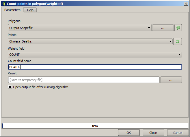
The new field will be called DEATHS, and we use the COUNT field as weighting field.
The resulting table clearly reflects that the number of deaths in the polygon
corresponding to the first pump is much larger than the other ones.
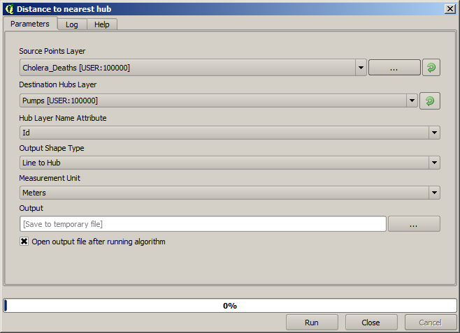
Another good way of visualizing the dependence of each point in the Cholera_deaths layer
with a point in the Pumps layer is to draw a line to the closest one.
This can be done with the Distance to nearest hub tool, and using the configuration shown next.
O resultado se parece com isso:
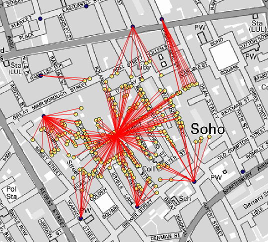
Embora o número de linhas seja maior no caso da bomba central, não se esqueça que isso não representa o número de mortes, mas o número de locais onde os casos de cólera foram encontrados. É um parâmetro representativo, mas não está considerando que alguns locais possam ter mais casos do que outros.
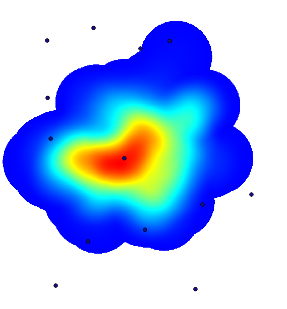
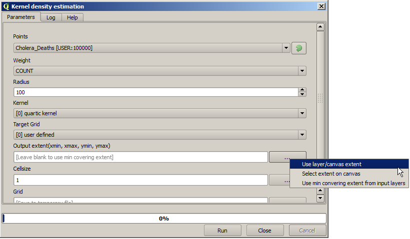
A density layer will also give us a very clear view of what is happening.
We can create it with the Heatmap (Kernel density estimation) algorithm.
Using the Cholera_deaths layer, its COUNT field as weight field, with a radius of 100,
the extent and cell size of the streets raster layer, we get something like this.
Remember that, to get the output extent, you do not have to type it. Click on the button on the right-hand side and select Use layer/canvas extent.
Seleccione la capa de calles ráster y su extensión automáticamente se añadirá al campo de texto. Debe hacer lo mismo con el tamaño de celda, seleccionando el tamaño de celda de esa capa también.
La combinación con la capa de bombas, vemos que hay una bomba claramente en el punto de acceso donde se encuentra la máxima densidad de los casos de muerte.