14.1. Vektorlayereigenschaften
Der Layereigenschaften Dialog für Vektorlayer enthält generelle Einstellungen, um das Aussehen der Layerobjekte in der Karte (Symbologie, Beschriftung, Diagramme) und die Interaktion mit der Maus (Aktionen, Kartentipps, …) zu verwalten. Er bietet auch Informationen über den Layer.
Sie können den Layereigenschaften Dialog öffnen, indem Sie:
im Layer `Bedienfeld einen Doppelklick auf den Layer machen oder einen Rechtsklick und im Kontextmenü :guilabel:`Eigenschaften … auswählen
in der Menüleiste auswählen wenn der Layer aktiv ist
Der Layereigenschaften Dialog für Vektorlayer bietet die folgenden Bereiche:
|
||
|
|
|
|
||
External plugins[2] tabs |


[1] Auch im Bedienfeld Layergestalltung verfügbar
Durch das Installieren von [2] Plugins können hier im Dialog Layereigenschaften weitere Tabs hizugefügt werden. Diese werden nicht in dieser Dokumentation behandelt, bitte schauen Sie in der entsprechenden Dokumentation nach.
Tipp
Layereigenschaften speichern und teilen
Mit dem Menü unten im Dialogfenster ist es möglich die Layereigenschaften (oder Teile davon) zu speichern und zu laden . Für mehr Informationen s. Verwalten von benutzerdefinierten Stilen.
Bemerkung
Da die Eigenschaften von eingebetteten Layern (see Layer/Gruppen einbinden) aus der ursprünglichen QGIS-Projektdatei stammen und um Änderungen zu vermeiden, die mit diesen Einstellungen Konflikte verursachen könnten, ist der Ebeneneigenschaften-Dialog für eingebetteten Ebenen nicht verfügbar.
14.1.1. Information Properties
 The Information tab is read-only and represents an interesting
place to quickly grab summarized information and metadata on the current layer.
Provided information are:
The Information tab is read-only and represents an interesting
place to quickly grab summarized information and metadata on the current layer.
Provided information are:
based on the provider of the layer (format of storage, path, geometry type, data source encoding, extent…);
picked from the filled metadata (access, links, contacts, history…);
or related to its geometry (spatial extent, CRS…) or its attributes (number of fields, characteristics of each…).
14.1.2. Source Properties
 Use this tab to define general settings for the vector layer.
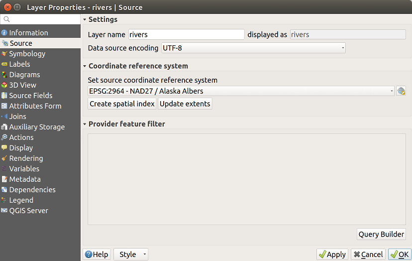
Abb. 14.1 Source tab in vector Layer Properties dialog
Other than setting the Layer name to display in the Layers Panel, available options include:
14.1.2.1. Koordinatenbezugssystem
Displays the layer’s Coordinate Reference System (CRS). You can change the layer’s CRS, selecting a recently used one in the drop-down list or clicking on
 Select CRS button
(see Coordinate Reference System Selector). Use this process only if the CRS applied to the
layer is a wrong one or if none was applied.
If you wish to reproject your data into another CRS, rather use layer reprojection
algorithms from Processing or Save it into another layer.
Select CRS button
(see Coordinate Reference System Selector). Use this process only if the CRS applied to the
layer is a wrong one or if none was applied.
If you wish to reproject your data into another CRS, rather use layer reprojection
algorithms from Processing or Save it into another layer.Create spatial index (only for OGR-supported formats).
Update extents information for a layer.
14.1.2.2. Abfrageeditor
The Query Builder dialog is accessible through the eponym button at the bottom of the Source tab in the Layer Properties dialog, under the Provider feature filter group.
The Query Builder provides an interface that allows you to define a subset of the features in the layer using a SQL-like WHERE clause and to display the result in the main window. As long as the query is active, only the features corresponding to its result are available in the project.
You can use one or more layer attributes to define the filter in the Query
Builder.
The use of more than one attribute is shown in Abb. 14.2.
In the example, the filter combines the attributes
toa(DateTimefield:cast("toa" as character) > '2017-05-17'andcast("toa" as character) < '2019-12-24T18:00:00'),name(Stringfield:"name" > 'S') andFID(Integerfield:FID > 10)
using the AND, OR and NOT operators and parenthesis.
This syntax (including the DateTime format for the toa field) works for
GeoPackage datasets.
The filter is made at the data provider (OGR, PostgreSQL, MSSQL…) level. So the syntax depends on the data provider (DateTime is for instance not supported for the ESRI Shapefile format). The complete expression:
cast("toa" as character) > '2017-05-17' AND
cast("toa" as character) < '2019-12-24T18:00:00' AND
NOT ("name" > 'S' OR FID > 10)
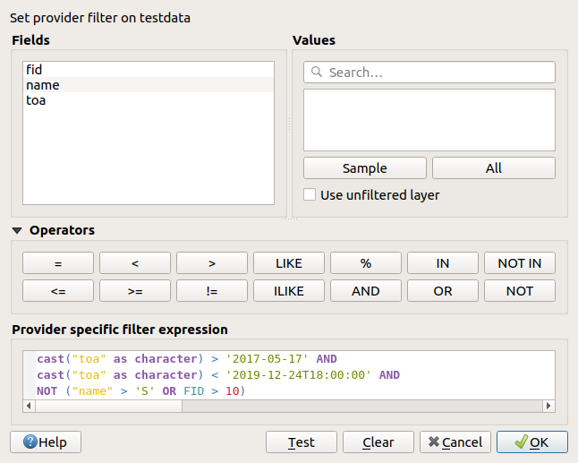
Abb. 14.2 Abfrageeditor
You can also open the Query Builder dialog using the Filter… option from the menu or the layer contextual menu. The Fields, Values and Operators sections in the dialog help you to construct the SQL-like query exposed in the Provider specific filter expression box.
The Fields list contains all the fields of the layer. To add an attribute column to the SQL WHERE clause field, double-click its name or just type it into the SQL box.
The Values frame lists the values of the currently selected field. To list all unique values of a field, click the All button. To instead list the first 25 unique values of the column, click the Sample button. To add a value to the SQL WHERE clause field, double click its name in the Values list. You can use the search box at the top of the Values frame to easily browse and find attribute values in the list.
The Operators section contains all usable operators. To add an operator to
the SQL WHERE clause field, click the appropriate button. Relational operators
( = , > , …), string comparison operator (LIKE), and logical
operators (AND, OR, …) are available.
The Test button helps you check your query and displays a message box with the number of features satisfying the current query. Use the Clear button to wipe the SQL query and revert the layer to its original state (ie, fully load all the features).
When a filter is applied,
QGIS treats the resulting subset acts as if it were the entire layer. For
example if you applied the filter above for ‚Borough‘ ("TYPE_2" = 'Borough'),
you can not display, query, save or edit Anchorage, because that is a
‚Municipality‘ and therefore not part of the subset.
Tipp
Filtered layers are indicated in the Layers Panel
In the Layers panel, filtered layer is listed with a  Filter icon next to it indicating the query used when the mouse hovers
over the button. Double-click the icon opens the Query Builder dialog
for edit.
Filter icon next to it indicating the query used when the mouse hovers
over the button. Double-click the icon opens the Query Builder dialog
for edit.
14.1.3. Symbology Properties
 The Symbology tab provides you with a comprehensive tool for
rendering and symbolizing your vector data. You can use tools that are
common to all vector data, as well as special symbolizing tools that were
designed for the different kinds of vector data. However all types share the
following dialog structure: in the upper part, you have a widget that helps
you prepare the classification and the symbol to use for features and at
the bottom the Layerdarstellung widget.
The Symbology tab provides you with a comprehensive tool for
rendering and symbolizing your vector data. You can use tools that are
common to all vector data, as well as special symbolizing tools that were
designed for the different kinds of vector data. However all types share the
following dialog structure: in the upper part, you have a widget that helps
you prepare the classification and the symbol to use for features and at
the bottom the Layerdarstellung widget.
Tipp
Wechseln Sie schnell zwischen verschiedenen Layerdarstellungen
Using the menu at the bottom of the Layer Properties dialog, you can save as many styles as needed. A style is the combination of all properties of a layer (such as symbology, labeling, diagram, fields form, actions…) as you want. Then, simply switch between styles from the context menu of the layer in Layers Panel to automatically get different representations of your data.
Tipp
Symbologie exportierten
Sie haben die Option die Vektorsymbologie von QGIS nach Google *.kml, *.dxf und MapInfo .*.tab Dateien zu exportieren. Öffnen Sie einfach das Rechte-Maustasten-Menü des Layers und klicken Sie auf Menü um die Symbologie entweder als oder zu speichern. Wenn Sie Symbollayer verwendet haben wird empfohlen die zweite Einstellung zu benutzen.
14.1.3.1. Objekt Darstellung
The renderer is responsible for drawing a feature together with the correct symbol. Regardless layer geometry type, there are four common types of renderers: single symbol, categorized, graduated and rule-based. For point layers, there are a point displacement and a heatmap renderers available while polygon layers can also be rendered with the inverted polygons and 2.5 D renderers.
Es gibt keinen kontinuirliche Farbe Renderer da es in der Tat einfach ein spezieller Fall des Abgestuft Renderers ist. Die Kategorisiert und Abgestuft Renderer können erstellt werden indem ein Symbol und ein Farbverlauf festgelegt werden - Sie werden die Farben für Symbole angemessen einsetzen. Für jeden Datentyp (Punkte, Linien und Polygone) sind Symbollayertypen erhältlich. Abhängig vom ausgesuchten Renderer gibt es verschiedene zusätzliche Bereiche.
Bemerkung
Wenn Sie den Darstellungstyp beim Einstellen des Stils eines Vektorlayers ändern werden die Einstellungen für das Symbol beibehalten. Beachten Sie dass dieses Vorgehen nur für eine Änderunge funktioniert. Wenn Sie den Darstellungstyp wiederholt ändern gehen die Einstellungen für das Symbol verloren.
Einzelsymbol Darstellung
The  Single Symbol renderer is used to render
all features of the layer using a single user-defined symbol.
See The Symbol Selector for further information about symbol representation.
Single Symbol renderer is used to render
all features of the layer using a single user-defined symbol.
See The Symbol Selector for further information about symbol representation.
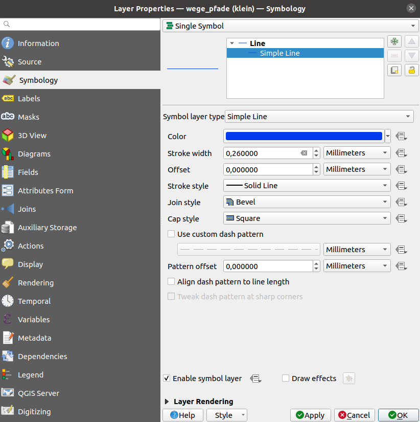
Abb. 14.3 Linieneigenschaften Einzelsymbol
No Symbols Renderer
The  No Symbols renderer is a special use case of the
Single Symbol renderer as it applies the same rendering to all features.
Using this renderer, no symbol will be drawn for features,
but labeling, diagrams and other non-symbol parts will still be shown.
No Symbols renderer is a special use case of the
Single Symbol renderer as it applies the same rendering to all features.
Using this renderer, no symbol will be drawn for features,
but labeling, diagrams and other non-symbol parts will still be shown.
Selections can still be made on the layer in the canvas and selected features will be rendered with a default symbol. Features being edited will also be shown.
This is intended as a handy shortcut for layers which you only want to show labels or diagrams for, and avoids the need to render symbols with totally transparent fill/border to achieve this.
Kategorisierte Darstellung
The  Categorized renderer is used to render the
features of a layer, using a user-defined symbol whose aspect reflects the
discrete values of a field or an expression.
Categorized renderer is used to render the
features of a layer, using a user-defined symbol whose aspect reflects the
discrete values of a field or an expression.
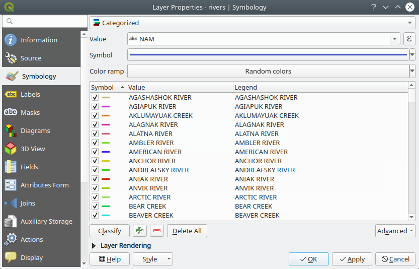
Abb. 14.4 Kategorisierte Symbolisierungsoptionen
To use categorized symbology for a layer:
Select the Value of classification: it can be an existing field or an expression you can type in the box or build using the associated
 button. Using expressions for categorizing
avoids the need to create an ad hoc field for symbology purposes (eg, if your
classification criteria are derived from one or more attributes).
button. Using expressions for categorizing
avoids the need to create an ad hoc field for symbology purposes (eg, if your
classification criteria are derived from one or more attributes).The expression used to classify features can be of any type; eg, it can:
be a comparison. In this case, QGIS returns values
1(True) and0(False). Some examples:myfield >= 100 $id = @atlas_featureid myfield % 2 = 0 within( $geometry, @atlas_geometry )
combine different fields:
concat( field_1, ' ', field_2 )
be a calculation on fields:
myfield % 2
year( myfield )
field_1 + field_2
substr( field_1, -3 )
be used to transform linear values to discrete classes, e.g.:
CASE WHEN x > 1000 THEN 'Big' ELSE 'Small' END
combine several discrete values into a single category, e.g.:
CASE
WHEN building IN ('residence', 'mobile home') THEN 'residential'
WHEN building IN ('commercial', 'industrial') THEN 'Commercial and Industrial'
END
Tipp
While you can use any kind of expression to categorize features, for some complex expressions it might be simpler to use rule-based rendering.
Configure the Symbol, which will be used as base symbol for all the classes;
Indicate the Color ramp, ie the range of colors from which the color applied to each symbol is selected.
Besides the common options of the color ramp widget, you can apply a
 Random Color Ramp to the categories.
You can click the Shuffle Random Colors entry to regenerate a new set
of random colors if you are not satisfied.
Random Color Ramp to the categories.
You can click the Shuffle Random Colors entry to regenerate a new set
of random colors if you are not satisfied.Then click on the Classify button to create classes from the distinct values of the provided field or expression.
Apply the changes if the live update is not in use and each feature on the map canvas will be rendered with the symbol of its class.
By default, QGIS appends an all other values class to the list. While empty at the beginning, this class is used as a default class for any feature not falling into the other classes (eg, when you create features with new values for the classification field / expression).
Further tweaks can be done to the default classification:
You can
 Add new categories,
  Remove
selected categories or Delete All of them.
Remove
selected categories or Delete All of them.A class can be disabled by unchecking the checkbox to the left of the class name; the corresponding features are hidden on the map.
Drag-and-drop the rows to reorder the classes
To change the symbol, the value or the legend of a class, double click the item.
Right-clicking over selected item(s) shows a contextual menu to:
Copy Symbol and Paste Symbol, a convenient way to apply the item’s representation to others
Change Color… of the selected symbol(s)
Change Opacity… of the selected symbol(s)
Change Output Unit… of the selected symbol(s)
Change Width… of the selected line symbol(s)
Change Size… of the selected point symbol(s)
Change Angle… of the selected point symbol(s)
Merge Categories: Groups multiple selected categories into a single one. This allows simpler styling of layers with a large number of categories, where it may be possible to group numerous distinct categories into a smaller and more manageable set of categories which apply to multiple values.
Tipp
Since the symbol kept for the merged categories is the one of the topmost selected category in the list, you may want to move the category whose symbol you wish to reuse to the top before merging.
Unmerge Categories that were previously merged
Match to saved symbols: Using the symbols library, assigns to each category a symbol whose name represents the classification value of the category
Match to symbols from file…: Provided a file with symbols, assigns to each category a symbol whose name represents the classification value of the category
Symbol levels… to define the order of symbols rendering.
Tipp
Edit categories directly from the Layers panel
When a layer symbology is based on a categorized, graduated or rule-based symbology mode, you can edit each of the categories from the Layers Panel. Right-click on a sub-item of the layer and you will:
 Toggle items visibility
 Show all items
 Hide all items
Modify the symbol color thanks to the color selector wheel
Edit symbol… from the symbol selector dialog
Copy symbol
Paste symbol
Abgestufte Darstellung
The  Graduated renderer is used to render
all the features from a layer, using an user-defined symbol whose color or size
reflects the assignment of a selected feature’s attribute to a class.
Graduated renderer is used to render
all the features from a layer, using an user-defined symbol whose color or size
reflects the assignment of a selected feature’s attribute to a class.
Like the Categorized Renderer, the Graduated Renderer allows you to define rotation and size scale from specified columns.
Genauso können Sie -analog zum Kategorisierten Renderer - im Menü auswählen:
The value (using the fields listbox or the
Set value expression function)Das Symbol (nutzen des Symbolauswahl Dialogs)
Die Legendenformatierung und die Genauigkeit
Die Methode, um das Symbol zu ändern: Farbe oder Größe
Die Farben (indem man die Farbverlaufsliste verwendet), wenn die Farbmethode ausgewählt ist
The size (using the size domain and its unit)
Then you can use the Histogram tab which shows an interactive histogram of the values from the assigned field or expression. Class breaks can be moved or added using the histogram widget.
Bemerkung
Sie können die statistische Zusammenfassung nutzen, um mehr Informationen über Ihren Vektorlayer zu erhalten. Siehe Statistical Summary Panel.
Zurück zu dem Klassen Reiter, Sie können die Anzahl der Klassen und auch den Modus für das Klassifizieren von Objekten innerhalb der Klassen (indem man die Modus-Liste verwendet) einstellen. Die möglichen Modi sind:
Equal Count (Quantile): each class will have the same number of elements (the idea of a boxplot).
Equal Interval: each class will have the same size (e.g. with the values from 1 to 16 and four classes, each class will have a size of four).
Logarithmic scale: suitable for data with a wide range of values. Narrow classes for low values and wide classes for large values (e.g. for decimal numbers with range [0..100] and two classes, the first class will be from 0 to 10 and the second class from 10 to 100).
Natural Breaks (Jenks): the variance within each class is minimized while the variance between classes is maximized.
Pretty Breaks: computes a sequence of about n+1 equally spaced nice values which cover the range of the values in x. The values are chosen so that they are 1, 2 or 5 times a power of 10. (based on pretty from the R statistical environment https://www.rdocumentation.org/packages/base/topics/pretty).
Standard Deviation: classes are built depending on the standard deviation of the values.
The listbox in the center part of the Symbology tab lists the classes together with their ranges, labels and symbols that will be rendered.
Klicken Sie auf den Klassifizieren Knopf um Klassen anhand des ausgewählten Modus zu erstellen. Jede Klasse kann anhand des Deaktivierens des Kontrollkästchens links neben dem Klassennamen ausgeschaltet werden.
Sie können das Symbol, den Wert oder die Beschriftung verändern, klicken Sie einfach auf das Element, das Sie ändern wollen.
Right-clicking over selected item(s) shows a contextual menu to:
Copy Symbol and Paste Symbol, a convenient way to apply the item’s representation to others
Change Color… of the selected symbol(s)
Change Opacity… of the selected symbol(s)
Change Output Unit… of the selected symbol(s)
Change Width… of the selected line symbol(s)
Change Size… of the selected point symbol(s)
Change Angle… of the selected point symbol(s)
The example in Abb. 14.5 shows the graduated rendering dialog for the major_rivers layer of the QGIS sample dataset.
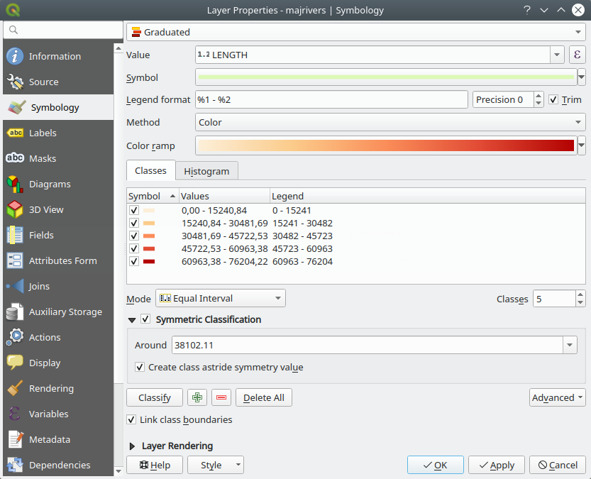
Abb. 14.5 Abgestufte Symbolisierungsoptionen
Tipp
Thematische Karten anhand von Ausdrücken erstellen
Categorized and graduated thematic maps can be created using the result
of an expression. In the properties dialog for vector layers, the attribute
chooser is extended with a Set column expression function.
So you don’t need to write the classification attribute
to a new column in your attribute table if you want the classification
attribute to be a composite of multiple fields, or a formula of some sort.
Proportionale Symbole und mehrdimensionale Analysen
Proportional Symbol and Multivariate Analysis are not rendering types available from the Symbology rendering drop-down list. However with the data-defined override options applied over any of the previous rendering options, QGIS allows you to display your point and line data with such representation.
Proportionale Symbole erstellen
To apply a proportional rendering:
First apply to the layer the single symbol renderer.
Then set the symbol to apply to the features.
Select the item at the upper level of the symbol tree, and use the
 Data-defined override button next
to the Size (for point layer) or Width (for line
layer) option.
Data-defined override button next
to the Size (for point layer) or Width (for line
layer) option.Select a field or enter an expression, and for each feature, QGIS will apply the output value to the property and proportionally resize the symbol in the map canvas.
If need be, use the Size assistant… option of the
menu to apply some transformation (exponential, flannery…) to the symbol
size rescaling (see Using the data-defined assistant interface for more details).
You can choose to display the proportional symbols in the Layers panel and the print layout legend item: unfold the Advanced drop-down list at the bottom of the main dialog of the Symbology tab and select Data-defined size legend… to configure the legend items (see Data-defined size legend for details).
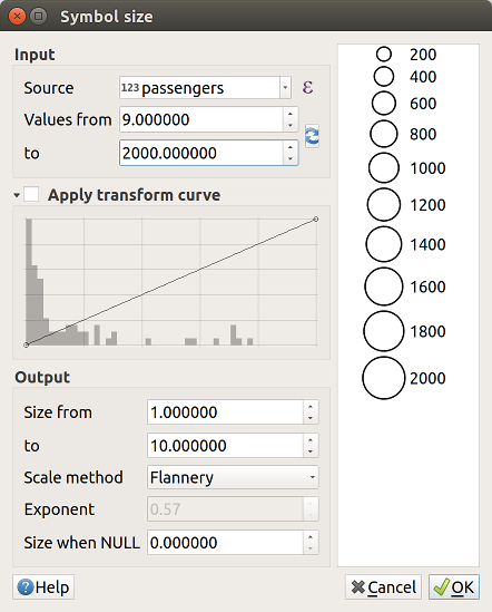
Abb. 14.6 Scaling airports size based on elevation of the airport
Mehrdimensionale Analyse erzeugen
Eine mehrdimensionale Analyse hilft Ihnen, die Beziehungen zwischen zwei oder mehr Variablen auszuwerten z. B. kann eine als Farbverlauf und die andere als Größe dargestellt werden.
The simplest way to create multivariate analysis in QGIS is to:
First apply a categorized or graduated rendering on a layer, using the same type of symbol for all the classes.
Then, apply a proportional symbology on the classes:
Click on the Change button above the classification frame: you get the The Symbol Selector dialog.
Rescale the size or width of the symbol layer using the
data defined override widget as seen above.
Like the proportional symbol, the scaled symbology can be added to the layer tree, on top of the categorized or graduated classes symbols using the data defined size legend feature. And both representation are also available in the print layout legend item.
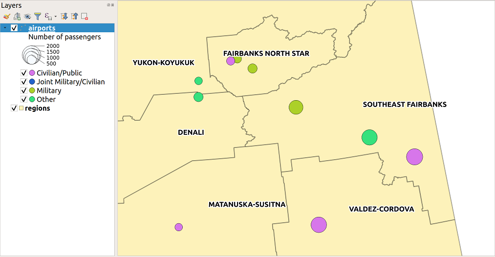
Abb. 14.7 Multivariate example with scaled size legend
Rule-based Renderer
The  Rule-based renderer is used to render
all the features from a layer,
using rule-based symbols whose aspect reflects the assignment of a selected
feature’s attribute to a class. The rules are based on SQL statements and can
be nested.
The dialog allows rule grouping by filter or scale, and you can decide
if you want to enable symbol levels or use only the first-matched rule.
Rule-based renderer is used to render
all the features from a layer,
using rule-based symbols whose aspect reflects the assignment of a selected
feature’s attribute to a class. The rules are based on SQL statements and can
be nested.
The dialog allows rule grouping by filter or scale, and you can decide
if you want to enable symbol levels or use only the first-matched rule.
To create a rule:
Activate an existing row by double-clicking it (by default, QGIS adds a symbol without a rule when the rendering mode is enabled) or click the
 Edit rule or Add rule button.
In the Edit Rule dialog that opens, you can define a label to help you identify each rule. This is the label that will be displayed in the Layers Panel and also in the print composer legend.
Manually enter an expression in the text box next to the
 Filter option or press the button next to it to open
the expression string builder dialog.
Filter option or press the button next to it to open
the expression string builder dialog.Use the provided functions and the layer attributes to build an expression to filter the features you’d like to retrieve. Press the Test button to check the result of the query.
You can enter a longer label to complete the rule description.
You can use the
 Scale Range option to set scales at which
the rule should be applied.
Scale Range option to set scales at which
the rule should be applied.Finally, configure the symbol to use for these features.
And press OK.
A new row summarizing the rule is added to the Layer Properties dialog. You can create as many rules as necessary following the steps above or copy pasting an existing rule. Drag-and-drop the rules on top of each other to nest them and refine the upper rule features in subclasses.
Selecting a rule, you can also organize its features in subclasses using the Refine selected rules drop-down menu. Automated rule refinement can be based on:
scales;
categories: applying a categorized renderer;
or ranges: applying a graduated renderer.
Refined classes appear like sub-items of the rule, in a tree hierarchy and like above, you can set symbology of each class.
In the Edit rule dialog, you can avoid writing all the rules and
make use of the  Else option to catch all the
features that do not match any of the other rules, at the same level. This
can also be achieved by writing
Else option to catch all the
features that do not match any of the other rules, at the same level. This
can also be achieved by writing Else in the Rule column of the
dialog.
Right-clicking over selected item(s) shows a contextual menu to:
Copy and Paste, a convenient way to create new item(s) based on existing item(s)
Copy Symbol and Paste Symbol, a convenient way to apply the item’s representation to others
Change Color… of the selected symbol(s)
Change Opacity… of the selected symbol(s)
Change Output Unit… of the selected symbol(s)
Change Width… of the selected line symbol(s)
Change Size… of the selected point symbol(s)
Change Angle… of the selected point symbol(s)
Refine Current Rule: open a submenu that allows to refine the current rule with scales, categories (categorized renderer) or Ranges (graduated renderer).
The created rules also appear in a tree hierarchy in the map legend. Double-click the rules in the map legend and the Symbology tab of the layer properties appears showing the rule that is the background for the symbol in the tree.
The example in Abb. 14.8 shows the rule-based rendering dialog for the rivers layer of the QGIS sample dataset.
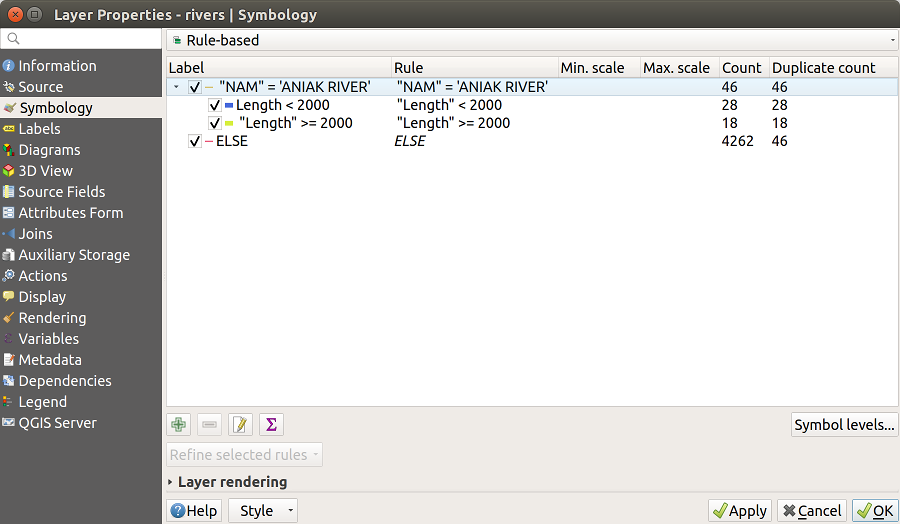
Abb. 14.8 Regelbasierte Symbolisierungsoptionen
Point displacement Renderer
The  Point Displacement renderer works to
visualize all features of a point layer, even if they have the same location.
To do this, the renderer takes the points falling in a given Distance
tolerance from each other and places them around their barycenter following
different Placement methods:
Point Displacement renderer works to
visualize all features of a point layer, even if they have the same location.
To do this, the renderer takes the points falling in a given Distance
tolerance from each other and places them around their barycenter following
different Placement methods:
Ring: places all the features on a circle whose radius depends on the number of features to display.
Concentric rings: uses a set of concentric circles to show the features.
Grid: generates a regular grid with a point symbol at each intersection.
The Center symbol widget helps you customize the symbol and color of the middle point. For the distributed points symbols, you can apply any of the No symbols, Single symbol, Categorized, Graduated or Rule-based renderer using the Renderer drop-down list and customize them using the Renderer Settings… button.
While the minimal spacing of the Displacement lines depends on the point symbol renderer’s, you can still customize some of its settings such as the Stroke width, Stroke color and Size adjustment (eg, to add more spacing between the rendered points).
Use the Labels group options to perform points labeling: the labels are placed near the displaced position of the symbol, and not at the feature real position. Other than the Label attribute, Label font and Label color, you can set the Minimum map scale to display the labels.
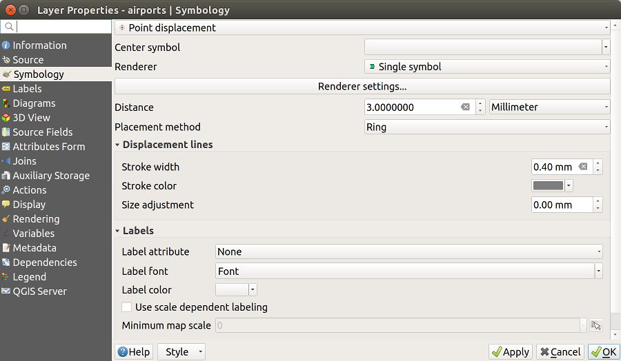
Abb. 14.9 Dialog Punktverdrängung
Bemerkung
Point Displacement renderer does not alter feature geometry, meaning that points are not moved from their position. They are still located at their initial place. Changes are only visual, for rendering purpose. Use instead the Processing Points displacement algorithm if you want to create displaced features.
Point Cluster Renderer
Unlike the Point Displacement renderer
which blows up nearest or overlaid point features placement, the  Point Cluster renderer groups nearby points into a single
rendered marker symbol. Based on a specified Distance, points
that fall within from each others are merged into a single symbol.
Points aggregation is made based on the closest group being formed, rather
than just assigning them the first group within the search distance.
Point Cluster renderer groups nearby points into a single
rendered marker symbol. Based on a specified Distance, points
that fall within from each others are merged into a single symbol.
Points aggregation is made based on the closest group being formed, rather
than just assigning them the first group within the search distance.
From the main dialog, you can:
set the symbol to represent the point cluster in the Cluster symbol; the default rendering displays the number of aggregated features thanks to the
@cluster_sizevariable on Font marker symbol layer.use the Renderer drop-down list to apply any of the other feature rendering types to the layer (single, categorized, rule-based…). Then, push the Renderer Settings… button to configure features‘ symbology as usual. Note that this renderer is only visible on features that are not clustered. Also, when the symbol color is the same for all the point features inside a cluster, that color sets the
@cluster_colorvariable of the cluster.
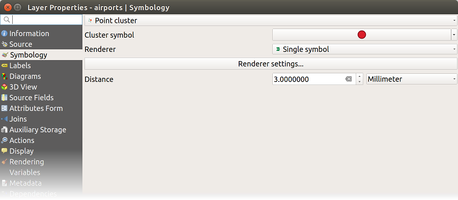
Abb. 14.10 Point Cluster dialog
Bemerkung
Point Cluster renderer does not alter feature geometry, meaning that points are not moved from their position. They are still located at their initial place. Changes are only visual, for rendering purpose. Use instead the Processing K-means clustering or DBSCAN clustering algorithm if you want to create cluster-based features.
Inverted Polygon Renderer
The  Inverted Polygon renderer allows user
to define a symbol to fill in
outside of the layer’s polygons. As above you can select subrenderers, namely
Single symbol, Graduated, Categorized, Rule-Based or 2.5D renderer.
Inverted Polygon renderer allows user
to define a symbol to fill in
outside of the layer’s polygons. As above you can select subrenderers, namely
Single symbol, Graduated, Categorized, Rule-Based or 2.5D renderer.
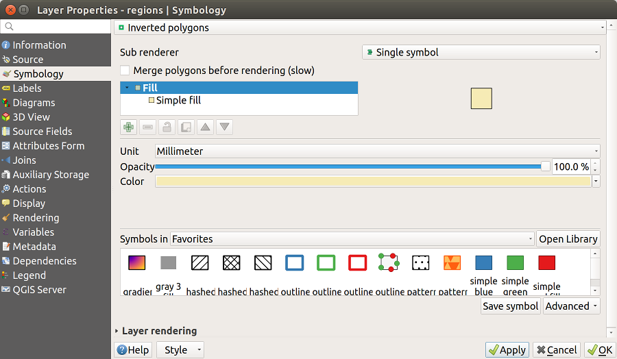
Abb. 14.11 Umgekehrte Polygone Dialog
Heatmap Renderer
With the  Heatmap renderer you can create live
dynamic heatmaps for (multi)point layers.
You can specify the heatmap radius in millimeters, points, pixels, map units or
inches, choose and edit a color ramp for the heatmap style and use a slider for
selecting a trade-off between render speed and quality. You can also define a
maximum value limit and give a weight to points using a field or an expression.
When adding or removing a feature the heatmap renderer updates the heatmap style
automatically.
Heatmap renderer you can create live
dynamic heatmaps for (multi)point layers.
You can specify the heatmap radius in millimeters, points, pixels, map units or
inches, choose and edit a color ramp for the heatmap style and use a slider for
selecting a trade-off between render speed and quality. You can also define a
maximum value limit and give a weight to points using a field or an expression.
When adding or removing a feature the heatmap renderer updates the heatmap style
automatically.
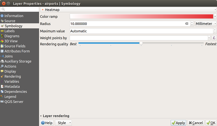
Abb. 14.12 Der Heatmap-Erweiterung Dialog
2.5D Renderer
Using the  2.5D renderer it’s possible to create
a 2.5D effect on your layer’s features.
You start by choosing a Height value (in map units). For that
you can use a fixed value, one of your layer’s fields, or an expression. You also
need to choose an Angle (in degrees) to recreate the viewer position
(0° means west, growing in counter clock wise). Use advanced configuration options
to set the Roof Color and Wall Color. If you would like
to simulate solar radiation on the features walls, make sure to check the
Shade walls based on aspect option. You can also
simulate a shadow by setting a Color and Size (in map
units).
2.5D renderer it’s possible to create
a 2.5D effect on your layer’s features.
You start by choosing a Height value (in map units). For that
you can use a fixed value, one of your layer’s fields, or an expression. You also
need to choose an Angle (in degrees) to recreate the viewer position
(0° means west, growing in counter clock wise). Use advanced configuration options
to set the Roof Color and Wall Color. If you would like
to simulate solar radiation on the features walls, make sure to check the
Shade walls based on aspect option. You can also
simulate a shadow by setting a Color and Size (in map
units).
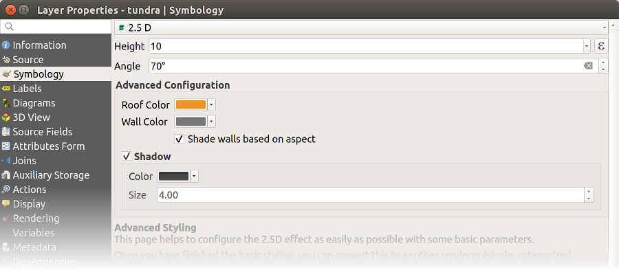
Abb. 14.13 2.5D dialog
Tipp
Using 2.5D effect with other renderers
Once you have finished setting the basic style on the 2.5D renderer, you can convert this to another renderer (single, categorized, graduated). The 2.5D effects will be kept and all other renderer specific options will be available for you to fine tune them (this way you can have for example categorized symbols with a nice 2.5D representation or add some extra styling to your 2.5D symbols). To make sure that the shadow and the „building“ itself do not interfere with other nearby features, you may need to enable Symbols Levels ( ). The 2.5D height and angle values are saved in the layer’s variables, so you can edit it afterwards in the variables tab of the layer’s properties dialog.
14.1.3.2. Layerdarstellung
From the Symbology tab, you can also set some options that invariably act on all features of the layer:
Opacity
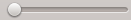 : You can make the underlying layer in
the map canvas visible with this tool. Use the slider to adapt the visibility
of your vector layer to your needs. You can also make a precise definition of
the percentage of visibility in the menu beside the slider.
: You can make the underlying layer in
the map canvas visible with this tool. Use the slider to adapt the visibility
of your vector layer to your needs. You can also make a precise definition of
the percentage of visibility in the menu beside the slider.Blending mode at the Layer and Feature levels: You can achieve special rendering effects with these tools that you may previously only know from graphics programs. The pixels of your overlaying and underlaying layers are mixed through the settings described in Mischmodi.
Wenden Sie Zeicheneffekte auf alle Layerobjekte an, mit dem Zeicheneffekte Knopf.
Control feature rendering order allows you, using features attributes, to define the z-order in which they shall be rendered. Activate the checkbox and click on the
 button beside.
You then get the Define Order dialog in which you:
button beside.
You then get the Define Order dialog in which you:Choose a field or build an expression to apply to the layer features.
Set in which order the fetched features should be sorted, i.e. if you choose Ascending order, the features with lower value are rendered under those with higher value.
Define when features returning NULL value should be rendered: first (bottom) or last (top).
Repeat the above steps as many times as rules you wish to use.
The first rule is applied to all the features in the layer, z-ordering them according to their returned value. Then, within each group of features with the same value (including those with NULL value) and thus the same z-level, the next rule is applied to sort them. And so on…
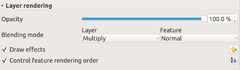
Abb. 14.14 Layerdarstellungsoptionen
14.1.3.3. Andere Einstellungen
Symbol levels
Für Renderer, die Symbollayer gestapelt ermöglichen (nur Heatmap nicht) gibt es eine Option, um die Darstellungsreihenfolge der einzelnen Symbolebenen zu steuern.
For most of the renderers, you can access the Symbols levels option by clicking the Advanced button below the saved symbols list and choosing Symbol levels. For the Rule-based Renderer the option is directly available through Symbols Levels… button, while for Point displacement Renderer renderer the same button is inside the Rendering settings dialog.
Um die Symbolebenen zu aktivieren, wählen Sie Symbolebenen aktivieren. Jede Reihe zeigt eine kleine Vorschau des kombinierten Symbols, seiner Beschriftung und die individuellen Symbollayer, unterteilt in verschiedene Spalten mit einer Nummer. Die Nummern zeigen die Darstellungsreihenfolge, in der die Symbollayer gezeichnet werden. Niedrige Werteebenen werden zuerst gezeichnet, liegen ganz unten, während höhere Werte als letztes gezeichnet werden und über den anderen liegen.
Abb. 14.15 Symbolebenen Dialog
Bemerkung
Wenn Symbolebenen deaktiviert werden, werden alle Symbole entsprechend ihren jeweiligen Objektreihenfolge gezeichnet. Überlappende Symbole werden einfach zu anderen darunter verschleiert. Außerdem „verschmelzen“ ähnliche Symbole nicht mit anderen.
Abb. 14.16 Unterschied von aktivierten (A) und deaktivierten (B) Symbolebenen
Data-defined size legend
When a layer is rendered with the proportional symbol or the multivariate rendering or when a scaled size diagram is applied to the layer, you can allow the display of the scaled symbols in both the Layers panel and the print layout legend.
To enable the Data-defined Size Legend dialog to render symbology, select the eponym option in the Advanced button below the saved symbols list. For diagrams, the option is available under the Legend tab. The dialog provides the following options to:
select the type of legend:
Legend not enabled,
Separated legend items and
Collapsed legend. For the latter option, you can select whether
the legend items are aligned at the Bottom or at the Center;set the symbol to use for legend representation;
insert the title in the legend;
resize the classes to use: by default, QGIS provides you with a legend of five classes (based on natural pretty breaks) but you can apply your own classification using the
Manual size classes option.
Use the and buttons to set your custom classes
values and labels.
A preview of the legend is displayed in the right panel of the dialog and updated as you set the parameters. For collapsed legend, a leader line from the horizontal center of the symbol to the corresponding legend text is drawn.
Abb. 14.17 Setting size scaled legend
Bemerkung
Currently, data-defined size legend for layer symbology can only be applied to point layer using single, categorized or graduated symbology.
Zeicheneffekte
Damit die Layerdarstellung verbessert und vermieden (oder zumindest reduziert) wird, dass andere Software auf die endgültige Darstellung der Karte umsortiert, bietet QGIS eine weitere leistungsfähige Funktionalität: Die Option  Zeicheneffekte, die zur Anpassung Zeicheneffekte für die Visualisierung von Vektorlayern hinzufügt.
The option is available in the dialog, under the Layer rendering group (applying to the whole layer) or in symbol layer properties (applying to corresponding features). You can combine both usage.
Paint effects can be activated by checking the Draw effects option
and clicking the Customize effects button. That will open
the Effect Properties Dialog (see Abb. 14.18). The following
effect types, with custom options are available:
Source: Draws the feature’s original style according to the configuration of the layer’s properties. The Opacity of its style can be adjusted as well as the Blend mode and Draw mode. These are common properties for all types of effects.

Abb. 14.18 Zeicheneffekte: Dialog Quelle
Blur: Adds a blur effect on the vector layer. The custom options that you can change are the Blur type (Stack blur (fast) or Gaussian blur (quality)) and the Blur strength.
Abb. 14.19 Zeicheneffekte: Dialog verwischen
Colorise: This effect can be used to make a version of the style using one single hue. The base will always be a grayscale version of the symbol and you can:
Use the
 Grayscale to select how to create it:
options are ‚By lightness‘, ‚By luminosity‘, ‚By average‘ and ‚Off‘.
Grayscale to select how to create it:
options are ‚By lightness‘, ‚By luminosity‘, ‚By average‘ and ‚Off‘.If
Colorise is selected, it will be possible to mix
another color and choose how strong it should be.Control the Brightness, Contrast and Saturation levels of the resulting symbol.
Abb. 14.20 Zeicheneffekte: Dialog einfärben
Drop Shadow: Using this effect adds a shadow on the feature, which looks like adding an extra dimension. This effect can be customized by changing the Offset angle and distance, determining where the shadow shifts towards to and the proximity to the source object. also has the option to change the Blur radius and the Color of the effect.
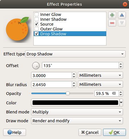
Abb. 14.21 Zeicheneffekte: Dialog Schattenwurf
Inner Shadow: This effect is similar to the Drop Shadow effect, but it adds the shadow effect on the inside of the edges of the feature. The available options for customization are the same as the Drop Shadow effect.
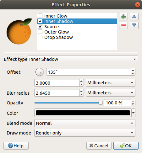
Abb. 14.22 Zeicheneffekte: Dialog Innerer Schatten
Inner Glow: Adds a glow effect inside the feature. This effect can be customized by adjusting the Spread (width) of the glow, or the Blur radius. The latter specifies the proximity from the edge of the feature where you want any blurring to happen. Additionally, there are options to customize the color of the glow using a Single color or a Color ramp.
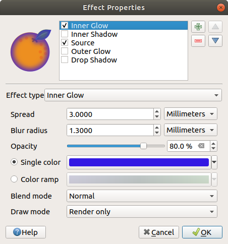
Abb. 14.23 Zeicheneffekte: Dialog Inneres Glühen
Outer Glow: This effect is similar to the Inner Glow effect, but it adds the glow effect on the outside of the edges of the feature. The available options for customization are the same as the Inner Glow effect.
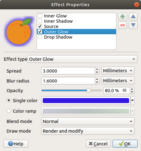
Abb. 14.24 Zeicheneffekte: Dialog Äußeres Glühen
Transform: Adds the possibility of transforming the shape of the symbol. The first options available for customization are the Reflect horizontal and Reflect vertical, which actually create a reflection on the horizontal and/or vertical axes. The other options are:
Shear X,Y: Slants the feature along the X and/or Y axis.
Scale X,Y: Enlarges or minimizes the feature along the X and/or Y axis by the given percentage.
Rotation: Turns the feature around its center point.
and Translate X,Y changes the position of the item based on a distance given on the X and/or Y axis.
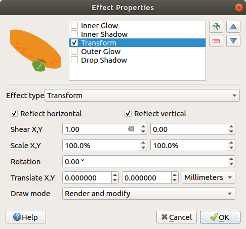
Abb. 14.25 Zeicheneffekte: Dialog transformieren
One or more effect types can be used at the same time. You (de)activate an effect
using its checkbox in the effects list. You can change the selected effect type by
using the Effect type option. You can reorder the effects
using  Move up and
  Move down
buttons, and also add/remove effects using the Add new effect
and Remove effect buttons.
Move down
buttons, and also add/remove effects using the Add new effect
and Remove effect buttons.
There are some common options available for all draw effect types. Opacity and Blend mode options work similar to the ones described in Layerdarstellung and can be used in all draw effects except for the transform one.
There is also a Draw mode option available for
every effect, and you can choose whether to render and/or modify the
symbol, following some rules:
Effects render from top to bottom.
Render only mode means that the effect will be visible.
Modifier only mode means that the effect will not be visible but the changes that it applies will be passed to the next effect (the one immediately below).
The Render and Modify mode will make the effect visible and pass any changes to the next effect. If the effect is at the top of the effects list or if the immediately above effect is not in modify mode, then it will use the original source symbol from the layers properties (similar to source).
14.1.4. Labels Properties
The  Labels properties provides you with all the needed
and appropriate capabilities to configure smart labeling on vector layers. This
dialog can also be accessed from the Layer Styling panel, or using
the Layer Labeling Options button of the Labels toolbar.
Labels properties provides you with all the needed
and appropriate capabilities to configure smart labeling on vector layers. This
dialog can also be accessed from the Layer Styling panel, or using
the Layer Labeling Options button of the Labels toolbar.
The first step is to choose the labeling method from the drop-down list. Available methods are:
 No labels: the default value, showing no labels
from the layer
No labels: the default value, showing no labels
from the layer- Single labels: Show labels on the map using a single
attribute or an expression
and
 Blocking: allows to set a layer as just an
obstacle for other layer’s labels without rendering any labels of its own.
Blocking: allows to set a layer as just an
obstacle for other layer’s labels without rendering any labels of its own.
The next steps assume you select the Single labels
option, opening the following dialog.
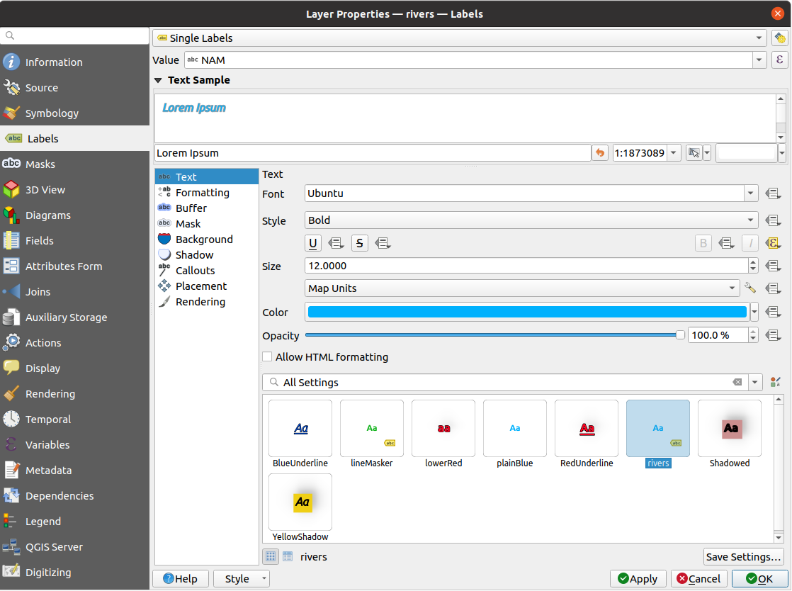
Abb. 14.26 Layer labeling settings - Single labels
At the top of the dialog, a Value drop-down list is enabled.
You can select an attribute column to use for labeling. By default, the
display field is used. Click if you want to define
labels based on expressions - See Ausdrucksbasierte Beschriftungen definieren.
Below are displayed options to customize the labels, under various tabs:


Description of how to set each property is exposed at Setting a label.
14.1.4.1. Setting the automated placement engine
You can use the automated placement settings to configure a project-level
automated behavior of the labels. In the top right corner of the
Labels tab, click the  Automated placement
settings (applies to all layers) button, opening a dialog with the following
options:
Automated placement
settings (applies to all layers) button, opening a dialog with the following
options:
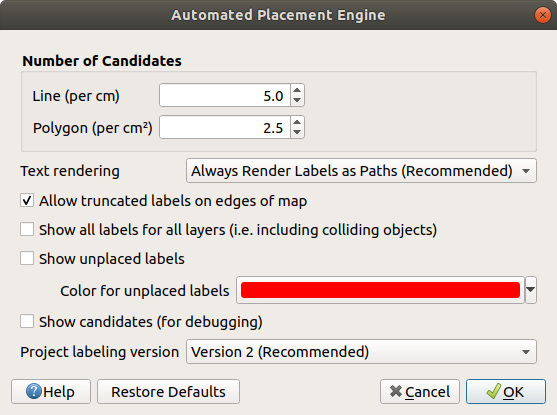
Abb. 14.27 The labels automated placement engine
Number of candidates: calculates and assigns to line and polygon features the number of possible labels placement based on their size. The longer or wider a feature is, the more candidates it has, and its labels can be better placed with less risk of collision.
Text rendering: sets the default value for label rendering widgets when exporting a map canvas or a layout to PDF or SVG. If Always render labels as text is selected then labels can be edited in external applications (e.g. Inkscape) as normal text. BUT the side effect is that the rendering quality is decreased, and there are issues with rendering when certain text settings like buffers are in place. That’s why Always render labels as paths (recommended) which exports labels as outlines, is recommended.
- Allow truncated labels on edges of map: controls
whether labels which fall partially outside of the map extent should be
rendered. If checked, these labels will be shown (when there’s no way to
place them fully within the visible area). If unchecked then partially
visible labels will be skipped. Note that this setting has no effects on
labels‘ display in the layout map item.
- Show all labels for all layers (i.e. including
colliding objects). Note that this option can be also set per layer (see
Rendering tab)
- Show unplaced labels: allows to determine whether any
important labels are missing from the maps (e.g. due to overlaps or other
constraints). They are displayed using a customizable color.
- Show candidates (for debugging): controls whether boxes
should be drawn on the map showing all the candidates generated for label placement.
Like the label says, it’s useful only for debugging and testing the effect different
labeling settings have. This could be handy for a better manual placement with
tools from the label toolbar.
Project labeling version: QGIS supports two different versions of label automatic placement:
Version 1: the old system (used by QGIS versions 3.10 and earlier, and when opening projects created in these versions in QGIS 3.12 or later). Version 1 treats label and obstacle priorities as „rough guides“ only, and it’s possible that a low-priority label will be placed over a high-priority obstacle in this version. Accordingly, it can be difficult to obtain the desired labeling results when using this version and it is thus recommended only for compatibility with older projects.
Version 2 (recommended): this is the default system in new projects created in QGIS 3.12 or later. In version 2, the logic dictating when labels are allowed to overlap obstacles has been reworked. The newer logic forbids any labels from overlapping any obstacles with a greater obstacle weight compared to the label’s priority. As a result, this version results in much more predictable and easier to understand labeling results.
14.1.4.2. Regelbasierte Beschriftung
With rule-based labeling multiple label configurations can be defined and applied selectively on the base of expression filters and scale range, as in Rule-based rendering.
To create a rule, select the  Rule-based labeling option in the main
drop-down list from the Labels tab and click the button
at the bottom of the dialog. Then fill the new dialog with a description and an
expression to filter features. You can also set a scale range in which the label rule should be applied. The other
options available in this dialog are the common settings
seen beforehand.
Rule-based labeling option in the main
drop-down list from the Labels tab and click the button
at the bottom of the dialog. Then fill the new dialog with a description and an
expression to filter features. You can also set a scale range in which the label rule should be applied. The other
options available in this dialog are the common settings
seen beforehand.
Abb. 14.28 Regeleigenschaften
A summary of existing rules is shown in the main dialog (see Abb. 14.29).
You can add multiple rules, reorder or imbricate them with a drag-and-drop.
You can as well remove them with the button or edit them with
button or a double-click.
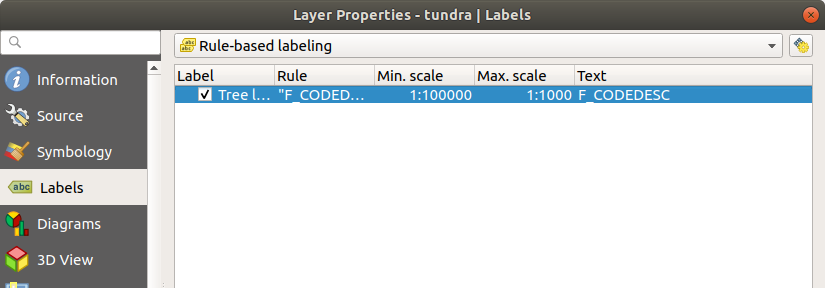
Abb. 14.29 Regelbasierte Beschriftung Bedienfelder
14.1.4.3. Ausdrucksbasierte Beschriftungen definieren
Whether you choose single or rule-based labeling type, QGIS allows using expressions to label features.
Assuming you are using the Single labels method, click the
button near the Value drop-down list in the
Labels tab of the properties dialog.
In Abb. 14.30, you see a sample expression to label the alaska
trees layer with tree type and area, based on the field ‚VEGDESC‘, some
descriptive text, and the function $area in combination with
format_number() to make it look nicer.
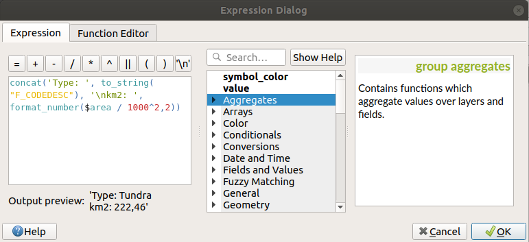
Abb. 14.30 Ausdrücke für das Beschriften verwenden
Expression based labeling is easy to work with. All you have to take care of is that:
You may need to combine all elements (strings, fields, and functions) with a string concatenation function such as
concat,+or||. Be aware that in some situations (when null or numeric value are involved) not all of these tools will fit your need.Strings are written in ‚single quotes‘.
Fields are written in „double quotes“ or without any quote.
Schauen wir uns einige Beispiele an:
Label based on two fields ‚name‘ and ‚place‘ with a comma as separator:
"name" || ', ' || "place"
Returns:
John Smith, Paris
Label based on two fields ‚name‘ and ‚place‘ with other texts:
'My name is ' + "name" + 'and I live in ' + "place"
'My name is ' || "name" || 'and I live in ' || "place"
concat('My name is ', name, ' and I live in ', "place")
Returns:
My name is John Smith and I live in Paris
Label based on two fields ‚name‘ and ‚place‘ with other texts combining different concatenation functions:
concat('My name is ', name, ' and I live in ' || place)Returns:
My name is John Smith and I live in Paris
Or, if the field ‚place‘ is NULL, returns:
My name is John Smith
Multi-line label based on two fields ‚name‘ and ‚place‘ with a descriptive text:
concat('My name is ', "name", '\n' , 'I live in ' , "place")Returns:
My name is John Smith
I live in Paris
Label based on a field and the $area function to show the place’s name and its rounded area size in a converted unit:
'The area of ' || "place" || ' has a size of '
|| round($area/10000) || ' ha'
Returns:
The area of Paris has a size of 10500 ha
Create a CASE ELSE condition. If the population value in field population is <= 50000 it is a town, otherwise it is a city:
concat('This place is a ',
CASE WHEN "population" <= 50000 THEN 'town' ELSE 'city' END)
Returns:
This place is a town
Display name for the cities and no label for the other features (for the „city“ context, see example above):
CASE WHEN "population" > 50000 THEN "NAME" END
Returns:
Paris
Wie Sie im Ausdruckeditor sehen können stehen Ihnen hunderte von Funktionen zur Verfügung um einfache und sehr komplexe Ausdrücke zumBeschriften Ihrer Daten in QGIS zu erstellen. Siehe das Ausdrücke Kapitel für weitere Informationen und ein Beispiel zu Ausdrücken.
14.1.4.4. Datendefinierte Übersteuerung für das Beschriften
With the Data defined override function, the settings for
the labeling are overridden by entries in the attribute table or expressions
based on them. This feature can be used to
set values for most of the labeling options described above.
For example, using the Alaska QGIS sample dataset, let’s label the airports
layer with their name, based on their militarian USE, i.e. whether the airport
is accessible to :
military people, then display it in gray color, size 8;
others, then show in blue color, size 10.
To do this, after you enabled the labeling on the NAME field of the layer
(see Setting a label):
Activate the Text tab.
Click on the
icon next to the Size property.Select Edit… and type:
CASE
  WHEN "USE" like '%Military%' THEN 8 -- because compatible values are 'Military'
                                      -- and 'Joint Military/Civilian'
  ELSE 10
END
Press OK to validate. The dialog closes and the
button
becomes  meaning that an rule is being run.
Then click the button next to the color property, type the expression below and validate:
CASE
  WHEN "USE" like '%Military%' THEN '150, 150, 150'
  ELSE '0, 0, 255'
END
Likewise, you can customize any other property of the label, the way you want.
See more details on the Data-define override widget’s
description and manipulation in Datendefinierte Übersteuerung Setup section.
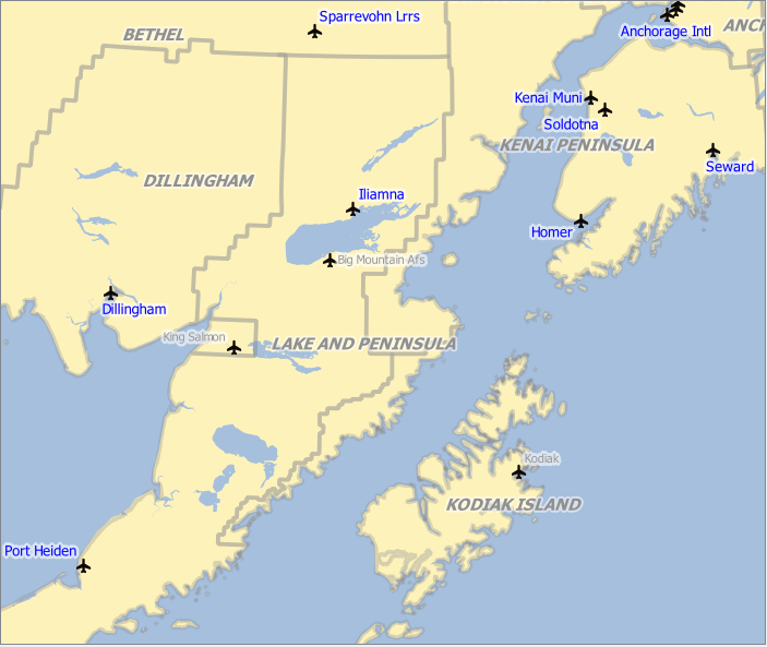
Abb. 14.31 Airports labels are formatted based on their attributes
Tipp
Use the data-defined override to label every part of multi-part features
There is an option to set the labeling for multi-part features independently from
your label properties. Choose the  Rendering,
Feature options, go to the Data-define override button
next to the checkbox Label every part of multipart-features
and define the labels as described in Datendefinierte Übersteuerung Setup.
The Label Toolbar
The Label Toolbar provides some tools to manipulate
label or  diagram
properties.
diagram
properties.
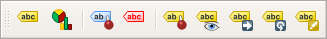
Abb. 14.32 The Label toolbar
While for readability, label has been used below to describe the Label
toolbar, note that when mentioned in their name, the tools work almost the
same way with diagrams:
 Highlight Pinned Labels and Diagrams. If the
vector layer of the label is editable, then the highlighting is green,
otherwise it’s blue.
Highlight Pinned Labels and Diagrams. If the
vector layer of the label is editable, then the highlighting is green,
otherwise it’s blue. Toggles Display of Unplaced Labels: Allows to
determine whether any important labels are missing from the maps (e.g. due
to overlaps or other constraints). They are displayed with a customizable
color (see Setting the automated placement engine).
Toggles Display of Unplaced Labels: Allows to
determine whether any important labels are missing from the maps (e.g. due
to overlaps or other constraints). They are displayed with a customizable
color (see Setting the automated placement engine). Pin/Unpin Labels and Diagrams. By clicking or draging an
area, you pin label(s). If you click or drag an area holding Shift,
label(s) are unpinned. Finally, you can also click or drag an area holding
Ctrl to toggle the pin status of label(s).
Pin/Unpin Labels and Diagrams. By clicking or draging an
area, you pin label(s). If you click or drag an area holding Shift,
label(s) are unpinned. Finally, you can also click or drag an area holding
Ctrl to toggle the pin status of label(s). Show/Hide Labels and Diagrams. If you click on the labels,
or click and drag an area holding Shift, they are hidden.
When a label is hidden, you just have to click on the feature to restore its
visibility. If you drag an area, all the labels in the area will be restored.
Show/Hide Labels and Diagrams. If you click on the labels,
or click and drag an area holding Shift, they are hidden.
When a label is hidden, you just have to click on the feature to restore its
visibility. If you drag an area, all the labels in the area will be restored. Moves a Label or Diagram. You just have to drag the label to
the desired place.
Moves a Label or Diagram. You just have to drag the label to
the desired place. Rotates a Label. Click the label and move around and
you get the text rotated.
Rotates a Label. Click the label and move around and
you get the text rotated. Change Label Properties. It opens a dialog to change the
clicked label properties; it can be the label itself, its coordinates, angle,
font, size, multiline alignment … as long as this property has been mapped
to a field. Here you can set the option to Label every
part of a feature.
Change Label Properties. It opens a dialog to change the
clicked label properties; it can be the label itself, its coordinates, angle,
font, size, multiline alignment … as long as this property has been mapped
to a field. Here you can set the option to Label every
part of a feature.
Warnung
Label tools overwrite current field values
Using the Label toolbar to customize the labeling actually writes the new value of the property in the mapped field. Hence, be careful to not inadvertently replace data you may need later!
Bemerkung
The Auxiliary Storage Properties mechanism may be used to customize labeling (position, and so on) without modifying the underlying data source.
Customize the labels from the map canvas
Combined with the Label Toolbar, the data defined override setting
helps you manipulate labels in the map canvas (move, edit, rotate).
We now describe an example using the data-defined override function for the
Move label function (see Abb. 14.33).
Importieren Sie
lakes.shpaus dem QGIS Beispieldatensatz.Doppelklicken Sie den Layer um die Layereigenschaften zu öffnen. Klicken Sie auf Beschriftungen und Platzierung. Wählen Sie
Abstand vom Punkt.Look for the Data defined entries. Click the
icon
to define the field type for the Coordinate. Choose xlabelfor X andylabelfor Y. The icons are now highlighted in yellow.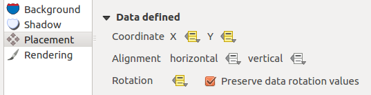
Abb. 14.33 Das Beschriften von Polygonlayern mit datendefinierter Übersteuerung
Zoomen Sie auf einen See.
Set editable the layer using the
 Toggle Editing button.
Go to the Label toolbar and click the
icon.
Now you can shift the label manually to another position (see Abb. 14.34).
The new position of the label is saved in the xlabelandylabelcolumns of the attribute table.It’s also possible to add a line connecting each lake to its moved label using:
the label’s callout property
or the geometry generator symbol layer with the expression below:
make_line( centroid( $geometry ), make_point( "xlabel", "ylabel" ) )
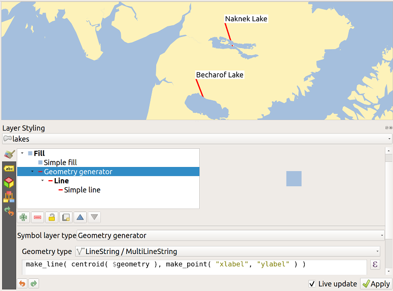
Abb. 14.34 Moved labels
Bemerkung
The Auxiliary Storage Properties mechanism may be used with data-defined properties without having an editable data source.
14.1.5. Diagrams Properties
The Diagrams tab allows you to add a graphic overlay to
a vector layer (see Abb. 14.35).
Die aktuelle Kernimplementation von Diagrammen bietet Unterstützung von:
 No diagrams: the default value with no diagram
displayed over the features;
No diagrams: the default value with no diagram
displayed over the features; Pie chart, a circular statistical graphic divided into
slices to illustrate numerical proportion. The arc length of each slice is
proportional to the quantity it represents;
Pie chart, a circular statistical graphic divided into
slices to illustrate numerical proportion. The arc length of each slice is
proportional to the quantity it represents; Text diagram, a horizontaly divided circle showing statistics
values inside;
Text diagram, a horizontaly divided circle showing statistics
values inside; Histogram, bars of varying colors for each attribute
aligned next to each other
Histogram, bars of varying colors for each attribute
aligned next to each other Stacked bars, Stacks bars of varying colors for each
attribute on top of each other vertically or horizontally
Stacked bars, Stacks bars of varying colors for each
attribute on top of each other vertically or horizontally
In the top right corner of the Diagrams tab, the
Automated placement settings (applies to all layers) button provides
means to control diagram labels placement on the
map canvas.
Tipp
Switch quickly between types of diagrams
Given that the settings are almost common to the different types of diagram, when designing your diagram, you can easily change the diagram type and check which one is more appropriate to your data without any loss.
For each type of diagram, the properties are divided into several tabs:
14.1.5.1. Attribute
Attribute`definiert, welche Variablen in dem Diagramm gezeigt werden. Nutzen Sie den :sup:`Objekt hinzufügen Knopf um das gewünschte Feld in das ‚Zugeordnete Attribut‘ Bedienfeld zu schieben. Erzeugte Attribute mit den Ausdrücke können auch genutzt werden.
You can move up and down any row with click and drag, sorting how attributes are displayed. You can also change the label in the ‚Legend‘ column or the attribute color by double-clicking the item.
This label is the default text displayed in the legend of the print layout or of the layer tree.
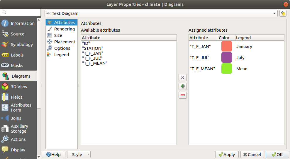
Abb. 14.35 Diagram properties - Attributes tab
14.1.5.2. Layeranzeige kontrollieren
Rendering defines how the diagram looks like. It provides general settings that do not interfere with the statistic values such as:
the graphic’s opacity, its outline width and color;
depending on the type of diagram:
for histogram and stacked bars, the width of the bar and the spacing between the bars. You may want to set the spacing to
0for stacked bars. Moreover, the Axis line symbol can be made visible on the map canvas and customized using line symbol properties.for text diagram, the circle background color and the font used for texts;
for pie charts, the Start angle of the first slice and their Direction (clockwise or not).
the use of paint effects on the graphics.
In this tab, you can also manage and fine tune the diagram visibility with different options:
Diagram z-index: controls how diagrams are drawn on top of each other and on top of labels. A diagram with a high index is drawn over diagrams and labels;
- Show all diagrams: shows all the diagrams even if they
overlap each other;
Show diagram: allows only specific diagrams to be rendered;
Always Show: selects specific diagrams to always render, even when they overlap other diagrams or map labels;
setting the Scale dependent visibility;
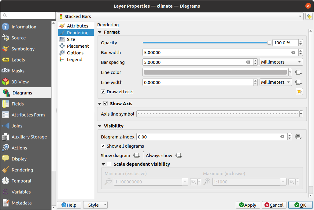
Abb. 14.36 Diagram properties - Rendering tab
14.1.5.3. Größe
Size is the main tab to set how the selected statistics are represented. The diagram size units can be ‚Millimeters‘, ‚Points‘, ‚Pixels‘, ‚Map Units‘ or ‚Inches‘. You can use:
Fixed size, a unique size to represent the graphic of all the features (not available for histograms)
or Scaled size, based on an expression using layer attributes:
In Attribute, select a field or build an expression
Press Find to return the Maximum value of the attribute or enter a custom value in the widget.
For histogram and stacked bars, enter a Bar length value, used to represent the Maximum value of the attributes. For each feature, the bar lenght will then be scaled linearly to keep this matching.
For pie chart and text diagram, enter a Size value, used to represent the Maximum value of the attributes. For each feature, the circle area or diameter will then be scaled linearly to keep this matching (from
0). A Minimum size can however be set for small diagrams.
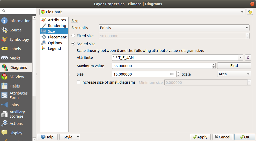
Abb. 14.37 Diagram properties - Size tab
14.1.5.4. Platzierung
Placement defines the diagram position. Depending on the layer geometry type, it offers different options for the placement (more details at Placement):
Around point or Over point for point geometry. The former variable requires a radius to follow.
Around line or Over line for line geometry. Like point feature, the first variable requires a distance to respect and you can specify the diagram placement relative to the feature (‚above‘, ‚on‘ and/or ‚below‘ the line) It’s possible to select several options at once. In that case, QGIS will look for the optimal position of the diagram. Remember that you can also use the line orientation for the position of the diagram.
Around centroid (at a set Distance), Over centroid, Using perimeter and Inside polygon are the options for polygon features.
The Coordinate group provides direct control on diagram placement, on a feature-by-feature basis, using their attributes or an expression to set the X and Y coordinate. The information can also be filled using the Move labels and diagrams tool.
In the Priority section, you can define the placement priority rank of each diagram, ie if there are different diagrams or labels candidates for the same location, the item with the higher priority will be displayed and the others could be left out.
Discourage diagrams and labels from covering features defines features to use as obstacles, ie QGIS will try to not place diagrams nor labels over these features. The priority rank is then used to evaluate whether a diagram could be omitted due to a greater weighted obstacle feature.
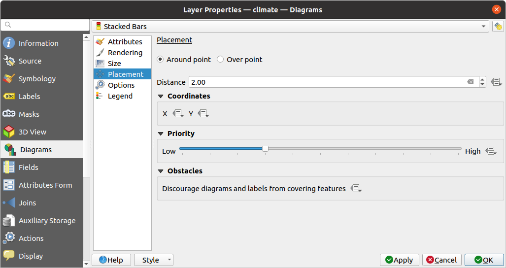
Abb. 14.38 Vector properties dialog with diagram properties, Placement tab
14.1.5.5. Optionen
The Options tab has settings for histograms and stacked bars. You can choose whether the Bar orientation should be Up, Down, Right or Left, for horizontal and vertical diagrams.
14.1.5.6. Legend
From the Legend tab, you can choose to display items of the diagram in the Layers panel, and in the print layout legend, next to the layer symbology:
check Show legend entries for diagram attributes to display in the legends the
ColorandLegendproperties, as previously assigned in the Attributes tab;and, when a scaled size is being used for the diagrams, push the Legend Entries for Diagram Size… button to configure the diagram symbol aspect in the legends. This opens the Data-defined Size Legend dialog whose options are described in Data-defined size legend.
When set, the diagram legend items (attributes with color and diagram size) are also displayed in the print layout legend, next to the layer symbology.
14.1.6. Masks Properties
 The Masks tab helps you configure the current layer
symbols overlay with other symbol layers or labels, from any layer.
This is meant to improve the readability of symbols and labels whose colors
are close and can be hard to decipher when overlapping; it adds a custom and
transparent mask around the items to „hide“ parts of the symbol layers of
the current layer.
The Masks tab helps you configure the current layer
symbols overlay with other symbol layers or labels, from any layer.
This is meant to improve the readability of symbols and labels whose colors
are close and can be hard to decipher when overlapping; it adds a custom and
transparent mask around the items to „hide“ parts of the symbol layers of
the current layer.
To apply masks on the active layer, you first need to enable in the project either mask symbol layers or mask labels. Then, from the Masks tab, check:
the Masked symbol layers: lists in a tree structure all the symbol layers of the current layer. There you can select the symbol layer item you would like to transparently „cut out“ when they overlap the selected mask sources
the Mask sources tab: list all the mask labels and mask symbol layers defined in the project. Select the items that would generate the mask over the selected masked symbol layers
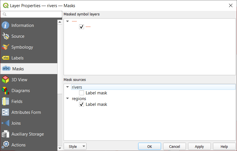
Abb. 14.39 Layer properties - Masks tab
14.1.7. 3D View Properties
 The 3D View tab provides settings for vector layers that should
be depicted in the 3D Map view tool.
The 3D View tab provides settings for vector layers that should
be depicted in the 3D Map view tool.
For better performance, data from vector layers are loaded in the background, using multithreading, and rendered in tiles whose size can be controlled from the Layer rendering section of the tab:
Zoom levels count: determines how deep the quadtree will be. For example, one zoom level means there will be a single tile for the whole layer. Three zoom levels means there will be 16 tiles at the leaf level (every extra zoom level multiplies that by 4). The default is
3and the maximum is8.- Show bounding boxes of tiles: especially useful if
there are issues with tiles not showing up when they should
To display a layer in 3D, select from the combobox at the top of the tab, either:
Single symbol: features are rendered using a common 3D symbol whose properties can be data-defined or not. Read details on setting a 3D symbol for each layer geometry type.
Rule-based: multiple symbol configurations can be defined and applied selectively based on expression filters and scale range. More details on how-to at Rule-based rendering.
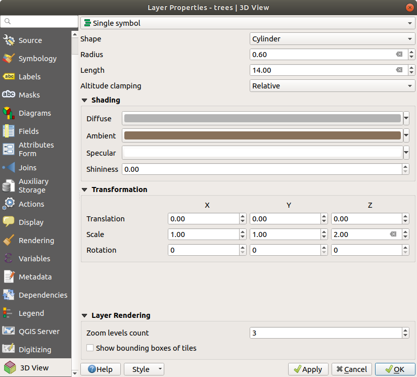
Abb. 14.40 3D properties of a point layer
14.1.8. Fields Properties
 The Fields tab provides information on
fields related to the layer and helps you organize them.
The Fields tab provides information on
fields related to the layer and helps you organize them.
The layer can be made editable using the
Toggle editing mode. At this moment, you can modify its structure using
the  New field and
  Delete field
buttons.
Delete field
buttons.
You can also rename fields by double-clicking its name. This is only supported for data providers like PostgreSQL, Oracle, Memory layer and some OGR layer depending on the OGR data format and version.
If set in the underlying data source or in the forms properties, the field’s alias is also displayed. An alias is a human readable field name you can use in the feature form or the attribute table. Aliases are saved in the project file.
Depending on the data provider, you can associate a comment with a field, for example at its creation. This information is retrieved and shown in the Comment column and is later displayed when hovering over the field label in a feature form.
Other than the fields contained in the dataset, virtual fields and Auxiliary Storage included, the Fields tab also lists fields from any joined layers. Depending on the origin of the field, a different background color is applied to it.
For each listed field, the dialog also lists read-only characteristics such as
its type, type name, length and precision. When serving the
layer as WMS or WFS, you can also check here which fields could be retrieved.
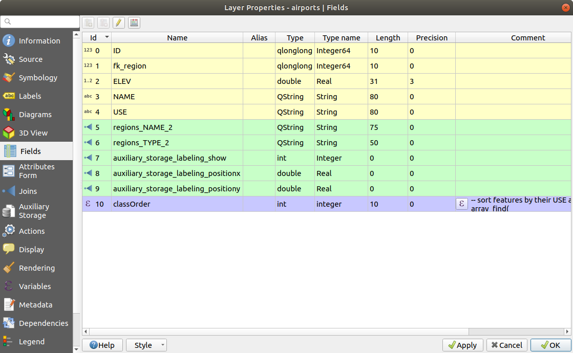
Abb. 14.41 Fields properties tab
14.1.9. Attributes Form Properties
 The Attributes Form tab helps you set up the form to
display when creating new features or querying existing one. You can define:
The Attributes Form tab helps you set up the form to
display when creating new features or querying existing one. You can define:
the look and the behavior of each field in the feature form or the attribute table (label, widget, constraints…);
the form’s structure (custom or autogenerated):
extra logic in Python to handle interaction with the form or field widgets.
At the top right of the dialog, you can set whether the form is opened by default when creating new features. This can be configured per layer or globally with the Suppress attribute form pop-up after feature creation option in the menu.
14.1.9.1. Customizing a form for your data
By default, when you click on a feature with the  Identify
Features tool or switch the attribute table to the form view mode, QGIS
displays a basic form with predefined widgets (generally spinboxes and
textboxes — each field is represented on a dedicated row by its label next
to the widget). If relations are set on the layer,
fields from the referencing layers are shown in an embedded frame
at the bottom of the form, following the same basic structure.
Identify
Features tool or switch the attribute table to the form view mode, QGIS
displays a basic form with predefined widgets (generally spinboxes and
textboxes — each field is represented on a dedicated row by its label next
to the widget). If relations are set on the layer,
fields from the referencing layers are shown in an embedded frame
at the bottom of the form, following the same basic structure.
This rendering is the result of the default Autogenerate value of the
Attribute editor layout setting in the tab. This property holds three different
values:
Autogenerate: keeps the basic structure of „one row - one field“ for the form but allows to customize each corresponding widget.Drag-and-drop designer: other than widget customization, the form structure can be made more complex eg, with widgets embedded in groups and tabs.Provide ui file: allows to use a Qt designer file, hence a potentially more complex and fully featured template, as feature form.
The autogenerated form
When the Autogenerate option is on, the Available widgets panel
shows lists of fields (from the layer and its relations) that would be shown in
the form. Select a field and you can configure its appearance and behavior in
the right panel:
adding custom label and automated checks to the field;
setting a particular widget to use.
The drag and drop designer
The drag and drop designer allows you to create a form with several containers (tabs or groups) to present the attribute fields, as shown for example in Abb. 14.42.
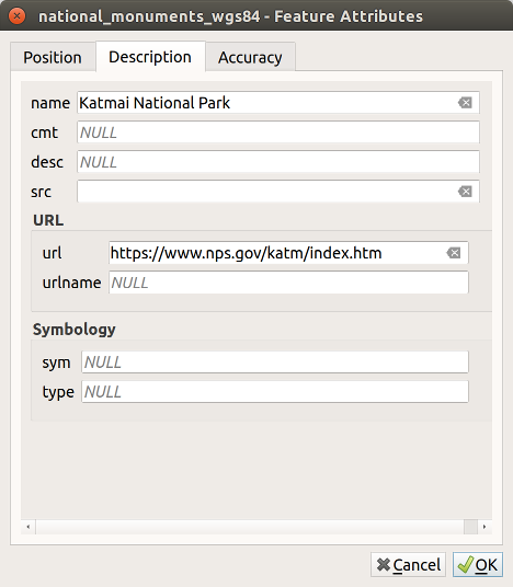
Abb. 14.42 Das Ergebnis eines integrierten Formulars mit Reitern und benannten Gruppen
Choose
Drag and drop designerfrom the Select attribute layout editor combobox. This enables the Form Layout panel next to the Available widgets panel, filled with existing fields. The selected field displays its properties in a third panel.Select fields you do not want to use in your Form Layout panel and hit the
button to remove them. Drag and drop fields
from the other panel to re-add them. The same field can be added multiple times.Drag and drop fields within the Form Layout panel to reorder their position.
Add containers (tab or group frames) to associate fields that belong to the same category and better structure the form.
The first step is to use the
icon to create a tab in which
fields and groups will be displayedThen set the properties of the container, ie:
the name
the type, ie a tab or a group in container (a group inside a tab or another group)
and the number of columns the embedded fields should be distributed over
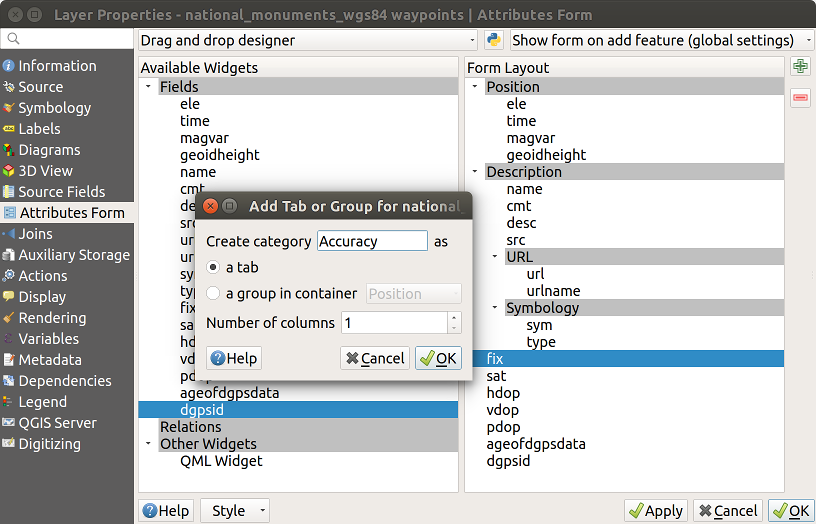
Abb. 14.43 Dialog to create containers with the Attribute editor layout
These, and other properties can later be updated by selecting the item and, from the third panel:
hide or show the container’s label
display the container as a group box (only available for tabs).
rename the container
set the number of columns
enter an expression to control the container’s visibility. The expression will be re-evaluated every time values in the form change, and the tab or group box shown/hidden accordingly
add a background color
You can create as many containers as you want; press the
icon again to create another tab or a group frame under
an existing tab.
The next step is to assign the relevant fields to each container, by simple drag and drop. Groups and tabs can also be moved in the same way.
Customize the widget of the fields in use
In case the layer is involved in a one or many to many relation, drag-and-drop the relation name from the Available widgets panel to the Form Layout panel. The associated layer attribute form will be embedded at the chosen place in the current layer’s form. As for the other items, select the relation label to configure some properties:
hide or show the relation label
show the link button
show the unlink button
Apply the layer’s properties dialog
Open a feature attribute form (eg, using the
Identify features
tool) and it should display the new form.
Using custom ui-file
The Provide ui-file option allows you to use complex dialogs made with
Qt-Designer. Using a UI-file allows a great deal of freedom in creating a
dialog. Note that, in order to link the graphical objects (textbox,
combobox…) to the layer’s fields, you need to give them the same name.
Use the Edit UI to define the path to the file to use.
UI-files can also be hosted on a remote server. In this case, you provide the URL of the form instead of the file path in Edit UI.
You’ll find some example in the Creating a new form lesson of the QGIS Übungshandbuch. For more advanced information, see https://woostuff.wordpress.com/2011/09/05/qgis-tips-custom-feature-forms-with-python-logic/.
Enhance your form with custom functions
QGIS forms can have a Python function that is called when the dialog is opened. Use this function to add extra logic to your dialogs. The form code can be specified in three different ways:
load from the environment: use a function, for example instartup.pyor from an installed pluginload from an external file: a file chooser will let you select a Python file from your filesystem or enter a URL for a remote file.provide code in this dialog: a Python editor will appear where you can directly type the function to use.
In all cases you must enter the name of the function that will be called
(open in the example below).
Ein Beispiel ist (im Modul MyForms.py):
def open(dialog,layer,feature):
    geom = feature.geometry()
    control = dialog.findChild(QWidget,"My line edit")
Reference in Python Init Function like so: open
14.1.9.2. Configure the field behavior
The main part of the Attributes Form tab helps you set the type of widget used to fill or display values of the field, in the attribute table or the feature form: you can define how user interacts with each field and the values or range of values that are allowed to be added to each.
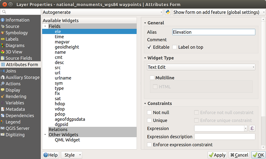
Abb. 14.44 Dialog um ein Bearbeitungselement für eine Attributspalte auszuwählen
Common settings
Regardless the type of widget applied to the field, there are some common properties you can set to control whether and how a field can be edited.
Widget display
Show label: indicates whether the field name should be displayed in the form (only in the Drag and drop designer mode).
General options
Alias: a human readable name to use for fields. The alias will be displayed in the feature form, the attribute table, or in the Identify results panel. It can also be used as field name replacement in the expression builder, easing expressions understanding and reviews. Aliases are saved in project file.
Comment: displays the field’s comment as shown in the Fields tab, in a read-only state. This information is shown as tooltip when hovering over the field label in a feature form.
- Editable: uncheck this option to set the field read-only
(not manually modifiable) even when the layer is in edit mode. Note that
checking this setting doesn’t override any edit limitation from the provider.
- Label on top: places the field name above or beside
the widget in the feature form.
Default values
Default value: for new features, automatically populates by default the field with a predefined value or an expression-based one. For example, you can:
use
$x,$length,$areato automatically populate a field with the feature’s X coordinate, length, area or any geometric information at its creation;increment a field by 1 for each new feature using
maximum("field")+1;save the feature creation datetime using
now();use variables in expressions, making it easier to e.g. insert the operator name (
@user_full_name), the project file path (@project_path), …
A preview of the resulting default value is displayed at the bottom of the widget.
Bemerkung
The
Default valueoption is not aware of the values in any other field of the feature being created so it won’t be possible to use an expression combining any of those values i.e using an expression likeconcat(field1, field2)may not work.- Apply default value on update: whenever the feature
attribute or geometry is changed, the default value is recalculated. This
could be handy to save values like last user that modifies data, last time it
was changed…
Constraints
You can constrain the value to insert in the field. This constraint can be:
- Not null: requires the user to provide a value;
- Unique: guarantee the inserted value to be unique
throughout the field;
based on a custom expression: e.g.
not regexp_match(col0,'[^A-Za-z]')will ensure that the value of the field col0 has only alphabet letters. A short description can be added to help you remember the constraint.
Whenever a value is added or edited in a field, it’s submitted to the existing constraints and:
if it meets all the requirements, a green check is shown beside the field in the form;
if it does not meet all the requirements, then the field is colored in yellow or orange and a corresponding cross is displayed next to the widget. You can hover over the cross to remind which constraints are applied to the field and fix the value:
A yellow cross appears when the unmet constraint is an unenforced one and it does not prevent you to save the changes with the „wrong“ values;
An orange cross can not be ignored and does not allow you to save your modifications until they meet the constraints. It appears when the
Enforce constraint option is checked.
Edit widgets
Based on the field type, QGIS automatically determines and assigns a default widget type to it. You can then replace the widget with any other compatible with the field type. The available widgets are:
Checkbox: Displays a checkbox whose state defines the value to insert.
Classification: Only available when a categorized symbology is applied to the layer, displays a combo box with the values of the classes.
Color: Displays a color widget allowing to select a color; the color value is stored as a html notation in the attribute table.
Datum/Zeit: Stellt ein Linienfeld dar, das ein Kalender-Widget zum Öffnen eines Datums, einer Zeit oder beidem, darstellt. Der Spaltentyp muss Text sein. Sie könnne ein benutzerdefiniertes Format auswählen, einen Pop-up-Kalender, etc.
Enumeration: Opens a combo box with predefined values fetched from the database. This is currently only supported by the PostgreSQL provider, for fields of
enumtype.Attachment: Uses a „Open file“ dialog to store file path in a relative or absolute mode. It can also be used to display a hyperlink (to document path), a picture or a web page.
Versteckt: Ein verstecktes Attribut ist unsichtbar. Der Anwender kann den Inhalt nicht sehen.
Key/Value: Displays a two-columns table to store sets of key/value pairs within a single field. This is currently supported by the PostgreSQL provider, for fields of
hstoretype.List: Displays a single column table to add different values within a single field. This is currently supported by the PostgreSQL provider, for fields of
arraytype.Bereich: Erlaubt Ihnen numerische Werte eines bestimmten Wertebereichs festzulegen. Das Bearbeitungselement kann entweder ein Schieber oder ein Drehfeld sein.
Relation Reference: This is the default widget assigned to the referencing field (i.e., the foreign key in the child layer) when a relation is set. It provides direct access to the parent feature’s form which in turn embeds the list and form of its children.
Text Edit (default): This opens a text edit field that allows simple text or multiple lines to be used. If you choose multiple lines you can also choose html content.
Unique Values: You can select one of the values already used in the attribute table. If ‚Editable‘ is activated, a line edit is shown with autocompletion support, otherwise a combo box is used.
Uuid Generator: Generates a read-only UUID (Universally Unique Identifiers) field, if empty.
Value Map: A combo box with predefined items. The value is stored in the attribute, the description is shown in the combo box. You can define values manually or load them from a layer or a CSV file.
Value Relation: Offers values from a related table in a combobox. You can select layer, key column and value column. Several options are available to change the standard behaviors: allow null value, order by value, allow multiple selections and use of auto-completer. The forms will display either a drop-down list or a line edit field when completer checkbox is enabled.
Tipp
Relative Path in Attachment widget
If the path which is selected with the file browser is located in the same
directory as the .qgs project file or below, paths are converted to
relative paths. This increases portability of a .qgs project with
multimedia information attached.
14.1.10. Joins Properties
 The Joins tab allows you to associate features
of the current layer (called
The Joins tab allows you to associate features
of the current layer (called Target layer) to features from another
loaded vector layer (or table). The join is based on an attribute that is shared by the
layers. The layers can be geometryless (tables) or not but their join attribute
should be of the same type.
To create a join:
Click the
Add new join button. The Add vector
join dialog appears.Select the Join layer you want to connect with the target vector layer
Specify the Join field and the Target field that are common to both the join layer and the target layer
Press OK and a summary of selected parameters is added to the Join panel.
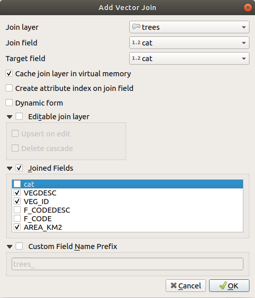
Abb. 14.45 Verknüpfe eine Attributtabelle zu einem vorhandenen Vektorlayer
The steps above will create a join, where ALL the attributes of the first matching feature in the join layer is added to the target layer’s feature. QGIS provides more options to tweak the join:
- Cache join layer in virtual memory: allows you to cache
values in memory (without geometries) from the joined layer in order to speed
up lookups.
- Create attribute index on the join field
- Dynamic form: helps to synchronize join fields on the
fly, according to the Target field. This way, constraints for
join fields are also correctly updated. Note that it’s deactivated by default
because it may be very time consuming if you have a lot of features or a
myriad of joins.
If the target layer is editable, then some icons will be displayed in the attribute table next to fields, in order to inform about their status:
 : the join layer is not configured to be
editable. If you want to be able to edit join features from the target
attribute table, then you have to check the option
Editable join layer.
: the join layer is not configured to be
editable. If you want to be able to edit join features from the target
attribute table, then you have to check the option
Editable join layer. : the join layer is well configured to be
editable, but its current status is read only.
: the join layer is well configured to be
editable, but its current status is read only. : the join layer is editable, but synchronization
mechanisms are not activated. If you want to automatically add a feature in
the join layer when a feature is created in the target layer, then you have
to check the option Upsert on edit. Symmetrically,
the option Delete cascade may be activated if you
want to automatically delete join features.
: the join layer is editable, but synchronization
mechanisms are not activated. If you want to automatically add a feature in
the join layer when a feature is created in the target layer, then you have
to check the option Upsert on edit. Symmetrically,
the option Delete cascade may be activated if you
want to automatically delete join features.
- Joined fields: instead of adding all the fields from
the joined layer, you can specify a subset.
- Custom field name prefix for joined fields, in order
to avoid name collision
QGIS currently has support for joining non-spatial table formats supported by OGR (e.g., CSV, DBF and Excel), delimited text and the PostgreSQL provider.
14.1.11. Auxiliary Storage Properties
The regular way to customize styling and labeling is to use data-defined properties as described in Datendefinierte Übersteuerung Setup. However, it may not be possible if the underlying data is read only. Moreover, configuring these data-defined properties may be very time consuming or not desirable! For example, if you want to fully use map tools coming with The Label Toolbar, then you need to add and configure more than 20 fields in your original data source (X and Y positions, rotation angle, font style, color and so on).
The Auxiliary Storage mechanism provides the solution to these limitations and awkward configurations. Auxiliary fields are a roundabout way to automatically manage and store these data-defined properties (labels, diagram, symbology…) in a SQLite database thanks to editable joins. This allows you to store properties for layers that aren’t editable.
A tab is available in vector layer properties dialog to manage auxiliary storage:
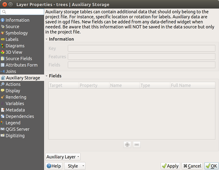
Abb. 14.46 Auxiliary Storage tab
14.1.11.1. Labeling
Considering that the data source may be customized thanks to data-defined properties without being editable, labeling map tools described in The Label Toolbar are always available as soon as labeling is activated.
Actually, the auxiliary storage system needs an auxiliary layer to store these properties in a SQLite database (see Auxiliary storage database). Its creation process is run the first time you click on the map while a labeling map tool is currently activated. Then, a window is displayed, allowing you to select the primary key to use for joining (to ensure that features are uniquely identified):
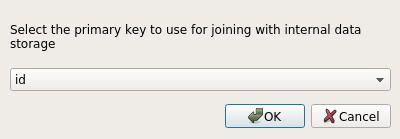
Abb. 14.47 Auxiliary Layer creation dialog
As soon as an auxiliary layer is configured for the current data source, you can retrieve its information in the tab:
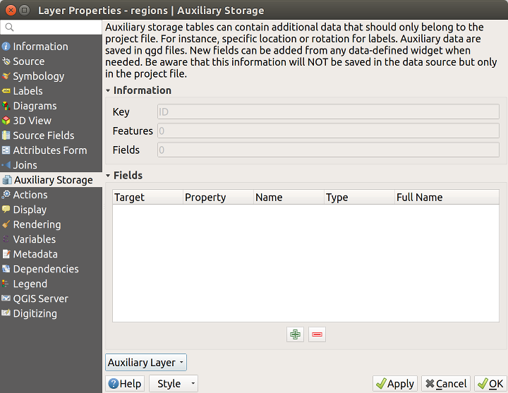
Abb. 14.48 Auxiliary Layer key
The auxiliary layer now has these characteristics:
the primary key is
ID,there are
0features using an auxiliary field,there are
0auxiliary fields.
Now that the auxiliary layer is created, you can edit the layer labels.
Click on a label while the Change Label
map tool is activated, then you can update styling properties like sizes,
colors, and so on. The corresponding data-defined properties are created
and can be retrieved:
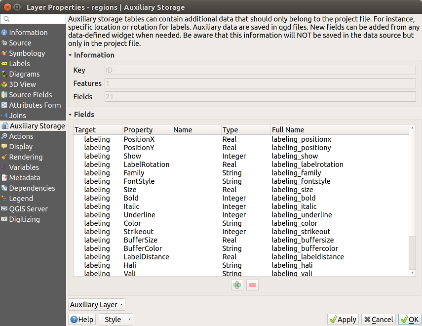
Abb. 14.49 Auxiliary Fields
As you can see in the figure above, 21 fields are automatically created and
configured for labeling. For example, the FontStyle auxiliary field type is
a String and is named labeling_fontstyle in the underlying SQLite
database. There is also 1 feature which is currently using these auxiliary
fields.
Notice that the icon  is displayed in the Labels
properties tab indicating that the data-defined override options are set
correctly:
is displayed in the Labels
properties tab indicating that the data-defined override options are set
correctly:
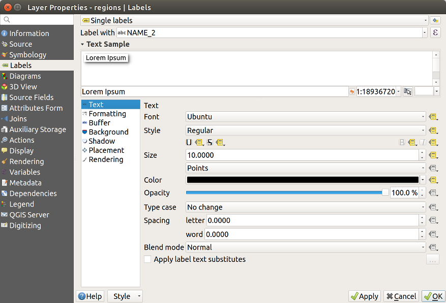
Abb. 14.50 Data-defined properties automatically created
Otherwise, there’s another way to create an auxiliary field for a
specific property thanks to the
data-defined override button.
By clicking on Store data in the project, an auxiliary
field is automatically created for the Opacity field.
If you click on this button and the auxiliary layer is not created
yet, a window (Abb. 14.47) is first
displayed to select the primary key to use for joining.
14.1.11.2. Symbolisierung
Like the method described above for customizing labels, auxiliary fields can
also be used to stylize symbols and diagrams. To do this, click on
Data-defined override and select Store data in
the project for a specific property. For example, the Fill
color field:
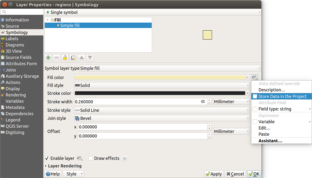
Abb. 14.51 Data-defined property menu for symbol
There are different attributes for each symbol (e.g. fill style, fill color, stroke color, etc…), so each auxiliary field representing an attribute requires a unique name to avoid conflicts. After selecting Store data in the project, a window opens and displays the Type of the field and prompts you to enter a unique name for the auxiliary field. For example, when creating a Fill color auxiliary field the following window opens:
Abb. 14.52 Name of the auxiliary field for a symbol
Once created, the auxiliary field can be retrieved in the auxiliary storage tab:
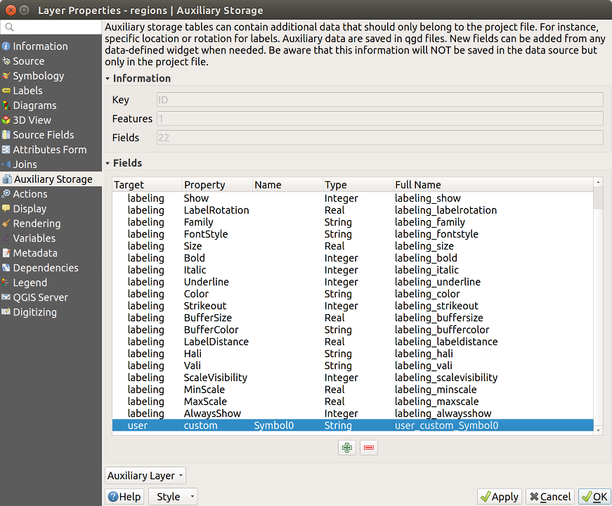
Abb. 14.53 Auxiliary field symbol
14.1.11.3. Attribute table and widgets
Auxiliary fields can be edited using the attribute table. However, not all auxiliary fields are initially visible in the attribute table.
Auxiliary fields representing attributes of a layer’s symbology, labeling,
appearance, or diagrams will appear automatically in the attribute table. The
exception are attributes that can be modified using the Label Toolbar
which are hidden by default. Auxiliary fields representing a Color have a
widget Color set by default, otherwise auxiliary fields default to the
Text Edit widget.
Auxiliary fields that represent attributes that can be modified using the Label toolbar are Hidden in the attribute table by default. To make a field visible, open the Attribute Form properties tab and change the value of an auxiliary field Widget Type from Hidden to another relevant value. For example, change the auxiliary_storage_labeling_size to Text Edit or change auxiliary_storage_labeling_color to the Color widget. Those fields will now be visible in the attribute table.
Auxiliary fields in the attribute table will appear like the following image:
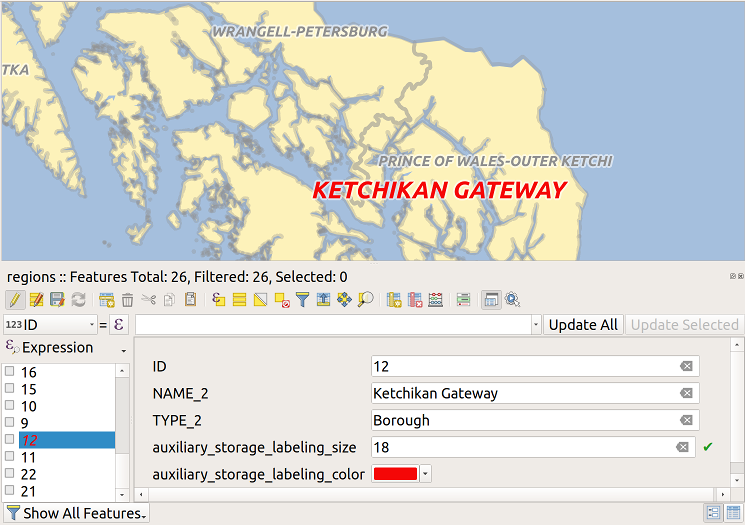
Abb. 14.54 Form with auxiliary fields
14.1.11.4. Management
The Auxiliary Layer menu allows you to manage the auxiliary fields:
Abb. 14.55 Auxiliary layer management
The first item Create is disabled in this case because the auxiliary layer is already created. But in case of a fresh work, you can use this action to create an auxiliary layer. As explained in Labeling, a primary key will be needed then.
The Clear action allows to keep all auxiliary fields, but remove
their contents. This way, the number of features using these fields will fall to
0.
The Delete action completely removes the auxiliary layer. In other words, the corresponding table is deleted from the underlying SQLite database and properties customization are lost.
Finally, the Export action allows to save the auxiliary layer as a new vector layer. Note that geometries are not stored in auxiliary storage. However, in this case, geometries are exported from the original data source too.
14.1.11.5. Auxiliary storage database
When you save your project with the .qgs format, the SQLite database
used for auxiliary storage is saved at the same place but with the extension
.qgd.
For convenience, an archive may be used instead thanks to the .qgz format.
In this case, .qgd and .qgs files are both embedded in the archive.
14.1.12. Actions Properties
 QGIS bietet die Möglichkeit, Aktionen auf Basis von Attributen einer Ebene durchzuführen. Dies kann für eine Vielzahl von Aktionen genutzt werden, z.B. um ein Programm mit Abfragen aus der Attributdatenbank zu füttern oder um Parameter an ein Web-Reporting-Tool weiterzugeben.
Abb. 14.56 Überblick über den Dialog Aktionen mit einigen Beispielaktionen
Aktionen auf Basis von Attributen sind sinnvoll wenn sie häufig eine externe Anwendung starten oder eine Internetseite auf Basis von einem oder mehreren Werten in Ihrem Vektorlayer visualisieren wollen. Sie sind in 6 Typen aufgeteilt und können wie folgt verwendet werden:
Allgemein, Mac, Windows und Unix Aktionen starten einen externen Prozess.
Python Aktionen führen einen Python-Ausdruck aus.
Allgemeine und Pythonaktionen sind überall sichtbar.
Mac, Windows und Unix Aktionen sind nur sichtbar auf der entsprechenden Plattform (z.B. können Sie drei ‚Bearbeiten‘ Aktionen definieren um einen Editor zu öffnen und die Benutzer können nur die eine ‚Bearbeiten‘ Aktion für Ihr Betriebssystem sehen und ausführen um den Editor zu starten).
There are several examples included in the dialog. You can load them by clicking on Create Default Actions. To edit any of the examples, double-click its row. One example is performing a search based on an attribute value. This concept is used in the following discussion.
The Show in Attribute Table allows you to display in the
attribute table dialog the checked feature-scoped actions, either as Combo
Box or as Separate Buttons (see Configuring the columns).
14.1.12.1. Aktionen definieren
To define an attribute action, open the vector Layer
Properties dialog and click on the Actions tab. In the
Actions tab, click the Add a new action
to open the Edit Action dialog.
Select the action Type and provide a descriptive name
for the action. The action itself must contain the name of the application
that will be executed when the action is invoked.
You can add one or more attribute field values as arguments to the application.
When the action is invoked, any set of characters that start with a %
followed by the name of a field will be replaced by the value of that field.
The special characters %% will be replaced by the value of the field
that was selected from the identify results or attribute table (see using_actions
below). Double quote marks can be used to group text into a single argument to
the program, script or command. Double quotes will be ignored if preceded by a
backslash.
The Action Scopes allows you to define where the action should be available. You have 4 different choices:
Feature Scope: action is available when right click in the cell within the attribute table.
Field Scope: action is available when right click in the cell within the attribute table, in the feature form and in the default action button of the main toolbar.
Layer Scope: action is available in the action button in the attribute table toolbar. Be aware that this type of action involves the entire layer and not the single features.
Canvas: action is available in the main action button in the toolbar.
Wenn Sie Feldnamen vorfinden die Substrings anderer Feldnamen sind (z.B., col1 und col10) sollten Sie das angeben indem Sie den Feldnamen (und den % Buchstaben) mit eckigen Klammern umrunden (z.B. [%col10]). Hiermit wird vermieden dass der %col10 Feldname mit de, %col1 Feldnamen mit einem 0 am Ende verwechselt wird. Die Klammern werden von QGS entfernt wenn es im Wert des Feldes ersetzt. Wenn Sie wollen dass das zu ersetzende Feld von eckigen Klammern umrandet wird verwenden Sie ein zweites Set wie hier:[[%col10]].
Wenn Sie das Objekte abfragen Werkzeug verwenden, können Sie den Identifikationsergebnis Dialog öffnen. Es enthält eine (Abgeleitet) Item das layertyprelevante Informationen enthält. Die Werte in diesem Element können auf ähnliche Weise den anderen Feldern zugeordnet werden indem dem Abgeleitet Feldnamen ein (Derived) vorangeht. Zum Beispiel hat ein Punktlayer ein X und Y Feld und die Werte dieser Felder können in der Aktion mit %(Derived).X und %(Derived).Y verwendet werden. Die Abgeleitet Attribute sind nur in der Objekte abfragen Dialog Box erhältlich, jedoch nicht in der Attributtabelle Dialogbox.
Two example actions are shown below:
konqueror https://www.google.com/search?q=%namkonqueror https://www.google.com/search?q=%%
In the first example, the web browser konqueror is invoked and passed a URL
to open. The URL performs a Google search on the value of the nam field
from our vector layer. Note that the application or script called by the
action must be in the path, or you must provide the full path. To be certain, we
could rewrite the first example as:
/opt/kde3/bin/konqueror https://www.google.com/search?q=%nam. This will
ensure that the konqueror application will be executed when the action is
invoked.
Das zweite Beispiel nutzt den Ausdruck %%, welcher unabhängig ist von einem speziellen Feld. Beim Ausführen des Befehls wird der Ausdruck %% durch den Wert des jeweils selektierten Feldes aus Objekte abfragen oder der Attributtabelle ersetzt.
14.1.12.2. Aktionen anwenden
QGIS offers many ways to execute actions you enabled on a layer. Depending on their settings, they can be available:
in the drop-down menu of
 Run Feature Action button from
the Attributes toolbar or Attribute table dialog;
Run Feature Action button from
the Attributes toolbar or Attribute table dialog;when right-clicking a feature with the
Identify Features tool
(see Identifying Features for more information);from the Identify Results panel, under the Actions section;
as items of an Actions column in the Attribute Table dialog.
Wenn Sie eine Aktion mit %% Notation verwenden, machen Sie einen Rechtsklick auf den Feldwert im Objekte abfragen Dialog oder im Attributtabelle Dialog den Sie der Anwendung oder dem Skript übergeben wollen.
In einem weiteren Beispiel soll gezeigt werden, wie Attributwerte eines Vektorlayers abgefragt und in eine Textdatei mit Hilfe der Bash und des echo Kommandos geschrieben werden (funktioniert also nur unter  und evtl.
  ). Der Abfragelayer enthält die Felder Art
 taxon_name, Latitude lat und Longitude long. Wir möchten jetzt eine räumliche Selektion von Örtlichkeiten machen und diese Feldwerte in eine Textdatei für den ausgewählten Datensatz (in der QGIS Kartenansicht in gelb gezeigt) exportieren. Hier ist die Aktion, um dies zu erreichen:
bash -c "echo \"%taxon_name %lat %long\" >> /tmp/species_localities.txt"
Nachdem ein paar Orte auf dem Bildschirm ausgewählt wurden (diese erscheinen gelb hinterlegt), starten wir die Aktion mit der rechten Maustaste über den Dialog Abfrageergebnisse und können danach in der Textdatei die Ergebnisse ansehen:
Acacia mearnsii -34.0800000000 150.0800000000
Acacia mearnsii -34.9000000000 150.1200000000
Acacia mearnsii -35.2200000000 149.9300000000
Acacia mearnsii -32.2700000000 150.4100000000
As an exercise, we can create an action that does a Google search on the lakes
layer. First, we need to determine the URL required to perform a search on a
keyword. This is easily done by just going to Google and doing a simple
search, then grabbing the URL from the address bar in your browser. From this
little effort, we see that the format is https://www.google.com/search?q=QGIS,
where QGIS is the search term. Armed with this information, we can proceed:
Laden Sie den Layer file:lakes.shp.
Öffnen Sie den Layereigenschaften Dialog indem Sie einen Doppelklick auf den Layer in der Legende machen und wählen Sie aus dem Popup-Menü.
Click on the Actions tab.
Click
Add a new action.Choose the Open action type,
Geben Sie einen Namen für die Aktion ein, z.B.
Google Search.Additionally you can add a Short Name or even an Icon.
Choose the action Scope. See Aktionen definieren for further information. Leave the default settings for this example.
Für diese Aktion ist es notwendig den Namen des externen Programms anzugeben. In diesem Fall können wir Firefox verwenden. Wenn das Programm sich nicht im Pfad befindet müssen Sie den vollständigen Pfad angeben.
Following the name of the external application, add the URL used for doing a Google search, up to but not including the search term:
https://www.google.com/search?q=The text in the Action field should now look like this:
https://www.google.com/search?q=Click on the drop-down box containing the field names for the
lakeslayer. It’s located just to the left of the Insert button.From the drop-down box, select ‚NAMES‘ and click Insert.
Die Aktion sieht nun so aus:
https://www.google.com/search?q=[%NAMES%]To finalize and add the action, click the OK button.
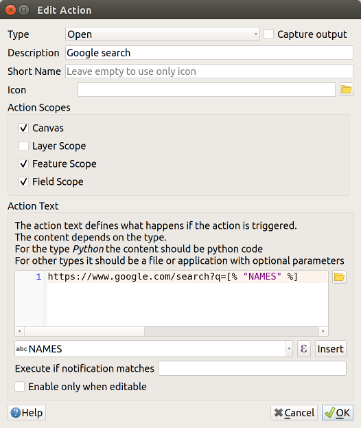
Abb. 14.57 Edit action dialog configured with the example
Damit ist die Aktion fertig für den Einsatz. Der gesamte Befehl der Aktion sollte folgendermaßen aussehen:
https://www.google.com/search?q=[%NAMES%]
Damit ist die Aktion fertig für den Einsatz. Schließen Sie den Eigenschaften Dialog und zoomen Sie in einen Bereich Ihrer Wahl. Stellen Sie sicher, dass der Layer lakes in der Legende aktiviert ist. Nun identifizieren Sie einen See. In der Ergebnisanzeige sollte nun die Aktion sichtbar sein:
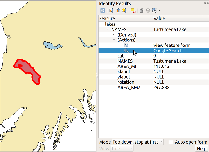
Abb. 14.58 Wählen Sie ein Objekt und eine Aktion aus
When we click on the action, it brings up Firefox and navigates to the URL
https://www.google.com/search?q=Tustumena. It is also possible to add further
attribute fields to the action. Therefore, you can add a + to the end of
the action text, select another field and click on Insert Field. In
this example, there is just no other field available that would make sense
to search for.
Sie können auch mehrere Aktionen für einen Layer definieren. Sie alle werden dann bei der Abfrage von Objekten im Identifikationsergebnis Dialog angezeigt.
Sie können auch die aus der Attributtabelle aufrufen, indem Sie eine Zeile mit der rechten Maustaste auswählen und dann die Aktion aus dem Pop-up-Menü wählen.
Sie sehen, man kann sich eine Vielzahl interessanter Aktionen ausdenken. Wenn Sie z.B. einen Punktlayer mit einzelnen Punkten haben, an denen Photos geschossen wurden, dann können Sie eine Aktion erstellen, über die Sie dann das entsprechende Foto anzeigen lassen können, wenn Sie auf den Punkt in der Karte klicken. Man kann auch zu bestimmten Attributen webbasierte Information ablegen (z.B. in einer HTML-Datei) und diese dann über eine Aktion anzeigen lassen, etwa so wie in dem Google Beispiel.
Wir können auch komplexere Beispiele erstellen, indem wir z.B. Python Aktionen verwenden.
Usually, when we create an action to open a file with an external application, we can use absolute paths, or eventually relative paths. In the second case, the path is relative to the location of the external program executable file. But what about if we need to use relative paths, relative to the selected layer (a file-based one, like Shapefile or SpatiaLite)? The following code will do the trick:
command = "firefox"
imagerelpath = "images_test/test_image.jpg"
layer = qgis.utils.iface.activeLayer()
import os.path
layerpath = layer.source() if layer.providerType() == 'ogr'
  else (qgis.core.QgsDataSourceURI(layer.source()).database()
    if layer.providerType() == 'spatialite' else None)
path = os.path.dirname(str(layerpath))
image = os.path.join(path,imagerelpath)
import subprocess
subprocess.Popen( [command, image ] )
Wir müssen uns nur ins Gedächtnis rufen dass es sich um eine Python Aktion handelt und dass das Ändern der command und imagerelpath Variablen auf unsere Bedürfnisse angepasst wird.
Was aber wenn der relative Pfad relativ zur (gespeicherten) Projektdatei sein muss? Der Code der Python Aktion würde wie folgt lauten:
command = "firefox"
imagerelpath = "images_test/test_image.jpg"
projectpath = qgis.core.QgsProject.instance().fileName()
import os.path
path = os.path.dirname(str(projectpath)) if projectpath != '' else None
image = os.path.join(path, imagerelpath)
import subprocess
subprocess.Popen( [command, image ] )
Ein anderes Python Aktion Beispiel ist das mit wir dem Projekt neue Layer hinzufügen können. Z.B. wird in den folgenden Beispielen dem Projekt ein Vektorlayer beziehungsweise ein Rasterlayer hinzugefügt. Die Namen der Dateien, die dem Projekt hinzugefügt werden sollen, und die Namen, die den Layern gegeben werden, sind datengesteuert (filename und layername sind Spaltennamen der Attributtabelle des Vektorlayers in dem die Aktion erstellt wurde):
qgis.utils.iface.addVectorLayer('/yourpath/[% "filename" %].shp',
  '[% "layername" %]', 'ogr')
Um eine Rasterdatei hinzuzufügen (ein TIF-Bild in diesem Beispiel) wird daraus:
qgis.utils.iface.addRasterLayer('/yourpath/[% "filename" %].tif',
  '[% "layername" %]')
14.1.13. Display Properties
 The Display tab helps you configure fields to use for
feature identification:
The Display tab helps you configure fields to use for
feature identification:
The Display name: based on a field or an expression. This is:
the label shown on top of the feature information in the Identify tool results
the field used in the locator bar when looking for features in all layers
the feature identifier in the attribute table form view
the feature identifier when the map or layout is exported to a layered output format such as GeoPDF
the map tip information, i.e. the message displayed in the map canvas when hovering over a feature of the active layer with the
 Show
Map Tips icon pressed. Applicable when no HTML Map Tip is set.
Show
Map Tips icon pressed. Applicable when no HTML Map Tip is set.
The HTML Map Tip is specifically created for the map tips: it’s a more complex and full HTML text mixing fields, expressions and html tags (multiline, fonts, images, hyperlink…).
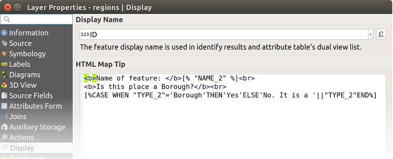
Abb. 14.59 HTML-Code für Kartenhinweis
To activate map tips, select the menu option or click on the Show Map Tips icon of the
Attributes Toolbar. Map tip is a cross-session feature meaning that
once activated, it stays on and apply to any layer in any project, even in
future QGIS sessions until it’s toggled off.
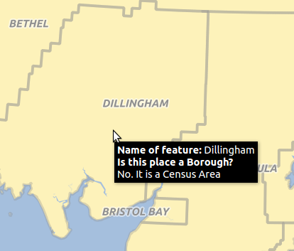
Abb. 14.60 Kartenhinweis erstellt mit HTML-Code
14.1.14. Rendering Properties
14.1.14.1. Maßstabsabhängige Sichtbarkeit
You can set the Maximum (inclusive) and Minimum
(exclusive) scale, defining a range of scale in which features will be
visible. Out of this range, they are hidden. The  Set to current canvas scale button helps you use the current map
canvas scale as boundary of the range visibility.
See Maßstabsabhängige Layeranzeige for more information.
Set to current canvas scale button helps you use the current map
canvas scale as boundary of the range visibility.
See Maßstabsabhängige Layeranzeige for more information.
14.1.14.2. Simplify geometry
QGIS offers support for on-the-fly feature generalisation. This can
improve rendering times when drawing many complex features at small scales.
This feature can be enabled or disabled in the layer settings using the
Simplify geometry option. There is also a global
setting that enables generalisation by default for newly added layers (see
global simplification for more information).
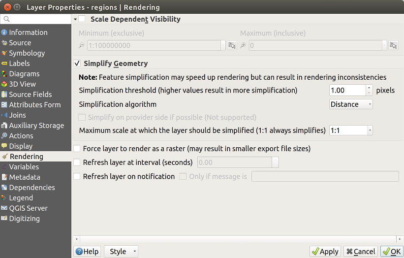
Abb. 14.61 Dialog Layergeometrien vereinfachen
Bemerkung
Objektgeneralisierung, kann in einigen Fällen, Artefakte in Ihre gerenderte Ausgabe einführen. Dies können Splitter zwischen Polygonen und ungenau Darstellung bei der Verwendung von Offset-basierten Symbolayern sein.
While rendering extremely detailed layers (e.g. polygon layers with a huge number of nodes), this can cause layout exports in PDF/SVG format to be huge as all nodes are included in the exported file. This can also make the resultant file very slow to work with/open in other programs.
Aktivieren von Force layer to render as raster zwingt diese Layer dazu gerastert zu werden, so dass die exportierten Dateien nicht alle enthaltenen Knoten in diesen Layern enthalten müssen und die Wiedergabe daher beschleunigt wird.
You can also do this by forcing the layout to export as a raster, but that is an all-or-nothing solution, given that the rasterisation is applied to all layers.
Refresh layer at interval (seconds): set a timer to automatically refresh individual layers at a matching interval. Canvas updates are deferred in order to avoid refreshing multiple times if more than one layer has an auto update interval set.
Depending on the data provider (e.g. PostgreSQL), notifications can be sent to
QGIS when changes are applied to the data source, out of QGIS. Use the
Refresh layer on notification option to trigger an update.
You can also limit the layer refresh to a specific message set in the
Only if message is text box.
14.1.15. Variables Properties
The Variables tab lists all the variables available at
the layer’s level (which includes all global and project’s variables).
It also allows the user to manage layer-level variables. Click the
button to add a new custom layer-level variable. Likewise, select a custom
layer-level variable from the list and click the button to remove
it.
More information on variables usage in the General Tools Storing values in Variables section.
14.1.16. Metadata Properties
 The Metadata tab provides you with options to create
and edit a metadata report on your layer. Information to fill concern:
The Metadata tab provides you with options to create
and edit a metadata report on your layer. Information to fill concern:
the data Identification: basic attribution of the dataset (parent, identifier, title, abstract, language…);
the Categories the data belongs to. Alongside the ISO categories, you can add custom ones;
the Keywords to retrieve the data and associated concepts following a standard based vocabulary;
the Access to the dataset (licenses, rights, fees, and constraints);
the Extent of the dataset, either spatial one (CRS, map extent, altitudes) or temporal;
the Contact of the owner(s) of the dataset;
the Links to ancillary resources and related information;
the History of the dataset.
A summary of the filled information is provided in the Validation tab and helps you identify potential issues related to the form. You can then either fix them or ignore them.
Metadata are currently saved in the project file. They can also be saved in a
.qmd file alongside file based layers or in a local .sqlite
database for remote layers (e.g. PostGIS).
14.1.17. Dependencies Properties
 The Dependencies tab allows to declare data
dependencies between layers. A data dependency occurs when a data modification
in a layer, not by direct user manipulation, may modify data of other layers.
This is the case for instance when geometry of a layer is updated by a
database trigger or custom PyQGIS scripting after modification of another
layer’s geometry.
The Dependencies tab allows to declare data
dependencies between layers. A data dependency occurs when a data modification
in a layer, not by direct user manipulation, may modify data of other layers.
This is the case for instance when geometry of a layer is updated by a
database trigger or custom PyQGIS scripting after modification of another
layer’s geometry.
In the Dependencies tab, you can select any layers which may externally alter the data in the current layer. Correctly specifying dependent layers allows QGIS to invalidate caches for this layer when the dependent layers are altered.
14.1.18. Legend Properties
 The Legend properties tab provides you with advanced
settings for the Layers panel and/or the print
layout legend. These options include:
The Legend properties tab provides you with advanced
settings for the Layers panel and/or the print
layout legend. These options include:
- Text on symbols: In some cases it can be useful to add
extra information to the symbols in the legend. With this frame, you can
affect to any of the symbols used in the layer symbology a text that is
displayed over the symbol, in both Layers panel and print layout
legend. This mapping is done by typing each text next to the symbol in the
table widget or filling the table using the Set Labels from Expression
button. Text appearance is handled through the font and color selector
widgets of the Text Format button.
Abb. 14.62 Setting text on symbols (left) and its rendering in the Layers panel (right)
a list of widgets you can embed within the layer tree in the Layers panel. The idea is to have a way to quickly access some actions that are often used with the layer (setup transparency, filtering, selection, style or other stuff…).
By default, QGIS provides transparency widget but this can be extended by plugins registering their own widgets and assign custom actions to layers they manage.
14.1.19. QGIS Server Properties
 The QGIS Server tab consists of Description,
Attribution, MetadataURL, and LegendUrl sections.
The QGIS Server tab consists of Description,
Attribution, MetadataURL, and LegendUrl sections.
From the Description section, you can change the Short name used to reference the layer in requests (to learn more about short names, read Short name for layers, groups and project). You can also add or edit a Title and Abstract for the layer, or define a Keyword list here. These keyword lists can be used in a metadata catalog. If you want to use a title from an XML metadata file, you have to fill in a link in the DataUrl field.
Use Attribution to get attribute data from an XML metadata catalog.
In MetadataUrl, you can define the general path to the XML metadata catalog. This information will be saved in the QGIS project file for subsequent sessions and will be used for QGIS server.
Im Abschnitt LegendenUrl, können Sie der URL eines Legendenbilds in dem URL Feld anbieten. Sie können das Format Drop-Down-Menü nutzen, um das entsprechende Format des Bilds anzuwenden. Zur Zeit werden png, jpg und jpeg Formate unterstützt.
Abb. 14.63 QGIS Server tab in vector layers properties dialog
To learn more about QGIS Server, read the QGIS Server Anleitung/Handbuch.
14.1.20. Digitizing Properties
 The Digitizing tab gives access to options that help to ensure the
quality of digitized geometries.
The Digitizing tab gives access to options that help to ensure the
quality of digitized geometries.
Abb. 14.64 The QGIS Digitizing tab in the vector layers properties dialog
14.1.20.1. Automatic Fixes
Options in the Automatic Fixes section will directly affect the vertices
of any geometry which is added or modified.
If the Remove duplicate nodes option is checked, any two subsequent
vertices with exactly the same coordinates will be removed.
If the Geometry precision is set, all vertices will be rounded to
the closest multiple of the configured geometry precision. The rounding will
happen in the layer coordinate reference system. Z and M values are not
rounded. With many map tools, a grid is shown on the canvas while digitizing.
14.1.20.2. Geometry Checks
In the Geometry checks section, additional validations on a per
geometry basis can be activated. Immediately after any geometry modification,
failures in these checks are reported to the user in the geometry validation panel.
As long as a check is failing, it is not possible to save the layer.
The Is valid check will run basic validity checks like self intersection on
geometries.
14.1.20.3. Topology Checks
In the Topology checks section, additional topology validation checks can be activated. Topology checks will be executed when the user saves the layer. Check errors will be reported in the geometry validation panel. As long as validation errors are present, the layer can not be saved. Topology checks are executed in the area of the bounding box of the modified features. Since other features may be present in the same area, topological errors concerning these features are reported as well as errors introduced in the current edit session.
Topology check option |
Illustration |
|---|---|
The |
|
The |
|
The |

|
Gap check exceptions
Sometimes it is desirable to keep gaps inside an area in a polygon layer that otherwise is fully covered by polygons. For example, a land use layer may have acceptable holes for lakes. It is possible to define areas that are ignored in the gap check. Since gaps inside these areas are allowed, we will refer to them as Allowed Gaps areas.
In the options for the gap checks under Allowed Gaps, an Allowed Gaps layer can be configured.
Whenever the gap check is executed, gaps which are covered by one or more polygons in the Allowed Gaps Layer are not reported as topology errors.
It is also possible to configure an additional Buffer. This buffer is applied to each polygon on the Allowed Gaps Layer. This makes it possible to make the tests less susceptible to small changes in the outlines at the borders of gaps.
When Allowed Gaps are enabled, an additional button (Add Allowed Gap) for detected gap errors is available in the geometry validation dock, where gaps are reported during digitizing. If the Add Allowed Gap button is pushed, a new polygon with the geometry of the detected gap is inserted into the Allowed Gaps Layer. This makes it possible to quickly flag gaps as allowed.