12.1. The Style Manager
12.1.1. The Style Manager dialog
The Style Manager is the place where you can manage and create
generic style items. These are symbols, color ramps, text formats or label
settings that can be used to symbolize features, layers or print layouts.
They are stored in the symbology-style.db database under the active
user profile and shared with all the project files
opened with that profile.
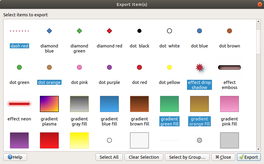
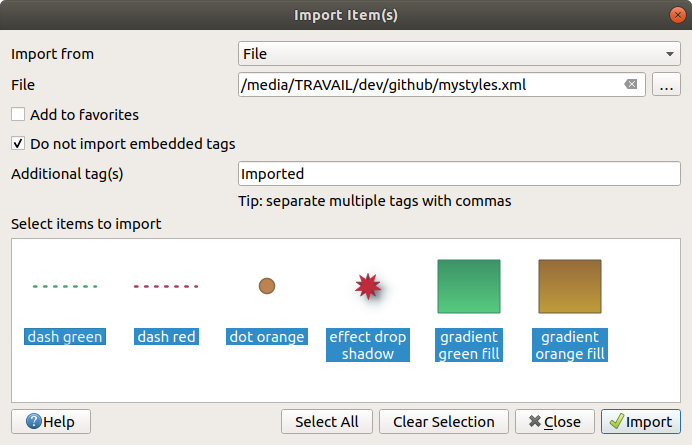
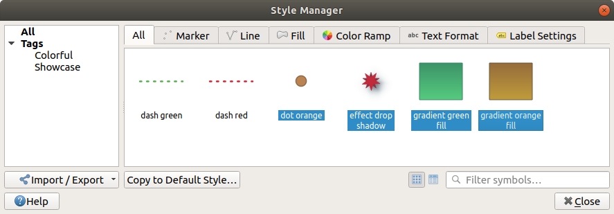
Style items can also be shared with others thanks to the export/import
capabilities of the Style Manager dialog.
You can open that modeless dialog either:
or with the
 Style Manager button from a vector
menu (while configuring
a symbol or formatting a text).
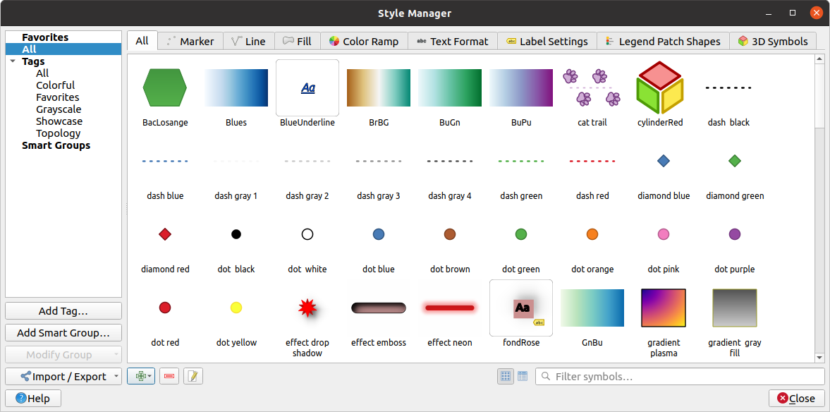
Abb. 12.1 The Style Manager
12.1.1.1. Organizing style items
The Style Manager dialog displays in its center a frame with previewed items organized into tabs:
All for a complete collection of point, linear and surface symbols and label settings as well as predefined color ramps and text formats;
 Color ramp;
 Text format to manage text formats,
which store the font, color, buffers, shadows, and backgrounds of texts
(i.e. all the formatting parts of the label settings, which for instance can
be used in layouts);
 Label settings to manage label settings, which include the text formats and some layer-type specific
settings such as label placement, priority, callouts, rendering…
 3D Symbols to configure symbols with 3D properties (extrusion, shading, altitude, …) for the features to render
in a 3D Map view
For each family of items, you can organize the elements into different categories, listed in the panel on the left:
Favorites: displayed by default when configuring an item, it shows an extensible set of items;
All: lists all the available items for the active type;
Tags: shows a list of labels you can use to identify the items. An item can be tagged more than once. Select a tag in the list and the tabs are updated to show only their items that belong to it. To create a new tag you could later attach to a set of items, use the Add Tag… button or select the
 Add Tag…
from any tag contextual menu;
Add Tag…
from any tag contextual menu;Smart Group: a smart group dynamically fetches its symbols according to conditions set (see eg, Abb. 12.2). Click the Add Smart Group… button to create smart groups. The dialog box allows you to enter an expression to filter the items to select (has a particular tag, have a string in its name, etc.). Any symbol, color ramp, text format or label setting that satisfies the entered condition(s) is automatically added to the smart group.
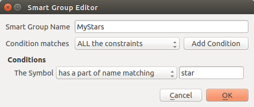
Abb. 12.2 Creating a Smart Group
Tags and smart groups are not mutually exclusive: they are simply two different ways to organize your style elements. Unlike the smart groups that automatically fetch their belonged items based on the input constraints, tags are filled by the user. To edit any of those categories, you can either:
select the items, right-click and choose and then select the tag name or create a new tag;
select the tag and press . A checkbox appears next to each item to help you select or deselect it. When selection is finished, press .
select the smart group, press and configure a new set of constraints in the Smart Group Editor dialog. This option is also available in the contextual menu of the smart group.
To remove a tag or a smart group, right-click on it and select the  Remove button. Note that this does not delete the items grouped in the
category.
12.1.1.2. Adding, editing or removing an item
As seen earlier, style elements are listed under different tabs whose contents depend on the active category (tag, smart group, favorites…). When a tab is enabled, you can:
Add new items: press the
 Add item button and configure the
item following symbols, color ramps or text format and label builder description.
Add item button and configure the
item following symbols, color ramps or text format and label builder description.Modify an existing item: select an item and press
 Edit
item button and configure as mentioned above.
Edit
item button and configure as mentioned above.Delete existing items: to delete an element you no longer need, select it and click
 Remove item (also available through right-click).
The item will be deleted from the local database.
Note that the All tab provides access to these options for every type of item.
Right-clicking over a selection of items also allows you to:
Add to Favorites;
Remove from Favorites;
and select the appropriate tag or create a new one to use; the currently assigned tags are checked;
Clear Tags: detaching the symbols from any tag;
Remove Item(s);
Edit Item: applies to the item you right-click over;
Copy Item;
Paste Item …: pasting to one of the categories of the style manager or elsewhere in QGIS (symbol or color buttons)
Export Selected Symbol(s) as PNG… (only available with symbols);
Export Selected Symbol(s) as SVG… (only available with symbols);
12.1.2. Setting a Color Ramp
The Color ramp tab in the Style Manager dialog helps you preview different color ramps based on the category selected in the left panel.
To create a custom color ramp, activate the Color ramp tab and click the
 Add item button. The button reveals a drop-down list to
choose the ramp type:
Gradient: given a start and end colors, generate a color ramp which can be continuous or discrete. With double-clicking the ramp preview, you can add as many intermediate color stops as you want.
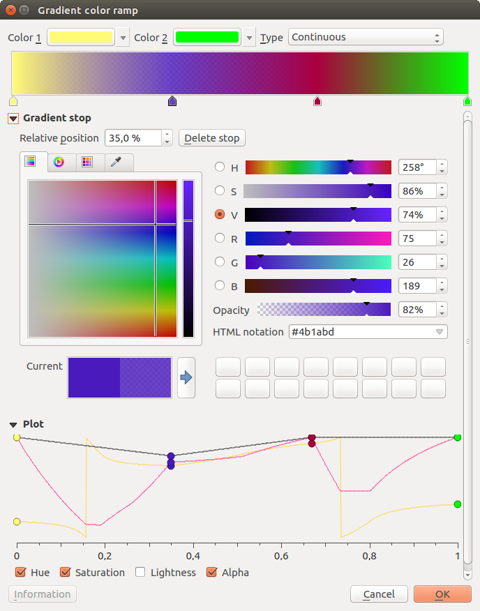
Abb. 12.6 Example of custom gradient color ramp with multiple stops
Color presets: allows to create a color ramp consisting of a list of colors selected by the user;
Random: creates a random set of colors based on range of values for Hue, Saturation, Value and Opacity and a number of colors (Classes);
Catalog: ColorBrewer: a set of predefined discrete color gradients you can customize the number of colors in the ramp;
or Catalog: cpt-city: an access to a whole catalog of color gradients to locally save as standard gradient. The cpt-city option opens a new dialog with hundreds of themes included ‚out of the box‘.
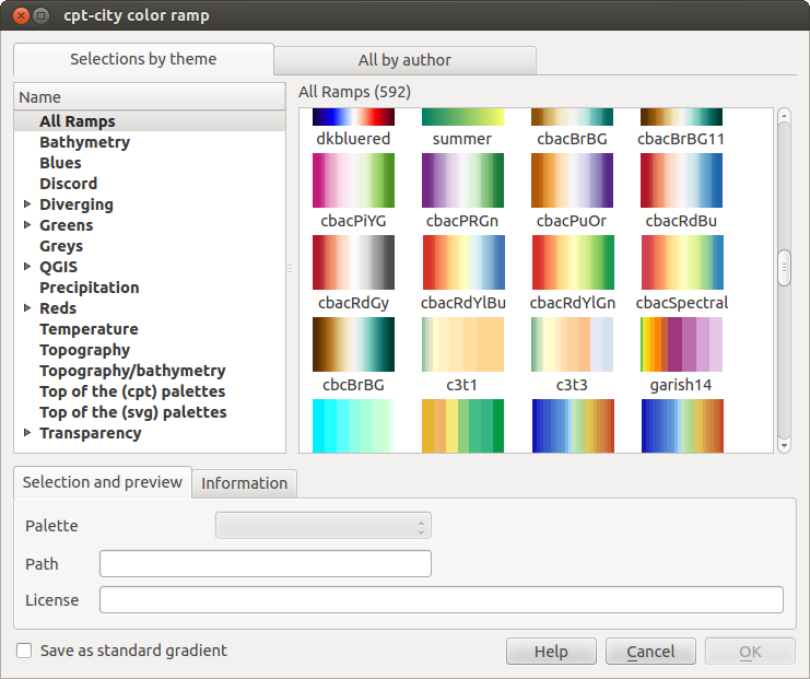
Abb. 12.7 cpt-city dialog with hundreds of color ramps
Tipp
Easily adjust the color stops of the gradient color ramp
Double-clicking the ramp preview or drag-and-drop a color from the color spot onto the ramp preview adds a new color stop. Each color stop can be tweaked using the Farbauswahl widgets or by plotting each of its parameters. You can also reposition it using the mouse, the arrow keys (combine with Shift key for a larger move) or the Relative position spinbox. Pressing Delete stop as well as DEL key removes the selected color stop.


