The Symbol Library
The Style Manager
The Style Manager is the place where users can manage and create generic symbols and color ramps to be used in several QGIS projects. You can open that modeless dialog:
with the
 Style Manager button of the Project toolbar;
from the
menu;or from a vector tab (using the
Style Manager button in a symbol property dialog).
The dialog allows you to:
create, edit and remove symbols and color ramps;
organize symbols and color ramps in custom groups;
export and import symbols and color ramps.
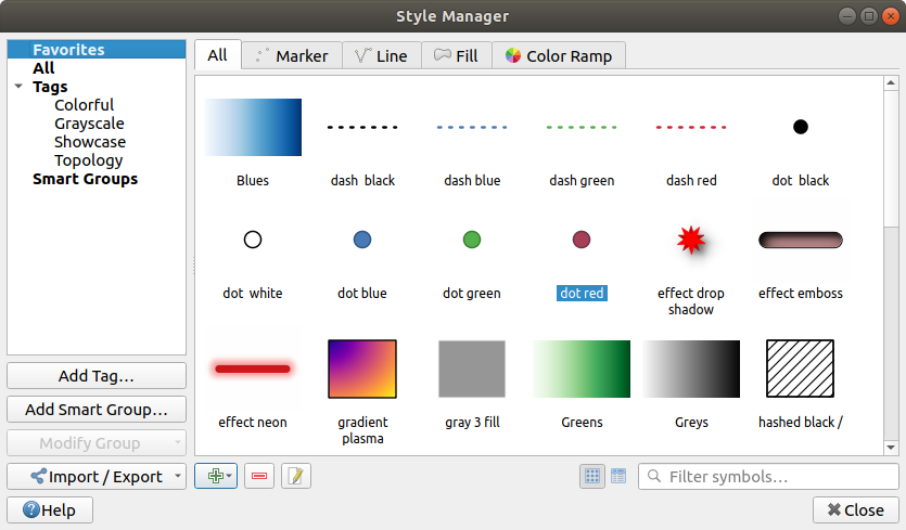
The Style Manager
Organizing symbols and color ramps
The Style Manager dialog displays in its center a frame with previewed items organized into tabs:
All for a complete collection of point, linear and surface symbols as the following items allow only to display a single item group;
 Marker for point symbols;
 Line for linear symbols;
 Fill for surface symbols;
and
 Color ramp
For each family of items, you can organize the elements into different categories, listed in the panel on the left:
Favorites: displayed by default when configuring an item, it shows a set of default symbols and color ramps you can extend;
All: listing all the installed symbols and color ramps;
Tags: shows a list of labels you can use to identify the items. A symbol or color ramp can be tagged more than once. Select a tag in the list and you’ll see the items that belong to it for each type of item. To create a new tag you could later attach to symbols or color ramps, use the Add Tag… button or select the
 Add Tag…
from any tag contextual menu;
Add Tag…
from any tag contextual menu;Smart Group: a smart group dynamically fetches its symbols according to conditions set (see eg, figure_smart_group). Click the Add Smart Group… button to create smart groups. The dialog box allows you to enter an expression to filter the items to select (has a particular tag, have a string in its name, etc.). Any symbol or color ramp that satisfies the entered condition(s) is automatically added to the smart group.
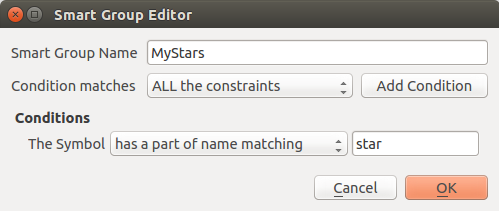
Creating a Smart Group
Tags and smart groups are not mutually exclusive: they are simply two different ways to organize your symbols and color ramps. Unlike the smart groups that automatically fetch their belonged items based on the input constraints, tags are filled by the user. To edit any of those categories, you can either:
select the items, right-click and choose and then select the tag name or create a new tag;
select the tag and press . A
 checkbox appears near each item to help you select
or deselect it. When selection is finished, press .
checkbox appears near each item to help you select
or deselect it. When selection is finished, press .select the smart group, press and configure a new set of constraints in the Smart Group Editor dialog. This option is also available in the contextual menu of the smart group.
To remove a tag or a smart group, right-click on it and select the  Remove button. Note that this does not delete the items grouped in the
category.
Remove button. Note that this does not delete the items grouped in the
category.
Adding, editing or removing an item
As seen earlier, symbols and color ramps are listed under different tabs whose contents depend on the active category (tag, smart group, favorites…). For each type of symbols (Marker , Line or Fill) and color ramp, when the tab is enabled, you can:
Add new items: press the
Add item button and configure the
item following symbols or color ramps
builder description.Modify an existing item: select an item and press
 Edit item
button and configure as mentioned above.
Edit item
button and configure as mentioned above.Delete existing items: to delete a symbol you no longer need, select it and click
Remove item (also available through right-click).
The symbol will be deleted from the local symbols database.
Right-clicking over a selection of items also allows you to:
Add to Favorites;
Remove from Favorites;
and select the appropriate tag or create a new one to use;
Clear Tags: detaching the symbols from any tag;
Remove Item(s);
Edit Item: applies to the item you right-click over;
Export Selected Symbol(s) as PNG… (not available with color ramps);
Export Selected Symbol(s) as SVG… (not available with color ramps);
Sharing symbols and color ramps
The  Import/Export tool, at the left bottom of the Style
Manager dialog, offers options to easily share symbols and color ramps with
others. These options are also available through right-click over the items.
Import/Export tool, at the left bottom of the Style
Manager dialog, offers options to easily share symbols and color ramps with
others. These options are also available through right-click over the items.
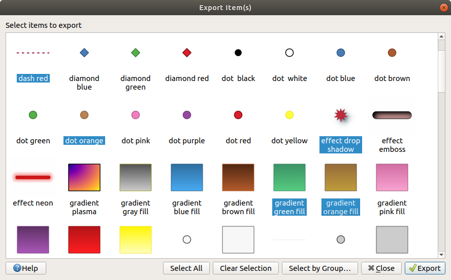
Exporting items
You can export a set of items to an .XML file:
Expand the
Import/Export drop-down menu and select
 Export Item(s)…
Choose the symbols and color ramps you’d like to integrate. Symbol selection can be done with the mouse or using a tag or group previously set.
Press Export when ready. You’ll be prompted to indicate the destination of the saved file. The XML format generates a single file containing all the selected symbols. This file can then be imported in another user’s style library.
Exporting symbols and color ramps
When symbols are selected, you can also export them to .PNG or .SVG.
Exporting to .PNG or .SVG (both not available for color ramp symbols)
creates a file for each selected symbol in a given folder. The SVG folder can be
added to the SVG paths in menu of another user, allowing him direct access to all these symbols.
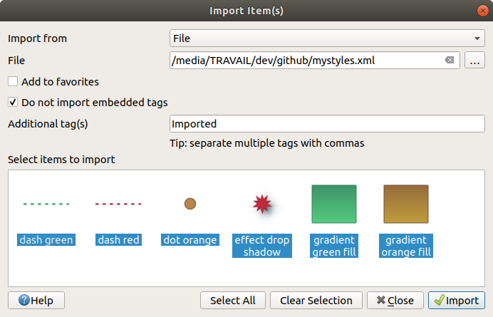
Importing items
You can extend your symbols library by importing new symbols:
Expand the
Import/Export drop-down menu and select
 Import Item(s) at the left bottom of the dialog.
In the new dialog, indicate the source of the symbols (it can be an
.xmlfile on the disk or a url).Set whether to
Add to favorites the items to import.Check
Do not import embedded tags to avoid the import
of tags associated to the items being imported.Give the name of any Additional tag(s) to apply to the new items.
Select from the preview the items you want to add to your library.
And press Import.
Importing symbols and color ramps
Color Ramp
The Color ramp tab in the Style Manager dialog helps you preview different color ramps based on the category selected in the left panel.
To create a custom color ramp, activate the Color ramp tab and click the
Add item button. The button reveals a drop-down list to
choose the ramp type:
Gradient: given a start and end colors, generate a color ramp which can be continuous or discrete. With double-clicking the ramp preview, you can add as many intermediate color stops as you want.
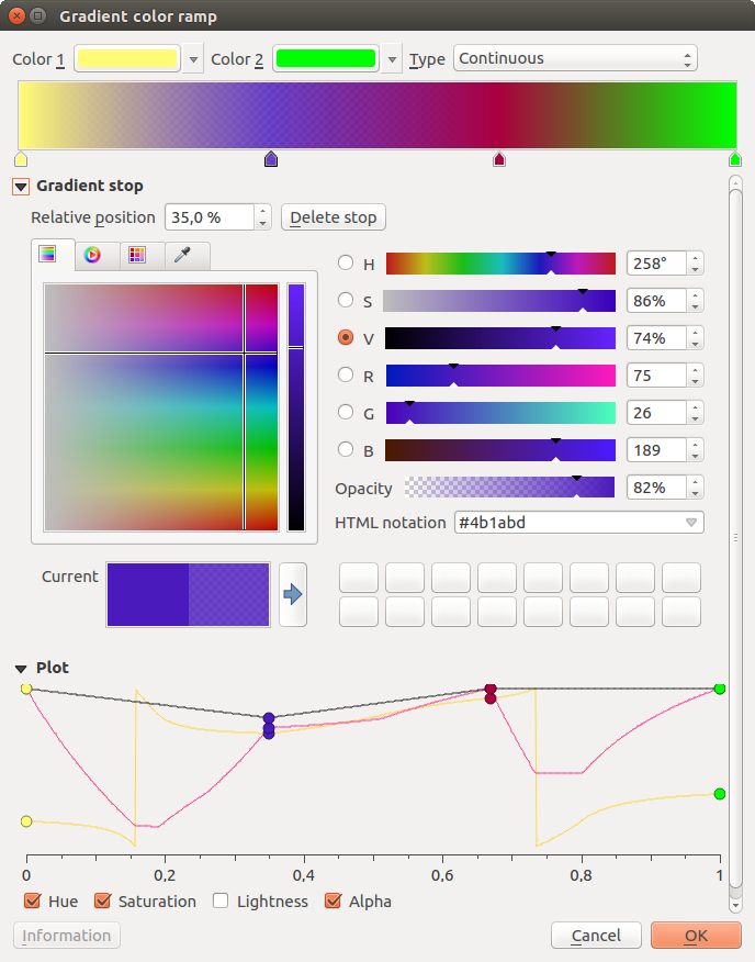
Example of custom gradient color ramp with multiple stops
Color presets: allows to create a color ramp consisting of a list of colors selected by the user;
Random: creates a random set of colors based on range of values for Hue, Saturation, Value and Opacity and a number of colors (Classes);
Catalog: ColorBrewer: a set of predefined discrete color gradients you can customize the number of colors in the ramp;
or Catalog: cpt-city: an access to a whole catalog of color gradients to locally save as standard gradient. The cpt-city option opens a new dialog with hundreds of themes included ‘out of the box’.
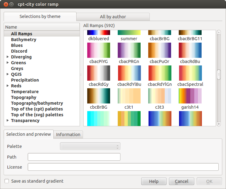
cpt-city dialog with hundreds of color ramps
Tip
Easily adjust the color stops of the gradient color ramp
Double-clicking the ramp preview or drag-and-drop a color from the color spot onto the ramp preview adds a new color stop. Each color stop can be tweaked using the Color Selector widgets or by plotting each of its parameters. You can also reposition it using the mouse, the arrow keys (combine with Shift key for a larger move) or the Relative position spinbox. Pressing Delete stop as well as DEL key removes the selected color stop.
The Symbol Selector
The Symbol selector is the main dialog to design a symbol. You can create or edit Marker, Line or Fill Symbols.
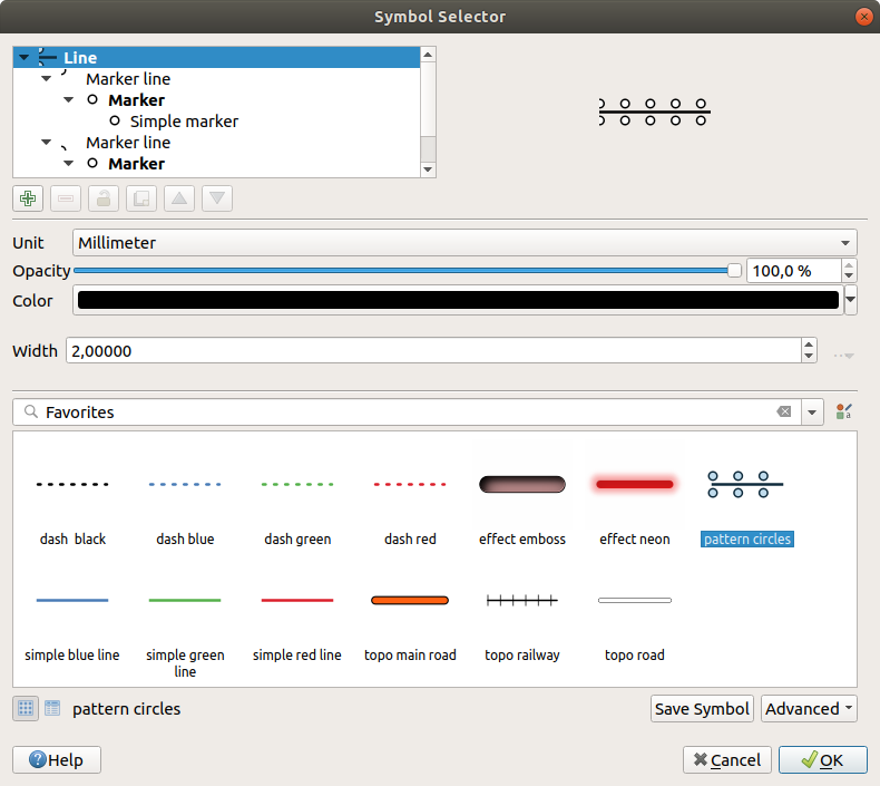
Designing a Line symbol
Two main components structure the symbol selector dialog:
the symbol tree, showing symbol layers that are combined afterwards to shape a new global symbol
and settings to configure the selected symbol layer in the tree.
The symbol layer tree
A symbol can consist of several Symbol layers. The symbol tree shows the overlay of these symbol layers that are combined afterwards to shape a new global symbol. Besides, a dynamic symbol representation is updated as soon as symbol properties change.
A set of tools is available to manage the symbol tree items and according to the level selected, you’ll get enabled different tools at the bottom of the dialog to:
- add new symbol layer: you can stack as many symbols as you want
- remove the selected symbol layer
lock colors of symbol layer: a
 locked color stays unchanged when
user changes the color at the global (or upper) symbol level
locked color stays unchanged when
user changes the color at the global (or upper) symbol level duplicate a (group of) symbol layer(s)
move up or down the symbol layer
When a symbol layer is selected in the tree, you can also:
control its visibility with the
 Enable layer option.
Disabled symbol layers are not drawn, but are saved and can be enabled at a
later stage. This makes it easier to customize parts of the symbol based on
the feature attributes or to tweak symbol appearance without having to
totally delete a symbol layer;
Enable layer option.
Disabled symbol layers are not drawn, but are saved and can be enabled at a
later stage. This makes it easier to customize parts of the symbol based on
the feature attributes or to tweak symbol appearance without having to
totally delete a symbol layer;apply rendering effects using the
Draw effects button.
Configuring a symbol
In QGIS, configuring a symbol is done in two steps: the symbol and then the symbol layer.
The symbol
At the top level of the tree, it depends on the layer geometry and can be of Marker, Line or Fill type. Each symbol can embed one or more symbols (including, of any other type) or symbol layers.
You can setup some parameters that apply to the global symbol:
Unit: it can be Millimeter, Points, Pixels, Meters at Scale, Map unit or Inches
Transparency
Color: when this parameter is changed by the user, its value is echoed to all unlocked sub-symbols color
Size and Rotation for marker symbols
Width for line symbols
Note
The Data-defined override button beside the last layer-related parameters is inactive when setting the symbol from the Style manager dialog. When the symbol is connected to a map layer, this button helps you create proportional or multivariate analysis rendering.
The symbols used at this level are items you can pick from the symbols
library. Available symbols of the corresponding type
are shown and, through the editable drop-down list just above, can be filtered
by free-form text or by categories.
You can also update the list of symbols using the
Style Manager button and open the eponym dialog. There,
you can use any capabilities as exposed in The Style Manager section.
The symbols are displayed either:
in an icon list (with thumbnail, name and associated tags) using the
 List View button below the frame;
or as icon preview using the
 Icon View button.
Press the Save Symbol button to add any symbol being edited to the symbols
library. With the Advanced  option, you can:
set the symbol levels: defining the way symbol layers are connected to each other in the map canvas (see Symbol levels for more information)
and for line and fill symbols, clip features to canvas extent.
Tip
Note that once you have set the size in the lower levels of the Symbol layers dialog, the size of the whole symbol can be changed with the Size (for marker symbols) or the Width (for line symbols) menu in the first level again. The size of the lower levels changes accordingly, while the size ratio is maintained.
The symbol layer
At a lower level of the tree, you can customize the symbol layers. The available
symbol layer types depend on the upper symbol type. You can apply on the symbol
layer  paint effects to enhance its rendering.
Because describing all the options of all the symbol layer types would not be possible, only particular and significant ones are mentioned below.
Common parameters
Some common options and widgets are available to build a symbol layer, regardless it’s of marker, line or fill sub-type:
the color selector widget to ease color manipulation
Units: it can be Millimeter, Points, Pixels, Meters at Scale, Map unit or Inches
the
 data-defined override widget near almost all options,
extending capabilities of customizing each symbol (see Data defined override setup for
more information)
data-defined override widget near almost all options,
extending capabilities of customizing each symbol (see Data defined override setup for
more information)
Note
While the description below assumes that the symbol layer type is bound to the feature geometry, keep in mind that you can embed symbol layers in each others. In that case, the lower level symbol layer parameter (placement, offset…) might be bound to the upper-level symbol, and not to the feature geometry itself.
Marker Symbols
Appropriate for point geometry features, marker symbols have several Symbol layer types:
Simple marker (default);
Ellipse marker: a simple marker symbol layer, with customizable width and height;
Filled marker: similar to the simple marker symbol layer, except that it uses a fill sub symbol to render the marker. This allows use of all the existing QGIS fill (and stroke) styles for rendering markers, e.g. gradient or shapeburst fills;
Font marker: use installed fonts as marker symbols;
Geometry generator (see The Geometry Generator);
Vector Field marker (see The Vector Field Marker);
SVG marker: provides you with images from your SVG paths (set in menu) to render as marker symbol. Width and height of the symbol can be set independently or using the
 Lock aspect ratio. Each SVG file colors and stroke can
also be adapted.
Lock aspect ratio. Each SVG file colors and stroke can
also be adapted.Note
SVG version requirements
QGIS renders SVG files that follow the SVG Tiny 1.2 profile, intended for implementation on a range of devices, from cellphones and PDAs to laptop and desktop computers, and thus includes a subset of the features included in SVG 1.1 Full, along with new features to extend the capabilities of SVG.
Some features not included in these specifications might not be rendered correctly in QGIS.
Tip
Enable SVG marker symbol customization
To have the possibility to change the colors of a SVG marker, you have to add the placeholders
param(fill)for fill color,param(outline)for stroke color andparam(outline-width)for stroke width. These placeholders can optionally be followed by a default value, e.g.:<svg width="100%" height="100%"> <rect fill="param(fill) #ff0000" stroke="param(outline) #00ff00" stroke-width="param(outline-width) 10" width="100" height="100"> </rect> </svg>
For each marker symbol layer type, you can set some of the following properties:
Size
Fill color using all the capabilities of the Color Selector widget, extended by a shortcut to apply a Transparent fill in the drop-down menu;
Stroke color using all the capabilities of the color selector widget, extended by a shortcut to apply a Transparent stroke in the drop-down menu;
Stroke style
Stroke width
Join style
Rotation
Offset: You can shift the symbol in the X or Y direction;
Anchor point.
In most of the marker symbols dialog, you also have a frame with previews of predefined symbols you can choose from.
Line Symbols
Appropriate for line geometry features, line symbols have following symbol layer types:
Simple line (default): available settings are:
Color
Stroke width
Stroke style
Join style
Cap style
Offset
- Use custom dash pattern: overrides the Stroke
style setting with a custom dash.
Arrow: draws lines as curved (or not) arrows with a single or a double head with configurable width, length and thickness. To create a curved arrow the line feature must have at least three vertices. It also uses a fill symbol such as gradients or shapeburst to render the arrow body. Combined with the geometry generator, this type of layer symbol helps you representing flow maps;
Geometry generator (see The Geometry Generator);
Marker line: displays a marker symbol along the line. It can be at a regular distance or based on its geometry: first, last or each vertex, on central point or on every curve point. You can set an offset along the line for the marker symbol, or offset the line itself. The Rotate marker option allows you to set whether the marker symbol should follow the line orientation or not.
Fill Symbols
Appropriate for polygon geometry features, fill symbols have also several symbol layer types:
Simple fill (default): the following settings are available:
Fill color using all the capabilities of the Color Selector widget, extended by a shortcut to apply a Transparent fill
Fill style
Stroke color using all the capabilities of the color selector widget, extended by a shortcut to apply a Transparent stroke
Stroke width
Stroke style
Join style
Offset: You can shift the symbol in the X or Y direction;
Centroid fill: places a marker symbol at the centroid of the visible feature. The position of the marker may however not be the real centroid of the feature because calculation takes into account the polygon(s) clipped to area visible in map canvas for rendering and ignores holes. Use the geometry generator symbol if you want the exact centroid.
The marker can be placed on every part of a multi-part feature or only on its biggest part, and forced to be inside the polygon;
Geometry generator (see The Geometry Generator);
Gradient fill: uses a radial, linear or conical gradient, based on either simple two color gradients or a predefined gradient color ramp to fill polygon layers. Gradient can be rotated and applied on a single feature basis or across the whole map extent. Also start and end points can be set via coordinates or using the centroid (of feature or map);
Line pattern fill: fills the polygon with a hatching pattern of line symbol layer. You can set the spacing between lines and an offset from the feature boundary;
Point pattern fill: fills the polygon with a hatching pattern of marker symbol layer. You can set the spacing between lines and an offset from the feature boundary;
Raster image fill: you can fill polygons with a tiled raster image. Options include (data defined) file name, opacity, image size (in pixels, mm or map units), coordinate mode (feature or view) and rotation;
SVG fill: fills the polygon using SVG markers;
Shapeburst fill: this option buffered a gradient fill, where a gradient is drawn from the boundary of a polygon towards the polygon’s centre. Configurable parameters include distance from the boundary to shade, use of color ramps or simple two color gradients, optional blurring of the fill and offsets;
Outline: Arrow: uses a line arrow symbol layer to represent the polygon boundary;
Outline: Marker line: uses a marker line symbol layer to represent the polygon boundary;
Outline: simple line: uses a simple line symbol layer to represent the polygon boundary. The Draw line only inside polygon option helps polygon borders inside the polygon and can be useful to clearly represent adjacent polygon boundaries.
Note
When geometry type is polygon, you can choose to disable the automatic clipping of lines/polygons to the canvas extent. In some cases this clipping results in unfavourable symbology (e.g. centroid fills where the centroid must always be the actual feature’s centroid).
The Geometry Generator
Available with all types of symbols, the geometry generator symbol layer allows to use expression syntax to generate a geometry on the fly during the rendering process. The resulting geometry does not have to match with the original geometry type and you can add several differently modified symbol layers on top of each other.
Some examples:
-- render the centroid of a feature
centroid( $geometry )

-- visually overlap features within a 100 map units distance from a point
-- feature, i.e generate a 100m buffer around the point
buffer( $geometry, 100 )

-- Given polygon layer1( id1, layer2_id, ...) and layer2( id2, fieldn...)
-- render layer1 with a line joining centroids of both where layer2_id = id2
make_line( centroid( $geometry ),
           centroid( geometry( get_feature( 'layer2', 'id2', attribute(
               $currentfeature, 'layer2_id') ) )
         )
The Vector Field Marker
The vector field marker is used to display vector field data such as earth deformation, tidal flows, and the like. It displays the vectors as lines (preferably arrows) that are scaled and oriented according to selected attributes of data points. It can only be used to render point data; line and polygon layers are not drawn by this symbology.
The vector field is defined by attributes in the data, which can represent the field either by:
cartesian components (
xandycomponents of the field)or polar coordinates: in this case, attributes define
LengthandAngle. The angle may be measured either clockwise from north, or Counterclockwise from east, and may be either in degrees or radians.or as height only data, which displays a vertical arrow scaled using an attribute of the data. This is appropriate for displaying the vertical component of deformation, for example.
The magnitude of field can be scaled up or down to an appropriate size for viewing the field.