20. Travailler avec des nuages de points
20.1. Introduction aux nuages de points
Qu’est-ce qu’un nuage de points ?
Un nuage de points est une représentation de l’espace en trois dimensions constituée d’une multitude de points (jusqu’à des billions ou même des trillions). Chacun des points ont des coordonnées x, y et z. Selon la méthode d’acquisition, les nuages de point peuvent avoir des attributs supplémentaires tels qu’une valeur de couleur ou d’intensité. Ces attributs peuvent être utilisés, par exemple, pour afficher les nuages de points dans différentes couleurs. Dans QGIS, un nuage de points peut être utilisé pour générer une image en trois dimension d’un paysage (ou d’un autre objet).
Formats pris en charge
QGIS gère les formats de données Entwine Point Tile (EPT) et LAS/LAZ. Pour travailler avec des nuages de points, QGIS enregistre toujours les données au format EPT. EPT est un format de stockage qui consiste en plusieurs fichiers stockés dans un même répertoire. Pour permettre un accès rapide aux données, EPT utilise l’indexation. Pour plus d’information sur le format EPT, consultez le site web d’Entwine
Si les données sont au format LAS ou LAZ, QGIS les convertira au format EPT au moment du premier chargement. Selon la taille du fichier, cela peut prendre un certain temps. A cette étape, un sous répertoire est créé dans le répertoire où se trouve le fichier LAS/LAZ en suivant ce schéma : ept_ + nom__fichier_LAS/LAZ. SI un tel répertoire existe déjà, QGIS charge les données EPT immédiatement (ce qui accélère le temps de chargement).
Bon à savoir
Dans QGIS, il n’est pas (encore) possible d’éditer des nuages de points. Si vous souhaitez manipuler votre nuage de points, vous pouvez utiliser CloudCompare, un outils open source de traitement des nuages de points. Par ailleurs, la bibliothèque Point Data Abstraction Library (PDAL - similaire à GDAL) vous propose des outils pour éditer les nuages de points (PDAL est uniquement en ligne de commande).
Dû au très grand nombre de points de données, il n’est pas possible d’afficher la table attributaire d’un nuage de points dans QGIS. Cependant, l” Outil d’identification gère les nuages de points et vous pouvez ainsi afficher tous les attributs d’un point de données.
20.2. Propriétés des nuages de points
La fenêtre des Propriétés de la couche d’un nuage de points propose les paramètres généraux de la couche et de son rendu. Elle fournit également des informations sur la couche.
Pour ouvrir la fenêtre Propriétés de la couche :
Dans le panneau Couches, double-cliquez sur la couche ou faites un clic droit et sélectionnez Propriétés… dans le menu contextuel ;
Allez dans le menu lorsque la couche est sélectionnée.
La fenêtre des Propriétés de la couche d’un nuage de points propose les sections suivantes :
|
||
|
|
|

[1] Aussi disponible dans le panneau Style de Couche
Note
La plupart des propriétés d’une couche de nuage de points peut être sauvegardée dans un fichier .qml via l’onglet Symbologie, en bas de la fenêtre des propriétés. Plus de détails ici : Sauvegarder et Partager les propriétés d’une couche.
20.2.1. Onglet Information
L’onglet  Information, en lecture seule, permet d’avoir rapidement un résumé des informations et métadonnées de la couche courante. Les informations fournies sont :
Généralités telles que le nom dans le projet, le chemin source, la date de la dernière modification, la taille et le fournisseur utilisé
Basé sur le fournisseur de la couche : emprise et nombre de points
Le système de coordonnées de référence : nom, unités, méthode, précision, référence (c’est-à-dire statique ou dynamique)
Métadonnées délivrées par le fournisseur : date de création, version, format des données, échelle X/Y/Z…
Reprises de l’onglet
 Métadonnées (où elles peuvent être éditées) : accès, emprise, liens, contacts, historique…
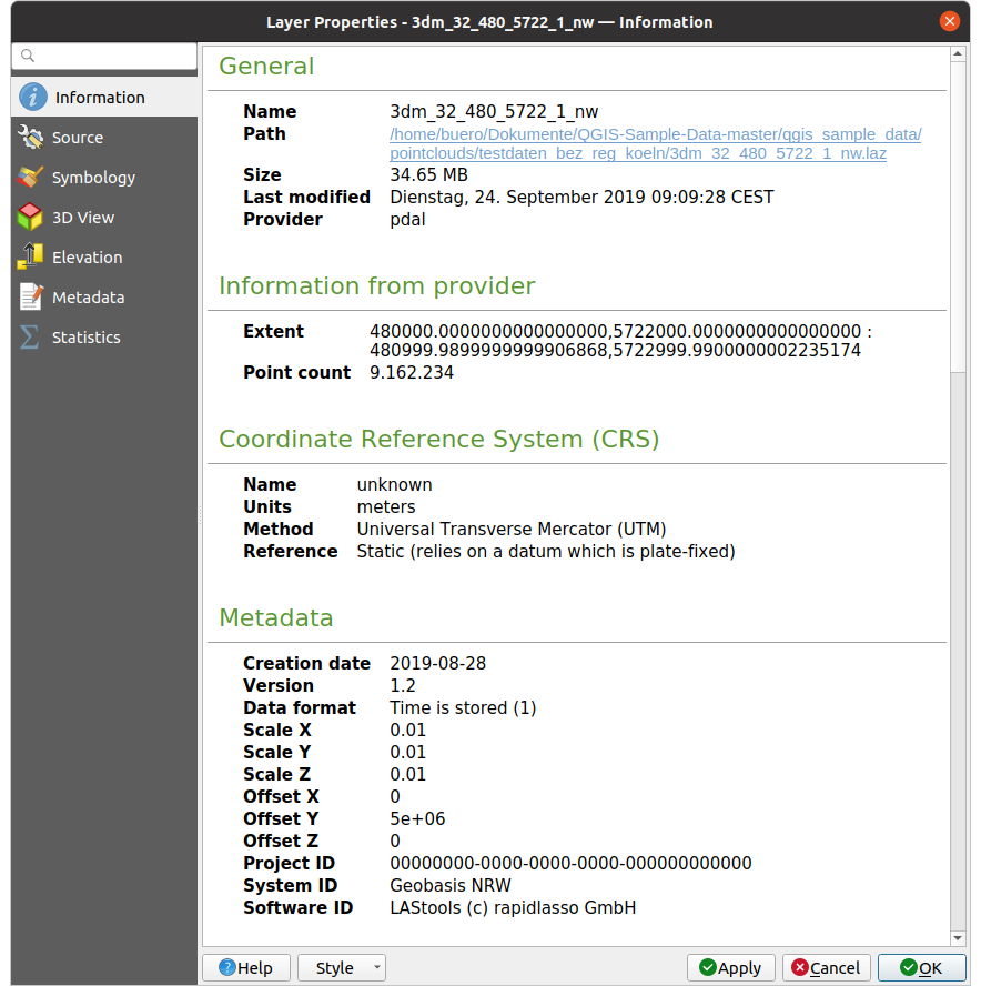
Fig. 20.1 Onglet d’Information d’un nuage de points
20.2.2. Onglet Source
Dans l’onglet  Source, vous pouvez voir et modifier les informations de base sur la couche de nuage de points :
Paramètres: Donner à la couche un nom différent de celui du fichier et qui sera utilisé pour identifier la couche dans le projet (dans le Panneau Couches, les expressions, la légende des mises en page…).
Système de Coordonnées de Référence assigné (SCR) : Ici vous pouvez changer le Système de Coordonnées de Référence assigné à la couche en sélectionnant un système utilisé récemment parmi la liste déroulante ou en cliquant sur le bouton
 Sélectionner le SCR (voir Sélectionneur de Système de Coordonnées de Référence). Utilisez ce paramètre uniquement si le SCR de la couche n’est pas le bon ou si elle n’en a pas de défini.
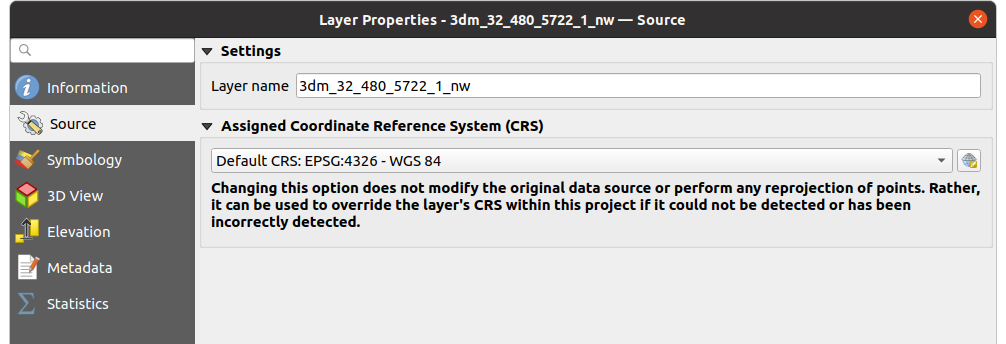
Fig. 20.2 Onglet source de nuage de points
20.2.3. Onglet Symbologie
Le choix des paramètres pour le rendu d’un nuage de point se fait dans l’onglet  Symbologie. Dans la partie supérieure, se trouve les paramètres pour les différents types de rendus des entités. Dans la partie inférieure, se trouvent les sections avec les paramètres généraux pour l’intégralité de la couche, qui s’appliquent après le rendu des entités.
20.2.3.1. Types de rendu pour les entités
Différentes options pour le rendu des nuages de points peuvent être sélectionnées via le menu déroulant situé en haut de l’onglet Symbologie (cf. Fig. 20.3) :
 Emprise uniquement : Seul le rectangle d’emprise de la couche est dessinée ; pratique pour avoir un aperçu de l’emprise des données. Comme à l’accoutumée, le Symbol widget vous permet de configurer toutes les propriétés (couleur, pointillé…) du rectangle d’emprise.
 Attribut par rampe : Les données sont dessinées via un dégradé de couleur. Voir Attribute by Ramp Renderer
 RVB : Dessine les données en utilisant les valeurs de couleur rouge, vert et bleu. Voir RGB Renderer
 Classification : Les données sont dessinée en utilisant des couleurs différentes pour chaque classe. Voir Classification Renderer
Lorsqu’un nuage de points est chargé, QGIS suit cette logique pour choisir le meilleur rendu :
si le jeu de données contient des informations de couleur (rouge, vert, bleu), le rendu RVB est utilisé,
sinon, si le jeu de données contient un attribut
Classification, le rendu Classification est utilisé,sinon, il reviendra au rendu basé sur l’attribut Z.
SI vous ne connaissez pas les attributs du nuage de points, l”onglet  Statistiques fournit un bon aperçu des attributs et de leur gamme de valeurs.
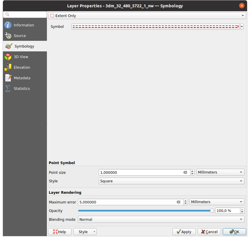
Fig. 20.3 Onglet Symbologie d’un nuage de points
Attribute by Ramp Renderer
With Attribute by Ramp, the data can be
displayed by numerical values over a color gradient. Such numerical values
can be, for example, an existing intensity attribute or the Z-value. Depending
on a minimum and a maximum value, the other values are spread to the color
gradient via interpolation. The distinct values and their assignment to a
certain color are called « color map » and are shown in the table. There are
various setting options, which are described below the figure.
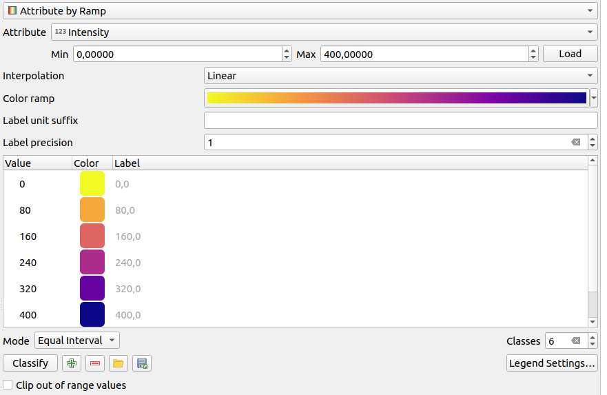
Fig. 20.4 Point cloud symbology tab: Attribute by Ramp
Min and Max define the range that is applied to the color ramp: the Min value represents the left, the Max value the right end of the color ramp, the values in between are interpolated. By default QGIS detects the minimum and the maximum from the selected attribute but they can be modified. Once you have changed the values, you can restore the defaults by clicking on the Load button.
The Interpolation entry defines how values are assigned their color:
Discrete (a
<=symbol appears in the header of the Value column): The color is taken from the closest color map entry with equal or higher valueLinear The color is linearly interpolated from the color map entries above and below the pixel value, meaning that to each dataset value corresponds a unique color
Exact (a
=symbol appears in the header of the Value column): Only pixels with value equal to a color map entry are applied a color; others are not rendered.
The Color ramp widget helps you select the color ramp to assign to the dataset. As usual with this widget, you can create a new one and edit or save the currently selected one.
The Label unit suffix adds a label after the value in the legend, and the Label precision controls the number of decimals to display.
The classification Mode helps you define how values are distributed across the classes:
Continuous: Classes number and color are fetched from the color ramp stops; limits values are set following stops distribution in the color ramp (you can find more information on stops in Définition d’une rampe de couleurs).
Equal interval: The number of classes is set by the Classes field at the end of the line; limits values are defined so that the classes all have the same magnitude.
The classes are determined automatically and shown in the color map table. But you can also edit these classes manually:
Double clicking in a Value in the table lets you modify the class value
Double clicking in the Color column opens the Sélecteur de couleur widget, where you can select a color to apply for that value
Double clicking in the Label column to modify the label of the class
Right-clicking over selected rows in the color table shows a contextual menu to Change Color… and Change Opacity… for the selection
Below the table there are the options to restore the default classes with
Classify or to manually  Add values or
 Delete selected values from the table.
Since a customized color map can be very complex, there is also the option to
 Load an existing color map or to
  Save it for use in
other layers (as a
Save it for use in
other layers (as a txt file).
If you have selected Linear for Interpolation, you can also configure:
 Clip out of range values By default, the linear
method assigns the first class (respectively the last class) color to
values in the dataset that are lower than the set Min
(respectively greater than the set Max) value.
Check this setting if you do not want to render those values.
Clip out of range values By default, the linear
method assigns the first class (respectively the last class) color to
values in the dataset that are lower than the set Min
(respectively greater than the set Max) value.
Check this setting if you do not want to render those values.Legend settings, for display in the Layers panel and in the layout legend. Customization works the same way as with a raster layer (find more details at Personnaliser une légende de raster).
RGB Renderer
With the RGB renderer, three selected attributes
from the point cloud will be used as the red, green and blue component. If the
attributes are named accordingly, QGIS selects them automatically and fetches
Min and Max values for each band and scales the coloring
accordingly. However, it is also possible to modify the values manually.
A Contrast enhancement method can be applied to the values: No Enhancement, Stretch to MinMax, Stretch and Clip to MinMax and Clip to MinMax
Note
The Contrast enhancement tool is still under development. If you have problems with it, you should use the default setting Stretch to MinMax.
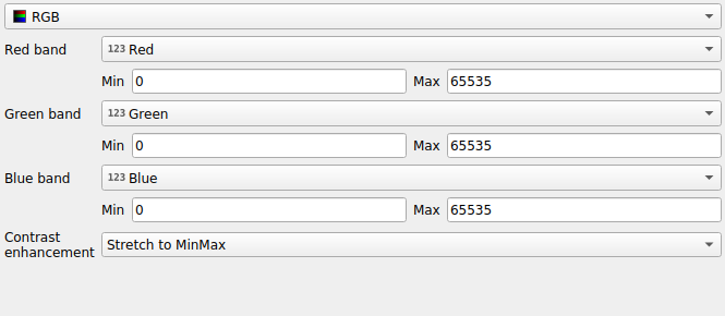
Fig. 20.5 The point cloud RGB renderer
Classification Renderer
In the Classification rendering, the point cloud is shown
differentiated by color on the basis of an attribute. Any type of attribute
can be used (numeric, string, …). Point cloud data often includes a
field called Classification. This usually contains data determined
automatically by post-processing, e.g. about vegetation. With
Attribute you can select the field from the attribute table that
will be used for the classification. By default, QGIS uses the definitions of
the LAS specification (see table “ASPRS Standard Point Classes” in the PDF on
ASPRS home page).
However, the data may deviate from this schema; in case of doubt, you have to
ask the person or institution from which you received the data for the
definitions.
Fig. 20.6 The point cloud classification renderer
In the table all used values are displayed with the corresponding color and
legend. At the beginning of each row there is a check box; if it is
unchecked, this value is no longer shown on the map. With double click in the
table, the Color, the Value and the Legend
can be modified (for the color, the Sélecteur de couleur widget opens).
Below the table there are buttons with which you can change the default classes generated by QGIS:
With the Classify button the data can be classified automatically: all values that occur in the attributes and are not yet present in the table are added
Vous pouvez ajouter ou supprimer manuellement des valeurs à l’aide des boutons
Ajouter and SupprimerDelete All removes all values from the table
Indication
In the Layers panel, you can right-click over a class leaf entry of a layer to quickly configure visibility of the corresponding features.
20.2.3.2. Point Symbol
Under Point Symbol, the size and the unit (e.g. millimeters, pixels, inches) with which each data point is displayed can be set. Either Circle or Square can be selected as the style for the points.
20.2.3.3. Layer Rendering
In the Layer Rendering section you have the following options to modify the rendering of the layer:
Draw order: allows to control whether point clouds rendering order on 2d map canvas should rely on their Z value. It is possible to render :
with the Default order in which the points are stored in the layer,
from Bottom to top (points with larger Z values cover lower points giving the looks of a true ortho photo),
or from Top to bottom where the scene appears as viewed from below.
Maximum error: Point clouds usually contains more points than are needed for the display. By this option you set how dense or sparse the display of the point cloud will be (this can also be understood as “maximum allowed gap between points”). If you set a large number (e.g. 5 mm), there will be visible gaps between points. Low value (e.g. 0.1 mm) could force rendering of unnecessary amount of points, making rendering slower (different units can be selected).
Opacity: You can make the underlying layer in the map canvas visible with this tool. Use the slider to adapt the visibility of your layer to your needs. You can also make a precise definition of the percentage of visibility in the menu beside the slider.
Blending mode: You can achieve special rendering effects with this tool. The pixels of your overlaying and underlying layers are mixed through the settings described in Modes de fusion.
Eye dome lighting: this applies shading effects to the map canvas for a better depth rendering. Rendering quality depends on the draw order property; the Default draw order may give sub-optimal results. Following parameters can be controlled:
Strength: increases the contrast, allowing for better depth perception
Distance: represents the distance of the used pixels off the center pixel and has the effect of making edges thicker.
20.2.4. Onglet Vue 3D
Dans l’onglet  Vue 3D, vous pouvez choisir les paramètres de rendu du nuage de points dans la vue 3D.
20.2.4.1. Modes de rendu en 3D
Following options can be selected from the drop down menu at the top of the tab:
No Rendering: Data are not displayed
Follow 2D Symbology: Syncs features rendering in 3D with symbology assigned in 2D
 Single Color: All points are displayed in the same
color regardless of attributes
Single Color: All points are displayed in the same
color regardless of attributes- Attribute by Ramp: Interpolates a given attribute
over a color ramp and assigns to features their matching color.
See Attribute by Ramp Renderer.
- RGB: Use different attributes of the features
to set the Red, Green and Blue color components to assign to them.
See RGB Renderer.
- Classification: differentiates points by color
on the basis of an attribute. See Classification Renderer.
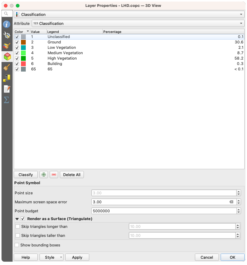
Fig. 20.7 The point cloud 3D view tab with the classification renderer
20.2.4.2. 3D Point Symbol
In the lower part of the 3D View tab you can find the
Point Symbol section. Here you can make general settings for the
entire layer which are the same for all renderers. There are the following
options:
Point size: The size (in pixels) with which each data point is displayed can be set
Maximum screen space error: By this option you set how dense or sparse the display of the point cloud will be (in pixels). If you set a large number (e.g. 10), there will be visible gaps between points; low value (e.g. 0) could force rendering of unnecessary amount of points, making rendering slower (you can find more details at Symbology Maximum error).
Point budget: To avoid long rendering, you can set the maximum number of points that will be rendered
Check
Render as surface (Triangulate) to render
the point cloud layer in the 3D view with a solid surface obtained by triangulation.
You can control dimensions of the computed triangles:- Skip triangles longer than a threshold value:
sets in the horizontal plan, the maximum length of a side of the triangles to consider
- Skip triangles taller than a threshold value:
sets in the vertical plan, the maximum height of a side of the triangles to consider
- Show bounding boxes: Especially useful for debugging,
shows bounding boxes of nodes in hierarchy
20.2.5. Onglet Rendu
Under the Scale dependent visibility group box,
you can set the Maximum (inclusive) and Minimum
(exclusive) scale, defining a range of scale in which features will be
visible. Out of this range, they are hidden. The  Set to current canvas scale button helps you use the current map
canvas scale as boundary of the range visibility.
See Sélecteur de visibilité définie par l’échelle for more information.
Set to current canvas scale button helps you use the current map
canvas scale as boundary of the range visibility.
See Sélecteur de visibilité définie par l’échelle for more information.
Note
Vous pouvez aussi activer l’échelle de visibilité sur une couche depuis le panneau de couches. Clic-droit sur la couche et dans le menu contextuel, sélectionner Définir l’échelle de visibilité.
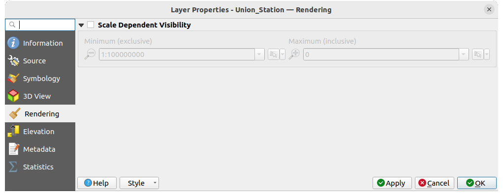
Fig. 20.8 L’onglet de rendu du nuage de points
20.2.6. Onglet Élévation
In the  Elevation tab, you can set corrections for
the Z-values of the data. This may be necessary to adjust the elevation of
the data in 3D maps and its appearance in the profile tool charts.
There are following options:
Elevation tab, you can set corrections for
the Z-values of the data. This may be necessary to adjust the elevation of
the data in 3D maps and its appearance in the profile tool charts.
There are following options:
Under Elevation group:
You can set a Scale: If
10is entered here, a point that has a value Z =5is displayed at a height of50.Un Décalage au niveau z peut être entré. Ceci est utile pour faire correspondre différentes sources de données dans sa hauteur. Par défaut, la valeur z la plus basse contenue dans les données est utilisée comme valeur. Cette valeur peut aussi être restaurée à l’aide du bouton
 Rafraîchir en fin de la ligne.
Under Profile Chart Accuracy, the Maximum error helps you control how dense or sparse the points will be rendered in the elevation profile. Larger values result in a faster generation with less points included.
Under Profile Chart Appearance, you can control the point display:
Point size: the size to render the points with, in supported units (millimeters, map units, pixels, …)
Style: whether to render the points as Circle or Square
Apply a single Color to all the points visible in the profile view
Check
Respect layer’s coloring to instead show the points
with the color assigned via their 2D symbology Apply opacity by distance from curve effect,
reducing the opacity of points which are further from the profile curve
Apply opacity by distance from curve effect,
reducing the opacity of points which are further from the profile curve
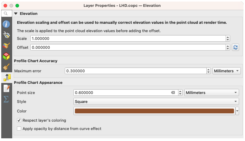
Fig. 20.9 L’onglet élévation du nuage de points
20.2.7. Onglet Métadonnées
L’onglet Métadonnées vous offre des options pour créer et modifier un rapport de métadonnées sur votre couche. Voir Metadata pour plus d’informations.
20.2.8. Onglet Statistiques
Dans l’onglet Statistiques vous trouverez un aperçu des attributs de votre nuage de points et de leur répartition.
En haut vous trouverez la section Statistiques des attributs. Ici tous les attributs contenus dans le nuage de points sont listés, ainsi que certaines de leurs valeurs statistiques : Minimum, Maximum, Moyenne, Écart-type
S’il y a un attribut Classification, alors il y a une autre table dans la section inférieure. Ici toutes les valeurs contenues dans l’attribut sont listées, ainsi que leur abondance absolue Compte et relative %.
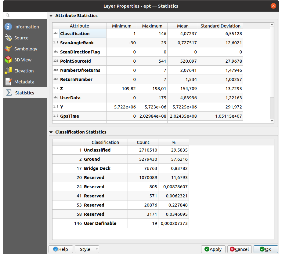
Fig. 20.10 L’onglet Statistiques d’un nuage de points