3.3. Lesson: Clasificação
Labels are a good way to communicate information such as the names of
individual places, but they can’t be used for everything.
For example, let us say that someone wants to know what each
landuse area is used for.
Using labels, you would get this:
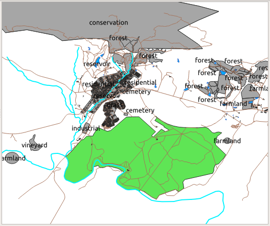
Esto dificulta la lectura el etiquetado del mapa e incluso sería abrumador si hay muchos usos diferentes del territorio en un mapa.
El objetivo de esta lección: Aprender como clasificar los datos vectoriales efectivamente.
3.3.1.  Follow Along: Clasificación de Datos Nominales
Open the Layer Properties dialog for the
landuselayerGo to the Symbology tab
Clique no menu suspenso que diz Simbologia Simples e altere-o para Categorizado:
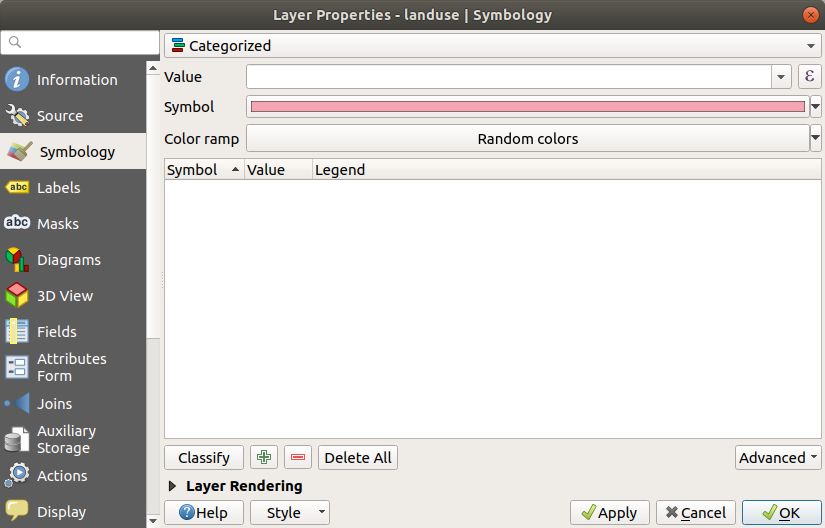
In the new panel, change the Value to
landuseand the Color ramp to Random colorsClick the button labeled Classify
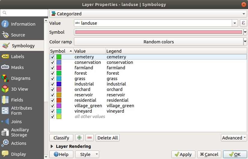
Clique OK.
Verás algo como esto:
Click the arrow (or plus sign) next to
landusein the Layers panel, you’ll see the categories explained: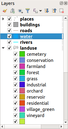
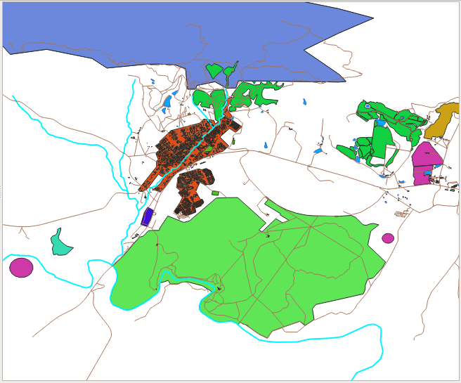
Now our landuse polygons are colored and are classified so that areas with the same land use are the same color.
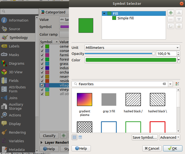
If you wish to, you can change the symbol of each landuse area by double-clicking the relevant color block in the Layers panel or in the Layer Properties dialog:
Nota que hay una categoría vacía.
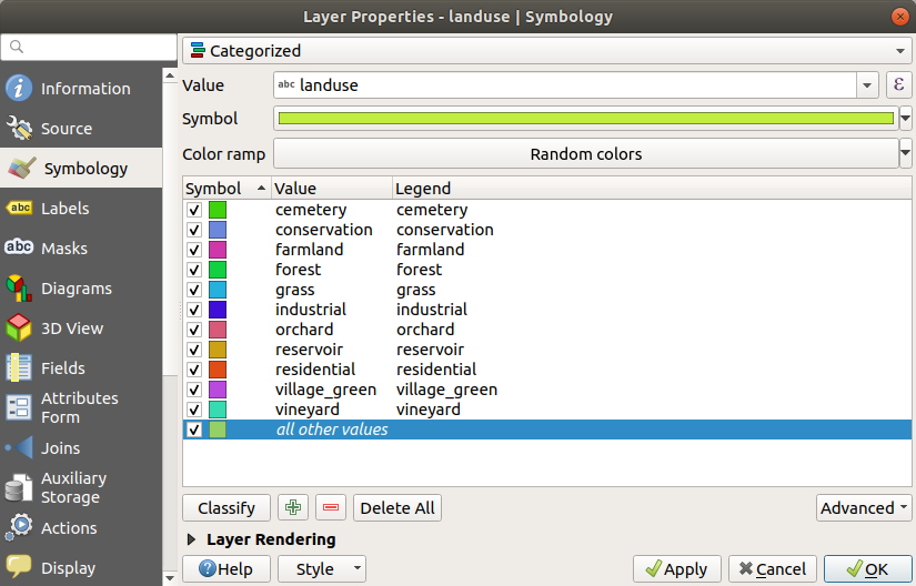
This empty category is used to color any objects which do not have a landuse value defined or which have a NULL value. It can be useful to keep this empty category so that areas with a NULL value are still represented on the map. You may like to change the color to more obviously represent a blank or NULL value.
¡Recuerda guardar tu mapa ahora para no perder todos tus laboriosos cambios!
3.3.2. Try Yourself Más Clasificación
Use the knowledge you gained above to classify the buildings layer.
Set the categorisation against the building field and use the
Spectral color ramp.
Nota
Recuerda ampliar en un área urbana para ver los resultados.
3.3.3.  Follow Along: Clasificación por Razones
Hay cuatro tipos de clasificación: nominal, ordinal, de intervalos y relativa.
In nominal classification, the categories that objects are classified into are name-based; they have no order. For example: town names, district codes, etc. Symbols that are used for nominal data should not imply any order or magnitude.
For points, we can use symbols of different shape.
For polygons, we can use different types of hatching or different colours (avoid mixing light and dark colours).
For lines, we can use different dash patterns, different colours (avoid mixing light and dark colours) and different symbols along the lines.
In ordinal classification, the categories are arranged in a certain order. For example, world cities are given a rank depending on their importance for world trade, travel, culture, etc. Symbols that are used for ordinal data should imply order, but not magnitude.
For points, we can use symbols with light to dark colours.
For polygons, we can use graduated colours (light to dark).
For lines, we can use graduated colours (light to dark).
In interval classification, the numbers are on a scale with positive, negative and zero values. For example: height above/below sea level, temperature in degrees Celsius. Symbols that are used for interval data should imply order and magnitude.
For points, we can use symbols with varying size (small to big).
For polygons, we can use graduated colours (light to dark) or add diagrams of varying size.
For lines, we can use thickness (thin to thick).
In ratio classification, the numbers are on a scale with only positive and zero values. For example: temperature above absolute zero (0 degrees Kelvin), distance from a point, the average amount of traffic on a given street per month, etc. Symbols that are used for ratio data should imply order and magnitude.
For points, we can use symbols with varying size (small to big).
For polygons, we can use graduated colours (light to dark) or add diagrams of varying size.
For lines, we can use thickness (thin to thick).
In the example above, we used nominal classification to color each
record in the landuse layer based on its landuse attribute.
Now we will use ratio classification to classify the records by area.
We are going to reclassify the layer, so existing classes will be lost if not saved. To store the current classification:
Open the layer’s properties dialog
Click the Save Style … button in the Style drop-down menu.
Select Rename Current…, enter
land usageand press OK.The categories and their symbols are now saved in the layer’s properties.
Click now on the Add… entry of the Style drop-down menu and create a new style named
ratio. This will store the new classification.Close the Layer Properties dialog
We want to classify the landuse areas by size, but there is a problem: they don’t have a size field, so we’ll have to make one.
Open the Attributes Table for the
landuselayer.Enter edit mode by clicking the
 Toggle editing
button
Toggle editing
buttonAdd a new column of decimal type, called
AREA, using the New field button:
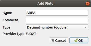
Clique OK.
The new field will be added (at the far right of the table; you may need to scroll horizontally to see it). However, at the moment it is not populated, it just has a lot of NULL values.
To solve this problem, we will need to calculate the areas.
Open the field calculator with the
 button.
You will get this dialog:
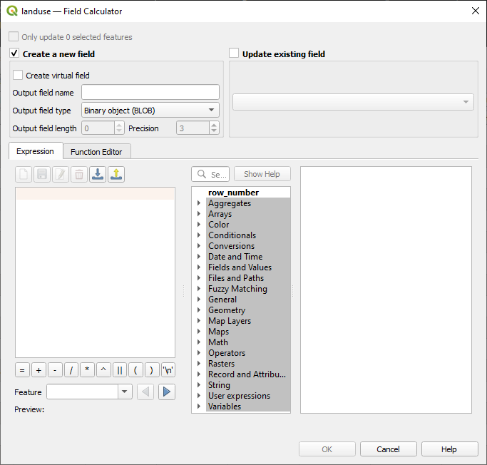
Check the
 Update existing fields
Select AREA in the fields drop-down menu
Under the Expression tab, expand the Geometry functions group in the list and find
Double-click on it so that it appears in the Expression field
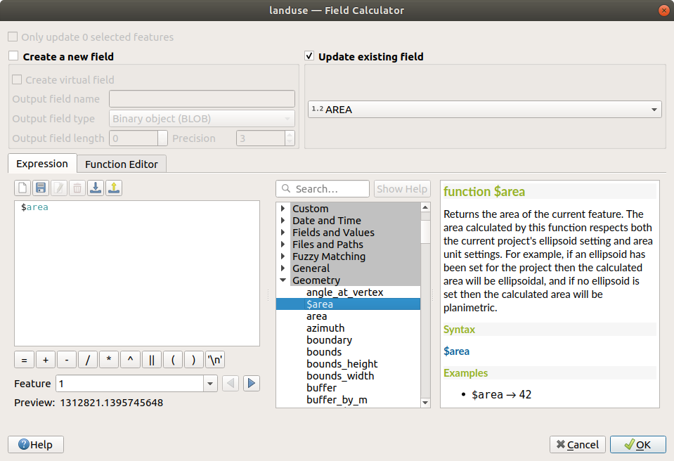
Clique OK.
Scroll to the
AREAfield in the attribute table and you will notice that it is populated with values (you may need to click the column header to refresh the data).
Nota
These areas respect the project’s area unit settings, so they may be in square meters or square degrees.
Press
 to save the edits and exit the edit mode with
Toggle editing
to save the edits and exit the edit mode with
Toggle editingClose the attribute table
Now that we have the data, let’s use them to render the landuse layer.
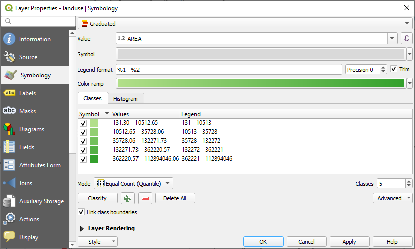
Open the Layer properties dialog’s Symbology tab for the
landuselayerChange the classification style from Categorized to Graduated
Change the Value to
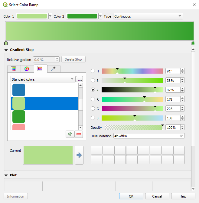
AREAUnder Color ramp, choose the option Create New Color Ramp…:
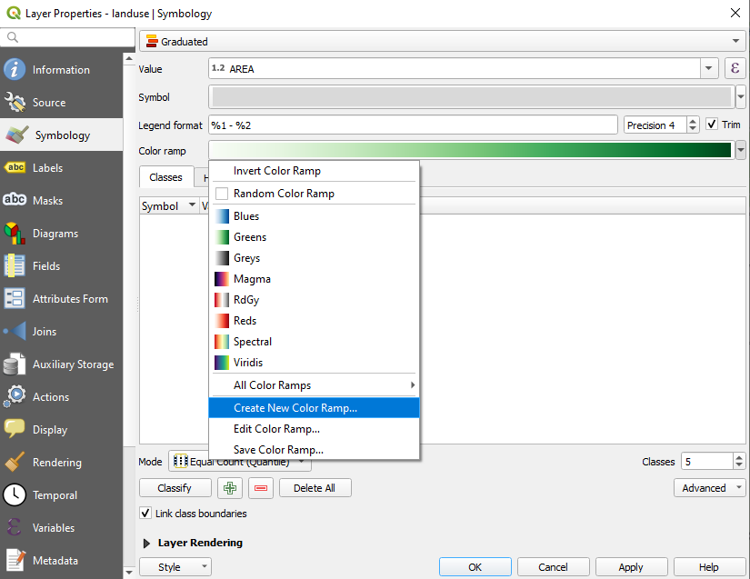
Choose Gradient (if it’s not selected already) and click OK. You will see this:
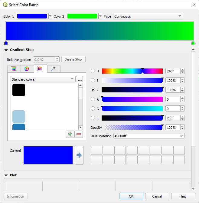
Estarás usando esto para denotar áreas, con áreas pequeñas como Color 1 y áreas grandes como Color 2.
Choose appropriate colors
En el ejemplo, el resultado se ve así:
Clique OK.
You can save the colour ramp by selecting Save Color Ramp… under the Color ramp tab. Choose an appropriate name for the colour ramp and click Save. You will now be able to select the same colour ramp easily under All Color Ramps.
Click Classify
Now you will have something like this:
Deja todo lo demás como está.
Click OK:
3.3.4. Try Yourself Refinar la Clasificación
Cambia los valores de Modo y Clases hasta que obtengas una clasificación coherente.
3.3.5.  Follow Along: Clasificación basada en Reglas
Es común combinar múltiples criterios para una clasificación, pero desafortunadamente la clasificación normal solo tiene en cuenta un atributo. Ahí es donde la clasificación basada en reglas entra en juego.
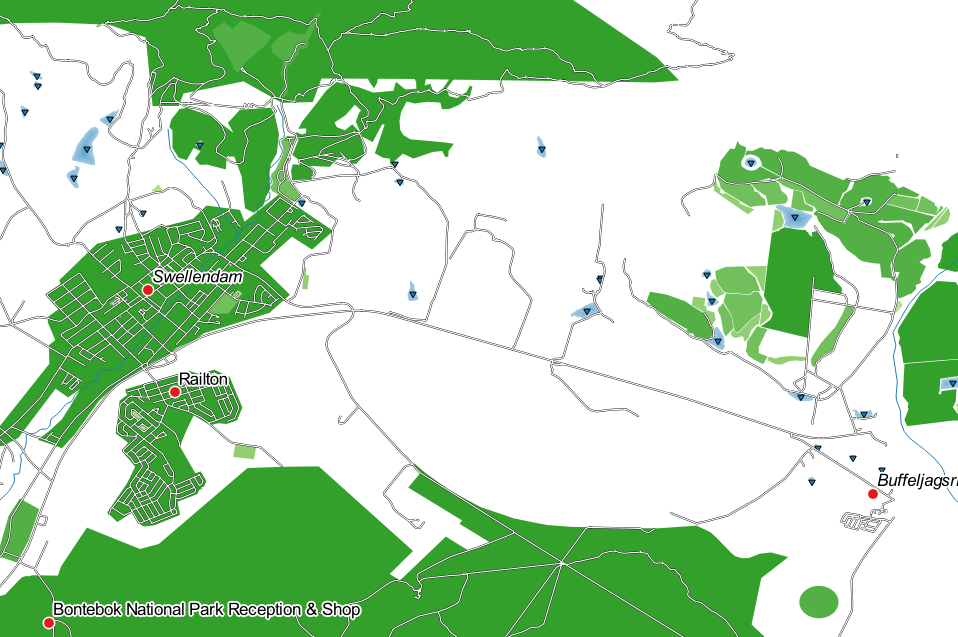
In this lesson, we will represent the landuse layer in a way to
easily identify Swellendam city from the other residential area,
and from the other types of landuse (based on their area).
Open the Layer Properties dialog for the
landuselayerSwitch to the Symbology tab
Switch the classification style to Rule-based
QGIS will automatically show the rules that represent the current classification implemented for this layer. For example, after completing the exercise above, you may see something like this:
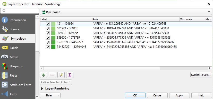
Click and drag to select all the rules
Use the
 Remove selected rules button to remove
all of the existing rules
Remove selected rules button to remove
all of the existing rules
Let’s now add our custom rules.
Click the
 Add rule button
The Edit rule dialog then appears
Enter
Swellendam cityas LabelClick the
 button next to the Filter text
area to open the Expression String Builder
button next to the Filter text
area to open the Expression String BuilderEnter the criterion
"name" = 'Swellendam'and validate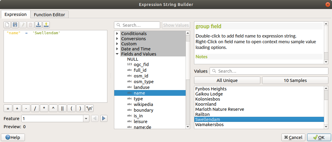
Back to the Edit rule dalog, assign it a darker grey-blue color in order to indicate the town’s importance in the region and remove the border
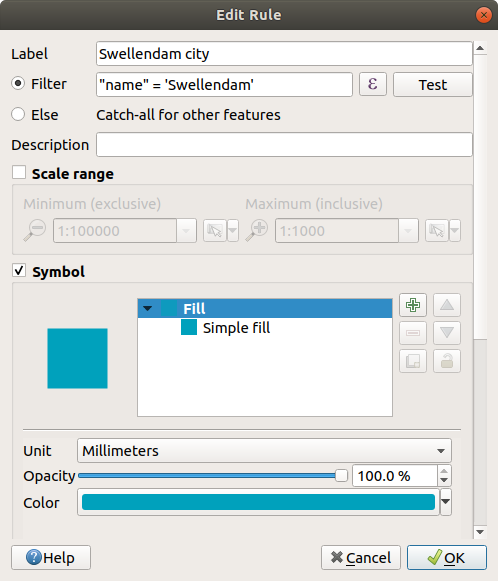
Pressione OK
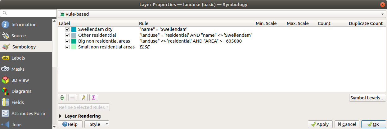
Repeat the steps above to add the following rules:
Other residential label with the criterion
"landuse" = 'residential' AND "name" <> 'Swellendam'(or"landuse" = 'residential' AND "name" != 'Swellendam'). Choose a pale blue-grey Fill colorBig non residential areas label with the criterion
"landuse" <> 'residential' AND "AREA" >= 605000. Choose a mid-green color.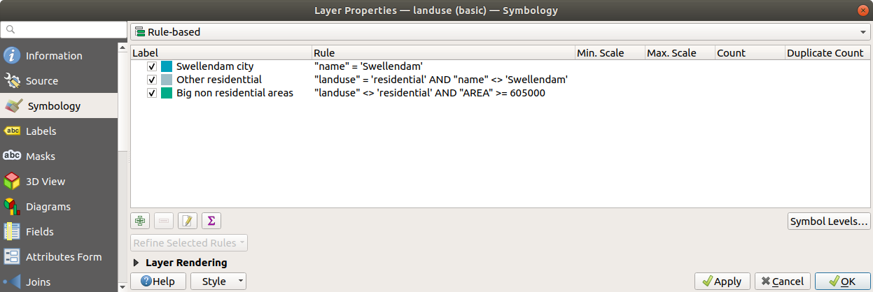
These filters are exclusive, in that they exclude areas on the map (non-residential areas which are smaller than 605000 (square meters) are not included in any of the rules).
We will catch the remaining features using a new rule labeled Small non residential areas. Instead of a filter expression, Check the
 Else.
Give this category a suitable pale green color.
Else.
Give this category a suitable pale green color.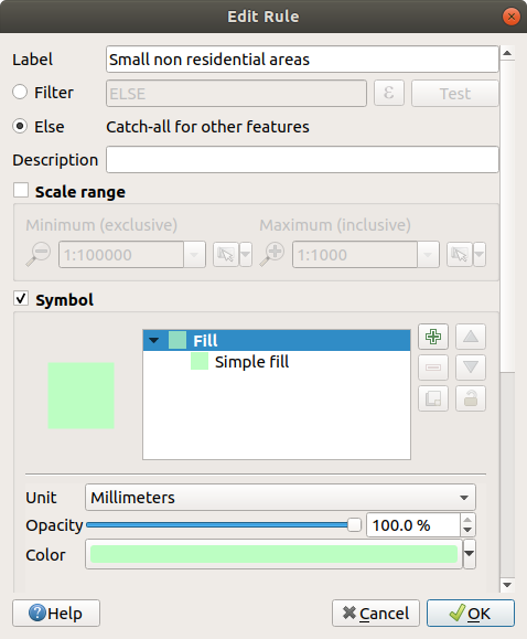
Your rules should now look like this:
Apply this symbology
Tu mapa se parecerá a este:
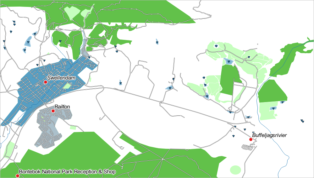
Ahora tienes un mapa con las áreas residenciales más destacadas Swellendam y otras áreas no residenciales coloreadas de acuerdo con su tamaño.
3.3.6. In Conclusion
La simbología nos permite representar los atributos de una capa de una forma sencilla de entender. También permite a los que visualicen el mapa entender el significado de las características, utilizando atributos relevantes que hemos escogido. Dependiendo del problema al que te enfrentes, aplicarás diferentes técnicas de clasificación para resolverlos.
3.3.7. What’s Next?
Ahora tenemos un bonito mapa, pero ¿Cómo obtendremos del QGIS un formato que se pueda imprimir o convertirlo en una imagen o PDF? ¡Ese es el tema de la siguiente lección!