17.14. Un prim exemplu de analiză
Notă
În această lecție, vom efectua o analiză reală, folosind doar bara de instrumente, astfel încât să vă familiarizați cu elementele cadrului de prelucrare.
O dată ce totul este configurat, iar algoritmii externi sunt gata de utilizare, dispunem de un instrument foarte puternic pentru efectuarea analizelor spațiale. Este timpul să elaborăm un exercițiu mai amplu, folosind date din lumea reală.
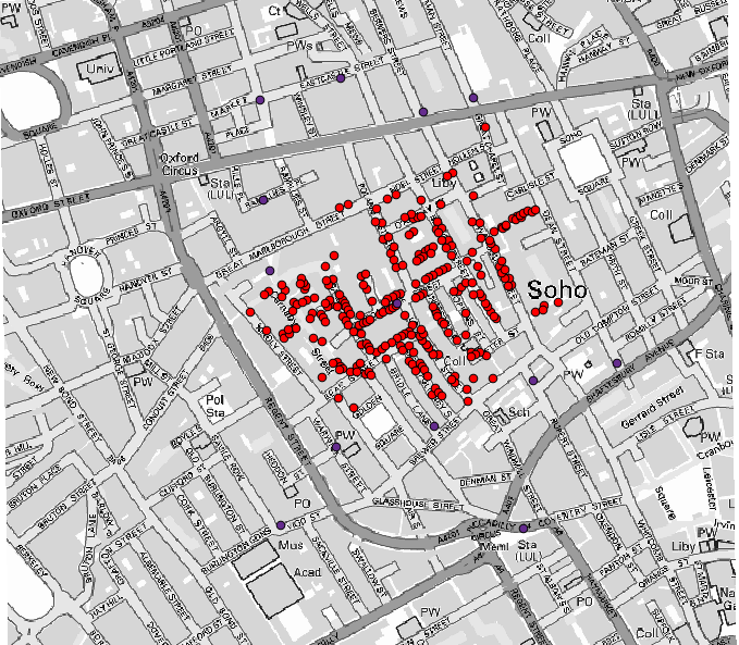
We will be using the well-known dataset that John Snow used in 1854, in his groundbreaking work (https://en.wikipedia.org/wiki/John_Snow_%28physician%29), and we will get some interesting results. The analysis of this dataset is pretty obvious and there is no need for sophisticated GIS techniques to end up with good results and conclusions, but it is a good way of showing how these spatial problems can be analyzed and solved by using different processing tools.
Setul de date conține fișierul shape cu decesele cauzate de holeră și locațiile pompelor, precum și o hartă OSM randată în format TIFF. Deschideți proiectul QGIS corespunzător acestei lecții.
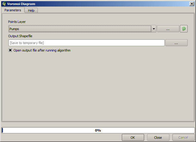
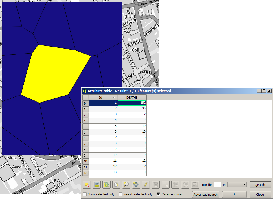
The first thing to do is to calculate the Voronoi diagram (a.k.a. Thiessen polygons) of the pumps layer, to get the influence zone of each pump. The Voronoi Diagram algorithm can be used for that.
Destul de ușor, dar ne va oferi deja informații interesante.
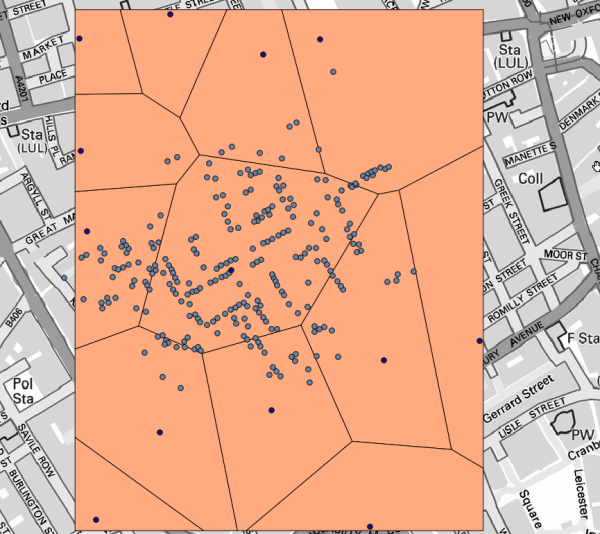
În mod evident, cele mai multe cazuri se încadrează într-unul dintre poligoane
To get a more quantitative result, we can count the number of deaths in each polygon. Since each point represents a building where deaths occured, and the number of deaths is stored in an attribute, we cannot just count the points. We need a weighted count, so we will use the Count points in polygon (weighted) tool.
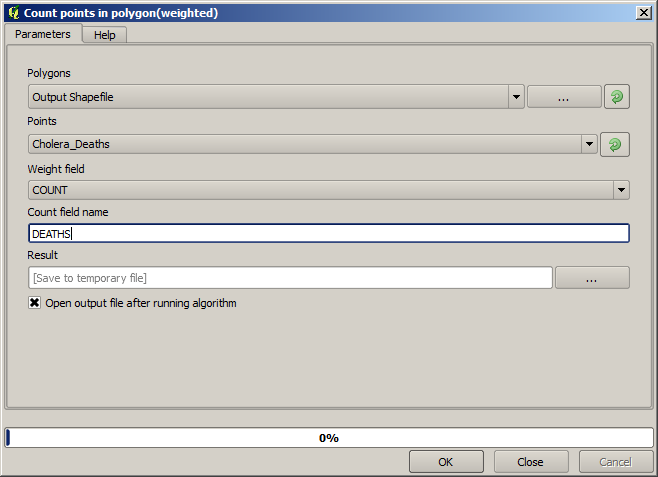
The new field will be called DEATHS, and we use the COUNT field as weighting field. The resulting table clearly reflects that the number of deaths in the polygon corresponding to the first pump is much larger than the other ones.
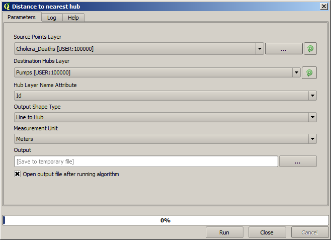
Another good way of visualizing the dependence of each point in the Cholera_deaths layer with a point in the Pumps layer is to draw a line to the closest one. This can be done with the Distance to nearest hub tool, and using the configuration shown next.
Rezultatul arată în felul următor:
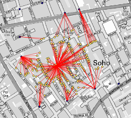
Although the number of lines is larger in the case of the central pump, do not forget that this does not represent the number of deaths, but the number of locations where cholera cases were found. It is a representative parameter, but it is not considering that some locations might have more cases than other.
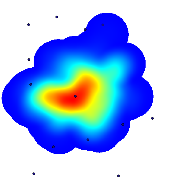
A density layer will also give us a very clear view of what is happening. We can create it with the Kernel density algorithm. Using the Cholera_deaths layer, its COUNT field as weight field, with a radius of 100, the extent and cellsize of the streets raster layer, we get something like this.
Amintiți-vă că, pentru a obține întinderea rezultatului, nu trebuie să o introduceți. Faceți clic pe butonul din partea dreaptă și selectați Use layer/canvas extent.
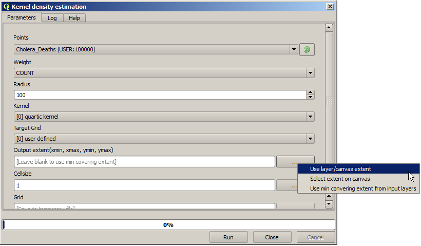
Selectați stratul străzilor raster iar întinderea sa va fi adăugată automat în câmpul de text. Trebuie să faceți același lucru cu dimensiunea celulei, selectând-o, de asemenea, din acel strat.
Prin combinarea cu stratul de pompe, vom vedea că există o pompă în mod clar în punctul fierbinte, în care se constată densitatea maximă a cazurilor de deces.