6.4. Lesson: 空間統計
注釈
LinfinitiとS Motala(ケープ半島工科大学)が開発したレッスン
Spatial statistics allows you to analyze and understand what is going on in a given vector dataset. QGIS includes many useful tools for statistical analysis.
The goal for this lesson: To know how to use QGIS' spatial statistics tools within the Processing Toolbox.
6.4.1.  Follow Along: テストデータセットの作成
We will create a random set of points, to get a dataset to work with.
To do so, you will need a polygon dataset to define the area you want to create the points in.
We will use the area covered by streets.
Start a new project
Add your
roadsdataset, as well assrtm_41_19(elevation data) found inexercise_data/raster/SRTM/.注釈
SRTM DEMレイヤーのCRSは、道路レイヤーのCRSとは異なる場合があります。 QGISは両方のレイヤーを単一のCRSで再投影しています。次の演習では、この違いは重要ではありませんが、自由に再投影してください(このモジュールの前半で示したように)。
Open Processing toolbox
Use the tool to generate an area enclosing all the roads by selecting
Convex Hullas the Geometry Type: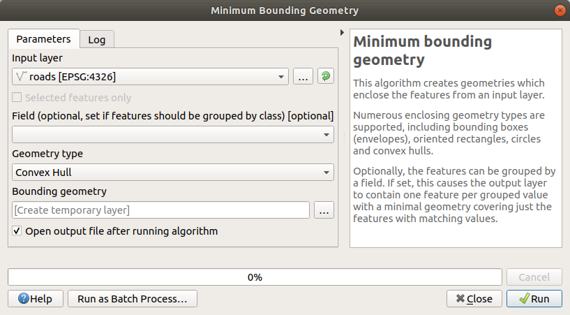
As you know, if you don't specify the output, Processing creates temporary layers. It is up to you to save the layers immediately or at a later stage.
ランダム点群の作成
Create 100 random points in this area using the tool at , with a minimum distance of
0.0: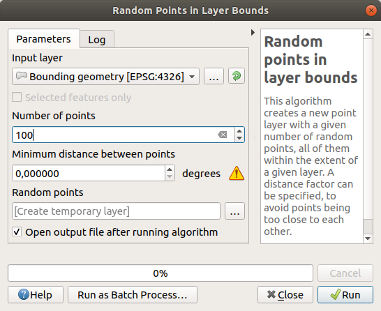
注釈
黄色の警告サインは、そのパラメータが距離に関係していることを示しています。 境界ジオメトリ レイヤーは地理座標系にあり、アルゴリズムはこれを思い出させます。この例では、このパラメータを使用しないため、無視してかまいません。
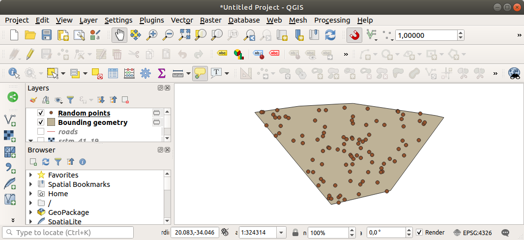
If needed, move the generated random point to the top of the legend to see them better:
データのサンプリング
To create a sample dataset from the raster, you'll need to use the algorithm. This tool samples the raster at the locations of the points and adds the raster values in new field(s) depending on the number of bands in the raster.
Open the Sample raster values algorithm dialog
サンプリングポイントを含むレイヤーとして
Random_pointsを選択し、値を取得するバンドとしてSRTMラスターを選択します。新しいフィールドのデフォルト名はrvalue_Nです。ここで、Nはラスターバンドの番号です。必要に応じて、プレフィックスの名前を変更できます。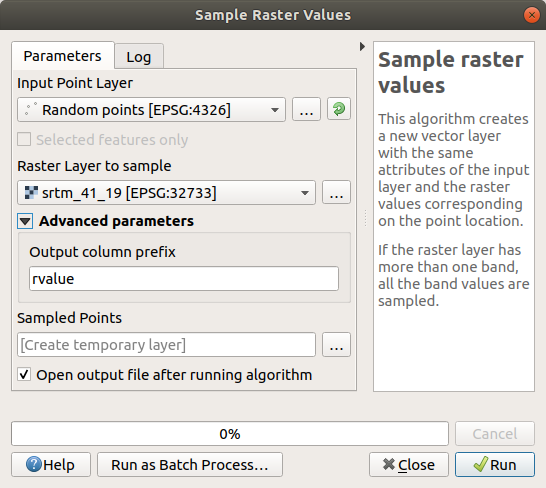
Press Run
Now you can check the sampled data from the raster file in the
attribute table of the Sampled Points layer.
They will be in a new field with the name you have chosen.
サンプルレイヤーはここに示すとおりです:
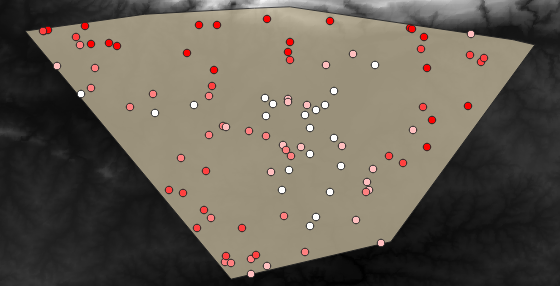
The sample points are classified using the rvalue_1 field such
that red points are at a higher altitude.
You will be using this sample layer for the rest of the statistical exercises.
6.4.2. Follow Along: 基本統計
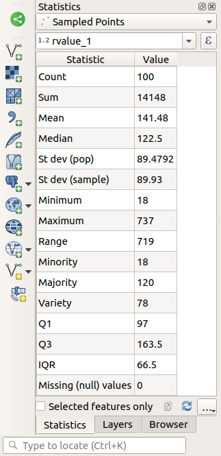
さて、このレイヤに対して基本統計を取得しましょう。
Click on the
 Show statistical summary icon in the
Attributes Toolbar.
A new panel will pop up.
Show statistical summary icon in the
Attributes Toolbar.
A new panel will pop up.In the dialog that appears, specify the
Sampled Pointslayer as the source.Select the rvalue_1 field in the field combo box. This is the field you will calculate statistics for.
The Statistics Panel will be automatically updated with the calculated statistics:
注釈
You can copy the values by clicking on the
 Copy Statistics To Clipboard button and paste the results
into a spreadsheet.
Copy Statistics To Clipboard button and paste the results
into a spreadsheet.Close the Statistics Panel when done
Many different statistics are available:
- カウント
The number of samples/values.
- 合計
The values added together.
- 平均
The mean (average) value is simply the sum of the values divided by the number of values.
- 中間値
If you arrange all the values from smallest to greatest, the middle value (or the average of the two middle values, if N is an even number) is the median of the values.
- St Dev (pop)
標準偏差。値が平均値の周りのどの程度近くに密集しているかの指標を与えます。標準偏差が小さいほど、値が平均値により近づく傾向があります。
- Minimum
値の最小値です。
- Maximum
値の最大値です。
- レンジ
最小および最大値間の差です。
- Q1
First quartile of the data.
- Q3
Third quartile of the data.
- Missing (null) values
The number of missing values.
6.4.3. Follow Along: Compute statistics on distances between points
Create a new temporary point layer.
Enter edit mode, and digitize three points somewhere among the other points.
Alternatively, use the same random point generation method as before, but specify only three points.
Save your new layer as distance_points in the format you prefer.
To generate statistics on the distances between points in the two layers:
Open the tool.
Select the
distance_pointslayer as the input layer, and theSampled Pointslayer as the target layer.このように設定します:

If you want you can save the output layer as a file or just run the algorithm and save the temporary output layer later.
Click Run to generate the distance matrix layer.
Open the attribute table of the generated layer: values refer to the distances between the distance_points features and their two nearest points in the Sampled Points layer:
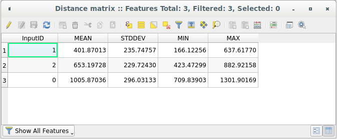
With these parameters, the Distance Matrix tool calculates distance statistics for each point of the input layer with respect to the nearest points of the target layer. The fields of the output layer contain the mean, standard deviation, minimum and maximum for the distances to the nearest neighbors of the points in the input layer.
6.4.4. Follow Along: Nearest Neighbor Analysis (within layer)
To do a nearest neighbor analysis of a point layer:
Choose .
In the dialog that appears, select the Random points layer and click Run.
The results will appear in the Processing Result Viewer Panel.
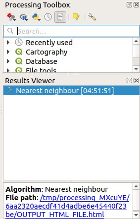
Click on the blue link to open the
htmlpage with the results: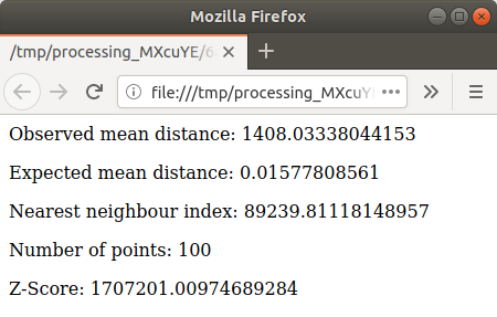
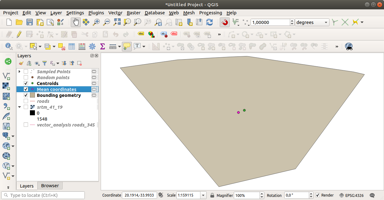
6.4.5. Follow Along: 平均座標
データセットの平均座標を取得するために:
Start
In the dialog that appears, specify Random points as Input layer, and leave the optional choices unchanged.
実行 をクリックします。
Let us compare this to the central coordinate of the polygon that was used to create the random sample.
Start
In the dialog that appears, select
Bounding geometryas the input layer.
As you can see, the mean coordinates (pink point) and the center of the study area (in green) don't necessarily coincide.
The centroid is the barycenter of the layer (the barycenter of a square is the center of the square) while the mean coordinates represent the average of all node coordinates.
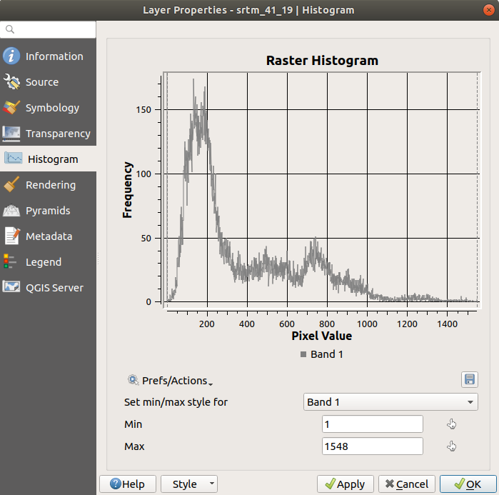
6.4.6. Follow Along: 画像ヒストグラム
The histogram of a dataset shows the distribution of its values. The simplest way to demonstrate this in QGIS is via the image histogram, available in the Layer Properties dialog of any image layer (raster dataset).
In your Layers panel, right-click on the
srtm_41_19layerSelect
Choose the Histogram tab. You may need to click on the Compute Histogram button to generate the graphic. You will see a graph that shows the frequency distribution for the raster values.
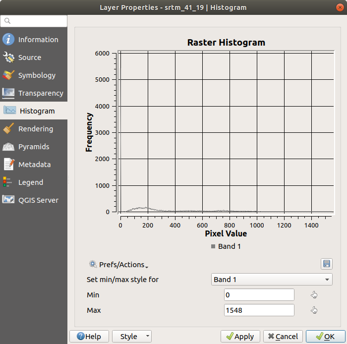
The graph can be exported as an image with the
 Save plot button
You can see more detailed information about the layer in the Information tab (the mean and max values are estimated, and may not be exact).
The mean value is 332.8 (estimated to 324.3), and the maximum
value is 1699 (estimated to 1548)!
You can zoom in the histogram.
Since there are a lot of pixels with value 0, the histogram looks
compressed vertically.
By zooming in to cover everything but the peak at 0, you will see
more details:
注釈
If the mean and maximum values are not the same as above, it
can be due to the min/max value calculation.
Open the Symbology tab and expand the
Min / Max Value Settings menu.
Choose  Min / max and click on
Apply.
Min / max and click on
Apply.
Keep in mind that a histogram shows you the distribution of values, and not all values are necessarily visible on the graph.
6.4.7. Follow Along: 空間的補間
Let's say you have a collection of sample points from which you would like to extrapolate data. For example, you might have access to the Sampled points dataset we created earlier, and would like to have some idea of what the terrain looks like.
To start, launch the tool in the Processing Toolbox.
For Point layer select
Sampled pointsSet Weighting power to
5.0In Advanced parameters, set Z value from field to
rvalue_1Finally click on Run and wait until the processing ends
Close the dialog
Here is a comparison of the original dataset (left) to the one constructed from our sample points (right). Yours may look different due to the random nature of the location of the sample points.
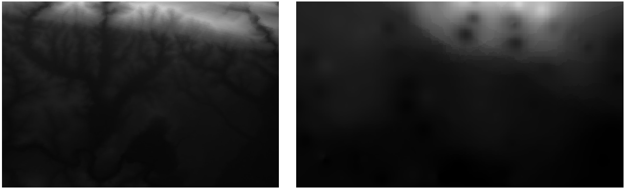
As you can see, 100 sample points aren't really enough to get a detailed impression of the terrain. It gives a very general idea, but it can be misleading as well.
6.4.8.  Try Yourself Different interpolation methods
Use the processes shown above to create a set of 10 000 random points
注釈
If the number of points is really big, the processing time can take a long time.
Use these points to sample the original DEM
Use the Grid (IDW with nearest neighbor searching) tool on this dataset.
Set Power and Smoothing to
5.0and2.0, respectively.
結果(ランダムな点の位置に応じて)多かれ少なかれ、このようになります。
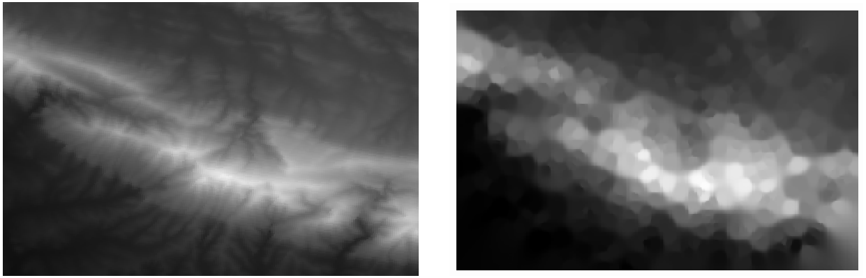
This is a better representation of the terrain, due to the greater density of sample points. Remember, larger samples give better results.
6.4.9. In Conclusion
QGIS has a number of tools for analyzing the spatial statistical properties of datasets.
6.4.10. What's Next?
Now that we have covered vector analysis, why not see what can be done with rasters? That is what we will do in the next module!