7.4. Lesson: 空間統計
ノート
LinfinitiとS Motala(ケープ半島工科大学)が開発したレッスン
空間統計によって、与えられたベクターデータセットで何が起こっているかを分析し理解できます。 QGISは、この点で有用であることが分かる統計分析のためのいくつかの標準的なツールが含まれています。
The goal for this lesson: To know how to use QGIS’ spatial statistics tools.
7.4.1.  Follow Along: テストデータセットの作成
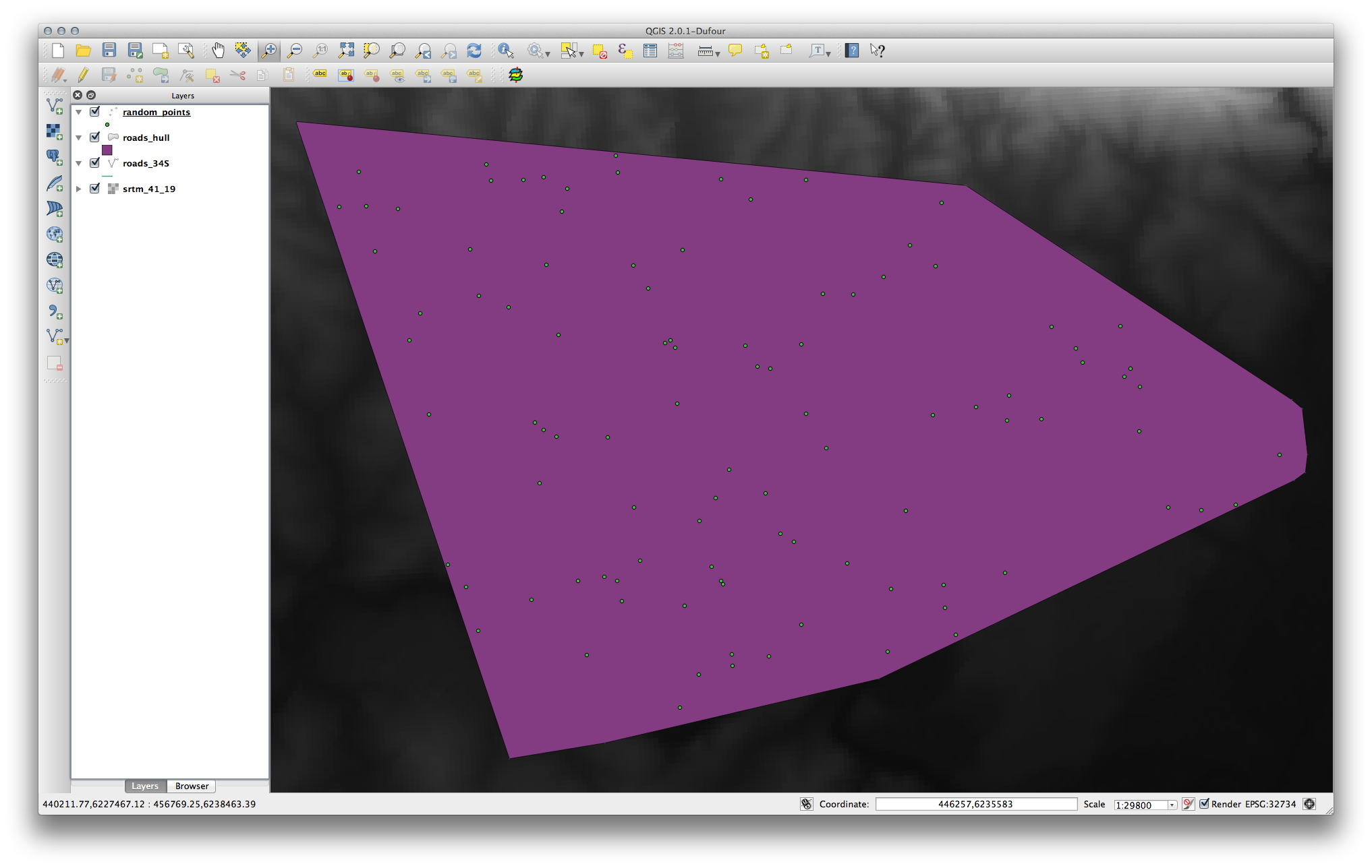
ポイントデータセットの操作を知るために、ポイントのランダムセットを作成します。
そのためには、ポイントを作成したいエリアの範囲を定義するポリゴンデータセットが必要です。
ストリートで覆われているエリアを使います。
- Create a new empty map.
- Add your roads_34S layer, as well as the srtm_41_19.tif raster (elevation data) found in exercise_data/raster/SRTM/.
ノート
You might find that your SRTM DEM layer has a different CRS to that of the roads layer. If so, you can reproject either the roads or DEM layer using techniques learnt earlier in this module.
- Use the Convex hull(s) tool (available under Vector ‣ Geoprocessing Tools) to generate an area enclosing all the roads:
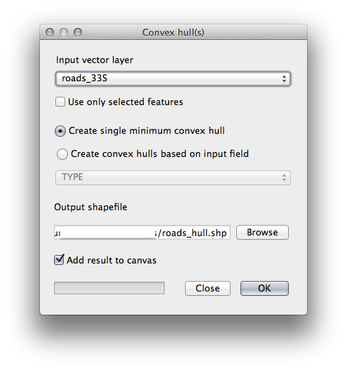
- Save the output under exercise_data/spatial_statistics/ as roads_hull.shp.
- Check Add result to canvas option to add the output to the TOC (Layers list).
7.4.1.1. ランダム点群の作成
- Create random points in this area using the tool at Vector ‣ Research Tools ‣ Random points:
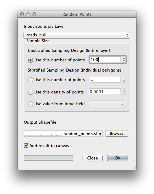
- Save the output under exercise_data/spatial_statistics/ as random_points.shp.
- Check Add result to canvas option to add the output to the TOC (Layers list).
7.4.1.2. データのサンプリング
- To create a sample dataset from the raster, you’ll need to use the Point sampling tool plugin.
- Refer ahead to the module on plugins if necessary.
- Search for the phrase point sampling in the Plugin ‣ Manage and Install Plugins... and you will find the plugin.
- As soon as it has been activated with the Plugin Manager, you will find the tool under Plugins ‣ Analyses ‣ Point sampling tool:

- Select random_points as the layer containing sampling points, and the SRTM raster as the band to get values from.
- Make sure that “Add created layer to the TOC” is checked.
- Save the output under exercise_data/spatial_statistics/ as random_samples.shp.
Now you can check the sampled data from the raster file in the attributes table of the random_samples layer, they will be in a column named srtm_41_19.tif.
サンプルレイヤーはここに示すとおりです:
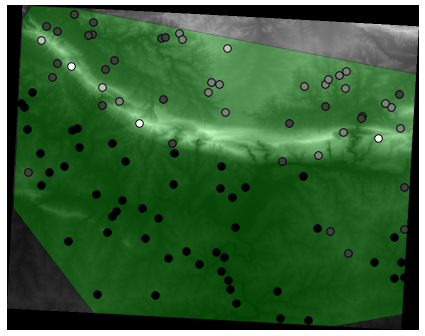
The sample points are classified by their value such that darker points are at a lower altitude.
残りの統計の練習ではこのサンプルレイヤーを使用します。
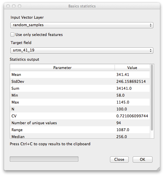
7.4.2. Follow Along: 基本統計
さて、このレイヤに対して基本統計を取得しましょう。
- Click on the Vector ‣ Analysis Tools ‣ Basic statistics menu entry.
- In the dialog that appears, specify the random_samples layer as the source.
- Make sure that the Target field is set to srtm_41_19.tif which is the field you will calculate statistics for.
- Click OK. You’ll get results like this:
ノート
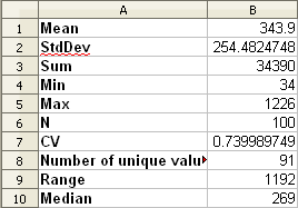
You can copy and paste the results into a spreadsheet. The data uses a (colon :) separator.
- Close the plugin dialog when done.
To understand the statistics above, refer to this definition list:
- 平均
平均(平均)値は、単純な値の量で割った値の合計です。
- StdDev
標準偏差。値が平均値の周りのどの程度近くに密集しているかの指標を与えます。標準偏差が小さいほど、値が平均値により近づく傾向があります。
- 合計
すべての値を加算します。
- Min
値の最小値です。
- Max
値の最大値です。
- N
サンプル/値の量です。
- CV
- The spatial covariance of the dataset.
- Number of unique values
- The number of values that are unique across this dataset. If there are 90 unique values in a dataset with N=100, then the 10 remaining values are the same as one or more of each other.
- レンジ
最小および最大値間の差です。
- 中間値
最小から最大までのすべての値を整列させた場合、真ん中の値(またはNが偶数である場合は真ん中の2つの値の平均)は値の中央値です。
7.4.3. Follow Along: Compute a Distance Matrix
- Create a new point layer in the same projection as the other datasets (WGS 84 / UTM 34S).
- Enter edit mode and digitize three point somewhere among the other points.
- Alternatively, use the same random point generation method as before, but specify only three points.
- Save your new layer as distance_points.shp.
To generate a distance matrix using these points:
- Open the tool Vector ‣ Analysis Tools ‣ Distance matrix.
- Select the distance_points layer as the input layer, and the random_samples layer as the target layer.
このように設定します:
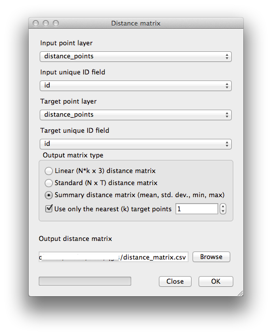
- Save the result as distance_matrix.csv.
- Click OK to generate the distance matrix.
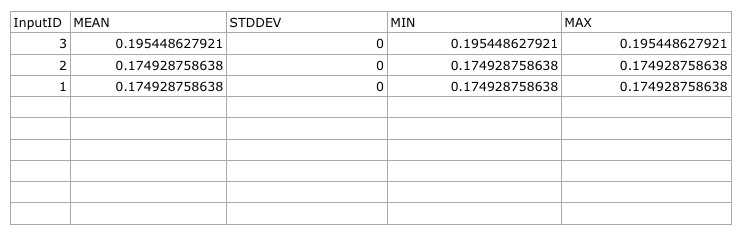
- Open it in a spreadsheet program to see the results. Here is an example:
7.4.4. Follow Along: Nearest Neighbor Analysis
To do a nearest neighbor analysis:
- Click on the menu item Vector ‣ Analysis Tools ‣ Nearest neighbor analysis.
- In the dialog that appears, select the random_samples layer and click OK.
- The results will appear in the dialog’s text window, for example:
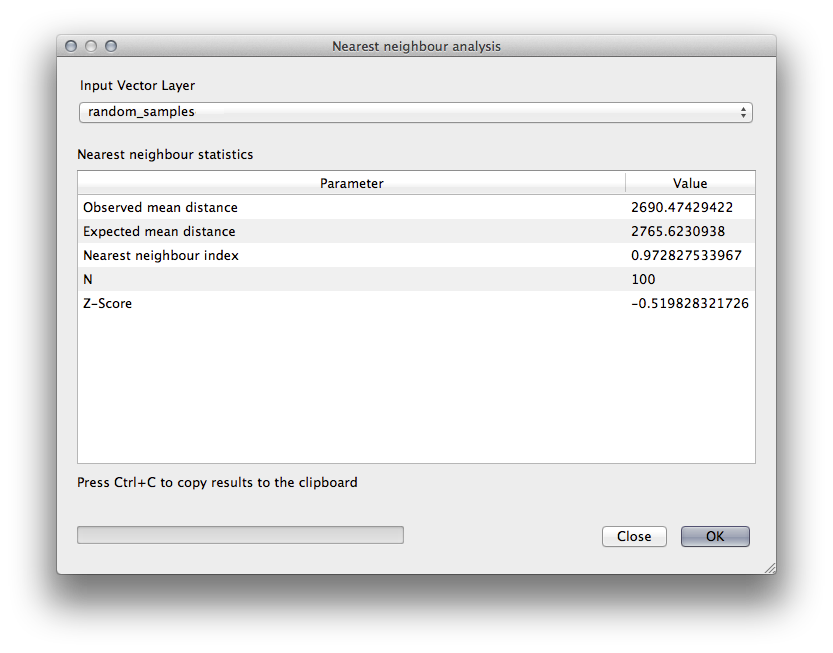
ノート
You can copy and paste the results into a spreadsheet. The data uses a (colon :) separator.
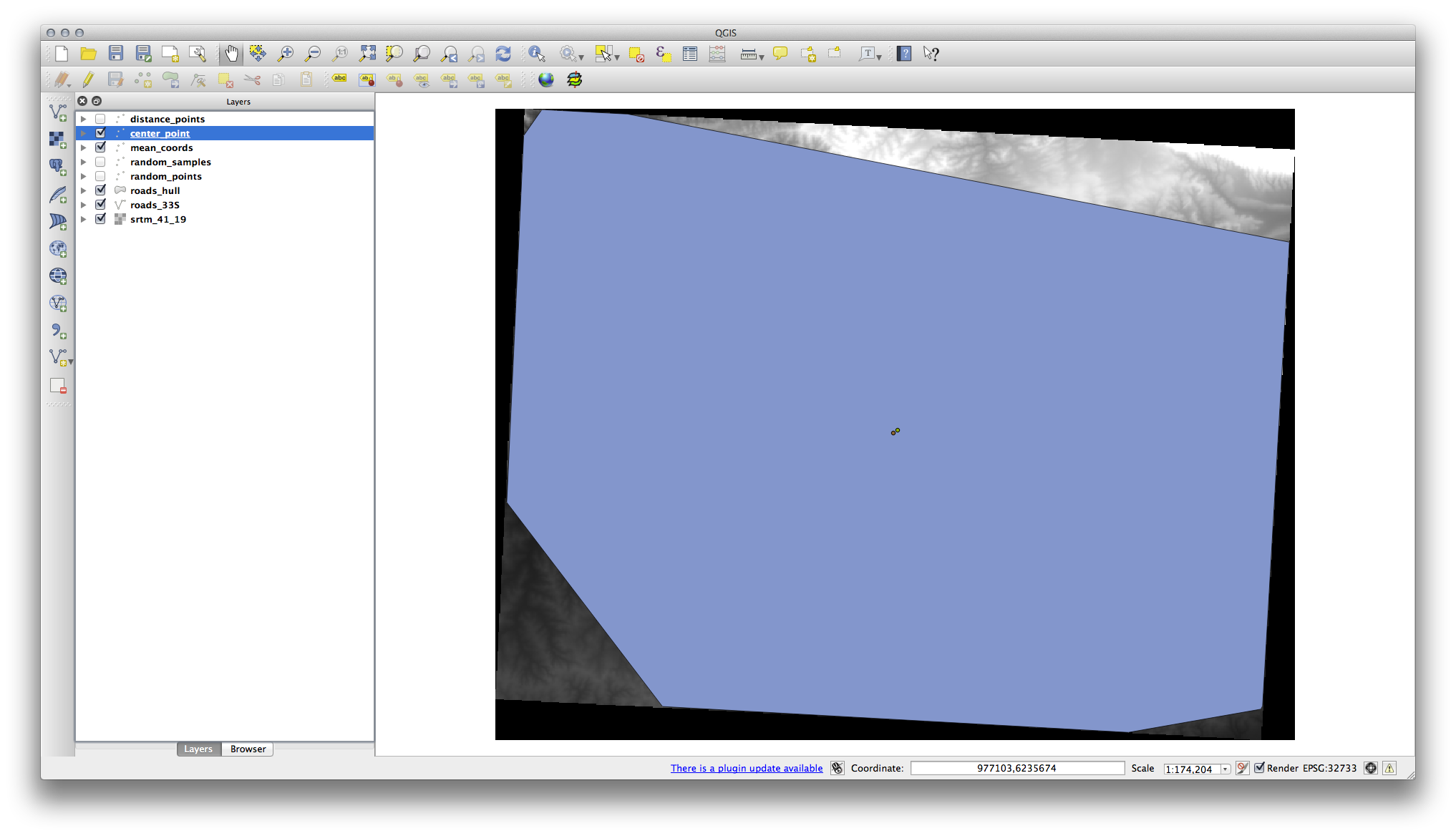
7.4.5. Follow Along: 平均座標
データセットの平均座標を取得するために:
- Click on the Vector ‣ Analysis Tools ‣ Mean coordinate(s) menu item.
- In the dialog that appears, specify random_samples as the input layer, but leave the optional choices unchanged.
- Specify the output layer as mean_coords.shp.
- Click OK.
- Add the layer to the Layers list when prompted.
ランダムなサンプルを作成するために使用されたポリゴンの座標の中央にこれを比較してみましょう。
- Click on the Vector ‣ Geometry Tools ‣ Polygon centroids menu item.
- In the dialog that appears, select roads_hull as the input layer.
- Save the result as center_point.
- Add it to the Layers list when prompted.
As you can see from the example below, the mean coordinates and the center of the study area (in orange) don’t necessarily coincide:
7.4.6. Follow Along: 画像ヒストグラム
The histogram of a dataset shows the distribution of its values. The simplest way to demonstrate this in QGIS is via the image histogram, available in the Layer Properties dialog of any image layer.
- In your Layers list, right-click on the SRTM DEM layer.
プロパティ を選択します。
ヒストグラム タブを選択します。 グラフィックを生成するには ヒストグラム計算 ボタンをクリックする必要があるかもしれません。画像内の値の度数を記述するグラフが表示されます。
それを画像として出力できます:
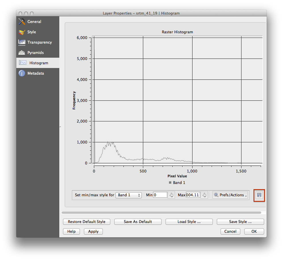
- Select the Metadata tab, you can see more detailed information inside the Properties box.
The mean value is 332.8, and the maximum value is 1699! But those values don’t show up on the histogram. Why not? It’s because there are so few of them, compared to the abundance of pixels with values below the mean. That’s also why the histogram extends so far to the right, even though there is no visible red line marking the frequency of values higher than about 250.
ですから、ヒストグラムは値の分布を示しており、すべての値がグラフに必ずしも表示されているではないことを覚えておいてください。
- (You may now close Layer Properties.)
7.4.7. Follow Along: 空間的補間
Let’s say you have a collection of sample points from which you would like to extrapolate data. For example, you might have access to the random_samples dataset we created earlier, and would like to have some idea of what the terrain looks like.
To start, launch the Grid (Interpolation) tool by clicking on the Raster ‣ Analysis ‣ Grid (Interpolation) menu item.
- In the Input file field, select random_samples.
- Check the Z Field box, and select the field srtm_41_19.
- Set the Output file location to exercise_data/spatial_statistics/interpolation.tif.
- Check the Algorithm box and select Inverse distance to a power.
- Set the Power to 5.0 and the Smoothing to 2.0. Leave the other values as-is.
- Check the Load into canvas when finished box and click OK.
- When it’s done, click OK on the dialog that says Process completed, click OK on the dialog showing feedback information (if it has appeared), and click Close on the Grid (Interpolation) dialog.
ここにあるのは元のデータセット(左)と私たちのサンプルポイントから構築されたもの(右)との比較です。サンプル点の位置にはランダム性があるため、実際に作成されたものは異なっている場合があります。
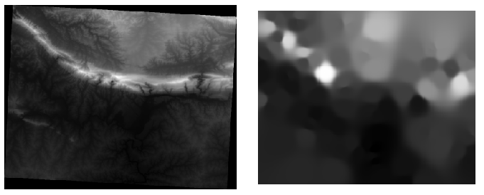
As you can see, 100 sample points aren’t really enough to get a detailed impression of the terrain. It gives a very general idea, but it can be misleading as well. For example, in the image above, it is not clear that there is a high, unbroken mountain running from east to west; rather, the image seems to show a valley, with high peaks to the west. Just using visual inspection, we can see that the sample dataset is not representative of the terrain.
7.4.8.  Try Yourself
- Use the processes shown above to create a new set of 1000 random points.
オリジナルのDEMをサンプリングするためにこれらのポイントを使用してください。
- Use the Grid (Interpolation) tool on this new dataset as above.
- Set the output filename to interpolation_1000.tif, with Power and Smoothing set to 5.0 and 2.0, respectively.
結果(ランダムな点の位置に応じて)多かれ少なかれ、このようになります。
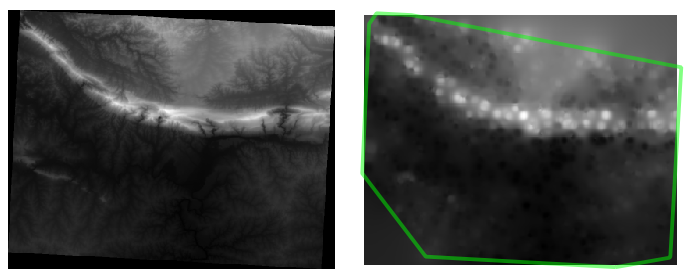
The border shows the roads_hull layer (which represents the boundary of the random sample points) to explain the sudden lack of detail beyond its edges. This is a much better representation of the terrain, due to the much greater density of sample points.
Here is an example of what it looks like with 10 000 sample points:
ノート
It’s not recommended that you try doing this with 10 000 sample points if you are not working on a fast computer, as the size of the sample dataset requires a lot of processing time.
7.4.9. Follow Along: Additional Spatial Analysis Tools
Originally a separate project and then accessible as a plugin, the SEXTANTE software has been added to QGIS as a core function from version 2.0. You can find it as a new QGIS menu with its new name Processing from where you can access a rich toolbox of spatial analysis tools allows you to access various plugin tools from within a single interface.
- Activate this set of tools by enabling the Processing ‣ Toolbox menu entry. The toolbox looks like this:
You will probably see it docked in QGIS to the right of the map. Note that the tools listed here are links to the actual tools. Some of them are SEXTANTE’s own algorithms and others are links to tools that are accessed from external applications such as GRASS, SAGA or the Orfeo Toolbox. This external applications are installed with QGIS so you are already able to make use of them. In case you need to change the configuration of the Processing tools or, for example, you need to update to a new version of one of the external applications, you can access its setting from Processing ‣ Options and configurations.
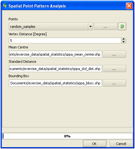
7.4.10. Follow Along: Spatial Point Pattern Analysis
For a simple indication of the spatial distribution of points in the random_samples dataset, we can make use of SAGA’s Spatial Point Pattern Analysis tool via the Processing Toolbox you just opened.
- In the Processing Toolbox, search for this tool Spatial Point Pattern Analysis.
- Double-click on it to open its dialog.
7.4.10.1. Installing SAGA
ノート
If SAGA is not installed on your system, the plugin’s dialog will inform you that the dependency is missing. If this is not the case, you can skip these steps.
7.4.10.2. On Windows
Included in your course materials you will find the SAGA installer for Windows.
- Start the program and follow its instructions to install SAGA on your Windows system. Take note of the path you are installing it under!
Once you have installed SAGA, you’ll need to configure SEXTANTE to find the path it was installed under.
- Click on the menu entry Analysis ‣ SAGA options and configuration.
- In the dialog that appears, expand the SAGA item and look for SAGA folder. Its value will be blank.
- In this space, insert the path where you installed SAGA.
7.4.10.3. On Ubuntu
- Search for SAGA GIS in the Software Center, or enter the phrase sudo apt-get install saga-gis in your terminal. (You may first need to add a SAGA repository to your sources.)
- QGIS will find SAGA automatically, although you may need to restart QGIS if it doesn’t work straight away.
7.4.10.4. On Mac
Homebrew users can install SAGA with this command:
- brew install saga-core
If you do not use Homebrew, please follow the instructions here:
http://sourceforge.net/apps/trac/saga-gis/wiki/Compiling%20SAGA%20on%20Mac%20OS%20X
7.4.10.5. After installing
Now that you have installed and configured SAGA, its functions will become accessible to you.
7.4.10.6. Using SAGA
- Open the SAGA dialog.
- SAGA produces three outputs, and so will require three output paths.
- Save these three outputs under exercise_data/spatial_statistics/, using whatever file names you find appropriate.
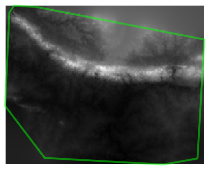
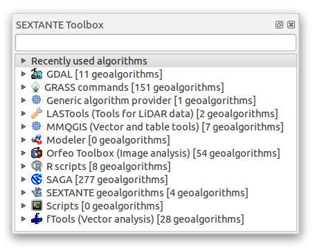
The output will look like this (the symbology was changed for this example):
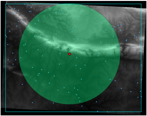
The red dot is the mean center; the large circle is the standard distance, which gives an indication of how closely the points are distributed around the mean center; and the rectangle is the bounding box, describing the smallest possible rectangle which will still enclose all the points.
7.4.11. Follow Along: Minimum Distance Analysis
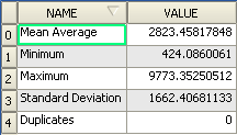
Often, the output of an algorithm will not be a shapefile, but rather a table summarizing the statistical properties of a dataset. One of these is the Minimum Distance Analysis tool.
- Find this tool in the Processing Toolbox as Minimum Distance Analysis.
It does not require any other input besides specifying the vector point dataset to be analyzed.
- Choose the random_points dataset.
- Click OK. On completion, a DBF table will appear in the Layers list.
- Select it, then open its attribute table. Although the figures may vary, your results will be in this format:
7.4.12. In Conclusion
QGISは、データセットの空間的な統計的性質を分析するための多くの可能性を可能にします。
7.4.13. What’s Next?
これでベクター分析はカバーしましたが、ラスターで何ができるかは見ないのでしょうか。それは次のモジュールでやります!