중요
번역은 여러분이 참여할 수 있는 커뮤니티 활동입니다. 이 페이지는 현재 61.11% 번역되었습니다.
17.14. 첫 번째 분석 예제
참고
이 수업에서는 사용자가 공간 처리 프레임워크 요소에 더 익숙해질 수 있도록 툴박스만을 사용해서 실제 분석 작업을 수행할 것입니다.
Now that everything is configured and we can use external algorithms, we have a very powerful tool to perform spatial analysis. It is time to work out a larger exercise with some real world data.
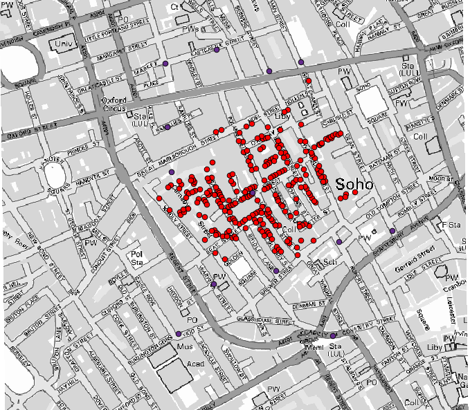
존 스노우(John Snow)가 1854년 자신의 획기적인 작업 에 사용했던 유명한 데이터셋을 이용해서 흥미로운 결과를 얻을 것입니다. 이 데이터셋을 분석하는 작업은 꽤 명확한 편으로 제대로 된 결과물 및 결론을 얻는 데 복잡한 GIS 기술이 필요하지는 않지만, 이 공간 문제들을 서로 다른 공간 처리 도구들을 써서 어떻게 분석하고 해결할 수 있는지 알 수 있는 훌륭한 방법입니다.
이 데이터셋은 콜레라에 의한 사망자 수 및 펌프 위치를 담고 있는 셰이프파일과 TIFF 포맷으로 렌더링된 OSM 맵을 포함합니다. 이 수업에 해당하는 QGIS 프로젝트를 여십시오.
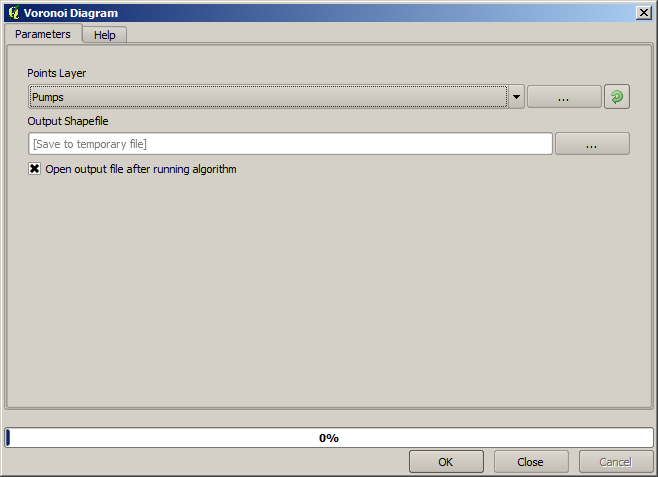
The first thing to do is to calculate the Voronoi diagram (a.k.a. Thiessen polygons) of the pumps layer, to get the influence zone of each pump. The Voronoi polygons algorithm can be used for that.
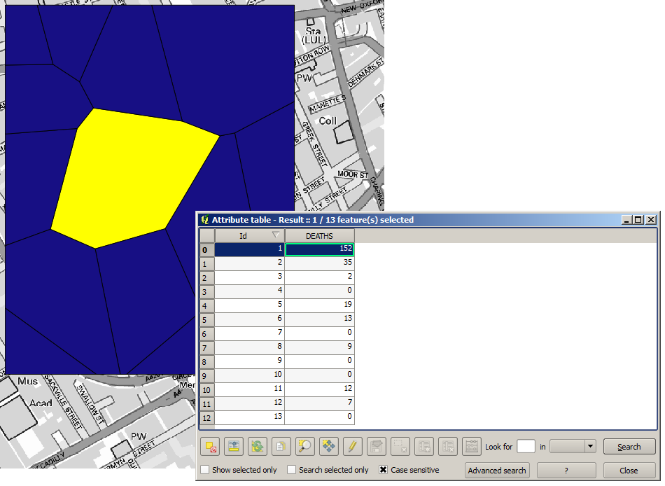
꽤 쉬운 작업이지만, 벌써 흥미로운 정보를 알려주고 있습니다.
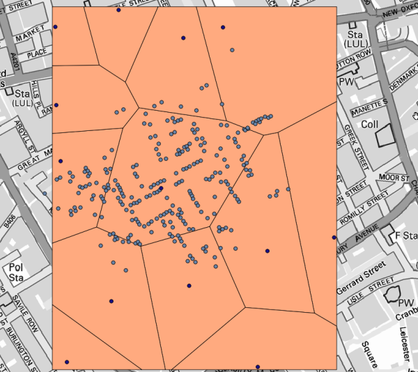
명백히 보이듯이, 폴리곤 중 하나 안에 사망자 대부분이 존재합니다.
To get a more quantitative result, we can count the number of deaths in each polygon. Since each point represents a building where deaths occurred, and the number of deaths is stored in an attribute, we cannot just count the points. We need a weighted count, so we will use the Count points in polygon tool.
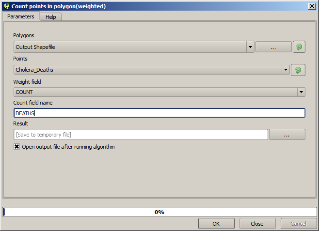
The new field will be called DEATHS, and we use the COUNT field as weighting field.
The resulting table clearly reflects that the number of deaths in the polygon
corresponding to the first pump is much larger than the other ones.
Another good way of visualizing the dependence of each point in the Cholera_deaths layer
with a point in the Pumps layer is to draw a line to the closest one.
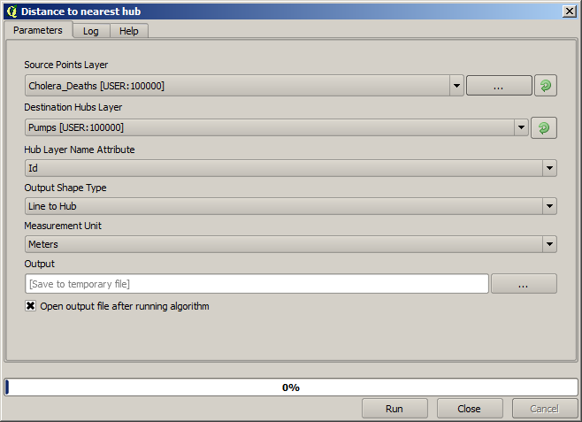
This can be done with the Distance to nearest hub tool, and using the configuration shown next.
결과는 다음과 같습니다:
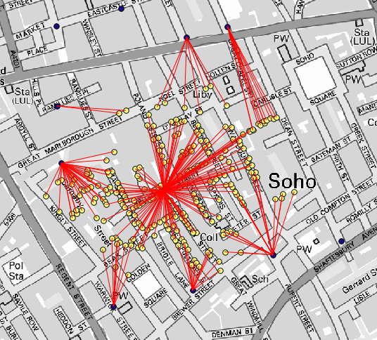
중앙에 있는 펌프의 선 개수가 가장 많지만, 이것은 사망자 수가 아니라 콜레라가 발생한 위치의 개수라는 점을 잊어서는 안 됩니다. 분명 결과를 대표할 수 있는 파라미터이긴 하지만 일부 위치의 사망자 수가 다른 곳보다 더 많을 수 있다는 사실을 고려하지 않고 있습니다.
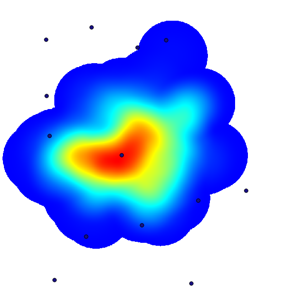
A density layer will also give us a very clear view of what is happening.
We can create it with the Heatmap (Kernel density estimation) algorithm.
Using the Cholera_deaths layer, its COUNT field as weight field, with a radius of 100,
the extent and cell size of the streets raster layer, we get something like this.
Remember that, to get the output extent, you do not have to type it. Click on the button on the right-hand side and select Use layer/canvas extent.
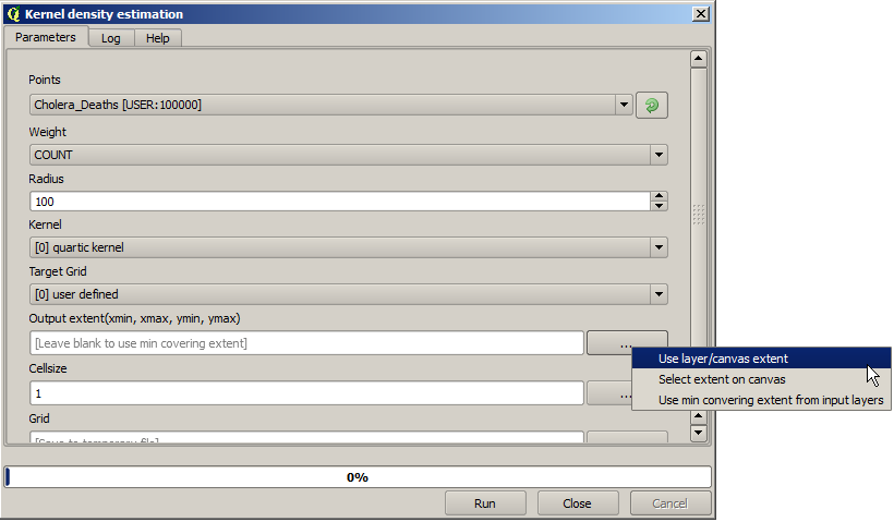
그리고 도로 래스터 레이어를 선택하면 해당 레이어의 범위가 자동적으로 텍스트란에 채워질 것입니다. 셀 크기도 동일한 방법으로, 해당 레이어의 셀 크기를 선택해서 설정해야 합니다.
Pumps 레이어와 결합하면, 콜레라 발생 지역에서 명확하게 사망자 수가 최대 밀도를 보이는 곳에 펌프 하나가 있다는 사실을 알 수 있습니다.