` `
ベクタープロパティダイアログ
ベクターレイヤーの レイヤーのプロパティ ダイアログは、地図内のレイヤーの地物の外観(シンボル、ラベル、ダイアグラム)、マウスとの相互作用(アクション、地図のヒント、フォームデザイン)を管理するための一般設定を提供します。また、レイヤーについての情報を提供します。
To access the Layer Properties dialog, double-click on a layer in the legend or right-click on the layer and select Properties from the pop-up menu.
ノート
Depending on the external plugins you have installed, new tabs may be added to the layer properties dialog. Those are not presented below.
ちなみに
Live update rendering
The レイヤースタイル設定パネル provides you with some of the common features of the Layer properties dialog and is a good modeless widget that you can use to speed up the configuration of the layer styles and automatically view your changes in the map canvas.
ノート
埋め込まれたレイヤー( プロジェクトを入れ子にする を参照)のプロパティ(シンボル、ラベル、アクション、デフォルト値、フォーム...)元のプロジェクトファイルから引き出されているため、またこの動作を壊す可能性のある変更を避けるために、これらのレイヤーに対してはレイヤーのプロパティダイアログは利用できなくされています。
General Properties
 Use this tab to make general settings for the vector layer.
There are several options available:
Use this tab to make general settings for the vector layer.
There are several options available:
Layer Info
- Set the Layer name to display in the Layers Panel
- Display the Layer source of the vector layer
- Define the Data source encoding to define provider-specific options and to be able to read the file
空間参照系
PROJ.4文字列として、レイヤーの座標参照系(CRS)を表示します。ドロップダウンリストで最近使用したものを選択するか、
 CRSを選択 ボタン( 座標系選択 を参照)をクリックすると、レイヤーのCRSを変更できます。CRSは、レイヤーに適用された場合にのみ、このプロセスを使用して何も適用しなかった場合は間違ったものですか。別のCRSにデータを再投影したい場合はむしろ、プロセッシングからのレイヤーの再投影アルゴリズムか 別のレイヤーに保存 を使用してください。
- Create a Spatial Index (only for OGR-supported formats)
- Update Extents information for a layer
縮尺に応じた表示設定
最大(含む) と 最小(含まない) 縮尺を設定して、地物が表示される縮尺の範囲を定義できます。この範囲の外ではそれらは非表示になります。  現在のキャンバス縮尺 ボタンに設定を使用すると、範囲の可視性の境界として、現在の地図キャンバスの縮尺を使用できます。詳細は 縮尺依存レンダリング 参照。
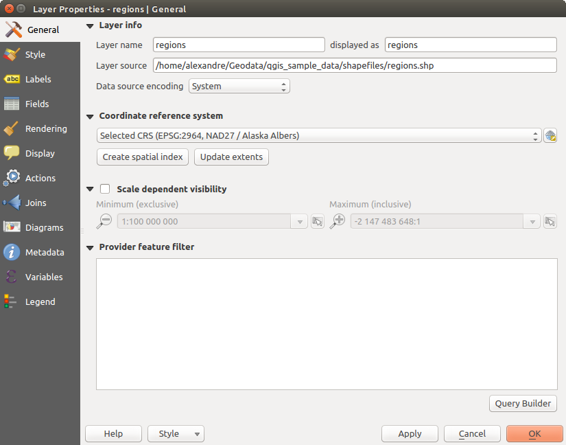
General tab in vector layers properties dialog
クエリビルダー
Under the Provider Feature Filter frame, the Query Builder allows you to define a subset of the features in the layer using a SQL-like WHERE clause and to display the result in the main window. As long as the query is active, only the features corresponding to its result are available in the project. The query result can be saved as a new vector layer.
The Query Builder is accessible through the eponym term at the bottom of the General tab in the Layer Properties. Under Feature subset, click on the [Query Builder] button to open the Query builder. For example, if you have a regions layer with a TYPE_2 field, you could select only regions that are borough in the Provider specific filter expression box of the Query Builder. Figure_vector_querybuilder shows an example of the Query Builder populated with the regions.shp layer from the QGIS sample data. The Fields, Values and Operators sections help you to construct the SQL-like query.
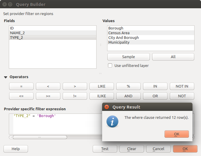
クエリビルダー
The Fields list contains all attribute columns of the attribute table to be searched. To add an attribute column to the SQL WHERE clause field, double click its name in the Fields list. Generally, you can use the various fields, values and operators to construct the query, or you can just type it into the SQL box.
The Values list lists the values of an attribute table. To list all possible values of an attribute, select the attribute in the Fields list and click the [all] button. To list the first 25 unique values of an attribute column, select the attribute column in the Fields list and click the [Sample] button. To add a value to the SQL WHERE clause field, double click its name in the Values list.
The Operators section contains all usable operators. To add an operator to the SQL WHERE clause field, click the appropriate button. Relational operators ( = , > , ...), string comparison operator (LIKE), and logical operators (AND, OR, ...) are available.
The [Test] button shows a message box with the number of features satisfying the current query, which is useful in the process of query construction. The [Clear] button clears the text in the SQL WHERE clause text field. The [OK] button closes the window and selects the features satisfying the query. The [Cancel] button closes the window without changing the current selection.
QGIS treats the resulting subset acts as if it were the entire layer. For example if you applied the filter above for ‘Borough’, you can not display, query, save or edit Anchorage, because that is a ‘Municipality’ and therefore not part of the subset.
The only exception is that unless your layer is part of a database, using a subset will prevent you from editing the layer.
Style Properties
 The Style tab provides you with a comprehensive tool for
rendering and symbolizing your vector data. You can use tools that are
common to all vector data, as well as special symbolizing tools that were
designed for the different kinds of vector data. However all types share the
following dialog structure: in the upper part, you have a widget that helps
you prepare the classification and the symbol to use for features and at
the bottom the レイヤーレンダリング widget.
The Style tab provides you with a comprehensive tool for
rendering and symbolizing your vector data. You can use tools that are
common to all vector data, as well as special symbolizing tools that were
designed for the different kinds of vector data. However all types share the
following dialog structure: in the upper part, you have a widget that helps
you prepare the classification and the symbol to use for features and at
the bottom the レイヤーレンダリング widget.
ちなみに
ベクターシンボロジーをエクスポート
Google *.kml, *.dxfとMapInfo *.tab ファイルにQGISからベクターシンボルをエクスポートするオプションがあります。ちょうどレイヤーの右マウスメニューを開き、 名前を付けて保存を... 上のクリック出力ファイルの名前とその形式を指定します。ダイアログで シンボルエクスポート メニューを使用して、シンボルを、 地物シンボル ‣ または シンボルレイヤーシンボル ‣ のいずれかとして保存します。シンボルレイヤーを使用している場合は、第二の設定を使用することをお勧めします。
地物のレンダリング
The renderer is responsible for drawing a feature together with the correct symbol. Regardless layer geometry type, there are four common types of renderers: single symbol, categorized, graduated and rule-based. For point layers, there are a point displacement and a heatmap renderers available while polygon layers can also be rendered with the inverted polygons and 2.5 D renderers.
連続カラーレンダラーはありません。実際には段階レンダラーの特殊な場合でしかないからです。分類および段階レンダラは、シンボルとカラーランプを指定して作成できる - それらは適宜、シンボルの色を設定します。各データタイプ(ポイント、ライン、およびポリゴン)のために、ベクターシンボルレイヤータイプが利用可能です。選択したレンダラーによっては、ダイアログで異なる追加のセクションが提供されます。
ノート
レンダラーの種類を変更する場合は、ベクターレイヤーのスタイルを設定するときは、シンボルのために作られた設定は維持されます。この手順は、1つの変更のために働くことに注意してください。レンダラーの種類を変更繰り返すとシンボルの設定は失われます。
単一シンボルレンダラー
The  Single Symbol renderer is used to render
all features of the layer using a single user-defined symbol.
See シンボルセレクタ for further information about symbol representation.
Single Symbol renderer is used to render
all features of the layer using a single user-defined symbol.
See シンボルセレクタ for further information about symbol representation.
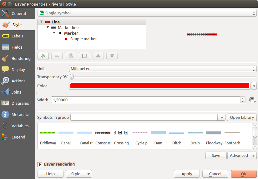
単一シンボルラインプロパティ
ちなみに
レイヤーパネルから直接記号を編集する
If in your Layers Panel you have layers with categories defined through
categorized, graduated or rule-based style mode, you can quickly change the
fill color of the symbol of the categories by right-clicking on a category
and choose the color you prefer from a  color wheel menu.
Right-clicking on a category will also give you access to the options Hide
all items, Show all items and Edit symbol.
color wheel menu.
Right-clicking on a category will also give you access to the options Hide
all items, Show all items and Edit symbol.
シンボルレンダラーなし
それはすべての地物に同じレンダリングを適用するよう  シンボルなし レンダラーは、単一のシンボルレンダラーの特殊なユースケースです。このレンダラーを使用して、何のシンボルは、地物のために描かれませんが、ラベル付け、図や他の非記号の部分は、まだ表示されます。
選択はまだキャンバスでレイヤーの上に作ることができ、選択した地物は、デフォルトのシンボルで描画されます。編集中の地物も表示されます。
これは、あなただけのラベルやダイアグラムを表示したいレイヤーのための便利なショートカットとして意図され、そしてこれを達成するために、完全に透明の塗りつぶし/境界でシンボルをレンダリングする必要性を回避しています。
分類レンダラー
The  Categorized renderer is used to render the
features of a layer, using a user-defined symbol whose aspect reflects the
discrete values of a field or an expression. The Categorized menu allows you to
Categorized renderer is used to render the
features of a layer, using a user-defined symbol whose aspect reflects the
discrete values of a field or an expression. The Categorized menu allows you to
既存のフィールドを選択するか([列]リストボックスを使用して) または
 列の式を設定 を使用して 式 を入力または構築します。地物を分類するために使用される式は、任意のタイプのものであってもよいです。例えばこのようなものが可能です:
比較で、たとえば myfield >= 100, $id = @atlas_featureid, myfield % 2 = 0, within( $geometry, @atlas_geometry ) 。この場合、QGISにより値 1 (True) と 0 (False) が返されます。
異なるフィールドを組み合わせて、例えば、 concat( field1, ' ', field2 ) は同時に2つ以上のフィールド上の分類を処理する場合に特に有用です。
フィールド上の計算、例えば myfield % 2, year( myfield ) field_1 + field_2
離散クラスの線形値を変換するために使用します。例えば:
CASE WHEN x > 1000 THEN 'Big' ELSE 'Small' END
1つの単一のカテゴリに複数の離散値を結合する。
CASE
WHEN building IN ('residence', 'mobile home') THEN 'residential'
WHEN building IN ('commercial', 'industrial') THEN 'Commercial and Industrial'
END
ノート
地物を分類するための式にはどんな種類も使用できますが、いくつかの複雑な式については 規則に基づくレンダリング を使用する方が簡単かもしれません。
( シンボルセレクタ ダイアログを使用して)各クラスの基本シンボルとして使用されるシンボル;
シンボルに適用される色が選択された色(カラーランプのリストボックスを使用して)の範囲
Then click on [Classify] button to create classes from the distinct value of the attribute column. Each class can be disabled unchecking the checkbox at the left of the class name.
シンボル、値および/またはクラスのラベルを変更するには、変更したい項目をダブルクリック。
右クリックでコンテクストメニューに コピー/貼り付け 、 色を変更 、 変更透明度、変更出力部 、 変更シンボル幅 を示しています。
figure_categorized_symbology の例では、QGISサンプルデータセットの河川レイヤーに使用されるカテゴリのレンダリングダイアログが表示されます。
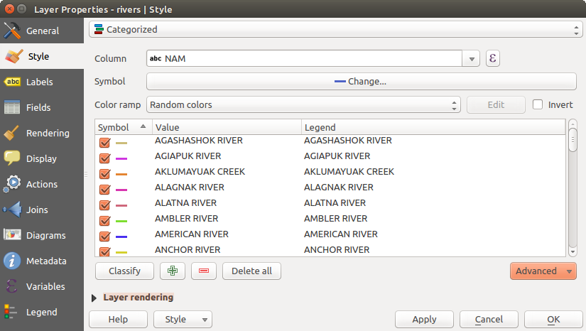
分類シンボル化オプション
ちなみに
複数シンボルを選択して変更する
シンボロジでは複数のシンボルを選択して右クリックでそれらの色,透過度,サイズや太さを変更できます.
ちなみに
シンボル名に分類を一致させる
[詳細設定]メニューで、クラスの下で、分類内のカテゴリ名にシンボル名を一致させるために、2つの最初のアクションのいずれかを選択できます。 保存記号に一致 は 、スタイルマネージャ からシンボル名でカテゴリ名に一致。ファイルからシンボルに一致 は、カテゴリ名を外部ファイルからシンボル名へ一致。
段階レンダラー
The  Graduated renderer is used to render
all the features from a layer, using an user-defined symbol whose color or size
reflects the assignment of a selected feature’s attribute to a class.
Graduated renderer is used to render
all the features from a layer, using an user-defined symbol whose color or size
reflects the assignment of a selected feature’s attribute to a class.
分類レンダラーと同じように一般レンダラーでは回転とサイズ縮尺の値を特定の列に定義できます.
また、分類レンダラーと同じように、以下を選択できます:
属性([列]リストボックスまたは
列の式を設定 機能を使用)(シンボル選択ダイアログを使用して)、シンボル
凡例形式と精度
色やサイズ:記号を変更するために使用する方法
色(カラーランプのリストを使用して)カラー方式が選択された場合
サイズ(サイズのドメインおよびその単位を使用して)
その後、割り当てられたフィールドまたは式の値のインタラクティブなヒストグラムを示すヒストグラム]タブを使用できます。クラスブレークが移動またはヒストグラムウィジェットを使用して追加できます。
ノート
ベクターレイヤーに関する詳細な情報を取得するために統計概要パネルを使用できます。 統計の概要パネル 参照。
[クラス]タブに戻って、クラスの数および(モード]リストを使用して)クラス内の地物を分類するためのモードも指定できます。使用可能なモードは以下のとおりです:
- Equal Interval: each class has the same size (e.g. values from 0 to 16 and 4 classes, each class has a size of 4);
- Quantile: each class will have the same number of element inside (the idea of a boxplot);
- Natural Breaks (Jenks): the variance within each class is minimal while the variance between classes is maximal;
- Standard Deviation: classes are built depending on the standard deviation of the values;
プリティブレーク:xの値の範囲をカバーする約N + 1等間隔nice値のシーケンスを計算します。それらは http://astrostatistics.psu.edu/datasets/R/html/base/html/pretty 、10のべきの1、2または5倍になるように値が選ばれます(R統計環境 http://astrostatistics.psu.edu/datasets/R/html/base/html/pretty.html からプリティに基づいて)。
The listbox in the center part of the Style tab lists the classes together with their ranges, labels and symbols that will be rendered.
選択したモードを使用してクラスを作成する 分類 ボタンをクリックしてください。各クラスは、クラス名の左にあるチェックボックスをオフに無効にできます。
シンボル、値および/またはクラスのラベルを変更するには、変更したい項目をダブルクリック。
右クリックでコンテクストメニューに コピー/貼り付け 、 色を変更 、 変更透明度、変更出力部 、 変更シンボル幅 を示しています。
figure_graduated_symbology の例では、QGISサンプルデータセットの河川レイヤーのための段階レンダリングダイアログが表示されます。
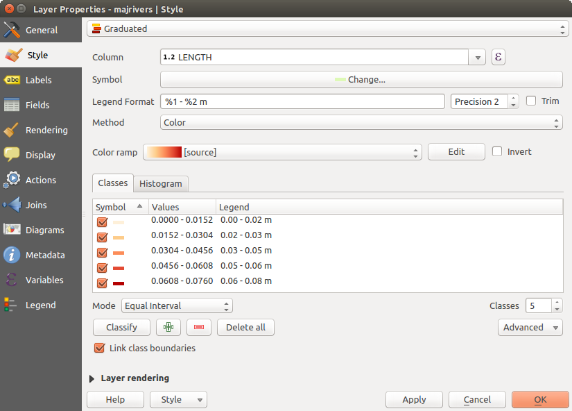
段階シンボル化オプション
ちなみに
式を利用した主題図
分類と段階主題は、式の結果を使用して作成できます。ベクターレイヤーのプロパティダイアログでは、属性選択は 列の式の設定 機能で拡張されます。だから、分類属性は、複数のフィールドの複合、またはある種の式になりたい場合は、属性テーブルで新しい列に分類属性を記述する必要はありません。
比例シンボルと多変量解析
Proportional Symbol and Multivariate Analysis are not rendering types available from the Style rendering drop-down list. However with the Size Assistant options applied over any of the previous rendering options, QGIS allows you to display your point and line data with such representation.
比例シンボルを作成する
Proportional rendering is done by first applying to the layer the 単一シンボルレンダラー.
Once you set the symbol, at the upper level of the symbol tree, the
 Data-defined override button available beside
Size or Width options (for point or line layers
respectively) provides tool to create proportional symbology for the layer.
An assistant is moreover accessible through the menu
to help you define size expression.
Data-defined override button available beside
Size or Width options (for point or line layers
respectively) provides tool to create proportional symbology for the layer.
An assistant is moreover accessible through the menu
to help you define size expression.
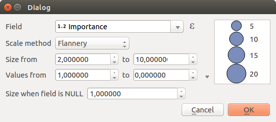
Varying size assistant
The assistant lets you define:
- The attribute to represent, using the Field listbox or the
Set column expression function (see 式)
- the scale method of representation which can be ‘Flannery’, ‘Surface’ or ‘Radius’
- The minimum and maximum size of the symbol
- The range of values to represent: The down pointing arrow helps you fill automatically these fields with the minimum (or zero) and maximum values returned by the chosen attribute or the expression applied to your data.
- An unique size to represent NULL values.
To the right side of the dialog, you can preview the features representation within a live-update widget. This representation is added to the layer tree in the layer legend and is also used to shape the layer representation in the print composer legend item.
The values presented in the varying size assistant above will set the size ‘Data-defined override’ with:
coalesce(scale_exp(Importance, 1, 20, 2, 10, 0.57), 1)
多変量解析を作成する
多変量解析のレンダリングを使用すると2つの以上の変数間の関係を評価するのに役立ちます。例えば、1つをカラーランプで表してもう1つをサイズで表現することができます。
The simplest way to create multivariate analysis in QGIS is to first apply a categorized or graduated rendering on a layer, using the same type of symbol for all the classes. Then, clicking on the symbol [Change] button above the classification frame, you get the シンボルセレクタ dialog from which, as seen above, you can activate and set the size assistant option either on size (for point layer) or width (for line layer).
Like the proportional symbol, the size-related symbol is added to the layer tree, at the top of the categorized or graduated classes symbols. And both representation are also available in the print composer legend item.
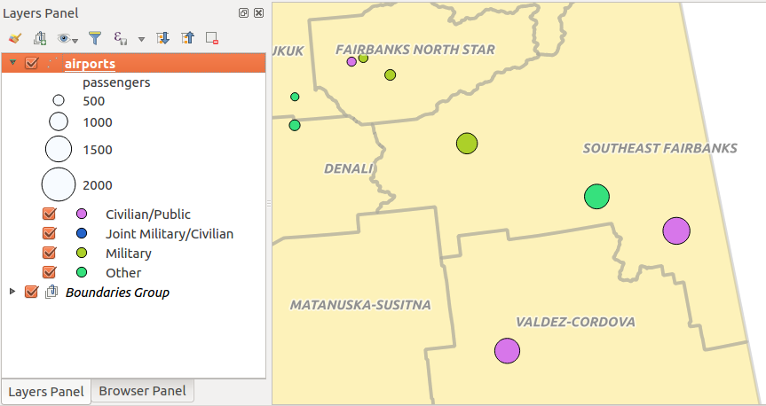
Multivariate example
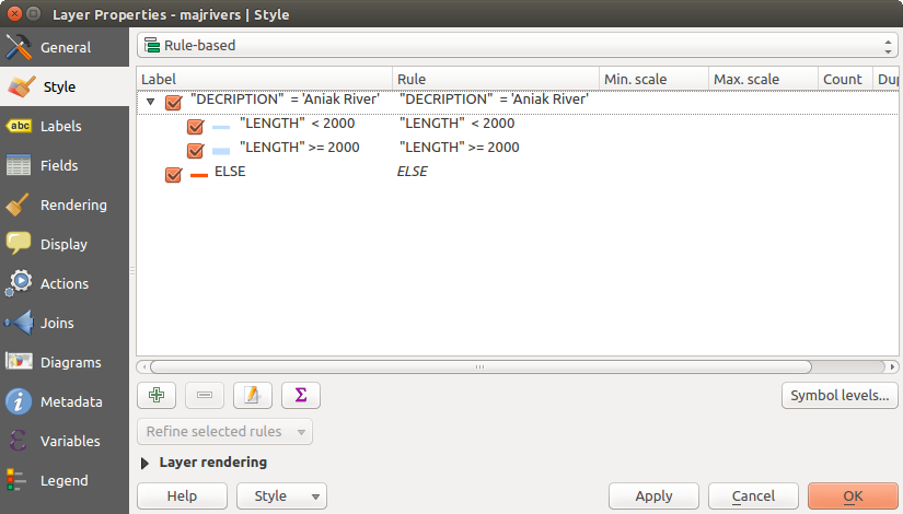
Rule-based Renderer
The  Rule-based renderer is used to render
all the features from a layer,
using rule-based symbols whose aspect reflects the assignment of a selected
feature’s attribute to a class. The rules are based on SQL statements.
The dialog allows rule grouping by filter or scale, and you can decide
if you want to enable symbol levels or use only the first-matched rule.
Rule-based renderer is used to render
all the features from a layer,
using rule-based symbols whose aspect reflects the assignment of a selected
feature’s attribute to a class. The rules are based on SQL statements.
The dialog allows rule grouping by filter or scale, and you can decide
if you want to enable symbol levels or use only the first-matched rule.
To create a rule, activate an existing row by double-clicking on it, or
click on ‘+’ and click on the new rule. In the Rule properties dialog,
you can define a label for the rule. Press the  button to open the
expression string builder.
In the Function List, click on Fields and Values to view all
attributes of the attribute table to be searched.
To add an attribute to the field calculator Expression field,
double click on its name in the Fields and Values list. Generally, you
can use the various fields, values and functions to construct the calculation
expression, or you can just type it into the box (see 式).
You can create a new rule by copying and pasting an existing rule with the right
mouse button. You can also use the ‘ELSE’ rule that will be run if none of the other
rules on that level matches.
Since QGIS 2.8 the rules appear in a tree hierarchy in the map legend. Just
double-click the rules in the map legend and the Style tab of the layer
properties appears showing the rule that is the background for the symbol in
the tree.
button to open the
expression string builder.
In the Function List, click on Fields and Values to view all
attributes of the attribute table to be searched.
To add an attribute to the field calculator Expression field,
double click on its name in the Fields and Values list. Generally, you
can use the various fields, values and functions to construct the calculation
expression, or you can just type it into the box (see 式).
You can create a new rule by copying and pasting an existing rule with the right
mouse button. You can also use the ‘ELSE’ rule that will be run if none of the other
rules on that level matches.
Since QGIS 2.8 the rules appear in a tree hierarchy in the map legend. Just
double-click the rules in the map legend and the Style tab of the layer
properties appears showing the rule that is the background for the symbol in
the tree.
figure_rule_based_symbology の例では、QGISサンプルデータセットの河川レイヤーのための規則に基づくレンダリング]ダイアログボックスが表示されます。
規則に基づくシンボル化オプション
Point displacement Renderer
The  Point Displacement renderer
works to visualize all features of a point layer, even if they have the same location.
To do this, the symbols of the points are placed on a displacement circle
around one center symbol or on several concentric circles.
Point Displacement renderer
works to visualize all features of a point layer, even if they have the same location.
To do this, the symbols of the points are placed on a displacement circle
around one center symbol or on several concentric circles.
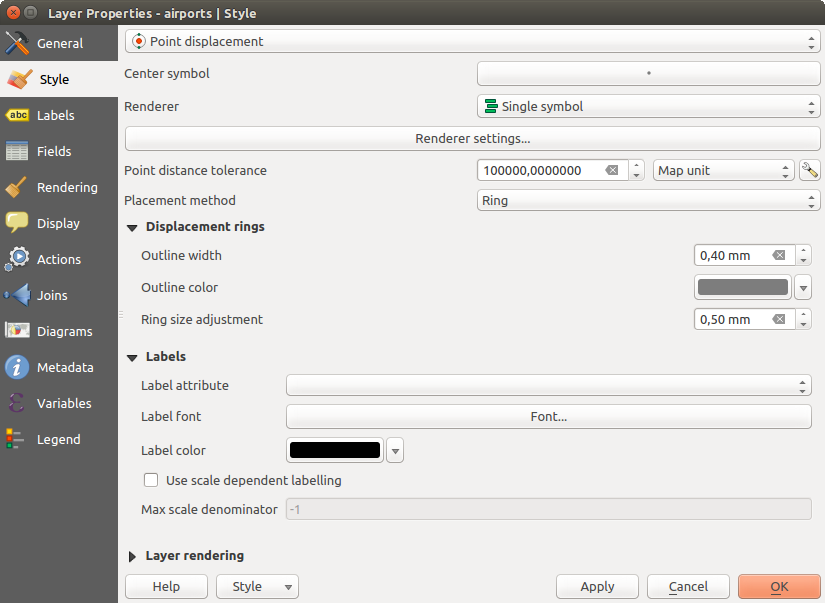
ポイント変位ダイアログ
ノート
You can still render features with other renderer like Single symbol, Graduated, Categorized or Rule-Based renderer using the Renderer drop-down list then the Renderer Settings... button.
Inverted Polygon Renderer
 逆ポリゴン レンダラーは、ユーザーがレイヤーのポリゴンの外側に塗りつぶしするシンボルを定義することを可能にします。上記のように、サブレンダラー、すなわち単一シンボル、段階、分類、規則に基づく、または2.5 Dのレンダラー、を選択できます。
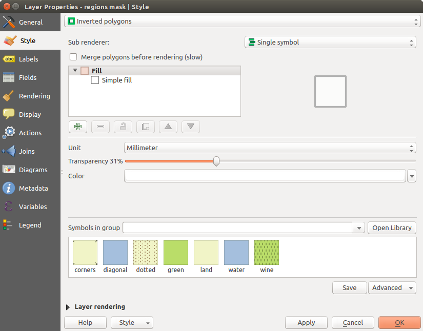
反転ポリゴンダイアログ
Heatmap Renderer
With the  Heatmap renderer you can create live
dynamic heatmaps for (multi)point layers.
You can specify the heatmap radius in pixels, mm or map units, choose and
edit a color ramp for the heatmap style and use a slider for selecting a trade-off
between render speed and quality. You can also define a maximum value limit and give a
weight to points using a field or an expression. When adding or removing a feature
the heatmap renderer updates the heatmap style automatically.
Heatmap renderer you can create live
dynamic heatmaps for (multi)point layers.
You can specify the heatmap radius in pixels, mm or map units, choose and
edit a color ramp for the heatmap style and use a slider for selecting a trade-off
between render speed and quality. You can also define a maximum value limit and give a
weight to points using a field or an expression. When adding or removing a feature
the heatmap renderer updates the heatmap style automatically.
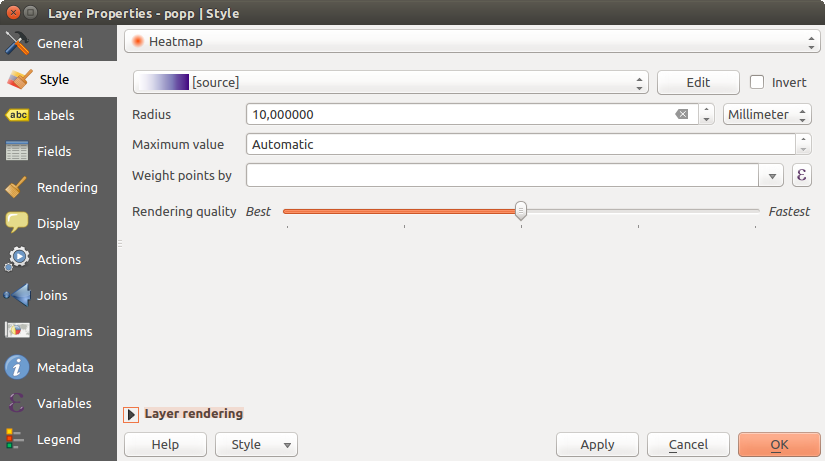
ヒートマップダイアログ
2.5D Renderer
 2.5 D レンダラーを使用すると、レイヤーの地物上の 2.5 D の効果を作成することが可能です。 高さ 値(地図単位)選択して起動します。そのために、固定値で、レイヤーのフィールドのいずれか、または式を使用できます。(0° は西を意味し、反時計回り方向に大きく)、視聴者の位置を再作成するために 角度 (度)また、選択する必要があります。 屋根色 と 壁色 設定するには、高度な設定オプションを使用します。地物の壁に太陽放射をシミュレートしたい場合は、
  方角に基づくシェードの壁 オプションをチェックしてください。また 色 と サイズ を設定することで、影をシミュレートできます(地図単位)。
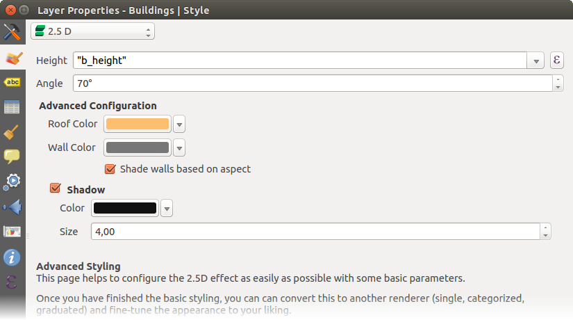
2.5Dダイアログ
ちなみに
他のレンダラーとともに2.5 D効果を使用する
2.5 Dレンダラーの基本的なスタイルの設定が完了したら、別のレンダラーにこれを変換できます(単一、分類、段階)。2.5 Dの効果は保持されますし、他のすべてのレンダラー固有のオプションを微調整それら(素敵な2.5次元表現を持つ例えば分類記号を持っているか、2.5 Dシンボルにいくつかの余分なスタイリングを追加できますこの方法)へのために利用できるようになります。( 詳細 ‣ シンボルレベル... )影と「建物」自体が他の近くの地物に干渉しないことを確認するために、シンボルレベルを有効にする必要があります。2.5 Dの高さと角度の値はレイヤーの変数に保存されているので、レイヤーのプロパティ]ダイアログボックスの[変数]タブで、後でそれを編集できます。
レイヤーレンダリング
From the Style tab, you can also set some options that invariabily act on all features of the layer:
Layer transparency
 : You can make the underlying layer in
the map canvas visible with this tool. Use the slider to adapt the visibility
of your vector layer to your needs. You can also make a precise definition of
the percentage of visibility in the the menu beside the slider.
: You can make the underlying layer in
the map canvas visible with this tool. Use the slider to adapt the visibility
of your vector layer to your needs. You can also make a precise definition of
the percentage of visibility in the the menu beside the slider.Layer blending mode and Feature blending mode: You can achieve special rendering effects with these tools that you may previously only know from graphics programs. The pixels of your overlaying and underlaying layers are mixed through the settings described in 描画モード.
ペイント効果 を持つすべてのレイヤーの地物に 描画効果 ボタンを適用します。
地物レンダリング順序を制御 では、地物属性を使用して、それらがレンダリングされなければならない Z-順序 を定義できます。チェックボックスを有効にし、をクリックしてください
ボタンの横にあります。 順序を定義 ダイアログ次に、取得します:- choose a field or build an expression to apply to the layer features
- set in which order the fetched features should be sorted, i.e. if you choose Ascending order, the features with lower value are rendered under those with upper value.
- define when features returning NULL value should be rendered: first or last.
You can add several rules of ordering. The first rule is applied to all the features in the layer, z-ordering them according to the value returned. Then, for each group of features with the same value (including those with NULL value) and thus same z-level, the next rule is applied to sort its items among them. And so on...
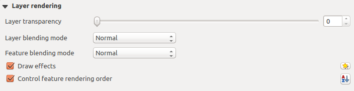
レイヤーのレンダリングオプション
他の設定
Symbols levels
積み重ねのシンボルレイヤーを許可する(唯一のヒートマップだけはなし)レンダラーのために、各シンボルのレベルのレンダリング順序を制御するためのオプションがあります。
For most of the renderers, you can access the Symbols levels option by clicking the [Advanced] button below the saved symbols list and choosing Symbol levels. For the Rule-based Renderer the option is directly available through [Symbols levels] button, while for Point displacement Renderer renderer the same button is inside the Rendering settings dialog.
シンボルレベルを有効にするには シンボルレベルを有効にする を選択します。各行は、合成シンボル、ラベルとそれに次の番号の列に分割され、個々のシンボルレイヤーの少量のサンプルを表示されます。数字は、シンボルレイヤーが描画された描画順のレベルを表します。低い値のレベルが最初に描画され、底部に滞在、より高い値は他の上に最後に描かれます。
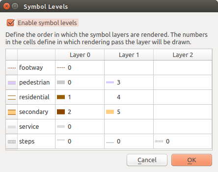
シンボルレベルダイアログ
ノート
シンボルレベルを無効にしている場合は、完全なシンボルがそれぞれの地物順序に従って描画されます。重なるシンボルは、下の他のシンボルで単に見難くされます。また、同種のシンボルはお互いに「併合」されません。
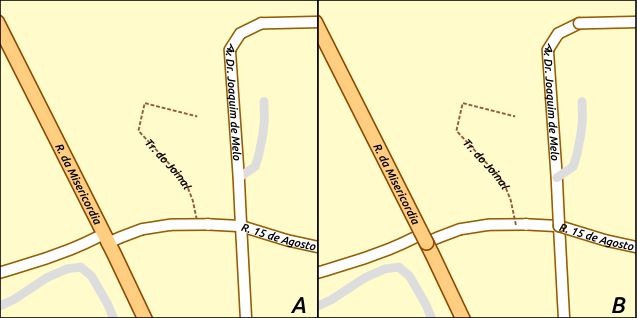
シンボルレベルの有効(A)と無効(B)の差
描画効果
地図の最終的なレンダリングのために他のソフトウェアに頼るのレイヤーのレンダリングを改善し、避ける(または少なくとも軽減)するために、QGISでは別の強力な機能を提供します:  描画効果 オプション、これはベクターレイヤーの可視化をカスタマイズするための描画効果を追加します。
The option is available in the Layer Properties –> Style dialog, under the Layer rendering group (applying to the whole layer) or in symbol layer properties (applying to corresponding features). You can combine both usage.
Paint effects can be activated by checking the Draw effects option
and clicking the Customize effects button, that will open
the Effect Properties Dialog (see figure_effects_source). The following
effect types, with custom options are available:
Source: Draws the feature’s original style according to the configuration of the layer’s properties. The transparency of its style can be adjusted.

描画効果:[元]ダイアログ
Blur: Adds a blur effect on the vector layer. The options that someone can change are the Blur type (Stack or Gaussian blur), the strength and transparency of the blur effect.
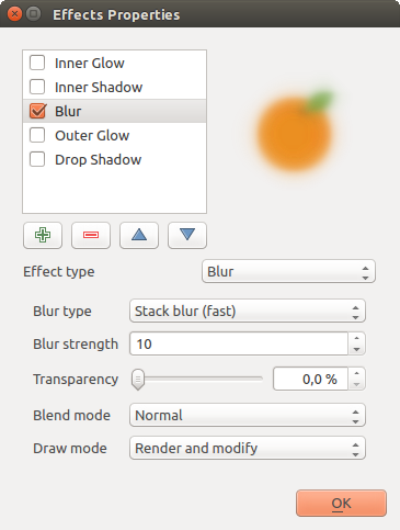
効果を描く:[ぼかし]ダイアログ
Colorize: This effect can be used to make a version of the style using one single hue. The base will always be a grayscale version of the symbol and you can use the
 Grayscale to select how to create it
(options are: ‘lightness’, ‘luminosity’ and ‘average’). If
Colorise is selected, it will be possible to mix another color
and choose how strong it should be. You can also control the
Brightness, contrast and
saturation levels of the resulting symbol.
Grayscale to select how to create it
(options are: ‘lightness’, ‘luminosity’ and ‘average’). If
Colorise is selected, it will be possible to mix another color
and choose how strong it should be. You can also control the
Brightness, contrast and
saturation levels of the resulting symbol.
描画効果:彩色ダイアログ
Drop Shadow: Using this effect adds a shadow on the feature, which looks like adding an extra dimension. This effect can be customized by changing the offset degrees and radius, determining where the shadow shifts towards to and the proximity to the source object. Drop Shadow also has the option to change the blur radius, the transparency and the color of the effect.

描画効果:ドロップシャドウダイアログ
Inner Shadow: This effect is similar to the Drop Shadow effect, but it adds the shadow effect on the inside of the edges of the feature. The available options for customization are the same as the Drop Shadow effect.
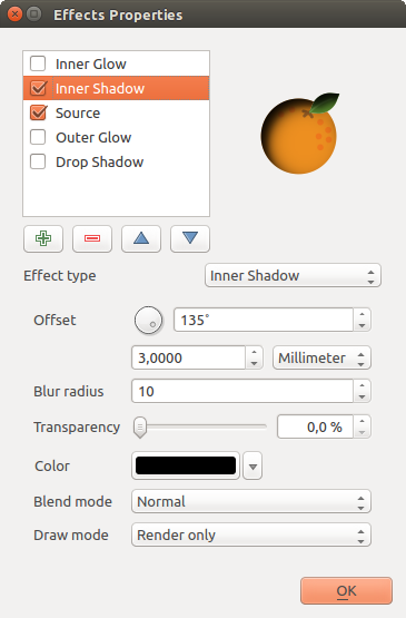
描画効果:[内部シャドウ]ダイアログ
Inner Glow: Adds a glow effect inside the feature. This effect can be customized by adjusting the spread (width) of the glow, or the Blur radius. The latter specifies the proximity from the edge of the feature where you want any blurring to happen. Additionally, there are options to customize the color of the glow, with a single color or a color ramp.
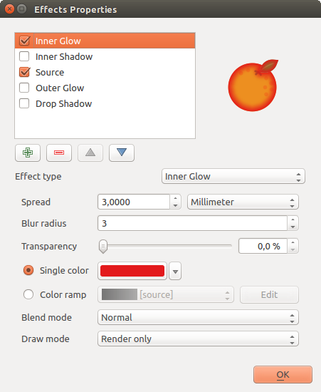
描画効果:インナーグローダイアログ
Outer Glow: This effect is similar to the Inner Glow effect, but it adds the glow effect on the outside of the edges of the feature. The available options for customization are the same as the Inner Glow effect.

描画効果:光彩(外側)ダイアログ
Transform: Adds the possibility of transforming the shape of the symbol. The first options available for customization are the Reflect horizontal and Reflect vertical, which actually create a reflection on the horizontal and/or vertical axes. The 4 other options are:
- Shear: slants the feature along the x and/or y axis
- Scale: enlarges or minimizes the feature along the x and/or y axis by the given percentage
- Rotation: turns the feature around its center point
- and Translate changes the position of the item based on a distance given on the x and/or the y axis.
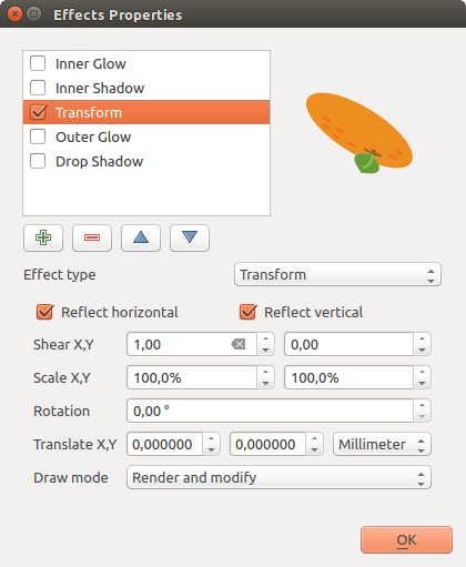
描画効果:[変換]ダイアログ
There are some common options available for all draw effect types. Transparency and Blend mode options work similar to the ones described in レイヤーレンダリング and can be used in all draw effects except for the transform one.
One or more draw effects can used at the same time. You activate/deactivate an effect
using its checkbox in the effects list. You can change the selected effect type by
using the Effect type option. You can reorder the effects
using  Move up and
  Move down
buttons, and also add/remove effects using the
Move down
buttons, and also add/remove effects using the  Add effect
and
Add effect
and  Remove effect buttons.
There is also a Draw mode option available for
every draw effect, and you can choose whether to render and/or to modify the
symbol. Effects render from top to bottom.’Render only’ mode means that the
effect will be visible while the ‘Modify only’ mode means that the effect will
not be visible but the changes that it applies will be passed to the next effect
(the one immediately below). The ‘Render and Modify’ mode will make the
effect visible and pass any changes to the next effect. If the effect is in the
top of the effects list or if the immediately above effect is not in modify
mode, then it will use the original source symbol from the layers properties
(similar to source).
ラベルのプロパティ
 ラベル プロパティはベクターレイヤー上のスマートラベルを設定するために、すべての必要な、適切な機能を提供します。このダイアログは レイヤースタイル設定 パネルから、または ラベルツールバー の レイヤーのラベリングオプション アイコン使用してアクセスできます。
ラベルを設定する
The first step is to choose the labeling method from the drop-down list. There are four options available:
- No labels
- Show labels for this layer
- Rule-based labeling
- and Blocking: allows to set a layer as just an obstacle for other layer’s labels without rendering any labels of its own.
The next steps assume you select the Show labels for this layer option, enabling following tabs that help you configure the labeling:
It also enables the Label with drop-down list, from which you can select an
attribute column to use. Click if you want to define
labels based on expressions - See 式に基づいてラベルを定義する.
次の手順は、ドロップダウンメニューの隣に位置している データ定義の上書き を使用しない簡単なラベル付けを説明しています。ユースケースについては ラベル付けのためにデータ定義の上書きを使用する 参照。
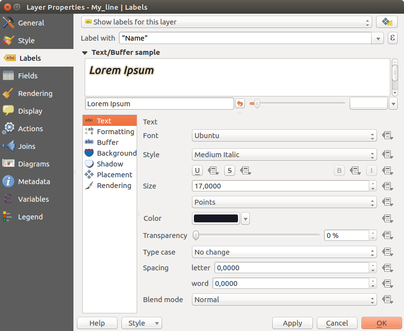
レイヤーのラベルの設定 - [テキスト]タブ
テキストタブ
In the Text tab, you can define the Font, Style, and Size of your labels’ text (see Figure_labels). There are options available to set the labels’ Color and Transparency. Use the Type case option to change the capitalization style of the text. You have the possibility to render the text as ‘All uppercase’, ‘All lowercase’ or ‘Capitalize first letter’. In Spacing, you can change the space between words and between individual letters. Finally, use the Blend mode option to determine how your labels will mix with the map features below them (see more about it in 描画モード).
ラベルテキスト置き換えを適用 オプションでは地物ラベルのテキストを置換するテキストのリストを指定できます(例えば、通りのタイプの省略)。代替テキストは、このように地図キャンバスのラベルを表示するために使用されます。また、ユーザーは、置き換えのリストをエクスポートおよびインポートすることで、簡単に再利用と共有ができます。
フォーマットタブ
In the Formatting tab, you can define a character for a line break in the labels with the Wrap on character option. You can also format the Line Height and the alignment. For the latter, typical values are available (left, right, and center), plus Follow label placement for point layers. When set to this mode, text alignment for labels will be dependent on the final placement of the label relative to the point. E.g., if the label is placed to the left of the point, then the label will be right aligned, while if it is placed to the right, it will be left aligned.
ラインベクターレイヤーについては、ラインの方向を決定するのを助けるために ラインの方向シンボル を含めることができます。それらは 配置 タブから 湾曲 または 平行 配置オプションで使用するとき、特によく働きます。シンボルの位置を 逆方向 設定するオプションがあります。
数値ラベルをフォーマットする numbersを書式設定 オプションを使用します。 小数点位置 の数を設定できます。デフォルトでは、小数点第3位が使用されます。正の数の正符号を表示したい場合は 正符号を表示 使用します。
[バッファ]タブ
To create a buffer around the labels, activate the
Draw text buffer checkbox in the Buffer tab. You can
set the buffer’s Size, color, and
Transparency. The buffer expands from the label’s outline
, so, if the color buffer’s fill checkbox is
activated, the buffer interior is filled. This may be relevant when
using partially transparent labels or with non-normal blending
modes, which will allow seeing behind the label’s text. Deactivating
color buffer’s fill checkbox (while using totally
transparent labels) will allow you to create outlined text labels.
[背景]タブ
In the Background tab, you can define with Size X and Size Y the shape of your background. Use Size type to insert an additional ‘Buffer’ into your background. The buffer size is set by default here. The background then consists of the buffer plus the background in Size X and Size Y. You can set a Rotation where you can choose between ‘Sync with label’, ‘Offset of label’ and ‘Fixed’. Using ‘Offset of label’ and ‘Fixed’, you can rotate the background. Define an Offset X,Y with X and Y values, and the background will be shifted. When applying Radius X,Y, the background gets rounded corners. Again, it is possible to mix the background with the underlying layers in the map canvas using the Blend mode (see 描画モード).
シャドウタブ
Use the Shadow tab for a user-defined Drop shadow.
The drawing of the background is very variable.
Choose between ‘Lowest label component’, ‘Text’, ‘Buffer’ and ‘Background’.
The Offset angle depends on the orientation
of the label. If you choose the Use global shadow checkbox,
then the zero point of the angle is
always oriented to the north and doesn’t depend on the orientation of the label.
You can influence the appearance of the shadow with the Blur radius.
The higher the number, the softer the shadows. The appearance of the drop shadow
can also be altered by choosing a blend mode.
配置]タブ
Choose the Placement tab for configuring label placement and labeling priority. Note that the placement options differ according to the type of vector layer, namely point, line or polygon.
ポイントレイヤーの配置
 Cartographic 配置モード、ポイントラベルが理想的な地図製作配置規則次のポイント地物を備えた最高の視覚的な関係、で生成されます。ラベルは点地物自体から、または地物を表すために使用されるシンボルの境界のいずれかから設定された 距離 に配置できます。それは、データ定義されたサイズで設定されたかどうかに分類レンダラーに異なるシンボルを使用している場合、シンボルの大きさは、例えば、固定されていない場合、後者のオプションは特に便利です。
デフォルトでは、配置は次の順序で優先順位付けされています。
右上
左上
右下
左下
右中央
左中央
最上、少し右
最下、少し左。
配置優先順位は、しかし優先位置のデータ定義されたリストを使用して、個々の地物に合わせてカスタマイズまたは設定できます。また、これは特定の配置だけ使用されるようにできます。たとえば沿岸の地物のためにラベルが土地の上に配置されることを防ぐことができます。
周りの点 設定ではラベルを( 距離 で設定)地物の周りに円を等しい半径で配置します。 象限 オプションを使用してラベルの配置も制約できます。
pointからのオフセット 配置では、ラベルは点地物からの固定オフセットで配置されます。ラベルを配置している 象限 選択できます。また、Xを設定できますし、Yは ポイントとそのラベル間X、Y としてラベルの配置の角度を変更できます 回転 設定。したがって、定義された回転に選択象限の配置が可能です。
線レイヤーでの配置
線レイヤーのラベルオプションは、 平行 、  湾曲 または 水平 です。 平行 と 湾曲 オプションについては、ポジションを設定できます 線より上 線上 線より下 。これは、一度に複数のオプションを選択することが可能です。その場合には、QGISは最適なラベル位置を探します。平行湾曲配置について、また、ラベルの位置のためのラインの向きを使用できます。また、 湾曲 オプションを選択しているときは 湾曲文字間の最大角度 を定義できます( Figure_labels_placement_lines を参照)。
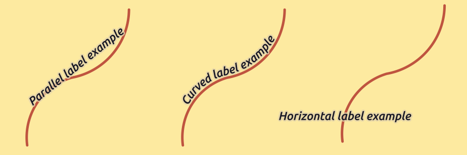
ラインでのラベルの配置例
すべての3つの配置オプションについて、ラベルを繰り返すための最小距離を設定できます。距離は mm または 地図単位 であることができます。
ポリゴンレイヤーの配置
ポリゴンにラベルを配置するため、次のいずれかのオプションを選択できます( figure_labels_placement_polygon 参照)。
- 重心からのオフセット,
- 水平 (低速),
- 重心周り,
- 自由 (低速),
- 周囲を使用,
and
周囲を使用(湾曲).
重心からのオフセット 設定では重心が 見えるポリゴン または 全体ポリゴン あるかどうかを指定できます。つまり、どんなに地図上の全地物を見ることができれば、重心のいずれかを使用して、地図上で見ることができたポリゴンのために使用されているか、重心が全体のポリゴンのために決定されることを意味します。特定の象限内のラベルを配置し、オフセットと回転を定義できます。
周りの重心 設定ではラベルを重心周りに指定した距離で配置します。ここでも、重心のための 見えるポリゴン または 全体ポリゴン を定義できます。
水平(低速) または 自由(低速) オプションでは、QGISで多角形の内部に水平または回転ラベルのいずれかの最高の位置に配置されます。
周囲を使用 オプションを使うと、ラベルはポリゴン境界の隣に描かれます。ラベルは行のパラレルオプションのように動作します。ラベルの位置と距離を定義できます。位置については、 線の上方 、 線上 、 線の下方 と ライン方向依存位置 が可能です。ラベルとポリゴンアウトラインの間の距離、およびラベルの繰り返し間隔を指定できます。
周囲を使用(曲線) オプションは、カーブしたラベルを使って、ポリゴン境界に沿ってラベルを描画するのに役立ちます。 周囲を使用 設定で利用可能なパラメーターに加えて、 曲線文字間の最大角度 ポリゴンを内側または外側に設定できます。
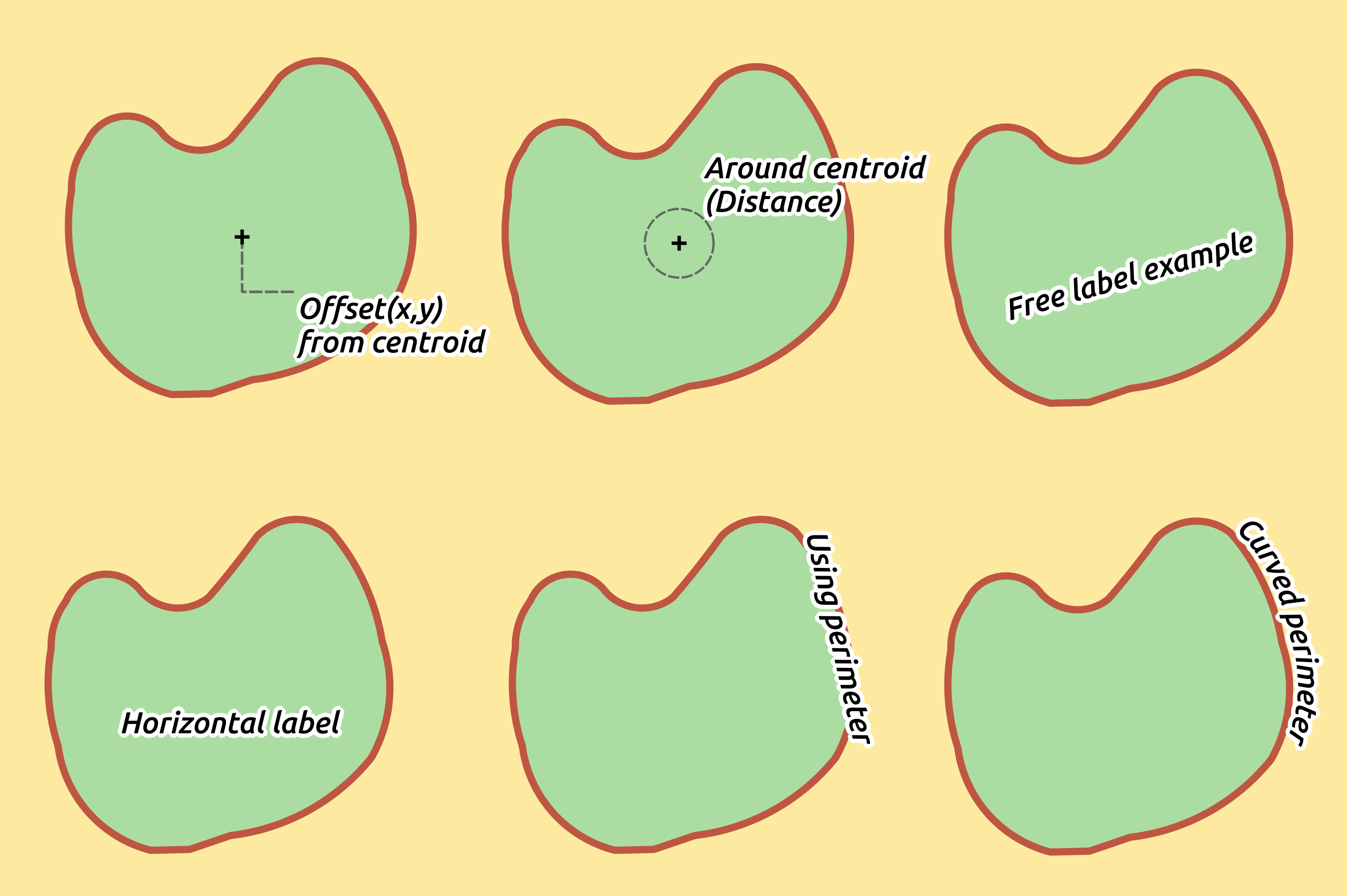
ポリゴンでのラベルの配置例
優先度 セクションでは、ラベルは、すべての3つのベクターのレイヤータイプ(点、線、多角形)のためにレンダリングされる優先順位を定義できます。この配置オプションは、地図キャンバス内の他のベクターレイヤーのラベルと対話します。異なるレイヤーからのラベルが同じ場所にある場合は、優先度の高いラベルが表示され、他は取り残されます。
[レンダリング]タブ
In the Rendering tab, you can tune when the labels can be rendered and their interaction with other labels and features.
ラベルオプション の下には、 縮尺に基づく と ピクセルサイズに基づく の表示設定があります。
ラベルZインデックス は、ラベルが他のレイヤーからのラベルと同様に(データ定義のオーバーライド式を使用して)レイヤーで他の地物ラベル、との関係においても、レンダリングされる順序を決定します。より高いzインデックスを有するラベルは、低いzインデックスを持つ(任意レイヤーからの)ラベルの上にレンダリングされます。
さらに、ロジックは、2つのラベルでZインデックスが一致した場合、次になるように微調整されています:
それらが同じレイヤーからのものである場合、より小さなラベルが大きいラベル上に描画されます
ラベルは、それらは異なるレイヤーからしている場合、そのレイヤー自身と同じ順序で描画されます(すなわち地図の凡例に設定された順序を尊重)。
この設定では、ラベルが他のレイヤーからの地物の下に描画されることはありません、それだけでラベルがすべてのレイヤーの地物の上に描画される順序を制御していることに注意してください。
ラベルをレンダリングし、読みやすいラベルを表示するために、一方で、QGISは自動的にラベルの位置を評価し、衝突の場合には、それらの一部を非表示にできます。ただし、手動でそれらの配置を修正するために、このレイヤーのための すべてのラベルを表示(衝突ラベルを含む) を選択できます。
ラベル表示 と 常に表示 データ定義の表現では、どのラベルをレンダリングする必要があるか微調整できます。
地物オプション の下では、 ラベル付けする地物の数を制限 マルチパート地物のすべての部分にラベル を選択できます。 これより小さい地物 のラベルを抑制し、両方のラインとポリゴンのレイヤーが使用して、地物をラベル付けするためには最小サイズを設定するオプションを提供します。ポリゴン地物の場合、また、それらは完全に地物かに収まるかどうかに応じて表示するようにラベルを絞り込むことができます。ライン地物については、選択できます 重複ラベルを避けるために連結されたラインをマージ と一緒に非常に風通しの良い地図をレンダリングし、 距離 か[配置]タブで 繰り返し オプション。
障害物 フレームから、ラベルと地物の間のカバーの関係を管理できます。 地物カバーからラベルを思いとどまら を有効化、レイヤーの地物は、(同一レイヤー内の他の地物からのラベルを含む)任意のラベルのための障害物として作用すべきかどうかを決定するためのオプション。障害物とは、その上にQGISがラベルを配置しないように可能な限りしようとする地物です。代わりに、全レイヤーでは、使用して、障害物として使用する地物のサブセットを定義できます データ定義された上書き オプションの横に制御します。
障害物のための 優先制御スライダーを使用すると、特定のレイヤーの地物を重なっている他のレイヤーの地物より優先してラベル付けできます。 重みが軽い 障害物の優先順位は、レイヤーの地物は、以下の障害物と見なされ、ラベルでカバーされるので、より可能性が高いことを意味します。この優先順位は、同じレイヤー内に、特定の地物が他のものよりも被覆されやすいように、データを定義できます。
ポリゴンレイヤーの場合、ラベルの配置を最小化することによって、可能性障害物の地物の種類を選択できます。
地物の内部にわたり :ポリゴンの内部(ポリゴンの内側に完全に外側またはわずかにラベルを置くことを好む)の上にラベルを配置する回避します
または 地物の境界上で :(ポリゴンの内側外側または完全にラベルを置くことを好む)、ポリゴンの境界の上にラベルを配置する回避できます。これは、地物はエリア全体をカバーする地域の境界レイヤー、用などに便利です。このケースでは、これらの地物の中にラベルを配置しないようにすることは不可能だし、それは、地物間の境界上にそれらを置くことを避けるために非常に良く見えます。
規則に基づくラベル付け
規則に基づくラベル付けで、複数のラベルの設定を定義し、 規則に基づくレンダリング 同様に、表現フィルタと縮尺範囲のベースに選択的に適用できます.
To create a rule, select the Rule-based labeling option in the main
drop-down list from the Labels tab and click the button
at the bottom of the dialog. Then fill the new dialog with a description and an
expression to filter features. You can also set a scale range in which the label rule should be applied. The other
options available in this dialog are the common settings
seen beforehand.

規則の設定
既存の規則の概要はメインダイアログ( figure_labels_rule_based 参照)に示されています。ドラッグアンドドロップで複数の規則を追加、並べ替え、imbricateできます。それらは ボタンで削除することも、 ボタンまたはダブルクリックで編集することもできます。
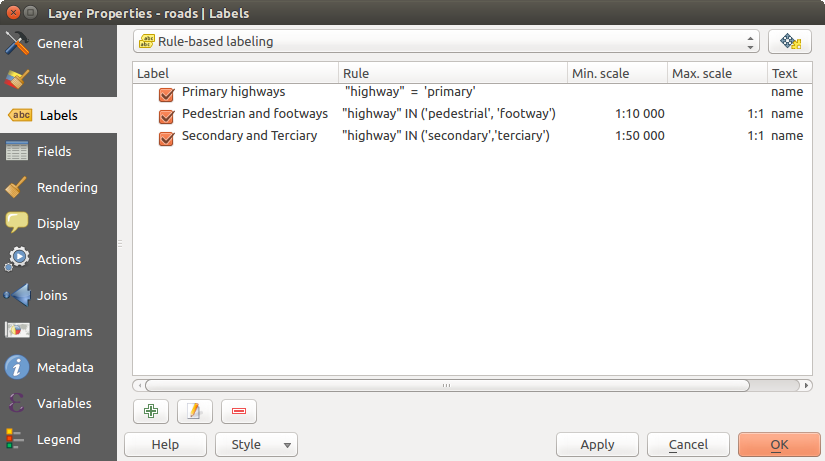
規則に基づくラベル作成パネル
式に基づいてラベルを定義する
Whether you choose simple or rule-based labeling type, QGIS allows using
expressions to label features. Click the icon near the
Label with drop-down list in the Labels tab
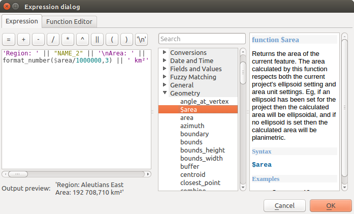
of the properties dialog. In figure_labels_expression, you see a sample
expression to label the alaska regions with name and area size, based on the
field ‘NAME_2’, some descriptive text, and the function $area in combination
with format_number() to make it look nicer.
レベル付けに式を使用する
式に基づくラベル付けで作業するのは簡単です。世話をする必要があるすべては、次のとおりです。
- You need to combine all elements (strings, fields, and functions) with a string concatenation function such as concat, + or ||. Be aware that in some situations (when null or numeric value are involved) not all of these tools will fit your need.
文字列は「一重引用符」で書かれます。
フィールドは、「二重引用符」または任意の引用符なしで書かれています。
いくつかの例を見てみましょう:
カンマを区切り文字とする2つのフィールド「名前」と「場所」に基づくラベル:
"name" || ', ' || "place"
返します:
John Smith, Paris
二つのフィールド「名前」や他のテキストと「場所」に基づくラベル:
'My name is ' + "name" + 'and I live in ' + "place"
'My name is ' || "name" || 'and I live in ' || "place"
concat('My name is ', name, ' and I live in ', "place")
返します:
My name is John Smith and I live in Paris
二つのフィールド「名前」と「場所」に基づく他のテキストで異なる連結関数を組み合わせるラベル:
concat('My name is ', name, ' and I live in ' || place)返します:
My name is John Smith and I live in Paris
フィールド「場所」のNULLである場合や、返し:
My name is John Smith
二つのフィールド「名前」と「場所」に基づく説明テキストを持つマルチラインラベル:
concat('My name is ', "name", '\n' , 'I live in ' , "place")返します:
My name is John Smith
I live in Paris
フィールドに基づくラベルと$area関数は、場所の名前と丸められた領域のサイズを変換された単位で表示します。
'The area of ' || "place" || ' has a size of '
|| round($area/10000) || ' ha'
返します:
The area of Paris has a size of 10500 ha
CASE ELSE条件を作成します。 population フィールドの人口値が <= 50000 であれば、それは町です。さもなければ、それは市です:
concat('This place is a ',
CASE WHEN "population <= 50000" THEN 'town' ELSE 'city' END)
返します:
This place is a town
式ビルダーで見ることができるように、QGISではデータにラベルを付けるために、シンプルで非常に複雑な式を作成するために利用可能な機能の数百を持っています。式の詳細と例については 式 章を参照。
ラベル付けのためにデータ定義の上書きを使用する
With the Data defined override functions, the settings for
the labeling are overridden by entries in the attribute table. It can be used to
set values for most of the labeling options described above. See the widget’s
description and manipulation in データ定義の上書きの設定 section.
ラベルツールバー
ラベルツールバー は ラベル または  ダイアグラム プロパティを操作するいくつかのツールを提供しますが、対応するデータ定義オプションが示されている場合のみです(そうでなければ、ボタンは無効になります)。レイヤーを編集モードにする必要もあります。
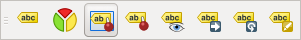
ラベルツールバー
読みやすくするために、 label は、ラベルのツールバーを記述するために以下で使用されてきたが、その名前に言及した際、ツールはダイアグラムとほぼ同じように動作していることに注意してください:
データ定義の位置を持っている
 ラベルやダイアグラムを固定/固定解除 。エリアをクリックするか、dragingすることで、ラベル(複数可)を固定。地域の保持をクリックするか、ドラッグした場合 Shift 、ラベル(s)が固定解除されています。最後に、また、地域の保持をクリックするかドラッグできます Ctrl でラベル(複数可)のピンの状態を切り替えること。
 ピンラベルとダイアグラムをハイライトする 。ラベルのベクターレイヤーが編集可能な場合、ハイライト表示は緑色になり、それ以外の場合は青色になります。
データ定義位置を持つ
 ラベルとダイアグラムを移動 。ラベルを目的の場所にドラッグするだけです。
データ定義の可視性を持つ
 ラベルとダイアグラムの表示/非表示 Shift を押している領域をクリックまたはドラッグすると、ラベルが非表示になります。ラベルが表示されていない場合は、その地物のポイントを囲む領域をクリックまたはドラッグして可視性を復元するだけです。
 ラベル回転 。ラベルをクリックして、周りに移動すると、テキストが回転し得ます。
 ラベルの変更 。クリックされたラベルのプロパティを変更するためのダイアログが開きます。このプロパティがフィールドにマップされている限り、ラベル自体、座標、角度、フォント、サイズなどが可能です。
警告
[ラベル]ツールは現在のフィールド値を上書きします
ラベルツールバー を使ってラベルをカスタマイズすると、マップされたフィールドにプロパティの新しい値が実際に書き込まれます。したがって、後で必要になるかもしれないデータを誤って置き換えないように注意してください!
地図キャンバスからラベルをカスタマイズする
Combined with the Label Toolbar, the data defined override setting
helps you manipulate labels in the map canvas (move, edit, rotate).
We now describe an example using the data-defined override function for the
Move label function (see figure_labels_data_defined).
QGISサンプルデータセットから lakes.shp をインポートします。
レイヤーのプロパティを開くには、レイヤーをダブルクリックします。 ラベル と 配置 をクリックしてください。
重心からのオフセット を選択してください。データによる定義 エントリを探します。
アイコンをクリックして 座標 ためのフィールドタイプを定義します。Xには xlabel とYには ylabel を選択してください。アイコンが今黄色で強調表示されています。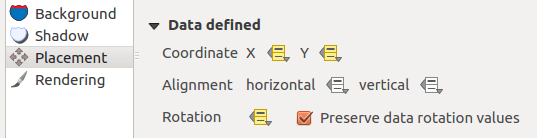
データ定義の上書きを有するベクターポリゴンレイヤーのラベリング
湖へズーム
 編集切り替え ボタンを使用してレイヤーを編集可能に設定します。
ラベルのツールバーに移動し、
アイコンをクリックしてください。今、別の位置( figure_labels_move 参照)に手動でラベルをシフトできます。ラベルの新しい位置は、属性テーブルの xlabel と ylabel 列に保存されます。以下の式で ジオメトリジェネレータ を使用すると、各レーキを移動したラベルに接続する線ストリングシンボルレイヤーを追加することもできます。
make_line( centroid( $geometry ), make_point( "xlabel", "ylabel" ) )

ラベルの移動
Fields Properties
 The Fields tab helps you organize the fields of
the selected dataset and the way you can interact with
the feature’s attributes. The buttons
The Fields tab helps you organize the fields of
the selected dataset and the way you can interact with
the feature’s attributes. The buttons  New field and
  Delete field
can be used when the dataset is in Editing mode.
Delete field
can be used when the dataset is in Editing mode.
You can rename fields by double-clicking in the fields name (note that you should switch to editing mode to edit the field name). This is only supported for data providers like PostgreSQL, Oracle, Memory layer and some OGR layer depending the OGR data format and version.
地物フォームまたは属性テーブル内の人間が読める形式のフィールドを表示するには、いくつかの別名を定義できます。このケースでは、編集モードに切り替える必要はありません。別名は、プロジェクトファイルに保存されます。
Comments can be added by clicking in the comment field of the column but if you are using a PostgreSQL layer, comment of the column could be the one in the PostgreSQL table if set. Comments are saved in the QGIS project file as for the alias.
The dialog also lists read-only characteristics of the field such as its type, type name, length and precision. When serving the layer as WMS or WFS, you can also check here which fields could be retrieved.
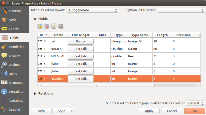
Field properties tab
フィールドの動作を設定する
Within the Fields tab, you also find an Edit widget column. This column can be used to define values or a range of values that are allowed to be added to the specific attribute table column. It also helps to set the type of widget used to fill or display values of the field, in the attribute table or the feature form. If you click on the [Edit widget] button, a dialog opens, where you can define different widgets.
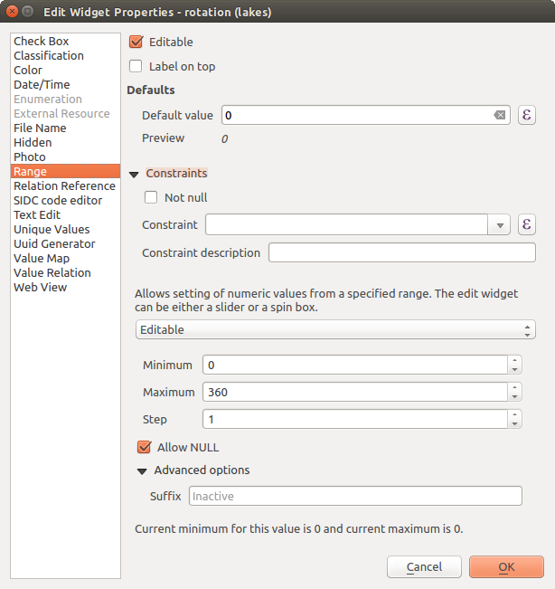
属性列の編集ウィジェットを選択するためのダイアログ
共通設定
Regardless the type of widget applied to the field, there are some common properties you can set to control whether and how a field can be edited:
Editable: uncheck this to set the field read-only (not manually modifiable) when the layer is in edit mode. Note that checking this setting doesn’t override any edit limitation from the provider.
Label on top: places the field name above or beside the widget in the feature form
Default value: for new features, automatically populates by default the field with a predefined value or an expression-based one. For example, you can:
- use $x, $length, $area to populate a field with the feature’s x coordinate, length, area or any geometric information at its creation;
- incremente a field by 1 for each new feature using maximum("field")+1;
- save the feature creation datetime using now();
- use variables in expressions, making it easier to e.g. insert the operator name (@user_full_name), the project file path (@project_path), ...
A preview of the resulting default value is displayed at the bottom of the widget.
ノート
The Default value option is not aware of the values in any other field of the feature being created so it won’t be possible to use an expression combining any of those values i.e using an expression like concat(field1, field2) may not work.
Constraints: you can constrain the value to insert in the field. This constraint can be:
- Not null: force the user to provide a value
based on a custom expression: e.g. regexp_match(col0,'A-Za-z') to ensure that the value of the field col0 has only alphabetical letter.
A short description of the constraint can be added and will be displayed at the top of the form as a warning message when the value supplied does not match the constraint.
編集ウィジェット
The available widgets are:
- Checkbox: Displays a checkbox, and you can define what attribute is added to the column when the checkbox is activated or not.
- Classification: Displays a combo box with the values used for classification, if you have chosen ‘unique value’ as legend type in the Style tab of the properties dialog.
- Color: Displays a color button allowing user to choose a color from the color dialog window.
日付/時刻 :日付、時刻、またはその両方を入力するには、カレンダーウィジェットを開くことができる行フィールドを表示します。列タイプはテキストでなければなりません。カスタム形式を選択でき、ポップアップカレンダーを、など
- Enumeration: Opens a combo box with values that can be used within the columns type. This is currently only supported by the PostgreSQL provider.
- External Resource: Uses a “Open file” dialog to store file path in a relative or absolute mode. It can also be used to display a hyperlink (to document path), a picture or a web page.
- File Name: Simplifies the selection by adding a file chooser dialog.
Hidden : 隠れた属性列は見ることができません. ユーザーはそのコンテンツをみることができません.
- Photo: Field contains a filename for a picture. The width and height of the field can be defined.
レンジ :特定の範囲から数値を設定できます。編集ウィジェットは、スライダーまたはスピンボックスのいずれかになります。
関係リファレンス:このウィジェットは、実際のレイヤーの地物フォームに参照レイヤーの地物フォームを埋め込むことができます。 1対多または多対多の関係を作成する 参照。
テキスト編集 (デフォルト):これは単純なテキストまたは複数行を使用できるテキスト編集フィールドを開きます。複数の行を選択した場合は、HTMLコンテンツを選択できます。
ユニークな値:すでに属性テーブルで使用される値のいずれかを選択できます。「編集可能」が有効になっている場合、ラインエディットは、そうでない場合は、コンボボックスが使用され、自動補完をサポートして示されています。
- UUID Generator: Generates a read-only UUID (Universally Unique Identifiers) field, if empty.
値マップ:事前に定義された項目を持つコンボボックス。値は、属性に格納され、説明はコンボボックスに示されています。手動で値を定義するか、またはレイヤーまたはCSVファイルからそれらを読み込むことができます。
- Value Relation: Offers values from a related table in a combobox. You can select layer, key column and value column. Several options are available to change the standard behaviours: allow null value, order by value, allow multiple selections and use of autocompleter. The forms will display either a drop-down list or a line edit field when completer checkbox is enabled.
- Web View: Field contains a URL. The width and height of the field is variable.
ちなみに
Relative Path in widgets
If the path which is selected with the file browser is located in the same directory as the .qgs project file or below, paths are converted to relative paths. This increases portability of a .qgs project with multimedia information attached. This is enabled only for File Name, Photo and Web View at this moment.
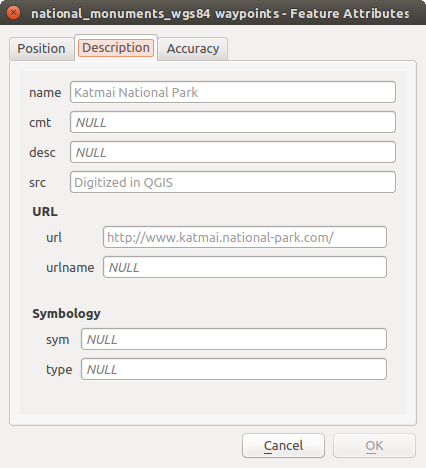
Customize a form for your data
By default, when you click on a feature with the  Identify
Features tool or switch the attribute table to the form view mode, QGIS
displays a form with tabulated textboxes (one per field). This rendering is
the result of the default Autogenerate value of the Layer
properties ‣ Fields ‣ Attribute editor layout setting. Thanks to the
widget setting, you can improve this dialog.
Identify
Features tool or switch the attribute table to the form view mode, QGIS
displays a form with tabulated textboxes (one per field). This rendering is
the result of the default Autogenerate value of the Layer
properties ‣ Fields ‣ Attribute editor layout setting. Thanks to the
widget setting, you can improve this dialog.
You can furthermore define built-in forms (see figure_fields_form), e.g. when you have objects with many attributes, you can create an editor with several tabs and named groups to present the attribute fields.
内蔵の結果タブと名前付きグループを持つフォーム
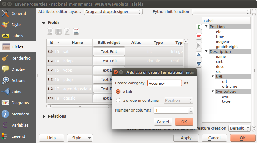
ドラッグアンドドロップデザイナ
Choose Drag and drop designer from the Attribute editor layout combobox to layout the features form within QGIS. Then, drag and drop rows from the Fields frame to the Label panel to have fields added to your custom form.
You can also use categories (tab or group frames) to better structure the form.
The first step is to use the icon to create a tab in which fields
and groups will be displayed (see figure_fields_layout). You can create as many
categories as you want.
The next step will be to assign to each category the relevant fields, using the
 icon. You’d need to select the targeted category beforehand.
You can use the same fields many times.
icon. You’d need to select the targeted category beforehand.
You can use the same fields many times.
属性編集レイアウト でカテゴリを生成するダイアログ
ダブルクリックでタブやグループを設定できます。QGISでフォームが開き、以下のようなことができます:
- choose to hide or show the item label
- rename the category
- set over how many columns the fields under the category should be distributed
- enter an expression to control the category visibility. The expression will be re-evaluated everytime values in the form change and the tab or groupbox shown/hidden accordingly.
- show the category as a group box (only available for tabs)
フィールドラベルをダブルクリックするだけで、そのウィジェットのラベルをフォームに表示するかしないかも指定できます。
In case the layer is involved in one to many relations (see 1対多または多対多の関係を作成する), referencing layers are listed in the Relations frame and their form can be embedded in the current layer form by drag-and-drop. Like the other items, double-click the relation label to configure some options:
- choose to hide or show the item label
- show the link button
- show the unlink button
Provide an ui-file
UIファイルを提供 オプションでは、Qtデザイナで作られた複雑なダイアログを使用できます。UIファイルを使用すると、ダイアログボックスを作成するにはかなり自由にできます。レイヤーのフィールドにグラフィカルオブジェクト(テキストボックス、コンボボックス...)をリンクするためには同じ名前を与える必要がある、ということに注意してください。
UIを編集 を使って、使用するファイルへのパスを定義します。
You’ll find some example in the Creating a new form lesson of the QGISトレーニングマニュアル. For more advanced information, see http://nathanw.net/2011/09/05/qgis-tips-custom-feature-forms-with-python-logic/.
カスタム関数でフォームを強化する
QGISフォームには、ダイアログを開いたときに呼び出されるPythonの関数を持たせることができます。ダイアログに追加のロジックを追加するには、この関数を使用してください。フォームのコードは3つの異なる方法で指定できます:
load from the environment : 関数を使用します、例えば startup.py 中の、またはプラグインからの)
外部ファイルからのロード :ファイル選択は、ファイルシステムからPythonのファイルを選択できるように、その場合に表示されます
このダイアログでコードを提供する :Pythonエディタが表示され、そこで使用する関数を直接入力できます。
すべての場合において、呼び出される関数の名前を入力する必要があります(下の例では open )。
例は(MyForms.pyモジュール):
def open(dialog,layer,feature):
    geom = feature.geometry()
    control = dialog.findChild(QWidged,"My line edit")
そのようなPythonのinit関数で参照: open
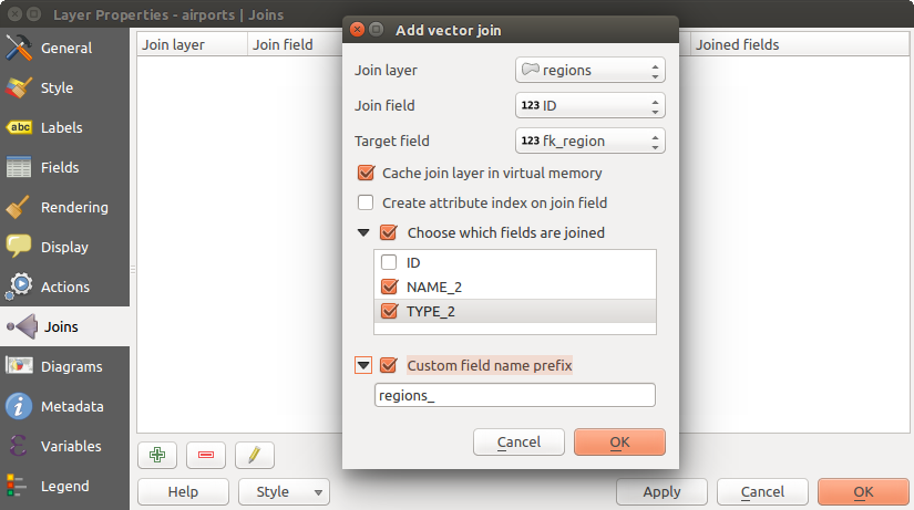
プロパティを結合
 結合 タブは、ロードされたベクターレイヤーにロードされた属性テーブルを結合できます。 をクリックした後 ベクター結合を追加 ダイアログが表示されます。 結合先ベクターレイヤーに接続したいレイヤー 結合キー列として、定義する必要があります。次に、結合するレイヤーと結合先レイヤーの両方に共通する結合フィールドを指定する必要があります。今、また、チェックボックス 結合フィールドを選択 に基づいて、結合レイヤーからフィールドのサブセットを指定できます。結合の結果として、結合レイヤーと結合先レイヤーからのすべての情報は、結合情報として結合先レイヤーの属性テーブルに表示されています。フィールドのサブセットを指定した場合のみ、これらのフィールドは、結合先レイヤーの属性テーブルに表示されます。
QGISは現在OGR(例えば、CSV、DBFやExcel)、区切りのテキストとPostgreSQLプロバイダー( figure_joins_1 を参照)でサポートされている非空間テーブルのフォーマットに参加をサポートしています。
既存のベクターレイヤーに属性テーブルに参加
さらにベクター結合ダイアログでは次のことができます:
- Cache join layer in virtual memory
- 結合フィールドに属性インデックスを作成する
- 結合されているフィールドを選択
- カスタムフィールド名prefix を作成します
ダイアグラムプロパティ
ダイアグラム メニューではベクターレイヤーにグラフィックオーバーレイを行うことができます ( figure_diagrams_attributes 参照).
図の現在のコアの実装は、以下にサポートを提供します:
- pie charts, a circular statistical graphic divided into slices to illustrate numerical proportion. The arc length of each slice is proportional to the quantity it represents,
- text diagrams, a horizontaly divided circle showing statistics values inside
- and histograms.
ちなみに
図の種類をすばやく切り替える
設定は図の異なるタイプにほとんど共通していることを考えると、図を設計する際に、何も損失なしに簡単に図の種類を変更し、どれがデータにとってより適切であるか確認できます。
図の種類ごとに、プロパティはいくつかのタブに分けられます。
属性
属性 ではどの変数をダイアグラムに表示するかを定義します。 項目を追加 ボタンを使用して「割り当てられた属性」パネルに必要なフィールドを選択します。 式 で生成された属性も使用できます。
属性の表示方法を並べ替え、クリックとドラッグでアップし、任意の行下に移動できます。また、項目をダブルクリックすることで「凡例」列または属性色でラベルを変更できます。
This label is the default text displayed in the legend of the print composer or of the layer tree.
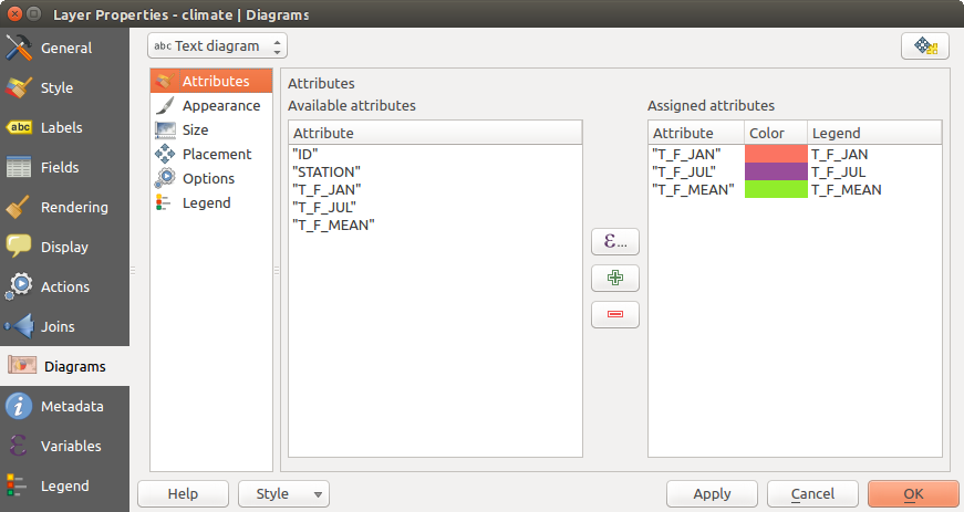
ダイアグラムのプロパティ - 属性タブ
Appearance
Appearance defines how the diagram looks like. It provides general settings that do not interfere with the statistic values such as:
- the graphic transparency, its outline width and color
- the width of the bar in case of histogram
- the circle background color in case of text diagram, and the font used for texts
円グラフで示される第1のスライスの左線の向き。スライスが時計回りに表示されていることに注意してください。
In this tab, you can also manage the diagram visibility:
- by removing diagrams that overlap others or Show all diagrams even if they overlap each other
- by selecting a field with Data defined visibility to precisely tune which diagrams should be rendered
- by setting the scale visibility
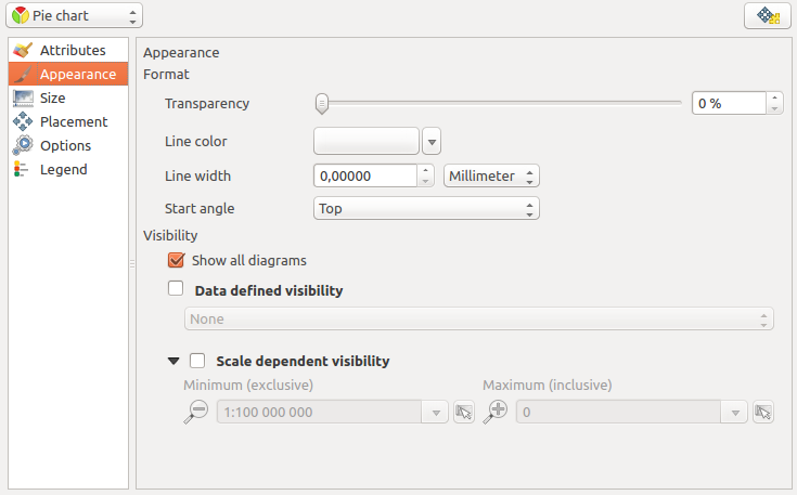
Diagram properties - Appearance tab
サイズ
Size is the main tab to set how the selected statistics are represented. The diagram size units can be ‘Map Units’ or ‘Millimeters’. You can use :
固定サイズ は、すべての地物のグラフィックを表現する唯一のサイズ、ヒストグラムを表示する場合は除く
または 縮尺付サイズ レイヤーの属性を使用して式に基づいて、。

ダイアグラムのプロパティ - サイズタブ
配置
配置 はダイアグラムの位置を定義するのに役立ちます。レイヤージオメトリタイプによれば、配置のためのさまざまなオプションを提供しています。
ポイントジオメトリのための「ポイント上」または「ポイント周り」。後者の変数では従う半径を必要とします。
ラインジオメトリのための「線上」または「線の周り」。ポイント地物と同様に、最後の変数は考慮する距離を必要とし、ユーザーは地物に相対的にダイアグラムの配置を指定できます(ライン「の上側」「上」および/または「の下側」)。一度に複数のオプションを選択することが可能です。その場合、QGISの方でダイアグラムの最適な位置を探します。ここではダイアグラムの位置のためのラインの向きも使用できることを覚えておいてください。
「重心以上」、(距離が設定された)「重心周り」、「周囲」と「ポリゴン内部」どこかには、ポリゴン地物のためのオプションです。
The diagram can also be placed using feature data by filling the X and Y fields with an attribute of the feature.
The placement of the diagrams can interact with the labeling, so you can detect and solve position conflicts between diagrams and labels by setting the Priority slider or the z-index value.
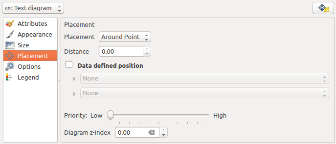
ダイアグラムプロパティを持つベクタープロパティダイアログ、配置タブ
凡例
From the Legend tab, you can choose to display items of the diagram in the レイヤーパネル, besides the layer symbology. It can be:
- the represented attributes: color and legend text set in Attributes tab
- and if applicable, the diagram size, whose symbol you can customize.
When set, the diagram legend items are also available in the print composer legend, besides the layer symbology.
ケーススタディ
アラスカ州の境界レイヤーの上に、気候ベクターレイヤーからの温度データを示すテキストダイアグラムを例とオーバーレイのデモンストレーションを行います。両方のベクターレイヤーともQGISサンプルデータセットの一部です( Sample Data セクションを参照)。
まず、
 ベクターをロード アイコンをクリックして、QGISサンプルデータセットフォルダを参照し、2つのベクターシェープレイヤー alaska.shp と climate.shp をロードしてください。
地図凡例にある climate レイヤーをダブルクリックして レイヤーのプロパティ ダイアログを開いて下さい.
ダイアグラム タブをクリックし、 ダイアグラムの種類
コンボボックスから「テキスト図」を選択してください。外観 タブで、背景色として水色を選択し、 サイズ タブ中、18ミリメートルに固定されたサイズを設定しました。
位置 タブ、配置は「点の周り」に設定できます。
図では、3つの列の値は T_F_JAN 、 T_F_JUL と T_F_MEAN を表示したいです。だから、 属性 タブ中で最初の T_F_JAN を選択し、
ボタンをクリックして T_F_JUL 、最後に T_F_MEAN を繰り返します。- Now click [Apply] to display the diagram in the QGIS main window.
サイズ タブで、グラフのサイズを調節できます。
アクティブ化 縮尺つきサイズ に基づいてダイアグラムのサイズを設定、属性の 最大値 と サイズ オプション。ダイアグラムが画面に表示される小さすぎる場合は、 小さいダイアグラムのサイズを大きく チェックボックスを有効化してダイアグラムの最小サイズを定義できます。割り当てられた属性 フィールドで色の値をダブルクリックして属性の色を変更します。 Figure_diagrams_mapped には結果のアイデアを提供します。
- Finally, click [Ok].
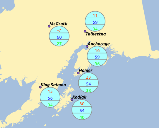
地図上に重ねた温度データからのダイアグラム
位置 タブで、ダイアグラムの データ定義の位置 が可能であることを思い出してください。ここでは、ダイアグラムの位置を定義するための属性を使用できます。 外観 タブで縮尺に応じた表示も設定できます。
サイズや属性も表現できます。 ボタンを使用して式を追加します。詳細と例は 式 章を参照。
データ定義のオーバーライドを使用する
前述したように、ダイアグラムのレンダリングを調整するのにいくつかのカスタムデータ定義を使用できます:
X と Y フィールドを充たすことで 配置 タブ中での位置
可視性 フィールドを埋めることによる 外観 タブでの可視性
詳細は ラベル付けのためにデータ定義の上書きを使用する 参照。
アクションのプロパティ
 QGISには地物の属性に基づいてアクションを実行する機能があります。これは任意の数のアクションを実行するために使用できます。例えば、地物の属性から構築された引数でプログラムを実行するり、Webレポーティングツールにパラメーター渡す、など。
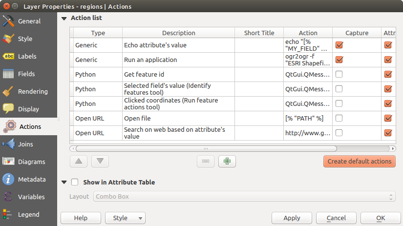
いくつかのサンプルアクションを含む概要アクションダイアログ
頻繁に外部のアプリケーションを実行したり、ベクターレイヤーに1つ以上の値に基づいてWebページを表示する際にアクションが便利です。それらは、6つのタイプに分けられ、このように使用できます。
Generic、Mac、WindowsとUnixのアクションが外部プロセスを開始します。
Python アクションは Python 構文を実行します.
GenericとPythonのアクションはどこでも見ることができます。
Mac、WindowsとUnixのアクションはそれぞれのプラットフォーム上だけに表示されます(つまり、エディタを開く「編集」アクションは3つ定義でき、ユーザーはそのエディタを実行するプラットフォームのための1つの「編集」アクションだけを表示して実行できます) 。
There are several examples included in the dialog. You can load them by clicking on [Create default actions]. To edit any of the examples, double-click its row. One example is performing a search based on an attribute value. This concept is used in the following discussion.
アクションの定義
属性のアクションを定義するには、ベクター レイヤーのプロパティ ダイアログを開いて アクション タブをクリックしてください。 アクション タブ中で 新しいアクションを追加 をクリックして アクションを編集 ダイアログ開きます。
アクションの タイプ を選択し、アクションのわかりやすい名前を指定します。アクション自体は、アクションが呼び出されたときに実行されるアプリケーションの名前が含まれている必要があります。アプリケーションへの引数として1つ以上の属性フィールドの値を追加できます。アクションが呼び出されると、フィールドの名前に続いて % で始まる任意の文字の集合は、そのフィールドの値に置き換えられます。特殊文字 :index:%% (以下 using_actions 参照)を識別結果や属性テーブルから選択されたフィールドの値によって置き換えられます。二重引用符は、プログラム、スクリプトまたはコマンドへの単一の引数にグループのテキストに使用できます。前にバックスラッシュを付けた場合、二重引用符は無視されます。
他のフィールド名の部分文字列であるフィールド名を持っている場合(例えば、 col1 と col10 )、角括弧(および % 文字)でフィールド名を囲むことで示す必要があります(例えば、 [%col10] )。 こうすることで %col10 フィールド名が 末尾に 0 がある %col1 フィールド名と間違えることを防げます。フィールドの値に代入したとき括弧はQGISによって除去されます。置換されたフィールドを角括弧で囲みたい場合は、このような第2のセットを使用します: [[%col10]]
地物識別 ツールを使用して、 識別結果 ダイアログを開くことができます。これは、レイヤーのタイプに関連する情報が含まれる (派生) アイテムを含みます。この項目の値は、 (派生). で派生されるフィールド名を進めることにより、その他のフィールドと同様の方法でアクセスできます。例えば、点レイヤーは、 X と Y フィールドを有し、これらのフィールドの値は、 %(派生).X と %(派生).Y でアクション中で使用できます。派生属性は 属性テーブル ダイアログボックスではなく、識別結果 ダイアログボックスからのみ利用可能です。
二つの例のアクションは以下の通りです:
- konqueror http://www.google.com/search?q=%nam
- konqueror http://www.google.com/search?q=%%
In the first example, the web browser konqueror is invoked and passed a URL to open. The URL performs a Google search on the value of the nam field from our vector layer. Note that the application or script called by the action must be in the path, or you must provide the full path. To be certain, we could rewrite the first example as: /opt/kde3/bin/konqueror http://www.google.com/search?q=%nam. This will ensure that the konqueror application will be executed when the action is invoked.
第二の例では %% 表記を使用しますが、その値は特定のフィールドに依存しません。アクションが呼び出されると、 %% は、識別結果や属性テーブルの選択したフィールドの値に置き換えられます。
アクションを使用する
Actions can be invoked from either the Identify Results dialog,
an Attribute Table dialog or from Run Feature Action
(recall that these dialogs can be opened by clicking
Identify Features or  Open Attribute Table or
 Run Feature Action). To invoke an action, right
click on the feature and choose the action from the pop-up menu (they should
have been enabled to be displayed in the attribute table). Actions are
listed in the popup menu by the name you assigned when defining the action.
Click on the action you wish to invoke.
Run Feature Action). To invoke an action, right
click on the feature and choose the action from the pop-up menu (they should
have been enabled to be displayed in the attribute table). Actions are
listed in the popup menu by the name you assigned when defining the action.
Click on the action you wish to invoke.
もし %% 表記を使ってアクションを呼び出した場合, アプリケーションかスクリプトに渡したいフィールドを 識別結果 ダイアログか 属性テーブル ダイアログで右クリックして下さい.
(  または多分
または多分  だけで動作します)ここでは別のベクターレイヤーからデータを引き出し、bashを使用してファイルと echo コマンドに挿入する例があります。当該レイヤーは、種名 taxon_name 、緯度 lat 及び経度 long のためのフィールドを有しています。地域の空間的な選択を行うと(QGIS地図領域に黄色で表示)選択したレコードのためのテキストファイルにこれらのフィールドの値をエクスポートできるようにしたいと思います。ここでは、これを達成するためのアクションは次のとおりです。
bash -c "echo \"%taxon_name %lat %long\" >> /tmp/species_localities.txt"
いくつかの地域を選択して、それぞれのアクションを実行し、出力ファイルを開いた後、このようなものが表示されます。
Acacia mearnsii -34.0800000000 150.0800000000
Acacia mearnsii -34.9000000000 150.1200000000
Acacia mearnsii -35.2200000000 149.9300000000
Acacia mearnsii -32.2700000000 150.4100000000
As an exercise, we can create an action that does a Google search on the lakes layer. First, we need to determine the URL required to perform a search on a keyword. This is easily done by just going to Google and doing a simple search, then grabbing the URL from the address bar in your browser. From this little effort, we see that the format is http://google.com/search?q=qgis, where QGIS is the search term. Armed with this information, we can proceed:
必ず lakes レイヤーをロードしましょう。
凡例中のレイヤーをダブルクリックして レイヤーのプロパティ ダイアログを開き、または右クリックしてポップアップメニューから プロパティ を選択します。
アクション タブをクリックします。
click
Add a new action.アクションの名前を入力して下さい.たとえば Google Search.
アクションを定義するために実行する外部プログラムの名前を提供しなければいけません. この場合私達はFirefoxを使います. もしプログラムがシステムのパス内に存在しない場合はフルパスを指定する必要があります.
Following the name of the external application, add the URL used for doing a Google search, up to but not including the search term: http://google.com/search?q=
The text in the Action field should now look like this: firefox http://google.com/search?q=
Click on the drop-down box containing the field names for the lakes layer. It’s located just to the left of the [Insert] button.
From the drop-down box, select ‘NAMES’ and click [Insert].
アクションテキストは現在このようになっています:
firefox http://google.com/search?q=%NAMES
To finalize and add the action, click the [OK] button.
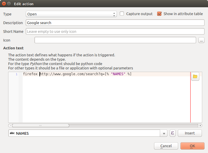
この例で設定されたアクションの編集ダイアログ
アクションは完成して利用可能になりました. 最終的なテキストはこのようになっています:
firefox http://google.com/search?q=%NAMES
これでアクションの利用が可能です。 レイヤーのプロパティ ダイアログを閉じて地図を見たい領域にズームして下さい。 lakes レイヤーがアクティブであることに注意して地物情報表示ツールで湖をクリックして下さい。結果表示ボックスの中にアクションが表示されているはずです:
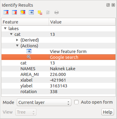
地物を選択し、アクションを選択してください
When we click on the action, it brings up Firefox and navigates to the URL http://www.google.com/search?q=Tustumena. It is also possible to add further attribute fields to the action. Therefore, you can add a + to the end of the action text, select another field and click on [Insert Field]. In this example, there is just no other field available that would make sense to search for.
レイヤーのための複数のアクションを定義でき、それぞれに表示されます 結果 ダイアログを確認します。
また、ポップアップメニューからアクションを選択し、行および右クリックを選択することにより、属性テーブルからアクションを呼び出すことができます。
アクションのための用途のすべての種類があります。たとえば、ファイル名と一緒に画像や写真の場所を含むポイントレイヤーを持っている場合、画像を表示するビューアを起動するアクションを作成できます。また、アクションを使用して、属性フィールドまたはフィールドの組み合わせのためのWebベースのレポートを、Google検索の例で行ったのと同じ方法でそれらを指定することで、起動できるでしょう。
また、より複雑な例を、例えば Python アクションを使用して作成できます。
Usually, when we create an action to open a file with an external application, we can use absolute paths, or eventually relative paths. In the second case, the path is relative to the location of the external program executable file. But what about if we need to use relative paths, relative to the selected layer (a file-based one, like a shapefile or SpatiaLite)? The following code will do the trick:
command = "firefox"
imagerelpath = "images_test/test_image.jpg"
layer = qgis.utils.iface.activeLayer()
import os.path
layerpath = layer.source() if layer.providerType() == 'ogr'
  else (qgis.core.QgsDataSourceURI(layer.source()).database()
    if layer.providerType() == 'spatialite' else None)
path = os.path.dirname(str(layerpath))
image = os.path.join(path,imagerelpath)
import subprocess
subprocess.Popen( [command, image ] )
アクションは Python の一種であり、 コマンド と imagerelpath 変数は必要に合わせて変更する必要があることだけ覚えておく必要があります。
しかし、相対パスが(保存された)プロジェクトファイルに相対的である必要がある場合はどうですか?Pythonのアクションのコードは次のようになります。
command = "firefox"
imagerelpath = "images/test_image.jpg"
projectpath = qgis.core.QgsProject.instance().fileName()
import os.path
path = os.path.dirname(str(projectpath)) if projectpath != '' else None
image = os.path.join(path, imagerelpath)
import subprocess
subprocess.Popen( [command, image ] )
別のPythonの動作例は、プロジェクトに新しいレイヤーを追加することが可能にするものです。例えば、以下の実施例は、それぞれプロジェクトベクターとラスターに追加します。プロジェクトに追加するファイルの名前やレイヤーに与えられる名前はデータ駆動型です( filename と layername は、アクションが作成されたベクターの属性テーブルの列名です)
qgis.utils.iface.addVectorLayer('/yourpath/[% "filename" %].shp',
  '[% "layername" %]', 'ogr')
ラスター(この例ではTIF画像)を追加するには、次のようになります:
qgis.utils.iface.addRasterLayer('/yourpath/[% "filename" %].tif',
  '[% "layername" %]')
画面のプロパティ
 This tab is specifically created for map tips: display a message in
the map canvas when hovering over a feature of the active layer.
This message can either be the value of a Field
or a more complex and full HTML text mixing fields,
expressions and html tags (multiline, fonts, images,
hyperlink ...).
This tab is specifically created for map tips: display a message in
the map canvas when hovering over a feature of the active layer.
This message can either be the value of a Field
or a more complex and full HTML text mixing fields,
expressions and html tags (multiline, fonts, images,
hyperlink ...).
To activate Map Tips, select the menu option View ‣ Map Tips
or click on the Map Tips icon. Map tip is a cross-session feature
meaning that once activated, it stays on and apply to any set layer in any project,
even in future QGIS sessions until it’s toggled off.
Figures Display Code and Mapped show an example of HTML code and how it behaves in map canvas.
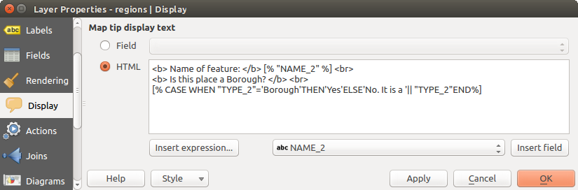
地図ヒントのためのHTMLコード
HTMLコードで作られた地図ヒント
レンダリングプロパティ
 QGIS offers support for on-the-fly feature generalisation. This can
improve rendering times when drawing many complex features at small scales.
This feature can be enabled or disabled in the layer settings using the
Simplify geometry option. There is also a global
setting that enables generalisation by default for newly added layers (see
global simplification for more information).
QGIS offers support for on-the-fly feature generalisation. This can
improve rendering times when drawing many complex features at small scales.
This feature can be enabled or disabled in the layer settings using the
Simplify geometry option. There is also a global
setting that enables generalisation by default for newly added layers (see
global simplification for more information).
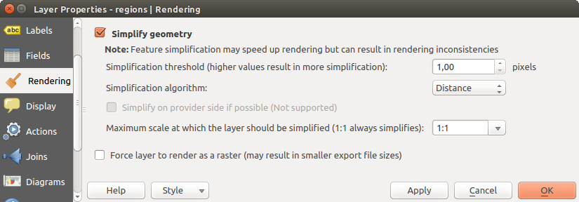
レイヤージオメトリ単純化ダイアログ
ノート
地物の総描は、いくつかの場合では、レンダリングされた出力にアーティファクトを持ち込むことがあります。これらは、ポリゴンとオフセットベースシンボルレイヤーを使用して不正確なレンダリングの間にスライバを含むことがあります。
While rendering extremely detailed layers (e.g. polygon layers with a huge number of nodes), this can cause composer exports in PDF/SVG format to be huge as all nodes are included in the exported file. This can also make the resultant file very slow to work with/open in other programs.
レイヤーをラスターとしてレンダリングするよう強制 をチェックすると、エクスポートされるファイルにこれらのレイヤーに含まれるすべてのノードが含まれる必要がなく、それゆえレンダリングが高速化されるように、これらのレイヤーがラスター化されることを強制します。
You can also do this by forcing the composer to export as a raster, but that is an all-or-nothing solution, given that the rasterisation is applied to all layers.
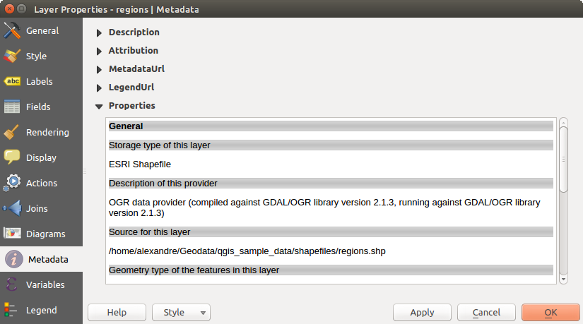
メタデータプロパティ
 The Metadata tab consists of Description,
Attribution, MetadataURL, LegendUrl
and Properties sections.
The Metadata tab consists of Description,
Attribution, MetadataURL, LegendUrl
and Properties sections.
In the Properties section, you get general information about the layer, including specifics about the type and location, number of features, feature type, and editing capabilities. The Extents table provides you with information on the layer extent and the Layer Spatial Reference System, which is information about the CRS of the layer. This can provide a quick way to get useful information about the layer.
Additionally, you can add or edit a title and abstract for the layer in the Description section. It’s also possible to define a Keyword list here. These keyword lists can be used in a metadata catalog. If you want to use a title from an XML metadata file, you have to fill in a link in the DataUrl field.
帰属 を使用してXMLメタデータ・カタログから属性データを取得します。
メタデータUrl では、XMLメタデータカタログへの一般的なパスを定義できます。この情報は、その後のセッションのためのQGISプロジェクトファイルに保存され、QGISサーバーに使用されます。
凡例Url セクションでは、URLフィールドに、凡例画像のURLを提供できます。画像の適切なフォーマットを適用する書式のドロップダウンオプションを使用できます。現在、PNG、JPGやJPEG画像フォーマットがサポートされています。
Metadata tab in vector layers properties dialog
ちなみに
異なるレイヤー表現をすばやく切り替える
Using the Styles ‣ Add combobox at the bottom of the Layer Properties dialog, you can save as many combinations of layer properties settings (symbology, labeling, diagram, fields form, actions...) as you want. Then, simply switch between styles from the context menu of the layer in Layers Panel to automatically get different representations of your data.
変数のプロパティ
変数 タブには、(すべてのグローバルおよびプロジェクトの変数を含む)レイヤーのレベルで利用可能なすべての変数を示しています。
また、ユーザーはレイヤーレベルの変数を管理できます。 をクリックします。ボタンを押して、新しいカスタムレイヤーレベル変数を追加します。同様に、リストからカスタムレイヤーレベル変数を選択し、 ボタンを押して削除します。
Variables セクションに一般ツールでの変数の使用方法の詳細があります。
凡例プロパティ
 The Legend tab provides you with a list of widgets you
can embed within the layer tree in the Layers panel. The idea is to have a
way to quickly access some actions that are often used with the layer (setup
transparency, filtering, selection, style or other stuff...).
The Legend tab provides you with a list of widgets you
can embed within the layer tree in the Layers panel. The idea is to have a
way to quickly access some actions that are often used with the layer (setup
transparency, filtering, selection, style or other stuff...).
デフォルトで、QGISでは透明ウィジェットを提供していますが、これは、独自のウィジェットを登録するプラグインによって拡張し、それらが管理するレイヤーにカスタムアクションを割り当てることができます。