Svarbu
Vertimas yra bendruomenės pastangos, prie kurių jūs galite prisijungti. Šis puslapis šiuo metu išverstas 100.00%.
8. Bendri įrankiai
8.1. Kontekstinė pagalba
Kai jums reikia pagalbos konkrečia tema, jūs galite žiūrėti atitinkamą Naudotojo vadovo puslapį per mygtuką Pagalba, kurį rasite daugumoje dialogų — prašome pastebėti, kad trečiųjų šalių priedai gali nukreipti jus į savo svetainių puslapius.
8.2. Skydeliai
Pagal nutylėjimą QGIS darbui teikia daug skydelių. Kai kurie iš jų aprašomi žemiau, o kitus galima rasti kitose dokumentacijos dalyse. Pilną QGIS teikiamų numatytųjų skydelių sąrašą galima rasti meniu ir rasti juos paminėtus skyriuje Skydeliai.
8.2.1. Sluoksnių skydelis
Skydelyje Sluoksniai (dar žinomame kaip žemėlapio legenda) yra visų projekto sluoksnių sąrašas ir jis padeda jums valdyti jų matomumą bei žemėlapio išvaizdą. Jūs galite įjungti ir išjungti šį skydelį spausdami Ctrl+1.
QGIS suteikia daugybę būdų pridėti sluoksnius į projektą:
naudojant mygtuką Pridėti iš konkretaus duomenų tiekėjo kortelės dialoge Duomenų šaltinių tvarkyklė
QGIS skydelyje Naršyklė ar DB tvarkyklė: spauskite du kartus, tempkite ir numeskite failus ir sluoksnius į QGIS arba naudokite kontekstinį meniu
tempkite ir numeskite failus iš operacinės sistemos failų naršyklės į QGIS
Visais šiais atvejais jūs galite atverti vieną ar daugiau sluoksnių vienu metu. Nauji sluoksniai pridedami į skydelį Sluoksniai:
jei numetami virš skydelio Sluoksniai - toje konkrečioje vietoje, kur jie paleidžiami
kitais atvejais vietoje, kuri nurodyta globaliame nustatyme Elgsena pridedant naujus sluoksnius
o pridedant kelis sluoksnius jie rikiuojami tokia tvarka, kuri padidina galimybę, kad jų grupavimas logiškas ir geoobjektai kiek galima geriau matomi, naudojant tokią logiką (nuo viršaus žemyn):
vektorinių taškų sluoksniai
vektorinių linijų sluoksniai
vektorinių poligonų sluoksniai
taškų masyvų sluoksniai
tinklelio sluoksniai
rastro sluoksniai
Įrankinė Sluoksnių skydelio viršuje leidžia jums:
 Atverti sluoksnių stilių skydelį (F7): įjungti ir išjungti Sluoksnių stiliaus skydelį.
 Pridėti naują grupę: žr. Sąveika su grupėmis ir sluoksniais
 Valdyti žemėlapio temas: valdyti sluoksnių matomumą ir tvarkyti juos skirtingose žemėlapio temose.
 filtruoti sluoksnius legendos medyje:
Filtruoti legendą pagal žemėlapio turinį: sluoksnių skydelyje rodomi tik sluoksniai, kurie yra nurodyti kaip matomi, ir kurių geoobjektai kerta dabartinę žemėlapio drobę. Priešingu atveju sluoksniui taikomas bendras NULL simbolis. Priklausomai nuo sluoksnio simbologijos tai yra patogus būdas identifikuoti, kurio sluoksnio geoobjektai yra jūsų dominančioje teritorijoje.
Rodyti privačius sluoksnius: patogus būdas rodyti ir sąveikauti su privačiais sluoksniais skydelyje Sluoksniai nekeičiant projekto nustatymų.
Rodyti tik neveikiančius sluoksnius: rodomi tik sluoksniai su neveikiančiais duomenų šaltiniais.
 Filtruoti legendą pagal išraišką: pritaikyti išraišką, kad iš parinktų sluoksnių medžio būtų išimti stiliai, kurie neturi geoobjektų, tenkinančių sąlygą. Tai galima naudoti paryškinti geoobjektus, kurie yra kito sluoksnio ploto/geoobjekto viduje. Iškrentančiame sąraše jūs galite keisti ar išvalyti šiuo metu taikomą išraišką.
 Išskleisti viską ar
  Sutraukti viską - išskleidžia ar sutraukia sluoksnius ir grupes sluoksnių skydelyje.
 Išimti sluoksnių grupę, kuri šiuo metu pažymėta.
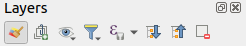
Fig. 8.1 Sluoksnių skydelio sluoksnių įrankinė
Pastaba
Įrankiai sluoksnių skydelio valdymui taipogi veikia ir žemėlapiui bei legendos elementams spausdinimo išdėstymuose
8.2.1.1. Žemėlapio temų konfigūravimas
Iškrentantis mygtukas Tvarkyti žemėlapio temas leidžia greitai ir patogiai valdyti sluoksnių matomumą skydelyje Sluoksniai:
 Rodyti visus sluoksnius
 Slėpti visus sluoksnius
 Rodyti parinktus sluoksnius
 Slėpti parinktus sluoksnius
 Perjungti parinktus sluoksnius: keičia pirmo skydelyje parinkto sluoksnio matomumą ir taiko tą būseną visiems kitiems parinktiems sluoksniams. Taipogi pasiekiamas naudojant klavišą Tarpas.
Perjungti parinktus sluoksnius nepriklausomai: keičia kiekvieno parinkto sluoksnio matomumo būseną
 Slėpti neparinktus sluoksnius
Be paprasto sluoksnių matomumo valdymo, meniu Tvarkyti žemėlapio temas leidžia jums konfigūruoti Žemėlapio temas legendoje ir persijungti iš vienos žemėlapio temos į kitą. Žemėlapio tema yra dabartinės žemėlapių legendos nuotrauka, kuri atsimena:
sluoksnius, kurie pažymėti kaip matomi skydelyje Sluoksniai
ir kiekvienam matomam sluoksniui:
nuorodą į stilių, kuris pritaikytas kiekvienam sluoksniui
matomos stiliaus klasės, t.y. Sluoksnio skydelyje įjungti elementai. Tai taikoma simbologijoms, kitokioms nei vieno simbolio braižymas
sluoksnio elemento(ų) ir vidinės grupės(ių) suskleidimo/išskleidimo būsena
Norėdami sukurti žemėlapio temą:
Įjunkite sluoksnį, kurį norite rodyti
Įprastai sukonfigūruokite sluoksnio savybes (simbologiją, diagramas, užrašus…)
Išplėskite meniu apačioje ir spauskite Pridėti…, kad įrašytumėte nustatymus kaip naują projekte įdėtą stilių
Pastaba
Žemėlapio tema neatsimena dabartinių savybių detalių: įrašoma tik nuoroda į stiliaus pavadinimą, taigi kai keičiate įjungtą sluoksnį (pvz. keičiate simbologijos braižymą), informacija atnaujinama žemėlapio temoje.
Kartokite ankstesnius žingsnius tiek kiek reikia kitiems sluoksniams
Jei reikia, išplėskite ar suskleiskite grupes ar matomų sluoksnių elementus skydelyje Sluoksniai
Spauskite mygtuką
Tvarkyti žemėlapio temas skydelio viršuje ir tada Pridėti temą…Įveskite žemėlapio temos pavadinimą ir spauskite Gerai
Nauja tema rodoma apatinėje iškrentančio meniu dalyje.
Galite kurti tiek žemėlapio temų, kiek reikia: kai tik dabartinė žemėlapio legendos kombinacija (matomi sluoksniai, jų aktyvumo būsena, žemėlapio legendos elementai) neatitinka esamos temos turinio, kaip nurodyta viršuje, spauskite Pridėti temą…, kad sukurtumėte naują žemėlapio temą, arba naudokite , kad pakeistumėte esamą žemėlapio temą. Galite pervadinti aktyvią žemėlapio temą naudodami Pervadinti dabartinę temą… arba naudokite mygtuką Išimti dabartinę temą, jei norite ją ištrinti.
Žemėlapio temos padeda greitai persijungti tarp skirtingų iš anksto sukonfigūruotų kombinacijų: parinkite žemėlapio temą sąraše, kad atstatytumėte jos kombinaciją. Visos sukonfigūruotos temos taipogi prieinamos ir spausdinimo išdėstymuose, kur jūs galite sukurti skirtingus žemėlapio elementus pagal konkrečias temas, nepriklausomai nuo to, kas braižoma dabartinėje pagrindinėje drobėje (žr. Žemėlapio elementų sluoksniai).
8.2.1.2. Sluoksnių skydelio kontekstinio meniu apžvalga
Po įrankine yra pagrindinis Sluoksnių skydelio komponentas - sąrašas visų į projektą pridėtų sluoksnių, pasirinktinai sudėliotas į grupes. Sluoksnis su įjungta greta jo esančia varnele rodo savo turinį žemėlapio drobės apimtyje, nebent nustatytas nuo mastelio priklausantis matomumas. Sluoksnį galima pažymėti ir tempti aukštyn ar žemyn legendoje, norint pakeisti jo Z-rikiuotę. Z-rikiuotė reiškia, kad aukščiau išvardinti sluoksniai braižomi virš sluoksnių, išvardintu legendos apačioje. Taipogi sluoksnį ar sluoksnių grupę galima tempti iš vieno QGIS egzemplioriaus į kitą.
Pastaba
Z-rikiuotės elgseną galima keisti skydelyje Sluoksnių rikiuotė.
Priklausomai nuo skydelyje parinkto elemento, dešinys paspaudimas rodo jam skirtus veiksmus, kurie pateikiami žemiau. Kai kurie iš šių veiksmų negalimi, kai parenkami keli elementai (pvz., Filtruoti, Pervadinti, Savybės).
Parinktis |
Grupė |
Vektorinis sluoksnis |
Rastro sluoksnis |
Tinklelio sluoksnis |
Taškų masyvo sluoksnis |
3D sluoksnis |
|---|---|---|---|---|---|---|
|
|
|
|
|
|
|
|
|
|||||
|
|
|
|
|
|
|
Rodyti objektų skaičių |
|
|||||
|
|
|
||||
Kopijuoti sluoksnį/grupę |
|
|
|
|
|
|
Pervadinti sluoksnį/grupę |
|
|
|
|
|
|
|
|
|||||
Tempti naudojant dabartinę apimtį |
|
|||||
|
|
|||||
|
|
|||||
|
|
|||||
|
|
|||||
|
|
|||||
|
|
|||||
|
|
|||||
|
|
|
|
|
|
|
|
|
|
|
|
|
|
Išimti iš grupės |
|
|
|
|
||
Perkelti į viršų |
|
|
|
|
|
|
Perkelti į apačią |
|
|
|
|
|
|
Įjungti su visais tėvais |
|
|
|
|
||
Grupuoti parinktus |
|
|
|
|
||
|
|
|||||
|
|
|
||||
|
|
|
||||
Filtras… |
|
|
|
|||
Keisti duomenų šaltinį… |
|
|
|
|
||
Taisyti duomenų šaltinį… |
|
|
|
|
||
(redagavimo režime) |
|
|||||
|
||||||
|
||||||
Nustatyti sluoksnio mastelio matomumą… |
|
|
|
|
|
|
Didinti iki matomo mastelio |
|
|
|
|
||
|
|
|
|
|
||
|
|
|
|
|
||
(paskutiniai CRS) |
|
|
|
|||
|
|
|
|
|
||
|
||||||
Nustatyti grupės WMS duomenis… |
|
|||||
|
|
|||||
Įjungti su visais vaikais (Ctrl-paspaudimas) |
|
|||||
Išjungti su visais vaikais (Ctrl-paspaudimas) |
|
|||||
Daryti pastoviu |
|
|||||
|
|
|
|
|
|
|
|
||||||
|
||||||
|
||||||
|
|
|
|
|
|
|
|
|
|
|
|
||
|
|
|
|
|
||
|
|
|
|
|
||
|
|
|
|
|
||
|
|
|
|
|
||
|
|
|
|
|
||
|
||||||
|
||||||
|
||||||
Pridėti sluoksnio pastabas… |
|
|
|
|
|
|
Keisti sluoksnio pastabas… |
|
|
|
|
||
Išimti sluoksnio pastabas |
|
|
|
|
||
Savybės… |
|
|
|
|
|


GRASS vektoriniams sluoksniams negalimas  Perjungti redagavimą. Daugiau informacijos apie GRASS vektorinių sluoksnių redagavimą rasite skyriuje Digitizing and editing a GRASS vector layer.
8.2.1.3. Sąveika su grupėmis ir sluoksniais
Sluoksnius legendų lange galima organizuoti į grupes. Yra keli būdai, kaip tai galima padaryti:
Spauskite
 piktogramą, kad pridėtumėte naują grupę. Įrašykite grupės pavadinimą ir spauskite Enter. Dabar spauskite esamą sluoksnį ir įtempkite jį į grupę.
Parinkite daugiau nei vieną sluoksnį, spauskite piktogramą
. Parinkti sluoksniai automatiškai įterpiami į naują grupę.Parinkite kelis sluoksnius, spauskite dešinį pelės mygtuką legendos lange ir parinkite Grupuoti parinktus. Parinkti sluoksniai bus automatiškai įdėti į naują grupę.
Jei norite iškelti sluoksnį iš grupės, ištempkite jį arba spauskite ant jo dešinį mygtuką ir pasirinkite Iškelti iš grupės: sluoksnis bus iškeltas iš grupės ir padėtas virš jos. Grupes taipogi galima įdėti į kitas grupes. Jei sluoksnis yra tokioje kelių lygmenų grupėje, Iškelti iš grupės iškels sluoksnį iš visų grupių.
Jei norite perkelti grupę ar sluoksnį į sluoksnių skydelio viršų, arba pertempkite jį į viršų, arba pasirinkite Perkelti aukštyn. Jei šią parinktį naudosite sluoksniui grupėje, sluoksnis bus perkeltas į dabartinės grupės viršų. Parinktis Perkelti žemyn turi tą pačią logiką, tik perkelia sluoksnius ir grupes žemyn.
Grupės varnelė vienu paspaudimu parodys arba paslėps grupėje esančius sluoksnius. Laikant Ctrl varnelė taipogi įjungs ar išjungs visus sluoksnius grupėje ir pogrupiuose.
Ctrl-paspaudimas ant įjungto / išjungto sluoksnio išjungs / įjungs sluoksnį ir visus jo tėvus.
Įjungus parinktį Viena kitą išjungianti grupė, jūs grupėje vienu metu galite įjungti tik vieną sluoksnį. Kai tik tokios grupės sluoksnis įjungiamas, visi kiti sluoksniai yra išjungiami.
Galima tuo pačiu metu parinkti daugiau nei vieną sluoksnį ar grupę laikant mygtuką Ctrl ir spaudžiant ant papildomų sluoksnių. Jūs tada galite perkelti visus parinktus sluoksnius į naują grupę vienu metu.
Jūs taipogi galite vienu metu ištrinti daugiau nei vieną sluoksnį ar grupę, parenkant kelis elementus su Ctrl klavišu ir tada spaudžiant Ctrl+D: visi parinkti sluoksniai ar grupės bus išimti iš sluoksnių sąrašo.
Daugiau informacijos apie sluoksnius ir grupes naudojant indikatoriaus piktogramą
Kai kuriais atvejais, sluoksnių ar grupių formatavimas ar greta skydelyje Sluoksniai esančios piktogramos duoda daugiau informacijos apie sluoksnį/grupę. Šie elementai yra:
- rodo, kad sluoksnis yra redagavimo režime ir jūs galite keisti duomenis
 rodo, kad sluoksnis yra redaguojamas ir yra neįrašytų pakeitimų
 rodo, kad sluoksniui taikomas filtras. Užveskite pelę virš piktogramos, kad pamatytumėte filtro išraišką, spauskite du kartus, jei norite pakeisti užklausą
 rodo, kad sluoksniai šiame projekte yra privalomi, todėl jų negalima išimti
 identifikuoja įdėtą grupę ar sluoksnį ir kelią iki jų originalaus projekto failo
 identifikuoja sluoksnį, kurio duomenų šaltinis buvo neprieinamas projekto atidarymo metu (žr. Neteisingų kelių iki failų tvarkymas). Spauskite piktogramą, kad atnaujintumėte šaltinio kelią arba sluoksnio kontekstiniame meniu parinkite Taisyti duomenų šaltinį….
 primena jums, kad sluoksnis yra laikinas juodraštinis sluoksnis ir jo turinys bus išmestas, kai jūs uždarysite šį projektą. Kad išvengtumėte duomenų praradimo, paverskite sluoksnį pastoviu paspausdami piktogramą, kad įrašytumėte sluoksnį į bet kokį GDAL vektorinį formatą, palaikomą QGIS.
 identifikuoja sluoksnį, kuris naudojamas redagavimo režime neprisijungus.
 identifikuoja sluoksnį, kuris neturi ar turi nežinomą CRS
 sluoksniai su koordinatėmis, laikomomis koordinačių atskaitos sistemoje, kuri iš principo turi žemą tikslumą (reikia, kad būtų įjungta atitinkama nuostata)
 identifikuoja drobės animacijos valdomą sluoksnį su laiku
 identifikuoja sluoksnį, kuris turi susijusias pastabas
Pilkas pavadinimas, kai žemėlapio drobės mastelis nepatenka į sluoksnio matomų mastelių diapazoną (nustatoma savybėse). Spauskite kontekstinio meniu parinktį Didinti iki matomo mastelio, kad pakeistumėte žemėlapio mastelį iki artimiausio mastelio, kuriame sluoksnis bus matomas.
Sluoksnių braižymo kontrolė naudojant grupavimą
Grupės - tai būdas struktūrizuoti sluoksnius projekto medyje, bet jos taipogi gali įtakoti kaip braižomas jų turinys - kaip vienas objektas braižymo metu.
Tokio braižymo parinktis galima skydelyje Sluoksnio stilius, kai parinkta grupė. Kortelėje Simbologija įjunkite  Braižyti sluoksnius kaip grupę, kad įjungtumėte keletą parinkčių, kurios valdo bendrą vaikinių sluoksnių išvaizdą, vietoj atskirų sluoksnių:
Nepermatomumas: Vaikinių sluoksnių geoobjektai, kuriuos dengia kitas vaikinis sluoksnis liks uždengti, nepermatomumas taikomas tik „visai grupei“.
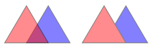
Fig. 8.2 Nepermatomumas nurodytas sluoksniams ir grupei
Piešinukas kairėje rodo du sluoksnius, kurie braižomi su 50% nepermatomumu (matomi ir žemiau esantys geoobjektai, bet pusiau uždengti 50% raudono geoobjekto viršuje). Antrame paveiksliuke matomas rezultatas, kai nepermatomumas nurodytas grupei (žemiau esančio mėlyno geoobjekto dalys yra pilnai uždengtos virš jo esančio raudono sluoksnio, o gautas rezultatas braižomas su 50% nepermatomumu).
Suliejimo režimai: Kaip ir nepermatomumas, suliejimo režimo nustatymas (pvz. daugybos, perdengimo, …) visai grupei reiškia, kad iš pradžių paruošiami vaikiniai sluoksniai, kur aukščiau esantys uždengia žemesniuosius. Braižymas tada gaunamas suliejant plokščią grupę su sluoksniais, esančiais žemiau grupės.
Kai vaikiniams sluoksniams priskirti suliejimo režimai, jis taikomas prieš išplokštinimą, bet apimtis ribojama tik tos grupės vaikiniams sluoksniams, o ne kitiems sluoksniams, esantiems žemiau visos grupės.
Grupių vaikiniams sluoksniams pateikiama daugiau suliejimo režimų jų kortelėje Simbologija, kurie atlieka stiliaus „apkarpymo“ veiksmus kitiems vaikiniams sluoksniams braižymo metu. Pavyzdžiui jūs galite apkarpyti vieno sluoksnio turinio braižymą turiniu iš kito „uždengiančio“ sluoksnio.
Sluoksnio efektai: efektai taikomi tik suplokštintam vaikinių sluoksnių vaizdui, taigi pavyzdžiui metamo šešėlio efektas bus taikomas uždengtiems vaikiniams sluoksniams.
Kai grupei nurodoma Braižyti sluoksnius kaip grupę, tada tik grupė bus rodoma skydelyje Sluoksnių rikiuotė. Grupių vaikai nebus matomi šiame rikiuotės sąraše, nes jų rikiuotę nustato grupės sluoksnio vieta.
8.2.1.4. Sluoksnio stiliaus keitimas
Skydelyje Sluoksniai jūs turite kelis variantus, kaip greitai ir paprastai pakeisti sluoksnio braižymą.
Spauskite ant sluoksnio dešinį pelės mygtuką ir parinkite , kad:
pamatytumėte šiuo metu sluoksniui galimus stilius. Jei apibrėžėte daug stilių, galite perjungti iš vieno į kitą ir jūsų sluoksnio braižymas bus automatiškai atnaujintas žemėlapio drobėje.
kopijuotumėte dalį ar visą dabartinį stilių, o, kai galima, įkeltumėte nukopijuotą stilių iš kito sluoksnio
Pervadinti dabartinį… stilių
Pridėti naują stilių (kuris yra dabartinio sluoksnio kopija)
arba Pašalinti dabartinį stilių (tik kai jau yra keli stiliai).
Patarimas
Greitai dalinkitės sluoksnio stiliumi
Kontekstiniame meniu nukopijuokite sluoksnio stilių ir įkelkite jį į grupę ar sluoksnių pažymėjimą: stilius taikomas visiems to paties tipo (vektoriniams, rastro, tinklelio, taškų masyvo, …) sluoksniams, kaip pradinis sluoksnis ir, vektoriniams sluoksniams, turi tą patį geometrijos tipą (taškas, linija ar poligonas).
Kai naudojama simbologija, kuri remiasi geoobjekto klasifikacija (pvz. kategorizuota, graduota ar pagal taisykles vektoriniams sluoksniams ar klasifikuota taškų masyvams), paspaudus dešinį pelės mygtuką ant klasės įrašo skydelyje Sluoksniai galima pakeisti klasių (ir jų geoobjektų) matomumą ir išvengti jų (ne)pažymėjimo po vieną:
 Perjungti elementus
- Rodyti visus elementus
- Slėpti visus elementus
Vektoriniams sluoksniams, klasės šakos įrašo kontekstinis meniu taipogi leidžia:
 Pažymėti geoobjektus: pažymi visus klasę atitinkančius sluoksnio geoobjektus
 Rodyti atributų lentelėje: atidaro atributų lentelę, kurioje filtruoti tik atitinkančios klasės geoobjektai
keisti simbolio spalvą naudojant Spalvos ratą. Patogumui, spalvų rato apačioje taipogi galima pasirinkti ir iš paskutinių naudotų spalvų.
Keisti simbolį…: atveria dialogą Simbolio parinkimas, leidžiantį keisti geoobjekto simbolį (simbolį, dydį, spalvą…).
Kopijuoti simbolį
Įkelti simbolį
Patarimas
Du kartus paspaudus klasės lapo įrašą taipogi atveriamas dialogas Simbolio parinkimas.
8.2.2. Sluoksnio stiliaus skydelis
Skydelis Sluoksnio stilius (dar įjungiamas su Ctrl+3) yra greitas kelias iki to paties funkcionalumo, kaip ir randamam dialoge Sluoksnio savybės. Jis suteikia greitą ir paprastą būdą apibrėžti sluoksnio braižymą ir elgseną bei vizualizuoti rezultatus neatidarant sluoksnio savybių dialogo.
Be to, kad vengia sluoksnio savybių dialogo blokavimo (arba „modalizavimo“), sluoksnio stiliaus skydelis taip pat išvengia ekrano užgriozdinimo dialogais ir turi daugumą stiliaus funkcijų (spalvų parinkiklį, efektų savybes, taisyklių keitimą, užrašų pakeitimą…): pvz., paspaudus spalvų mygtukus sluoksnio stiliaus skydelių viduje, spalvos parinkimo dialogas atidaromas sluoksnio stiliaus skydelio viduje, o ne kaip atskiras dialogas.
Sluoksnio skydelyje esančiame iškrentančiame dabartinių sluoksnių sąraše parinkite elementą ir:
Priklausomai nuo aktyvaus elemento nustatykite:
- Grupių simbologiją (žr. Sluoksnių braižymo kontrolė naudojant grupavimą)
- Rastro sluoksnio simbologijos,
 permatomumo ir
  histogramos savybes. Šios parinktys tokios pačios kaip ir Rastro savybių dialogas.
 - Vektorinių sluoksnių simbologijos,
 užrašų,
  slėpimo ir
  3D vaizdo savybes. Šios parinktys yra tokios pačios kaip ir Vektorių savybių dialogas ir gali būti išplėstos savo savybėmis, kurias prideda trečiųjų šalių priedai.
 - Simbologijos, Užrašų ir 3D vaizdo tinklelio sluoksnio savybes. Šios parinktys yra tokios pačios, kaip Mesh Dataset Properties.
- Simbologijos, 3D vaizdo ir
 Aukščio savybes taškų masyvo ar 3D kaladėlių sluoksniui. Šios parinktys yra tokios pačios kaip Point Clouds Properties ar 3D Tiles Properties.
 - Simbologijos ir Užrašų savybes vektorinių kaladėlių sluoksniui. Šios parinktys yra tokios pačios, kaip Vector Tiles Dataset Properties.
- Simbologijos savybes anotacijų sluoksniui. Šios parinktys yra tokios pačios, kaip geoobjektų anotavimo savybės.
Įjunkite ir konfigūruokite globalias žemėlapio šešėliavimo savybes
Tvarkykite susijusius stilius
 Stilių tvarkyklėje (daugiau informacijos Savo stilių tvarkymas).
Žiūrėkite jūsų padarytų dabartinio projekto sluoksnio pakeitimų
 Istoriją, kur galite ir atšaukti ar atstatyti bet kokią būseną parinkdami ją ir spausdami Taikyti.
Kita galinga šio skydelio savybė yra varnelė Gyvas atnaujinimas. Įjunkite ją, jei norite, kad jūsų pakeitimai nedelsiant būtų atspindėti žemėlapio drobėje: jums daugiau nebereikės spaudyti mygtuko Taikyti.
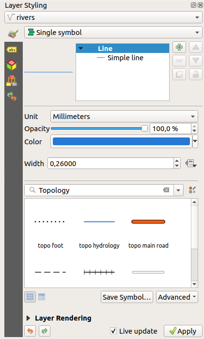
Fig. 8.3 Sluoksnio simbologijos nustatymas stilių skydelyje
8.2.3. Sluoksnių rikiuotės skydelis
Pagal nutylėjimą QGIS žemėlapio drobėje sluoksniai rodomi pagal skydelyje Sluoksniai matomą seką: kuo aukščiau šiame skydelyje yra sluoksnis, tuo aukščiau (taigi matomiau) sluoksnis bus ir žemėlapio vaizde.
Galite nustatyti sluoksnių braižymo tvarką, kuri nepriklausytų nuo sluoksnių skydelio, naudodami skydelį Sluoksnių eiliškumas, kurį galite įjungti meniu arba kombinacija Ctrl+9. Įjunkite varnelę Valdyti braižymo eiliškumą, esančia sąrašo apačioje, kad surikiuotumėte sluoksnius taip, kaip jums reikia. Ši rikiuotė taikoma žemėlapio drobei. Pavyzdžiui Fig. 8.4, jūs matote, kaip geoobjektai oro uostai yra rodomi virš alaska poligono, nepriklausomai nuo to, kaip tie sluoksniai išdėstyti sluoksnių skydelyje.
Išjungus varnelę Valdyti braižymo eiliškumą bus atstatyta numatytoji elgsena.
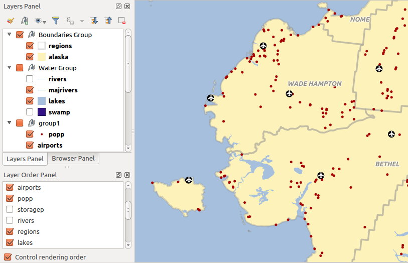
Fig. 8.4 Nuo legendos nepriklausančio sluoksnių eiliškumo nustatymas
8.2.4. Apžvalgos skydelis
Skydelis Peržiūra (Ctrl+8) rodo žemėlapį su kai kurių sluoksnių pilna apimtimi. Peržiūros žemėlapis užpildomas sluoksniais naudojant meniu ar sluoksnių kontekstiniame meniu esančią parinktį Rodyti peržiūroje. Šiame vaizde raudonas stačiakampis rodo dabartinės žemėlapio drobės apimtį, taip padedant jums greitai susiorientuoti, kurią žemėlapio vietą šiuo metu žiūrite. Jei paspausite ir tempsite raudoną stačiakampį peržiūros ribose, atitinkamai keisis ir pagrindinio žemėlapio vaizdo apimtis.
Pastebėtina, kad peržiūros žemėlapyje nebraižomi užrašai, net jei žemėlapyje sluoksniams yra sukonfigūruotas užrašų rodymas.
8.2.5. Pranešimų žurnalo skydelis
Įkeliant ar vykdant kai kuriuos apdorojimo veiksmus jūs galite sekti pranešimus, kurie pasirodo skirtingose  Pranešimų žurnalo skydelio kortelėse. Jį galima įjungti naudojant patį dešiniausią būsenos juostos mygtuką.
8.2.6. Atšaukimo/pakartojimo skydelis
Kiekvienam keičiamam sluoksniui skydelis Atšaukimas/pakartojimas (Ctrl+5) rodo visų įvykdytų veiksmų sąrašą, leidžia jums greitai atšaukti kelis veiksmus parenkant aukščiau pateiktą veiksmą. Daugiau informacijos rasite skyriuje apie pakeitimų atšaukimą ir pakartojimą.
8.2.7. Statistinės suvestinės skydelis
Skydelis Statistika (Ctrl+6) teikia apibendrintą bet kokio vektorinio sluoksnio informaciją. Šiame skydelyje jūs galite parinkti:
vektorinį sluoksnį, kuriam reikia skaičiuoti statistiką: jį galima parinkti iš viršutinio iškrentančio meniu arba susieta su aktyviu sluoksniu skydelyje Sluoksniai, naudojant varnelę Sekti pažymėtą sluoksnį, statistikos apačioje esančiame iškrentančiame meniu
lauką ar
 išraišką, kurią reikia naudoti kiekvienam sluoksniui, paskutinis parinkimas atsimenamas ir automatiškai skaičiuojamas vėl pažymėjus sluoksnį.
grąžinamą statistiką naudojant iškrentantį mygtuką dialogo apatiniame dešiniame kampe. Priklausomai nuo laukų (ar išraiškos reikšmių) tipo, galimos statistikos yra:
Statistika |
Tekstas |
Sveikas skaičius |
Realus skaičius |
Data |
|---|---|---|---|---|
Skaičius |
|
|
|
|
Unikalių reikšmių skaičius |
|
|
||
Trūkstamų reikšmių skaičius |
|
|
|
|
Sum |
|
|
||
Vidurkis |
|
|
|
|
Standartinis nuokrypis |
|
|
||
Standartinis nuokrypis pagal mėginį |
|
|
||
Minimali reikšmė |
|
|
|
|
Maksimali reikšmė |
|
|
|
|
Diapazonas |
|
|
|
|
Mažuma |
|
|
|
|
Dauguma |
|
|
|
|
Variacija |
|
|
||
Pirmas kvartilis |
|
|
||
Trečias kvartilis |
|
|
||
Tarpkvartilinis diapazonas |
|
|
||
Minimalus ilgis |
|
|||
Maksimalus ilgis |
|
|||
Vidutinis ilgis |
|
Statistikos sumos gali būti:
grąžinamos visam sluoksniui arba
Tik parinktiems geoobjektams nukopijuotos į iškarpinę ir įkeltos į lentelę kitoje aplikacijoje
perskaičiuotos naudojant mygtuką
 kai pasikeičia duomenys (pvz. sukurti nauji ar pašalinti esami geoobjektai, pakeisti atributai)
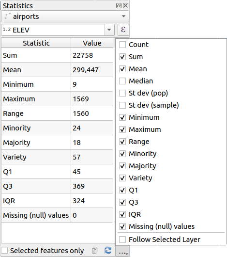
Fig. 8.5 Rodyti lauko statistiką
8.2.8. Tinkinimo/kūrimo įrankių skydelis
Skydelis Tinkinimo/kūrimo įrankiai (F12) vienoje vietoje suteikia galimybę valdyti QGIS tinkinimo veiksmus. Teikiami įrankiai organizuojami tokiose kortelėse:
 API dokumentacija: įtraukia į programuotojus orientuotą dokumentaciją
 Tinklo žurnalas: įrašo ir rodo tinklo užklausas ir sąveikas
 Užklausų žurnalas: įrašo duomenų teikėjų vykdomas SQL komandas ir jų vykdymo laikus
 Profiliuotojas: teikia kiekvieno veiksmo įkėlimo laikus, taip randant sulėtėjimo priežastis
Pastaba
Priedų autoriai gali praplėsti šį skydelį savomis kortelėmis jų priedų tinkinimui ir kūrimui. Tai daroma naudojant metodą registerDevToolWidgetFactory.
8.2.8.1. API dokumentacija
Kortelė API Dokumentacija gali rodyti arba  PyQGIS API dokumentaciją, arba
  Qt API dokumentaciją. Jos yra įtrauktos į valdiklį ir leidžia jums naršyti bei ieškoti dokumentacijoje neišeinant iš QGIS. Tai taipogi yra vieta, kurioje jūs galite rodyti konkretų jūsų kodo objektų ar klasių pagalbos puslapį. Pythono interaktyvioje konsolėje ar teksto redagavimo dialoge parinkite ar užveskite pelę virš teksto ir spauskite F1 arba dešinį pelės mygtuką ir parinkite Kontekstinė pagalba, kad gautumėte šią API pagalbą. Jei norite skaityti aktyvų puslapį sistemos naršyklėje, tada spauskite
  Atverti žiniatinklio naršyklėje.
Daugiau informacijos apie valdiklių konfigūraciją rasite kontekstinėje pagalboje.
8.2.8.2. Tinklo žurnalas
Kortelė Tinklo žurnalizavimas leidžia jums įrašyti ir rodyti tinklo užklausas kartu su krūva kitos naudingos informacijos, tokios kaip užklausos ir atsakymo būsena, antraštės, klaidos, SSL konfigūracija, laikai, podėlio būsena ir t.t.
Iš viršutinės įrankinės jūs galite:
 Įrašyti žurnalą: kas pradės ar sustabdys žurnalizavimą.
 Valyti žurnalą: išvalys žurnalo istoriją.
 Įrašyti žurnalą…: iš pradžių parodys didelį įspėjimą, kad žurnalas yra jautrus ir turi būti laikomas konfidencialiu, o tada leis jums įrašyti žurnalą.
Spauskite iškrentantį meniu
 Nustatymai, kad parinktumėte ar norite Rodyti sėkmingas užklausas, Rodyti laikus ir Rodyti atsakymus, paimtus iš podėlio.
 Išjungti podėlį: išjungs podėlį, kad kiekviena užklausa būtų vykdoma.
 Filtruoti užklausas pagal URL eilučių iškarpas arba užklausos būseną
Paspaudę dešinį pelės mygtuką ant užklausos jūs galite:
Atverti URL, kuris atvers URL jūsų numatytoje naršyklėje.
Kopijuoti URL
Kopijuoti kaip cURL, kad galėtumėte tai panaudoti terminale.
Kopijuoti kaip JSON: kopijuoja medžio reikšmes kaip json eilutę į iškarpinę, lengvam įkėlimui į rinktų pranešimus ar nutolusiai pagalbai.
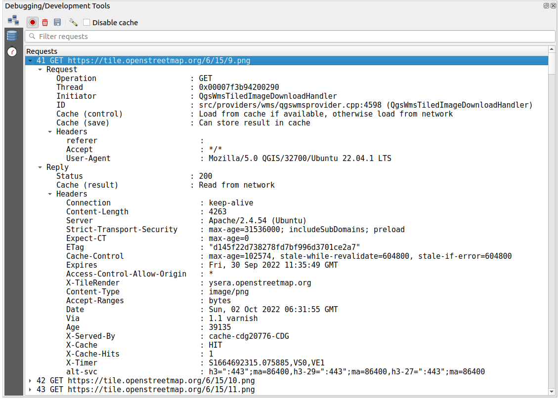
Fig. 8.6 GET užklausos tinklo žurnalo išvestis
8.2.8.3. Užklausų žurnalas
Užklausų žurnalas yra vieta, kur surašomos visos duomenų tiekėjų ir jungčių API į duomenų bazę siunčiamos SQL komandos ir jų vykdymo laikai, pamatuoti QGIS (t.y. kliento, kuris siunčia komandas). Tai gali būti naudinga tiriant greitaveiką ar konkretų sluoksnį QGIS algoritmo ar priedo tinkinimo metu.
Iš viršutinės įrankinės jūs galite:
- Įrašyti žurnalą: kas pradės ar sustabdys žurnalizavimą.
- Valyti žurnalą: išvalys žurnalo istoriją.
- Įrašyti žurnalą…: iš pradžių parodys didelį įspėjimą, kad žurnalas yra jautrus ir turi būti laikomas konfidencialiu, o tada leis jums įrašyti žurnalą.
- Filtruoti užklausas pagal užklausos teksto poaibius ar detales, tokias kaip tiekėjo tipas, pradžios laikas, iniciatorius, …
Spauskite praneštą užklausą ir jūs galėsite:
Kopijuoti SQL komandą, išsiųsta iš QGIS į duomenų bazę
Kopijuoti kaip JSON: kopijuoja medžio reikšmes kaip json eilutę į iškarpinę, lengvam įkėlimui į rinktų pranešimus ar nutolusiai pagalbai.
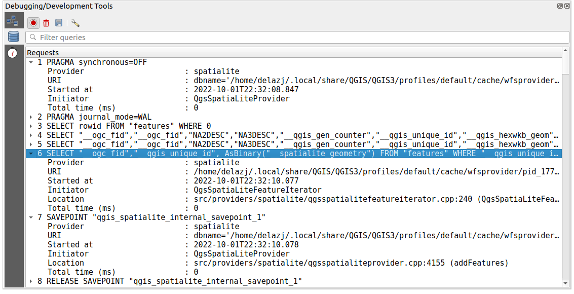
Fig. 8.7 Užklausų žurnalo išvestis
8.2.8.4. Profiliuotojas
Kortelė Profiliuotojas leidžia gauti informaciją, per kiek laiko atliekama kiekviena operacija naudotojo iškviestame veiksme. Priklausomai nuo konteksto, šios operacijos gali būti nustatymų ar meniu skaitymas, žemėlapio drobės ar 3D vaizdo kūrimas, sluoksnių priklausomybių sprendimas, žymelių ar išdėstymų įkėlimas, … Tai padeda identifikuoti lėto įkėlimo laiko priežastis.
Numatytieji palaikomi veiksmai gali būti parinkti iškrentančiame meniu Kategorija:
Pradžia padeda diagnozuoti (ir pataisyti) pasitaikančius ilgus QGIS paleidimo laikus.
Projekto įkėlimas leidžia gauti detalią informaciją apie įvairius projekto įkėlimo etapus, kad galėtumėte identifikuoti lėto projekto įkėlimo priežastis.
Žemėlapio braižymo įrankis leidžia identifikuoti skaudančius žemėlapio braižymo taškus ir atsekti, kurie konkrečiai sluoksniai yra lėtų žemėlapio perbraižymų priežastis.
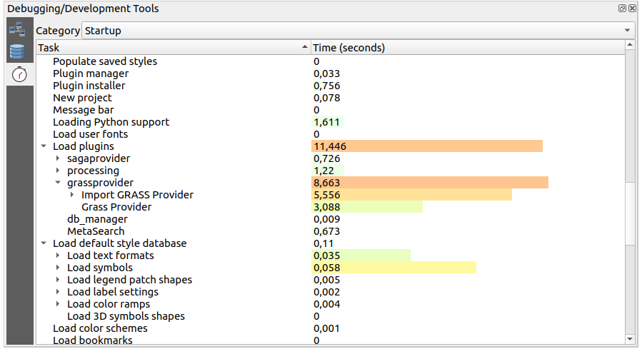
Fig. 8.8 QGIS pradžios profilis
8.3. Išorinių projektų sluoksnių įtraukimas
Kartais prireikia kai kuriuos sluoksnius laikyti skirtinguose projektuose, bet su tuo pačiu stiliumi. Jūs galite arba šiems sluoksniams sukurti numatytąjį stilių, arba įtraukti juos iš kito projekto ir taip sutaupyti laiką ir pastangas.
Esamo projekto sluoksnių įtraukimas turi kai kurių pranašumų lyginant su stiliaus naudojimu:
Gali būti pridėti visų tipų sluoksniai (vektoriniai ir rastro, vietiniai ar internetiniai…)
Ištraukiant grupes ir sluoksnius jūs galite išlaikyti tą pačią „fono“ sluoksnių medžio struktūrą skirtinguose projektuose
Nors įtraukti sluoksniai gali būti redaguojami, jūs negalite pakeisti jų savybių, tokių kaip simbologijos, etikečių, formų, numatytųjų reikšmių ir veiksmų, taip užtikrinant nuoseklumą tarp projektų
Pakeiskite elementus pradiniame projekte ir visi pakeitimai bus išplatinti į visus kitus projektus
Jei norite įtraukti turinį iš kitų projektų failų į jūsų projektą, parinkite :
Spauskite mygtuką …, kad rastumėte projektą: jūs galite matyti projekto turinį (žr. Fig. 8.9)
Laikykite Ctrl (ar
 Cmd) ir spauskite ant sluoksnių ar grupių, kuriuos norite ištraukti
Sauskite Gerai
Pažymėti sluoksniai ir grupės įtraukiami į skydelį Sluoksniai ir rodomi žemėlapio drobėje. Prie jų pavadinimo pridedama piktograma , kad būtų galima atskirti, o užvedus virš jų pelę bus rodomas kelias iki originalaus projekto.
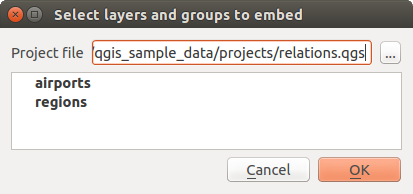
Fig. 8.9 Parinkite įtraukiamus sluoksnius ir grupes
Kaip bet kurį kitą sluoksnį, įtrauktą sluoksnį galima išimti iš projekto paspaudus ant sluoksnio dešinį pelės mygtuką ir parinkus Išimti.
Patarimas
Įtraukto sluoksnio braižymo pakeitimas
Įtraukto sluoksnio braižymo keisti negalima, nebent jūs pakeitimus darysite pradiniame projekte. Bet jūs galite spausti ant sluoksnio dešinį pelės mygtuką ir parinkti Kurti sluoksnio dublį bei taip sukurti sluoksnį, kuris yra pilnavertis ir nebepriklauso nuo pradinio projekto. O tada jau galite saugiai išimti susietą sluoksnį.
8.4. Sąveika su geoobjektais
8.4.1. Geoobjektų pažymėjimas
QGIS teikia kelis įrankius geoobjektų žymėjimui žemėlapio drobėje. Žymėjimo įrankius rasite meniu arba Pažymėjimo įrankinėje.
Pastaba
Pažymėjimo įrankiai veikia su šiuo metu aktyviu sluoksniu.
8.4.1.1. Rankinis žymėjimas žemėlapio drobėje
Kad pažymėtumėte vieną ar daugiau geoobjektų pele, galite naudoti vieną iš šių įrankių:
 Parinkti geoobjektus pagal plotą ar vienu paspaudimu
 Parinkti geoobjektus poligonu
 Parinkti geoobjektus laisvai
 Parinkti geoobjektus spinduliu
Pastaba
Visi įrankiai, išskyrus Parinkti geoobjektus poligonu, leidžia jums parinkti geoobjektą(us) žemėlapio drobėje vienu paspaudimu.
Pastaba
Naudokite įrankį Parinkti geoobjektus poligonu, jei norite naudoti esamą poligono geoobjektą (iš bet kokio sluoksnio) aktyvaus sluoksnio persidengiančių geoobjektų parinkimui. Spauskite dešiniu pelės mygtuku poligoną ir parinkite jį iš kontekstinio meniu, kuriame rodomas sąrašas visų poligonų, esančių paspaudimo taške. Bus pažymėti visi persidengiantys aktyvaus sluoksnio objektai.
Patarimas
Naudokite meniu , kad pakartotumėte jūsų paskutinį parinkimą. Labai naudinga, kai jūs sunkiai dirbote, kad pažymėtumėte daug geoobjektų, o tada netyčia paspaudėte kitur ir išvalėte jūsų pažymėjimą.
Kai naudojate įrankį Parinkti geoobjektą(us), laikykite Shift ar Ctrl (Cmd macOS), kad perjungtumėte, ar geoobjektas parinktas (t.y. arba prideda, arba išima jį iš dabartinio parinkimo).
Kitiems įrankiams galimos skirtingos elgsenos, laikant:
Shift: pridėti geoobjektus į dabartinį parinkimą
Ctrl/Cmd: išimti geoobjektus iš dabartinio pažymėjimo
Ctrl+Shift/Cmd+Shift: sukirsti su dabartiniu parinkimu, t.y. palikti tik persidengiančius dabartinio parinkimo geoobjektus
Alt: parinkti visus geoobjektus, kurie yra pilnai parinkimo formoje. Naudojant kartu su mygtukais Shift ar Ctrl/Cmd jūs galite pridėti ar išimti geoobjektus į/iš dabartinį parinkimą.
8.4.1.2. Automatinis parinkimas
Kiti pažymėjimo įrankiai, dauguma iš kurių pasiekiami iš Atributų lentelės, vykdo parinkimą pagal geoobjekto atributų arba jo pažymėjimo būseną (pastebėtina, kad atributų lentelė ir žemėlapio drobė rodo tą pačią informaciją, taigi jei jūs parenkate geoobjektą atributų lentelėje, tai jis bus parinktas ir žemėlapio drobėje):
 Parinkti geoobjektus pagal išraišką… arba spauskite Ctrl+F3, kad parinktumėte geoobjektus naudodami išraiškos dialogą
 Parinkti geoobjektus pagal reikšmę… arba spauskite F3
 Nužymėti geoobjektus visuose sluoksniuose arba spauskite Ctrl+Alt+A, kad nužymėtumėte visus parinktus geoobjektus visuose sluoksniuose
 Nužymėti geoobjektus dabartiniame aktyviame sluoksnyje arba spauskite Ctrl+Shift+A
- Parinkti visus geoobjektus arba spauskite Ctrl+A, kad parinktumėte visus dabartinio sluoksnio geoobjektus
 Invertuoti geoobjektų parinkimą, kad invertuotumėte dabartinio sluoksnio parinkimą
 Parinkti pagal vietą, kad parinktumėte geoobjektus pagal jų erdvinę sąsają su kitais geoobjektais (tame pačiame arba kitame sluoksnyje - žr. Select by location)
 Parinkti pagal atstumą, kad parinktumėte geoobjektus, kurie yra nurodytu atstumu nuo atskaitos geoobjekto - žr. Select within distance)
Pavyzdžiui, jei norite rasti regionus, kurių tipas yra „boroughs“ iš QGIS pavyzdinio failo regions.shp, jūs galite:
Panaudoti piktogramą
Parinkti geoobjektus pagal išraiškąIšplėsti grupę Laukai ir reikšmės
Du kartus spausti lauką, pagal kurį norite filtruoti („TYPE_2“)
Spausti viršutiniame dešiniame skydelyje Visos unikalios
Sąraše spausti „Borough“. Redaktoriaus lauke Išraiška įrašyti tokią užklausą:
"TYPE_2" = 'Borough'
Spausti Parinkti geoobjektus
Išraiškų kūrimo dialoge jūs taipogi galite naudoti , kad parinktumėte tai, ką naudojote anksčiau. Dialogas atsimena 20 paskutinių naudotų išraiškų. Daugiau informacijos ir pavyzdžių rasite Išraiškos.
Patarimas
Įrašykite jūsų parinkimą į naują failą
Naudotojai gali įrašyti parinktus geoobjektus į Naują laikiną juodraštinį sluoksnį arba Naują vektorinį sluoksnį naudojant ir tada nurodant norimą formatą.
8.4.1.3. Parinkti geoobjektus pagal reikšmę
Šis parinkimo įrankis atveria sluoksnio geoobjekto formą ir leidžia naudotojui pasirinkti, kokios reikšmės ieškoti kuriame lauke, ar paiešką atlikti atsižvelgiant į raidžių dydį ir koks turėtų būti naudojamas veiksmas. Įrankis turi automatinį užbaigimą, automatiškai užbaigiantį paieškos laukus esamomis reikšmėmis.
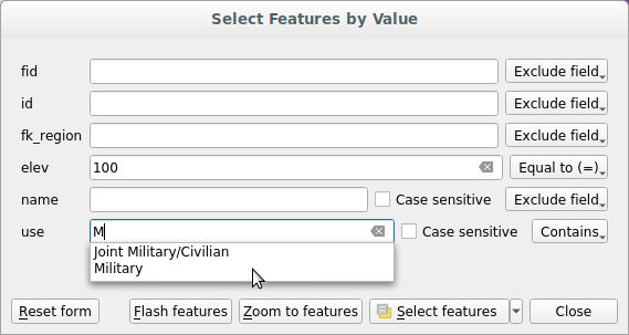
Fig. 8.10 Geoobjektų filtravimas/parinkimas naudojant formos dialogą
Greta kiekvieno lauko yra iškrentantis sąrašas su parinktimis, valdančiomis paieškos elgseną:
Lauko paieškos variantas |
Tekstas |
Numeric |
Data |
|---|---|---|---|
Išimti lauką iš paieškos |
|
|
|
Lygu (=) |
|
|
|
Nelygu (≠) |
|
|
|
Daugiau už (>) |
|
|
|
Mažiau už (<) |
|
|
|
Daugiau arba lygu (≥) |
|
|
|
Mažiau arba lygu (≤) |
|
|
|
Tarp (imtinai) |
|
|
|
Ne tarp (imtinai) |
|
|
|
Įtraukia |
|
||
Neįtraukia |
|
||
Nėra (null) |
|
|
|
Yra (not null) |
|
|
|
Prasideda |
|
||
Baigiasi |
|
Teksto lyginimams taipogi galima naudoti parinktį Atsižvelgti į raidžių dydį.
Nustačius visas paieškos parinktis, spauskite Ieškoti geoobjektų, kad parinktumėte atitinkančius geoobjektus. Iškrentančios parinktys yra:
Parinkti geoobjektus
Pridėti į dabartinį parinkimą
Išimti iš dabartinio parinkimo
Filtruoti dabartinį parinkimą
Taipogi galite išvalyti visas paieškos parinktys naudodami mygtuką Atstatyti formą.
Nustačius sąlygas jūs galite:
Priartinti geoobjektus žemėlapio drobėje be poreikio iš naujo parinkti
Mirksėti geoobjektus, paryškinant atitinkančius geoobjektus. Tai patogus būdas identifikuoti objektą jo nerenkant ir nenaudojant identifikavimo įrankio. Pastebėtina, kad mirksėjimas nekeičia žemėlapio drobės apimties, todėl geoobjektai bus matomi tik jei jie yra dabartinėje žemėlapio drobėje.
8.4.2. Geoobjektų identifikavimas
Įrankis  Identifikuoti geoobjektus leidžia jums sąveikauti su žemėlapio drobe ir gauti informaciją iššokančiame lange apie geoobjektus ar pikselius. Jį galima naudoti gaunant informaciją apie daugumą QGIS palaikomų sluoksnių tipų (vektoriai, rastras, tinklelis, taškų debesis, wms, wfs, …). Norint identifikuoti elementą, naudokite vieną iš:
Ctrl+Shift+I (ar
Cmd+Shift+I),Mygtuką
Identifikuoti geoobjektus įrankinėje Atributai
Tada spauskite aktyvaus sluoksnio geoobjektą ar pikselį. Identifikuojamas elementas paryškinamas žemėlapio drobėje, kol atveriamas dialogas Identifikavimo rezultatai su detalia informacija. Dialogas taipogi rodo kelis mygtukus išmanesnei konfigūracijai.
8.4.2.1. Identifikavimo rezultatų dialogas
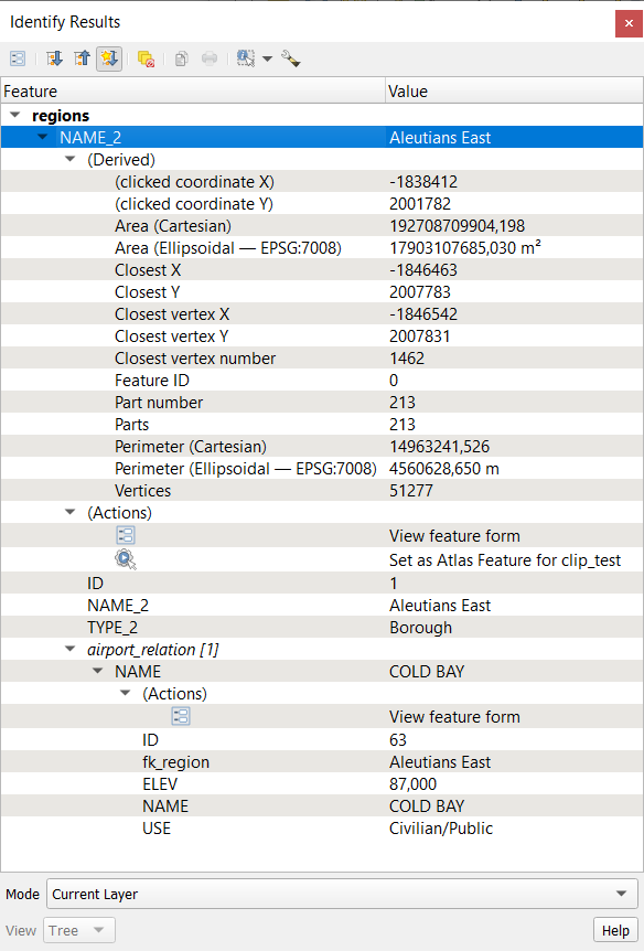
Fig. 8.11 Identifikavimo rezultatų dialogas
Nuo apačios į viršų
Vaizdas valdo bendrą dialogo išvaizdą ir rezultatų formatą, galimi variantai:
Medis: tai yra numatytasis vaizdas, kuris grąžina rezultatus medžio tipo struktūroje, kur pirmas elementas yra sluoksnio pavadinimas, o jo vaikai yra jo identifikuotas lementas(ai).
Lentelė: galimas tik rastro sluoksniams, jis leidžia rodyti rezultatus kaip lentelę, kurios stulpeliai yra
Sluoksnis,FID,AtributasirReikšmėarba Grafikas: galimas tik rastro sluoksniams
Režimas leidžia jums pasirinkti sluoksnius, iš kurių bus grąžinami rezultatai. Šie sluoksniai turi būti matomi, jie turi rodyti duomenis žemėlapio drobėje, ir turi turėti nustatytą požymį identifikuojami per meniu . Galimi režimai yra:
Dabartinis sluoksnis: rezultatus grąžins tik sluoksnis(iai), parinktas skydelyje Sluoksniai. Jei parinkta grupė, rezultatai bus išrenkami iš visų jos vaikinių sluoksnių.
Nuo viršaus žemyn, sustoti ties pirmu: rezultatai yra iš aukščiausio geoobjekto ar pikselio po pele.
Iš viršaus žemyn: rezultatai yra iš sluoksnių su geoobjektu ar pikseliu po pele.
Sluoksnio parinkimas: atveria kontekstinį meniu, kur naudotojas parenka sluoksnį, kurio geoobjektus reikia identifikuoti. Jei po pele yra tik vienas geoobjektas, rezultatai rodomi automatiškai.
Kai jūs identifikuojate žemėlapio drobės duomenis, viršutinėje informacijos valdiklio dalyje esantis dialogas Identifikavimo rezultatai parodys objekto, kuris paspaustas (arba virš kurio užvesta pelė), detales. Jų formatavimas priklauso nuo parinkto vaizdo.
Identifikavimo įrankio rodoma informacija priklauso nuo jūsų parinkto sluoksnio tipo, ar jis yra:
vektorinis sluoksnis (įskaitant vektorines kaladėles ar taškų masyvo duomenis),
Esant medžio tipo vaizde, viršutinėje dalyje taipogi rodomi keli įrankiai
 Atverti formą dabartiniam geoobjektui
- Išplėsti medį
- Sutraukti medį
 Pagal nutylėjimą išskleisti naujus rezultatus, kad nurodytumėte, ar kito geoobjekto identifikavimo informacija turėtų būti suskleista ar išskleista
- Valyti rezultatus
- Kopijuoti identifikuotą geoobjektą į iškarpinę, tinka perkėlimui į skaičiuoklę.
 Spausdinti parinktą HTML atsakymą: tekstinis rezultatų formatavimas spausdinimui ant popieriaus arba įrašymui kaip
 .PDFfailuinteraktyvūs identifikavimo įrankiai: iškrentantis meniu su įrankiais, skirtais parinkti identifikuojamus geoobjektus ar taškus žemėlapio drobėje
- Identifikavimo nustatymai leidžia jums aktyvuoti, ar norite:
- Automatiškai atverti formą vieno geoobjekto rezultatams: Įjungus, kiekvieną kartą, kai identifikuojamas vienas geoobjektas, atidaroma forma, kurioje rodomi jo atributai. Tai patogus būdas greitai keisti geoobjekto atributus.
- Slėpti rezultatuose išvestinius atributus jei norite rodyti tik tuos laukus, kurie realiai apibrėžti sluoksnyje
- Slėpti rezultatuose NULL reikšmes
- Rodyti ryšius vektorinio sluoksnio identifikavimo rezultatų medyje
- Pagalba leis pasiekti dabartinę dokumentaciją
8.4.2.2. Geoobjektų identifikavimo įrankio naudojimas
Numatytame vaizde (Vaizdas: Medis), skydelis Identifikavimo rezultatai teikia kelis įrankius, leidžiančius sąveikauti su užklausiamais sluoksniais. Teisinga šių įrankių kombinacija su paskirties sluoksnių parinkimu gali stipriai pagerinti identifikavimo veiksmus:
 Identifikuoti geoobjektą(us) vienu paspaudimu arba paspaudimu ir tempimu
vienas paspaudimas arba paspaudimas ir tempimas: grąžinami dengiami geoobjektai iš paskirties sluoksnių
dešinys paspaudimas: dengiami geoobjektai iš paskirties sluoksnių surašomi į kontekstinį meniu, sugrupavus pagal sluoksnius. Jūs tada galite pasirinkti:
rodyti konkretaus geoobjekto rezultatą,
rodyti visų konkretaus sluoksnio geoobjektų rezultatą,
vektoriniams sluoksniams taipogi galima atverti jų atributų lentelę atfiltravus pagal grąžintus geoobjektus
arba rodyti visus grąžintus geoobjektus.
 Identifikuoti geoobjektus užvedus pelę: judinant pelę žemėlapio drobėje virš paskirties sluoksnio elementų, jie paryškinami ir grąžinami rezultatų skydelyje.
 Identifikuoti geoobjektus poligonu: grąžina elementus, persidengiančius su nubrėžtu arba parinktu poligonu.
Nubrėžkite poligoną (spauskite kairį mygtuką, kad padėtumėte tašką, dešinį mygtuką, kad uždarytumėte poligono braižymą) ir visi dengiami geoobjektai iš paskirties sluoksnių bus paryškinti ir grąžinti rezultatų skydelyje.
Spauskite dešinį mygtuką ir gausite visų projekte paspaudimo vietoje matomų poligono geoobjektų sąrašą. Parinkite įrašą ir QGIS grąžins visus geoobjektus iš paskirties sluoksnio, kuriuos dengia parinktas poligonas.
 Identifikuoti geoobjektus laisvu apibrėžimu: grąžina elementus, kuriuos dengia laisva ranka nubraižytas poligonas. Nubrėžkite poligoną (kairys paspaudimas pradžiai, tada tempkite žymeklį, kad sukurtumėte plotą, dešiniu mygtuku baikite poligono braižymą). Visi dengiami paskirties sluoksnių geoobjektai paryškinami ir grąžinami rezultatų skydelyje.
 Identifikuoti geoobjektus spinduliu grąžina elementus, kuriuos dengia nubraižytas apskritimas. Nubrėžkite apskritimą (kairiu mygtuku nurodykite centro tašką ir judindami pelės žymeklį suformuokite aplink jį apskritimą arba teksto įvedimo laukelyje įveskite spindulį, tada spauskite dešinį pelės mygtuką arba Enter, kad patvirtintumėte apskritimą). Visi padengti paskirties sluoksniu geoobjektai bus paryškinti ir grąžinti rezultatų skydelyje.
Patarimas
Filtruokite sluoksnius Geoobjektų identifikavimo įrankio užklausoms
Per meniu , išjunkite šalia sluoksnio esantį stulpelį Identifikuojamas, kad sluoksnis nebūtų užklausiamas naudojant įrankį Identifikuoti geoobjektus. Tai patogus būdas grąžinti geoobjektus tik iš jus dominančių sluoksnių.
8.4.2.3. Rezultatų kontekstinis meniu
Kitas funkcijas galima rasti identifikuoto elemento kontekstiniame meniu. Pavyzdžiui, priklausomai nuo sluoksnio tipo, jūs galite:
sąveikauti su konkrečiu identifikuoti elementu:
Geoobjekto peržiūros forma ar Geoobjekto redagavimo forma, vektoriniams sluoksniams
Priartinti iki geoobjekto: priartinti žemėlapio drobę iki identifikuojamo geoobjekto ar pikselio apimties
Identifikuoti geoobjektą: iš naujo parodo ir centruoja paieškos rezultatus ties identifikuoto geoobjekto susijusiu vektoriniu geoobjektu. Veikia tik jei identifikavimo nustatymuose įjungta parinktis
Rodyti ryšius.Kopijuoti geoobjektą: kopijuoja vektoriaus geometriją ir atributus arba pikselio geometriją
Perjungti geoobjekto parinkimą: prideda ar išima identifikuotą geoobjektą į/iš parinkimo
Kopijuoti atributo reikšmę: kopijuoja jūsų paspaustą medžio elemento stulpelio Reikšmė reikšmę
Kopijuoti geoobjekto atributus: kopijuoja identifikuoto elemento atributų pavadinimus ir reikšmes
Parinkti geoobjektus pagal atributo reikšmę: parenka visus sluoksnio vektorinius geoobjektus, kurie atitinka parinktą atributo reikšmę
valdyti sluoksnių braižymą, rezultatų skydelį ar žemėlapio drobę:
Valyti rezultatą: išima rezultatus iš lango
Valyti paryškinimus: išima žemėlapyje paryškintus elementus
Paryškinti viską: paryškina žemėlapio drobėje visus rezultatų dialoge identifikuotus elementus, nepriklausomai nuo jų sluoksnio
Paryškinto sluoksnį: paryškina žemėlapio drobėje visus elementus, identifikuotus pažymėto įrašo sluoksnyje
Aktyvuoti sluoksnį: parenka identifikuoto elemento sluoksnį skydelyje Sluoksniai
Sluoksnio savybės: atveria identifikuoto elemento sluoksnio savybių langą
Išskleisti viską ar Sutraukti viską rezultatų medyje
8.5. Sluoksnio savybių įrašymas ir bendrinimas
8.5.1. Savo stilių tvarkymas
Kai vektorinis sluoksnis pridedamas į žemėlapio drobę, QGIS pagal nutylėjimą braižo jo geoobjektus naudojant atsitiktinį simbolį/spalvą. Bet jūs galite per meniu parinkti numatytąjį simbolį, kuris bus taikomas kiekvienam pridėtam sluoksniui priklausomai nuo jo geometrijos tipo.
Bet dažniausiai jūs norėtumėte turėti savo ir sudėtingesnius stilius, kurie būtų (paprasčiau) pritaikomi sluoksniams automatiškai ar rankomis. Jūs galite tai pasiekti naudodami sluoksnio savybių dialogo apačioje esantį meniu . Šis meniu suteikia jums galimybes sukurti, įkelti ir tvarkyti stilius.
Stilius saugo įvairią informaciją, kuri nustatoma sluoksnio ar projekto savybių dialoge ir yra skirta sąveikai su sluoksniu ar jo braižymui. Tai yra:
Kategorija |
Vektorius |
Rastras |
|---|---|---|
|
||
|
||
|
nėra |
|
|
nėra |
|
|
nėra |
|
|
nėra |
|
|
nėra |
|
|
||
|
nėra |
|
|
||
|
||
|
||
|
nėra |
|
|
nėra |
|
|
||
|
nėra |
|
|
||
|
||


Pagal nutylėjimą stilius, kuris taikomas įkeltam sluoksniui, pavadintas default. Kai pasiekiate idealų ir tinkamą jūsų sluoksnio braižymą, jūs galite įrašyti jį spausdami  mygtuką ir parinkdami:
Pervadinti dabartinį: Aktyvus stilius pervadinamas ir atnaujinamas dabartinėmis parinktimis
Pridėti: Sukuriamas naujas stilius naudojant dabartines parinktis. Pagal nutylėjimą jis bus įrašomas į QGIS projekto failą. Žemiau rasite informaciją, kaip įrašyti stilių į kitą failą arba duomenų bazę
Išimti: Ištrinti nenorimą stilių, jei turite apibrėžę sluoksniui daugiau nei vieną stilių.
Iškrentančio Stilių sąrašo apačioje matote sluoksniui nustatytus stilius, o aktyvus stilius yra pažymėtas.
Pastebėtina, kad kiekvieną kartą kai jūs tikrinate sluoksnių savybių dialogą, aktyvus stilius atnaujinamas pagal jūsų padarytus pakeitimus.
Galite sukurti sluoksniui kiek tik norite stilių, bet tik vieną galima įjungti vienu metu. Kartu su Žemėlapio temomis tai suteikia greitą ir galingą būdą tvarkyti sudėtingus projektus be poreikio kurti sluoksnių kopijas žemėlapių legendoje.
Pastaba
Kadangi jums pritaikant sluoksnio savybių pakeitimus jie laikomi aktyviame stiliuje, visada įsitikinkite, kad keičiate teisingą stilių, kad netyčia nepakeistumėte stilių, naudojamą žemėlapio temoje.
Patarimas
Tvarkykite stilius iš sluoksnio kontekstinio meniu
Spauskite dešinį pelės mygtuką ant sluoksnio skydelyje Sluoksniai, kad nukopijuotumėte, įkeltumėte ar pervadintumėte sluoksnių stilius. Tiek vektoriniams, tiek rastro sluoksniams jūs galite pasirinkti, kurias stilių kategorijas norite įkelti/kopijuoti. Parinkite Visos stiliaus kategorijos arba vieną iš galimų kategorijų, priklausomai nuo sluoksnio tipo. Pastebėtina, kad rastro sluoksnių kategorijos Simbologija ir Braižymas visada kopijuojamos kartu.
8.5.2. Stilių saugojimas faile ar duomenų bazėje
Nors pagal nutylėjimą stiliai, sukurti per mygtuką Stilius, įrašomi į projektą, juos galima nukopijuoti ir įdėti iš vieno sluoksnio į kitą tame pačiame projekte, o taipogi galima įrašyti juos už projekto ribų, kad juos galima būtų įkelti kitame projekte.
8.5.2.1. Įrašymas į tekstinį failą
Paspaudus jūs galite įrašyti stilių kaip:
QGIS sluoksnio stiliaus failą (
.qml)SLD failą (
.sld), tik vektoriniams sluoksniams
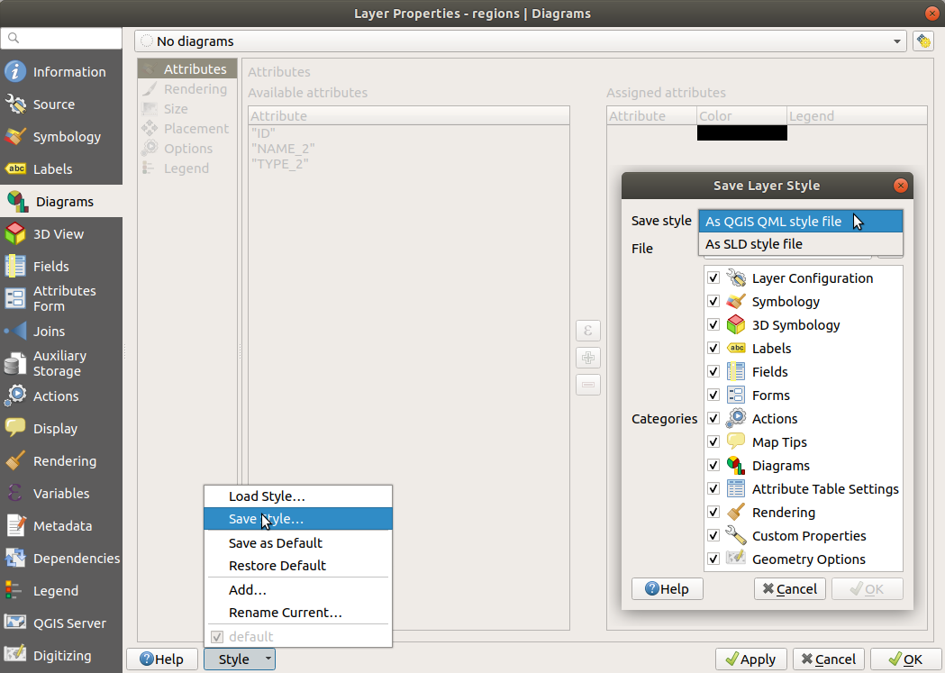
Fig. 8.12 Vektorinio sluoksnio stiliaus parinktys
Kai naudojamas su failais paremtais sluoksniais (.shp, .tab…), Įrašyti kaip numatytąjį sukuria sluoksniui .qml failą (su tokiu pačiu pavadinimu). SLD galima eksportuoti iš bet kokio tipo braižymo – vieno simbolio, kategorizuoto, graduoto arba pagal taisykles – bet importuojant SLD sukuriamas arba vieno simbolio arba braižymas pagal taisykles. Tai reiškia, kad kategorizuotas ar graduotas stilius pakeičiamas į paremtą taisyklėmis. Jei norite išlaikyti šiuos braižymus, turite naudoti QML formatą. Kitavertus jis kartais gali būti patogus, kaip lengvas būdas keisti stilių į paremtą taisyklėmis.
8.5.2.2. Įrašymas į duomenų bazę
Vektorinių sluoksnių stilius taipogi galima saugoti ir duomenų bazėje, jei sluoksnio duomenų šaltinis yra duomenų tiekėjas. Palaikomi formatai yra PostgreSQL, GeoPackage, SpatiaLite, MS SQL Server ir Oracle. Sluoksnio stilius įrašomas į duomenų bazės lentelę (pavadintą layer_styles). Spauskite , tada užpildykite dialogą, kad apibrėžtumėte stiliaus pavadinimą, pridėkite aprašymą, jei reikia - .ui failą bei nurodykite, ar stilius turėtų būti numatytasis.
Galite įrašyti kelis stilius vienoje duomenų bazės lentelėje. Bet kiekviena lentelė turi tik vieną numatytąjį stilių. Numatytuosius stilius galima įrašyti į sluoksnių duomenų bazę arba qgis.db, vietinę SQLite duomenų bazę aktyvaus naudotojo profilio aplanke.
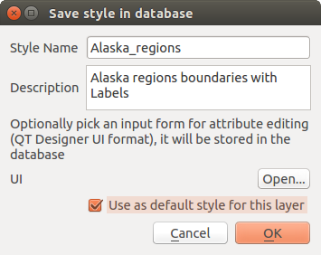
Fig. 8.13 Stiliaus įrašymo į duomenų bazę dialogas
Patarimas
Dalinimasis stilių failais tarp duomenų bazių
Stilių galite įrašyti į duomenų bazę tik tada, jei sluoksnis ateina iš tokios duomenų bazės. Negalite maišyti duomenų bazių (pavyzdžiui sluoksnis Oracle, o stilius MS SQL Serveryje). Vietoje to naudokite paprasto teksto failą, jei norite, kad stiliumi būtų dalinamasi tarp duomenų bazių.
Pastaba
Jūs galite susidurti su problemomis atstatant layer_styles lentelę iš PostgreSQL duomenų bazės atsarginės kopijos. Sekite QGIS layer_style table and database backup, kad tai pataisytumėte.
8.5.2.3. Stiliaus įkėlimas
Įkeliant sluoksnį į QGIS, jei numatytasis šio sluoksnio stilius jau yra, QGIS įkelia sluoksnį su šiuo stiliumi. Taipogi ir ieško ir įkelia tą failą, pakeičiant dabartinį sluoksnio stilių.
padeda jums pritaikyti sluoksniui bet kurį įrašytą stilių. Tekstinių failų stilius (.sld ar .qml) galima taikyti bet kuriam bet kurio formato sluoksniui, o duomenų bazėje įrašytus stilius galima taikyti jei sluoksnis yra iš tos pačios duomenų bazės arba jei sluoksnis laikomas vietinėje QGIS duomenų bazėje.
Dialogas Duomenų bazės stilių tvarkyklė rodo sąrašą su sluoksniu susijusių stilių, kurie rasti duomenų bazėje, ir visus kitus joje įrašytus stilius, su jų pavadinimu ir aprašymu.
Patarimas
Greitai dalinkitės sluoksnio stiliumi projekto viduje
Jūs taipogi galite dalintis sluoksnio stiliais projekto viduje neimportuodami failo ar duomenų bazės stiliaus: spauskite dešinį pelės mygtuką ant sluoksnio Sluoksnių skydelyje ir iškrentančiame sąraše Stiliai nukopijuokite sluoksnio stilių, tada įkelkite jį į grupę ar ar parinktus sluoksnius: stilius pritaikomas visiems to paties tipo (vektorių ar rastro) sluoksniams, kaip ir pradinis sluoksnis. Vektorinių sluoksnių atveju tikrinama, kad sutaptų ir geometrijos tipas (taškas, linija ar poligonas).
8.5.3. Sluoksnio apibrėžimo failas
Sluoksnio apibrėžimus galima įrašyti kaip Sluoksnio apibrėžimo failus (.qlr) naudojant aktyvaus sluoksnio kontekstinį meniu . Sluoksnio apibrėžimo faile (.qlr) yra nuorodos į sluoksnių duomenų šaltinius ir jų stiliai. .qlr failai rodomi naršyklės skydelyje ir juos galima naudoti, kad pridėtumėte sluoksnius (su jų įrašytu stiliumi) į sluoksnių skydelį. Taipogi galite tempti ir numesti .qlr failus iš sistemos failų tvarkyklės į žemėlapio drobę.
8.6. Jūsų duomenų dokumentavimas
Be jūsų duomenų rodymo ir simbolizavimo, QGIS leidžia jums užpildyti:
metaduomenis: informaciją, kuri padeda žmonėms suprasti duomenų rinkinį, kaip jie gali jį pasiekti ir naudoti… tai yra duomenų aibės savybės ir gali gyventi už QGIS projekto. Metaduomenis taipogi galima apibrėžti pačiam projekto failui.
pastabas: instrukcijas ir komentarus apie sluoksnį dabartiniame projekte
8.6.1. Metaduomenys
Projekto ar sluoksnio savybių dialoge kortelė Metaduomenys teikia jums parinktis, skirtas kurti ir keisti elemento metaduomenų ataskaitą. Pildoma informacija:
duomenų Identifikacija: bazinės duomenų rinkinio autorių teisės (savininkas, identifikatorius, pavadinimas, aprašymas, kalba…);
Kategorijos, kurioms priklauso duomenys. Kartu su ISO kategorijomis, jūs galite nurodyti ir savo;
Raktažodžiai duomenų ištraukimui ir susijusioms sąvokoms pagal standartais paremtą žodyną;
Prieiga prie duomenų rinkinio (licencijos, teisės, mokesčiai ir apribojimai);
Duomenų aibės Apimtis, arba erdvinė (CRS, žemėlapio apimtis, aukščiai), arba laiko;
Duomenų aibės savininko(ų) Kontaktai;
Nuorodos į pagalbinius resursus ir susijusią informaciją;
duomenų rinkinio Istorija.
Užpildytos informacijos santrauka pateikiama kortelėje Tikrinimas, kuri padeda jums identifikuoti potencialias su forma susijusias problemas. Tada galite jas pataisyti arba ignoruoti.
Metaduomenys pagal nutylėjimą įrašomi į projekto failą, iškrentantis sąrašas Metaduomenys siūlo metaduomenų įrašymo/įkėlimo parinktis iš .qmd failo ar „Numatytosios“ vietos.
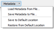
Fig. 8.14 Metaduomenų įkėlimo/įrašymo parinktys
„Numatytoji“ vieta, kurią naudoja Įrašyti į numatytąją vietą ir Atstatyti iš numatytosios vietos, keičiasi priklausomai nuo atitinkamo duomenų šaltinio ir jo konfigūracijos:
PostgreSQL duomenų šaltiniams, jei įjungta konfigūracijos parinktis Leisti įrašyti/įkelti QGIS sluoksnio metaduomenis į duomenų bazę, metaduomenys saugomi tam skirtoje duomenų bazės lentelėje.
GeoPackage duomenų šaltiniams Įrašyti į numatytąją vietą visada metaduomenis įrašo į vidines GeoPackage metaduomenų lenteles.
Kai metaduomenys įrašomi į vidines PostgreSQL ar GeoPackage lenteles, pagal juos galima ieškoti ir filtruoti naršyklėje ir sluoksnio metaduomenų paieškos skydelyje.
Visiems kitiems failais paremtiems duomenų šaltiniams Įrašyti į numatytąją vietą metaduomenis įrašo į
.qmdfailą greta pagrindinio duomenų failo.Visais kitais atvejais Įrašyti į numatytąją vietą metaduomenis įrašo į vietinę
.sqliteduomenų bazę.
8.6.2. Sluoksnio pastabos
Sluoksnio pastabos leidžia dokumentuoti sluoksnį dabartinio projekto viduje. Jose galima laikyti svarbius pranešimus projekto naudotojams, tokius kaip darbų sąrašus, instrukcijas, įspėjimus…
Sluoksnio kontekstiniame meniu skydelyje Sluoksniai parinkite Pridėti sluoksnio pastabas… ir užpildykite dialoge norimą tekstą.
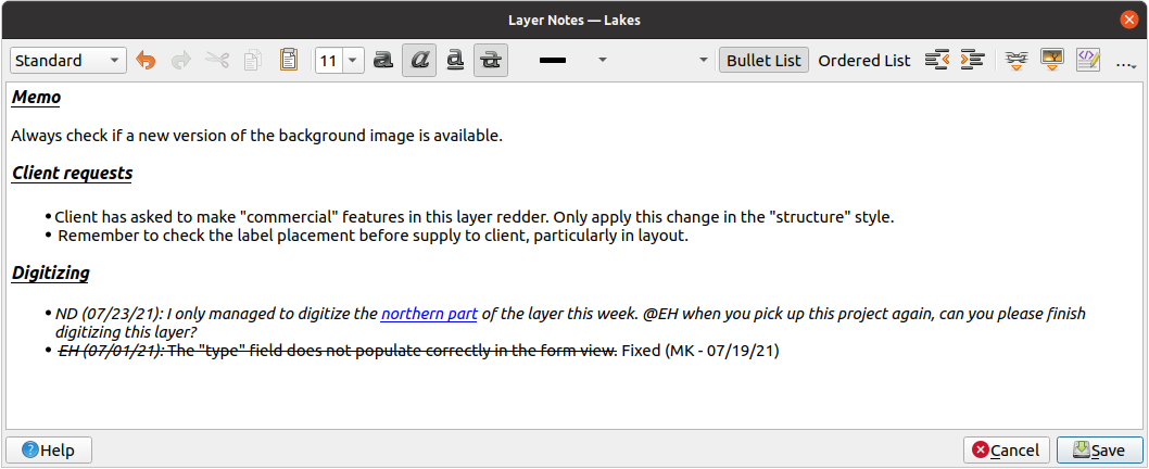
Fig. 8.15 Sluoksnio pastabų pridėjimas
Dialogas Pridėti sluoksnio pastabas teikia html pagrindo kelių eilučių redagavimo įrankį su pilnu rinkiniu įrankių, skirtų:
teksto valdymui: iškirpimui, kopijavimui, įkėlimui, atšaukimui, pakartojimui
simbolių formatavimui, taikomam visam ar tik daliai turinio: šrifto dydžiui ir spalva, riebumui, pasvirimui, pabraukimui, perbraukimui, fono spalva, URL paryškinimui
paragrafo struktūrai: nenumeruotiems ir numeruotiems sąrašams, atitraukimui, iš anksto apibrėžtoms antraštėms
failo įterpimui, net su pertempimu ir numetimu
HTML kodo keitimui
Naudodami iškrentantį sąrašą … įrankinės tolimoje dešinėje, jūs galite:
Išimti visą formatavimą
Išimti simbolių formatavimą
Išvalyti visą turinį
Sluoksnių skydelyje sluoksniai su pastaba turi piktogramą , ant kurios užvedus pelę rodoma pastaba. Spauskite piktogramą, jei norite keisti pastabą. Taipogi galite spausti dešinį pelės mygtuką ant sluoksnio ir tada Keisti sluoksnio pastabą… ar Išimti sluoksnio pastabą.
Pastaba
Pastabos yra sluoksnio stiliaus dalis ir gali būti įrašomos į .qml ar .qlr failą. Jas taipogi galima perkelti iš vieno sluoksnio į kitą kopijuojant sluoksnio stilių.
8.7. Reikšmių saugojimas kintamuosiuose
QGIS jūs galite naudoti kintamuosius naudingų pasikartojančių reikšmių saugojimui (pvz. projekto pavadinimo ar naudotojo pilno vardo). Juos galima naudoti išraiškose. Kintamuosius galima apibrėžti aplikacijos globaliame lygyje, projekto lygyje, sluoksnio lygyje, apdorojimo modeliavimo lygyje, išdėstymo lygyje ir išdėstymo elemento lygyje. Kaip CSS nubanguojančiose taisyklėse, kintamuosius galima permušti - t.y. projekto lygio kintamasis permuš bet kurį aplikacijos lygio kintamąjį su tokiu pačiu pavadinimu. Galite naudoti šiuos kintamuosius kurdami tekstines eilutes ar kitas savas išraiškas naudojant simbolį @ prieš kintamojo pavadinimą. Pavyzdžiui spausdinimo išdėstyme galima sukurti užrašą su tokiu turiniu:
This map was made using QGIS [% @qgis_version %]. The project file for this
map is: [% @project_path %]
Nubraižys štai tokį užrašą:
This map was made using QGIS 3.4.4-Madeira. The project file for this map is:
/gis/qgis-user-conference-2019.qgs
Be iš anksto nustatytų tik skaitymo kintamųjų jūs galite apibrėžti savo kintamuosius bet kuriam iš aukščiau paminėtų lygių. Jūs galite valdyti:
globalius kintamuosius per meniu
projekto kintamuosius dialoge Projekto savybės (žr. Projekto savybės)
vektorinio sluoksnio kintamuosius dialoge Sluoksnio savybės (žr. Vektorių savybių dialogas);
modeliuotojo kintamuosius dialoge Modelių dizaineris (žr. Modelių dizaineris);
išdėstymo kintamuosius skydelyje Sluoksniai spausdinimo išdėstyme (žr. The Layout Panel);
ir išdėstymo elementų kintamuosius skydelyje Elementų savybės spausdinimo išdėstyme (žr. Layout Items Common Options).
Siekiant atskirti redaguojamus kintamuosius, tik skaitymo kintamųjų pavadinimai ir reikšmės rodomos pasvirusios. Kitavertus, aukštesnio lygio kintamieji, permušti žemesnio lygio kintamaisiais yra rodomi perbraukti.
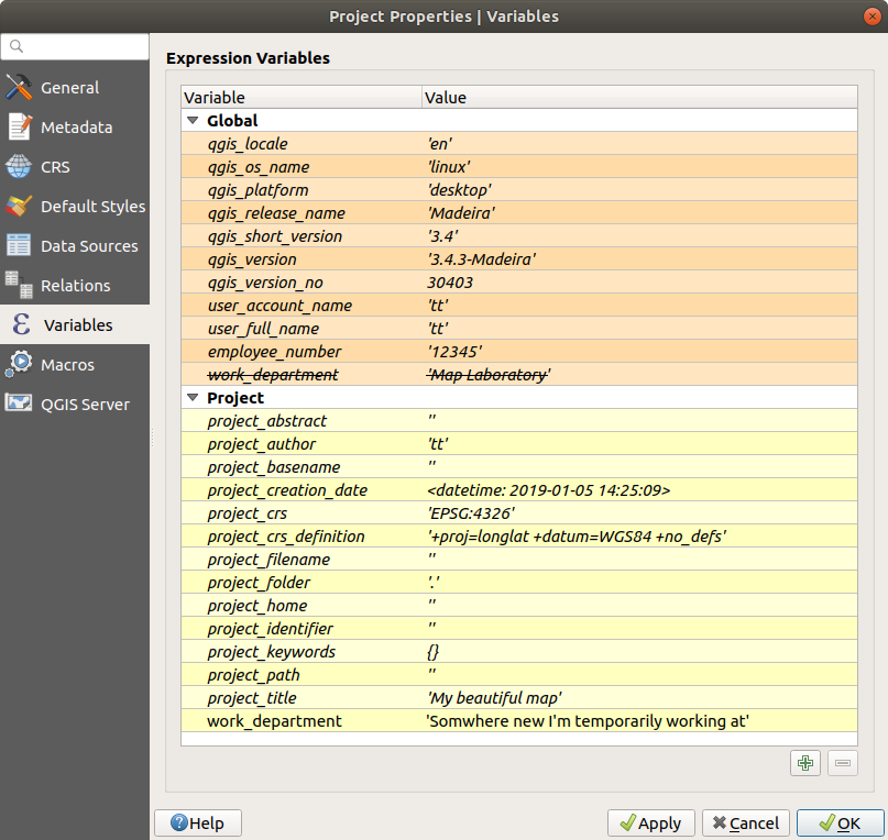
Fig. 8.16 Kintamųjų redaktorius projekto lygyje
Pastaba
Daugiau apie kintamuosius jūs galite paskaityti ir rasti pavyzdžių Nyall Dawson tinklaraščio įrašuose Kintamųjų tyrinėjimas QGIS 2.12, 1 dalis, 2 dalis ir 3 dalis.
8.8. Bendri valdikliai
QGIS yra kelios parinktys, su kuriomis pastoviai reikia dirbti. Patogumo dėlei, QGIS teikia jums specialius valdiklius, kurie pristatomi žemiau.
8.8.1. Spalvų parinkiklis
8.8.1.1. Spalvų dialogas
Dialogas Parinkite spalvą bus rodomas visada, kai paspausite piktogramą  , kad parinktumėte spalvą. Šio dialogo galimybės priklauso nuo to, kas nurodyta parinktyje Naudoti savus spalvų parinkimų dialogus, kurią rasite . Jei įjungta, bus naudojamas bendras OS, kuriame veikia QGIS, spalvų dialogas. Priešingu atveju bus naudojamas savas QGIS spalvų dialogas.
Savas spalvos parinkimo dialogas turi keturias skirtingas korteles, kurios leidžia jums parinkti spalvas  Spalvų rampoje,
  Spalvų rate,
  Spalvų paletėje ar
  Spalvų parinkikliu. Pirmose dviejose kortelėse jūs galite naršyti po visas galimas spalvų kombinacijas ir pritaikyti jūsų pasirinkimą elementui.
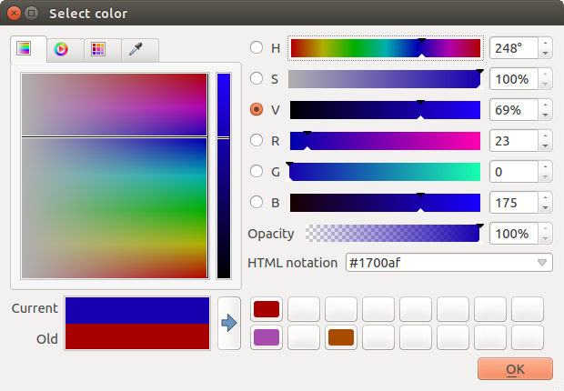
Fig. 8.17 Spalvos parinkimo rampos kortelė
Spalvų pavyzdžių kortelėje jūs galite pasirinkti iš sąrašo spalvų palečių (daugiau informacijos rasite Spalvų nustatymai). Visas paletes, išskyrus Paskutinės spalvos, galima keisti naudojant mygtukus  Pridėti dabartinę spalvą ir
  Išimti parinktą spalvą, kuriuos rasite po sąrašu.
Šalia iškrentančio paletės sąrašo esantis mygtukas … taipogi leidžia:
kopijuoti, įkelti, importuoti ir eksportuoti spalvas
kurti, importuoti ir išimti spalvų paletes
pridėti savo paletę į spalvų parinkimo valdiklį su elementu Rodyti spalvų mygtukuose (žr. Fig. 8.19)
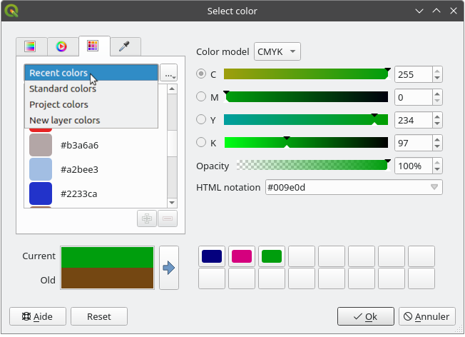
Fig. 8.18 Spalvų parinkimo pavyzdžių kortelė
Kitas variantas yra naudoti Spalvų parinkiklį, kuris leidžia jums paimti spalvą pelės žymeklio vietoje bet kurioje QGIS UI ar net kitos programos dalyje: spauskite tarpą kol kortelė aktyvi, užveskite pelę virš norimos spalvos ir spauskite ant jos arba dar kartą paspauskite tarpą. Jūs taipogi galite spausti mygtuką Parinkti spalvą, kad aktyvuotumėte parinkimą.
Kokį metodą benaudotumėte, parinkta spalva visada bus aprašoma Spalvų modelio parinktimis, o modelis pagal nutylėjimą bus toks, koks nurodytas projekto spalvų modelis:
RGB: spalvos nustatomos slankikliais, skirtais
HSV(Spalva, sodrumas ir reikšmė) arbaRGB(raudona, žalia, mėlyną) reikšmėms.CMYK (žydra, rožinė, geltona, juoda)
Keisti spalvą yra labai paprasta, tereikia paspausti ant spalvos rato ar rampos ar bet kurio spalvos parametrų slankiklio. Galite keisti tokius parametrus naudodami sukimo valdiklį, esantį greta, arba naudodami pelės ratuką virš atitinkamo slankiklio. Jūs taipogi galite įrašyti spalvą, naudodami HTML notaciją. Na ir galų gale yra slankiklis Nepermatomumas, kuris leidžia nurodyti permatomumo lygį.
Dialogas taipogi teikia vizualų palyginimą tarp Senos spalvos (pritaikytos objektui) ir Dabartinės (t.y. tos, kuri dabar parenkama). Naudodami tempimą ir numetimą ar mygtuką  Pridėti spalvą į pavyzdžius, bet kurią iš šių spalvų galima įrašyti į vietą paprastai prieigai.
Patarimas
Greitas spalvos keitimas
Tempkite ir numeskite spalvos parinkimo valdiklį į kitą, kad pritaikytumėte jo spalvą.
8.8.1.2. Greitas iškrentantis spalvos parinkimas
Spauskite iškrentančio sąrašo rodyklę, esančią dešinėje spalvos mygtuko pusėje, kad parodytumėte valdiklį greitam spalvos parinkimui. Jis suteikia:
spalvos ratą, kuriame galite parinkti spalvą
alfa slankiklį spalvos nepermatomumui keisti
spalvos paletes, kurioms anksčiau buvo nustatytas Rodyti spalvų mygtukuose
leidžia kopijuoti dabartinę spalvą ir įkelti ją į kitą valdiklį
parinkti spalvą iš bet kurios jūsų kompiuterio rodomos vietos
parinkti spalvą spalvų parinkimo dialogu
galimybę tempti ir numesti spalvą iš vieno valdiklio į kitą greitam pakeitimui
Patarimas
Sukite pelės ratuką virš spalvos parinkimo valdiklio, kad greitai pakeistumėte susijusios spalvos nepermatomumą.
Pastaba
Kai spalvos valdiklis nustatytas į projekto spalvą per nuo duomenų priklausančius savybių permušimus, aukščiau išvardintos spalvų keitimo funkcijos negalimos. Jums visų pirma reikės Atjungti spalvą ar Išvalyti apibrėžimą.
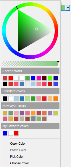
Fig. 8.19 Greito spalvos parinkimo meniu
8.8.1.3. Iškrentantis spalvų rampos parinkimas
Spalvų rampos - tai praktiškas būdas pritaikyti spalvų aibę vienam ar keliems geoobjektams. Jų kūrimas aprašytas skyriuje Spalvų rampos kūrimas. Kaip ir kitoms spalvoms, paspaudus spalvų rampų mygtuką 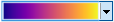 atveriamas atitinkamo spalvos rampos tipo dialogas, kuriame galite keisti jos savybes.
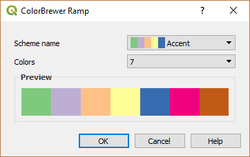
Fig. 8.20 Colorbrewer rampos keitimas
Dešinėje esantis iškrentantis meniu leidžia greitai pasiekti platesnę spalvų rampų aibę ir parinktis:
Apsukti spalvų rampą
Išvalyti spalvų rampą - nuimti bet kurią valdikliui paskirtą spalvų rampą (veikia tik kai kuriuose kontekstuose)
- Atsitiktinės spalvos: veikia tik kai kuriuose kontekstuose (pvz., kai spalvų rampa naudojama sluoksnio simbologijai), įjungus šią parinktį, sukuriama ir pritaikoma atsitiktinių spalvų rampa. Tai taipogi įjungia parinktį Atsitiktinai sudėlioti spalvas, kad būtų sukurta nauja rampa, jei dabartinė netinka.
peržiūra
gradientircatalog: cpt-cityspalvų rampų, turinčių žymą Parankiniai dialoge Stilių tvarkyklėVisos spalvų rampos leidžia pasiekti visas duomenų bazėje esančias suderinamas spalvų rampas
Kurti naują spalvų rampą… bet kurio palaikomo tipo, kurią galima būtų naudoti dabartiniame valdiklyje (pastebėtina, kad ši spalvų rampa nebus rodoma niekur kitur, nebent jūs įrašysite ją į biblioteką)
Keisti spalvų rampą…, tas pats, kas paspaudus spalvos rampos mygtuką
Įrašyti spalvų rampa…, kad įrašytumėte dabartinę spalvų rampą su jos patinkinimais į stilių biblioteką
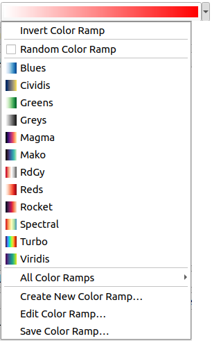
Fig. 8.21 Greito spalvų rampos parinkimo valdiklis
8.8.2. Simbolių valdiklis
Simbolių parinkimo valdiklis - tai patogus būdas, kai norite nustatyti geoobjekto simbolio savybes. Paspaudus iškrentančią rodyklę, kartu su spalvų iškrentančiu valdikliu rodomas ir šios simbolio parinktys:
Konfigūruoti simbolį…: tas pats, kas paspaudus simbolio parinkimo valdiklį. Atidaromas dialogas, leidžiantis keisti simbolio parametrus.
Kopijuoti simbolį iš dabartinio elemento
Įdėti simbolį į dabartinį elementą, pagreitinant konfigūravimą
Valyti dabartinį simbolį leidžia atšaukti simbolį, priskirtą valdikliui (veikia tik kai kuriuose kontekstuose)
Patarimas
Sukite pelės ratuką virš žymeklio ar linijos simbolio valdikliu, kad greitai keistumėte atitinkamo simbolio dydį.
8.8.3. Nutolusio arba įtraukto failo parinkiklis
Greta failų parinkimo valdiklio, mygtukas … kartais rodys ir rodyklę žemyn. Paprastai taip bus, kai naudojamas:
SVG failas simboliui ar užrašui
rastro piešinys simboliams, užrašams, tekstūrai ar dekoracijoms
Paspaudus rodyklę jums bus pateiktas meniu, kuris leis:
Parinkti failą…, kad įkeltumėte failą iš failų sistemos. Failas identifikuojamas keliu, ir QGIS reikia išspręsti kelią, kad parodytų atitinkamą piešinį
Iš URL…, įkelti failą iš nutolusio URL. Kaip ir aukščiau, piešinys bus įkeliamas tik sėkmingai atsiuntus nutolusį resursą
Įtraukti failą…, kad įtrauktumėte failą į dabartinį projektą, stilių duomenų bazę ar spausdinimo išdėstymo šabloną. Tada failas visada braižomas kaip elemento dalis. Tai patogus būdas sukurti savistovų projektą su savo simboliais, kuriais lengva dalintis tarp skirtingų naudotojų ir QGIS diegimų.
Ištraukti įdėtą failą…, kad ištrauktumėte įdėtą failą iš valdiklio ir įrašytumėte jį į diską.
8.8.4. Nuo mastelio priklausomo matomumo parinkimas
Nuo mastelio priklausomo matomumo parinkimas teikia parinktis, valdančias mastelius, kuriuose elementas matomas žemėlapio drobėje. Už nurodyto mastelio diapazono ribų elementai nerodomi. Jis gali būti taikomas pvz. sluoksniams, užrašams ar diagramoms jų savybių kortelėje Braižymas.
Spauskite varnelę
Nuo mastelio priklausantis matomumasĮ lauką Minimalus (išskirtinai) mastelį, kai objektas matomas labiausiai atitolinus, įrašykite rankiniu būdu arba parinkite iš iš anksto apibrėžtų mastelių
ir/arba lauke Maksimalus (imtinai) įrašykite labiausiai priartintą mastelį
Prie mastelio laukų esantis mygtukas
 Nustatyti pagal dabartinį drobės mastelį nustato dabartinį drobės mastelį kaip matomumo ribą. Spauskite rodyklę greta mygtuko ir pasiekite mastelius iš išdėstymo žemėlapių ir perpanaudokite juos pildydami laukus.
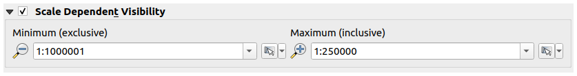
Fig. 8.22 Matomumo mastelių parinkimo valdiklis
8.8.5. Erdvinės apimties parinkimas
Apimties parinkimo valdiklis yra patogus ir greitas būdas parinkti erdvinę apimtį sluoksniui ar apriboti, kur vykdomi veiksmai. Priklausomai nuo konteksto, jis leidžia parinkti:
Dabartinio sluoksnio apimtis: pvz. eksportuojant sluoksnį
: naudoja dabartiniame projekte įkelto sluoksnio apimtį
Naudoti dabartinės Žemėlapio drobės apimtį
Brėžti drobėje: stačiakampį, kurio koordinatės tada naudojamos
Skaičiuoti pagal žymelę: naudoja įrašytos žymelės apimtį
Skaičiuoti pagal išdėstymo žemėlapį: naudoja išdėstymo žemėlapio apimtį
Įvesti arba keisti koordinates kaip
xmin, xmax, ymin, ymax
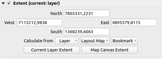
Fig. 8.23 Apimties parinkimo valdiklis
8.8.6. Šrifto parinkiklis
Šriftų parinkimo valdiklis yra patogus būdas parinkti tekstinės informacijos šrifto savybes (geoobjektų savybių, dekoracijos užrašų, žemėlapių legendos…). Paspaude iškrentančią rodyklę matysite kelias ar visas iš šių parinkčių:
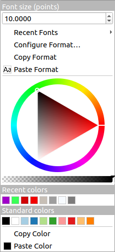
Fig. 8.24 Šrifto parinkimo iškrentantis meniu
Valyti dabartinį teksto formatą - atšaukti bet kokį valdikliui priskirtą teksto formatą (veikia tik kai kuriuose kontekstuose)
Šrifto dydis susijusiais vienetais
meniu su parinktu aktyviu šriftu (viršuje)
Konfigūruoti formatą…: tas pats, kas paspaudus šrifto parinkimo valdiklį. Atidaro Teksto formato dialogą, kurs teikia sudėtingesnes formatavimo parinktis, tokias kaip spalva, permatomumas, orientacija, HTML notacija, buferis, fonas, šešėlis…
Kopijuoti formatą teksto
Įkelti formatą tekstui, pagreitinant konfigūraciją
the spalvų valdiklis greitam spalvos parinkimui
Patarimas
Naudokite pelės ratuką virš šriftų parinkimo valdiklio, kad greitai keistumėte susijusio teksto šrifto dydį.
8.8.7. Vienetų parinkiklis
Elementų (užrašų, simbolių, išdėstymo elementų…) dydžių savybės QGIS nebūtinai susijusios su projekto, ar konkretaus sluoksnio vienetais. Didesnei daliai savybių, iškrentantis Vienetų parinkiklis leidžia jums tvarkyti reikšmes pagal jūsų pageidaujamą braižymą (remiantis ekrano raiška, popieriaus dydžiu ar paviršiumi). Galimi vienetai:
Milimetrai
Taškai
Pikseliai
Coliai
Procentai: leidžia kai kurias savybes nurodyti kaip procentą kitų savybių. Pavyzdžiui tai naudinga kuriant teksto formatus, kur komponentai (buferio dydis, šešėlio spindulys…) gražiai kinta keičiant teksto dydį, vietoje pastovaus buferio/šešėlio dydžio. Tada jums nereikia keisti šių dydžių keičiantis teksto dydžiui.
Metrai mastelyje: Tai leidžia jums visada nustatyti dydį metrais, nepriklausomai nuo to, kokie yra žemėlapio vienetai (pvz. jie gali būti coliai, pėdos, geografiniai laipsniai…). Dydis metrais skaičiuojamas pagal dabartinio projekto elipsoidą ir projekciją kaip metrai dabartinio žemėlapio apimties centre. Projektuotuose žemėlapiuose tai skaičiuojama projektuotais vienetais. Žemėlapiams su geografinėmis koordinatėmis (platuma/ilguma), dydis apytiksliai skaičiuojamas naudojant elipsoidinius skaičiavimus pagal vertikalų žemėlapio mastelį.
ir Žemėlapio vienetai: Dydis skaičiuojamas atsižvelgiant į žemėlapio vaizdo mastelį. Kadangi tai gali reikšti per dideles ar per mažas reikšmes, naudokite greta įvedimo esantį mygtuką
, kad apribotumėte dydžio diapazoną priklausomai nuo:Minimalaus mastelio ir Maksimalaus mastelio: reikšmė perskaičiuojama pagal žemėlapio vaizdo mastelį kol pasiekiamas vienas iš šių apribojimų. Peržengus ribą naudojama artimiausia ribinė reikšmė.
ir/arba Minimalų dydį ir Maksimalų dydį nurodytą
mm: reikšmė perskaičiuojama pagal žemėlapio vaizdo mastelį, kol pasiekiamas vienas iš šių apribojimų, tada paliekama apribojimo reikšmė.
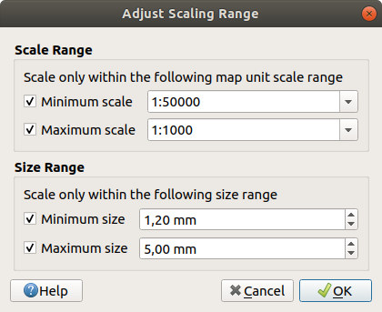
Fig. 8.25 Mastelio diapazono perskaičiavimo dialogas
8.8.8. Skaičių formatavimas
Skaičių formatai leidžia formatuoti rodomas skaitines reikšmes, naudojant įvairias formatavimo technikas (pavyzdžiui mokslinė notacija, valiutų reikšmės, procentų reikšmės, savas formatavimas ir pan.). Naudoti galima nustatant tekstą išdėstymo mastelio juostoje ar lentelėje, spalvų rampos legendoje, aukščio profilio brėžinyje, …
Fig. 8.26 Skaitinės reikšmės formatavimas
Palaikomos skirtingos formatų kategorijos. Daugumai iš jų galite nustatyti dalį ar visas iš toliau pateikiamų skaičių parinkčių:
- Rodyti tūkstančių skyriklį
- Rodyti pliuso ženklą
- Rodyti nulius pabaigoje
Bet jie taipogi gali turėti savo nustatymus. Teikiamos kategorijos:
Bendra, numatytoji kategorija: neturi nustatymų ir rodo reikšmes tokias, kokios jos yra tėvinių valdiklių savybėse arba naudojant globalius nustatymus.
Savo išraiška: leidžia susidėlioti savo QGIS išraišką skaičių formatavimui. Išraiška gali naudoti kintamąjį
@value, kad gautų formatuojamą reikšmę ir tada naudoti bet kurią standartinę QGIS išraiškų funkciją, kad suformatuotų skaičių taip, kaip norima.Skaičius
Reikšmę galima Apvalinti iki nurodyto skaičiaus Skaitmenų po kablelio arba jų Esminių skaitmenų
tinkinti Tūkstančių skyriklį ir Dešimtainės dalies skirtuką
Kryptis tekstinei krypties išraiškai naudojant:
Formatą: galimi reikšmių diapazonai yra nuo
0 iki 180°, su priesaga E/W,-180 iki +180°ir0 iki 360°skaičius Skaitmenų po kablelio
Valiuta tekstiniai valiutos reikšmės išraiškai.
Priešdėlis
Priesaga
skaičius Skaitmenų po kablelio
Trupmena paprastai dešimtainės reikšmės trupmeninei išraiškai (pvz. 1/2 vietoje 0.5)
- Naudoti unikodo viršutinius/apatinius tekstus rodymui. Pavyzdžiui 1/2 vietoje 1/2
- Naudoti tam skirtus unikodo simbolius
nurodyti savo Tūkstančių skirtuką
Procentai - prideda
%prie reikšmių, nustatant:skaičius Skaitmenų po kablelio
Keitimas nurodo, ar esamos reikšmės iš karto rodo procentus (tada jos bus paliktos), ar proporciją (tada jos bus pakeistos)
Mokslinė notacija forma
2.56e+03. Galima nurodyti Skaitmenų po kablelio skaičių.
Skiltyje Pavyzdys rodoma nustatymų peržiūra.
8.8.9. Suliejimo režimai
QGIS specialiems braižymo efektams siūlo skirtingų suliejimo režimų įrankius, kuriuos jūs anksčiau galėjote matyti tik grafinėse programose. Suliejimo režimus galima taikyti sluoksniams ir geoobjektams bei spausdinimo išdėstymo elementams:
Normalus: tai standartinis suliejimo režimas, kuris naudoja viršutinio pikselio alfa kanalą, kad sulietų jį su žemiau esančiu pikseliu. Spalvos nemaišomos.
Šviesinti: parenka maksimalią kiekvieno komponento reikšmę iš priekyje ir fone esančių pikselių. Turėkite omenyje, kad rezultatai paprastai būna dantyti ir šiurkštūs.
Atrinkti: šviesūs šaltinio pikseliai braižomi virš paskirties, o tamsūs - nebraižomi. Šis režimas naudingiausias maišant vieno elemento tekstūra su kitu elementu (pavyzdžiui naudojant šešėliavimą kito sluoksnio tekstūrai).
Vengti: šviesinti ir sodrinti žemiau esančius pikselius pagal viršuje esančių pikselių šviesumą. Šviesesni viršutiniai pikseliai sukelia apatinių pikselių sodrumo ir ryškumo didėjimą. Tai geriausiai veikia, kai viršutiniai pikseliai nėra per ryškūs. Priešingu atveju efektas bus per ryškus.
Sudėtis: sudeda vieno elemento pikselių reikšmes su kito elemento reikšmėmis. Jei rezultatas viršija maksimalią reikšmę (RGB atveju), rodoma balta. Šis režimas tinka paryškinant geoobjektus.
Tamsinti: išlaiko kiekvieno viršuje ir apačioje esančio pikselio žemiausią reikšmę. Kaip ir šviesinimo atveju, rezultatai būna dantyti ir šiurkštūs.
Dauginti: viršutinio elemento pikseliai dauginami iš atitinkamo apatinio elemento pikselio. Rezultatai būna tamsesni.
Deginti: tamsesnės viršutinio elemento spalvos padaro apatinius elementus tamsesniais. Deginimą galima naudoti tvarkant ir spalvinant apatinius sluoksnius.
Perdengti: kombinuoja dauginimo ir atrinkimo suliejimo režimus. Šviesios dalys tampa šviesesnėmis, o tamsios - tamsesnėmis.
Minkšta šviesa: labai panašus į perdengimą, bet vietoje dauginimo/atrinkimo jis naudoja išdeginimą/vengimą. Tai turėtų imituoti piešinio apšvietimą minkšta šviesa.
Stipri šviesa: stipri šviesa taipogi labai panaši į perdengimo režimą. Ji turėtų imituoti piešinio apšvietimą labai intensyvia šviesa.
Skirtumas: atima viršutinį pikselį iš apatinio pikselio arba atvirkščiai, kad būtų gauta teigiama reikšmė. Suliejimas su juoda reiškia jokio pokyčio, nes visų spalvų skirtumas bus nulis.
Atimti: atima vieno elemento pikselių reikšmes iš kito. Neigiamų reikšmių atveju rodoma juoda.
Fig. 8.27 Suliejimo režimų pavyzdžiai, pritaikyti žaliam geoobjektui virš oranžinio
A: Normalus, B: Šviesinti, C: Atrinkti, D: Vengti, E: Sudėtis, F: Skirtumas, G: Atimti, H: Tamsinti, I: Dauginti, J: Deginti, K: Perdengti, L: Minkšta šviesa, M: Stipri šviesa
Kai sluoksnis yra grupėje, kuri braižo sluoksnius kaip grupę, braižant galimi papildomi suliejimo režimai. Jie leidžia apkirpti vieno sluoksnio nubraižytą turinį kitu - „slėpimo“ - sluoksniu.
Paslėpta iš apačios: išvestis yra viršutinis taškas, kur permatomumas sumažinamas pagal apatinį pikselį.
Paslėptas apatinis: išvestis yra apatinis pikselis, kur permatomumas sumažintas viršutiniu pikseliu.
Atvirkščiai paslėpta iš apačios: išvestis yra viršutinis pikselis, kur permatomumas sumažintas priešingu apatiniu pikseliu.
Atvirkščiai paslėptas apatinis: išvestis yra apatinis pikselis, kur nepermatomumas yra sumažintas atvirkščiu viršutiniu pikseliu.
Dažyti viduje apačioje: viršutinis pikselis yra suliejamas virš apatinio pikselio, o viršutinio pikselio nepermatomumas sumažinamas apatinio pikselio nepermatomumu.
Dažyti apačioje viduje: apatinis pikselis suliejamas su viršuje esančiu pikseliu, o apatinio pikselio nepermatomumas sumažinamas viršutinio pikselio nepermatomumu.
Fig. 8.28 Suliejimo apkarpymo režimų pavyzdžiai, pritaikyti žaliam sluoksniui grupėje
A: Paslėptas apatinis B: Paslėpta iš apačios C: Dažyti apačioje viduje D: Atvirkščiai paslėptas apatinis E: Atvirkščiai paslėpta iš apačios F: Dažyti viduje apačioje
8.8.10. Nuo duomenų priklausančių permušimų nustatymai
Greta daugelio vektorinių sluoksnių savybių dialogo ar spausdinimo išdėstymo parinkčių jūs rasite piktogramą  Nuo duomenų priklausomas permušimas. Naudojant išraiškas, kurios remiasi sluoksnio atributais ar elemento nustatymais, standartinėmis ar naudotojo sukurtomis funkcijomis ir kintamaisiais, šis įrankis leis jums nustatyti dinamines parametrų reikšmes. Įjungus šią parinktį, šio valdiklio grąžinama reikšmė pritaikoma parametrui nepriklausomai nuo jo normalios reikšmės (varnelė, tekstas, slankiklis…).
8.8.10.1. Nuo duomenų priklausomo permušimo valdiklis
Paspaudus piktogramą Nuo duomenų priklausantis permušimas, bus rodomi šie įrašai:
Aprašymas… kuris rodo, ar parinktis įjungta, kokios tikimasi įvesties, koks tinkamas įvesties tipas bei dabartinis apibrėžimas. Užvedus pelę ant valdiklio taipogi bus parodyta ši informacija.
Saugoti duomenis projekte: mygtukas leidžia savybę laikyti naudojant mechanizmą Auxiliary Storage Properties.
Lauko tipas: įrašas, leidžiantis parinkti vieną iš sluoksnio laukų, kurie atitinka pageidaujamą įvesties tipą.
Spalva: kai valdiklis yra susietas su spalvos savybe, šis meniu duoda prieigą prie spalvų, apibrėžtų kaip dabartinė projekto spalvų schema.
Kintamasis: meniu prieigai prie galimų naudotojo apibrėžtų kintamųjų
Keisti… mygtukas leidžia kurti arba keisti taikomą išraišką, naudojant dialogą Išraiškų teksto kūrėjas. Padedant jums tinkamai užpildyti išraišką, dialoge pateikiamas priminimas apie laukiamą išvesties formatą.
Mygtukai Įkelti ir Kopijuoti.
Mygtukas Valyti, leidžiantis išimti nustatymus.
Skaičių ir spalvų savybėms, Asistentas… leidžia nurodyti, kaip skirtinguose masteliuose geoobjekto duomenys taikomi savybėms (daugiau informacijos žemiau)
Patarimas
Naudokite dešinį paspaudimą duomenų permušimo (iš)įjungimui
Kai nuo duomenų priklausantis permušimas tinkamai nustatytas, rodoma geltona piktograma  ar
ar  . Jei jis sulūžęs, piktograma bus raudona
  ar
ar  .
.
Jūs galite įjungti ir išjungti sukonfigūruotą mygtuką Nuo duomenų priklausantį permušimas tiesiog spausdami valdiklį dešiniu pelės mygtuku.
Patarimas
Naudokite vidurinio mygtuko paspaudimą, kad sukurtumėte arba keistumėte taikomą išraišką
Jūs galite tiesiogiai atverti Išraiškos teksto kūrėjo dialogą, kad sukurtumėte ar keistumėte taikomą išraišką, tiesiog paspaudę valdiklį Nuo duomenų priklausantis permušimas viduriniu pelės mygtuku.
8.8.10.2. Nuo duomenų priklausančio permušimo asistento sąsajos naudojimas
Kai mygtukas Nuo duomenų priklausantis permušimas susietas su dydžiu, pločiu, pasukimu, permatomumu ar spalvos savybe, jis turi parinktį Asistentas…, kuri leidžia jums nurodyti, kaip duomenys taikomi kiekvieno geoobjekto parametrui. Bendrai paėmus, QGIS ištemps įvesties reikšmių intervalą į išvesties reikšmių intervalą ir braižys kiekvieną geoobjektą su jų atitinkama išvesties reikšme.
Pagalbininkas leidžia jums:
Apibrėžti įvesties duomenis, t.y.:
Šaltinis: reprezentuojamas atributas, nurodomas kaip laukas arba
išraiškareprezentuojamų reikšmių diapazonas: galite reikšmes įvesti ranka arba naudoti mygtuką
Ištraukti reikšmių diapazoną iš sluoksnio, kad laukai būtų užpildyti automatiškai su minimalia ir maksimalia reikšme, paskaičiuota jūsų duomenims taikoma Šaltinio išraiška. Geoobjektai, kurių reikšmės išeina už nurodyto intervalo ribų, bus reprezentuojami išvesties intervalo artimiausios ribos reikšme.
- Pritaikyti transformacijos kreivę: pagal nutylėjimą išvesties reikšmės taikomos įvesties geoobjektams pagal konkretų mastelio metodą (žr. nustatymus žemiau). Jūs galite permušti šią logiką: įjunkite transformavimo parinktį, spauskite diagramą, kad pridėtumėte lūžio tašką(us) ir pertempkite tašką(us), kad pritaikytumėte savo paskirstymą.
Apibrėžkite Išvesties reikšmes: parinktys kinta priklausomai nuo apibrėžiamo parametro. Galite globaliai nurodyti:
spalvai: tiesinė šaltinio reikšmių interpoliacija vykdoma nurodytoje spalvų rampoje, kad kiekvienam simboliui būtų priskirta teisinga spalva. Taipogi galima nurodyti spalvą, kurią reikia naudoti simboliams su NULL reikšmėmis.
pasukimui: tiesinė interpoliacija vykdoma minimalaus ir maksimalaus kampo intervale, kad kiekvienam simboliui būtų priskirtas teisingas pasukimas. Taipogi galima nurodyti kampo reikšmę, kurią reikia naudoti simboliams su NULL reikšmėmis.
permatomumui: polinominė interpoliacija yra daroma permatomumo reikšmių intervale nuo minimalios iki maksimalios reikšmės. Laukas Eksponentė nurodo būdą, kuriuo pradinės reikšmės keičiamos į išvesties intervalą. Laipsnio reikšmės, didesnės už
1reikš išvesties reikšmių pasiskirstymą, kuris pradeda lėtai, o tada greitėja šaltinio reikšmėm artėjant prie maksimumo. Mažesnės eksponentės reikšmės (mažesnės už1) darys priešingą įtaką. Taipogi galima nurodyti permatomumo reikšmę simboliams su NULL reikšmėmis.pločiui (linijų simbolių): interpoliacija daroma intervale nuo minimalios iki maksimalios reikšmės, kad kiekvienam simboliui būtų priskirtas teisingas plotis. Laukas Mastelio metodas nurodo kaip daroma interpoliacija ir ką reprezentuoja išvesties reikšmė.
Tiesinis: tiesiškai interpoliuoja simbolio plotį tarp Dydis nuo ir Dydis iki, kai išraiškos Šaltinis reikšmė kinta tarp reikšmė nuo ir reikšmė iki. Simbolių pločiai proporcingi.
Eksponentinis: taipogi interpoliuoja plotį, bet leidžia valdyti konkretų laipsnį, kuris naudojamas keičiant pagal lauką Eksponentė. Laipsnio reikšmės, didesnės už
1reikš išvesties reikšmių pasiskirstymą, kuris pradžioje didėja lėtai, o tada greitėja, šaltinio reikšmėms artėjant prie jų maksimumo. Mažesnės eksponentės (mažesnės už1) veiks atvirkščiai.
Taipogi galima nurodyti plotį, kurį reikia naudoti simboliams su NULL reikšmėmis.
dydžiui (taškų simbolių): interpoliacija vykdoma intervale nuo minimalios iki maksimalios reikšmės, kad kiekvienam simboliui būtų priskirtas teisingas „diametro“ dydis. Laukas Mastelio metodas nurodo, kaip vykdoma interpoliacija ir ką reprezentuoja išvesties reikšmė.
Spindulys: tiesiškai interpoliuoja simbolio spindulį tarp Dydis nuo ir Dydis iki, kai Šaltinio išraiškos reikšmė kinta tarp reikšmė nuo iki reikšmė iki. Simbolių spindulys yra proporcionalus.
Paviršius: keičia simbolio spindulį pagal kvadratinę šaknį (laipsnis
0.5), taikomą Šaltinio išraiškos reikšmei tiesioginiam simbolio ploto interpoliavimui tarp Dydis nuo ir Dydis iki, kai Šaltinio išraiškos reikšmės kinta nuo reikšmė nuo iki reikšmė iki. Simbolių plotas yra propocingas. Šis metodas geriau atspindi žmogaus dydžio suvokimą, nei spindulio.Flannery: taiko interpoliacijos plotui kompensavimo faktorių (laipsnį
0.57), kad sumažintų akių suvokimo nesugebėjimą įvertinti santykinių plotų. Galbūt tinka tik apskritiems simboliams.Eksponentinis: taipogi interpoliuoja plotą, bet leidžia valdyti konkretų laipsnį, kuris naudojamas keičiant pagal lauką Eksponentė. Laipsnio reikšmės, didesnės už
1reikš išvesties reikšmių pasiskirstymą, kuris pradžioje didėja lėtai, o tada greitėja, šaltinio reikšmėms artėjant prie jų maksimumo. Mažesnės eksponentės (mažesnės už1) veiks atvirkščiai.
Taipogi galima nurodyti dydį, kurį reikia naudoti simboliams su NULL reikšmėmis.

Fig. 8.29 Reikšmių perskaičiavimas naudojant skirtingus metodus (iš kairės į dešinę): Spindulys - Paviršius - Flannery - 2 laipsnis
Kai suderinama su savybe, dešinėje dialogo pusėje rodoma gyvai atnaujinama peržiūra, leidžianti jums valdyti reikšmių kitimą.
Fig. 8.30 Geoobjekto dydžio keitimas priklausomai nuo keleivių lauko reikšmės
Reikšmės, rodomos kintamo dydžio asistente aukščiau, nustatys „Nuo duomenų priklausantį permušimą“ žemiau pateikta formule:
coalesce(scale_polynomial("passengers", 9, 2000, 1, 10, 0.57), 0)
8.8.11. Autentifikacija
Daug duomenų QGIS tiekėjų (tokių kaip duomenų bazės, žiniatinklio paslaugos ar failais paremtos paslaugos) reikalauja prisijungimo duomenų. QGIS autentifikacijos valdiklis padeda naudotojams saugiai pateikti šiuos duomenis ir leidžia tai padaryti dviem būdais:
tiesiogiai įvesti bazinius prisijungimo duomenis,
ar parinkti esamą autentifikacijos konfigūraciją, kuri saugoma užkoduotoje autentifikacijos duomenų bazėje.

Fig. 8.31 Autentifikacijos valdiklis
8.8.11.1. Paprastas
Siunčiant prisijungimo duomenis, kortelė Paprastas leidžia jums nurodyti:
Naudotojo vardą: vardas naudotojo, kuriuo reikia jungtis prie duomenų šaltinio.
Slaptažodis: prisijungimui prie duomenų šaltinio naudojamas slaptažodis.
Keisti į konfigūraciją įrašys naudotojo vardą ir slaptažodį į naują autentifikacijos konfigūraciją.
Jūs galite įrašyti bet kurį ar abu parametrus - Naudotojo vardą ir Slaptažodį, tokiu atveju jie bus naudojami pagal nutylėjimą kiekvieną kartą, kai jums reikės prisijungti prie šios duomenų bazės ar paslaugos. Jei jų neįrašysite, jums reikės juos įvesti jungiantis prie duomenų bazės ar paslaugos kitose QGIS sesijose. Jūs galite nutraukti įvedimą, tokiu atveju prisijungimas nepavyks. Spauskite mygtuką ignoruoti šioje sesijoje, kad jūsų daugiau nebeklaustų šioje QGIS sesijoje. Taipogi galima ignoruoti 10 sekundžių. Tai nutrauks įvedimą, bet jums reikės palaukti 10 sekundžių prieš tai, kai galėsite bandyti iš naujo prisijungti. Jūsų įvesti prisijungimo parametrai laikomi laikiname vidiniame podėlyje ir grąžinami, kai prireikia tos pačios duomenų bazės naudotojo/slaptažodžio, kol jūs baigiate dabartinę QGIS sesiją.
Įspėjimas
QGIS naudotojo nustatymai ir saugumas
Kortelėje Autentifikacija išsaugojus naudotoją ir slaptažodį neapsaugoti prisijungimo duomenys bus laikomi jungties konfigūracijoje. Šie prisijungimo duomenys bus matomi jei, pavyzdžiui, pasidalinsite projektu su kuo nors kitu. Taigi patariama vietoje to įrašyti jūsų prisijungimo duomenis į Autentifikacijos konfigūraciją, (kortelė Konfigūracijos - daugiau informacijos rasite skyriuje Autentifikacijos sistema) arba paslaugos jungties faile (pavyzdį rasite PostgreSQL Paslaugos prisijungimo faile).
8.8.11.2. Konfigūracijos
QGIS gali įrašyti prisijungimo duomenis kaip autentifikavimo konfigūracijas. Kiekviena konfigūracija saugiai įrašo jūsų prisijungimo detales į perkeliamą užšifruotą duomenų bazę, kad galėtumėte juos vėl naudoti neįvedant iš naujo kiekvieną kartą. Šias konfigūracijas galima saugiai naudoti projektuose ir nustatymuose su jų ID žetonais.
Autentifikacijos konfigūracijos parinkėjas leidžia naudotojams pasirinkti vieną iš esamų konfigūracijų arba sukurti naujas. Jis teikia parinktis, skirtas:
Parinkti esamą autentifikacijos konfigūraciją iškrentančiame sąraše.
- Sukurti naują autentifikacijos konfigūraciją
- Ištrinti parinktą konfigūraciją
 Keisti parinktą konfigūraciją
Daugiau informacijos apie autentifikacijos sistemą rasite skyriuje Autentifikacijos sistema.