The Scale Bar Item
Scale bars provide a visual indication of the size of features, and distance
between features, on the map item. A scale bar item requires a map item.
Use the  Add Scale Bar tool following items creation
instructions to add a new scale bar item that you can
later manipulate the same way as exposed in Interacting with layout items.
Add Scale Bar tool following items creation
instructions to add a new scale bar item that you can
later manipulate the same way as exposed in Interacting with layout items.
By default, a new scale bar item shows the scale of the most recently added map item. You can customize it thanks to the Item Properties panel. Other than the items common properties, this feature has the following functionalities (see figure_layout_scalebar):
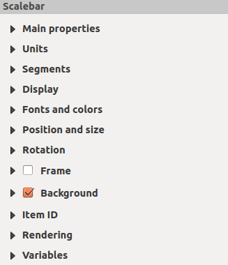
Scale Bar Item Properties Panel
Main properties
The Main properties group of the scale bar Item Properties panel provides the following functionalities (see figure_layout_scalebar_ppt):
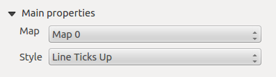
Scale Bar Main properties group
First, choose the map the scale bar will be attached to.
Then, choose the style of the scale bar. Six styles are available:
Single box and Double box styles, which contain one or two lines of boxes alternating colors;
Middle, Up or Down line ticks;
Numeric, where the scale ratio is printed (i.e., 1:50000).
Units and Segments
The Units and Segments groups of the scale bar Item Properties panel provide the following functionalities (see figure_layout_scalebar_units):
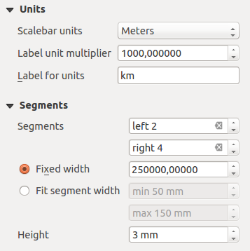
Scale Bar Units and Segments groups
In these two groups, you can set how the scale bar will be represented.
Select the units you want to use with Scalebar units. There are many possible choices: Map Units (the default one), Meters, Feet, Miles or Nautical Miles… which may force unit conversions.
The Label unit multiplier specifies how many scale bar units per labeled unit. Eg, if your scale bar units are set to “meters”, a multiplier of 1000 will result in the scale bar labels in “kilometers”.
The Label for units field defines the text used to describe the units of the scale bar, eg
morkm. This should be matched to reflect the multiplier above.You can define how many Segments will be drawn on the left and on the right side of the scale bar.
You can set how long each segment will be (Fixed width), or limit the scale bar size in
mmwith Fit segment width option. In the latter case, each time the map scale changes, the scale bar is resized (and its label updated) to fit the range set.Height is used to define the height of the bar.
Display
The Display group of the scale bar Item Properties panel provides the following functionalities (see figure_layout_scalebar_display):
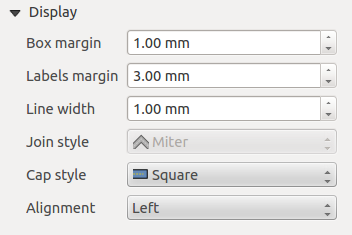
Scale Bar Display group
You can define how the scale bar will be displayed in its frame.
Box margin : space between text and frame borders
Labels margin : space between text and scale bar drawing
Line width : line width of the scale bar drawing
Join style : Corners at the end of scale bar in Bevel, Miter or Round style (only available for Scale bar style Single Box & Double Box)
Cap style : End of all lines in style Square, Round or Flat (only available for Scale bar style Line Ticks Up, Down and Middle)
Alignment : Puts text on the left, middle or right side of the frame (works only for Scale bar style Numeric)
Fonts and colors
The Fonts and colors group of the scale bar Item Properties panel provides the following functionalities (see figure_layout_scalebar_fonts):
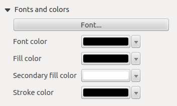
Scale Bar Fonts and colors groups
You can define the fonts and colors used for the scale bar.
Use the Font button to set the font of scale bar label
Font color: set the font color
Fill color: set the first fill color
Secondary fill color: set the second fill color
Line color: set the color of the lines of the Scale Bar
Fill colors are only used for Single Box and Double Box styles.