13.2. The Symbol Selector
The Symbol selector is the main dialog to design a symbol. You can create or edit Marker, Line or Fill Symbols.
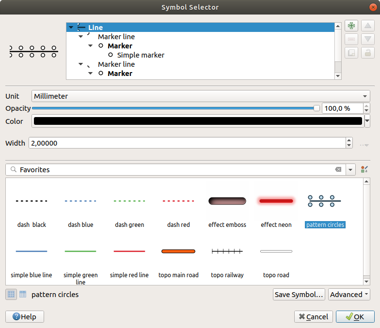
Fig. 13.10 Designing a Line symbol
Two main components structure the symbol selector dialog:
the symbol tree, showing symbol layers that are combined afterwards to shape a new global symbol
and settings to configure the selected symbol layer in the tree.
13.2.1. The symbol layer tree
A symbol can consist of several Symbol layers. The symbol tree shows the overlay of these symbol layers that are combined afterwards to shape a new global symbol. Besides, a dynamic symbol representation is updated as soon as symbol properties change.
Depending on the level selected in the symbol tree items, various tools are made available to help you manage the tree:
 add new symbol layer: you can stack as many symbols as you want
 remove the selected symbol layer
lock colors of symbol layer: a
 locked color stays unchanged when
user changes the color at the global (or upper) symbol level
locked color stays unchanged when
user changes the color at the global (or upper) symbol level duplicate a (group of) symbol layer(s)
move up or down the symbol layer
13.2.2. Configuring a symbol
In QGIS, configuring a symbol is done in two steps: the symbol and then the symbol layer.
13.2.2.1. The symbol
At the top level of the tree, it depends on the layer geometry and can be of Marker, Line or Fill type. Each symbol can embed one or more symbols (including, of any other type) or symbol layers.
You can setup some parameters that apply to the global symbol:
Unit: it can be Millimeters, Points, Pixels, Meters at Scale, Map units or Inches (see Unit Selector for more details)
Opacity
Color: when this parameter is changed by the user, its value is echoed to all unlocked sub-symbols color
Size and Rotation for marker symbols
Width for line symbols
Tip
Use the Size (for marker symbols) or the Width (for line symbols) properties at the symbol level to proportionally resize all of its embedded symbol layers dimensions.
Note
The Data-defined override button next to the width, size or rotation parameters is inactive when setting the symbol from the Style manager dialog. When the symbol is connected to a map layer, this button helps you create proportional or multivariate analysis rendering.
A preview of the symbols library: Symbols of the same type are shown and, through the editable drop-down list just above, can be filtered by free-form text or by categories. You can also update the list of symbols using the
 Style Manager button and open the eponym dialog. There,
you can use any capabilities as exposed in The Style Manager section.
Style Manager button and open the eponym dialog. There,
you can use any capabilities as exposed in The Style Manager section.The symbols are displayed either:
in an icon list (with thumbnail, name and associated tags) using the
 List View button below the frame;
or as icon preview using the
 Icon View button.
Press the Save Symbol button to add the symbol being edited to the symbols library.
With the Advanced
 option, you can:
for line and fill symbols, Clip features to canvas extent.
for fill symbols, Force right-hand rule orientation: allows forcing rendered fill symbols to follow the standard “right hand rule” for ring orientation (i.e, polygons where the exterior ring is clockwise, and the interior rings are all counter-clockwise).
The orientation fix is applied while rendering only, and the original feature geometry is unchanged. This allows for creation of fill symbols with consistent appearance, regardless of the dataset being rendered and the ring orientation of individual features.
Depending on the symbology of the layer a symbol is being applied to, additional settings are available in the Advanced menu:
Symbol levels… to define the order of symbols rendering
Match to Saved Symbols… and Match to Symbols from File… to automatically assign symbols to classes
13.2.2.2. The symbol layer
At a lower level of the tree, you can customize the symbol layers. The available
symbol layer types depend on the upper symbol type. You can apply on the symbol
layer  paint effects to enhance its rendering.
Because describing all the options of all the symbol layer types would not be possible, only particular and significant ones are mentioned below.
Common parameters
Some common options and widgets are available to build a symbol layer, regardless it’s of marker, line or fill sub-type:
the color selector widget to ease color manipulation
Units: it can be Millimeters, Points, Pixels, Meters at Scale, Map units or Inches (see Unit Selector for more details)
the
 Data-defined override widget near almost all options,
extending capabilities of customizing each symbol (see Data defined override setup for
more information)
Data-defined override widget near almost all options,
extending capabilities of customizing each symbol (see Data defined override setup for
more information)the
 Enable symbol layer option controls the symbol layer’s
visibility. Disabled symbol layers are not drawn when rendering the symbol but
are saved in the symbol. Being able to hide symbol layers is convenient when
looking for the best design of your symbol as you don’t need to remove any for
the testing. The data-defined override then makes it possible to hide or
display different symbol layers based on expressions (using, for instance, feature attributes).
Enable symbol layer option controls the symbol layer’s
visibility. Disabled symbol layers are not drawn when rendering the symbol but
are saved in the symbol. Being able to hide symbol layers is convenient when
looking for the best design of your symbol as you don’t need to remove any for
the testing. The data-defined override then makes it possible to hide or
display different symbol layers based on expressions (using, for instance, feature attributes).the
Draw effects button for effects rendering.
Note
While the description below assumes that the symbol layer type is bound to the feature geometry, keep in mind that you can embed symbol layers in each others. In that case, the lower level symbol layer parameter (placement, offset…) might be bound to the upper-level symbol, and not to the feature geometry itself.
Marker Symbols
Appropriate for point geometry features, marker symbols have several Symbol layer types:
Simple marker (default)
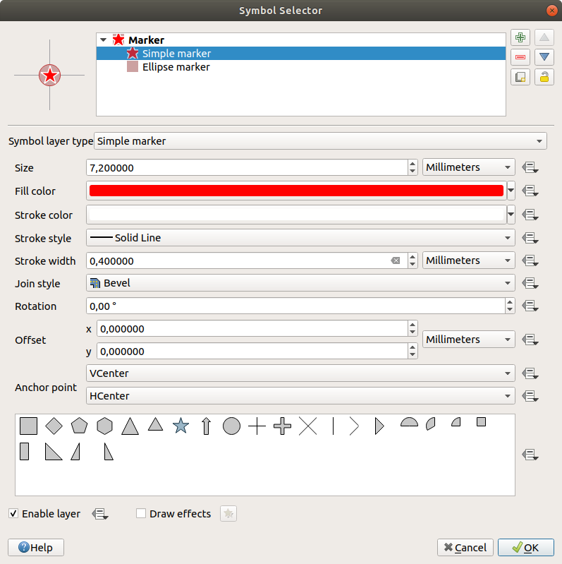
Fig. 13.11 Designing a Simple Marker Symbol
The simple marker symbol layer type has the following properties:
Size in various supported units
Fill color
Stroke color, Stroke style from a predefined list and Stroke size
Join style: it can be Bevel, Miter or Round
Cap style: it can be Square, Flat or Round
Rotation
Offset in X and Y directions from the feature
Anchor point: defining the quadrant point on the symbol to settle as placement origin. This is the point the Offset is applied on.
Ellipse marker: a simple marker symbol layer, with customizable width and height
Filled marker: similar to the simple marker symbol layer, except that it uses a fill sub symbol to render the marker. This allows use of all the existing QGIS fill (and stroke) styles for rendering markers, e.g. gradient or shapeburst fills.
Font marker: similar to the simple marker symbol layer, except that it uses installed fonts to render the marker. Its additional properties are:
Font family
Font style
Character(s), representing the text to display as symbol. They can be typed in or selected from the font characters collection widget and you can live Preview them with the selected settings.
Geometry generator (see The Geometry Generator)
Mask: its sub-symbol defines a mask shape whose color property will be ignored and only the opacity will be used. This is convenient when the marker symbol overlaps with labels or other symbols whose colors are close, making it hard to decipher. More details at Masks Properties.
Raster image marker: use an image (
PNG,JPG,BMP…) as marker symbol. The image can be a file on the disk, a remote URL, embedded in the style database (more details) or it can be encoded as a base64 string. Width and height of the image can be set independently or using the Lock aspect ratio. The size can be set using any of the
common units or as a percentage of the image’s original
size (scaled by the width).
Lock aspect ratio. The size can be set using any of the
common units or as a percentage of the image’s original
size (scaled by the width).Vector Field marker (see The Vector Field Marker)
SVG marker: provides you with images from your SVG paths (set in menu) to render as marker symbol. Width and height of the symbol can be set independently or using the
Lock aspect ratio. Each SVG file colors and stroke can
also be adapted. The image can be a file on the disk, a remote URL, embedded
in the style database (more details) or it can
be encoded as a base64 string.The symbol can also be set with Dynamic SVG parameters. See Parametrizable SVG section to parametrize an SVG symbol.
Note
SVG version requirements
QGIS renders SVG files that follow the SVG Tiny 1.2 profile, intended for implementation on a range of devices, from cellphones and PDAs to laptop and desktop computers, and thus includes a subset of the features included in SVG 1.1 Full, along with new features to extend the capabilities of SVG.
Some features not included in these specifications might not be rendered correctly in QGIS.
Line Symbols
Appropriate for line geometry features, line symbols have the following symbol layer types:
Simple line (default)
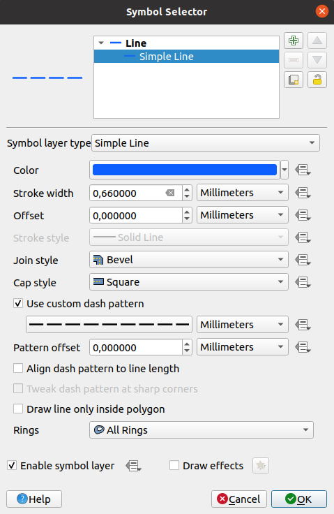
Fig. 13.12 Designing a Simple Line Symbol
The simple line symbol layer type has many of the same properties as the simple marker symbol, and in addition:
- Use custom dash pattern: overrides the
Stroke style setting with a custom dash.
Pattern offset: the positioning of the dashes/spaces in the line can be tweaked, so that they can be placed at nicer positions to account for corners in the line (also can be used potentially to “align” adjacent dash pattern borders)
- Align dash pattern to line length: the dash pattern
length will be adjusted so that the line will end with a complete dash
element, instead of a gap.
- Tweak dash pattern at sharp corners: dynamically
adjusts the dash pattern placement so that sharp corners are represented
by a full dash element coming into and out of the sharp corner.
Dependent on Align dash pattern to line length.
Trim lines from Start and/or End: allows for the line rendering to trim off the first x mm and last y mm from the actual line string when drawing the line. It can be used e.g. when creating complex symbols where a line layer should not overlap marker symbol layers placed at the start and end of the line. The start/end trim distance supports a range of units, including percentage of the overall line length, and can be data defined for extra control.
Arrow: draws lines as curved (or not) arrows with a single or a double head with configurable (and data-defined):
Head type
Arrow type
Arrow width
Arrow width at start
Head length
Head thickness
Offset
It is possible to create
Curved arrows
(the line feature must have at least three vertices) and
Repeat arrow on each segment.
It also uses a fill symbol such as gradients or
shapeburst to render the arrow body. Combined with the geometry generator,
this type of layer symbol helps you representing flow maps.Geometry generator (see The Geometry Generator)
Interpolated line: allows to render a line whose Stroke width and/or Color may be constant (given a Fixed width and Single color parameters) or vary along the geometry. When varying, necessary inputs are:
Start value and End value: Values that will be used for interpolation at the extremities of the features geometry. They can be fixed values, feature’s attributes or based on an expression.
Min. value and Max. value: Values between which the interpolation is performed. Press the
 Load button to automatically fill them based
on the minimum and maximum start/end values applied to the layer.
Load button to automatically fill them based
on the minimum and maximum start/end values applied to the layer.Only available for the stroke option:
Min. width and Max. width: define the range of the varying width. Min. width is assigned to the Min. value and Max. width to the Max. value. A unit can be associated.
- Use absolute value: only consider absolute value
for interpolation (negative values are used as positive).
- Ignore out of range: by default, when
the
[start value - end value]range of a feature is not included in the[min. value - max. value]range, the out-of-bounds parts of the feature’s geometry are rendered with the min or max width. Check this option to not render them at all.
For varying color, you can use any of the interpolation methods of color ramp classification
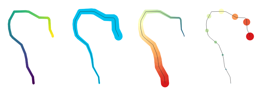
Fig. 13.13 Examples of interpolated lines
Marker line: repeats a marker symbol over the length of a line.
The Marker placement can be at a regular distance or based on the line geometry: first, last or each vertex, on the central point of the line or of each segment, or on every curve point.
Offset along the line: the markers placement can also be given an offset from the start, along the line
The
Rotate marker to follow line direction option
sets whether each marker symbol should be oriented relative to the line
direction or not.Because a line is often a succession of segments of different directions, the rotation of the marker is calculated by averaging over a specified distance along the line. For example, setting the Average angle over property to
4mmmeans that the two points along the line that are2mmbefore and after the symbol placement are used to calculate the line angle for that marker symbol. This has the effect of smoothing (or removing) any tiny local deviations from the overall line direction, resulting in much nicer visual orientations of the marker line symbols.Line offset: the marker symbols can also be offset from the line feature.
Hashed line: repeats a line segment (a hash) over the length of a line symbol, with a line sub-symbol used to render each individual segment. In other words, a hashed line is like a marker line in which marker symbols are replaced with segments. As such, the hashed lines have the same properties as marker line symbols, along with:
Hash length
Hash rotation
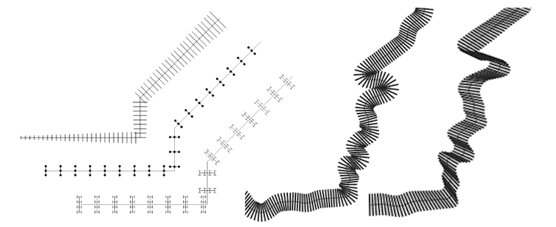
Fig. 13.14 Examples of hashed lines
Fill Symbols
Appropriate for polygon geometry features, fill symbols have also several symbol layer types:
Simple fill (default): fills a polygon with a uniform color
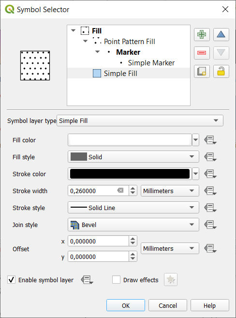
Fig. 13.15 Designing a Simple Fill Symbol
Centroid fill: places a marker symbol at the centroid of the visible feature. The position of the marker may not be the real centroid of the feature, because calculation takes into account the polygon(s) clipped to area visible in map canvas for rendering and ignores holes. Use the geometry generator symbol if you want the exact centroid.
You can:
Force placement of markers inside polygons
Draw markers on every part of multi-part features or place the point only on its biggest part
display the marker symbol(s) in whole or in part, keeping parts overlapping the current feature geometry (Clip markers to polygon boundary) or the geometry part the symbol belongs to (Clip markers to current part boundary only)
Geometry generator (see The Geometry Generator)
Gradient fill: uses a radial, linear or conical gradient, based on either simple two color gradients or a predefined gradient color ramp to fill polygons. The gradient can be rotated and applied on a single feature basis or across the whole map extent. Also start and end points can be set via coordinates or using the centroid (of feature or map). A data-defined offset can be defined;
Line pattern fill: fills the polygon with a hatching pattern of line symbol layer. You can set:
Rotation of the lines, counter-clockwise
Spacing: distance between consecutive lines
Offset distance of the lines from the feature boundary
Point pattern fill: fills the polygon with a grid pattern of marker symbol. You can set:
Distance: Horizontal and Vertical distances between consecutive markers
Displacement: a Horizontal (resp. Vertical) offset of alignment between consecutive markers in a column (resp. in a row)
Offset: Horizontal and Vertical distances from the feature boundary
Random marker fill: fills the polygon with a marker symbol placed at random locations within the polygon boundary. You can set:
Count method: whether the number of marker symbols to render is considered as an absolute count or density-based
Point count: the number of marker symbols to render,
an optional random number seed, to give consistent placement
Density area: in case of density-based count method, ensures the fill density of markers remains the same on different scale / zoom levels of markers whenever maps are refreshed (also allows random placement to play nice with QGIS server and tile-based rendering)
Clip markers to polygon boundary: whether markers rendered near the edges of polygons should be clipped to the polygon boundary or not
Raster image fill: fills the polygon with tiles from a raster image (
PNGJPG,BMP…). The image can be a file on the disk, a remote URL or an embedded file encoded as a string (more details). Options include (data defined) opacity, image width, coordinate mode (object or viewport), rotation and offset. The image width can be set using any of the common units or as a percentage of the original size.SVG fill: fills the polygon using SVG markers of a given size (Texture width);
Shapeburst fill: buffers a gradient fill, where a gradient is drawn from the boundary of a polygon towards the polygon’s centre. Configurable parameters include distance from the boundary to shade, use of color ramps or simple two color gradients, optional blurring of the fill and offsets;
Outline: Arrow: uses a line arrow symbol layer to represent the polygon boundary. The settings for the outline arrow are the same as for arrow line symbols.
Outline: Hashed line: uses a hash line symbol layer to represent the polygon boundary (Rings) which can be the interior rings only, the exterior ring only or all the rings). The other settings for the outline hashed line are the same as for hashed line symbols.
Outline: Marker line: uses a marker line symbol layer to represent the polygon boundary (Rings) which can be the interior rings only, the exterior ring only or all the rings). The other settings for the outline marker line are same as for marker line symbols.
Outline: simple line: uses a simple line symbol layer to represent the polygon boundary (Rings) which can be the interior rings only, the exterior ring only or all the rings). The Draw line only inside polygon option displays the polygon borders inside the polygon and can be useful to clearly represent adjacent polygon boundaries. The other settings for the outline simple line are the same as for simple line symbols.
Note
When geometry type is polygon, you can choose to disable the automatic clipping of lines/polygons to the canvas extent. In some cases this clipping results in unfavourable symbology (e.g. centroid fills where the centroid must always be the actual feature’s centroid).
Parametrizable SVG
You have the possibility to change the colors of a SVG marker.
You have to add the placeholders param(fill) for fill color,
param(outline) for stroke color and param(outline-width) for stroke
width. These placeholders can optionally be followed by a default value, e.g.:
<svg width="100%" height="100%">
<rect fill="param(fill) #ff0000" stroke="param(outline) #00ff00" stroke-width="param(outline-width) 10" width="100" height="100">
</rect>
</svg>
More generally, SVG can be freely parametrized using param(param_name).
This param can either be used as an attribute value or a node text:
<g stroke-width=".265" text-anchor="middle" alignment-baseline="param(align)">
  <text x="98" y="147.5" font-size="6px">param(text1)</text>
  <text x="98" y="156.3" font-size="4.5px">param(text2)</text>
</g>
The parameters can then be defined as expressions in the Dynamic SVG parameters table.
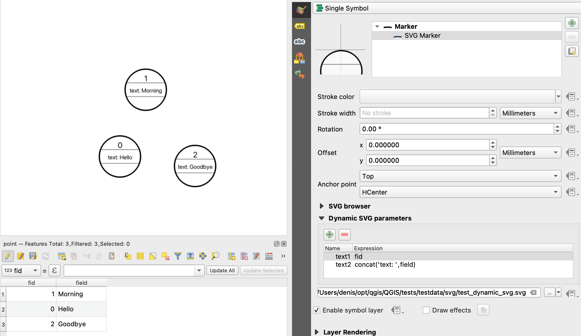
Fig. 13.16 Dynamic SVG parameters table
The Geometry Generator
Available with all types of symbols, the geometry generator symbol layer allows to use expression syntax to generate a geometry on the fly during the rendering process. The resulting geometry does not have to match with the original Geometry type and you can add several differently modified symbol layers on top of each other.
A Units property can be set: when the geometry generator symbol is not applied to a layer (e.g., it is used on a layout item), this allows more control over the generated output.
Some examples:
-- render the centroid of a feature
centroid( $geometry )

-- visually overlap features within a 100 map units distance from a point
-- feature, i.e generate a 100m buffer around the point
buffer( $geometry, 100 )

-- Given polygon layer1( id1, layer2_id, ...) and layer2( id2, fieldn...)
-- render layer1 with a line joining centroids of both where layer2_id = id2
make_line( centroid( $geometry ),
           centroid( geometry( get_feature( 'layer2', 'id2', attribute(
               $currentfeature, 'layer2_id') ) )
         )

-- Create a nice radial effect of points surrounding the central feature
-- point when used as a MultiPoint geometry generator
collect_geometries(
  array_foreach(
    generate_series( 0, 330, 30 ),
      project( $geometry, .2, radians( @element ) )
  )
)
The Vector Field Marker
The vector field marker is used to display vector field data such as earth deformation, tidal flows, and the like. It displays the vectors as lines (preferably arrows) that are scaled and oriented according to selected attributes of data points. It can only be used to render point data; line and polygon layers are not drawn by this symbology.
The vector field is defined by attributes in the data, which can represent the field either by:
cartesian components (
xandycomponents of the field)or polar coordinates: in this case, attributes define
LengthandAngle. The angle may be measured either clockwise from north, or Counterclockwise from east, and may be either in degrees or radians.or as height only data, which displays a vertical arrow scaled using an attribute of the data. This is appropriate for displaying the vertical component of deformation, for example.
The magnitude of field can be scaled up or down to an appropriate size for viewing the field.