Outdated version of the documentation. Find the latest one here.

` `

Het item Schaalbalk

To add a scale bar, click the scaleBar Add new scalebar icon, place the element with the left mouse button on the Print Composer canvas and position and customize the appearance in the scale bar Item Properties panel.

The Item properties of a scale bar item tab provides the following functionalities (see figure_composer_scalebar):

../../../../_images/scalebar_properties.png

Paneel Schaalbalk Item-eigenschappen

Algemene eigenschappen

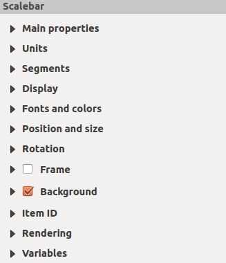
The Main properties dialog of the scale bar Item Properties panel provides the following functionalities (see figure_composer_scalebar_ppt):

../../../../_images/scalebar_mainproperties.png

Scale Bar Main properties Dialog

  • Kies eerst de kaart waar de schaalbalk aan moet worden toegevoegd.

  • Kies dan de stijl van de schaalbalk. Zes stijlen zijn beschikbaar:

    • Single box and Double box styles, which contain one or two lines of boxes alternating colors.
    • Middle, Up or Down line ticks.
    • Numeriek, waar de ratio van de schaal wordt afgedrukt (bijv., 1:50000).

Eenheden en Segmenten

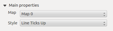
The Units and Segments dialogs of the scale bar Item Properties panel provide the following functionalities (see figure_composer_scalebar_units):

../../../../_images/scalebar_units.png

Scale Bar Units and Segments Dialogs

In these two dialogs, you can set how the scale bar will be represented.

  • Select the units you want to use with Scalebar units. There are four possible choices: Map Units, the default one and Meters, Feet or Nautical Miles which may force unit conversions.
  • The Label unit multiplier specifies how many scalebar units per labeled unit. Eg, if your scalebar units are set to “meters”, a multiplier of 1000 will result in the scale bar labels in “kilometers”.
  • The Label for units field defines the text used to describe the units of the scale bar, eg “m” or “km”. This should be matched to reflect the multiplier above.
  • U kunt definiëren hoeveel Segmenten zullen worden getekend aan de linker- en rechterkant van de schaalbalk.

  • You can set how long each segment will be (fixed width), or limit the scale bar size in mm with Fit segment width option. In the latter case, each time the map scale changes, the scale bar is resized (and its label updated) to fit the range set.
  • Hoogte wordt gebruikt om de hoogte van de balk te definiéren.

Tonen

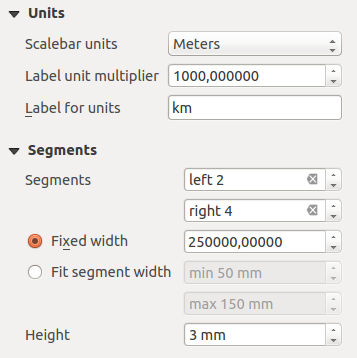
The Display dialog of the scale bar Item Properties panel provides the following functionalities (see figure_composer_scalebar_display):

../../../../_images/scalebar_display.png

Scale Bar Display

U kunt definiëren hoe de schaalbalk zal worden weergegeven in zijn frame.

  • Marges vak : ruimte tussen de tekst en de randen van het frame

  • Labels margin : space between text and scale bar drawing
  • Lijndikte : dikte van de lijn van de tekening van de schaalbalk

  • Join style : Corners at the end of scalebar in style Bevel, Rounded or Square (only available for Scale bar style Single Box & Double Box)
  • Stijl eindkap : Einde van alle lijnen in de stijlen Rechthoekig, Rond of Plat (alleen beschikbaar voor de stijlen Schaal;streepjes boven, onder en midden van de schaalbalk)

  • Uitlijning : Plaatst de tekst links, in het centrum of rechts in het frame (werkt alleen voor de stijl Numeriek van de schaalbalk)

Lettertypes en kleur

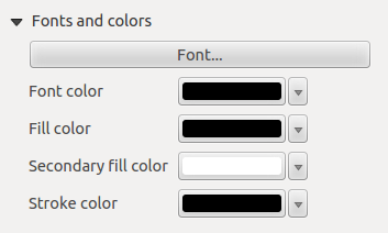
The Fonts and colors dialog of the scale bar Item Properties panel provides the following functionalities (see figure_composer_scalebar_fonts):

../../../../_images/scalebar_fonts.png

Scale Bar Fonts and colors Dialogs

You can define the fonts and colors used for the scale bar.

  • Use the [Font] button to set the font of scale bar label
  • Lettertype kleur: stelt de kleur van het lettertype in

  • Vulkleur: stelt de eerste vulkleur in

  • Secundaire vulkleur: stelt de tweede vulkleur in

  • Stroke color: set the color of the lines of the Scale Bar

Fill colors are only used for scale box styles Single Box and Double Box. To select a color you can use the list option using the dropdown arrow to open a simple color selection option or the more advanced color selection option, that is started when you click in the colored box in the dialog.