Outdated version of the documentation. Find the latest one here.

` `

スケールバーアイテム

To add a scale bar, click the scaleBar Add new scalebar icon, place the element with the left mouse button on the Print Composer canvas and position and customize the appearance in the scale bar Item Properties panel.

The Item properties of a scale bar item tab provides the following functionalities (see figure_composer_scalebar):

../../../../_images/scalebar_properties.png

スケールバーアイテムプロパティパネル

メインプロパティ

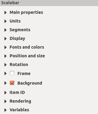
The Main properties dialog of the scale bar Item Properties panel provides the following functionalities (see figure_composer_scalebar_ppt):

../../../../_images/scalebar_mainproperties.png

Scale Bar Main properties Dialog

  • まず、スケールバーを添付する地図を選択します。

  • それから、スケールバーのスタイルを選択します。6つのスタイルが利用可能です:

    • Single box and Double box styles, which contain one or two lines of boxes alternating colors.
    • Middle, Up or Down line ticks.
    • 数値 では, 縮尺の値が表示されます (例 1:50000).

単位と線分列

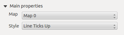
The Units and Segments dialogs of the scale bar Item Properties panel provide the following functionalities (see figure_composer_scalebar_units):

../../../../_images/scalebar_units.png

Scale Bar Units and Segments Dialogs

In these two dialogs, you can set how the scale bar will be represented.

  • Select the units you want to use with Scalebar units. There are four possible choices: Map Units, the default one and Meters, Feet or Nautical Miles which may force unit conversions.
  • The Label unit multiplier specifies how many scalebar units per labeled unit. Eg, if your scalebar units are set to “meters”, a multiplier of 1000 will result in the scale bar labels in “kilometers”.
  • The Label for units field defines the text used to describe the units of the scale bar, eg “m” or “km”. This should be matched to reflect the multiplier above.
  • 線分列 では, スケールバーの左と右をいくつで区切りるかを指定します.

  • You can set how long each segment will be (fixed width), or limit the scale bar size in mm with Fit segment width option. In the latter case, each time the map scale changes, the scale bar is resized (and its label updated) to fit the range set.
  • 高さ はバーの高さを指定します.

ディスプレイ

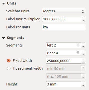
The Display dialog of the scale bar Item Properties panel provides the following functionalities (see figure_composer_scalebar_display):

../../../../_images/scalebar_display.png

Scale Bar Display

フレーム内でどのようにスケールバーが表示されるかを指定することができます.

  • ボックス幅 : テキストとフレーム枠との間隔です.

  • Labels margin : space between text and scale bar drawing
  • 線幅 : スケールバー描画の線幅です.

  • Join style : Corners at the end of scalebar in style Bevel, Rounded or Square (only available for Scale bar style Single Box & Double Box)
  • 頂点スタイル : 線の端の形を 角形, 平坦, 丸み から選びます (スケールバーのスタイルが中心チック, 上向きチック, 上向きチックの場合に有効です).

  • 配置 : テキストをフレームの左, 中央部, 右に配置します (スケールバーのスタイルが数値の場合に有効です).

フォントと色

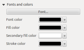
The Fonts and colors dialog of the scale bar Item Properties panel provides the following functionalities (see figure_composer_scalebar_fonts):

../../../../_images/scalebar_fonts.png

Scale Bar Fonts and colors Dialogs

You can define the fonts and colors used for the scale bar.

  • Use the [Font] button to set the font of scale bar label
  • フォントの色: フォントの色を設定します.

  • 塗りつぶしカラー: 塗りつぶし色を指定します.

  • 2番目の塗りつぶしカラー: もう一つの塗りつぶし色を指定します.

  • Stroke color: set the color of the lines of the Scale Bar

Fill colors are only used for scale box styles Single Box and Double Box. To select a color you can use the list option using the dropdown arrow to open a simple color selection option or the more advanced color selection option, that is started when you click in the colored box in the dialog.