4.2. Lesson: The Label Tool
Labels can be added to a map to show any information about an object. Any vector layer can have labels associated with it. These labels rely on the attribute data of a layer for their content.
Note
The Layer Properties dialog does have a Labels tab, which now offers the same functionality, but for this example we’ll use the Label tool, accessed via a toolbar button.
The goal for this lesson: To apply useful and good-looking labels to a layer.
4.2.1.  Follow Along: Using Labels
Before being able to access the Label tool, you will need to ensure that it has been activated.
- Go to the menu item View ‣ Toolbars.
- Ensure that the Label item has a check mark next to it. If it doesn’t, click on the Label item, and it will be activated.
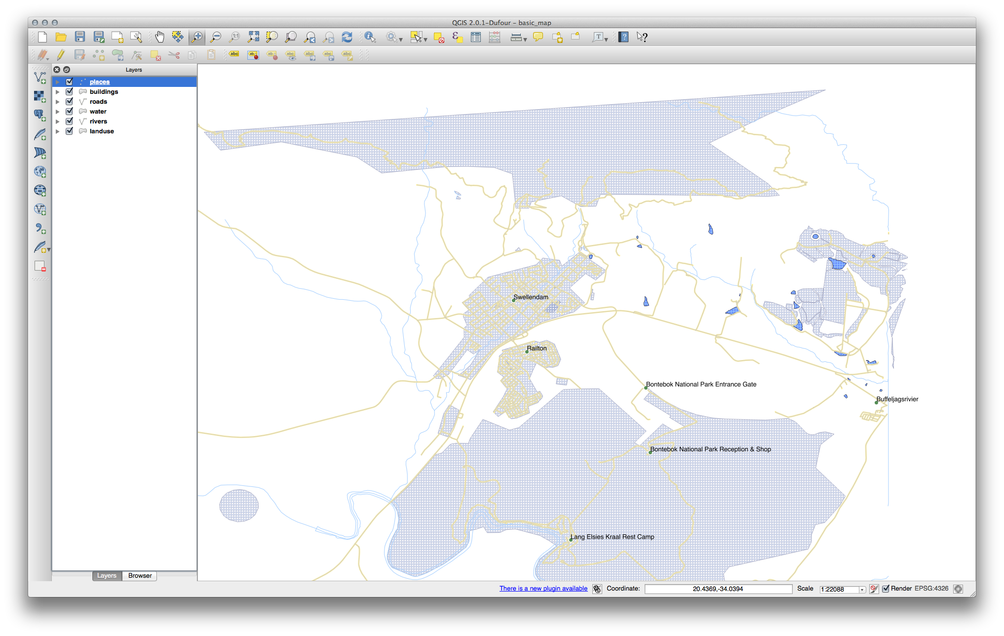
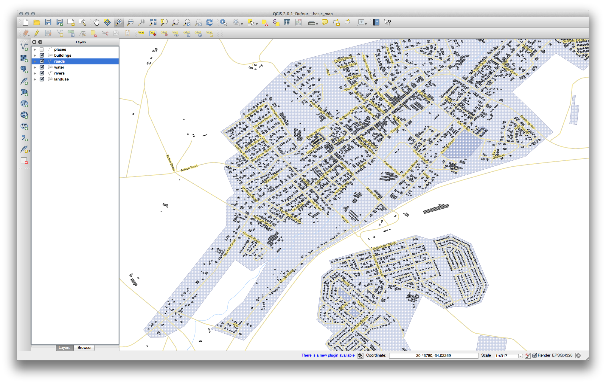
- Click on the places layer in the Layers list, so that it is highlighted.
- Click on the following toolbar button:

This gives you the Layer labeling settings dialog.
- Check the box next to Label this layer with....
You’ll need to choose which field in the attributes will be used for the labels. In the previous lesson, you decided that the NAME field was the most suitable one for this purpose.
- Select name from the list:
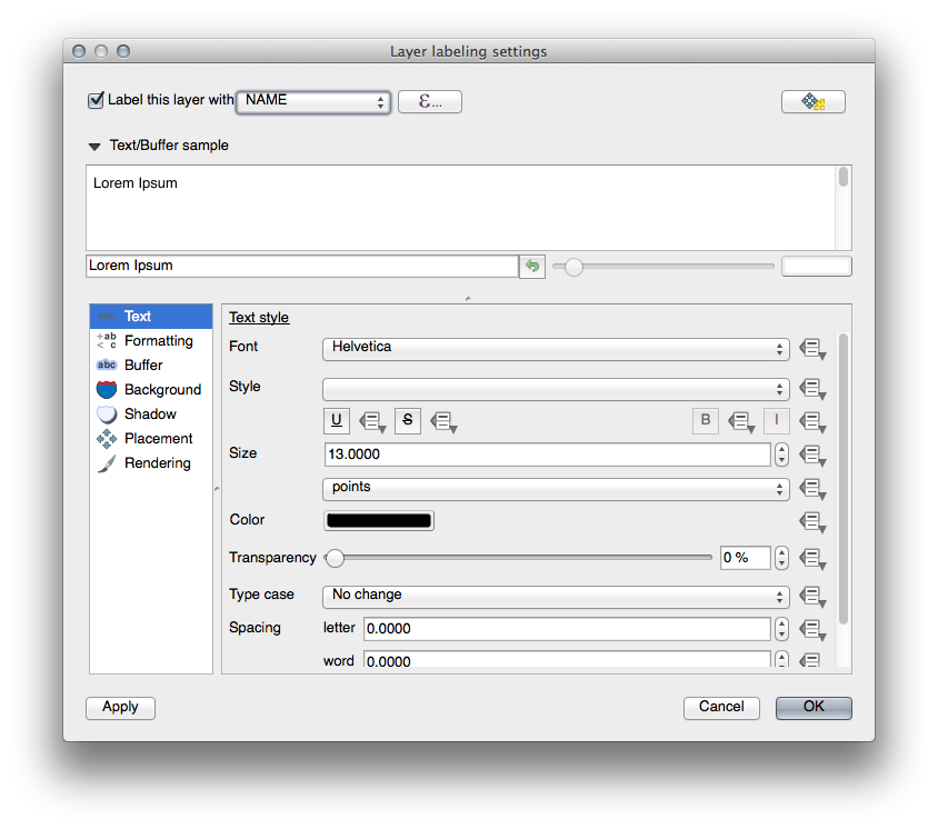
- Click OK.
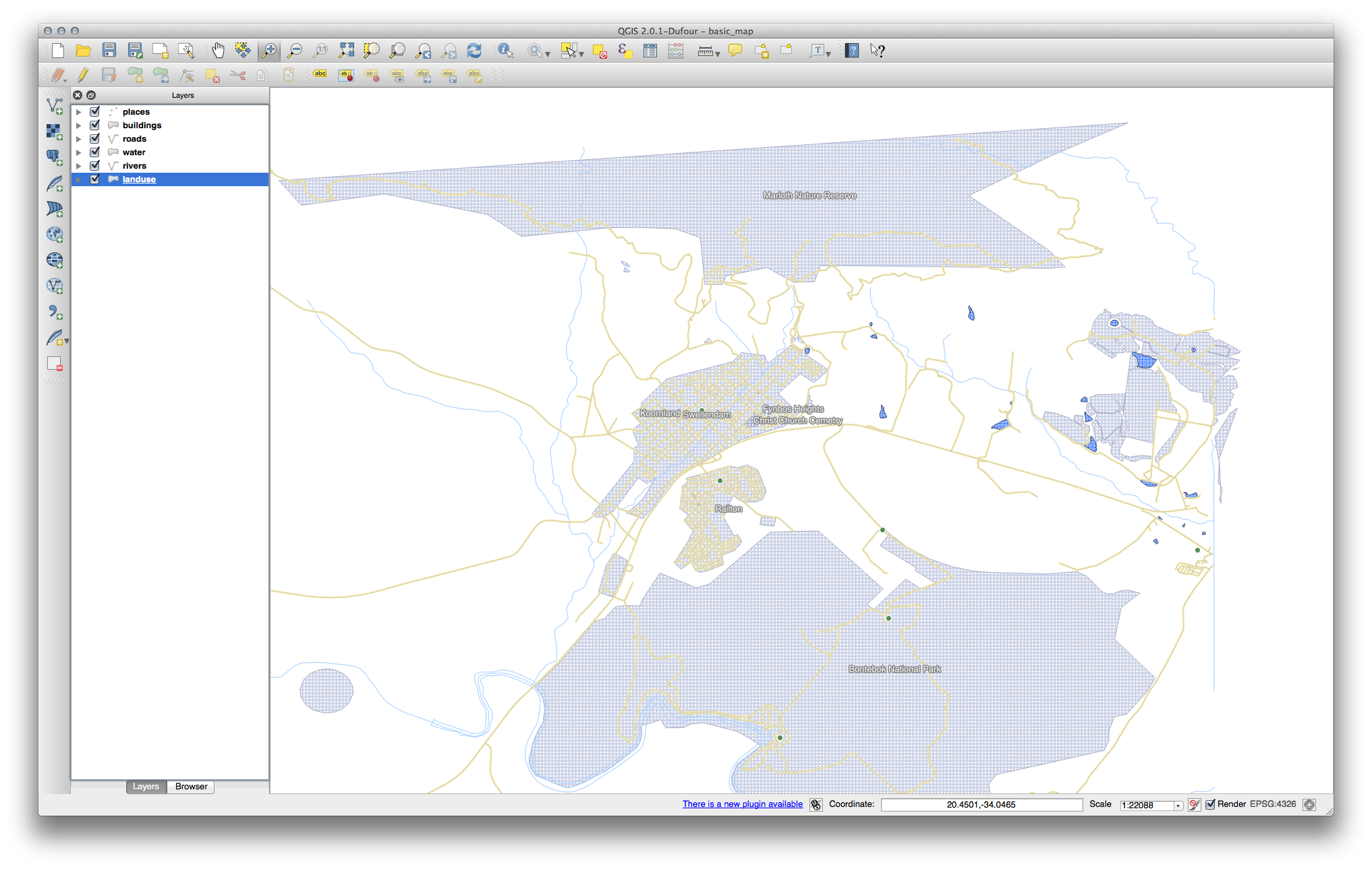
The map should now have labels like this:
4.2.2. Follow Along: Changing Label Options
Depending on the styles you chose for your map in earlier lessons, you’ll might find that the labels are not appropriately formatted and either overlap or are too far away from their point markers.
- Open the Label tool again by clicking on its button as before.
- Make sure Text is selected in the left-hand options list, then update the text formatting options to match those shown here:
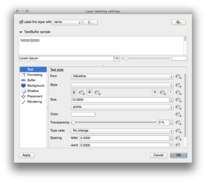
That’s the font problem solved! Now let’s look at the problem of the labels overlapping the points, but before we do that, let’s take a look at the Buffer option.
- Open the Label tool dialog.
- Select Buffer from the left-hand options list.
- Select the checkbox next to Draw text buffer, then choose options to match those shown here:
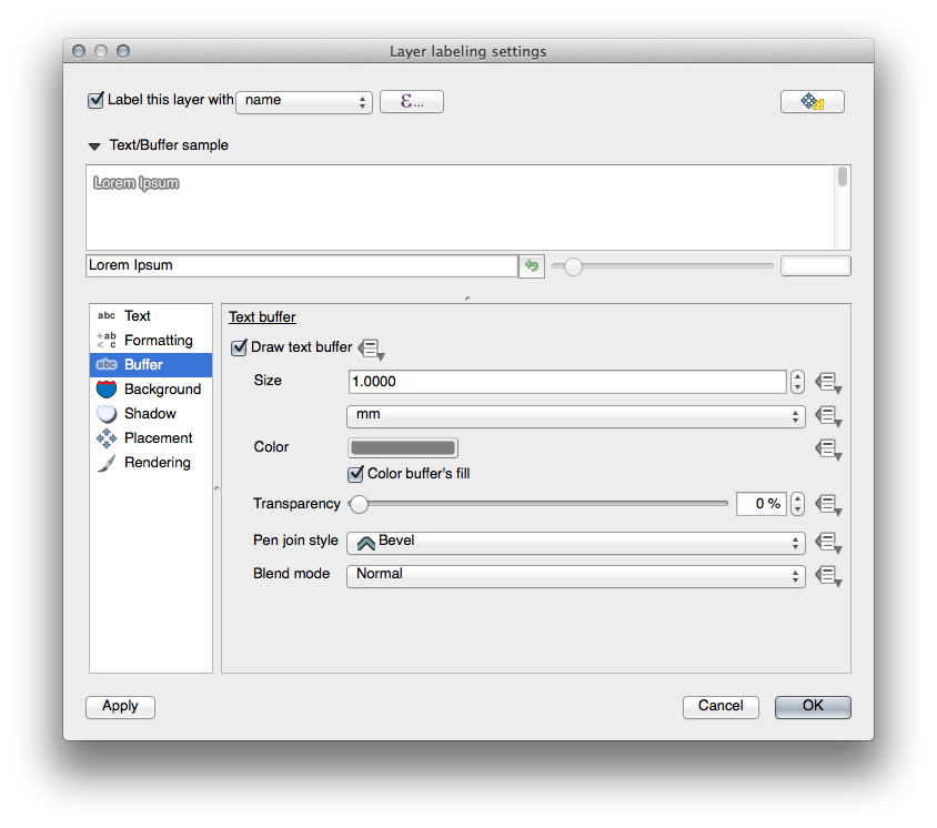
- Click Apply.
You’ll see that this adds a colored buffer or border to the place labels, making them easier to pick out on the map:
Now we can address the positioning of the labels in relation to their point markers.
- In the Label tool dialog, go to the Placement tab.
- Change the value of Distance to 2mm and make sure that Around point is selected:
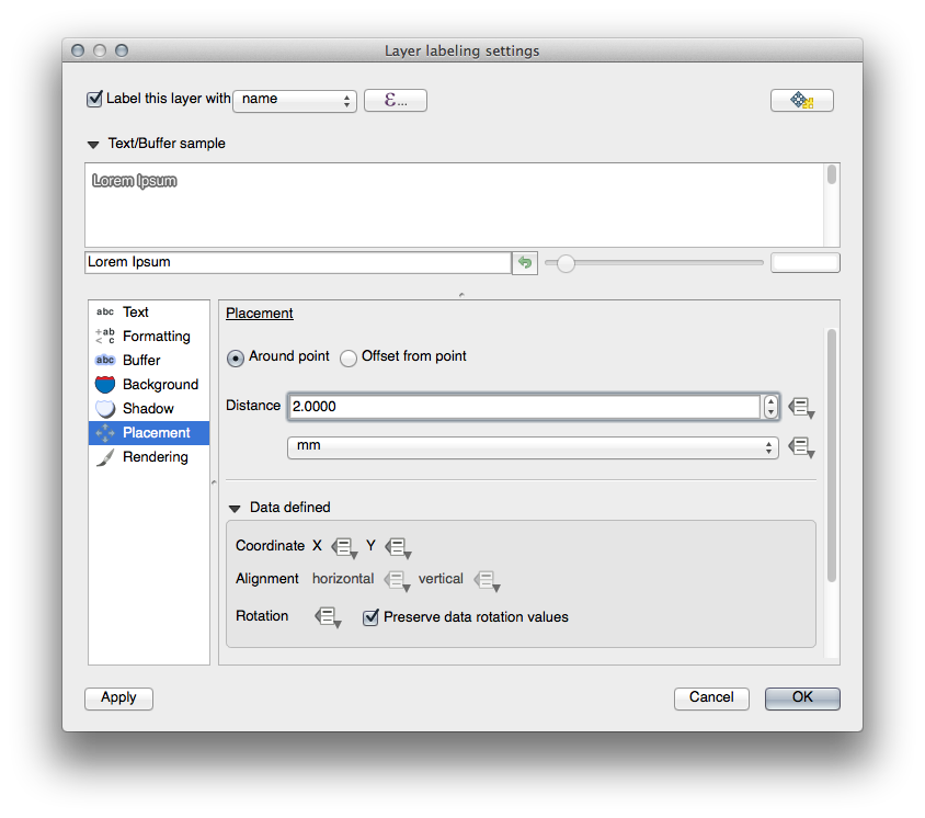
- Click Apply.
You’ll see that the labels are no longer overlapping their point markers.
4.2.3.  Follow Along: Using Labels Instead of Layer Symbology
In many cases, the location of a point doesn’t need to be very specific. For example, most of the points in the places layer refer to entire towns or suburbs, and the specific point associated with such features is not that specific on a large scale. In fact, giving a point that is too specific is often confusing for someone reading a map.
To name an example: on a map of the world, the point given for the European Union may be somewhere in Poland, for instance. To someone reading the map, seeing a point labeled European Union in Poland, it may seem that the capital of the European Union is therefore in Poland.
So, to prevent this kind of misunderstanding, it’s often useful to deactivate the point symbols and replace them completely with labels.
In QGIS, you can do this by changing the position of the labels to be rendered directly over the points they refer to.
- Open the Layer labeling settings dialog for the places layer.
- Select the Placement option from the options list.
- Click on the Offset from point button.
This will reveal the Quadrant options which you can use to set the position of the label in relation to the point marker. In this case, we want the label to be centered on the point, so choose the center quadrant:

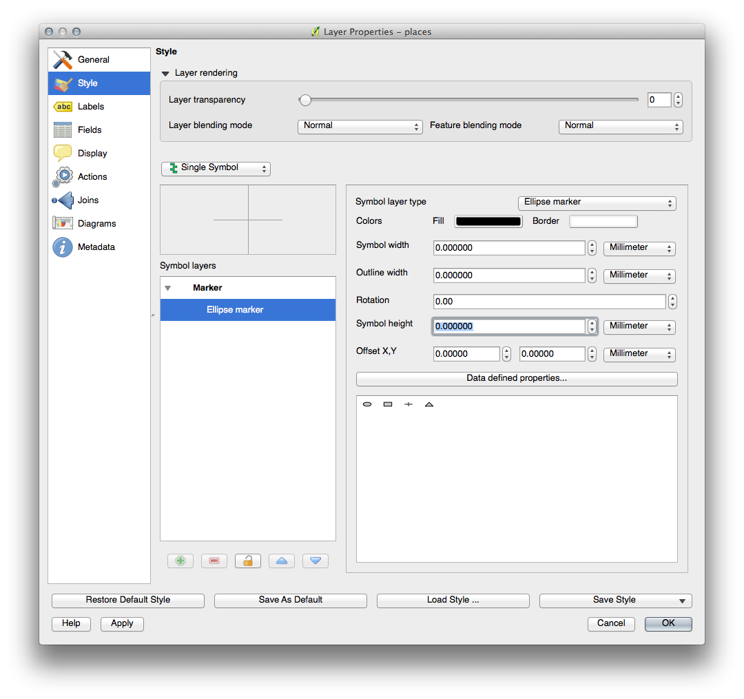
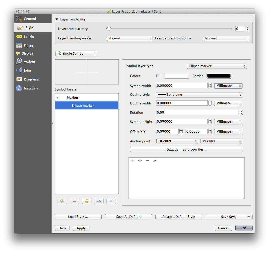
- Hide the point symbols by editing the layer style as usual, and setting the size of the Ellipse marker width and height to 0:
- Click OK and you’ll see this result:
If you were to zoom out on the map, you would see that some of the labels disappear at larger scales to avoid overlapping. Sometimes this is what you want when dealing with datasets that have many points, but at other times you will lose useful information this way. There is another possibility for handling cases like this, which we’ll cover in a later exercise in this lesson.
4.2.4. Try Yourself Customize the Labels
- Return the label and symbol settings to have a point marker and a label offset of 2.00mm. You may like to adjust the styling of the point marker or labels at this stage.
- Set the map to the scale 1:100000. You can do this by typing it into the Scale box in the Status Bar.
- Modify your labels to be suitable for viewing at this scale.
4.2.5. Follow Along: Labeling Lines
Now that you know how labeling works, there’s an additional problem. Points and polygons are easy to label, but what about lines? If you label them the same way as the points, your results would look like this:
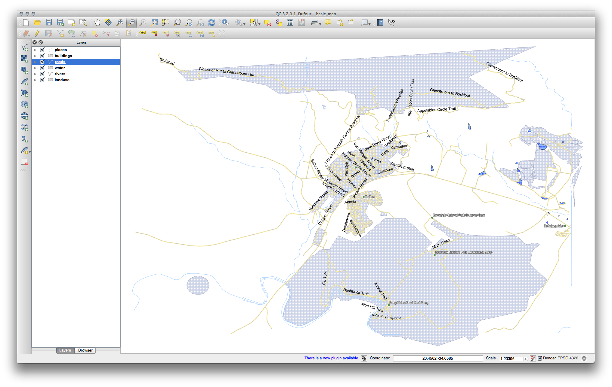
We will now reformat the roads layer labels so that they are easy to understand.
- Hide the Places layer so that it doesn’t distract you.
- Activate labels for the streets layer as before.
- Set the font Size to 10 so that you can see more labels.
- Zoom in on the Swellendam town area.
- In the Label tool dialog’s Advanced tab, choose the following settings:
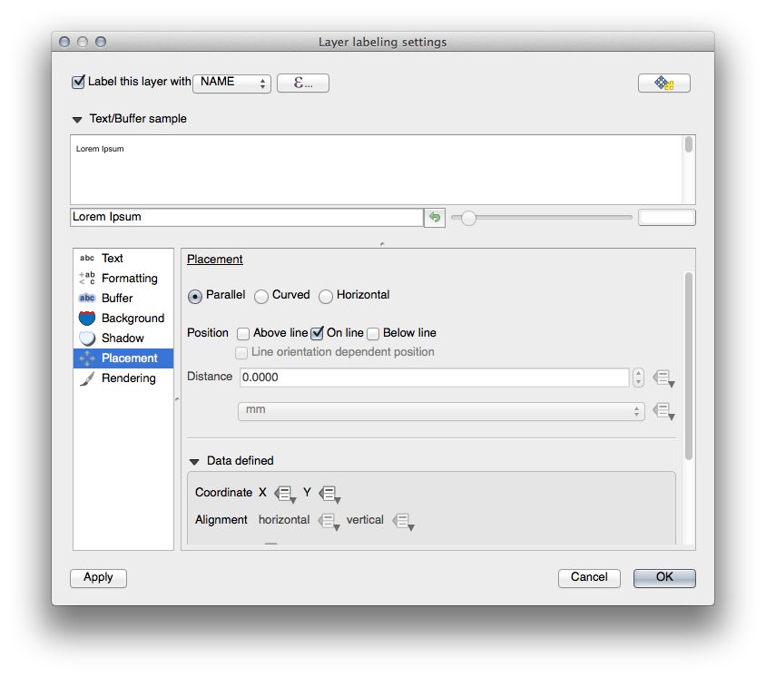
You’ll probably find that the text styling has used default values and the labels are consequently very hard to read. Set the label text format to have a dark-grey or black Color and a light-yellow buffer.
The map will look somewhat like this, depending on scale:
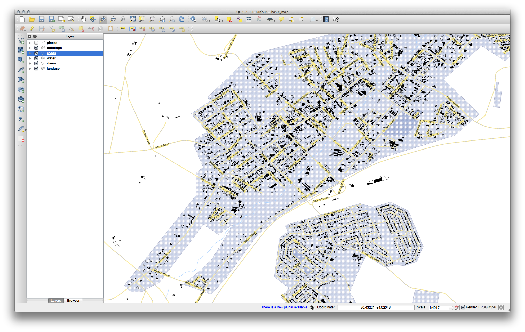
You’ll see that some of the road names appear more than once and that’s not always necessary. To prevent this from happening:
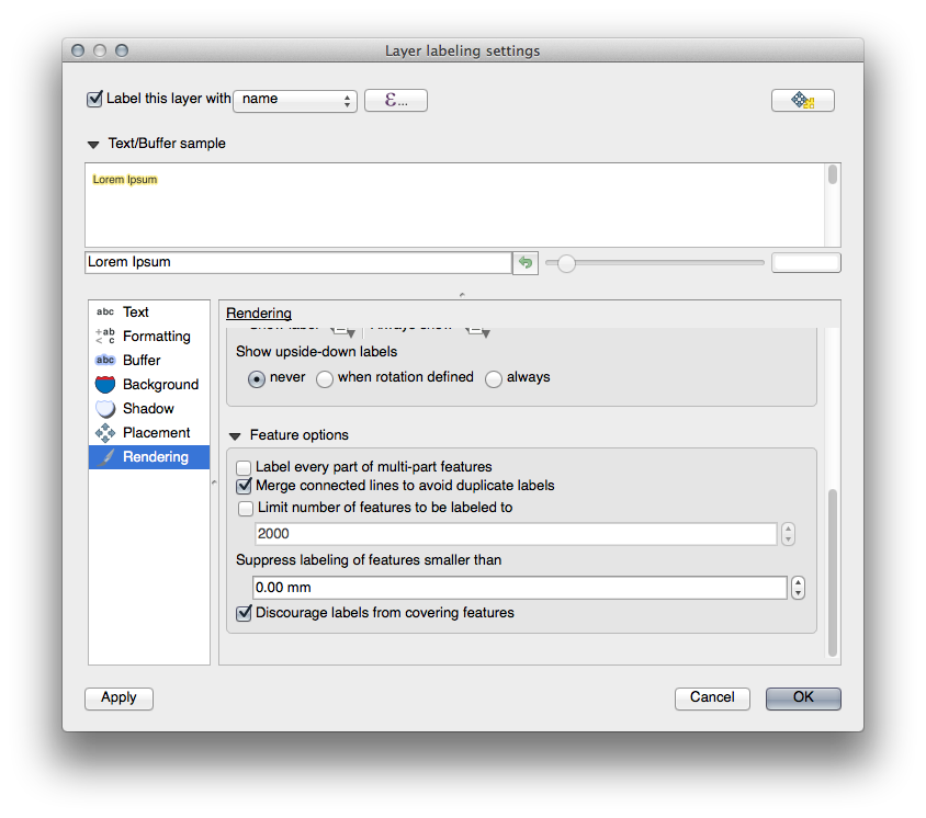
- In the Label labelling settings dialog, choose the Rendering option and select the Merge connected lines to avoid duplicate labels:
- Click OK
Another useful function is to prevent labels being drawn for features too short to be of notice.
- In the same Rendering panel, set the value of Suppress labeling of features smaller than ... to 5mm and note the results when you click Apply.
Try out different Placement settings as well. As we’ve seen before, the horizontal option is not a good idea in this case, so let’s try the curved option instead.
- Select the Curved option in the Placement panel of the Layer labeling settings dialog.
Here’s the result:
As you can see, this hides a lot of the labels that were previously visible, because of the difficulty of making some of them follow twisting street lines and still be legible. You can decide which of these options to use, depending on what you think seems more useful or what looks better.
4.2.6.  Follow Along: Data Defined Settings
- Deactivate labeling for the Streets layer.
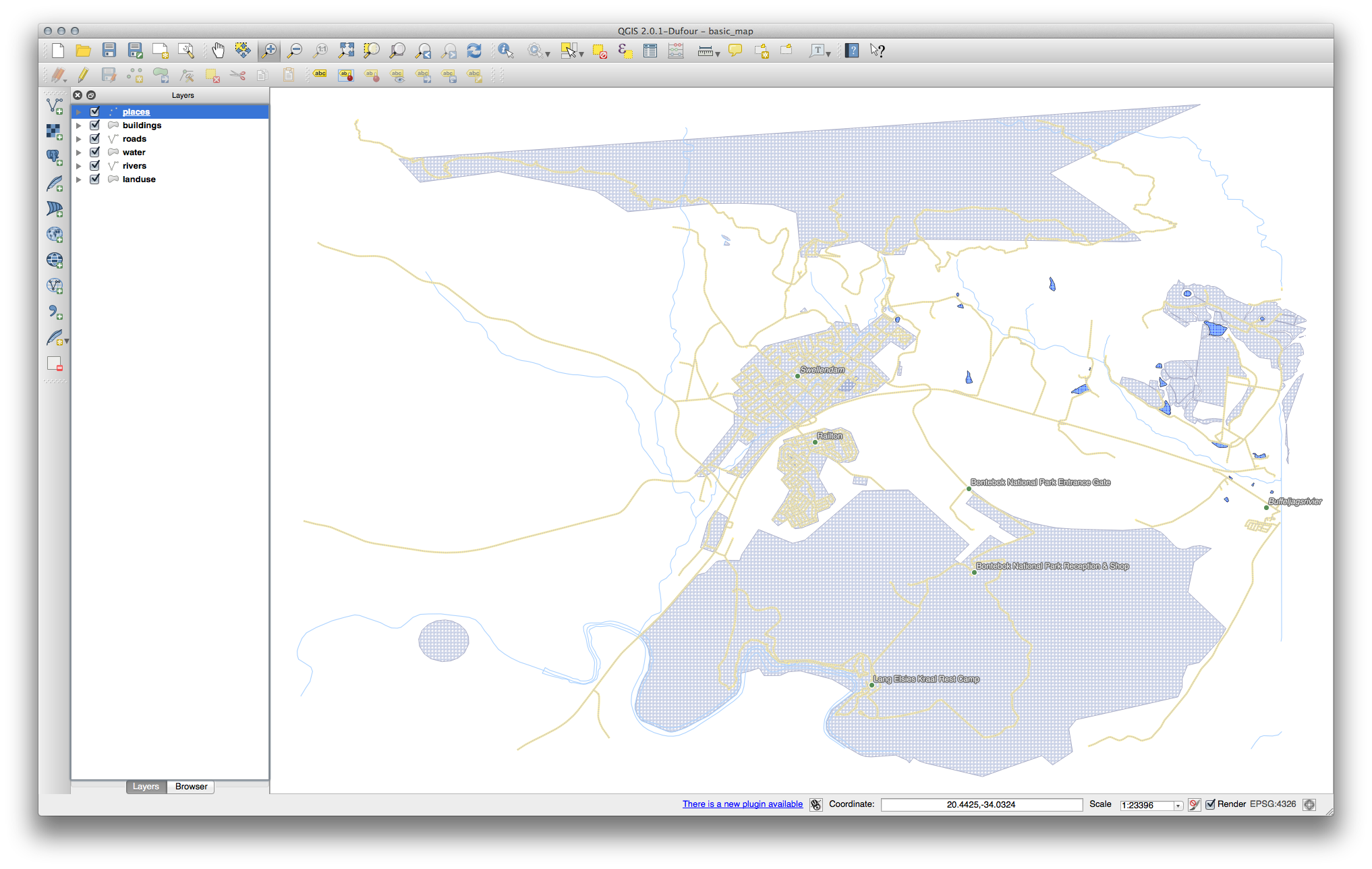
- Reactivate labeling for the Places layer.
- Open the attribute table for Places via the
 button.
It has one fields which is of interest to us now: place which defines the type of urban area for each object. We can use this data to influence the label styles.
- Navigate to the Text panel in the places Labels panel.
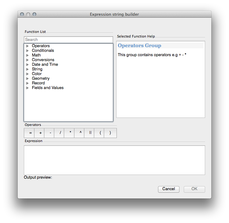
- In the Italic dropdown, select Edit... to open the Expression string builder:
In the text input, type: "place" = 'town' and click Ok twice:
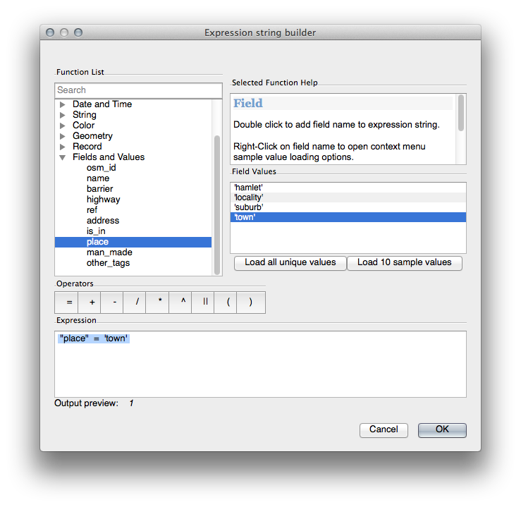
Notice its effects:
4.2.7. Try Yourself Using Data Defined Settings
Note
We’re jumping ahead a bit here to demonstrate some advanced labeling settings. At the advanced level, it’s assumed that you’ll know what the following means. If you don’t, feel free to leave out this section and come back later when you’ve covered the requisite materials.
- Open the Attribute Table for places.
- Enter edit mode by clicking this button:

- Add a new column:

- Configure it like this:
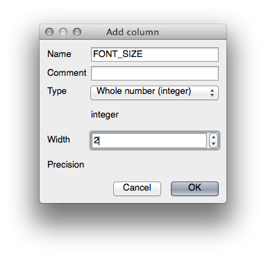
- Use this to set custom font sizes for each different type of place (i.e., each key in the PLACE field).
4.2.8. Further Possibilities With Labeling
We can’t cover every option in this course, but be aware that the Label tool has many other useful functions. You can set scale-based rendering, alter the rendering priority for labels in a layer, and set every label option using layer attributes. You can even set the rotation, XY position, and other properties of a label (if you have attribute fields allocated for the purpose), then edit these properties using the tools adjacent to the main Label tool:


(These tools will be active if the required attribute fields exist and you are in edit mode.)
Feel free to explore more possibilities of the labeling system.
4.2.9. In Conclusion
You’ve learned how to use layer attributes to create dynamic labels. This can make your map a lot more informative and stylish!
4.2.10. What’s Next?
Now that you know how attributes can make a visual difference for your map, how about using them to change the symbology of objects themselves? That’s the topic for the next lesson!