4.3. Lesson: Classification
Labels are a good way to communicate information such as the names of individual places, but they can’t be used for everything. For example, let’s say that someone wants to know what each landuse area is used for. Using labels, you’d get this:
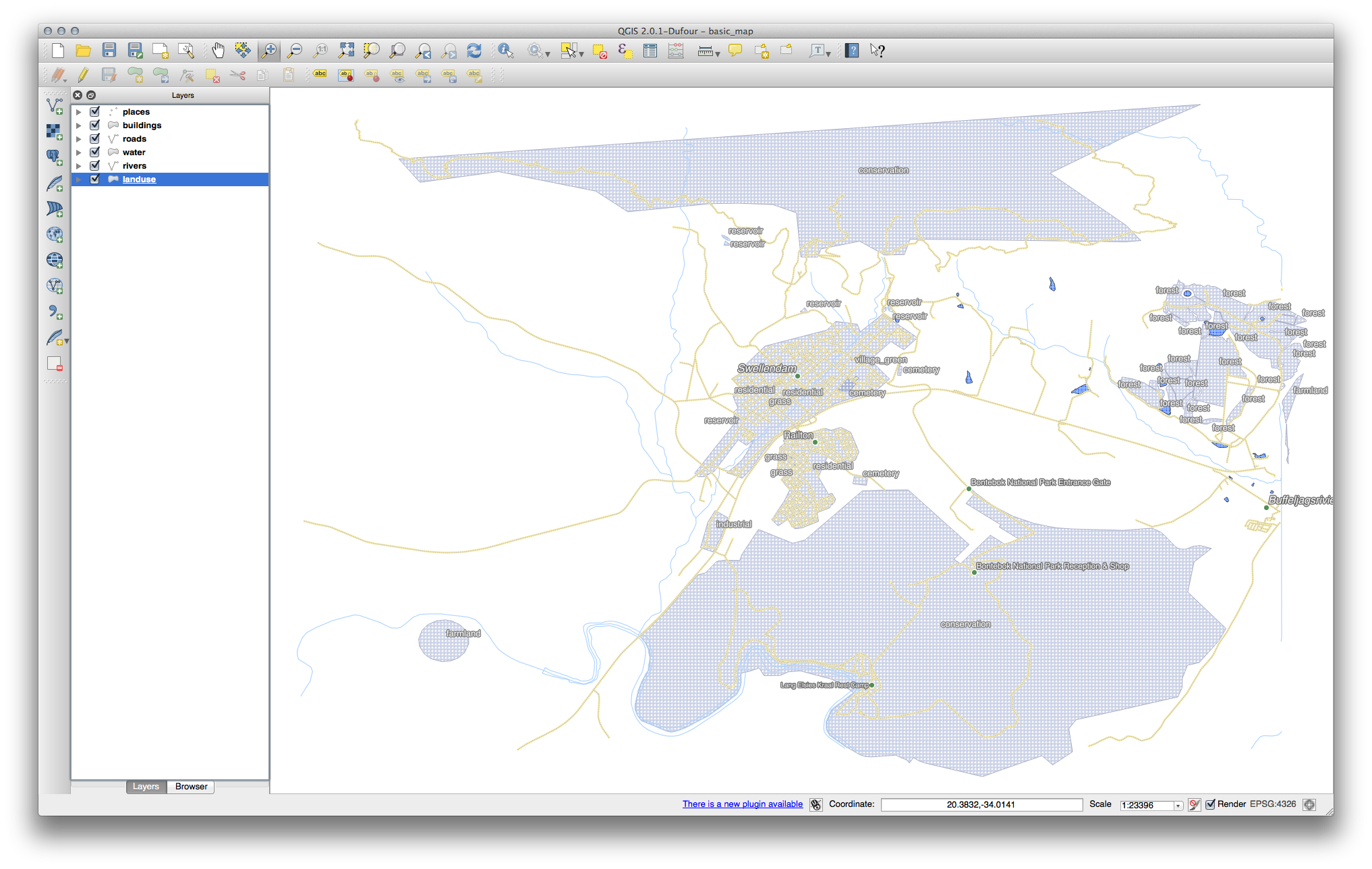
This makes the map’s labeling difficult to read and even overwhelming if there are numerous different landuse areas on the map.
The goal for this lesson: To learn how to classify vector data effectively.
4.3.1.  Follow Along: Classifying Nominal Data
- Open the Layer Properties dialog for the landuse layer.
- Go to the Style tab.
- Click on the dropdown that says Single Symbol and change it to Categorized:
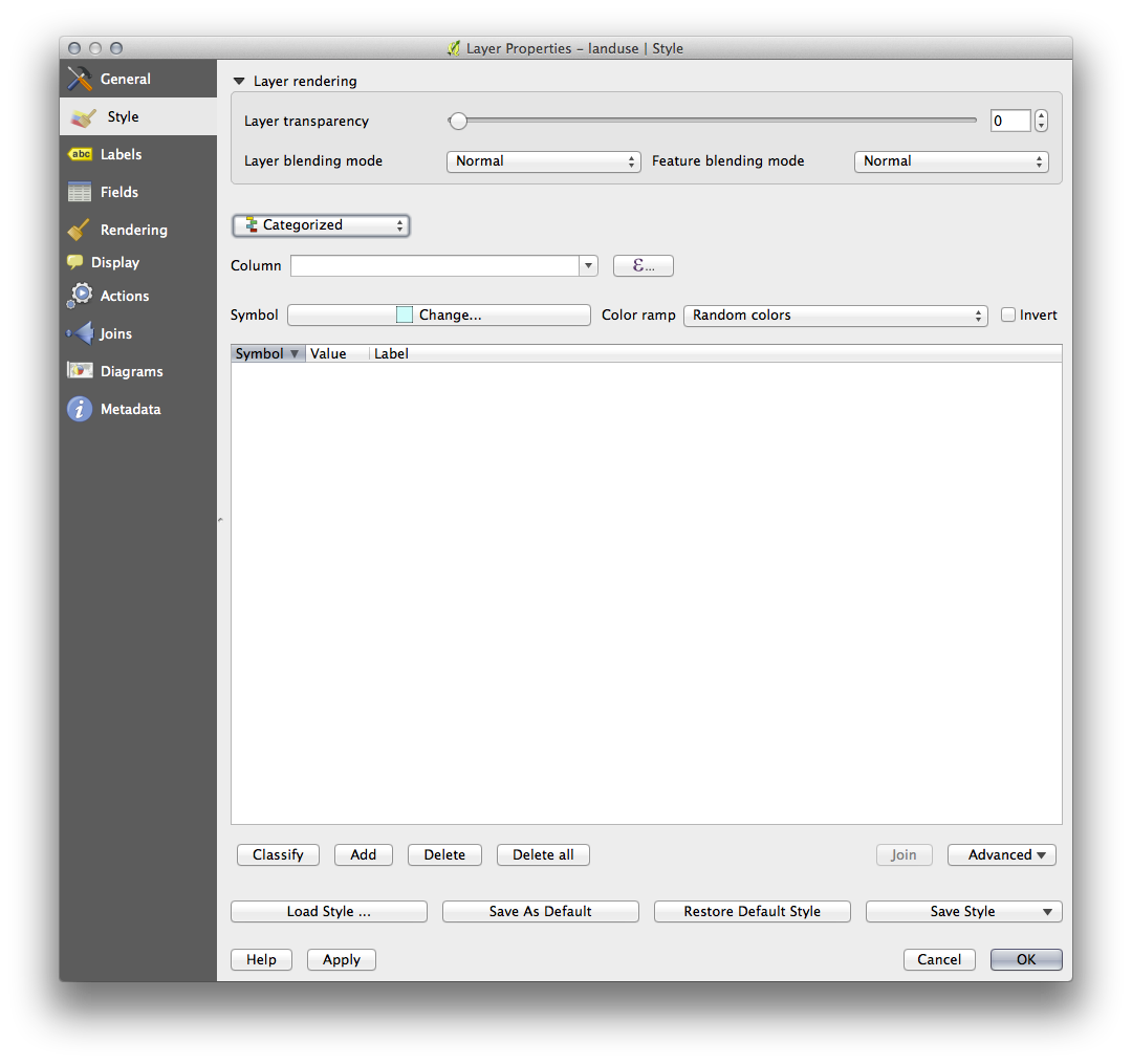
- In the new panel, change the Column to landuse and the Color ramp to Greens.
- Click the button labeled Classify:
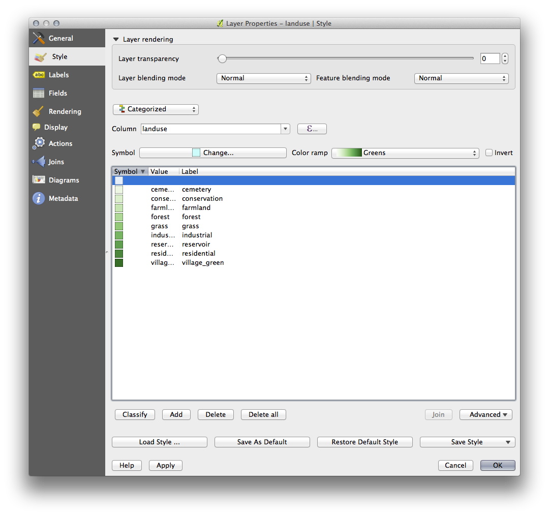
- Click OK.
You’ll see something like this:
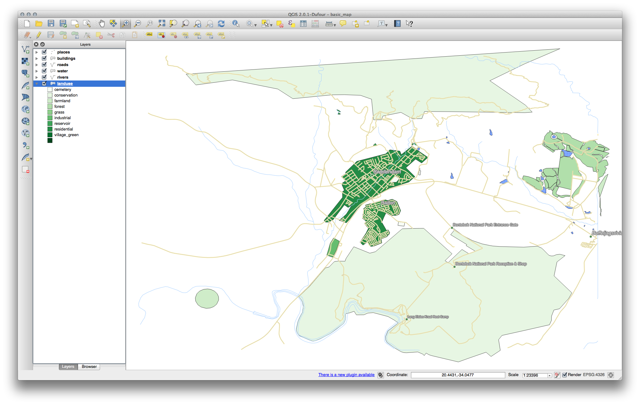
- Click the arrow (or plus sign) next to landuse in the Layer list, you’ll see the categories explained:
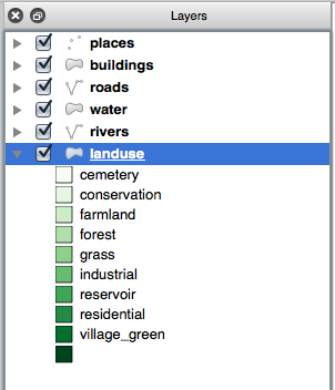
Now our landuse polygons are appropriately colored and are classified so that areas with the same land use are the same color. You may wish to remove the black border from the landuse layer:
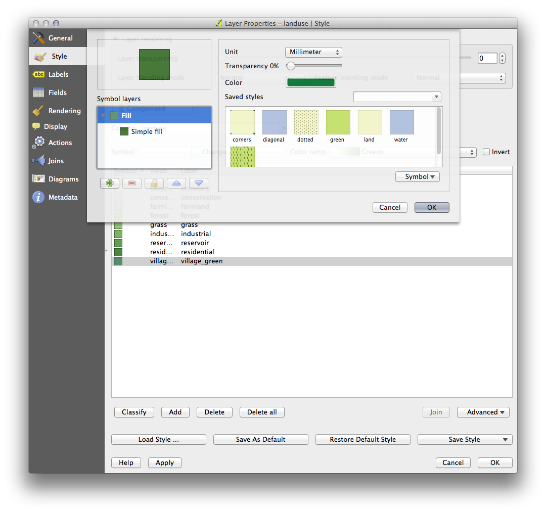
- Open Layer Properties, go to the Style tab and select Symbol.
- Change the symbol by removing the border from the Simple Fill layer and click OK.
You’ll see that the landuse polygon outlines have been removed, leaving just our new fill colours for each categorisation.
- If you wish to, you can change the fill color for each landuse area by double-clicking the relevant color block:
Notice that there is one category that’s empty:

This empty category is used to color any objects which do not have a landuse value defined or which have a NULL value. It is important to keep this empty category so that areas with a NULL value are still represented on the map. You may like to change the color to more obviously represent a blank or NULL value.
Remember to save your map now so that you don’t lose all your hard-earned changes!
4.3.2. Try Yourself More Classification
If you’re only following the basic-level content, use the knowledge you gained above to classify the buildings layer. Set the categorisation against the building column and use the Spectral color ramp.
Note
Remember to zoom into an urban area to see the results.
4.3.3.  Follow Along: Ratio Classification
There are four types of classification: nominal, ordinal, interval and ratio.
In nominal classification, the categories that objects are classified into are name-based; they have no order. For example: town names, district codes, etc.
In ordinal classification, the categories are arranged in a certain order. For example, world cities are given a rank depending on their importance for world trade, travel, culture, etc.
In interval classification, the numbers are on a scale with positive, negative and zero values. For example: height above/below sea level, temperature above/below freezing (0 degrees Celsius), etc.
In ratio classification, the numbers are on a scale with only positive and zero values. For example: temperature above absolute zero (0 degrees Kelvin), distance from a point, the average amount of traffic on a given street per month, etc.
In the example above, we used nominal classification to assign each farm to the town that it is administered by. Now we will use ratio classification to classify the farms by area.
- Save your landuse symbology (if you want to keep it) by clicking on the Save Style ... button in the Style dialog.
We’re going to reclassify the layer, so existing classes will be lost if not saved.
- Close the Style dialog.
- Open the Attributes Table for the landuse layer.
We want to classify the landuse areas by size, but there’s a problem: they don’t have a size field, so we’ll have to make one.
- Enter edit mode by clicking this button:

- Add a new column with this button:

- Set up the dialog that appears, like this:
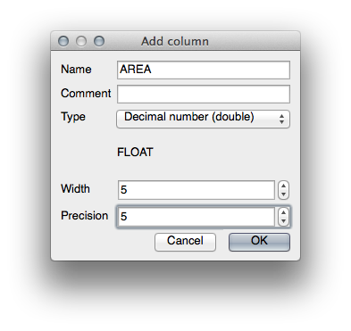
- Click OK.
The new field will be added (at the far right of the table; you may need to scroll horizontally to see it). However, at the moment it is not populated, it just has a lot of NULL values.
To solve this problem, we’ll need to calculate the areas.
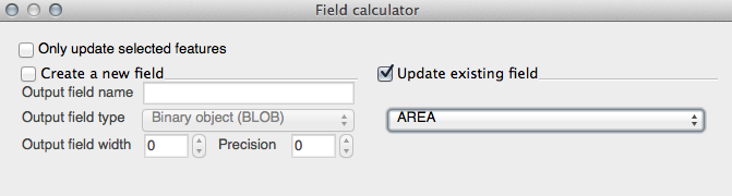
- Open the field calculator:

You’ll get this dialog:
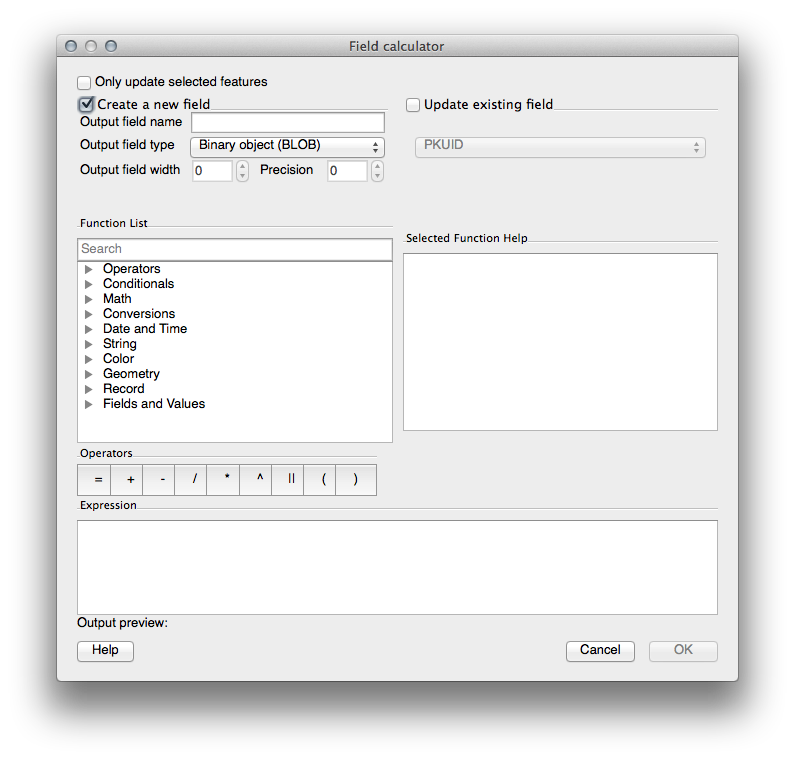
- Change the values at the top of the dialog to look like this:
- In the Function List, select Geometry ‣ $area:
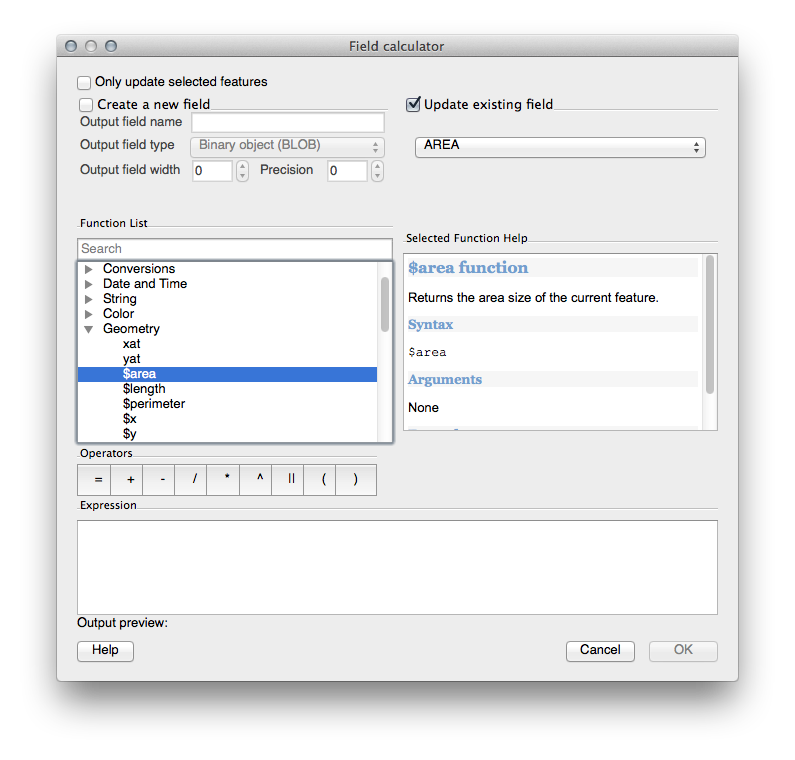
- Double-click on it so that it appears in the Expression field.
- Click OK.
Now your AREA field is populated with values (you may need to click the column header to refresh the data). Save the edits and click Ok.
Note
These areas are in degrees. Later, we will compute them in square meters.
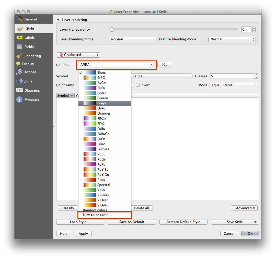
- Open the Layer properties dialog’s Style tab.
- Change the classification style from Categorized to Graduated.
- Change the Column to AREA:
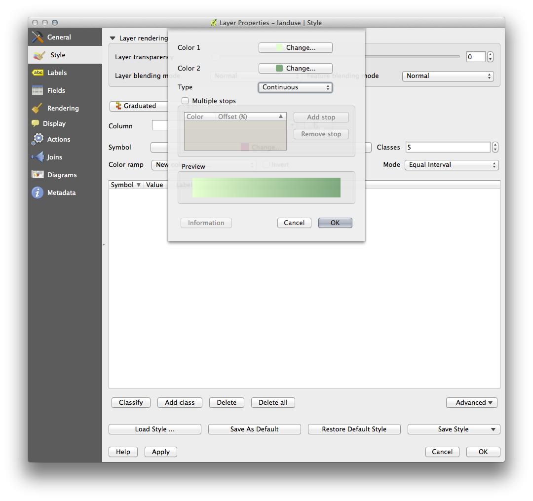
- Under Color ramp, choose the option New color ramp... to get this dialog:
- Choose Gradient (if it’s not selected already) and click OK. You’ll see this:
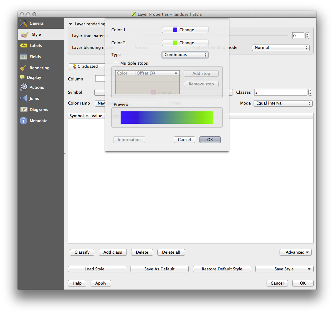
You’ll be using this to denote area, with small areas as Color 1 and large areas as Color 2.
- Choose appropriate colors.
In the example, the result looks like this:
- Click OK.
- Choose a suitable name for the new color ramp.
- Click OK after filling in the name.
Now you’ll have something like this:
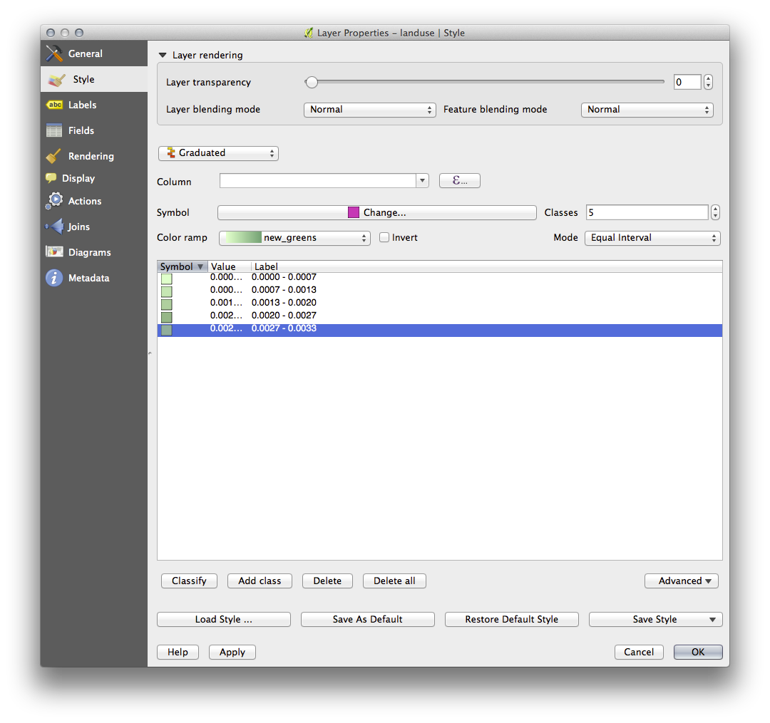
Leave everything else as-is.
- Click Ok:
4.3.4. Try Yourself Refine the Classification
- Get rid of the lines between the classes.
- Change the values of Mode and Classes until you get a classification that makes sense.
4.3.5.  Follow Along: Rule-based Classification
It’s often useful to combine multiple criteria for a classification, but unfortunately normal classification only takes one attribute into account. That’s where rule-based classification comes in handy.
- Open the Layer Properties dialog for the landuse layer.
- Switch to the Style tab.
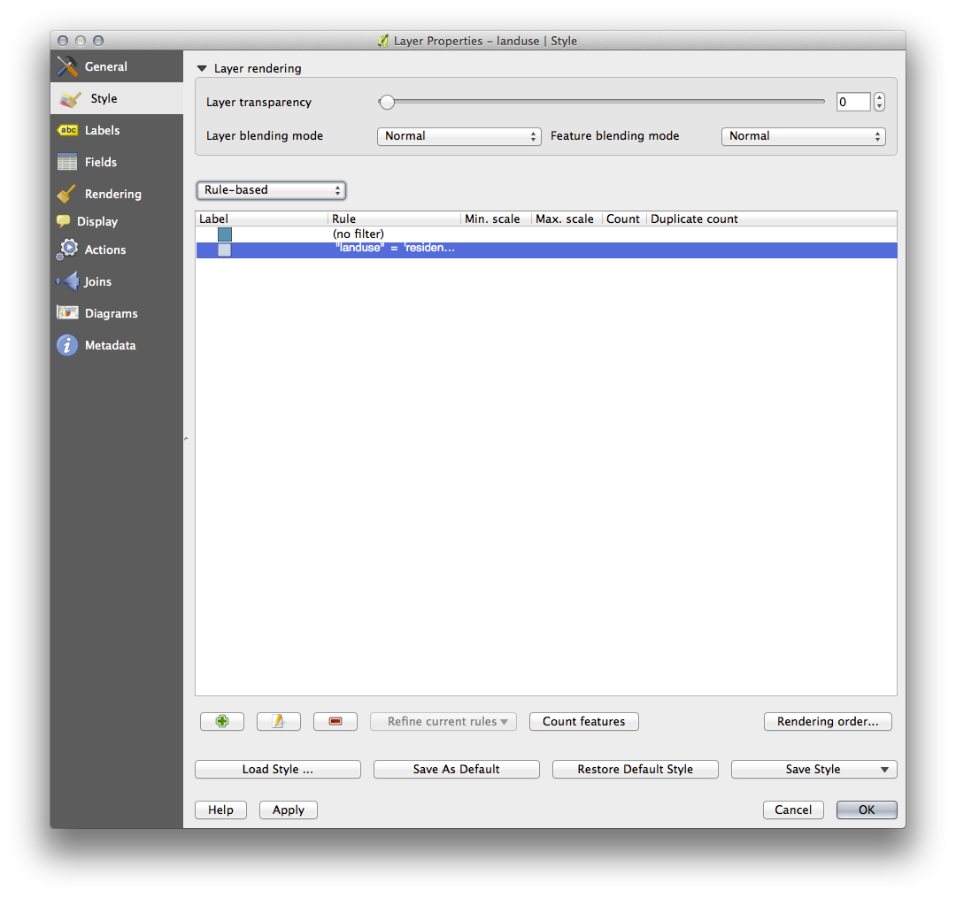
- Switch the classification style to Rule-based. You’ll get this:
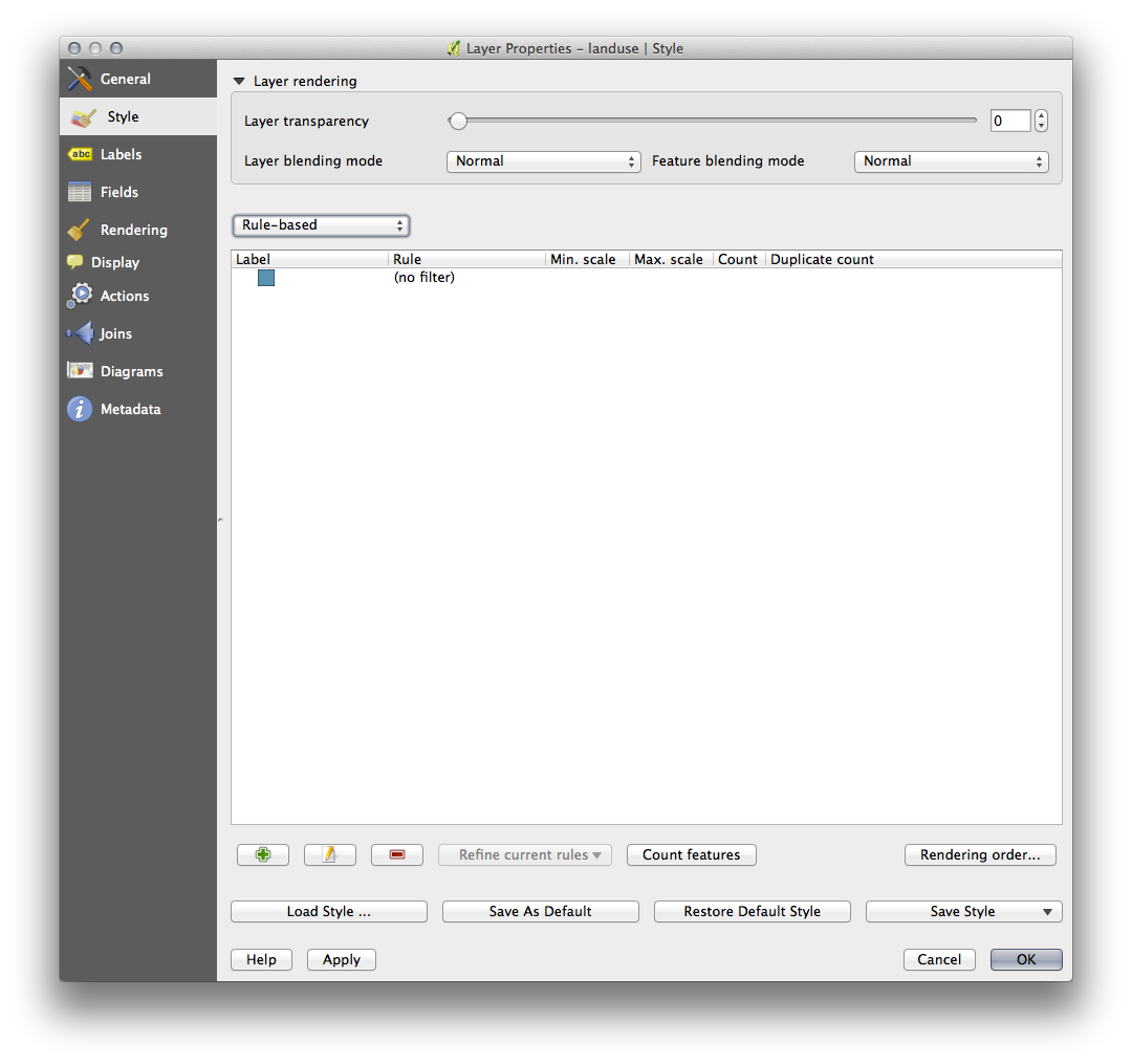
- Click the Add rule button:
 .
. - A new dialog then appears.
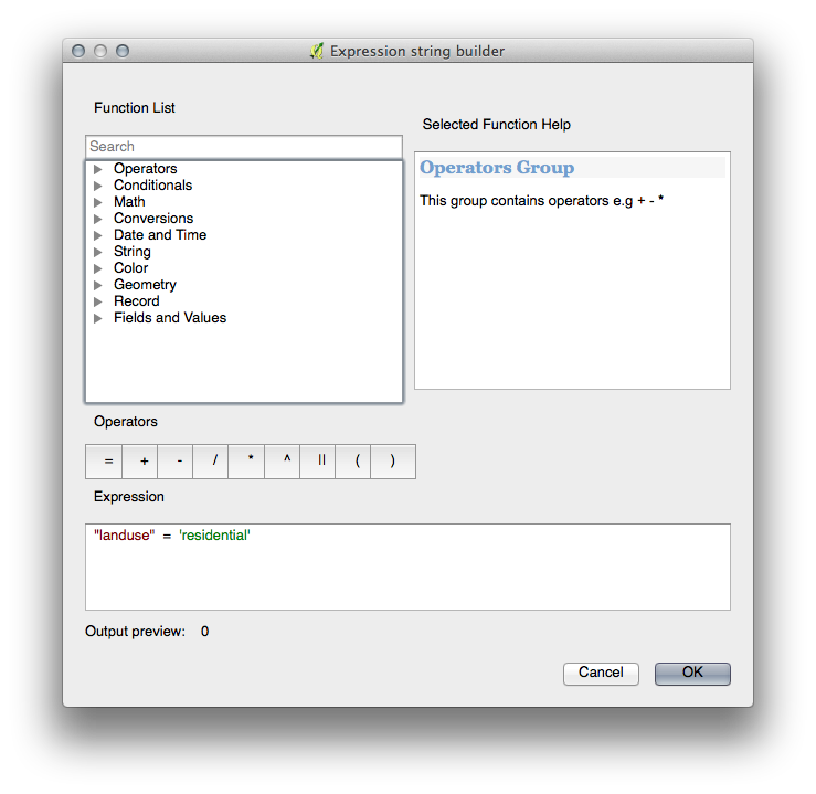
- Click the ellipsis ... button next to the Filter text area.
- Using the query builder that appears, enter the criterion "landuse" = 'residential' AND "name" != ' |majorUrbanName| ' , click Ok and choose a pale blue-grey for it and remove the border:
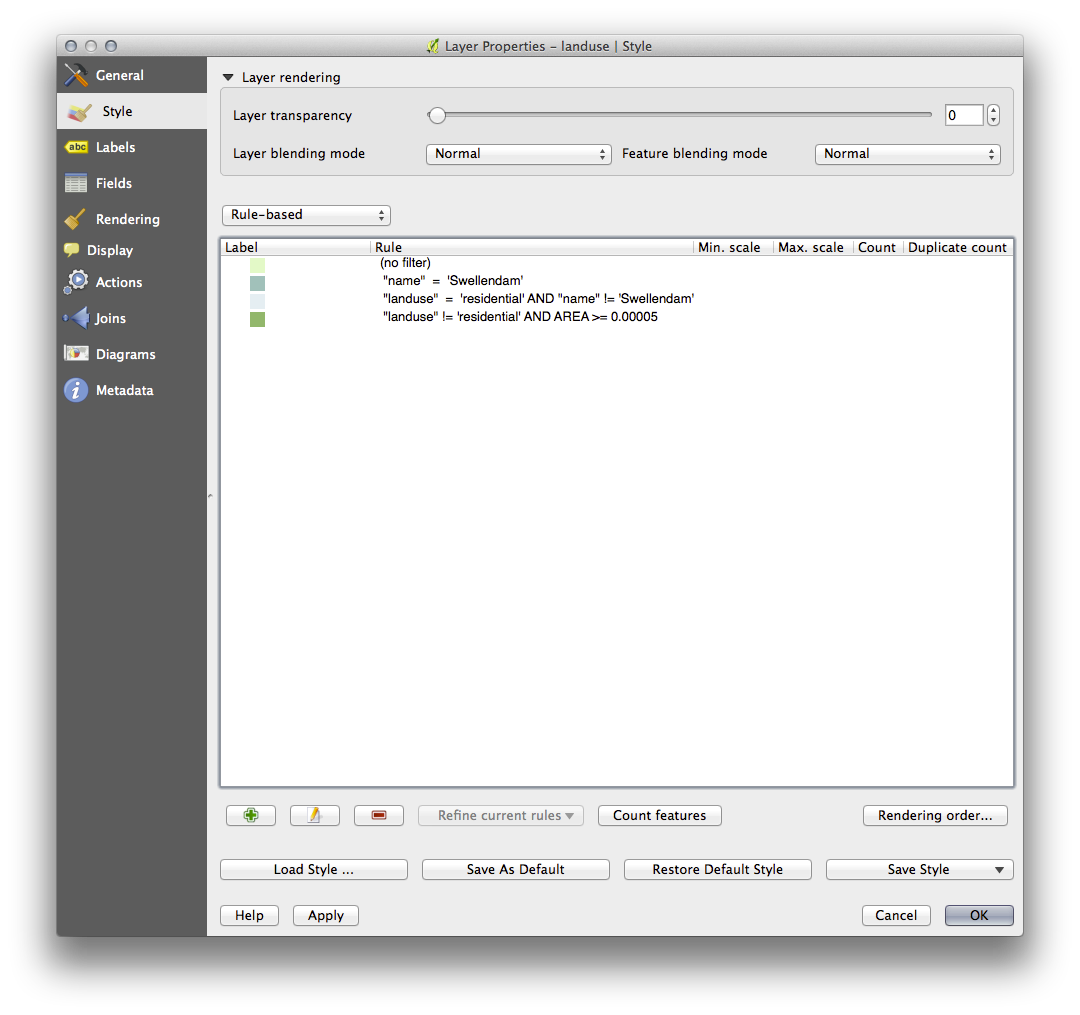
- Add a new criterion "landuse" != 'residential' AND "AREA" >= 0.00005 and choose a mid-green color.
- Add another new criterion "name" = ' |majorUrbanName| ' and assign it a darker grey-blue color in order to indicate the town’s importance in the region.
- Click and drag this criterion to the top of the list.
These filters are exclusive, in that they collectively exclude some areas on the map (i.e. those which are smaller that 0.00005, are not residential and are not ‘Swellendam‘). This means that the excluded polygons take the style of the default (no filter) category.
We know that the excluded polygons on our map cannot be residential areas, so give the default category a suitable pale green color.
Your dialog should now look like this:
- Apply this symbology.
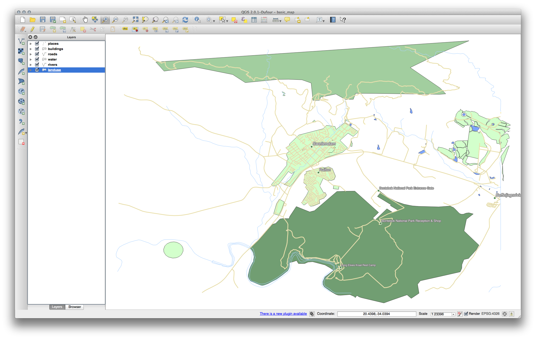
Your map will look something like this:
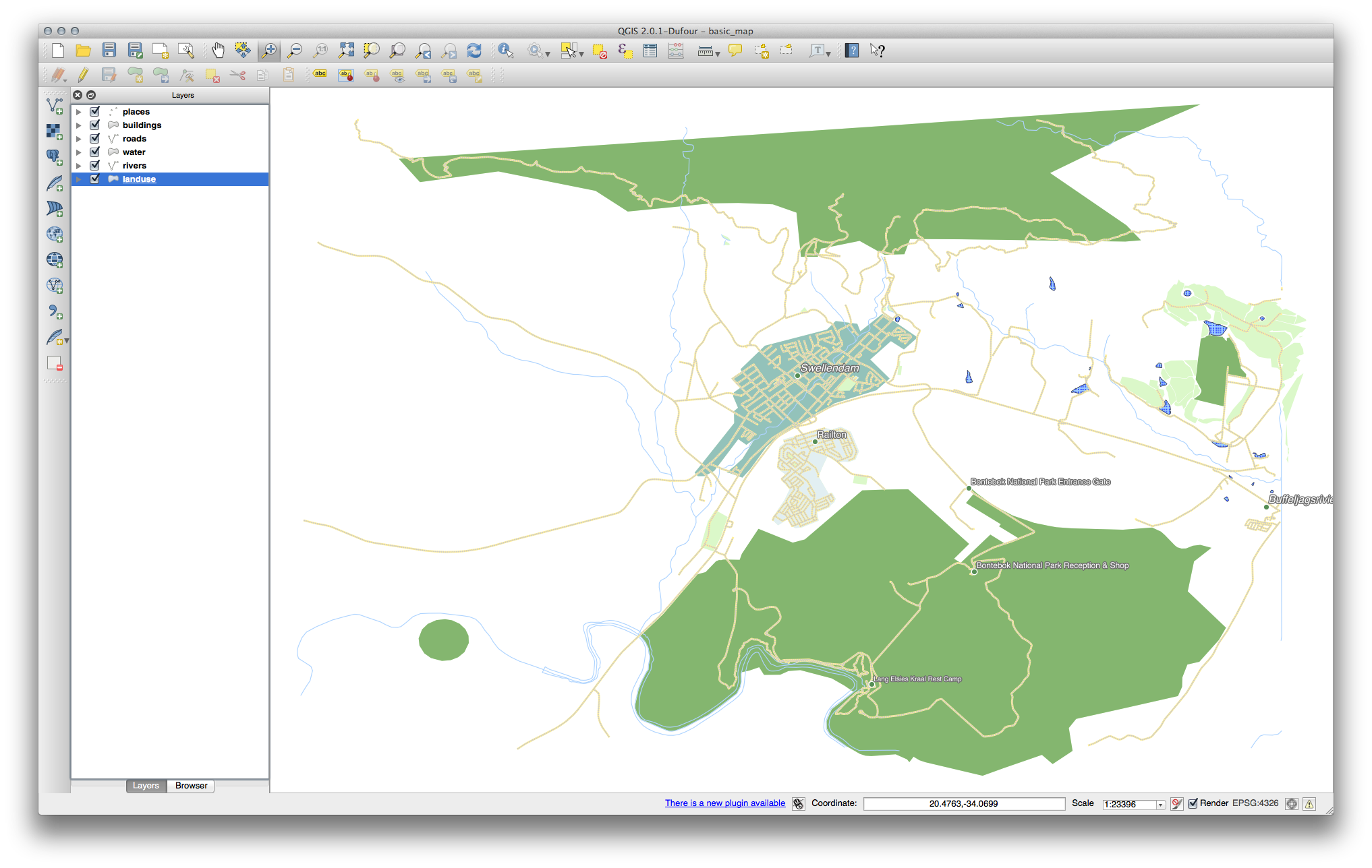
Now you have a map with Swellendam the most prominent residential area and other non-residential areas colored according to their size.
4.3.6. In Conclusion
Symbology allows us to represent the attributes of a layer in an easy-to-read way. It allows us as well as the map reader to understand the significance of features, using any relevant attributes that we choose. Depending on the problems you face, you’ll apply different classification techniques to solve them.
4.3.7. What’s Next?
Now we have a nice-looking map, but how are we going to get it out of QGIS and into a format we can print out, or make into an image or PDF? That’s the topic of the next lesson!