9. Memproduksi Peta
|
Tujuan: |
Mengetahui produksi peta untuk data spasial |
Kata kunci: |
Memproduksi peta, tata letak peta, skala garis, orientasi arah Utara, legenda, badan peta, satuan peta |

9.1. Tinjauan
Map production is the process of arranging map elements on a sheet of paper in a way that, even without many words, the average person can understand what it is all about. Maps are usually produced for presentations and reports where the audience or reader is a politician, citizen or a learner with no professional background in GIS. Because of this, a map has to be effective in communicating spatial information. Common elements of a map are the title, map body, legend, north arrow, scale bar, acknowledgement, and map border (see Gambar. 9.32).
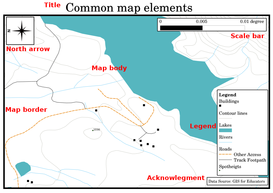
Gambar. 9.32 Elemen-elemen peta yang umum (label warna merah) antara lain judul, muka peta, legenda, arah utara, skala batang, keterangan dan batas peta.
Elemen lain yang dapat dimasukkan seperti "graticule" atau nama dari proyeksi petanya (CRS). Secara bersamaan, elemen membantu pembaca peta untuk mengintepretasi informasi yang terdapat dalam peta. Badan peta sudah pasti meliputi bagian paling penting dari peta itu sendiri karena memuat informasi peta. Elemen lain yang mendukung proses komunikasi dan membantu pembaca peta untuk mengarahkan dan memahami topik dalam peta. Misalnya, judul mendeskripsikan subyek dan legenda terkait dengan simbol - simbol yang terdapat dalam peta.
9.2. Detil Judul
Judul peta sangat penting karena pada umumnya merupakan hal yang pertama dilihat oleh pembaca peta. Judul dapat dibandingkan dengan judul dalam surat kabar. Sebaiknya, judul dibuat pendek namun dapat memuat ide dari informasi peta itu sendiri.
9.3. Detil Batas Peta
The map border is a line that defines exactly the edges of the area shown on the map. When printing a map with a graticule (which we describe further down), you often find the coordinate information of the graticule lines along the border lines, as you can see in Gambar. 9.33.
9.4. Detil Legenda Peta
A map is a simplified representation of the real world and map symbols are used to represent real objects. Without symbols, we wouldn't understand maps. To ensure that a person can correctly read a map, a map legend is used to provide a key to all the symbols used on the map. It is like a dictionary that allows you to understand the meaning of what the map shows. A map legend is usually shown a a little box in a corner of the map. It contains icons, each of which will represent a type of feature. For example, a house icon will show you how to identify houses on the map (see Gambar. 9.33).
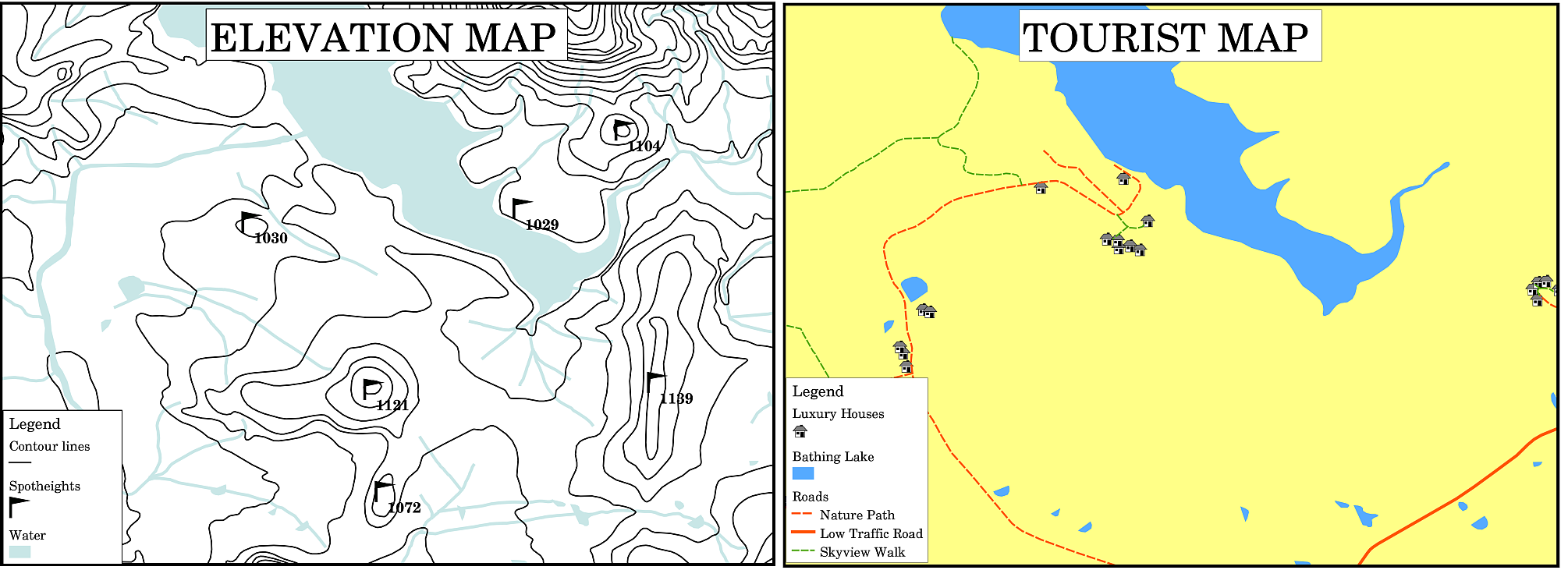
Gambar. 9.33 Dua peta dari area yang sama, keduanya memiliki feature air dengan latar belakang namun dengan tema yang berbeda, simbol peta dan warna pada legenda.
You can also use different symbols and icons in your legend to show different themes. In Gambar. 9.33 you can see a map with a lake in light blue overlaid with contour lines and spot heights to show information about the terrain in that area. On the right side you see the same area with the lake in the background but this map is designed to show tourists the location of houses they can rent for their holidays. It uses brighter colours, a house icon and more descriptive and inviting words in the legend.
9.5. Detil Arah Utara
Sebuah arah utara (sesuatu yang juga dapat disebut dengan kompas) adalah gambar yang memberikan informasi arah, "Utara", "Selatan", "Timur", dan "Barat". Dalam sebuah peta, arah tersebut digunakan untuk mengetahui arah Utara.
Sebagai contoh, dalam SIG berarti bahwa rumah yang berada di utara dari sebuah danau dapat ditemukan di atas danau tersebut di dalam peta. Jalan yang berada di timur akan ditunjukkan berada di sebelah kanan perairan dalam peta, sungai di selatan akan berada di bawah perairan, dan jika Anda mencari stasiun kereta yang berada di barat, Anda dapat menemukan di sebalh kiri peta.
9.6. Detil Skala
The scale of a map, is the value of a single unit of distance on the map, representing distance in the real world. The values are shown in map units (meters, feet or degrees). The scale can be expressed in several ways, for example, in words, as a ratio or as a graphical scale bar (see Gambar. 9.34).
Expressing a scale in words is a commonly used method and has the advantage of being easily understood by most map users. You can see an example of a word based scale in a Gambar. 9.34 (a). Another option is the representative fraction (RF) method, where both the map distance and the ground distance in the real world are given in the same map units, as a ratio. For example, a RF value 1:25,000 means that any distance on the map is 1/25,000 th of the real distance on the ground (see Gambar. 9.34 (b)). The value 25,000 in the ratio is called the scale denominator. More experienced users often prefer the representative fraction method, because it reduces confusion.
Ketika suatu fraksi menunjukkan rasio yang sangat kecil, misalnya 1:1000.000, hal tersebut yang disebut dengan "skala peta kecil". Sebaliknya, peta dengan skala 1:50.000 dikatakan peta dengan skala besar. Mudah untuk diingat bahwa skala kecil memual cakupan area yang luas, dan skala peta besar mencakup area yang kecil.
A scale expression as a graphic or bar scale is another basic method of expressing a scale. A bar scale shows measured distances on the map. The equivalent distance in the real world is placed above as you can see in Gambar. 9.34 (c).
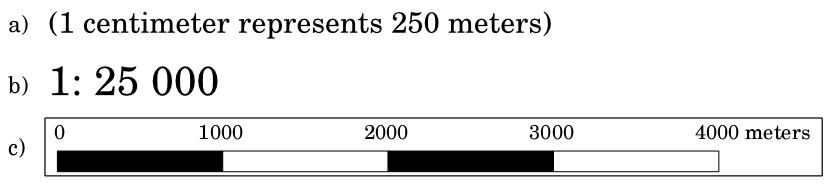
Gambar. 9.34 Sebuah skala dapat disajikan dalam bentuk kata - kata (a), rasio (b), atau grafik atau bar (c).
Peta biasanya memproduksi skala standar misalnya, 1:10.000, 1:25.000, 1:50.000, 1:100,000, 1:250.000, 1:500.000. Apa artinya hal tersebut untuk pembaca? Hal ini berarti jika anda mengalikan jarak yang terukur pada peta dengan bilangan penyebut skala, Anda akan mengetahui jarak di lapangan.
Misalnya, jika kita ingin mengukur jarak dari 100mm pada peta dengan skala 1:25.000, kita menghitung jarak di lapangan seperti ini:
100 mm x 25,000 = 2,500,000 mm
This means that 100 mm on the map is equivalent to 2,500,000 mm (2500 m) in the real word.
Another interesting aspect of a map scale, is that the lower the map scale, the more detailed the feature information in the map will be. In Gambar. 9.35, you can see an example of this. Both maps are the same size but have a different scale. The image on the left side shows more details, for example the houses south-west of the water body can be clearly identified as separate squares. In the image on the right you can only see a black clump of rectangles and you are not able to see each house clearly.
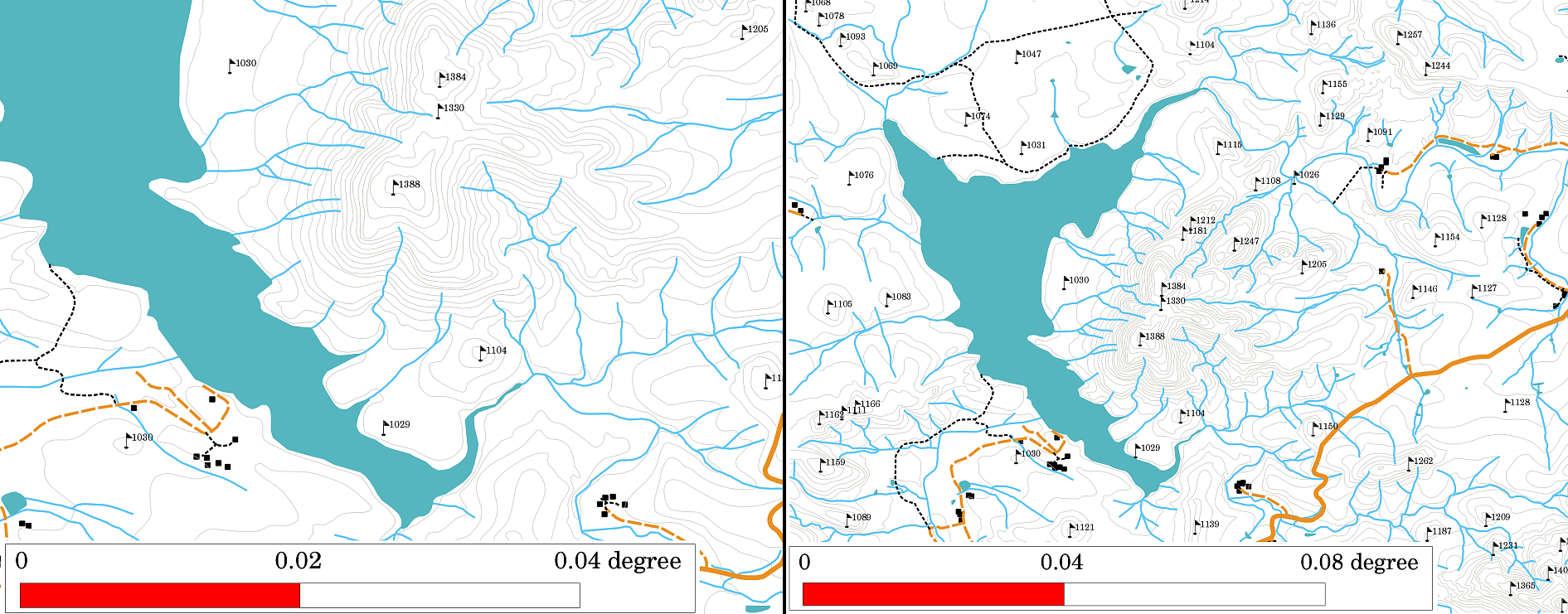
Gambar. 9.35 Peta yang menunjukkan area dengan dua skala yang berbeda. Skala peta di sebelah kiri adalah 1:25.000. Skala peta sebelah kanan adalah 1:50.000.
9.7. Detil Acknowledgement
Dalam area acknowledgement peta memungkinkan dimasukkan teks dengan informasi penting. Misalnya, informasi terkait dengan kualitas data yang digunakan dapat memudahkan pembaca mendapatkan ide tentang detilnya seperti bagaimana, oleh siapa, dan kapan peta dibuat. Jika Anda melihat peta topografi kota Anda, akan sangat penting mengetahui kapan peta dibuat dan oleh siapa. Jika peta sudah berumur 50 tahun, Anda mungkin menemukan banyak rumah dan jalan yang sudah tidak ada lagi atau mungkin tidak pernah ada. Jika Anda tahu bahwa peta dibuat oleh institusi resmi, Anda dapat menghubungi mereka dan meminta mereka memberikan versi terbarunya dengan informasi paling baru.
9.8. Detil Grid
A graticule is a network of lines overlain on a map to make spatial orientation easier for the reader. The lines can be used as a reference. As an example, the lines of a graticule can represent the earth's parallels of latitude and meridians of longitude. When you want to refer to a special area on a map during your presentation or in a report you could say: 'the houses close to latitude 26.04 / longitude -32.11 are often exposed to flooding during January and February' (see Gambar. 9.36).
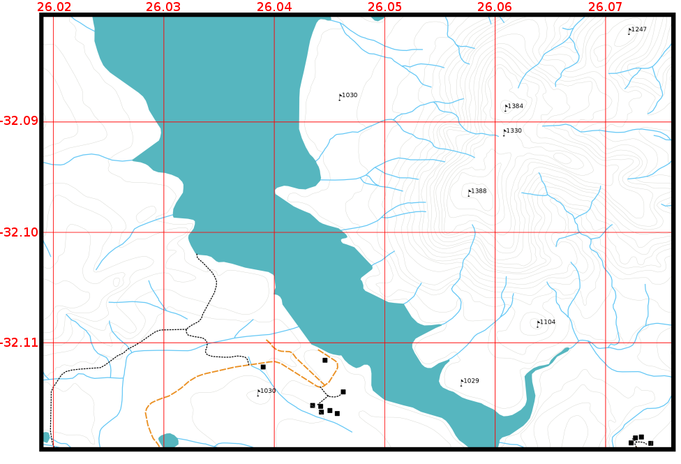
Gambar. 9.36 Graticules (red lines) representing the Earth’s parallels of latitude and meridians of longitude. The latitude and longitude values on the map border can be used for better orientation on the map.
9.9. Name of the map projection in detail
A map projection tries to represent the 3-dimensional Earth with all its features like houses, roads or lakes on a flat sheet of paper. This is very difficult as you can imagine, and even after hundreds of years there is no single projection that is able to represent the Earth perfectly for any area in the world. Every projection has advantages and disadvantages.
To be able to create maps as precisely as possible, people have studied, modified, and produced many different kinds of projections. In the end almost every country has developed its own map projection with the goal of improving the map accuracy for their territorial area (see Gambar. 9.37).
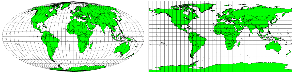
Gambar. 9.37 The world in different projections. A Mollweide Equal Area projection left, a Plate Carree Equidistant Cylindrical projection on the right.
With this in mind, we can now understand why it makes sense to add the name of the projection on a map. It allows the reader to see quickly, if one map can be compared with another. For example, features on a map in a so-called Equal Area projection appear very different to features projected in a Cylindrical Equidistant projection (see Gambar. 9.37).
Map projection is a very complex topic and we cannot cover it completely here. You may want to take a look at our previous topic: Coordinate Reference Systems if you want to know more about it.
9.10. Common problems / things to be aware of
It is sometimes difficult to create a map that is easy to understand and well laid out whilst still showing and explaining all the information that the reader needs to know. To achieve this, you need to create an ideal arrangement and composition of all the map elements. You should concentrate on what story you want to tell with your map and how the elements, such as the legend, scale bar and acknowledgements should be ordered. By doing this, you will have a well designed and educational map, that people would like to look at and be able to understand.
9.11. What have we learned?
Let's wrap up what we covered in this worksheet:
Map production means arranging map elements on a sheet of paper.
Map elements are the title, map body, map border, legend, scale, north arrow and the acknowledgement.
Scale represents the ratio of a distance on the map to the actual distance in the real world.
Scale is displayed in map units (meters, feet or degrees)
A legend explains all the symbols on a map.
A map should explain complex information as simply as possible.
Maps are usually always displayed 'North up'.
9.12. Now you try!
Here are some ideas for you to try with your learners:
Load some vector layers in your GIS for your local area. See if your learners can identify examples of different types of legend elements such as road types or buildings. Create a list of legend elements and define what the icons should look like, so a reader can most easily figure out their meaning in the map.
Create a map layout with your learners on a sheet of paper. Decide on the title of the map, what GIS layers you want to show and what colors and icons to have on the map. Use the techniques you learned in Topics Data Vektor and Vector Attribute Data to adjust the symbology accordingly. When you have a template, open the QGIS print layout and try to arrange a map layout as planned.
9.13. Something to think about
If you don't have a computer available, you can use any topographical map and discuss the map design with your learners. Figure out if they understand what the map wants to tell. What can be improved? How accurately does the map represent the history of the area? How would a map from 100 years ago differ from the same map today?
9.14. Further reading
Books:
Chang, Kang-Tsung (2006). Introduction to Geographic Information Systems. 3rd Edition. McGraw Hill. ISBN: 0070658986
DeMers, Michael N. (2005). Fundamentals of Geographic Information Systems. 3rd Edition. Wiley. ISBN: 9814126195
Website: Scale (map)
The QGIS User Guide also has more detailed information on map production provided in QGIS.
9.15. What's next?
In the section that follows we will take a closer look at vector analysis to see how we can use a GIS for more than just making good looking maps!