Outdated version of the documentation. Find the latest one here.

` `

축척 막대 항목

To add a scale bar, click the scaleBar Add new scalebar icon, place the element with the left mouse button on the Print Composer canvas and position and customize the appearance in the scale bar Item Properties panel.

The Item properties of a scale bar item tab provides the following functionalities (see figure_composer_scalebar):

../../../../_images/scalebar_properties.png

축척 막대 항목 속성 패널

주요 속성

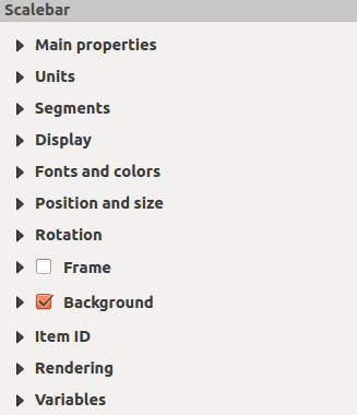
The Main properties dialog of the scale bar Item Properties panel provides the following functionalities (see figure_composer_scalebar_ppt):

../../../../_images/scalebar_mainproperties.png

Scale Bar Main properties Dialog

  • 먼저, 축척 막대를 첨부할 맵을 선택하십시오.

  • 그리고 축척 막대의 스타일을 선택하십시오. 다음 6종류 가운데 하나를 선택할 수 있습니다:

    • Single box and Double box styles, which contain one or two lines of boxes alternating colors.
    • Middle, Up or Down line ticks.
    • Numeric: 축척 비율을 인쇄 (예: 1:50000)

단위 및 분할

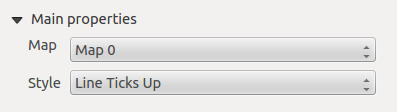
The Units and Segments dialogs of the scale bar Item Properties panel provide the following functionalities (see figure_composer_scalebar_units):

../../../../_images/scalebar_units.png

Scale Bar Units and Segments Dialogs

In these two dialogs, you can set how the scale bar will be represented.

  • Select the units you want to use with Scalebar units. There are four possible choices: Map Units, the default one and Meters, Feet or Nautical Miles which may force unit conversions.
  • The Label unit multiplier specifies how many scalebar units per labeled unit. Eg, if your scalebar units are set to “meters”, a multiplier of 1000 will result in the scale bar labels in “kilometers”.
  • The Label for units field defines the text used to describe the units of the scale bar, eg “m” or “km”. This should be matched to reflect the multiplier above.
  • Segments: 축척 막대의 좌측 및 우측에 얼마나 많은 분할을 놓을지 정의할 수 있습니다.

  • You can set how long each segment will be (fixed width), or limit the scale bar size in mm with Fit segment width option. In the latter case, each time the map scale changes, the scale bar is resized (and its label updated) to fit the range set.
  • Height: 축척 막대의 높이를 정의할 수 있습니다.

표시

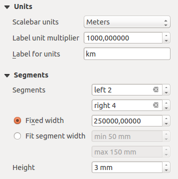
The Display dialog of the scale bar Item Properties panel provides the following functionalities (see figure_composer_scalebar_display):

../../../../_images/scalebar_display.png

Scale Bar Display

축척 프레임 안에서 축척 막대를 어떻게 표시할지 정의할 수 있습니다.

  • Box margin: 텍스트와 프레임 경계 사이의 여백을 설정합니다.

  • Labels margin : space between text and scale bar drawing
  • Line width: 축척 막대 렌더링의 라인 두께를 설정합니다.

  • Join style : Corners at the end of scalebar in style Bevel, Rounded or Square (only available for Scale bar style Single Box & Double Box)
  • Cap style: 모든 라인의 끝 스타일을 ‘Square’, ‘Round’ 또는 (Line Ticks Middle, Up, Down 전용) ‘Flat’ 가운데 하나로 선택합니다.

  • Alignment: 텍스트를 축척 프레임의 좌측, 중앙, 또는 우측으로 정렬합니다. (Numeric 전용입니다.)

폰트 및 색상

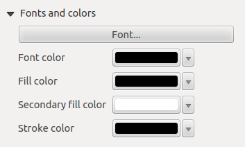
The Fonts and colors dialog of the scale bar Item Properties panel provides the following functionalities (see figure_composer_scalebar_fonts):

../../../../_images/scalebar_fonts.png

Scale Bar Fonts and colors Dialogs

You can define the fonts and colors used for the scale bar.

  • Use the [Font] button to set the font of scale bar label
  • Font color: 폰트 색상을 설정합니다.

  • Fill color: 첫 번째 채우기 색상을 설정합니다.

  • Secondary fill color: 두 번째 채우기 색상을 설정합니다.

  • Stroke color: set the color of the lines of the Scale Bar

Fill colors are only used for scale box styles Single Box and Double Box. To select a color you can use the list option using the dropdown arrow to open a simple color selection option or the more advanced color selection option, that is started when you click in the colored box in the dialog.