` `
Fenêtre Propriétés de la couche raster
To view and set the properties for a raster layer, double click on the layer name in the map legend, or right click on the layer name and choose Properties from the context menu. This will open the Raster Layer Properties dialog (see figure_raster_properties).
Il y a plusieurs onglets dans cette fenêtre :
- General
- Style
- Transparency
- Pyramids
- Histogram
- Metadata
- Legend
Raster Layers Properties Dialog
Astuce
Mise à jour du rendu en direct
Le: ref: layer_styling_panel vous fournit certaines des caractéristiques communes de la boîte de dialogue des propriétés des calques et est un bon widget modélisé que vous pouvez utiliser pour accélérer la configuration des styles de calque et afficher automatiquement vos modifications dans le canevas de la carte.
Note
Because properties (symbology, label, actions, default values, forms...) of embedded layers (see Inclusion de projets) are pulled from the original project file and to avoid changes that may break this behavior, the layer properties dialog is made unavailable for these layers.
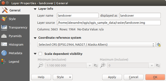
General Properties
Layer Info
The General tab displays basic information about the selected raster, including the layer source path, the display name in the legend (which can be modified), and the number of columns, rows and no-data values of the raster.
Coordinate Reference System
Displays the layer’s Coordinate Reference System (CRS) as a PROJ.4 string. You
can change the layer’s CRS, selecting a recently used one in the drop-down list
or clicking on  Select CRS button (see Sélectionneur de système de coordonnées de référence).
Use this process only if the CRS applied to the layer is a wrong one or if none
was applied. If you wish to reproject your data into another CRS, rather use
layer reprojection algorithms from Processing or Save it into another
layer.
Select CRS button (see Sélectionneur de système de coordonnées de référence).
Use this process only if the CRS applied to the layer is a wrong one or if none
was applied. If you wish to reproject your data into another CRS, rather use
layer reprojection algorithms from Processing or Save it into another
layer.
Scale dependent visibility
Vous pouvez définir une échelle Maximum (inclusive) et Minimum (exclusive), correspondant à une plage d’échelles pour lesquelles les couches sont visibles. En dehors de cette plage, elles sont cachées. Le bouton  Mettre à l’échelle actuelle du canevas permet d’utiliser l’échelle actuelle pour l’une ou l’autre des limites de la plage de visibilité. Voir Rendu dépendant de l’échelle pour plus d’informations.
Style Properties
Rendu des bandes raster
QGIS propose quatre Types de rendu. Le choix s’effectue en fonction du type de données.
- Multiband color - if the file comes as a multiband with several bands (e.g., used with a satellite image with several bands)
- Paletted - if a single band file comes with an indexed palette (e.g., used with a digital topographic map)
- Singleband gray - (one band of) the image will be rendered as gray; QGIS will choose this renderer if the file has neither multibands nor an indexed palette nor a continuous palette (e.g., used with a shaded relief map)
- Singleband pseudocolor - this renderer is possible for files with a continuous palette, or color map (e.g., used with an elevation map)
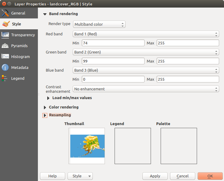
Multiband color
With the multiband color renderer, three selected bands from the image will be rendered, each band representing the red, green or blue component that will be used to create a color image. You can choose several Contrast enhancement methods: ‘No enhancement’, ‘Stretch to MinMax’, ‘Stretch and clip to MinMax’ and ‘Clip to min max’.
Raster Style - Multiband color rendering
This selection offers you a wide range of options to modify the appearance
of your raster layer. First of all, you have to get the data range from your
image. This can be done by choosing the Extent and pressing
[Load]. QGIS can  Estimate (faster) the
Min and Max values of the bands or use the
Estimate (faster) the
Min and Max values of the bands or use the
 Actual (slower) Accuracy.
Now you can scale the colors with the help of the Load min/max values
section. A lot of images have a few very low and high data. These outliers can be
eliminated using the Cumulative count cut setting.
The standard data range is set from 2% to 98% of the data values and can be adapted
manually. With this setting, the gray character of the image can disappear.
With the scaling option Min/max, QGIS creates a color
table with all of the data included in the original image (e.g., QGIS creates
a color table with 256 values, given the fact that you have 8 bit bands).
You can also calculate your color table using the Mean
+/- standard deviation x  .
Then, only the values within the standard deviation or within multiple standard deviations
are considered for the color table. This is useful when you have one or two cells
with abnormally high values in a raster grid that are having a negative impact on
the rendering of the raster.
.
Then, only the values within the standard deviation or within multiple standard deviations
are considered for the color table. This is useful when you have one or two cells
with abnormally high values in a raster grid that are having a negative impact on
the rendering of the raster.
All calculations can also be made for the Current extent.
Astuce
Visualiser une seule bande d’un raster multibande
If you want to view a single band of a multiband image (for example, Red), you might think you would set the Green and Blue bands to “Not Set”. But this is not the correct way. To display the Red band, set the image type to ‘Singleband gray’, then select Red as the band to use for Gray.
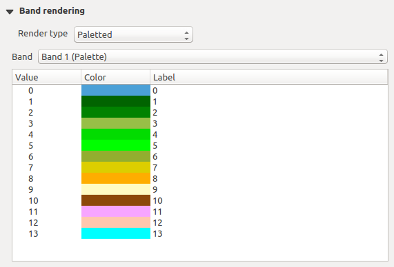
Paletted
C’est l’option standard pour les fichiers à une seule bande qui incluent déjà une table de couleurs, où à chaque valeur de pixel a été assignée une couleur. Dans ce cas, la palette est utilisée automatiquement. Si vous désirez modifier l’assignement des couleurs pour certaines valeurs, double cliquez simplement sur la couleur et la boîte de dialogue de Sélection de couleur apparaîtra. Il est possible d’assigner un label aux valeurs de couleur. L’étiquette apparaîtra alors dans la légende de la couche raster.
Raster Style - Paletted Rendering
Amélioration de contraste
Note
Lors de l’ajout d’une couche raster GRASS, l’option Amélioration de contraste sera automatiquement Étirer jusqu’au MinMax, quelles que soient les options générales de QGIS définies pour cette option.
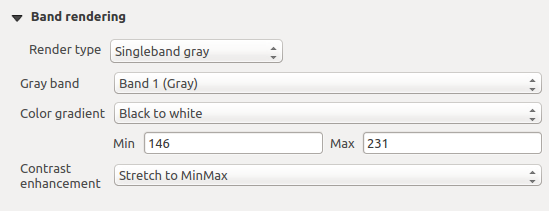
Singleband gray
This renderer allows you to render a single band layer with a Color gradient:
‘Black to white’ or ‘White to black’. You can define a Min
and a Max value by choosing the Extent first and
then pressing [Load]. QGIS can Estimate (faster)
the Min and Max values of the bands or use the
Actual (slower) Accuracy.
Raster Style - Singleband gray rendering
With the Load min/max values section, scaling of the color table
is possible. Outliers can be eliminated using the Cumulative
count cut setting.
The standard data range is set from 2% to 98% of the data values and can
be adapted manually. With this setting, the gray character of the image can disappear.
Further settings can be made with Min/max and
Mean +/- standard deviation x .
While the first one creates a color table with all of the data included in the
original image, the second creates a color table that only considers values
within the standard deviation or within multiple standard deviations.
This is useful when you have one or two cells with abnormally high values in
a raster grid that are having a negative impact on the rendering of the raster.
Singleband pseudocolor
C’est une option de rendu pour les fichiers à bande unique, incluant une palette de couleurs continues. Vous pouvez aussi créer des palettes de couleurs pour les fichiers à bande unique.
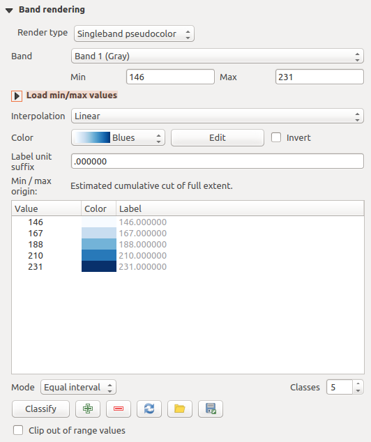
Raster Style - Singleband pseudocolor rendering
Three types of color interpolation are available:
- Discrete
Linéaire
- Exact
In the left block, the button  Add values manually adds a value
to the individual color table. The button
Add values manually adds a value
to the individual color table. The button  Remove selected row
deletes a value from the individual color table, and the
Remove selected row
deletes a value from the individual color table, and the
 Sort colormap items button sorts the color table according
to the pixel values in the value column. Double clicking on the value column
lets you insert a specific value. Double clicking on the color column opens the dialog
Change color, where you can select a color to apply on that value.
Further, you can also add labels for each color, but this value won’t be displayed
when you use the identify feature tool.
You can also click on the button
Sort colormap items button sorts the color table according
to the pixel values in the value column. Double clicking on the value column
lets you insert a specific value. Double clicking on the color column opens the dialog
Change color, where you can select a color to apply on that value.
Further, you can also add labels for each color, but this value won’t be displayed
when you use the identify feature tool.
You can also click on the button  Load color map from band,
which tries to load the table from the band (if it has any). And you can use the
buttons
Load color map from band,
which tries to load the table from the band (if it has any). And you can use the
buttons  Load color map from file or
  Export color map to file to load an existing color table or to save the
defined color table for other sessions.
Export color map to file to load an existing color table or to save the
defined color table for other sessions.
In the right block, Generate new color map allows you to create newly
categorized color maps. For the Classification mode  ‘Equal interval’, you only need to select the number of classes
and press the button Classify. You can invert the colors
of the color map by clicking the
‘Equal interval’, you only need to select the number of classes
and press the button Classify. You can invert the colors
of the color map by clicking the  Invert
checkbox. In the case of the Mode ‘Continuous’, QGIS creates
classes automatically depending on the Min and Max.
Defining Min/Max values can be done with the help of the Load min/max values section.
A lot of images have a few very low and high data. These outliers can be eliminated
using the Cumulative count cut setting. The standard
data range is set from 2% to 98% of the data values and can be adapted manually.
With this setting, the gray character of the image can disappear.
With the scaling option Min/max, QGIS creates a color
table with all of the data included in the original image (e.g., QGIS creates a
color table with 256 values, given the fact that you have 8 bit bands).
You can also calculate your color table using the Mean +/-
standard deviation x .
Then, only the values within the standard deviation or within multiple standard deviations
are considered for the color table.
Invert
checkbox. In the case of the Mode ‘Continuous’, QGIS creates
classes automatically depending on the Min and Max.
Defining Min/Max values can be done with the help of the Load min/max values section.
A lot of images have a few very low and high data. These outliers can be eliminated
using the Cumulative count cut setting. The standard
data range is set from 2% to 98% of the data values and can be adapted manually.
With this setting, the gray character of the image can disappear.
With the scaling option Min/max, QGIS creates a color
table with all of the data included in the original image (e.g., QGIS creates a
color table with 256 values, given the fact that you have 8 bit bands).
You can also calculate your color table using the Mean +/-
standard deviation x .
Then, only the values within the standard deviation or within multiple standard deviations
are considered for the color table.
Rendu des couleurs
Pour chaque type de Rendu par bande, des options de Rendu de la couleur sont disponibles.
Vous pouvez réaliser des effets spéciaux sur le rendu de vos rasters en utilisant un des modes de fusion (voir Modes de fusion).
D’autres paramètres permettent de modifier la Luminosité, la Saturation et le Contraste. Vous pouvez également utiliser un Dégradé de gris et le faire ‘Par clarté’, ‘Par luminosité’, ou ‘Par moyenne’. Pour une teinte de couleur, vous pouvez en modifier la ‘Force’
Ré-échantillonnage
Les options de Ré-échantillonnage déterminent l’apparence d’un raster quand vous zoomez ou dé-zoomez. Différents modes de ré-échantillonnage permettent d’optimiser l’apparence d’un raster. Ils calculent une nouvelle matrice de valeurs via une transformation géométrique.
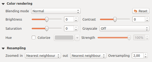
Raster Style - Color rendering and Resampling settings
En appliquant la méthode ‘Plus proche voisin’, le raster peut apparaître pixelisé lorsque l’on zoome dessus. Ce rendu peut être amélioré en choisissant les méthodes ‘Bilinéaire’ ou ‘Cubique’ qui adoucissent les angles. L’image est alors lissée. Ces méthodes sont adaptées par exemple aux rasters d’élévation.
At the bottom of the Style tab, you can see a thumbnail of the layer, its legend symbol, and the palette.
Propriétés de transparence
QGIS has the ability to display each raster layer at a different transparency level.
Use the transparency slider  to indicate to what extent the underlying layers
(if any) should be visible though the current raster layer. This is very useful
if you like to overlay more than one raster layer (e.g., a shaded relief map
overlayed by a classified raster map). This will make the look of the map more
three dimensional.
to indicate to what extent the underlying layers
(if any) should be visible though the current raster layer. This is very useful
if you like to overlay more than one raster layer (e.g., a shaded relief map
overlayed by a classified raster map). This will make the look of the map more
three dimensional.
De plus, vous pouvez entrer une valeur raster qui sera traitée comme NODATA dans l’option Valeur nulle supplémentaire.
An even more flexible way to customize the transparency can be done in the Custom transparency options section. The transparency of every pixel can be set here.
As an example, we want to set the water of our example raster file landcover.tif to a transparency of 20%. The following steps are necessary:
- Load the raster file landcover.tif.
- Open the Properties dialog by double-clicking on the raster name in the legend, or by right-clicking and choosing Properties from the pop-up menu.
- Select the Transparency tab.
- From the Transparency band drop-down menu, choose ‘None’.
Cliquez sur le bouton
Ajouter des valeurs manuellement. Une nouvelle ligne apparait dans la liste des pixels.- Enter the raster value in the ‘From’ and ‘To’ column (we use 0 here), and adjust the transparency to 20%.
- Press the [Apply] button and have a look at the map.
You can repeat steps 5 and 6 to adjust more values with custom transparency.
Comme vous pouvez le voir, il est assez facile de définir une transparence personnalisée, mais cela peut prendre un peu de temps. Par conséquent, vous pouvez utiliser le bouton  Exporter dans un fichier pour sauver vos paramètres de transparence dans un fichier. Le bouton Importer depuis le fichier charge vos paramètres de transparence et les applique à la couche raster actuelle.
Propriétés des Pyramides
Les couches raster à haute résolution peuvent ralentir la navigation dans QGIS. En créant des copies des données de plus basses résolutions (des pyramides), les performances peuvent être considérablement améliorées puisque QGIS sélectionne la résolution la plus pertinente à utiliser en fonction du niveau de zoom.
Vous devez avoir accès en écriture dans le répertoire où les données originelles sont stockées pour construire les pyramides.
From the Resolutions list, select resolutions for which you want to create pyramid by clicking on them.
If you choose Internal (if possible) from the Overview format drop-down menu, QGIS tries to build pyramids internally.
Note
Notez que construire des pyramides peut altérer le fichier original et, une fois créées, elles ne peuvent plus être supprimées. Si vous désirez préserver une version ‘sans pyramide’ de vos raster, réalisez une copie de sauvegarde avant de les construire.
If you choose External and External (Erdas Imagine) the pyramids will be created in a file next to the original raster with the same name and a .ovr extension.
Several Resampling methods can be used to calculate the pyramids:
Plus proche voisin
Moyenne
- Gauss
Cubique
- Mode
Aucune
Finally, click [Build pyramids] to start the process.
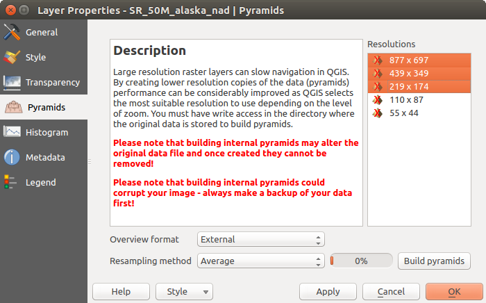
Pyramides Raster
Propriétés de l’Histogramme
The Histogram tab allows you to view the distribution of the bands
or colors in your raster. The histogram is generated automatically when you open the
Histogram tab. All existing bands will be displayed together. You
can save the histogram as an image with the button.
With the Visibility option in the  Prefs/Actions menu,
you can display histograms of the individual bands. You will need to select the option
Show selected band.
The Min/max options allow you to ‘Always show min/max markers’, to ‘Zoom
to min/max’ and to ‘Update style to min/max’.
With the Actions option, you can ‘Reset’ and ‘Recompute histogram’ after
you have chosen the Min/max options.
Prefs/Actions menu,
you can display histograms of the individual bands. You will need to select the option
Show selected band.
The Min/max options allow you to ‘Always show min/max markers’, to ‘Zoom
to min/max’ and to ‘Update style to min/max’.
With the Actions option, you can ‘Reset’ and ‘Recompute histogram’ after
you have chosen the Min/max options.
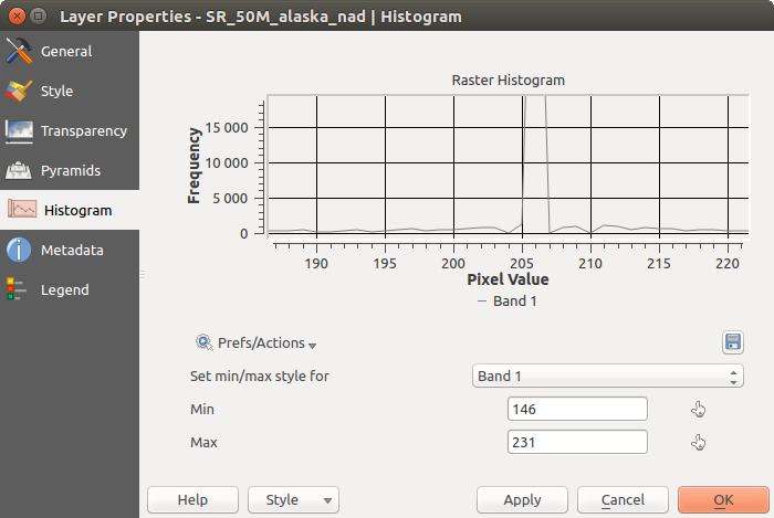
Histogramme raster
Propriétés des Métadonnées
The Metadata tab displays a wealth of information about the raster layer, including statistics about each band in the current raster layer. From this tab, entries may be made for the Description, Attribution, MetadataUrl and Properties. In Properties, statistics are gathered on a ‘need to know’ basis, so it may well be that a given layer’s statistics have not yet been collected.
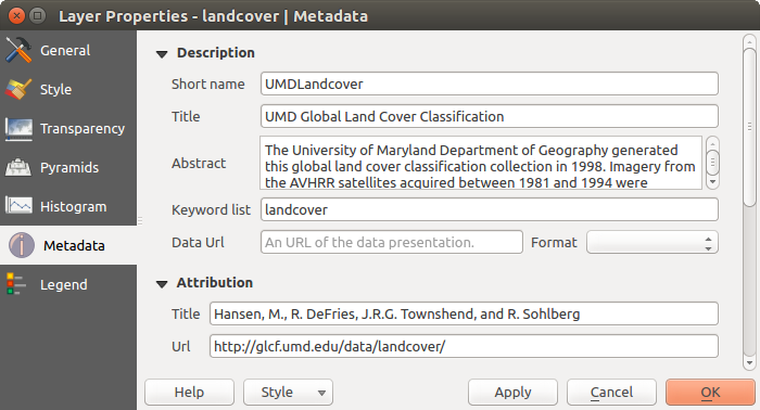
Raster Metadata
Propriétés de la Légende
The Legend tab provides you with a list of widgets you can embed within the layer tree in the Layers panel. The idea is to have a way to quickly access some actions that are often used with the layer (setup transparency, filtering, selection, style or other stuff...).
By default, QGIS provides transparency widget but this can be extended by plugins registering their own widgets and assign custom actions to layers they manage.