Importante
La traduzione è uno sforzo comunitario you can join. Questa pagina è attualmente tradotta al 61.11%.
17.14. Primo esempio di analisi
Nota
In questa lezione eseguiremo alcune analisi reali usando solo il toolbox, in modo che possiate acquisire maggiore familiarità con gli elementi del framework di processing.
Now that everything is configured and we can use external algorithms, we have a very powerful tool to perform spatial analysis. It is time to work out a larger exercise with some real world data.
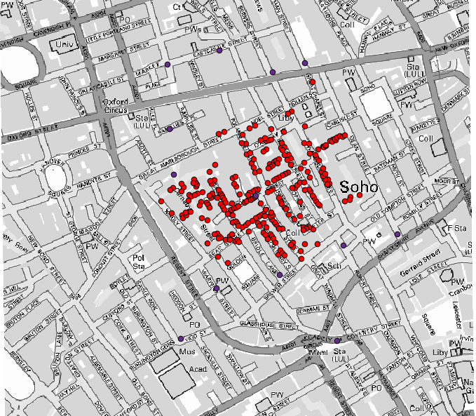
Useremo il ben noto set di dati che John Snow usò nel 1854, nel suo lavoro rivoluzionario (https://en.wikipedia.org/wiki/John_Snow_%28physician%29), e otterremo alcuni risultati interessanti. L’analisi di questo set di dati è abbastanza ovvia e non c’è bisogno di sofisticate tecniche GIS per finire con buoni risultati e conclusioni, ma è un buon modo per mostrare come questi problemi spaziali possono essere analizzati e risolti utilizzando diversi strumenti di processing.
Il set di dati contiene shapefile con le morti di colera e le posizioni delle fontanelle, e una mappa visualizzata da OSM in formato TIFF. Apri il progetto QGIS corrispondente a questa lezione.
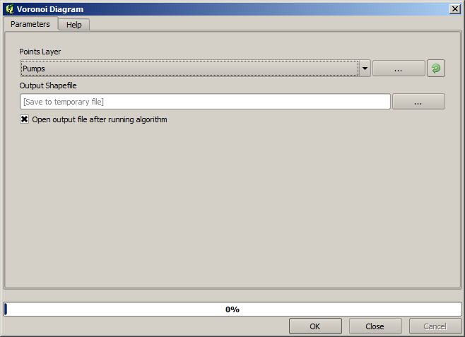
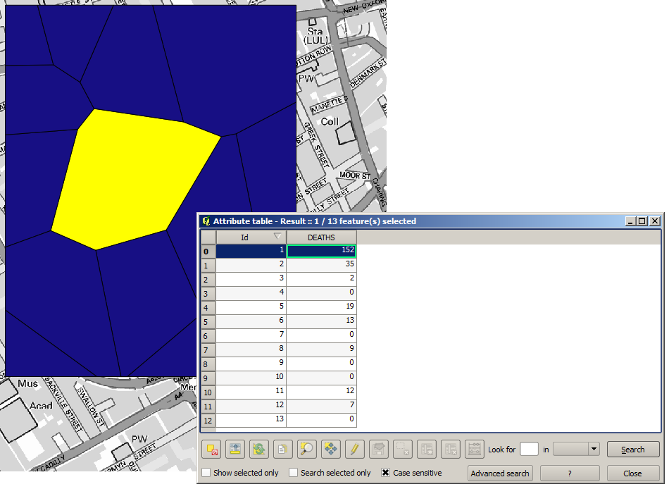
The first thing to do is to calculate the Voronoi diagram (a.k.a. Thiessen polygons) of the pumps layer, to get the influence zone of each pump. The Voronoi polygons algorithm can be used for that.
Piuttosto semplice, ma ci darà già informazioni interessanti.
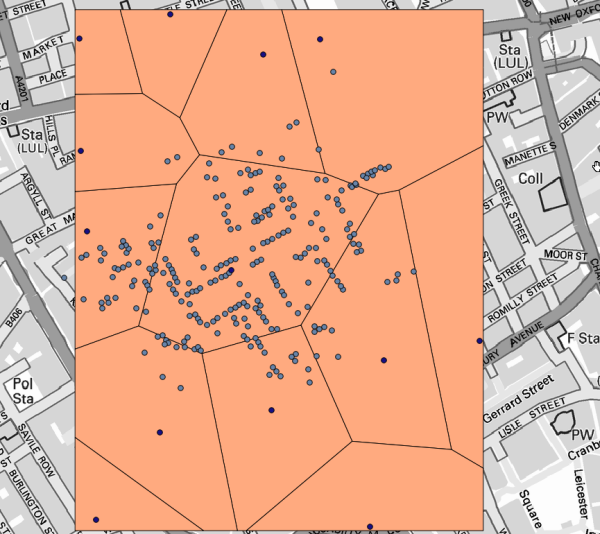
È evidente che la maggior parte dei casi si trova all’interno di uno dei poligoni
To get a more quantitative result, we can count the number of deaths in each polygon. Since each point represents a building where deaths occurred, and the number of deaths is stored in an attribute, we cannot just count the points. We need a weighted count, so we will use the Count points in polygon tool.
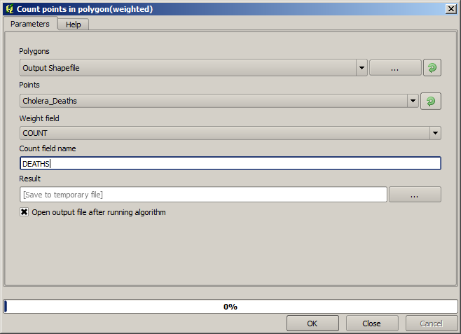
The new field will be called DEATHS, and we use the COUNT field as weighting field.
The resulting table clearly reflects that the number of deaths in the polygon
corresponding to the first pump is much larger than the other ones.
Another good way of visualizing the dependence of each point in the Cholera_deaths layer
with a point in the Pumps layer is to draw a line to the closest one.
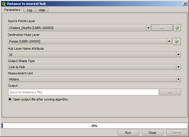
This can be done with the Distance to nearest hub tool, and using the configuration shown next.
Il risultato si presenta così:
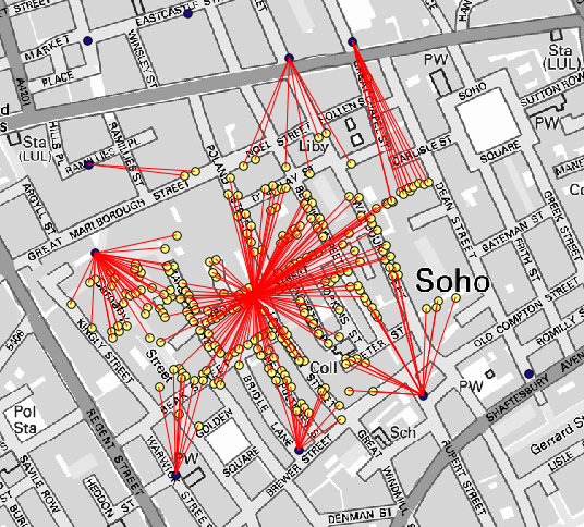
Anche se il numero di linee è più grande nel caso della fontanella centrale, non bisogna dimenticare che questo non rappresenta il numero di morti, ma il numero di località dove sono stati trovati casi di colera. È un parametro rappresentativo, ma non considera che alcune località potrebbero avere più casi di altre.
A density layer will also give us a very clear view of what is happening.
We can create it with the Heatmap (Kernel density estimation) algorithm.
Using the Cholera_deaths layer, its COUNT field as weight field, with a radius of 100,
the extent and cell size of the streets raster layer, we get something like this.
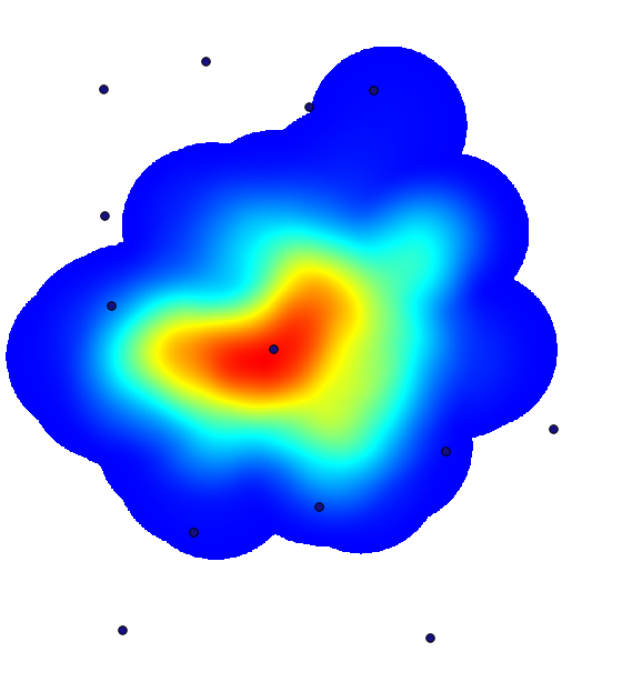
Remember that, to get the output extent, you do not have to type it. Click on the button on the right-hand side and select Use layer/canvas extent.
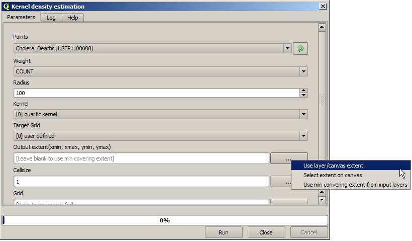
Seleziona il layer raster delle strade e la sua estensione sarà automaticamente aggiunta al campo di testo. Devi fare lo stesso con la dimensione della cella, selezionando anche la dimensione della cella di quel layer.
Combinando con lo strato delle fontanelle, vediamo che c’è una fontanella chiaramente nell’hotspot dove si trova la massima densità di casi di morte.