18.2.2. The Map Item
The map item is the main frame that displays the map you've designed in the map
canvas.
Use the  Add Map tool following items creation
instructions to add a new map item that you can later
manipulate the same way as exposed in Interacting with layout items.
Add Map tool following items creation
instructions to add a new map item that you can later
manipulate the same way as exposed in Interacting with layout items.
By default, a new map item shows the current status of the map canvas with its extent and visible layers. You can customize it thanks to the Item Properties panel. Other than the items common properties, this feature has the following functionalities:
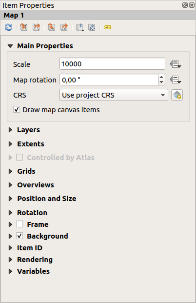
图 18.14 Map Item Properties Panel
18.2.2.1. The Toolbar
The Map Item Properties panel embeds a toolbar with the following functionalities:
 Update map preview
 Set map canvas to match main canvas extent
 View current map extent in main canvas
 Set map scale to match main canvas scale
 Set main canvas to match current map scale
 Bookmarks: set the map item extent to match
an existing spatial bookmark
Bookmarks: set the map item extent to match
an existing spatial bookmark Interactively edit map extent: pan and
zoom interactively
within the map item
Interactively edit map extent: pan and
zoom interactively
within the map item Labeling settings: control feature label behaviour
(placement, visibility...) in the layout map item extent:
Labeling settings: control feature label behaviour
(placement, visibility...) in the layout map item extent:set a Margin from map edges, a data definable distance from the map item's limits inside which no label should be displayed
 Allow truncated labels on edges of map: controls
whether labels which fall partially outside of the map item allowed extent
should be rendered. If checked, these labels will be shown (when there’s
no way to place them fully within the visible area). If unchecked then
partially visible labels will be skipped.
Allow truncated labels on edges of map: controls
whether labels which fall partially outside of the map item allowed extent
should be rendered. If checked, these labels will be shown (when there’s
no way to place them fully within the visible area). If unchecked then
partially visible labels will be skipped.Label blocking items: allows other layout items (such as scalebars, north arrows, inset maps, etc) to be marked as a blockers for the map labels in the active map item. This prevents any map labels from being placed under those items - causing the labeling engine to either try alternative placement for these labels or discard them altogether.
If a Margin from map edges is set, the map labels are not placed closer than the specified distance from the checked layout items.
Show unplaced labels: can be used to determine whether labels are missing from the layout map (e.g. due to conflicts with other map labels or due to insufficient space to place the label) by highlighting them in a predefined color.
 Clipping settings: allows to clip the map item to the atlas
feature and to shape and polygon items:
Clipping settings: allows to clip the map item to the atlas
feature and to shape and polygon items: Clip to atlas feature: you can determine that
the layout map item will be clipped automatically to the current atlas
feature.
Clip to atlas feature: you can determine that
the layout map item will be clipped automatically to the current atlas
feature.There are different clipping modes available:
Clip During Render Only: applies a painter based clip, so that portions of vector features which sit outside the atlas feature become invisible
Clip Feature Before Render: applies the clip before rendering features, so borders of features which fall partially outside the atlas feature will still be visible on the boundary of the atlas feature
Render Intersecting Features Unchanged: renders all features which intersect the current atlas feature, but without clipping their their geometry.
You can
Force labels inside atlas feature.
If you don't want to  Clip all layers to the
atlas feature you can use the
Clip all layers to the
atlas feature you can use the  Clip selected layers
option.
Clip selected layers
option.- Clip to item: it is possible to change the shape of the
map item by using a shape or polygon item from the print layout. When you
enable this option the map will be automatically clipped to the selected shape
in the combobox. Again, the above mentioned clipping modes are available and
labels can be forced to display only inside the clipping shape.
18.2.2.2. Main properties
In the Main properties group (see 图 18.14) of the map Item Properties panel, available options are:
The Update Preview button to refresh the map item rendering if the view in map canvas has been modified. Note that most of the time, the map item refresh is automatically triggered by the changes;
The Scale to manually set the map item scale;
The Map rotation allows you to rotate the map item content clockwise in degrees. The rotation of the map canvas can be imitated here;
The CRS allows you to display the map item content in any CRS. It defaults to
Use project CRS;- Draw map canvas items lets you show in the print
layout annotations that are placed on the main map
canvas.
18.2.2.3. Layers
By default, map item appearance is synced with the map canvas rendering meaning that toggling visibility of the layers or modifying their style in the Layers Panel is automatically applied to the map item. Because, like any other item, you may want to add multiple map items to a print layout, there's a need to break this synchronization in order to allow showing different areas, layer combinations, at different scales... The Layers properties group (see 图 18.15) helps you do that.
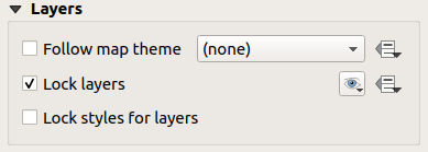
图 18.15 Map Layers group
If you want to keep the map item consistent with an existing map theme, check Follow map theme and select the
desired theme in the drop-down list. Any changes applied to the theme in QGIS'
main window (using the replace theme function) will automatically affect the
map item.
If a map theme is selected, the Lock styles for layers option is
disabled because Follow map theme also updates the
style (symbology, labels, diagrams) of the layers.
To lock the layers shown in a map item to the current map canvas visibility,
check Lock layers. When this option is enabled, any
changes on the layers' visibility in QGIS' main window will not affect
the layout's map item. Nevertheless, style and labels of locked
layers are still refreshed according to QGIS' main window.
You can prevent this by using Lock styles for layers.
Instead of using the current map canvas, you can also lock the layers of the
map item to those of an existing map theme: select a map theme from the
 Set layer list from a map theme drop-down button, and the
Lock layers is activated. The set of visible layers in
the map theme is from now on used for the map item until you select another map
theme or uncheck the Lock layers option. You then may
need to refresh the view using the Refresh view button of the
Navigation toolbar or the Update Preview button seen above.
Set layer list from a map theme drop-down button, and the
Lock layers is activated. The set of visible layers in
the map theme is from now on used for the map item until you select another map
theme or uncheck the Lock layers option. You then may
need to refresh the view using the Refresh view button of the
Navigation toolbar or the Update Preview button seen above.
Note that, unlike the Follow map theme option, if the Lock layers option is enabled and set to a map theme, the layers in the map item will not be refreshed even if the map theme is updated (using the replace theme function) in QGIS' main window.
Locked layers in the map item can also be data-defined,
using the  icon beside the option. When used, this overrides the
selection set in the drop-down list. You need to pass a list of layers
separated by
icon beside the option. When used, this overrides the
selection set in the drop-down list. You need to pass a list of layers
separated by | character.
The following example locks the map item to use only layers layer 1 and
layer 2:
concat ('layer 1', '|', 'layer 2')
18.2.2.4. Extents
The Extents group of the map item properties panel provides the following functionalities (see 图 18.16):
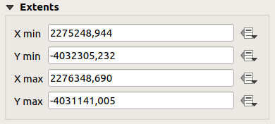
图 18.16 Map Extents group
The Extents area displays X and Y coordinates of the area shown
in the map item. Each of these values can be manually replaced, modifying the
map canvas area displayed and/or map item size.
Clicking the Set to Map Canvas Extent button sets the extent of the
layout map item to the extent of the main map canvas.
The button View Extent in Map Canvas does exactly the opposite; it
updates the extent of the main map canvas to the extent of the layout map item.
You can also alter a map item extent using the Move
item content tool: click-and-drag within the map item to modify its current
view, keeping the same scale. With the tool enabled, use the
mouse wheel to zoom in or out, modifying the scale of the shown map. Combine
the movement with Ctrl key pressed to have a smaller zoom.
18.2.2.5. Controlled by atlas
The Controlled by atlas group properties is available
only if an atlas is active in the print layout. Check
this option if you want the map item being ruled by the atlas; when iterating
over the coverage layer, the map item extent is panned/zoomed to the atlas
feature following:
- Margin around features: zooms to the feature at the
best scale, keeping around each a margin representing a percentage of the map
item width or height. The margin can be the same for all features or set
variable, e.g., depending on map scale;
- Predefined scale (best fit): zooms to the feature
at the project predefined scale where the atlas
feature best fits;
- Fixed scale: atlas features are panned from one
to another, keeping the same scale of the map item. Ideal when working with
features of same size (e.g., a grid) or willing to highlight size differences
among atlas features.
18.2.2.6. Grids
With grids, you can add, over your map, information relative to its extent or coordinates, either in the map item projection or a different one. The Grids group provides the possibility to add several grids to a map item.
With the
 and
and  buttons you can add or remove a selected
grid;
buttons you can add or remove a selected
grid;With the
 and
and  buttons you can move up and down a grid in
the list, hence move it on top or bottom of another one, over the map item.
buttons you can move up and down a grid in
the list, hence move it on top or bottom of another one, over the map item.
Double-click the added grid to rename it.
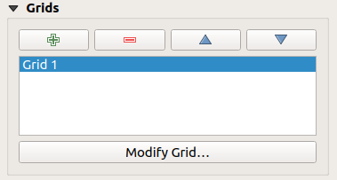
图 18.17 Map Grids Dialog
To modify a grid, select it and press the Modify Grid... button to open the Map Grid Properties panel and access its configuration options.
Grid Appearance
In the Map Grid Properties panel, check
Grid enabled to show the grid on the map item.
As grid type, you can specify to use a:
Solid: shows a line across the grid frame. The Line style can be customized using color and symbol selector widget;
Cross: displays segment at the grid lines intersection for which you can set the Line style and the Cross width;
Markers: only displays customizable markers symbol at grid lines intersection;
or Frame and annotations only.
Other than the grid type, you can define:
the CRS of the grid. If not changed, it will follow the Map CRS. The Change button lets you set it to a different CRS. Once set, it can be changed back to default by selecting any group heading (e.g Geographic Coordinate System) under Predefined Coordinate Reference Systems in the CRS selection dialog.
the Interval type to use for the grid references. Available options are
Map Unit,Fit Segment Width,MillimeterorCentimeter:choosing
Fit Segment Widthwill dynamically select the grid interval based on the map extent to a "pretty" interval. When selected, theMinimumandMaximumintervals can be set.the other options allow you to set the distance between two consecutive grid references in the
XandYdirections.
the Offset from the map item edges, in the
Xand/or theYdirectionand the Blend mode of the grid (see Blending Modes) when compatible.
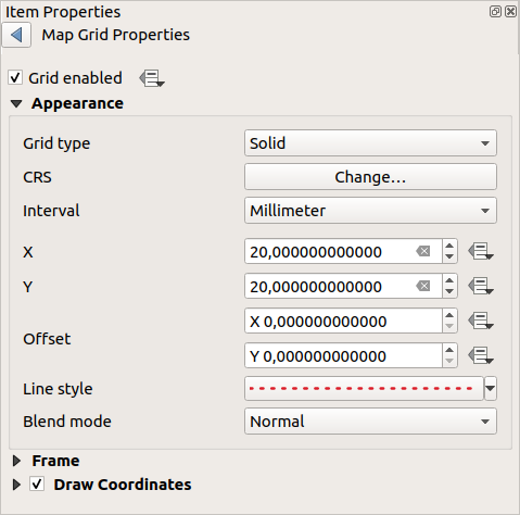
图 18.18 Grid Appearance Dialog
Grid Frame
There are different options to style the frame that holds the map.
The following options are available: No Frame, Zebra, Zebra (nautical),
Interior ticks, Exterior ticks, Interior and Exterior ticks,
Line border and Line border (nautical).
When compatible, it's possible to set the Frame size, a Frame margin, the Frame line thickness with associated color and the Frame fill colors.
Using Latitude/Y only and Longitude/X only values in the divisions
section you can prevent a mix of latitude/Y and longitude/X coordinates showing
on each side when working with rotated maps or reprojected grids.
Also you can choose to set visible or not each side of the grid frame.
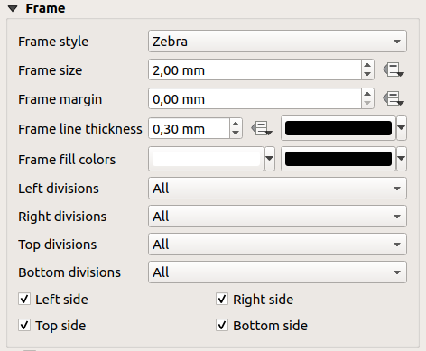
图 18.19 Grid Frame Dialog
Coordinates
The Draw coordinates checkbox allows you to add
coordinates to the map frame. You can choose the annotation numeric format,
the options range from decimal to degrees, minute and seconds, with or without
suffix, aligned or not and a custom format using the expression dialog.
You can choose which annotation to show. The options are: show all, latitude only, longitude only, or disable(none). This is useful when the map is rotated. The annotation can be drawn inside or outside the map frame. The annotation direction can be defined as horizontal, vertical ascending or vertical descending.
Finally, you can define the annotation font, font color, distance from the map frame and the precision of the drawn coordinates.
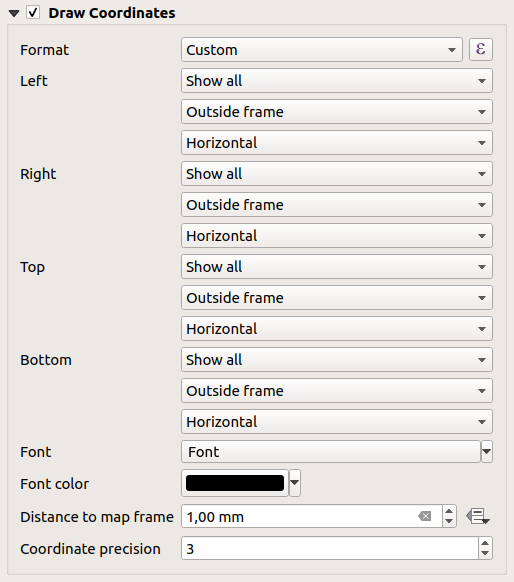
图 18.20 Grid Draw Coordinates dialog
18.2.2.7. Overviews
Sometimes you may have more than one map in the print layout and would like to locate the study area of one map item on another one. This could be for example to help map readers identify the area in relation with its larger geographic context shown in the second map.
The Overviews group of the map panel helps you create the link between two different maps extent and provides the following functionalities:
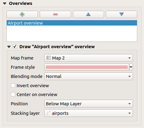
图 18.21 Map Overviews group
To create an overview, select the map item on which you want to show the other
map item's extent and expand the Overviews option in the
Item Properties panel. Then press the button to add
an overview.
Initially this overview is named 'Overview 1' (see 图 18.21). You can:
Rename it with a double-click
With the
and buttons, add or remove overviewsWith the
and buttons, move an overview up and down in
the list, placing it above or below other overviews in the map item
(when they are at the same stack position).
Then select the overview item in the list and check the
Draw "<name_overview>" overview to enable the drawing
of the overview on the selected map frame. You can customize it with:
The Map frame selects the map item whose extents will be shown on the present map item.
The Frame Style uses the symbol properties to render the overview frame.
The Blending mode allows you to set different transparency blend modes.
The
Invert overview creates a mask around the extents
when activated: the referenced map extents are shown clearly, whereas
the rest of the map item is blended with the frame fill color
(if a fill color is used).The
Center on overview pans the map item content so
that the overview frame is displayed at the center of the map. You can only
use one overview item to center, when you have several overviews.
The Position controls exactly where in the map item's layer stack the overview will be placed, e.g. allowing an overview extent to be drawn below some feature layers such as roads whilst drawing it above other background layers. Available options are:
Below map
Below map layer and Above map layer: place the overview frame below and above the geometries of a layer, respectively. The layer is selected in the Stacking layer option.
Below map labels: given that labels are always rendered above all the feature geometries in a map item, places the overview frame above all the geometries and below any label.
Above map labels: places the overview frame above all the geometries and labels in the map item.