18.2.6. The Scale Bar Item
Scale bars provide a visual indication of the size of features, and distance
between features, on the map item. A scale bar item requires a map item.
Use the  Add Scale Bar tool following items creation
instructions to add a new scale bar item that you can
later manipulate the same way as exposed in Interacting with layout items.
Add Scale Bar tool following items creation
instructions to add a new scale bar item that you can
later manipulate the same way as exposed in Interacting with layout items.
By default, a new scale bar item shows the scale of the map item over which it is drawn. If there is no map item below, the reference map is used. You can customize it in the Item Properties panel. Other than the items common properties, this feature has the following functionalities (see Gambar. 18.32):
Gambar. 18.32 Scale Bar Item Properties Panel
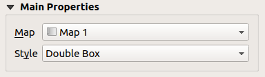
18.2.6.1. Main properties
The Main properties group of the scale bar Item Properties panel provides the following functionalities (see Gambar. 18.33):
Gambar. 18.33 Scale Bar Main properties group
First, choose the map the scale bar will be attached to
Then, choose the style of the scale bar. Available styles are:
Single box and Double box styles, which contain one or two lines of boxes alternating colors;
Middle, Up or Down line ticks;
Stepped line style that draws a stepped line representation of a scalebar
Hollow style that draws a single box with alternating color for the segments, with horizontal lines through alternating segments
Numeric, where the scale ratio is printed (e.g.,
1:50000).
Set properties as appropriate
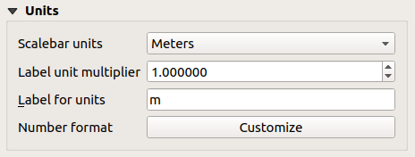
18.2.6.2. Units
The Units group of the scale bar Item Properties panel provides the functionalities to set the units of display and some text formatting (see Gambar. 18.34):
Gambar. 18.34 Scale Bar Units group
Select the units you want to use with Scalebar units. There are many possible choices: Map Units (the default one), Meters, Feet, Miles or Nautical Miles... and some derivatives. Units conversion is handled automatically.
The Label unit multiplier specifies how many scale bar units per labeled unit. Eg, if your scale bar units are set to "meters", a multiplier of 1000 will result in the scale bar labels in "kilometers".
The Label for units field defines the text used to describe the units of the scale bar, eg
morkm. This should be matched to reflect the multiplier above.Press Customize next to Number format to have control over all the formatting properties for the numbers in the scale bar, including thousand separators, decimal places, scientific notation, etc. (see Number Formatting for more details). Very useful in the case of making maps for audiences outside of the current QGIS locale, or when you would like to vary the style from the locale defaults (e.g. adding thousands separators when the locale default is to hide them).
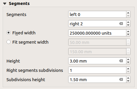
18.2.6.3. Segments
The Segments group of the scale bar Item Properties panel provides the functionalities to configure the number and size of segments and subdivisions (see Gambar. 18.35):
Gambar. 18.35 Scale Bar Segments group
You can define the number of Segments that will be drawn at the left and right sides of the
0of the scale bar:number of subdivisions of a unique segment on the Left side
number of segments on the Right side
You can set how long a segment will be (Fixed width), or limit the scale bar size in
mmwith Fit segment width option. In the latter case, each time the map scale changes, the scale bar is resized (and its label updated) to fit the range set.Height is used to define the height of the bar.
Right segment subdivisions is used to define the number of sections the right-side segments of the scale bar can have (for Line Ticks Down, Line Ticks Middle and Line Ticks Up scale bar styles) .
Subdivision height is used to define the height of the subdivision segment.
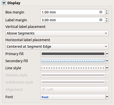
18.2.6.4. Display
The Display group of the scale bar Item Properties panel provides the following functionalities:
Gambar. 18.36 Scale Bar Display group
You can define how the scale bar will be displayed in its frame.
Box margin : space between text and frame borders
Label margin : space between text and scale bar drawing
Vertical label placement: it can be above or below the scale bar segment
Horizontal label placement: which would be centered at the scale bar segment's edge or center
Primary fill and Secondary fill of the scale bar drawing using fill symbols properties (color, opacity, patterns, effects...) --- for Single Box, Double Box and Hollow styles
Line style of the scale bar drawing using line symbols properties (color, stroke, join, cap style, patterns, effects...) --- for all but Numeric style
Division style and Subdivision style respectively for division and subdivision segments in Line Ticks Up, Line Ticks Middle and Line Ticks Down scale bar styles using line symbols properties (color, stroke, join, cap style, patterns, effects...)
Alignment puts text on the left, center or right side of the frame (only for Numeric scale bar style)
Font to set the properties (size, font, color, letter spacing, shadow, background...) of the scale bar label.
Since most of the display properties of the scale bar rely on symbols whose properties can be data-defined, it's possible to render data-defined scale bars.
Example: The following code applied to the bold property of the scale labels will display numbers in bold when they are a multiple of 500:
-- returns True (or 1) if the value displayed on the bar
-- is a multiple of 500

@scale_value % 500 = 0