` `
레스터 속성 대화창
To view and set the properties for a raster layer, double click on the layer name in the map legend, or right click on the layer name and choose Properties from the context menu. This will open the Raster Layer Properties dialog (see figure_raster_properties).
이 대화창에는 다음과 같은 탭들이 있습니다:
- General
- Style
- Transparency
- Pyramids
- Histogram
- Metadata
- Legend
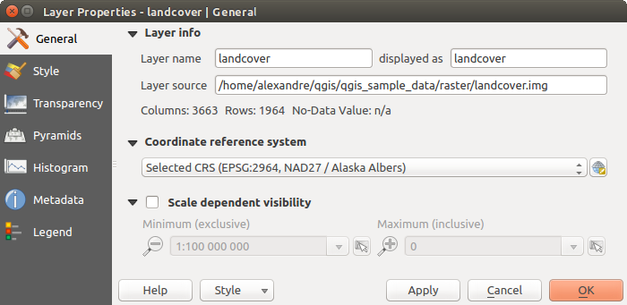
Raster Layers Properties Dialog
참고
실시간 렌더링 업데이트
레이어 스타일 작업 패널 은 레이어 속성 대화창의 공통 기능 가운데 일부를 제공하며, 레이어 스타일 환경 설정을 빠르게 할 수 있고 맵 캔버스에 사용자 변경 사항을 자동적으로 표시할 수 있는 훌륭한 모달리스 위젯입니다.
주석
원본 프로젝트 파일에서 삽입 레이어(프로젝트 내포 작업 참조)의 속성들(심볼, 라벨, 액션, 기본값, 양식 등등)을 읽어오기 때문에, 이 습성을 방해할 수도 있는 변경 사항이 적용되는 일을 피하기 위해 삽입 레이어에 대해 레이어 속성 대화창을 사용할 수 없게 돼 있습니다.
General Properties
Layer Info
The General tab displays basic information about the selected raster, including the layer source path, the display name in the legend (which can be modified), and the number of columns, rows and no-data values of the raster.
Coordinate Reference System
Displays the layer’s Coordinate Reference System (CRS) as a PROJ.4 string. You
can change the layer’s CRS, selecting a recently used one in the drop-down list
or clicking on  Select CRS button (see 좌표계 선택기).
Use this process only if the CRS applied to the layer is a wrong one or if none
was applied. If you wish to reproject your data into another CRS, rather use
layer reprojection algorithms from Processing or Save it into another
layer.
Select CRS button (see 좌표계 선택기).
Use this process only if the CRS applied to the layer is a wrong one or if none
was applied. If you wish to reproject your data into another CRS, rather use
layer reprojection algorithms from Processing or Save it into another
layer.
Scale dependent visibility
Maximum (inclusive) 및 Minimum (exclusive) 축척을 설정해서 레이어가 보이게 될 축척 범위를 정의할 수 있습니다. 이 범위를 벗어나면, 레이어를 숨깁니다.  Set to current canvas scale 버튼을 클릭하면 현재 맵 캔버스의 축척을 가시성 범위의 한계값으로 설정할 수 있습니다. 자세한 내용은 축척에 따른 렌더링 을 참조하세요.
Style Properties
밴드 렌더링
QGIS는 서로 다른 Render types 4개를 제공하고 있습니다. 데이터 유형에 따라 렌더링 작업자가 선택됩니다.
- Multiband color - if the file comes as a multiband with several bands (e.g., used with a satellite image with several bands)
- Paletted - if a single band file comes with an indexed palette (e.g., used with a digital topographic map)
- Singleband gray - (one band of) the image will be rendered as gray; QGIS will choose this renderer if the file has neither multibands nor an indexed palette nor a continuous palette (e.g., used with a shaded relief map)
- Singleband pseudocolor - this renderer is possible for files with a continuous palette, or color map (e.g., used with an elevation map)
Multiband color
With the multiband color renderer, three selected bands from the image will be rendered, each band representing the red, green or blue component that will be used to create a color image. You can choose several Contrast enhancement methods: ‘No enhancement’, ‘Stretch to MinMax’, ‘Stretch and clip to MinMax’ and ‘Clip to min max’.
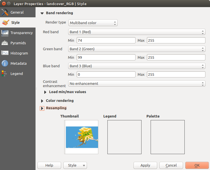
Raster Style - Multiband color rendering
This selection offers you a wide range of options to modify the appearance
of your raster layer. First of all, you have to get the data range from your
image. This can be done by choosing the Extent and pressing
[Load]. QGIS can  Estimate (faster) the
Min and Max values of the bands or use the
Estimate (faster) the
Min and Max values of the bands or use the
 Actual (slower) Accuracy.
Now you can scale the colors with the help of the Load min/max values
section. A lot of images have a few very low and high data. These outliers can be
eliminated using the Cumulative count cut setting.
The standard data range is set from 2% to 98% of the data values and can be adapted
manually. With this setting, the gray character of the image can disappear.
With the scaling option Min/max, QGIS creates a color
table with all of the data included in the original image (e.g., QGIS creates
a color table with 256 values, given the fact that you have 8 bit bands).
You can also calculate your color table using the Mean
+/- standard deviation x  .
Then, only the values within the standard deviation or within multiple standard deviations
are considered for the color table. This is useful when you have one or two cells
with abnormally high values in a raster grid that are having a negative impact on
the rendering of the raster.
.
Then, only the values within the standard deviation or within multiple standard deviations
are considered for the color table. This is useful when you have one or two cells
with abnormally high values in a raster grid that are having a negative impact on
the rendering of the raster.
All calculations can also be made for the Current extent.
참고
다중 밴드 래스터의 단일 밴드 살펴보기
If you want to view a single band of a multiband image (for example, Red), you might think you would set the Green and Blue bands to “Not Set”. But this is not the correct way. To display the Red band, set the image type to ‘Singleband gray’, then select Red as the band to use for Gray.
Paletted
팔레트 렌더링 작업자는 이미 색상표를 포함하고 있는 단일 밴드 파일을 위한 표준 렌더링 옵션입니다. 이 색상표는 각 픽셀 값을 특정 색상에 할당한 표입니다. 이런 경우, 팔레트를 자동적으로 렌더링합니다. 특정 값에 할당된 색상을 변경하고 싶다면, 해당 색상을 더블클릭하면 Select color 대화창이 열립니다. 또한, QGIS는 색상값에 라벨을 적용할 수도 있습니다. 이 라벨은 래스터 레이어 범례에 표시됩니다.
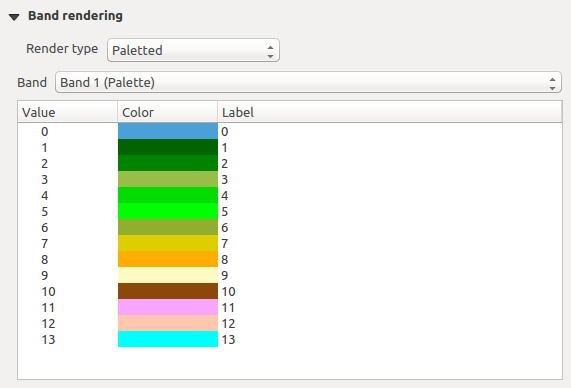
Raster Style - Paletted Rendering
대조 개선
주석
GRASS 래스터를 추가하면, QGIS 일반 옵션에서 어떤 값으로 설정돼 있건 상관없이, 자동적으로 Contrast enhancement 옵션이 항상 stretch to min max 로 설정될 것입니다.
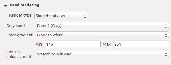
Singleband gray
This renderer allows you to render a single band layer with a Color gradient:
‘Black to white’ or ‘White to black’. You can define a Min
and a Max value by choosing the Extent first and
then pressing [Load]. QGIS can Estimate (faster)
the Min and Max values of the bands or use the
Actual (slower) Accuracy.
Raster Style - Singleband gray rendering
With the Load min/max values section, scaling of the color table
is possible. Outliers can be eliminated using the Cumulative
count cut setting.
The standard data range is set from 2% to 98% of the data values and can
be adapted manually. With this setting, the gray character of the image can disappear.
Further settings can be made with Min/max and
Mean +/- standard deviation x .
While the first one creates a color table with all of the data included in the
original image, the second creates a color table that only considers values
within the standard deviation or within multiple standard deviations.
This is useful when you have one or two cells with abnormally high values in
a raster grid that are having a negative impact on the rendering of the raster.
Singleband pseudocolor
이 렌더링 작업자는 연속적인 팔레트를 포함하는 단일 밴드 파일 용 렌더링 옵션입니다. 이 작업자는 단일 밴드에 대한 개별 색상 맵을 생성할 수도 있습니다.
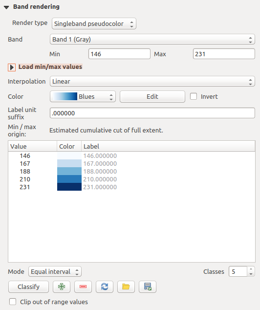
Raster Style - Singleband pseudocolor rendering
Three types of color interpolation are available:
- Discrete
선형(Linear)
- Exact
In the left block, the button  Add values manually adds a value
to the individual color table. The button
Add values manually adds a value
to the individual color table. The button  Remove selected row
deletes a value from the individual color table, and the
Remove selected row
deletes a value from the individual color table, and the
 Sort colormap items button sorts the color table according
to the pixel values in the value column. Double clicking on the value column
lets you insert a specific value. Double clicking on the color column opens the dialog
Change color, where you can select a color to apply on that value.
Further, you can also add labels for each color, but this value won’t be displayed
when you use the identify feature tool.
You can also click on the button
Sort colormap items button sorts the color table according
to the pixel values in the value column. Double clicking on the value column
lets you insert a specific value. Double clicking on the color column opens the dialog
Change color, where you can select a color to apply on that value.
Further, you can also add labels for each color, but this value won’t be displayed
when you use the identify feature tool.
You can also click on the button  Load color map from band,
which tries to load the table from the band (if it has any). And you can use the
buttons
Load color map from band,
which tries to load the table from the band (if it has any). And you can use the
buttons  Load color map from file or
  Export color map to file to load an existing color table or to save the
defined color table for other sessions.
Export color map to file to load an existing color table or to save the
defined color table for other sessions.
In the right block, Generate new color map allows you to create newly
categorized color maps. For the Classification mode  ‘Equal interval’, you only need to select the number of classes
and press the button Classify. You can invert the colors
of the color map by clicking the
‘Equal interval’, you only need to select the number of classes
and press the button Classify. You can invert the colors
of the color map by clicking the  Invert
checkbox. In the case of the Mode ‘Continuous’, QGIS creates
classes automatically depending on the Min and Max.
Defining Min/Max values can be done with the help of the Load min/max values section.
A lot of images have a few very low and high data. These outliers can be eliminated
using the Cumulative count cut setting. The standard
data range is set from 2% to 98% of the data values and can be adapted manually.
With this setting, the gray character of the image can disappear.
With the scaling option Min/max, QGIS creates a color
table with all of the data included in the original image (e.g., QGIS creates a
color table with 256 values, given the fact that you have 8 bit bands).
You can also calculate your color table using the Mean +/-
standard deviation x .
Then, only the values within the standard deviation or within multiple standard deviations
are considered for the color table.
Invert
checkbox. In the case of the Mode ‘Continuous’, QGIS creates
classes automatically depending on the Min and Max.
Defining Min/Max values can be done with the help of the Load min/max values section.
A lot of images have a few very low and high data. These outliers can be eliminated
using the Cumulative count cut setting. The standard
data range is set from 2% to 98% of the data values and can be adapted manually.
With this setting, the gray character of the image can disappear.
With the scaling option Min/max, QGIS creates a color
table with all of the data included in the original image (e.g., QGIS creates a
color table with 256 values, given the fact that you have 8 bit bands).
You can also calculate your color table using the Mean +/-
standard deviation x .
Then, only the values within the standard deviation or within multiple standard deviations
are considered for the color table.
색상 렌더링
모든 Band rendering 에 대해, Color rendering 도 할 수 있습니다.
혼합 모드 가운데 하나를 사용해서 사용자 래스터 파일(들)에 특별 렌더링 효과를 줄 수도 있습니다. (혼합 모드 를 참조하세요.)
Brightness 옵션으로 명도를, Saturation 옵션으로 채도를, Contrast 옵션으로 대조를 조정해서 색상을 심화 설정할 수도 있습니다. 또 Grayscale 옵션도 사용할 수 있는데, ‘By lightness’, ‘By luminosity’ 및 ‘By average’ 가운데 하나를 선택할 수 있습니다. 색상표에 있는 색채(hue) 하나를 선택한 다음 해당 색채의 Strength 를 조정할 수 있습니다.
리샘플링
Resampling 옵션은 사용자가 이미지를 확대/축소하는 경우 나타납니다. 리샘플링 모드로 맵의 모습을 최적화할 수 있습니다. 리샘플링 모드들은 기하학적 변형을 통해 새 회색조 값 매트릭스를 생성합니다.
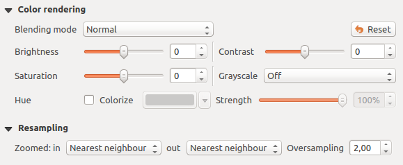
Raster Style - Color rendering and Resampling settings
‘Nearest neighbour’ 방법을 적용하면, 확대 시 맵의 픽셀이 두드러져 보일 수 있습니다. ‘Bilinear’ 또는 ‘Cubic’ 방법을 사용하면 이 모습을 향상시킬 수 있는데, 이 방법들은 뚜렷한 피처를 흐릿하게 만듭니다. 이 블러 효과로 더 부드러운 이미지를 생성할 수 있습니다. 이 방법들은, 예를 들자면 래스터 수치지형도에 적용할 수 있습니다.
At the bottom of the Style tab, you can see a thumbnail of the layer, its legend symbol, and the palette.
투명도 속성
QGIS has the ability to display each raster layer at a different transparency level.
Use the transparency slider  to indicate to what extent the underlying layers
(if any) should be visible though the current raster layer. This is very useful
if you like to overlay more than one raster layer (e.g., a shaded relief map
overlayed by a classified raster map). This will make the look of the map more
three dimensional.
to indicate to what extent the underlying layers
(if any) should be visible though the current raster layer. This is very useful
if you like to overlay more than one raster layer (e.g., a shaded relief map
overlayed by a classified raster map). This will make the look of the map more
three dimensional.
또한, Additional no data value 옵션에서 NODATA 로 처리돼야 할 래스터 값을 입력할 수 있습니다.
An even more flexible way to customize the transparency can be done in the Custom transparency options section. The transparency of every pixel can be set here.
As an example, we want to set the water of our example raster file landcover.tif to a transparency of 20%. The following steps are necessary:
- Load the raster file landcover.tif.
- Open the Properties dialog by double-clicking on the raster name in the legend, or by right-clicking and choosing Properties from the pop-up menu.
- Select the Transparency tab.
- From the Transparency band drop-down menu, choose ‘None’.
- Add values manually 버튼을 클릭합니다. 픽셀 목록에 새 행이 나타날 것입니다.
- Enter the raster value in the ‘From’ and ‘To’ column (we use 0 here), and adjust the transparency to 20%.
- Press the [Apply] button and have a look at the map.
You can repeat steps 5 and 6 to adjust more values with custom transparency.
이처럼 사용자 지정 투명도를 설정하는 일은 꽤 쉬운 편이지만, 반복 작업을 오래 해야 할 수도 있습니다. 따라서,  Export to file 아이콘을 이용해서 사용자의 투명도 목록을 파일로 저장할 수 있습니다. Import from file 아이콘은 사용자의 투명도 설정을 불러와 현재 래스터 레이어에 적용시킵니다.
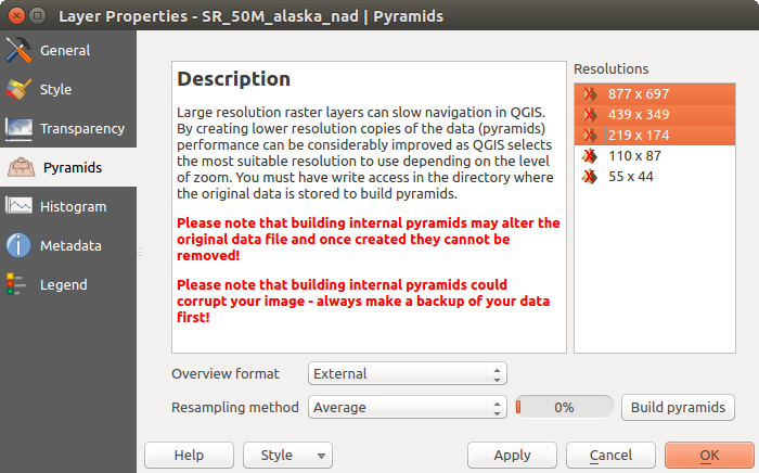
피라미드 속성
고해상도 래스터 레이어는 QGIS의 맵 탐색 속도를 느리게 할 수 있습니다. 이때 더 낮은 해상도를 가진 데이터 복사본들(피라미드)을 생성하면, QGIS가 확대/축소 수준에 따라 가장 알맞은 해상도를 선택하기 때문에 성능을 크게 개선할 수 있습니다.
피라미드를 생성하려면 원본 데이터가 저장돼 있는 디렉터리에 쓰기 권한을 가지고 있어야만 합니다.
Resolutions 목록에서, 해상도를 클릭해서 피라미드를 생성하려는 해상도를 선택하십시오.
Overview format 드롭다운 목록에서 Internal (if possible) 을 선택한 경우, QGIS는 피라미드를 원본 파일 내부에 생성하려 할 것입니다.
주석
피라미드 생성 작업이 원본 데이터 파일을 변경시킬 수도 있으며, 생성 후엔 제거할 수 없다는 점을 기억하십시오. 사용자 래스터의 ‘피라미드가 아닌’ 버전을 보존하고 싶다면, 피라미드를 생성하기 전에 백업하십시오.
External 및 External (Erdas Imagine) 을 선택한 경우, 원본 래스터 파일이 있는 디렉터리에 피라미드를 동일한 파일명과 .ovr 확장자를 가진 파일로 생성할 것입니다.
피라미드를 계산하는 데 다음 몇몇 Resampling methods 를 사용할 수 있습니다:
- Nearest Neighbour
- Average
- Gauss
- Cubic
- Mode
- None
Finally, click [Build pyramids] to start the process.
래스터 피라미드
히스토그램 속성
The Histogram tab allows you to view the distribution of the bands
or colors in your raster. The histogram is generated automatically when you open the
Histogram tab. All existing bands will be displayed together. You
can save the histogram as an image with the button.
With the Visibility option in the  Prefs/Actions menu,
you can display histograms of the individual bands. You will need to select the option
Show selected band.
The Min/max options allow you to ‘Always show min/max markers’, to ‘Zoom
to min/max’ and to ‘Update style to min/max’.
With the Actions option, you can ‘Reset’ and ‘Recompute histogram’ after
you have chosen the Min/max options.
Prefs/Actions menu,
you can display histograms of the individual bands. You will need to select the option
Show selected band.
The Min/max options allow you to ‘Always show min/max markers’, to ‘Zoom
to min/max’ and to ‘Update style to min/max’.
With the Actions option, you can ‘Reset’ and ‘Recompute histogram’ after
you have chosen the Min/max options.
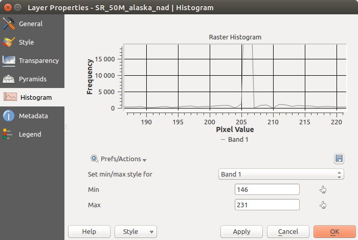
래스터 히스토그램
메타데이터 속성
The Metadata tab displays a wealth of information about the raster layer, including statistics about each band in the current raster layer. From this tab, entries may be made for the Description, Attribution, MetadataUrl and Properties. In Properties, statistics are gathered on a ‘need to know’ basis, so it may well be that a given layer’s statistics have not yet been collected.
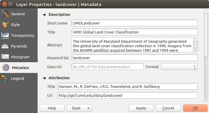
Raster Metadata
범례 속성
The Legend tab provides you with a list of widgets you can embed within the layer tree in the Layers panel. The idea is to have a way to quickly access some actions that are often used with the layer (setup transparency, filtering, selection, style or other stuff...).
QGIS가 기본적으로 투명도 위젯을 제공하고는 있지만, 플러그인의 자체 위젯을 등록하고 플러그인이 관리하는 레이어에 사용자 지정 액션을 할당하면 위젯 목록을 확장할 수 있습니다.