` `
Dialogfenster Rasterlayereigenschaften
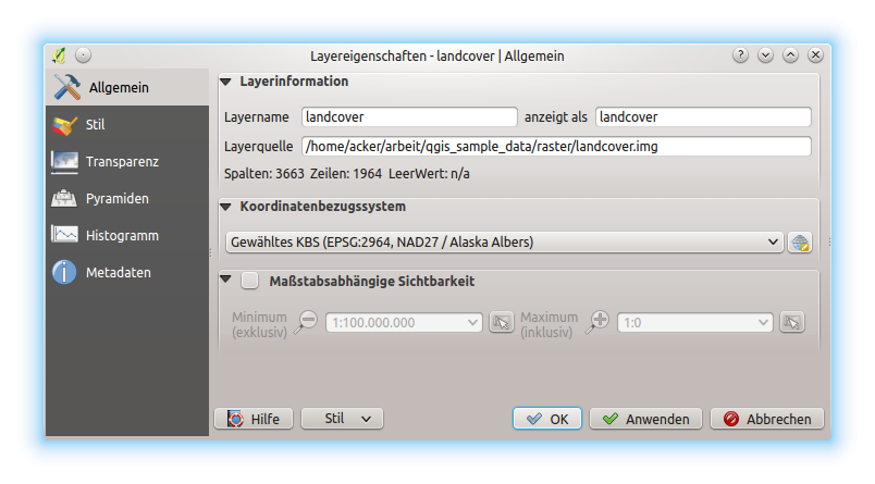
To view and set the properties for a raster layer, double click on the layer name in the map legend, or right click on the layer name and choose Properties from the context menu. This will open the Raster Layer Properties dialog (see figure_raster_properties).
There are several tabs in the dialog:
- General
- Style
- Transparency
- Pyramids
- Histogram
- Metadata
- Legend
Raster Layers Properties Dialog
Tipp
Live update rendering
The Layer Styling Panel provides you with some of the common features of the Layer properties dialog and is a good modeless widget that you can use to speed up the configuration of the layer styles and automatically view your changes in the map canvas.
Bemerkung
Because properties (symbology, label, actions, default values, forms...) of embedded layers (see Layer/Gruppen einbinden) are pulled from the original project file and to avoid changes that may break this behavior, the layer properties dialog is made unavailable for these layers.
General Properties
Layer Info
The General tab displays basic information about the selected raster, including the layer source path, the display name in the legend (which can be modified), and the number of columns, rows and no-data values of the raster.
Coordinate Reference System
Displays the layer’s Coordinate Reference System (CRS) as a PROJ.4 string. You
can change the layer’s CRS, selecting a recently used one in the drop-down list
or clicking on  Select CRS button (see Coordinate Reference System Selector).
Use this process only if the CRS applied to the layer is a wrong one or if none
was applied. If you wish to reproject your data into another CRS, rather use
layer reprojection algorithms from Processing or Save it into another
layer.
Select CRS button (see Coordinate Reference System Selector).
Use this process only if the CRS applied to the layer is a wrong one or if none
was applied. If you wish to reproject your data into another CRS, rather use
layer reprojection algorithms from Processing or Save it into another
layer.
Scale dependent visibility
You can set the Maximum (inclusive) and Minimum
(exclusive) scale, defining a range of scale in which the layer will be
visible. Out of this range, it’s hidden. The  Set to current canvas scale button helps you use the current map
canvas scale as boundary of the range visibility.
See Maßstabsabhängige Layeranzeige for more information.
Set to current canvas scale button helps you use the current map
canvas scale as boundary of the range visibility.
See Maßstabsabhängige Layeranzeige for more information.
Style Properties
Kanaldarstellung
QGIS bietet vier verschiedene Darstellungsart. Die ausgewählte Darstellungsart hängt vom Datentyp ab.
- Multiband color - if the file comes as a multiband with several bands (e.g., used with a satellite image with several bands)
- Paletted - if a single band file comes with an indexed palette (e.g., used with a digital topographic map)
- Singleband gray - (one band of) the image will be rendered as gray; QGIS will choose this renderer if the file has neither multibands nor an indexed palette nor a continuous palette (e.g., used with a shaded relief map)
- Singleband pseudocolor - this renderer is possible for files with a continuous palette, or color map (e.g., used with an elevation map)
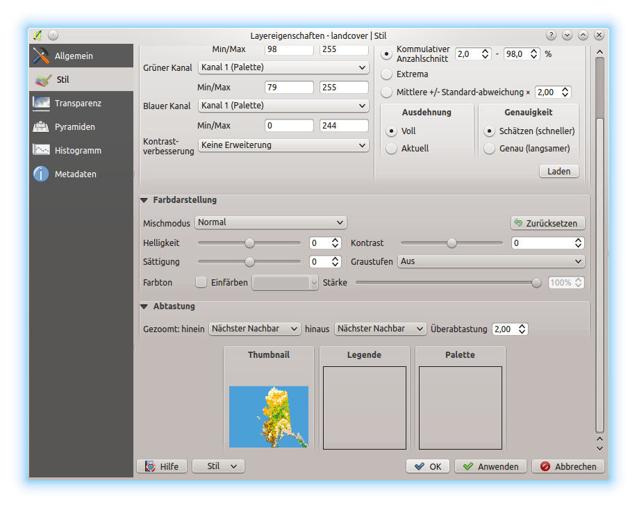
Multiband color
With the multiband color renderer, three selected bands from the image will be rendered, each band representing the red, green or blue component that will be used to create a color image. You can choose several Contrast enhancement methods: ‘No enhancement’, ‘Stretch to MinMax’, ‘Stretch and clip to MinMax’ and ‘Clip to min max’.
Raster Style - Multiband color rendering
This selection offers you a wide range of options to modify the appearance
of your raster layer. First of all, you have to get the data range from your
image. This can be done by choosing the Extent and pressing
[Load]. QGIS can  Estimate (faster) the
Min and Max values of the bands or use the
Estimate (faster) the
Min and Max values of the bands or use the
 Actual (slower) Accuracy.
Now you can scale the colors with the help of the Load min/max values
section. A lot of images have a few very low and high data. These outliers can be
eliminated using the Cumulative count cut setting.
The standard data range is set from 2% to 98% of the data values and can be adapted
manually. With this setting, the gray character of the image can disappear.
With the scaling option Min/max, QGIS creates a color
table with all of the data included in the original image (e.g., QGIS creates
a color table with 256 values, given the fact that you have 8 bit bands).
You can also calculate your color table using the Mean
+/- standard deviation x  .
Then, only the values within the standard deviation or within multiple standard deviations
are considered for the color table. This is useful when you have one or two cells
with abnormally high values in a raster grid that are having a negative impact on
the rendering of the raster.
.
Then, only the values within the standard deviation or within multiple standard deviations
are considered for the color table. This is useful when you have one or two cells
with abnormally high values in a raster grid that are having a negative impact on
the rendering of the raster.
All calculations can also be made for the Current extent.
Tipp
Einen einzelnen Kanal eines Mehrkanal-Rasterlayers anzeigen
If you want to view a single band of a multiband image (for example, Red), you might think you would set the Green and Blue bands to “Not Set”. But this is not the correct way. To display the Red band, set the image type to ‘Singleband gray’, then select Red as the band to use for Gray.
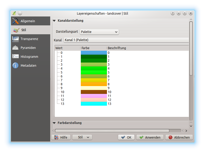
Paletted
Dies ist die voreingestellt Darstellungsart für Singleband-Dateien die bereits eine Farbtabelle besitzen, wobei jedem Pixel eine bestimmte Farbe zugewiesen wird. In diesem Fall wird die Palette automatisch dargestellt. Wenn Sie die Farben, die einem bestimmten Wert zugewiesen werden, ändern wollen, Doppelklicken Sie auf die Farbe und der Farbauswahl Dialog erscheint. Seit QGIS 2.2. ist es möglich dem Farbwert eine Beschriftung zuzuweisen. Die Beschriftung erscheint dann in der Legende des Rasterlayers.
Raster Style - Paletted Rendering
Kontrastverbesserung
Bemerkung
Wenn GRASS Rasterlayer hinzugefügt werden wird die Option Kontrastverbesserung immer automatisch auf Strecken auf MinMax eingestellt, ungeachtet der Einstellungen in den QGIS Optionen.
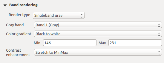
Singleband gray
This renderer allows you to render a single band layer with a Color gradient:
‘Black to white’ or ‘White to black’. You can define a Min
and a Max value by choosing the Extent first and
then pressing [Load]. QGIS can Estimate (faster)
the Min and Max values of the bands or use the
Actual (slower) Accuracy.
Raster Style - Singleband gray rendering
With the Load min/max values section, scaling of the color table
is possible. Outliers can be eliminated using the Cumulative
count cut setting.
The standard data range is set from 2% to 98% of the data values and can
be adapted manually. With this setting, the gray character of the image can disappear.
Further settings can be made with Min/max and
Mean +/- standard deviation x .
While the first one creates a color table with all of the data included in the
original image, the second creates a color table that only considers values
within the standard deviation or within multiple standard deviations.
This is useful when you have one or two cells with abnormally high values in
a raster grid that are having a negative impact on the rendering of the raster.
Singleband pseudocolor
Dies ist eine Darstellungsoption für Einkanaldateien die eine kontinuierliche Palette enthalten. Sie können hier auch individuelle Karten für die einzelnen Kanäle erstellen.
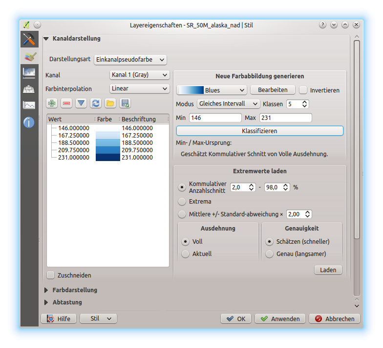
Raster Style - Singleband pseudocolor rendering
Three types of color interpolation are available:
- Discrete
- Linear
- Exact
In the left block, the button  Add values manually adds a value
to the individual color table. The button
Add values manually adds a value
to the individual color table. The button  Remove selected row
deletes a value from the individual color table, and the
Remove selected row
deletes a value from the individual color table, and the
 Sort colormap items button sorts the color table according
to the pixel values in the value column. Double clicking on the value column
lets you insert a specific value. Double clicking on the color column opens the dialog
Change color, where you can select a color to apply on that value.
Further, you can also add labels for each color, but this value won’t be displayed
when you use the identify feature tool.
You can also click on the button
Sort colormap items button sorts the color table according
to the pixel values in the value column. Double clicking on the value column
lets you insert a specific value. Double clicking on the color column opens the dialog
Change color, where you can select a color to apply on that value.
Further, you can also add labels for each color, but this value won’t be displayed
when you use the identify feature tool.
You can also click on the button  Load color map from band,
which tries to load the table from the band (if it has any). And you can use the
buttons
Load color map from band,
which tries to load the table from the band (if it has any). And you can use the
buttons  Load color map from file or
  Export color map to file to load an existing color table or to save the
defined color table for other sessions.
Export color map to file to load an existing color table or to save the
defined color table for other sessions.
In the right block, Generate new color map allows you to create newly
categorized color maps. For the Classification mode  ‘Equal interval’, you only need to select the number of classes
and press the button Classify. You can invert the colors
of the color map by clicking the
‘Equal interval’, you only need to select the number of classes
and press the button Classify. You can invert the colors
of the color map by clicking the  Invert
checkbox. In the case of the Mode ‘Continuous’, QGIS creates
classes automatically depending on the Min and Max.
Defining Min/Max values can be done with the help of the Load min/max values section.
A lot of images have a few very low and high data. These outliers can be eliminated
using the Cumulative count cut setting. The standard
data range is set from 2% to 98% of the data values and can be adapted manually.
With this setting, the gray character of the image can disappear.
With the scaling option Min/max, QGIS creates a color
table with all of the data included in the original image (e.g., QGIS creates a
color table with 256 values, given the fact that you have 8 bit bands).
You can also calculate your color table using the Mean +/-
standard deviation x .
Then, only the values within the standard deviation or within multiple standard deviations
are considered for the color table.
Invert
checkbox. In the case of the Mode ‘Continuous’, QGIS creates
classes automatically depending on the Min and Max.
Defining Min/Max values can be done with the help of the Load min/max values section.
A lot of images have a few very low and high data. These outliers can be eliminated
using the Cumulative count cut setting. The standard
data range is set from 2% to 98% of the data values and can be adapted manually.
With this setting, the gray character of the image can disappear.
With the scaling option Min/max, QGIS creates a color
table with all of the data included in the original image (e.g., QGIS creates a
color table with 256 values, given the fact that you have 8 bit bands).
You can also calculate your color table using the Mean +/-
standard deviation x .
Then, only the values within the standard deviation or within multiple standard deviations
are considered for the color table.
Farbdarstellung
Für jede Kanaldarstellung ist eine Farbdarstellung möglich.
You can also achieve special rendering effects for your raster file(s) using one of the blending modes (see Mischmodi).
Weitere Einstellungen können durch das Verändern der Helligkeit, der Sättigung und des Kontrast gemacht werden. Sie können auch eine Graustufen Option verwenden bei der Sie zwischen ‘Nach Helligkeit’, ‘Nach Leuchtkraft’ und ‘Nach Durchschnitt’ wählen können. Für einen Farbwert in der Farbtabelle können Sie die ‘Stärke’ verändern.
Abtastung
Die Abtastung Option kommt zur Erscheinung wenn Sie in ein Bild herein- oder herauszoomen. Abtastungsmodi können die Erscheinung der Karte optimieren. Sie berechnen eine neue Grauwertmatrix anhand einer geometrischen Transformation.
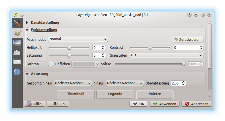
Raster Style - Color rendering and Resampling settings
Wenn Sie die ‘Nächster Nachbar’ Methode anwenden kann die Karte eine pixelige Struktur bein Hineinzoomen haben. Dieses Erscheinungsbild kann verbessert werden indem man die ‘Bilinear’ oder ‘Kubisch’ Methode verwendet, die scharfe Objekte verwischt. Der Effekt ist ein weicheres Bild. Diese Methode kann z.B. auf digitale Topographische Karten angewendet werden.
At the bottom of the Style tab, you can see a thumbnail of the layer, its legend symbol, and the palette.
Transparency Properties
QGIS has the ability to display each raster layer at a different transparency level.
Use the transparency slider  to indicate to what extent the underlying layers
(if any) should be visible though the current raster layer. This is very useful
if you like to overlay more than one raster layer (e.g., a shaded relief map
overlayed by a classified raster map). This will make the look of the map more
three dimensional.
to indicate to what extent the underlying layers
(if any) should be visible though the current raster layer. This is very useful
if you like to overlay more than one raster layer (e.g., a shaded relief map
overlayed by a classified raster map). This will make the look of the map more
three dimensional.
Additionally, you can enter a raster value that should be treated as NODATA in the Additional no data value option.
An even more flexible way to customize the transparency can be done in the Custom transparency options section. The transparency of every pixel can be set here.
As an example, we want to set the water of our example raster file landcover.tif to a transparency of 20%. The following steps are necessary:
- Load the raster file landcover.tif.
- Open the Properties dialog by double-clicking on the raster name in the legend, or by right-clicking and choosing Properties from the pop-up menu.
- Select the Transparency tab.
- From the Transparency band drop-down menu, choose ‘None’.
Klicken Sie den
Werte manuell hinzufügen Knopf. Eine neue Zeile erscheint in der Pixelliste.- Enter the raster value in the ‘From’ and ‘To’ column (we use 0 here), and adjust the transparency to 20%.
- Press the [Apply] button and have a look at the map.
You can repeat steps 5 and 6 to adjust more values with custom transparency.
Wie Sie sehen können ist es recht einfach die benutzerdefinierte Transparenz einzustellen, aber es kann ganz schön viel Arbeit sein. Deswegen können Sie den Knopf  In Datei exportieren benutzen um Ihre Transparenzliste in eine Datei zu speichern. Der Knopf Aus Datei importieren lädt Ihre Transparenzeinstellungen und wendet sie auf den aktuellen Rasterlayer an.
Pyramids Properties
Hochaufgelöste Rasterlayer können das Navigieren in QGIS verlangsamen. Indem Sie geringer aufgelöste Kopien (Pyramiden) erstellen, kann die Darstellung optimiert werden. QGIS wählt dann entsprechend des Zoom-Levels die passende Auflösung.
Sie brauchen dazu Schreibrecht in dem Ordner, in dem sich sie Originaldaten befinden.
From the Resolutions list, select resolutions for which you want to create pyramid by clicking on them.
If you choose Internal (if possible) from the Overview format drop-down menu, QGIS tries to build pyramids internally.
Bemerkung
Bitte beachten Sie dass das Erstellen von Pyramiden die Originaldatei verändern kann und sind sie erstmal erstellt können Sie nicht entfernt werden. Wenn Sie eine ‘nichtpyramidisierte’ Version Ihres Rasters erhalten wollen, machen Sie eine Backupkopie vor dem Erstellen von Pyramiden.
If you choose External and External (Erdas Imagine) the pyramids will be created in a file next to the original raster with the same name and a .ovr extension.
Several Resampling methods can be used to calculate the pyramids:
Nächster Nachbar
Durchschnitt
Gauß
Kubisch
Modus
Keine
Finally, click [Build pyramids] to start the process.
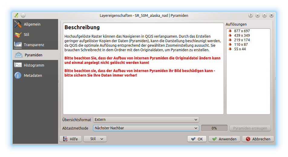
Raster Pyramids
Histogram Properties
The Histogram tab allows you to view the distribution of the bands
or colors in your raster. The histogram is generated automatically when you open the
Histogram tab. All existing bands will be displayed together. You
can save the histogram as an image with the button.
With the Visibility option in the  Prefs/Actions menu,
you can display histograms of the individual bands. You will need to select the option
Show selected band.
The Min/max options allow you to ‘Always show min/max markers’, to ‘Zoom
to min/max’ and to ‘Update style to min/max’.
With the Actions option, you can ‘Reset’ and ‘Recompute histogram’ after
you have chosen the Min/max options.
Prefs/Actions menu,
you can display histograms of the individual bands. You will need to select the option
Show selected band.
The Min/max options allow you to ‘Always show min/max markers’, to ‘Zoom
to min/max’ and to ‘Update style to min/max’.
With the Actions option, you can ‘Reset’ and ‘Recompute histogram’ after
you have chosen the Min/max options.
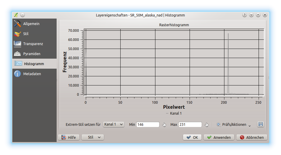
Rasterhistogramm
Metadata Properties
The Metadata tab displays a wealth of information about the raster layer, including statistics about each band in the current raster layer. From this tab, entries may be made for the Description, Attribution, MetadataUrl and Properties. In Properties, statistics are gathered on a ‘need to know’ basis, so it may well be that a given layer’s statistics have not yet been collected.
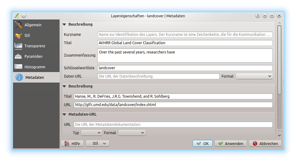
Raster Metadata
Legend Properties
The Legend tab provides you with a list of widgets you can embed within the layer tree in the Layers panel. The idea is to have a way to quickly access some actions that are often used with the layer (setup transparency, filtering, selection, style or other stuff...).
By default, QGIS provides transparency widget but this can be extended by plugins registering their own widgets and assign custom actions to layers they manage.