6.4. Lesson: Spatial Statistics
Note
Lesson developed by Linfiniti and S Motala (Cape Peninsula University of Technology)
Spatial statistics allows you to analyze and understand what is going on in a given vector dataset. QGIS includes many useful tools for statistical analysis.
The goal for this lesson: To know how to use QGIS’ spatial statistics tools within the Processing Toolbox.
6.4.1. ★☆☆ Follow Along: Create a Test Dataset
We will create a random set of points, to get a dataset to work with.
To do so, you will need a polygon dataset to define the area you want to create the points in.
We will use the area covered by streets.
Start a new project
Add your
roadsdataset, as well assrtm_41_19(elevation data) found inexercise_data/raster/SRTM/.Note
You might find that the SRTM DEM layer has a different CRS to that of the roads layer. QGIS is reprojecting both layers in a single CRS. For the following exercises this difference does not matter, but feel free to reproject (as shown earlier in this module).
Open Processing toolbox
Use the tool to generate an area enclosing all the roads by selecting
Convex Hullas the Geometry Type: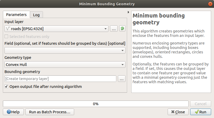
As you know, if you don’t specify the output, Processing creates temporary layers. It is up to you to save the layers immediately or at a later stage.
Creating random points
Create 100 random points in this area using the tool at , with a minimum distance of
0.0: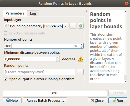
Note
The yellow warning sign tells you that that parameter concerns distances. The Bounding geometry layer is in a Geographical Coordinate System and the algorithm is just reminding you this. For this example we won’t use this parameter so you can ignore it.
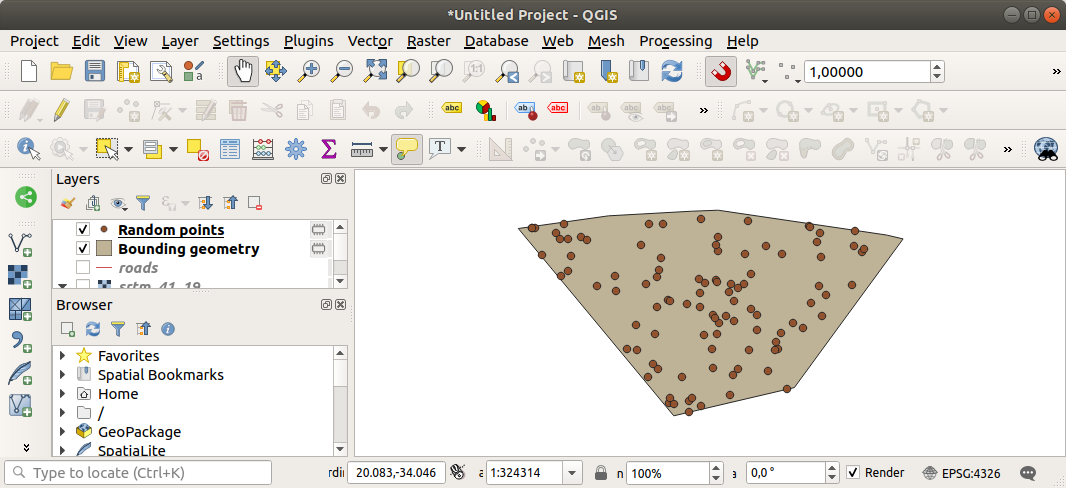
If needed, move the generated random point to the top of the legend to see them better:
Sampling the data
To create a sample dataset from the raster, you’ll need to use the algorithm. This tool samples the raster at the locations of the points and adds the raster values in new field(s) depending on the number of bands in the raster.
Open the Sample raster values algorithm dialog
Select
Random_pointsas the layer containing sampling points, and the SRTM raster as the band to get values from. The default name of the new field isrvalue_N, whereNis the number of the raster band. You can change the name of the prefix if you want.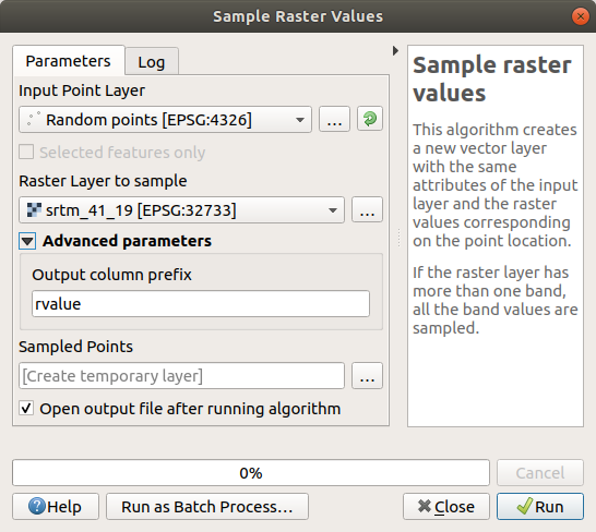
Press Run
Now you can check the sampled data from the raster file in the
attribute table of the Sampled Points layer.
They will be in a new field with the name you have chosen.
A possible sample layer is shown here:
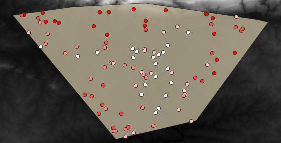
The sample points are classified using the rvalue_1 field such
that red points are at a higher altitude.
You will be using this sample layer for the rest of the statistical exercises.
6.4.2. ★☆☆ Follow Along: Basic Statistics
Now get the basic statistics for this layer.
Click on the
 Show statistical summary icon in the
Attributes Toolbar.
A new panel will pop up.
Show statistical summary icon in the
Attributes Toolbar.
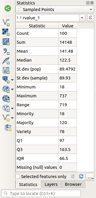
A new panel will pop up.In the dialog that appears, specify the
Sampled Pointslayer as the source.Select the rvalue_1 field in the field combo box. This is the field you will calculate statistics for.
The Statistics Panel will be automatically updated with the calculated statistics:
Note
You can copy the values by clicking on the
 Copy Statistics To Clipboard button and paste the results
into a spreadsheet.
Copy Statistics To Clipboard button and paste the results
into a spreadsheet.Close the Statistics Panel when done
Many different statistics are available:
- Count
The number of samples/values.
- Sum
The values added together.
- Mean
The mean (average) value is simply the sum of the values divided by the number of values.
- Median
If you arrange all the values from smallest to greatest, the middle value (or the average of the two middle values, if N is an even number) is the median of the values.
- St Dev (pop)
The standard deviation. Gives an indication of how closely the values are clustered around the mean. The smaller the standard deviation, the closer values tend to be to the mean.
- Minimum
The minimum value.
- Maximum
The maximum value.
- Range
The difference between the minimum and maximum values.
- Q1
First quartile of the data.
- Q3
Third quartile of the data.
- Missing (null) values
The number of missing values.
6.4.3. ★☆☆ Follow Along: Compute statistics on distances between points
Create a new temporary point layer.
Enter edit mode, and digitize three points somewhere among the other points.
Alternatively, use the same random point generation method as before, but specify only three points.
Save your new layer as
distance_pointsin the format you prefer.
To generate statistics on the distances between points in the two layers:
Open the tool.
Select the
distance_pointslayer as the input layer, and theSampled Pointslayer as the target layer.Set their
idfield as unique field referencesChange the Output matrix type option into Summary distance matrix.
set value of Use only the nearest (k) target points to
2.If you want you can save the output layer as a file or just run the algorithm and save the temporary output layer later.
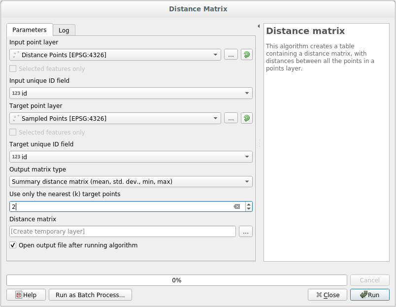
Click Run to generate the distance matrix layer.
Open the attribute table of the generated layer: values refer to the distances between the
distance_pointsfeatures and their two nearest points in theSampled Pointslayer: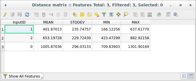
With these parameters, the Distance Matrix tool calculates distance statistics for each point of the input layer with respect to their two nearest points in the target layer. The fields of the output layer contain the mean, standard deviation, minimum and maximum for the calculated distances.
For further testing, you may want to modify the Output matrix type option or the number of target points.
6.4.4. ★☆☆ Follow Along: Nearest Neighbor Analysis (within layer)
To do a nearest neighbor analysis of a point layer:
Choose .
In the dialog that appears, select the
Random pointslayer and click Run.The results will appear in the Processing Result Viewer Panel.
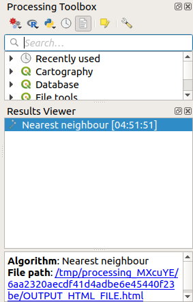
Click on the blue link to open the
htmlpage with the results: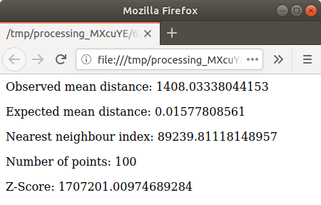
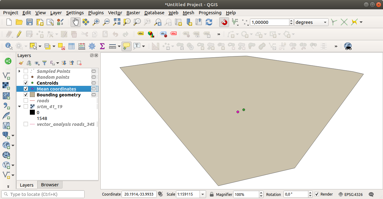
6.4.5. ★☆☆ Follow Along: Mean Coordinates
To get the mean coordinates of a dataset:
Start
In the dialog that appears, specify
Random pointsas Input layer, and leave the optional choices unchanged.Click Run.
Let us compare this to the central coordinate of the polygon that was used to create the random sample.
Start
In the dialog that appears, select
Bounding geometryas the input layer.
As you can see, the mean coordinates (pink point) and the center of the study area (in green) don’t necessarily coincide.
The centroid is the barycenter of the layer (the barycenter of a square is the center of the square) while the mean coordinates represent the average of all node coordinates.
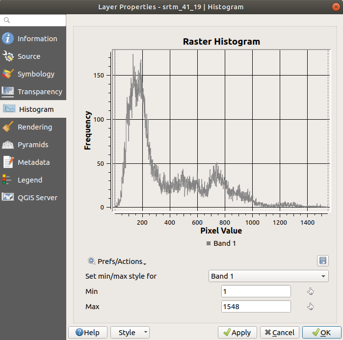
6.4.6. ★☆☆ Follow Along: Image Histograms
The histogram of a dataset shows the distribution of its values. The simplest way to demonstrate this in QGIS is via the image histogram, available in the Layer Properties dialog of any image layer (raster dataset).
In your Layers panel, right-click on the
srtm_41_19layerSelect
Choose the Histogram tab. You may need to click on the Compute Histogram button to generate the graphic. You will see a graph that shows the frequency distribution for the raster values.
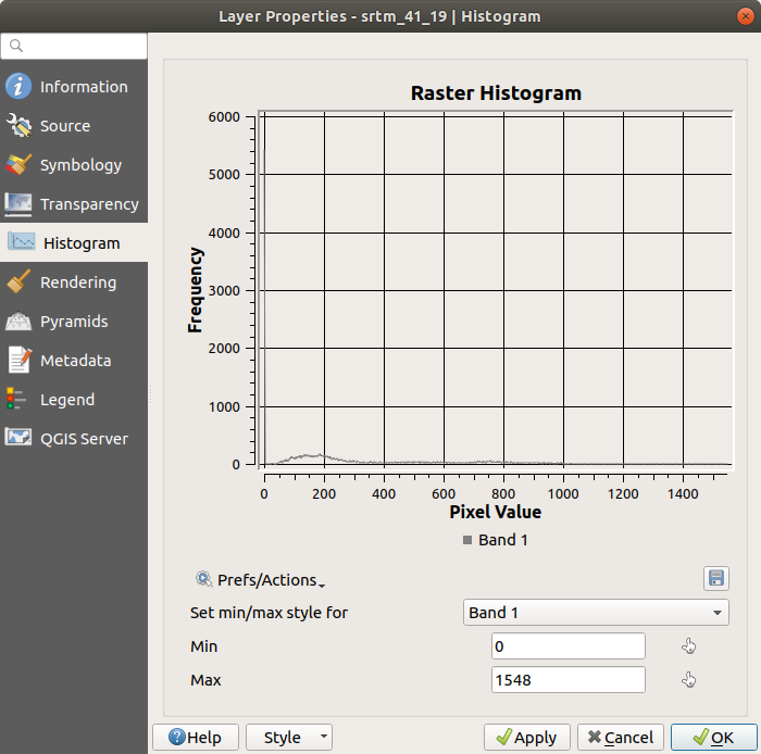
The graph can be exported as an image with the
 Save plot button
You can see more detailed information about the layer in the Information tab (the mean and max values are estimated, and may not be exact).
The mean value is 332.8 (estimated to 324.3), and the maximum
value is 1699 (estimated to 1548)!
You can zoom in the histogram.
Since there are a lot of pixels with value 0, the histogram looks
compressed vertically.
By zooming in to cover everything but the peak at 0, you will see
more details:
Note
If the mean and maximum values are not the same as above, it
can be due to the min/max value calculation.
Open the Symbology tab and expand the
Min / Max Value Settings menu.
Choose  Min / max and click on
Apply.
Min / max and click on
Apply.
Keep in mind that a histogram shows you the distribution of values, and not all values are necessarily visible on the graph.
6.4.7. ★☆☆ Follow Along: Spatial Interpolation
Let’s say you have a collection of sample points from which you would
like to extrapolate data.
For example, you might have access to the Sampled points
dataset we created earlier, and would like to have some idea of what
the terrain looks like.
To start, launch the tool in the Processing Toolbox.
For Point layer select
Sampled pointsSet Weighting power to
5.0In Advanced parameters, set Z value from field to
rvalue_1Finally click on Run and wait until the processing ends
Close the dialog
Here is a comparison of the original dataset (left) to the one constructed from our sample points (right). Yours may look different due to the random nature of the location of the sample points.
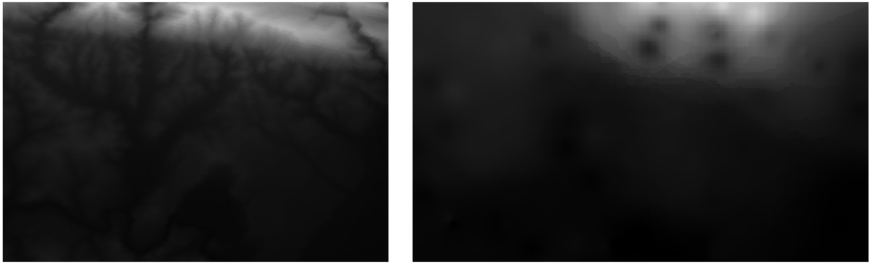
As you can see, 100 sample points aren’t really enough to get a detailed impression of the terrain. It gives a very general idea, but it can be misleading as well.
6.4.8. ★★☆ Try Yourself: Different interpolation methods
Use the processes shown above to create a set of 10 000 random points
Note
If the number of points is really big, the processing time can take a long time.
Use these points to sample the original DEM
Use the Grid (IDW with nearest neighbor searching) tool on this dataset.
Set Power and Smoothing to
5.0and2.0, respectively.
The results (depending on the positioning of your random points) will look more or less like this:
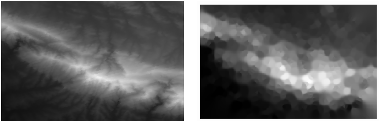
This is a better representation of the terrain, due to the greater density of sample points. Remember, larger samples give better results.
6.4.9. In Conclusion
QGIS has a number of tools for analyzing the spatial statistical properties of datasets.
6.4.10. What’s Next?
Now that we have covered vector analysis, why not see what can be done with rasters? That is what we will do in the next module!