Importante
A tradução é um esforço comunitário você pode contribuir. Esta página está atualmente traduzida em 12.69%.
20. Working with Point Clouds
20.1. Introduction to Point Clouds
What is A Point Cloud?
A point cloud is a three-dimensional image of a space made up of many individual of data points (up to billions, even trillions). Each of the points has an x, y and z coordinate. Depending on the capture method, point clouds usually also have additional attributes that came from the capture, such as color values or intensity. These attributes can be used, for instance, to display point clouds in different colors. In QGIS, a point cloud can be used to generate a three-dimensional image of the landscape (or of another space).
Supported Formats
QGIS supports the data formats Entwine Point Tile (EPT) and LAS/LAZ. To work with point clouds, QGIS always saves the data in EPT. EPT is a storage format that consists of several files stored in a common folder. To allow quick access to the data, EPT uses indexing. For more information on the EPT format, see entwine homepage
If the data is in LAS or LAZ format, QGIS will convert it to EPT when it is
loaded for the first time. Depending on the size of the file, this may take
some time. In this process, a subfolder is created in the folder in which
the LAS/LAZ file is located according to the scheme
ept_ + name_LAS/LAZ_file. If such a subfolder already exists,
QGIS loads the EPT immediately (which leads to a reduced loading time).
Worth Knowing
In QGIS it is not (yet) possible to edit point clouds. If you want to manipulate your point cloud, you can use CloudCompare, an open source point cloud processing tool. Also the Point Data Abstraction Library (PDAL - similar to GDAL) offers you options to edit point clouds (PDAL is command line only).
Due to the large number of data points, it is not possible to display an
attribute table of point clouds in QGIS. However, the  Identify tool supports point clouds, so you can display all
attributes, even of a single data point.
20.2. Point Clouds Properties
The Layer Properties dialog for a point cloud layer offers general settings for the layer and its rendering. It also provides information about the layer.
To access the Layer Properties dialog:
In the Layers panel, double-click the layer or right-click and select Properties… from the context menu;
Go to menu when the layer is selected.
The point cloud Layer Properties dialog provides the following sections:
|
||
|
|
|
[1] Also available in the Layer styling panel
Nota
Most of the properties of a point cloud layer can be saved
to or loaded from a .qml file using the Style menu
at the bottom of the properties dialog. More details
at Guardar e partilhar Propriedades da Camada
20.2.1. Information Properties
The  Information tab is read-only and represents an
interesting place to quickly grab summarized information and metadata on
the current layer. Provided information are:
General such as name in the project, source path, last save time and size, the used provider
Based on the provider of the layer: extent and number of points
The Coordinate Reference System: name, units, method, accuracy, reference (i.e. whether it’s static or dynamic)
Metadata delivered by the provider: creation date, version, data format, scale X/Y/Z, …
Picked from the
 Metadata tab
(where they can be edited): access, extents, links, contacts, history…
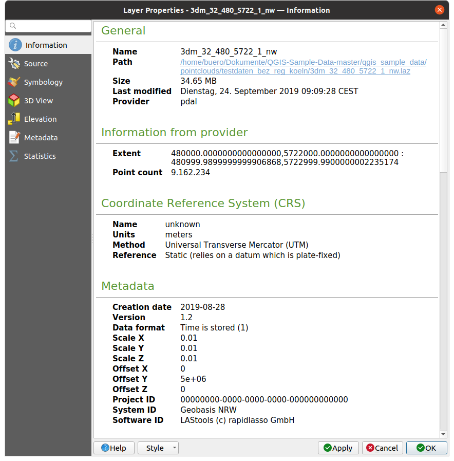
Fig. 20.1 Point cloud information tab
20.2.2. Source Properties
In the  Source tab you can see and edit basic
information about the point cloud layer:
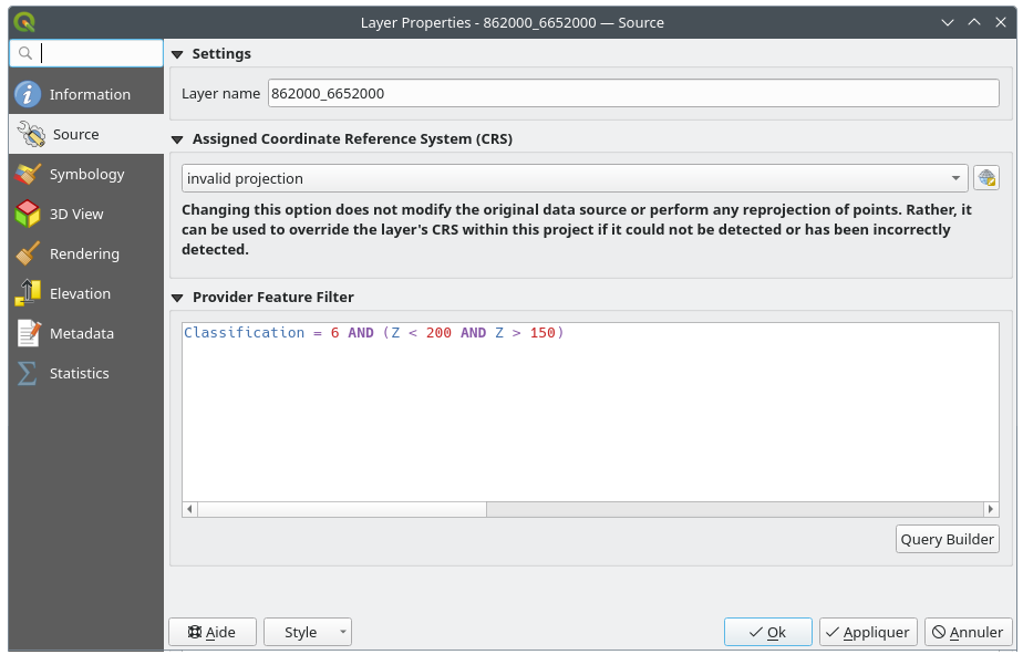
Fig. 20.2 Point cloud source tab
Settings: Set a Layer name different from the layer filename that will be used to identify the layer in the project (in the Layers Panel, with expressions, in print layout legend,…)
Assigned Coordinate Reference System (CRS): Here you can change the layer’s assigned Coordinate Reference System, selecting a recently used one in the drop-down list or clicking on
 set Projection Select CRS button (see Coordinate Reference System Selector). Use
this process only if the CRS applied to the layer is a wrong
one or if none was applied.
Provider Feature Filter: allows to restrict data to use in the current project to a subset, using functions and expression at the PDAL data provider level. Press the Query Builder button at the bottom to start setting the filter.
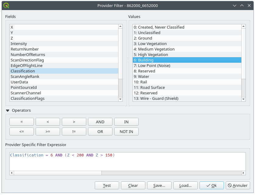
Fig. 20.3 Filtering point cloud layer to buildings at specific altitude
In the bottom part of the dialog, you can type a Provider specific filter expression. Such an expression can be built thanks to:
Fields: the list contains all the attributes of the point cloud layer. To add an attribute to the expression, double-click its name or just type it into the text box.
Values: frame lists values or statistics of the currently selected attribute, as a
key:valuepair. To add a value to the expression field, double click its name in the list: depending on the type of attribute, either the key or the value will be added to the expression. Or type the value in the expression text box.Operators: this toolbar contains all usable operators. To add an operator to the expression field, click the appropriate button. Relational operators (
=,>, …) and logical operators (AND,OR, …) are available.
The Test button helps you check the syntax of your query. Use the Clear button to wipe the query and revert the layer to its original state (i.e., fully load all the points in the layer). It is possible to Save… the query as a
.QQFfile, or Load… the query from a file into the dialog.When a filter is applied, QGIS treats the resulting subset as if it were the entire layer. For example if you applied the filter above for filtering buildings, you can not e.g. display, query, save or edit points that are of vegetation classification because they are not part of the subset.
Dica
Filtered layers are indicated in the Layers Panel
In the Layers panel, a filtered layer is listed with a
 Filter icon next to it
indicating the query used when the mouse hovers over the icon.
Double-click the icon to open the Query Builder dialog for edit.
This can also be achieved through the menu.
20.2.3. Symbology Properties
In the  Symbology tab the settings for the
rendering of the point cloud are made.
In the upper part, the settings of the different feature renderers can be found.
In the lower part, there are sections with which general settings
for the entire layer can be made and which apply over feature renderers.
20.2.3.1. Feature Rendering types
There are different options for rendering point clouds that can be selected using the drop-down menu at the top of the Symbology tab (see Fig. 20.4):
 Extent Only: Only a bounding box of the extent
of the data is displayed; convenient for overviewing the data extent.
As usual, the Symbol widget helps you configure
any properties (color, stroke, opacity, sub-layers, …) you’d like for the box.
 Attribute by Ramp: The data is drawn over
a color gradient. See Attribute by Ramp Renderer
 RGB: Draw the data using red, green and blue
color values. See RGB Renderer
 Classification: The data is drawn using different colors
for different classes. See Classification Renderer
When a point cloud is loaded, QGIS follows a logic to select the best renderer:
if the dataset contains color information (red, green, blue attributes), the RGB renderer will be used
else if the dataset contains a
Classificationattribute, the classified renderer will be usedelse it will fall back to rendering based on Z attribute
If you do not know the attributes of the point cloud, the  Statistics tab provides a good
overview of which attributes are contained in the point cloud and in which
ranges the values are located.
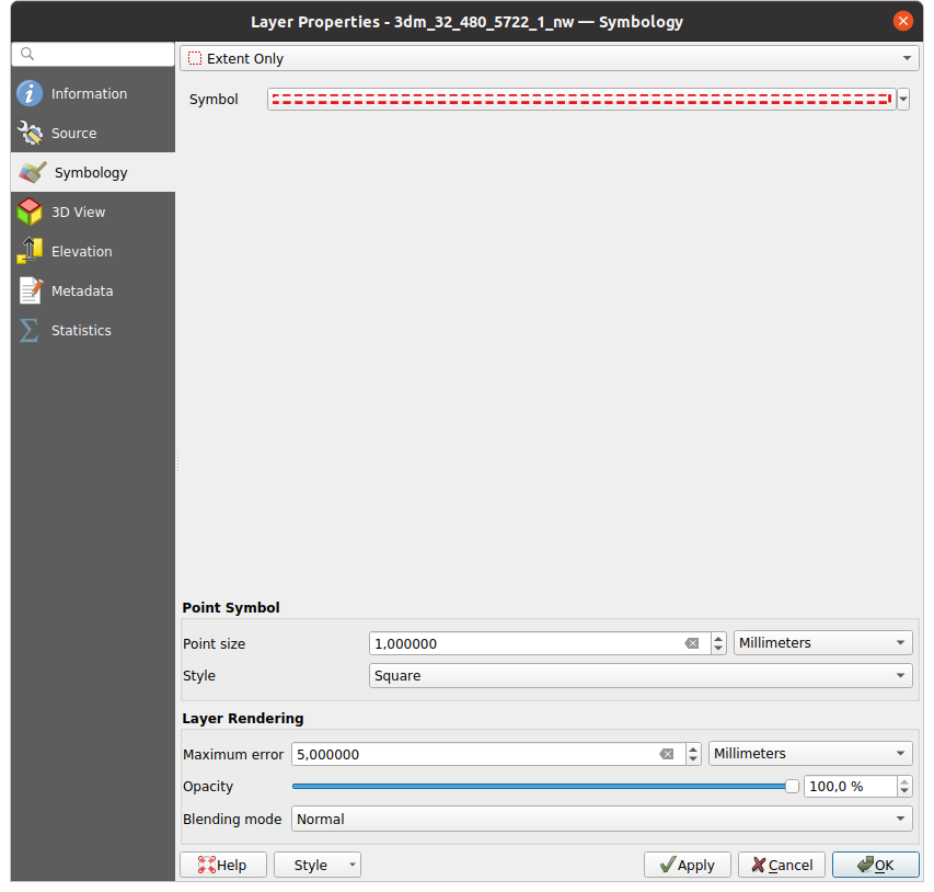
Fig. 20.4 Point cloud symbology tab
Attribute by Ramp Renderer
With  Attribute by Ramp, the data can be
displayed by numerical values over a color gradient. Such numerical values
can be, for example, an existing intensity attribute or the Z-value. Depending
on a minimum and a maximum value, the other values are spread to the color
gradient via interpolation. The distinct values and their assignment to a
certain color are called «color map» and are shown in the table. There are
various setting options, which are described below the figure.
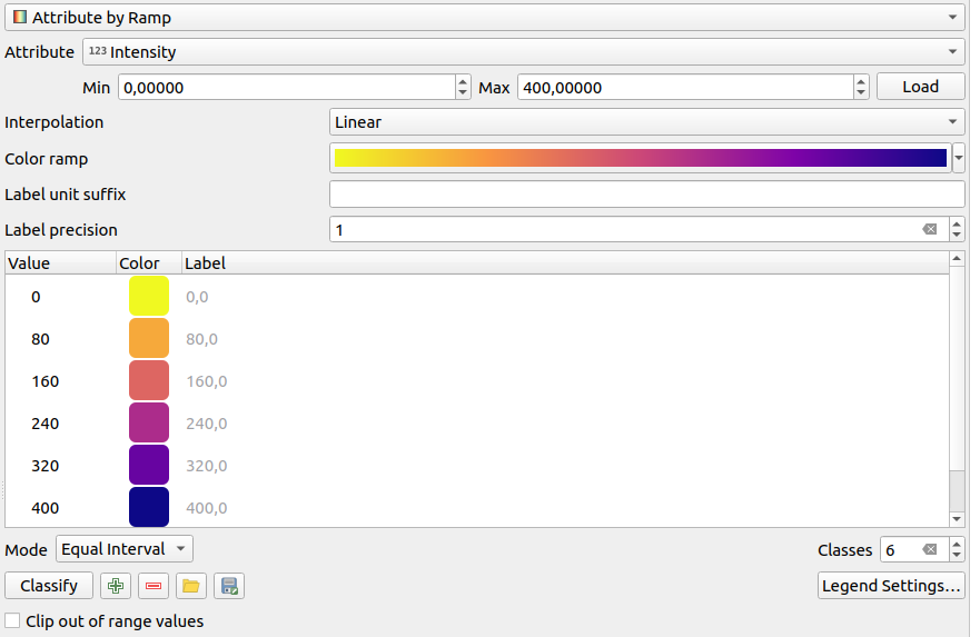
Fig. 20.5 Point cloud symbology tab: Attribute by Ramp
Min and Max define the range that is applied to the color ramp: the Min value represents the left, the Max value the right end of the color ramp, the values in between are interpolated. By default QGIS detects the minimum and the maximum from the selected attribute but they can be modified. Once you have changed the values, you can restore the defaults by clicking on the Load button.
The Interpolation entry defines how values are assigned their color:
Discrete (a
<=symbol appears in the header of the Value column): The color is taken from the closest color map entry with equal or higher valueLinear The color is linearly interpolated from the color map entries above and below the pixel value, meaning that to each dataset value corresponds a unique color
Exact (a
=symbol appears in the header of the Value column): Only pixels with value equal to a color map entry are applied a color; others are not rendered.
The Color ramp widget helps you select the color ramp to assign to the dataset. As usual with this widget, you can create a new one and edit or save the currently selected one.
The Label unit suffix adds a label after the value in the legend, and the Label precision controls the number of decimals to display.
The classification Mode helps you define how values are distributed across the classes:
Continuous: Classes number and color are fetched from the color ramp stops; limits values are set following stops distribution in the color ramp (you can find more information on stops in Setting a Color Ramp).
Equal interval: The number of classes is set by the Classes field at the end of the line; limits values are defined so that the classes all have the same magnitude.
The classes are determined automatically and shown in the color map table. But you can also edit these classes manually:
Double clicking in a Value in the table lets you modify the class value
Double clicking in the Color column opens the Selector de Cor widget, where you can select a color to apply for that value
Double clicking in the Label column to modify the label of the class
Right-clicking over selected rows in the color table shows a contextual menu to Change Color… and Change Opacity… for the selection
Below the table there are the options to restore the default classes with
Classify or to manually  Add values or
 Delete selected values from the table.
Since a customized color map can be very complex, there is also the option to
 Load an existing color map or to
  Save it for use in
other layers (as a
 txt file).
If you have selected Linear for Interpolation, you can also configure:
 Clip out of range values By default, the linear
method assigns the first class (respectively the last class) color to
values in the dataset that are lower than the set Min
(respectively greater than the set Max) value.
Check this setting if you do not want to render those values.
Clip out of range values By default, the linear
method assigns the first class (respectively the last class) color to
values in the dataset that are lower than the set Min
(respectively greater than the set Max) value.
Check this setting if you do not want to render those values.Legend settings, for display in the Layers panel and in the layout legend. Customization works the same way as with a raster layer (find more details at Customize raster legend).
RGB Renderer
With the  RGB renderer, three selected attributes
from the point cloud will be used as the red, green and blue component. If the
attributes are named accordingly, QGIS selects them automatically and fetches
Min and Max values for each band and scales the coloring
accordingly. However, it is also possible to modify the values manually.
A Contrast enhancement method can be applied to the values: No Enhancement, Stretch to MinMax, Stretch and Clip to MinMax and Clip to MinMax
Nota
The Contrast enhancement tool is still under development. If you have problems with it, you should use the default setting Stretch to MinMax.
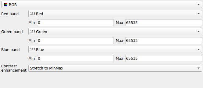
Fig. 20.6 The point cloud RGB renderer
Classification Renderer
In the  Classification rendering, the point cloud is shown
differentiated by color on the basis of an attribute. Any type of attribute
can be used (numeric, string, …). Point cloud data often includes a
field called
 Classification. This usually contains data determined
automatically by post-processing, e.g. about vegetation. With
Attribute you can select the field from the attribute table that
will be used for the classification. By default, QGIS uses the definitions of
the LAS specification (see table “ASPRS Standard Point Classes” in the PDF on
ASPRS home page).
However, the data may deviate from this schema; in case of doubt, you have to
ask the person or institution from which you received the data for the
definitions.
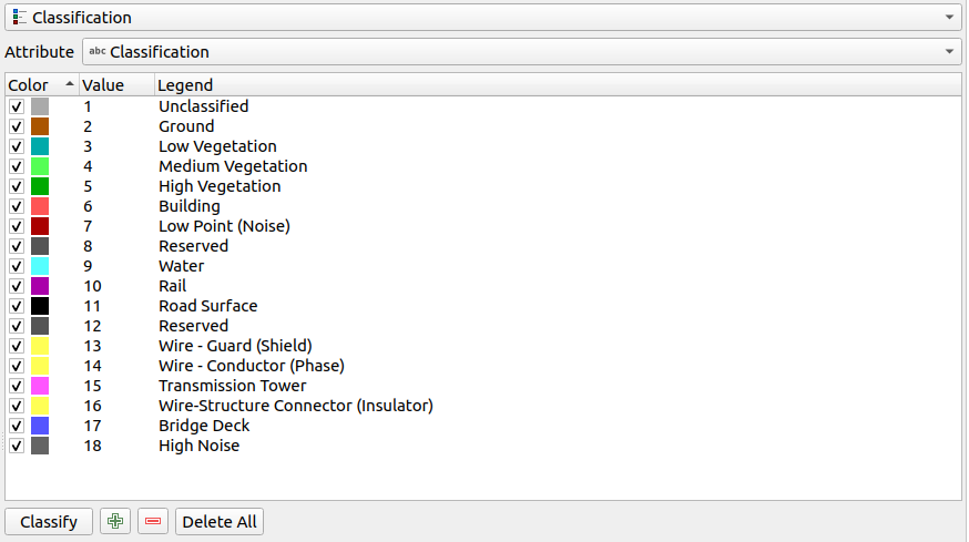
Fig. 20.7 The point cloud classification renderer
In the table all used values are displayed with the corresponding color and
legend. At the beginning of each row there is a  check box; if it is
unchecked, this value is no longer shown on the map. With double click in the
table, the Color, the Value and the Legend
can be modified (for the color, the Selector de Cor widget opens).
Below the table there are buttons with which you can change the default classes generated by QGIS:
With the Classify button the data can be classified automatically: all values that occur in the attributes and are not yet present in the table are added
With
 Add and
  Delete,
values can be added or removed manually
Delete,
values can be added or removed manuallyDelete All removes all values from the table
Dica
In the Layers panel, you can right-click over a class leaf entry of a layer to quickly configure visibility of the corresponding features.
20.2.3.2. Point Symbol
Under Point Symbol, the size and the unit (e.g. millimeters, pixels, inches) with which each data point is displayed can be set. Either Circle or Square can be selected as the style for the points.
20.2.3.3. Layer Rendering
In the Layer Rendering section you have the following options to modify the rendering of the layer:
Draw order: allows to control whether point clouds rendering order on 2d map canvas should rely on their Z value. It is possible to render :
with the Default order in which the points are stored in the layer,
from Bottom to top (points with larger Z values cover lower points giving the looks of a true ortho photo),
or from Top to bottom where the scene appears as viewed from below.
Maximum error: Point clouds usually contains more points than are needed for the display. By this option you set how dense or sparse the display of the point cloud will be (this can also be understood as “maximum allowed gap between points”). If you set a large number (e.g. 5 mm), there will be visible gaps between points. Low value (e.g. 0.1 mm) could force rendering of unnecessary amount of points, making rendering slower (different units can be selected).
Opacity: You can make the underlying layer in the map canvas visible with this tool. Use the slider to adapt the visibility of your layer to your needs. You can also make a precise definition of the percentage of visibility in the menu beside the slider.
Blending mode: You can achieve special rendering effects with this tool. The pixels of your overlaying and underlying layers are mixed through the settings described in Modos de Mesclagem.
Eye dome lighting: this applies shading effects to the map canvas for a better depth rendering. Rendering quality depends on the draw order property; the Default draw order may give sub-optimal results. Following parameters can be controlled:
Strength: increases the contrast, allowing for better depth perception
Distance: represents the distance of the used pixels off the center pixel and has the effect of making edges thicker.
20.2.4. 3D View Properties
In the  3D View tab you can make the settings for the rendering
of the point cloud in 3D maps.
20.2.4.1. 3D Rendering modes
Following options can be selected from the drop down menu at the top of the tab:
No Rendering: Data are not displayed
Follow 2D Symbology: Syncs features rendering in 3D with symbology assigned in 2D
 Single Color: All points are displayed in the same
color regardless of attributes
 Attribute by Ramp: Interpolates a given attribute
over a color ramp and assigns to features their matching color.
See Attribute by Ramp Renderer.
 RGB: Use different attributes of the features
to set the Red, Green and Blue color components to assign to them.
See RGB Renderer.
 Classification: differentiates points by color
on the basis of an attribute. See Classification Renderer.
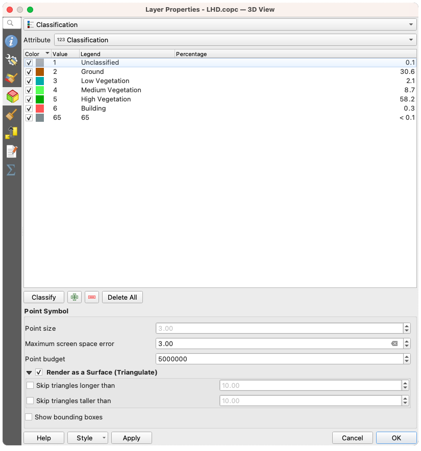
Fig. 20.8 The point cloud 3D view tab with the classification renderer
20.2.4.2. 3D Point Symbol
In the lower part of the  3D View tab you can find the
Point Symbol section. Here you can make general settings for the
entire layer which are the same for all renderers. There are the following
options:
Point size: The size (in pixels) with which each data point is displayed can be set
Maximum screen space error: By this option you set how dense or sparse the display of the point cloud will be (in pixels). If you set a large number (e.g. 10), there will be visible gaps between points; low value (e.g. 0) could force rendering of unnecessary amount of points, making rendering slower (you can find more details at Symbology Maximum error).
Point budget: To avoid long rendering, you can set the maximum number of points that will be rendered
Check
 Render as surface (Triangulate) to render
the point cloud layer in the 3D view with a solid surface obtained by triangulation.
You can control dimensions of the computed triangles:
 Show bounding boxes: Especially useful for debugging,
shows bounding boxes of nodes in hierarchy
20.2.5. Rendering Properties
Under the Scale dependent visibility group box,
you can set the Maximum (inclusive) and Minimum
(exclusive) scale, defining a range of scale in which features will be
visible. Out of this range, they are hidden. The  Set to current canvas scale button helps you use the current map
canvas scale as boundary of the range visibility.
See Visibility Scale Selector for more information.
Nota
You can also activate scale dependent visibility on a layer from within the Layers panel: right-click on the layer and in the contextual menu, select Set Layer Scale Visibility.
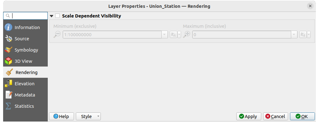
Fig. 20.9 The point cloud rendering tab
20.2.6. Elevation Properties
In the  Elevation tab, you can set corrections for
the Z-values of the data. This may be necessary to adjust the elevation of
the data in 3D maps and its appearance in the profile tool charts.
There are following options:
Under Elevation group:
You can set a Scale: If
10is entered here, a point that has a value Z =5is displayed at a height of50.An offset to the z-level can be entered. This is useful to match different data sources in its height to each other. By default, the lowest z-value contained in the data is used as this value. This value can also be restored with the
 Refresh button
at the end of the line.
Under Profile Chart Accuracy, the Maximum error helps you control how dense or sparse the points will be rendered in the elevation profile. Larger values result in a faster generation with less points included.
Under Profile Chart Appearance, you can control the point display:
Point size: the size to render the points with, in supported units (millimeters, map units, pixels, …)
Style: whether to render the points as Circle or Square
Apply a single Color to all the points visible in the profile view
Check
 Respect layer’s coloring to instead show the points
with the color assigned via their 2D symbology
 Apply opacity by distance from curve effect,
reducing the opacity of points which are further from the profile curve
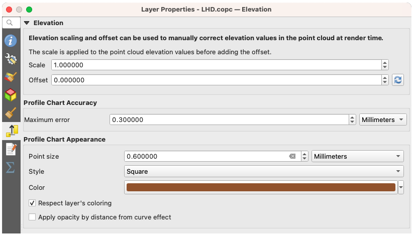
Fig. 20.10 The point cloud elevation tab
20.2.7. Metadata Properties
The  Metadata tab provides you with options
to create and edit a metadata report on your layer.
See Metadata for more information.
20.2.8. Statistics Properties
In the  Statistics tab you can get an overview of
the attributes of your point cloud and their distribution.
At the top you will find the section Attribute Statistics. Here all attributes contained in the point cloud are listed, as well as some of their statistical values: Minimum, Maximum, Mean, Standard Deviation
If there is an attribute Classification, then there is another table in the lower section. Here all values contained in the attribute are listed, as well as their absolute Count and relative % abundance.
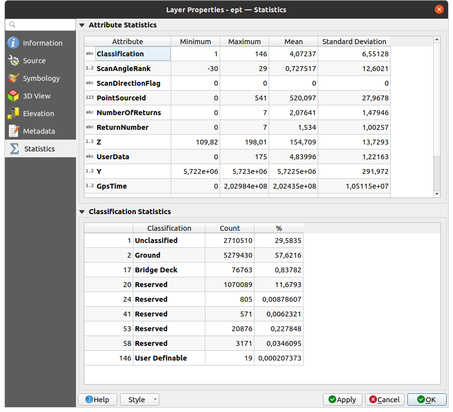
Fig. 20.11 The point cloud statistics tab
20.3. Virtual point cloud
Lidar surveys of larger areas are often multi-terabyte datasets with many billions of points.
Having such large datasets represented as a single point cloud file is not practical
due to the difficulties of storage, transfer, display and analysis.
Point cloud data are therefore typically stored and distributed split into square tiles (e.g. 1km x 1km),
each tile having a more manageable file size (e.g. ~200 MB when compressed).
Tiling of data solves the problems with size of data, but it introduces issues when processing or viewing an area of interest that does not fit entirely into a single tile. Users need to develop workflows that take into account multiple tiles and special care needs to be taken to deal with data near edges of tiles to avoid unwanted artefacts in outputs. Similarly, when viewing point cloud data, it becomes cumbersome to load many individual files and apply the same symbology.
Here is an example of several point cloud tiles loaded in QGIS. Each tile is styled based on min/max Z values of the tile, creating visible artefacts on tile edges. The styling has to be adjusted for each layer separately:
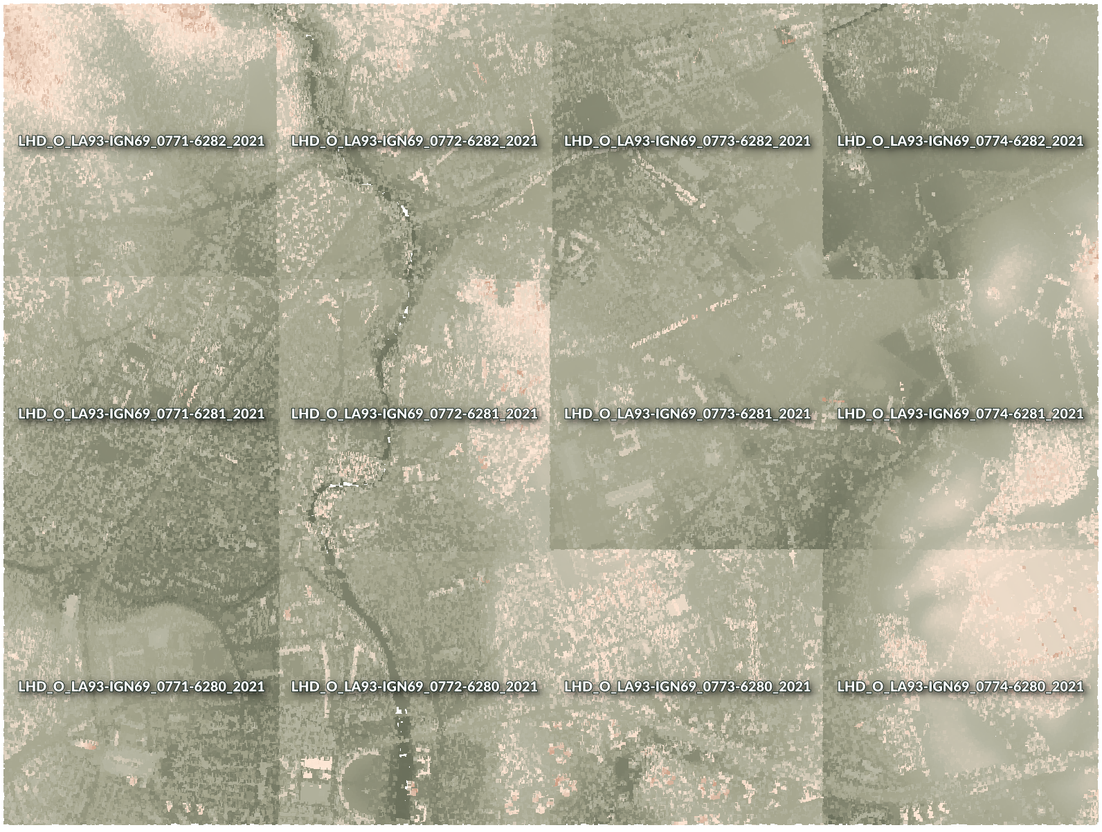
Fig. 20.12 Individual point cloud tiles loaded, with artefacts on edges
In the GIS world, many users are familiar with the concept of virtual rasters. A virtual raster is a file that simply references other raster files with actual data. In this way, GIS software then treats the whole dataset comprising many files as a single raster layer, making the display and analysis of all the rasters listed in the virtual file much easier.
Borrowing the concept of virtual rasters from GDAL, virtual point cloud (VPC) is a file format that references other point cloud files. Software supporting virtual point clouds handles the whole tiled dataset as a single data source.
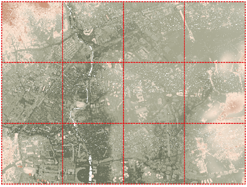
Fig. 20.13 The virtual point cloud
Displaying and manipulating virtual point cloud is much more fluent and easy.
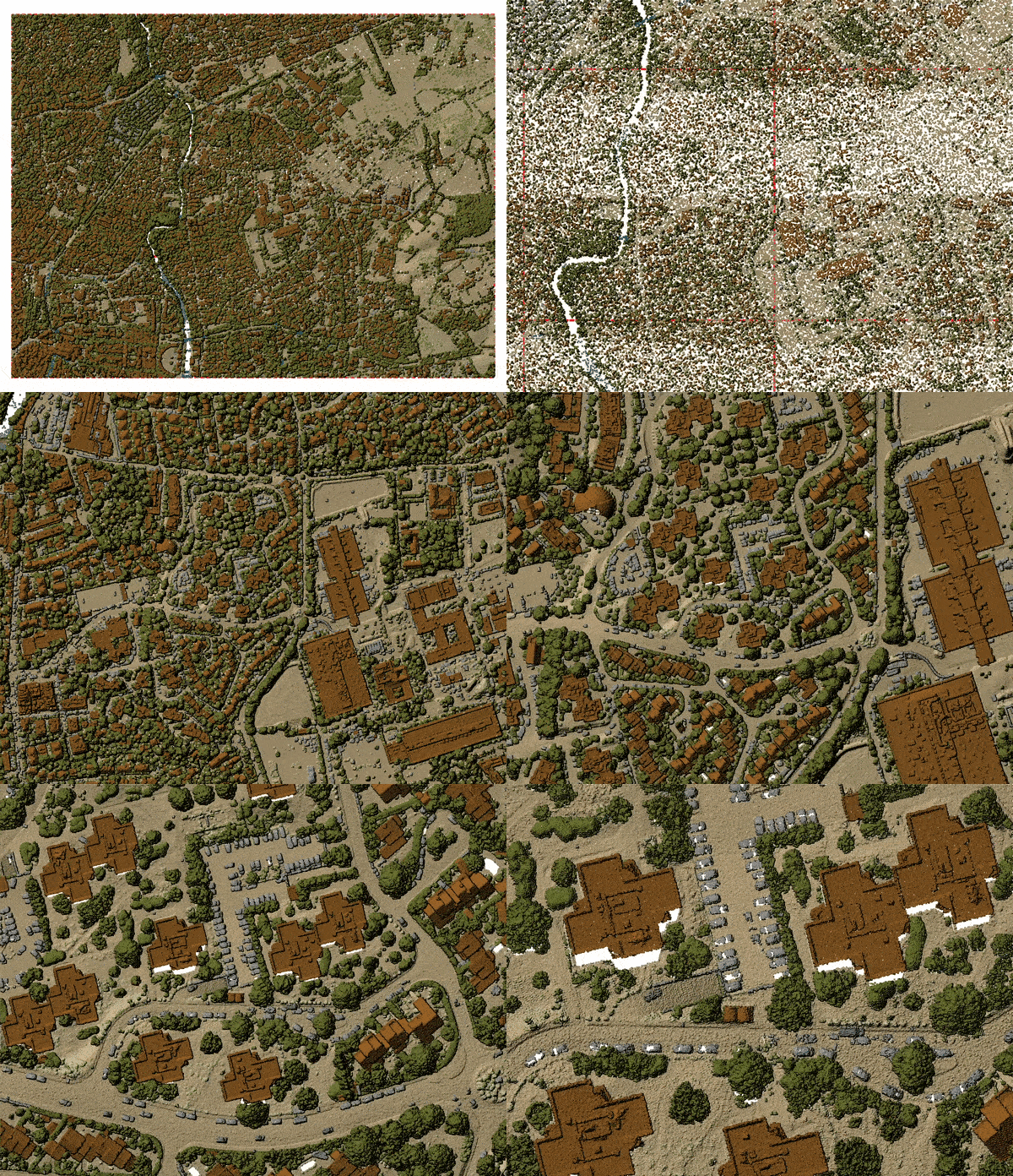
Fig. 20.14 The virtual point cloud output on 2D: displaying details when zooming in
At the core, a virtual point cloud file is a simple JSON file with .vpc extension,
containing references to actual data files (e.g. .LAS, .LAZ or .COPC files)
and additional metadata extracted from the files.
Even though it is possible to write VPC files by hand,
it is strongly recommended to create them using an automated tool, such as:
The Processing Build virtual point cloud (VPC) algorithm
The
build_vpccommand of PDAL wrench tool
For more details, please refer to the VPC specification that also contains best practices and optional extensions (such as overviews).
