중요
번역은 여러분이 참여할 수 있는 커뮤니티 활동입니다. 이 페이지는 현재 100.00% 번역되었습니다.
3.3. 수업: 범주화
라벨이 개별 장소들의 이름 같은 정보를 소통하기에 좋은 방법이긴 하지만, 모든 경우에 라벨을 사용할 수는 없습니다. 예를 들면 어떤 사람이 각 landuse 구역이 어떻게 사용되고 있는지 알고 싶어한다고 해봅시다. 라벨을 사용한다면 다음과 같은 맵을 보게 될 것입니다:
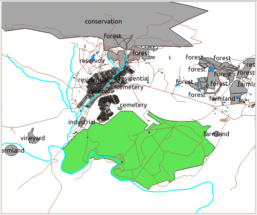
라벨을 읽기 어려울 뿐만 아니라 맵 상에 수많은 토지이용구역이 있을 경우 혼잡하기까지 합니다.
이 수업의 목표: 벡터 데이터를 효율적으로 범주화하는 방법 배우기.
3.3.1. ★☆☆ 따라해보세요: 명목형(nominal) 데이터 범주화시키기
landuse레이어의 Layer Properties 창을 여십시오.Symbology 탭으로 가십시오.
Single Symbol 이라는 드롭다운 메뉴를 클릭해서, Categorized 로 변경하십시오:
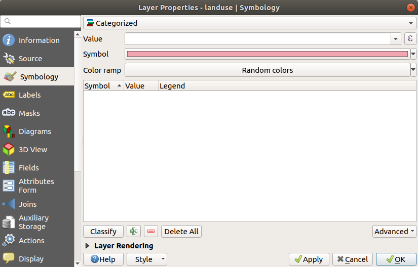
새 패널에서 Value 를
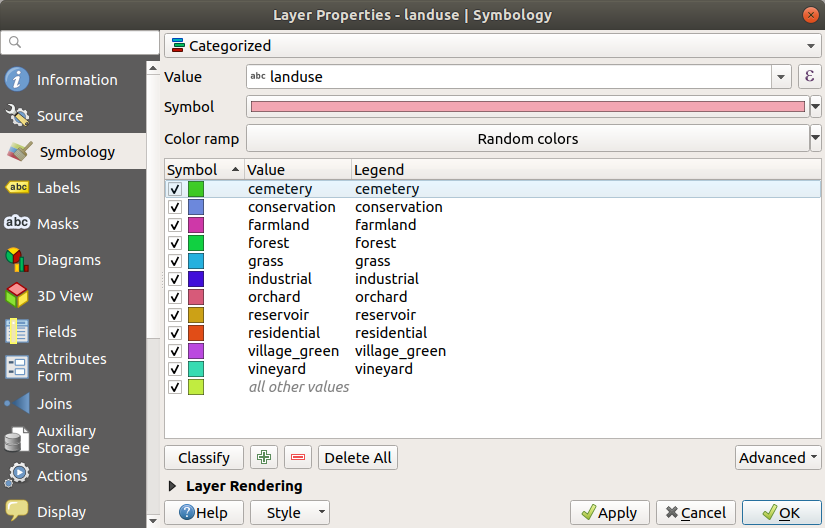
landuse로, Color ramp 를 Random colors 로 변경하십시오.Classify 버튼을 클릭하십시오.
OK 를 클릭하십시오.
결과는 다음과 같을 것입니다:
Layers 패널에서
landuse옆에 있는 화살표(또는 더하기표)를 클릭하면, 카테고리들에 대한 설명을 볼 수 있습니다: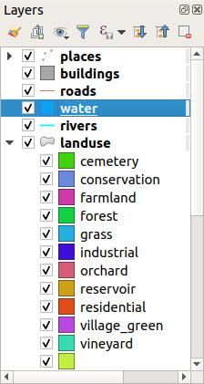
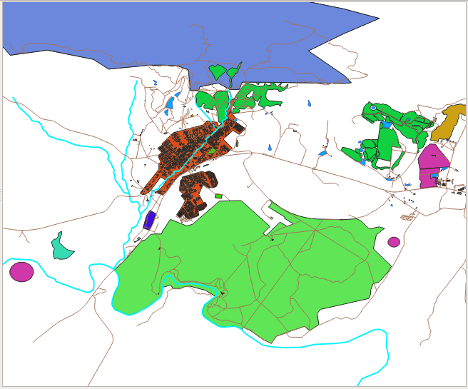
이제 토지이용구역 폴리곤들을 분류해서 색상을 적용했으므로, 토지이용이 동일한 구역들이 동일한 색상이 되었습니다.
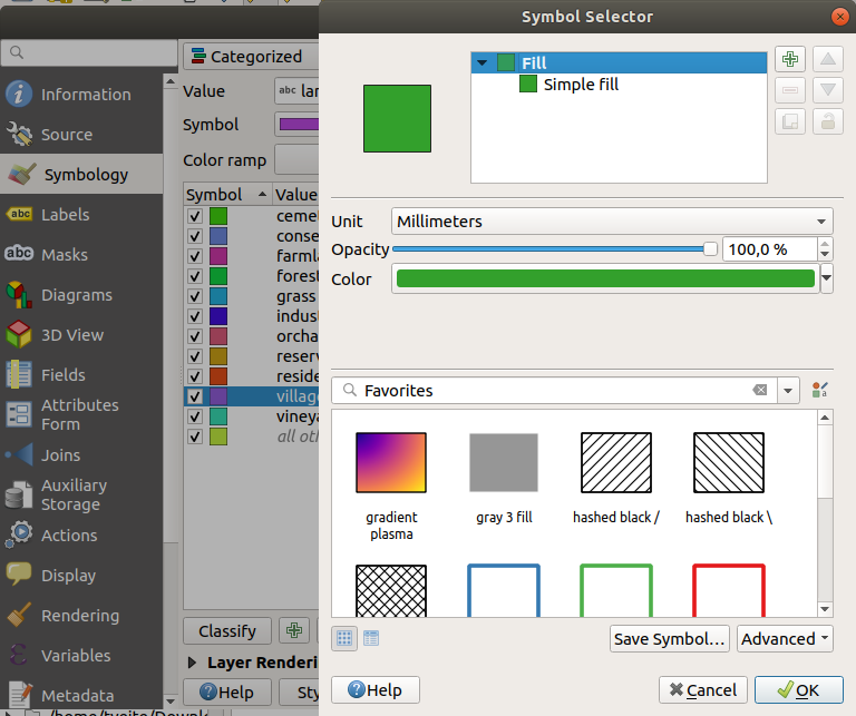
여러분이 원한다면 Layers 패널 또는 Layer Properties 대화창에서 관련 색상 블록을 더블 클릭해서 각 토지이용에 대한 심볼을 변경할 수 있습니다:
비어 있는 카테고리가 하나 있는 게 보이십니까?
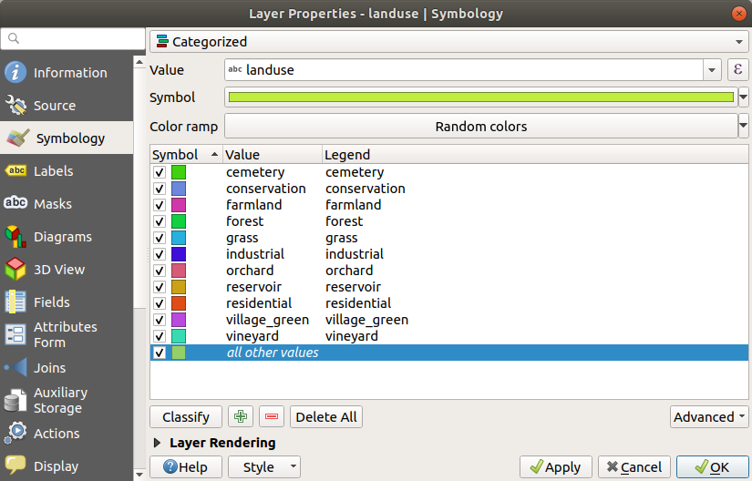
이 빈 카테고리는 토지이용 값이 없는, 또는 NULL 값을 가진 객체에 색상을 적용하기 위해 쓰입니다. 맵 상에 NULL 값을 가진 구역도 표현되도록 이 빈 카테고리를 유지하는 편이 유용할 수 있습니다. 비어 있는 값 또는 NULL 값을 표현하는 데 더 어울리는 색상으로 변경하고 싶을 수도 있겠네요.
여러분이 힘들게 바꾼 변경 사항을 잃지 않도록 지금 맵을 저장하세요!
3.3.2. ★☆☆ 혼자서 해보세요: 다양한 범주화들
앞에서 배운 지식을 이용해서 buildings 레이어를 범주화시켜보십시오. building 필드에 대해 카테고리들을 설정하고 Spectral 색상표를 사용하십시오.
참고
결과를 보려면 도심 지역으로 줌인해야 합니다.
3.3.3. ★★☆ 따라해보세요: 비율 범주화
범주화에는 명목(nominal), 순서(ordinal), 간격(interval), 그리고 비율(ratio), 네 가지 유형이 있습니다.
명목형 범주화의 경우, 객체들이 범주화되는 카테고리들이 이름 기반으로, 순서가 정해지지 않습니다. 예를 들면 도시 이름, 구역 번호 등등의 카테고리들이죠. 명목형 데이터에 쓰이는 심볼들은 어떤 순서나 규모도 암시해서는 안 됩니다.
포인트의 경우, 서로 다른 형태의 심볼들을 사용할 수 있습니다.
폴리곤의 경우, 서로 다른 해칭 유형들 또는 서로 다른 색상들을 사용할 수 있습니다. (밝은 색과 어두운 색을 섞어 쓰지는 마십시오.)
라인의 경우, 라인을 따라가는 서로 다른 대시 패턴, 서로 다른 색상들(밝은 색과 어두운 색을 섞어 쓰지는 마십시오), 그리고 서로 다른 심볼들을 사용할 수 있습니다.
순서형 범주화의 경우, 카테고리들이 특정 순서로 배열됩니다. 예를 들어 세계의 도시들을 세계 무역, 여행, 문화 등등의 중요도에 따라 순위를 매기는 것입니다. 순서형 데이터에 쓰이는 심볼들은 순서를 암시해야 하지만, 규모를 암시해서는 안 됩니다.
포인트의 경우, 밝은 색에서 어두운 색 순서의 심볼들을 사용할 수 있습니다.
폴리곤의 경우, (밝은 색에서 어두운 색 순서의) 등급(graduated) 색상을 사용할 수 있습니다.
라인의 경우, (밝은 색에서 어두운 색 순서의) 등급(graduated) 색상을 사용할 수 있습니다.
간격형 범주화의 경우, 숫자는 양수, 음수 및 0 값들의 척도로 표시됩니다. 예를 들면 해수면 위/아래 높이, 섭씨 도 단위 온도 등이 있습니다. 간격형 데이터에 쓰이는 심볼들은 순서와 규모를 암시해야 합니다.
포인트의 경우, (작은 것에서 큰 것 순서의) 다양한 크기의 심볼들을 사용할 수 있습니다.
폴리곤의 경우, (밝은 색에서 어두운 색 순서의) 등급 색상을 사용하거나 다양한 크기의 다이어그램들을 추가할 수 있습니다.
라인의 경우, (얇은 것에서 굵은 것 순서의) 굵기를 사용할 수 있습니다.
비율형 범주화의 경우, 양수와 0 값들만의 척도로 표시됩니다. 예를 들면 절대 영도(0 캘빈 온도) 위의 온도, 어떤 포인트로부터의 거리, 지정한 도로의 월 평균 교통량 등이 있습니다. 비율형 데이터에 쓰이는 심볼들은 순서와 규모를 암시해야 합니다.
포인트의 경우, (작은 것에서 큰 것 순서의) 다양한 크기의 심볼들을 사용할 수 있습니다.
폴리곤의 경우, (밝은 색에서 어두운 색 순서의) 등급 색상을 사용하거나 다양한 크기의 다이어그램들을 추가할 수 있습니다.
라인의 경우, (얇은 것에서 굵은 것 순서의) 굵기를 사용할 수 있습니다.
우리는 앞의 예시에서 landuse 레이어의 각 레코드에 레이어의 landuse 속성을 기반으로 색상을 할당하는 명목형 범주화를 사용했습니다. 이제 면적으로 레코드들을 범주화시키는 비율 범주화를 사용할 것입니다.
레이어를 다시 범주화시킬 것이기 때문에, 기존 범주들을 저장하지 않으면 사라질 것입니다. 현재 범주화를 저장하려면:
레이어의 속성 대화창을 여십시오.
Style 드롭다운 메뉴에 있는 Save Style … 버튼을 클릭하십시오.
Rename Current… 를 선택하고,
land usage라고 입력한 다음 OK 를 누르십시오.이제 레이어 속성에 카테고리들과 그 심볼들이 저장되었습니다.
다음으로 Style 드롭다운 메뉴에 있는 Add… 항목을 클릭하고
ratio라는 이름의 새 스타일을 생성하십시오. 새 범주화가 저장될 것입니다.Layer Properties 대화창을 닫으십시오.
우리는 토지이용구역들을 크기로 범주화시키고자 하지만, 문제가 하나 있습니다 — 크기 필드가 없기 때문에 하나 만들어줘야 합니다.
landuse레이어의 속성 테이블을 여십시오. Toggle editing 버튼을 클릭해서 편집 모드로 들어가십시오.
 New field 버튼을 사용해서 십진수 유형의 새로운 열을
 AREA라는 이름으로 추가하십시오: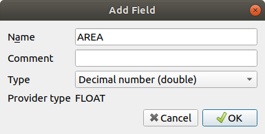
OK 를 클릭하십시오.
새 필드가 (테이블의 가장 오른쪽에) 추가될 것입니다. (이 필드를 보려면 수평 방향으로 스크롤해야 할 수도 있습니다.) 하지만, 이 시점에서 이 필드에는 값이 없습니다. NULL 값들만 가득 있을 뿐이죠.
이 문제를 해결하려면, 면적을 계산해야 할 것입니다.
 버튼으로 필드 계산기를 여십시오.
다음 대화창이 나타날 것입니다:
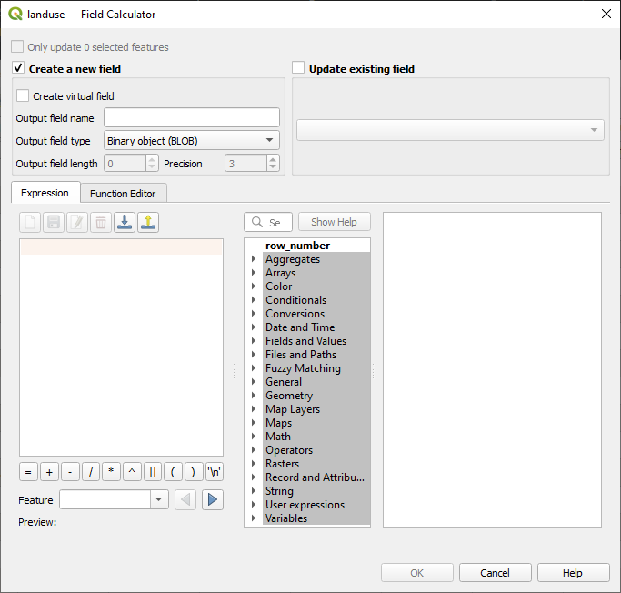
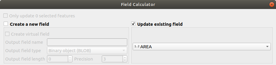
 Update existing fields 를 체크하십시오.
필드 드롭다운 메뉴에서 AREA 를 선택하십시오.
Expression 탭에서, 목록에 있는 Geometry 함수 그룹을 펼친 다음 를 찾으십시오.
이 함수가 Expression 란에 나타나도록 더블 클릭하십시오.
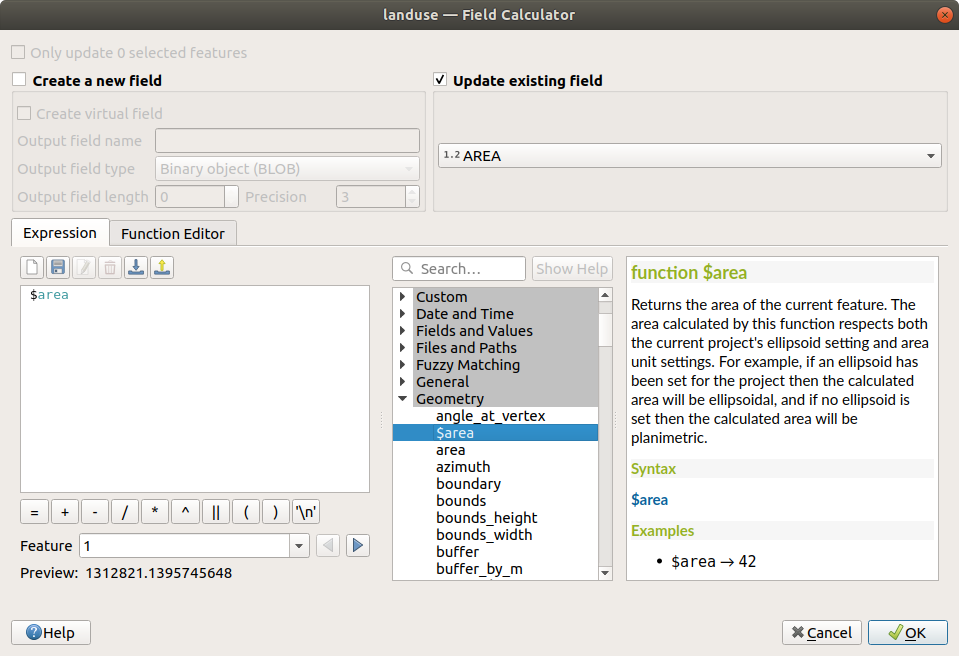
OK 를 클릭하십시오.
속성 테이블의
AREA필드로 스크롤하면 해당 필드가 값들로 채워져 있는 것을 볼 수 있을 것입니다. (열 헤더를 클릭해서 데이터를 새로고침해야 할 수도 있습니다.)
참고
이 면적 값들은 프로젝트의 면적 단위 설정을 따르기 때문에, 제곱미터일 수도 있고 평방도일 수도 있습니다.
 버튼을 눌러서 편집 내용을 저장한 다음 Toggle editing 버튼으로 편집 모드를 해제하십시오.
속성 테이블을 닫으십시오.
이제 데이터를 만들었으니, 이를 사용해서 landuse 레이어를 렌더링해봅시다.
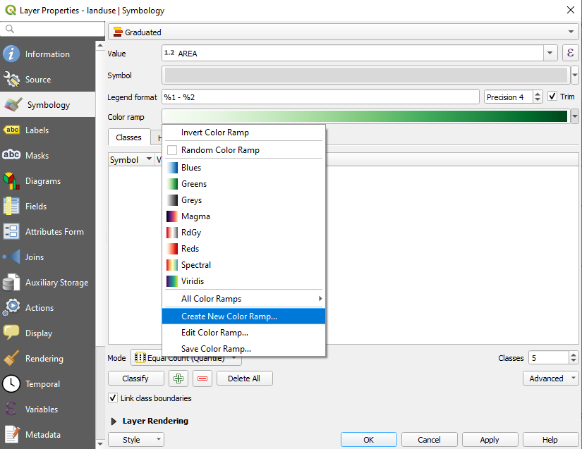
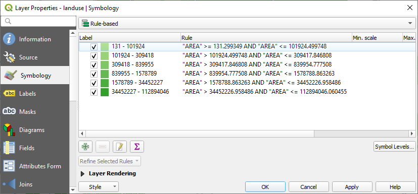
landuse레이어의 Layer properties 대화창에서 Symbology 탭을 선택하십시오.범주화 스타일을 Categorized 에서 Graduated 로 변경하십시오.
Value 를
AREA로 변경하십시오.Color ramp 아래 있는 Create New Color Ramp… 옵션을 선택하십시오:
(이미 선택되어 있지 않은 경우) Gradient 를 선택하고 OK 를 클릭하십시오. 다음 창을 보게 될 것입니다:
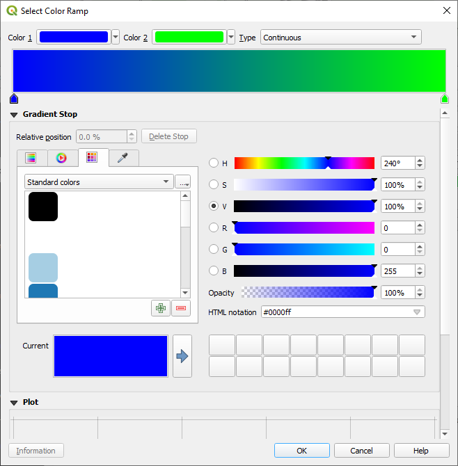
이 창을 이용해서, 적은 면적을 Color 1 로, 큰 면적을 Color 2 로 구분할 것입니다.
알맞은 색상들을 선택하십시오.
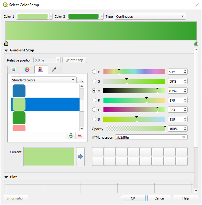
이 예제에서는 다음과 비슷한 결과가 나옵니다:
OK 를 클릭하십시오.
Color ramp 탭에서 Save Color Ramp… 를 선택하면 색상표를 저장할 수 있습니다. 이 색상표에 적합한 이름을 선택하고 Save 를 클릭하십시오. 이제 All Color Ramps 에서 동일한 색상표를 쉽게 선택할 수 있을 것입니다.
Mode 에서
 Equal Count (Quantile) 를 선택하십시오.
Classify 버튼을 클릭하십시오.
이제 다음과 같은 창을 보게 될 것입니다:
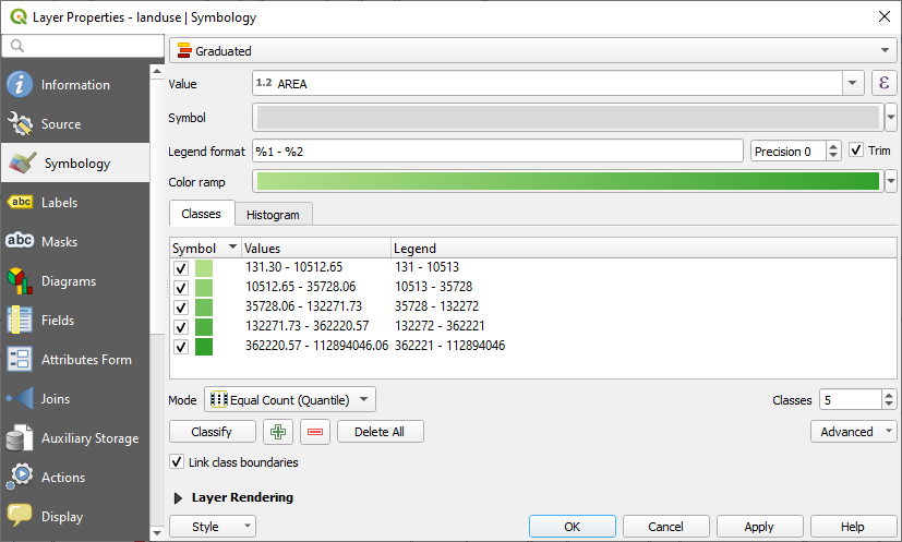
다른 항목은 그대로 놔둡니다.
OK 를 클릭하십시오.
3.3.4. ★★☆ 혼자서 해보세요: 범주화 개선시키기
여러분이 범주화를 이해하기 쉽도록 Mode 및 Classes 의 값을 변경해보십시오.
해답
여러분이 사용한 설정들이 똑같지 않을 수도 있지만, Classes 값을 6 으로 그리고 Mode 를 Natural Breaks (Jenks) 로 설정하면 (물론 색상은 동일하겠죠) 맵이 다음과 같이 보일 것입니다:
3.3.5. ★★★ 따라해보세요: 규칙 기반 범주화
범주화에 여러 개의 기준들을 결합하는 것이 유용할 경우가 많지만, 아쉽게도 일반적인 범주화에서는 단일 속성만 적용됩니다. 이런 경우 규칙 기반 범주화가 유용합니다.
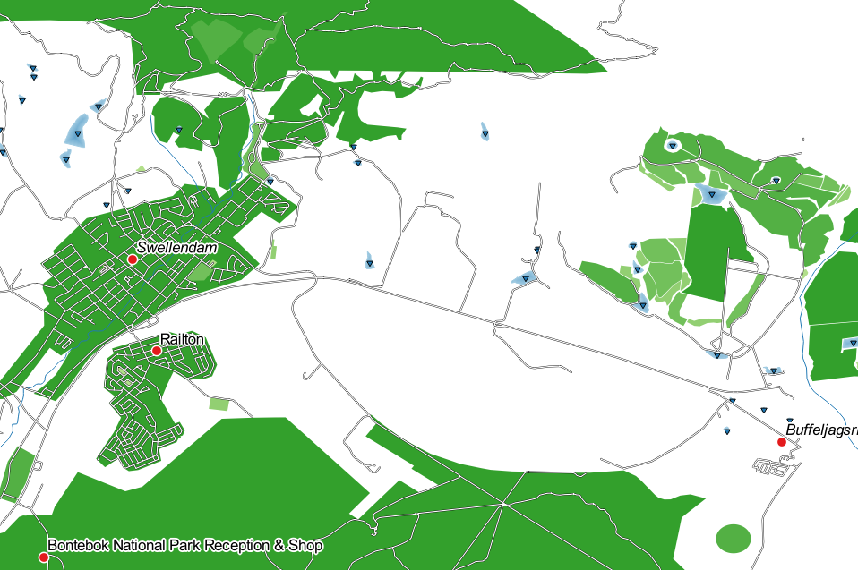
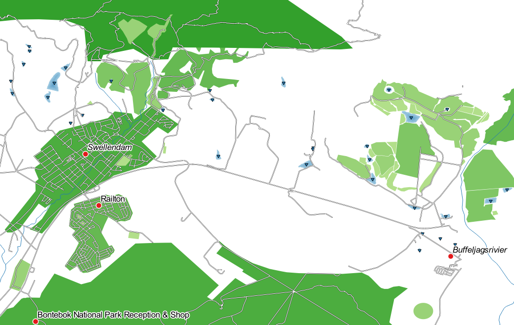
이 수업에서는 landuse 레이어를 Swellendam 도시가 다른 거주 지역과 그리고 다른 토지이용 유형들과 쉽게 구분될 수 있는 (면적 기반) 방식으로 표현할 것입니다.
landuse레이어의 Layer Properties 창을 여십시오.Symbology 탭으로 가십시오.
범주화 스타일을 Rule-based 로 바꾸십시오.
QGIS가 현재 이 레이어에 구현된 범주화를 표현하는 규칙을 자동으로 보여줄 것입니다. 예를 들면, 앞의 예제를 완료하면 다음과 같은 창을 볼 수 있을 겁니다:
모든 규칙을 선택하려면 클릭&드래그하십시오.
기존 규칙들을 전부 제거하려면
 Remove selected rules 버튼을 누르십시오.
이제 사용자 정의 규칙을 추가해보겠습니다.
 Add rule 버튼을 클릭하십시오.
그러면 Edit rule 대화창이 나타납니다.
Label 에
Swellendam city를 입력하십시오.Filter 텍스트란 옆에 있는
 버튼을 클릭해서 Expression String Builder 를 여십시오.
"name" = 'Swellendam'이라는 기준을 입력하고 무결성을 검증하십시오.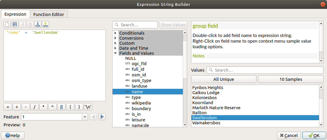
Edit rule 대화창으로 돌아와서, 지역 내에서 이 도시의 중요성을 알려주기 위한 진한 청회색을 할당한 다음 경계선을 제거하십시오.
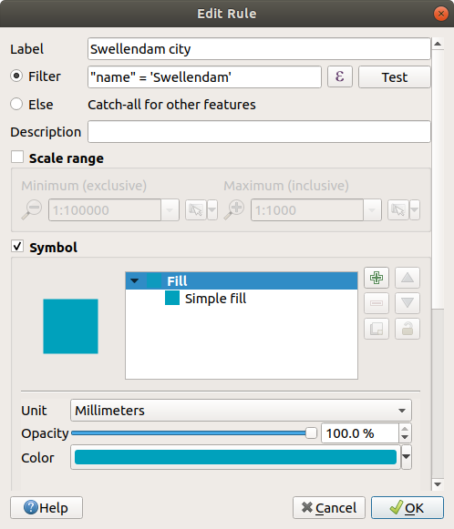
OK 를 클릭하십시오.
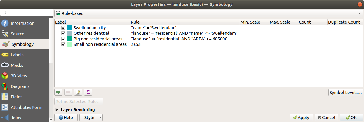
앞의 단계들을 반복해서 다음 규칙들을 추가하십시오:
"landuse" = 'residential' AND "name" <> 'Swellendam'이라는 기준을 사용해서 Other residential 이라는 라벨을 생성하십시오. Fill color 로는 연한 청회색을 선택하십시오."landuse" <> 'residential' AND "AREA" >= 605000이라는 기준을 사용해서 Big non residential areas 라는 라벨을 생성하십시오. 중간 정도의 녹색을 선택하십시오.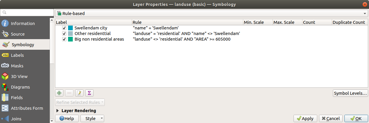
이 필터들은 맵 상에 있는 지역들을 제외한다는 점에서 배타적입니다. (면적이 605,000(제곱미터) 미만인 비주거 지역들은 어떤 규칙에도 포함되지 않았습니다.)
Small non residential areas 라는 새 규칙을 사용해서 나머지 피처들을 커버할 것입니다. 필터 표현식 대신,
 Else 를 체크하면 됩니다. 이 카테고리에 어울리는 연한 녹색을 할당하십시오.
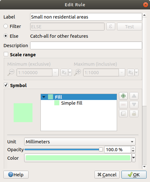
이제 여러분의 규칙들이 다음과 같이 보여야 합니다:
이 심볼을 적용하십시오.
사용자 맵이 다음과 비슷하게 보일 것입니다:
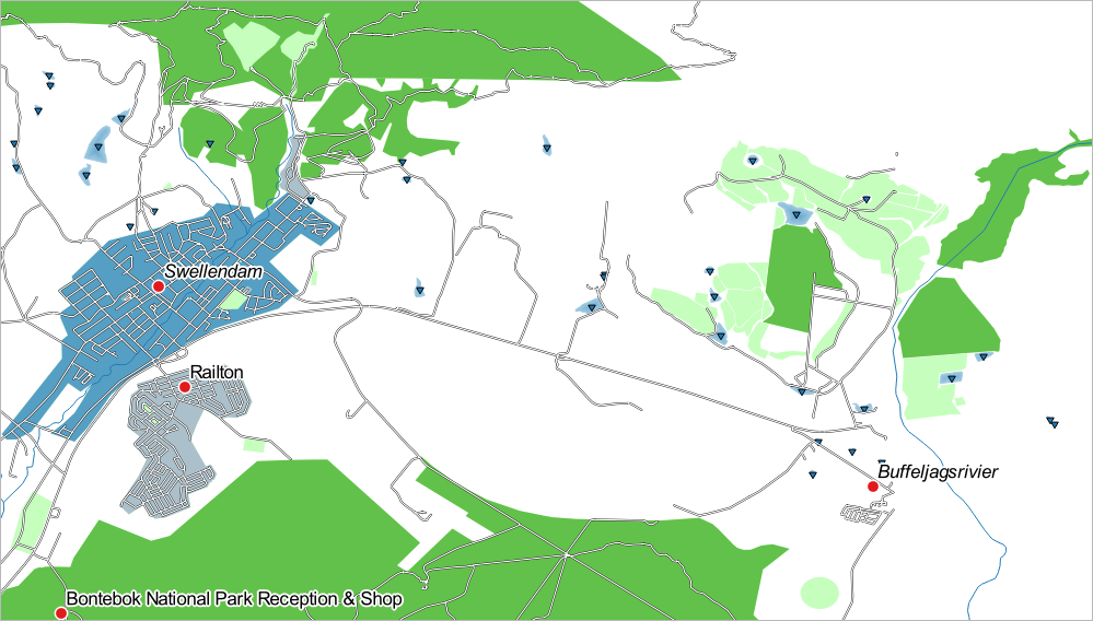
이제 Swellendam 이 가장 두드러진 주거 지역으로 나타나고 다른 비주거 지역은 면적에 따라 다른 색상을 보여주는 맵이 되었습니다.
3.3.6. 결론
심볼을 이용하면 레이어의 속성들을 읽기 쉬운 방법으로 나타낼 수 있습니다. 우리가 선택한 연관 속성을 이용해서 피처의 중요성을 이해하도록 만들 수 있습니다. 여러분이 당면한 문제가 무엇이냐에 따라 다른 범주화 기술을 적용해서 문제를 해결하십시오.
3.3.7. 다음은 무엇을 배우게 될까요?
이제 멋진 맵을 만들었습니다만, 이것을 어떻게 QGIS에서 분리시켜 인쇄할 수 있는 파일 포맷이나 이미지 또는 PDF로 만들 수 있을까요? 이것이 다음 강의의 주제입니다!