重要
翻訳は あなたが参加できる コミュニティの取り組みです。このページは現在 100.00% 翻訳されています。
17.14. 最初の分析例
注釈
このレッスンでは、プロセシング・フレームワークの要素により精通できるよう、ツールボックスだけを使用していくつかの実際の分析を実行します。
全てが設定され、外部アルゴリズムを使用でき、これで空間分析を実行するための非常に強力なツールを手に入れました。何か実世界のデータでより大規模な演習に取りかかる時が来ました。
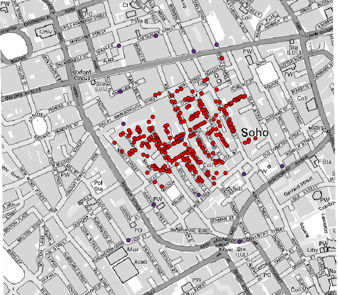
John Snowが1854年に彼の画期的な仕事(https://en.wikipedia.org/wiki/John_Snow_%28physician%29)で使用した有名なデータセットを使って、いくつかの興味深い結果を得てみます。このデータセットの分析はとても明白で、良い結果と結論に至るために高度なGIS技術を必要としませんが、このような空間的問題が、様々な処理ツールを使うことによってどのように分析され解決されるかを示す良い方法であるといえるでしょう。
データセットには、コレラによる死者の位置とポンプの位置のシェープファイル、およびOSMレンダリングされたTIFF形式の地図が含まれています。このレッスンに対応しているQGISプロジェクトを開いてください。
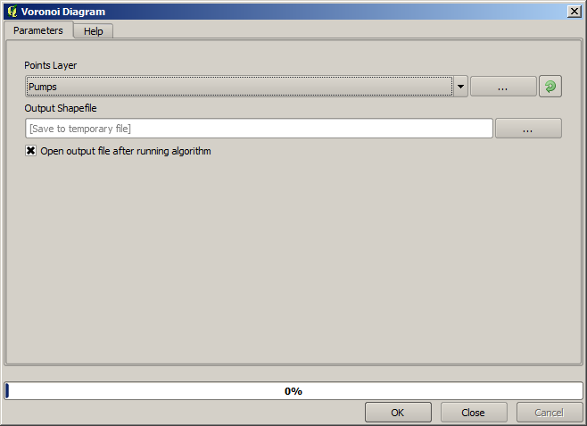
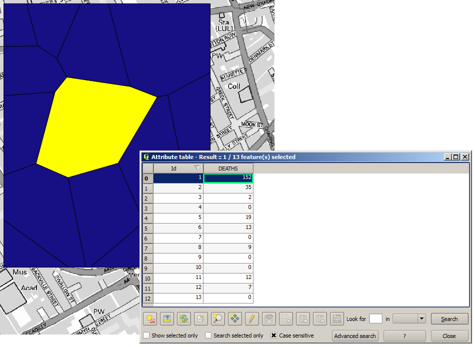
最初にすることは、ポンプレイヤのボロノイ図(別名:ティーセン多角形)を計算し、各ポンプの影響範囲を得ることです。 ボロノイ多角形 アルゴリズムが、それに使用できます。
かなり簡単ですが、それで早くも興味深い情報が得られます。
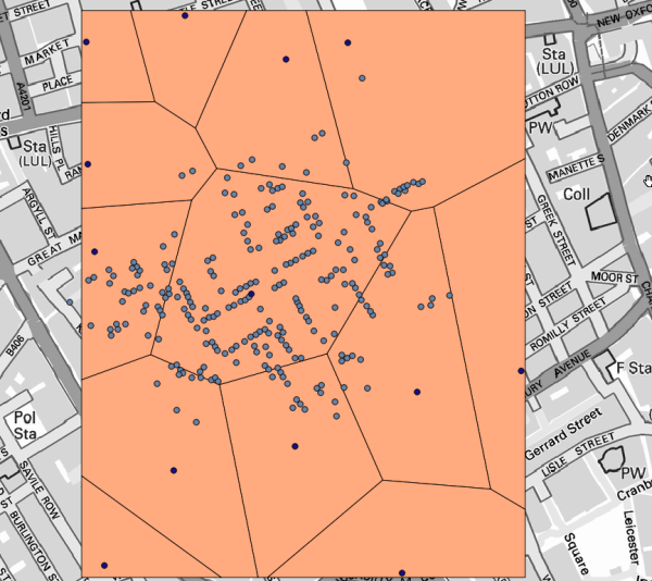
明らかに、ほとんどの患者がポリゴンの1つの範囲内にあります
より定量的な結果を得るためには、各ポリゴンにおける死者数をカウントできます。各ポイントは死者が発生した建物を表し、死者数は属性に格納されているので、ポイントをカウントするだけではできません。重み付けされたカウントを必要とするので、 ポリゴン内の点の数 ツールを使用します。
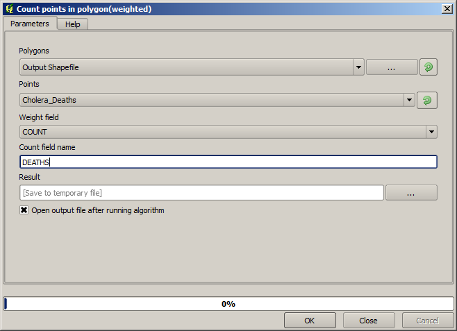
新しいフィールドは DEATH(死亡) と呼ばれ、そして COUNT フィールドを重みフィールドとして使用します。得られたテーブルは、明らかに第一のポンプに対応するポリゴンにおける死者数が他のものよりもはるかに大きいことを反映しています。
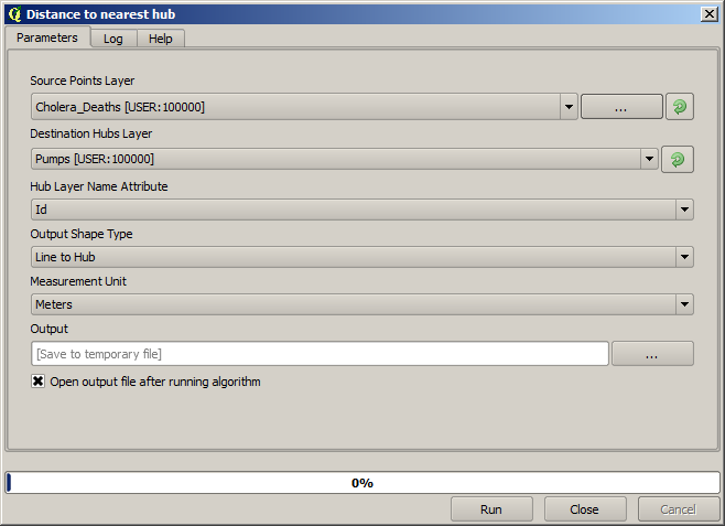
Pumps(ポンプ) レイヤのあるポイントと Cholera_deaths(コレラ死者) レイヤの各ポイントとの依存関係を視覚化するもう一つの良い方法は、最も近いものへ線を描くことです。これは、最寄のハブの距離(ハブへの線) ツールで次のような設定を使って行うことができます。
これの結果は次の通りです:
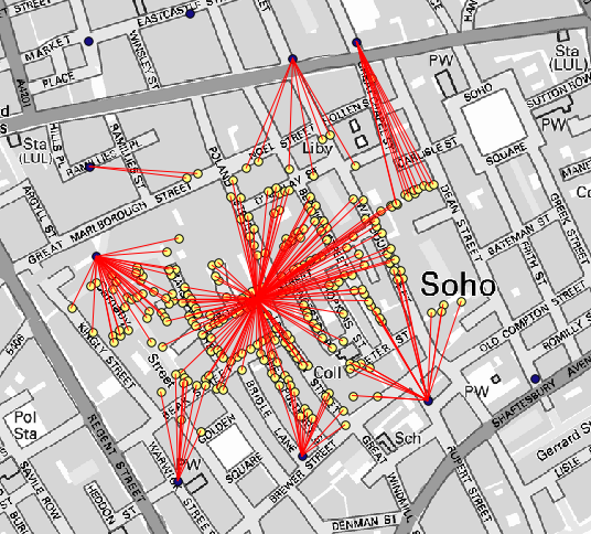
線の数は中央のポンプの方が多いですが、これは死者数ではなくコレラ患者が発見された場所の数を表していることを忘れないでください。それは代表的なパラメータですが、ある場所では他の場所よりも多くの患者が発生している可能性が考慮されていません。
密度レイヤはまた、何が起きているかを非常に明確に示してくれます。それは ヒートマップ(カーネル密度推定) アルゴリズムで作成できます。 Cholera_deaths レイヤ、重みフィールドとしてその COUNT フィールド、半径を100、街路ラスタレイヤの範囲とセルサイズを使用すると、次のようになります。
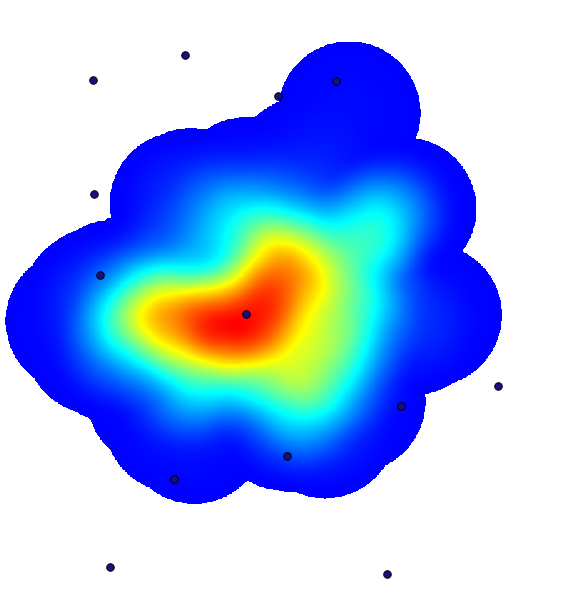
出力範囲の設定に入力する必要がないことを思い出してください。右側のボタンをクリックし、 レイヤ/キャンバス範囲を使用 を選択します。
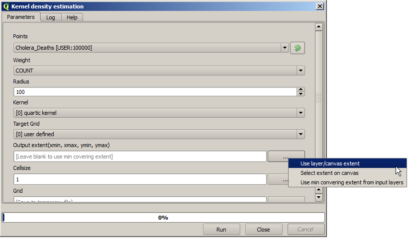
街路ラスタレイヤを選択すると、その範囲が自動的にテキストフィールドに追加されます。セルサイズでも同じことを行い、そのレイヤのセルサイズを選択する必要があります。
ポンプレイヤと組み合わせると、死亡例の密度が最大となるホットスポットには明らかにポンプが1台あることが分かります。