` `
The Vector Properties Dialog
- General Properties
- Style Properties
- Labels Properties
- Fields Properties
- Joins Properties
- Diagrams Properties
- Actions Properties
- Display Properties
- Rendering Properties
- Metadata Properties
- Variables Properties
- Legend Properties
The Layer Properties dialog for a vector layer provides general settings to manage appearance of layer features in the map (symbology, labeling, diagrams), interaction with the mouse (actions, map tips, form design). It also provides information about the layer.
To access the Layer Properties dialog, double-click on a layer in the legend or right-click on the layer and select Properties from the pop-up menu.
Catatan
Depending on the external plugins you have installed, new tabs may be added to the layer properties dialog. Those are not presented below.
Tip
Live update rendering
The Layer Styling Panel provides you with some of the common features of the Layer properties dialog and is a good modeless widget that you can use to speed up the configuration of the layer styles and automatically view your changes in the map canvas.
Catatan
Because properties (symbology, label, actions, default values, forms...) of embedded layers (see Proyek-proyek Nesting) are pulled from the original project file and to avoid changes that may break this behavior, the layer properties dialog is made unavailable for these layers.
General Properties
 Use this tab to make general settings for the vector layer.
There are several options available:
Use this tab to make general settings for the vector layer.
There are several options available:
Layer Info
- Set the Layer name to display in the Layers Panel
- Display the Layer source of the vector layer
- Define the Data source encoding to define provider-specific options and to be able to read the file
Coordinate Reference System
- Displays the layer’s Coordinate Reference System (CRS) as a PROJ.4 string.
You can change the layer’s CRS, selecting a recently used one
in the drop-down list or clicking on
 Select CRS button
(see Coordinate Reference System Selector). Use this process only if the CRS applied to the
layer is a wrong one or if none was applied.
If you wish to reproject your data into another CRS, rather use layer reprojection
algorithms from Processing or Save it into another layer.
Select CRS button
(see Coordinate Reference System Selector). Use this process only if the CRS applied to the
layer is a wrong one or if none was applied.
If you wish to reproject your data into another CRS, rather use layer reprojection
algorithms from Processing or Save it into another layer. - Create a Spatial Index (only for OGR-supported formats)
- Update Extents information for a layer
Scale dependent visibility
You can set the Maximum (inclusive) and Minimum
(exclusive) scale, defining a range of scale in which features will be
visible. Out of this range, they are hidden. The  Set to current canvas scale button helps you use the current map
canvas scale as boundary of the range visibility.
See Scale Dependent Rendering for more information.
Set to current canvas scale button helps you use the current map
canvas scale as boundary of the range visibility.
See Scale Dependent Rendering for more information.
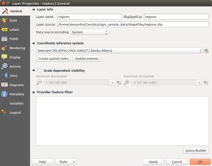
General tab in vector layers properties dialog
Query Builder
Under the Provider Feature Filter frame, the Query Builder allows you to define a subset of the features in the layer using a SQL-like WHERE clause and to display the result in the main window. As long as the query is active, only the features corresponding to its result are available in the project. The query result can be saved as a new vector layer.
The Query Builder is accessible through the eponym term at the bottom of the General tab in the Layer Properties. Under Feature subset, click on the [Query Builder] button to open the Query builder. For example, if you have a regions layer with a TYPE_2 field, you could select only regions that are borough in the Provider specific filter expression box of the Query Builder. Figure_vector_querybuilder shows an example of the Query Builder populated with the regions.shp layer from the QGIS sample data. The Fields, Values and Operators sections help you to construct the SQL-like query.
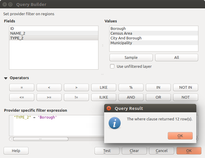
Query Builder
The Fields list contains all attribute columns of the attribute table to be searched. To add an attribute column to the SQL WHERE clause field, double click its name in the Fields list. Generally, you can use the various fields, values and operators to construct the query, or you can just type it into the SQL box.
The Values list lists the values of an attribute table. To list all possible values of an attribute, select the attribute in the Fields list and click the [all] button. To list the first 25 unique values of an attribute column, select the attribute column in the Fields list and click the [Sample] button. To add a value to the SQL WHERE clause field, double click its name in the Values list.
The Operators section contains all usable operators. To add an operator to the SQL WHERE clause field, click the appropriate button. Relational operators ( = , > , ...), string comparison operator (LIKE), and logical operators (AND, OR, ...) are available.
The [Test] button shows a message box with the number of features satisfying the current query, which is useful in the process of query construction. The [Clear] button clears the text in the SQL WHERE clause text field. The [OK] button closes the window and selects the features satisfying the query. The [Cancel] button closes the window without changing the current selection.
QGIS treats the resulting subset acts as if it were the entire layer. For example if you applied the filter above for ‘Borough’, you can not display, query, save or edit Anchorage, because that is a ‘Municipality’ and therefore not part of the subset.
The only exception is that unless your layer is part of a database, using a subset will prevent you from editing the layer.
Style Properties
 The Style tab provides you with a comprehensive tool for
rendering and symbolizing your vector data. You can use tools that are
common to all vector data, as well as special symbolizing tools that were
designed for the different kinds of vector data. However all types share the
following dialog structure: in the upper part, you have a widget that helps
you prepare the classification and the symbol to use for features and at
the bottom the Layer rendering widget.
The Style tab provides you with a comprehensive tool for
rendering and symbolizing your vector data. You can use tools that are
common to all vector data, as well as special symbolizing tools that were
designed for the different kinds of vector data. However all types share the
following dialog structure: in the upper part, you have a widget that helps
you prepare the classification and the symbol to use for features and at
the bottom the Layer rendering widget.
Tip
Export vector symbology
You have the option to export vector symbology from QGIS into Google *.kml, *.dxf and MapInfo *.tab files. Just open the right mouse menu of the layer and click on Save As... to specify the name of the output file and its format. In the dialog, use the Symbology export menu to save the symbology either as Feature symbology ‣ or as Symbol layer symbology ‣. If you have used symbol layers, it is recommended to use the second setting.
Features rendering
The renderer is responsible for drawing a feature together with the correct symbol. Regardless layer geometry type, there are four common types of renderers: single symbol, categorized, graduated and rule-based. For point layers, there are a point displacement and a heatmap renderers available while polygon layers can also be rendered with the inverted polygons and 2.5 D renderers.
There is no continuous color renderer, because it is in fact only a special case of the graduated renderer. The categorized and graduated renderers can be created by specifying a symbol and a color ramp - they will set the colors for symbols appropriately. For each data type (points, lines and polygons), vector symbol layer types are available. Depending on the chosen renderer, the dialog provides different additional sections.
Catatan
If you change the renderer type when setting the style of a vector layer the settings you made for the symbol will be maintained. Be aware that this procedure only works for one change. If you repeat changing the renderer type the settings for the symbol will get lost.
Single Symbol Renderer
The  Single Symbol renderer is used to render
all features of the layer using a single user-defined symbol.
See The Symbol Selector for further information about symbol representation.
Single Symbol renderer is used to render
all features of the layer using a single user-defined symbol.
See The Symbol Selector for further information about symbol representation.
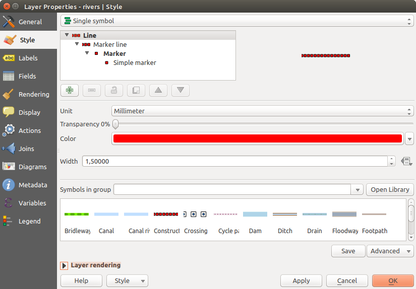
Single symbol line properties
Tip
Edit symbol directly from layer panel
If in your Layers Panel you have layers with categories defined through
categorized, graduated or rule-based style mode, you can quickly change the
fill color of the symbol of the categories by right-clicking on a category
and choose the color you prefer from a  color wheel menu.
Right-clicking on a category will also give you access to the options Hide
all items, Show all items and Edit symbol.
color wheel menu.
Right-clicking on a category will also give you access to the options Hide
all items, Show all items and Edit symbol.
No Symbols Renderer
The  No Symbols renderer is a special use case of the
Single Symbol renderer as it applies the same rendering to all features.
Using this renderer, no symbol will be drawn for features,
but labeling, diagrams and other non-symbol parts will still be shown.
No Symbols renderer is a special use case of the
Single Symbol renderer as it applies the same rendering to all features.
Using this renderer, no symbol will be drawn for features,
but labeling, diagrams and other non-symbol parts will still be shown.
Selections can still be made on the layer in the canvas and selected features will be rendered with a default symbol. Features being edited will also be shown.
This is intended as a handy shortcut for layers which you only want to show labels or diagrams for, and avoids the need to render symbols with totally transparent fill/border to achieve this.
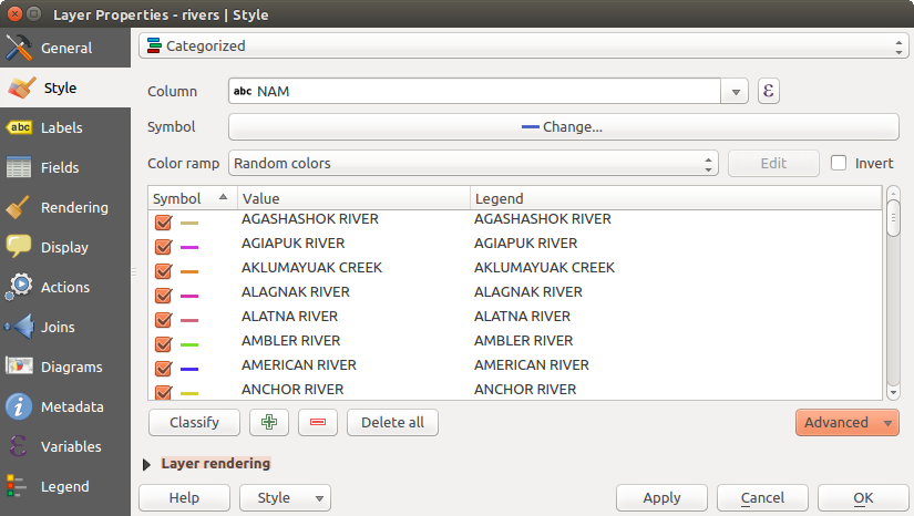
Categorized Renderer
The  Categorized renderer is used to render the
features of a layer, using a user-defined symbol whose aspect reflects the
discrete values of a field or an expression. The Categorized menu allows you to
Categorized renderer is used to render the
features of a layer, using a user-defined symbol whose aspect reflects the
discrete values of a field or an expression. The Categorized menu allows you to
select an existing field (using the Column listbox) or
type or build an expression using the
 Set column expression.
The expression used to classify features can be of any type; it can for example:
Set column expression.
The expression used to classify features can be of any type; it can for example:be a comparison, e.g. myfield >= 100, $id = @atlas_featureid, myfield % 2 = 0, within( $geometry, @atlas_geometry ). In this case, QGIS returns values 1 (True) and 0 (False).
combine different fields, e.g. concat( field1, ' ', field2 ) particularly useful when you want to process classification on two or more fields simultaneously.
be a calculation on fields, e.g. myfield % 2, year( myfield ) field_1 + field_2.
be used to transform linear values in discrete classes, e.g.:
CASE WHEN x > 1000 THEN 'Big' ELSE 'Small' END
combine several discrete values in one single category, e.g.:
CASE
WHEN building IN ('residence', 'mobile home') THEN 'residential'
WHEN building IN ('commercial', 'industrial') THEN 'Commercial and Industrial'
END
Catatan
While you can use any kind of expression to categorize features, for some complex expressions it might be simpler to use rule-based rendering.
the symbol (using the The Symbol Selector dialog) which will be used as base symbol for each class;
the range of colors (using the Color ramp listbox) from which color applied to the symbol is selected.
Then click on [Classify] button to create classes from the distinct value of the attribute column. Each class can be disabled unchecking the checkbox at the left of the class name.
To change symbol, value and/or label of the class, just double click on the item you want to change.
Right-click shows a contextual menu to Copy/Paste, Change color, Change transparency, Change output unit, Change symbol width.
The example in figure_categorized_symbology shows the category rendering dialog used for the rivers layer of the QGIS sample dataset.
Categorized Symbolizing options
Tip
Select and change multiple symbols
The Symbology allows you to select multiple symbols and right click to change color, transparency, size, or width of selected entries.
Tip
Match categories to symbol name
In the [Advanced] menu, under the classes, you can choose one of the two first actions to match symbol name to a category name in your classification. Matched to saved symbols match category name with a symbol name from your Style Manager. Match to symbols from file match category name to a symbol name from an external file.
Graduated Renderer
The  Graduated renderer is used to render
all the features from a layer, using an user-defined symbol whose color or size
reflects the assignment of a selected feature’s attribute to a class.
Graduated renderer is used to render
all the features from a layer, using an user-defined symbol whose color or size
reflects the assignment of a selected feature’s attribute to a class.
Like the Categorized Renderer, the Graduated Renderer allows you to define rotation and size scale from specified columns.
Also, analogous to the Categorized Renderer, it allows you to select:
- The attribute (using the Column listbox or the
Set column expression function)
- The symbol (using the Symbol selector dialog)
- The legend format and the precision
- The method to use to change the symbol: color or size
- The colors (using the color Ramp list) if the color method is selected
- The size (using the size domain and its unit)
Then you can use the Histogram tab which shows an interactive histogram of the values from the assigned field or expression. Class breaks can be moved or added using the histogram widget.
Catatan
You can use Statistical Summary panel to get more information on your vector layer. See Statistical Summary Panel.
Back to the Classes tab, you can specify the number of classes and also the mode for classifying features within the classes (using the Mode list). The available modes are:
- Equal Interval: each class has the same size (e.g. values from 0 to 16 and 4 classes, each class has a size of 4);
- Quantile: each class will have the same number of element inside (the idea of a boxplot);
- Natural Breaks (Jenks): the variance within each class is minimal while the variance between classes is maximal;
- Standard Deviation: classes are built depending on the standard deviation of the values;
- Pretty Breaks: Computes a sequence of about n+1 equally spaced nice values which cover the range of the values in x. The values are chosen so that they are 1, 2 or 5 times a power of 10. (based on pretty from the R statistical environment http://astrostatistics.psu.edu/datasets/R/html/base/html/pretty.html)
The listbox in the center part of the Style tab lists the classes together with their ranges, labels and symbols that will be rendered.
Click on Classify button to create classes using the chosen mode. Each classes can be disabled unchecking the checkbox at the left of the class name.
To change symbol, value and/or label of the class, just double click on the item you want to change.
Right-click shows a contextual menu to Copy/Paste, Change color, Change transparency, Change output unit, Change symbol width.
The example in figure_graduated_symbology shows the graduated rendering dialog for the rivers layer of the QGIS sample dataset.
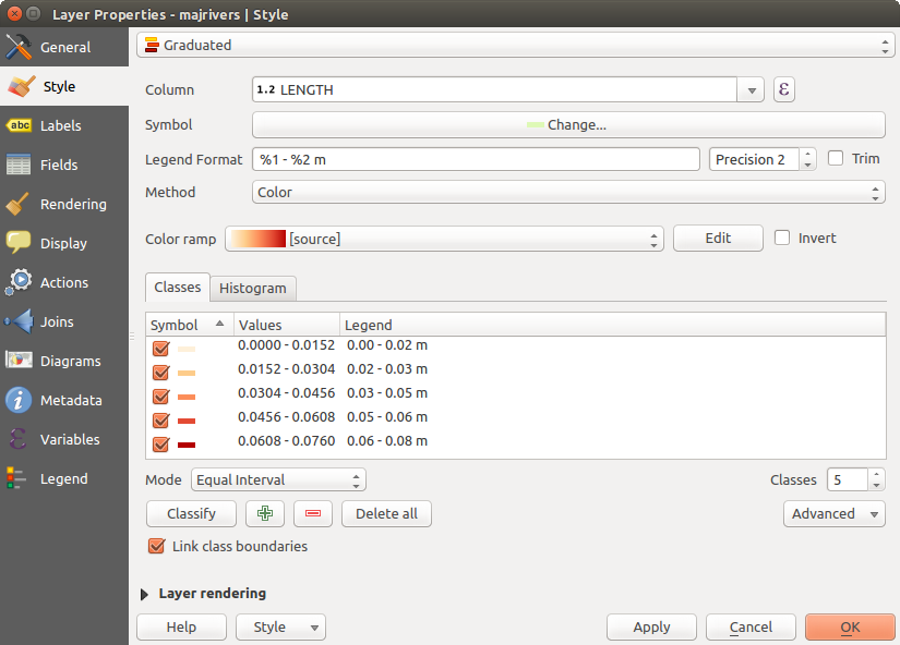
Graduated Symbolizing options
Tip
Thematic maps using an expression
Categorized and graduated thematic maps can be created using the result
of an expression. In the properties dialog for vector layers, the attribute
chooser is extended with a Set column expression function.
So you don’t need to write the classification attribute
to a new column in your attribute table if you want the classification
attribute to be a composite of multiple fields, or a formula of some sort.
Proportional Symbol and Multivariate Analysis
Proportional Symbol and Multivariate Analysis are not rendering types available from the Style rendering drop-down list. However with the Size Assistant options applied over any of the previous rendering options, QGIS allows you to display your point and line data with such representation.
Creating proportional symbol
Proportional rendering is done by first applying to the layer the Single Symbol Renderer.
Once you set the symbol, at the upper level of the symbol tree, the
 Data-defined override button available beside
Size or Width options (for point or line layers
respectively) provides tool to create proportional symbology for the layer.
An assistant is moreover accessible through the menu
to help you define size expression.
Data-defined override button available beside
Size or Width options (for point or line layers
respectively) provides tool to create proportional symbology for the layer.
An assistant is moreover accessible through the menu
to help you define size expression.
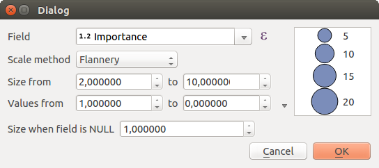
Varying size assistant
The assistant lets you define:
- The attribute to represent, using the Field listbox or the
Set column expression function (see Expressions)
- the scale method of representation which can be ‘Flannery’, ‘Surface’ or ‘Radius’
- The minimum and maximum size of the symbol
- The range of values to represent: The down pointing arrow helps you fill automatically these fields with the minimum (or zero) and maximum values returned by the chosen attribute or the expression applied to your data.
- An unique size to represent NULL values.
To the right side of the dialog, you can preview the features representation within a live-update widget. This representation is added to the layer tree in the layer legend and is also used to shape the layer representation in the print composer legend item.
The values presented in the varying size assistant above will set the size ‘Data-defined override’ with:
coalesce(scale_exp(Importance, 1, 20, 2, 10, 0.57), 1)
Creating multivariate analysis
A multivariate analysis rendering helps you evaluate the relationship between two or more variables e.g., one can be represented by a color ramp while the other is represented by a size.
The simplest way to create multivariate analysis in QGIS is to first apply a categorized or graduated rendering on a layer, using the same type of symbol for all the classes. Then, clicking on the symbol [Change] button above the classification frame, you get the The Symbol Selector dialog from which, as seen above, you can activate and set the size assistant option either on size (for point layer) or width (for line layer).
Like the proportional symbol, the size-related symbol is added to the layer tree, at the top of the categorized or graduated classes symbols. And both representation are also available in the print composer legend item.
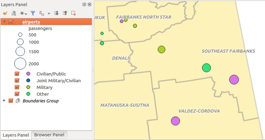
Multivariate example
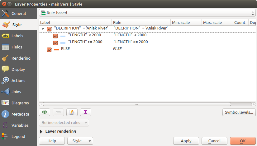
Rule-based Renderer
The  Rule-based renderer is used to render
all the features from a layer,
using rule-based symbols whose aspect reflects the assignment of a selected
feature’s attribute to a class. The rules are based on SQL statements.
The dialog allows rule grouping by filter or scale, and you can decide
if you want to enable symbol levels or use only the first-matched rule.
Rule-based renderer is used to render
all the features from a layer,
using rule-based symbols whose aspect reflects the assignment of a selected
feature’s attribute to a class. The rules are based on SQL statements.
The dialog allows rule grouping by filter or scale, and you can decide
if you want to enable symbol levels or use only the first-matched rule.
To create a rule, activate an existing row by double-clicking on it, or
click on ‘+’ and click on the new rule. In the Rule properties dialog,
you can define a label for the rule. Press the  button to open the
expression string builder.
In the Function List, click on Fields and Values to view all
attributes of the attribute table to be searched.
To add an attribute to the field calculator Expression field,
double click on its name in the Fields and Values list. Generally, you
can use the various fields, values and functions to construct the calculation
expression, or you can just type it into the box (see Expressions).
You can create a new rule by copying and pasting an existing rule with the right
mouse button. You can also use the ‘ELSE’ rule that will be run if none of the other
rules on that level matches.
Since QGIS 2.8 the rules appear in a tree hierarchy in the map legend. Just
double-click the rules in the map legend and the Style tab of the layer
properties appears showing the rule that is the background for the symbol in
the tree.
button to open the
expression string builder.
In the Function List, click on Fields and Values to view all
attributes of the attribute table to be searched.
To add an attribute to the field calculator Expression field,
double click on its name in the Fields and Values list. Generally, you
can use the various fields, values and functions to construct the calculation
expression, or you can just type it into the box (see Expressions).
You can create a new rule by copying and pasting an existing rule with the right
mouse button. You can also use the ‘ELSE’ rule that will be run if none of the other
rules on that level matches.
Since QGIS 2.8 the rules appear in a tree hierarchy in the map legend. Just
double-click the rules in the map legend and the Style tab of the layer
properties appears showing the rule that is the background for the symbol in
the tree.
The example in figure_rule_based_symbology shows the rule-based rendering dialog for the rivers layer of the QGIS sample dataset.
Rule-based Symbolizing options
Point displacement Renderer
The  Point Displacement renderer
works to visualize all features of a point layer, even if they have the same location.
To do this, the symbols of the points are placed on a displacement circle
around one center symbol or on several concentric circles.
Point Displacement renderer
works to visualize all features of a point layer, even if they have the same location.
To do this, the symbols of the points are placed on a displacement circle
around one center symbol or on several concentric circles.
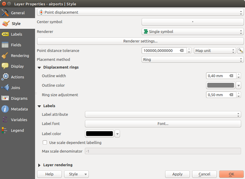
Point displacement dialog
Catatan
You can still render features with other renderer like Single symbol, Graduated, Categorized or Rule-Based renderer using the Renderer drop-down list then the Renderer Settings... button.
Inverted Polygon Renderer
The  Inverted Polygon renderer allows user
to define a symbol to fill in
outside of the layer’s polygons. As above you can select subrenderers, namely
Single symbol, Graduated, Categorized, Rule-Based or 2.5D renderer.
Inverted Polygon renderer allows user
to define a symbol to fill in
outside of the layer’s polygons. As above you can select subrenderers, namely
Single symbol, Graduated, Categorized, Rule-Based or 2.5D renderer.
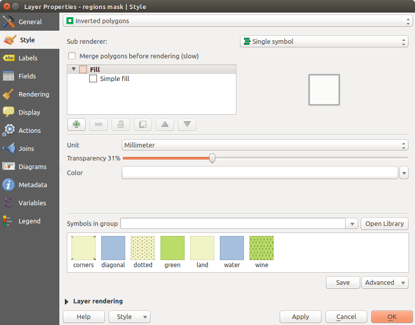
Inverted Polygon dialog
Heatmap Renderer
With the  Heatmap renderer you can create live
dynamic heatmaps for (multi)point layers.
You can specify the heatmap radius in pixels, mm or map units, choose and
edit a color ramp for the heatmap style and use a slider for selecting a trade-off
between render speed and quality. You can also define a maximum value limit and give a
weight to points using a field or an expression. When adding or removing a feature
the heatmap renderer updates the heatmap style automatically.
Heatmap renderer you can create live
dynamic heatmaps for (multi)point layers.
You can specify the heatmap radius in pixels, mm or map units, choose and
edit a color ramp for the heatmap style and use a slider for selecting a trade-off
between render speed and quality. You can also define a maximum value limit and give a
weight to points using a field or an expression. When adding or removing a feature
the heatmap renderer updates the heatmap style automatically.
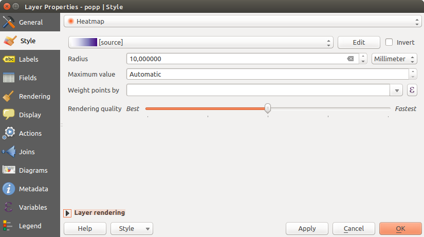
Heatmap dialog
2.5D Renderer
Using the  2.5D renderer it’s possible to create
a 2.5D effect on your layer’s features.
You start by choosing a Height value (in map units). For that
you can use a fixed value, one of your layer’s fields, or an expression. You also
need to choose an Angle (in degrees) to recreate the viewer position
(0° means west, growing in counter clock wise). Use advanced configuration options
to set the Roof Color and Wall Color. If you would like
to simulate solar radiation on the features walls, make sure to check the
2.5D renderer it’s possible to create
a 2.5D effect on your layer’s features.
You start by choosing a Height value (in map units). For that
you can use a fixed value, one of your layer’s fields, or an expression. You also
need to choose an Angle (in degrees) to recreate the viewer position
(0° means west, growing in counter clock wise). Use advanced configuration options
to set the Roof Color and Wall Color. If you would like
to simulate solar radiation on the features walls, make sure to check the
 Shade walls based on aspect option. You can also
simulate a shadow by setting a Color and Size (in map
units).
Shade walls based on aspect option. You can also
simulate a shadow by setting a Color and Size (in map
units).
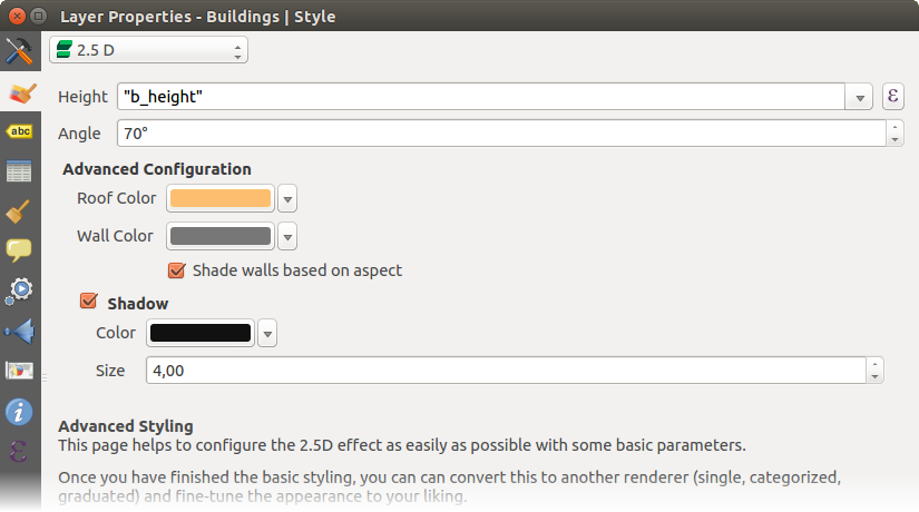
2.5D dialog
Tip
Using 2.5D effect with other renderers
Once you have finished setting the basic style on the 2.5D renderer, you can convert this to another renderer (single, categorized, graduated). The 2.5D effects will be kept and all other renderer specific options will be available for you to fine tune them (this way you can have for example categorized symbols with a nice 2.5D representation or add some extra styling to your 2.5D symbols). To make sure that the shadow and the “building” itself do not interfere with other nearby features, you may need to enable Symbols Levels ( Advanced ‣ Symbol levels...). The 2.5D height and angle values are saved in the layer’s variables, so you can edit it afterwards in the variables tab of the layer’s properties dialog.
Layer rendering
From the Style tab, you can also set some options that invariabily act on all features of the layer:
Layer transparency
 : You can make the underlying layer in
the map canvas visible with this tool. Use the slider to adapt the visibility
of your vector layer to your needs. You can also make a precise definition of
the percentage of visibility in the the menu beside the slider.
: You can make the underlying layer in
the map canvas visible with this tool. Use the slider to adapt the visibility
of your vector layer to your needs. You can also make a precise definition of
the percentage of visibility in the the menu beside the slider.Layer blending mode and Feature blending mode: You can achieve special rendering effects with these tools that you may previously only know from graphics programs. The pixels of your overlaying and underlaying layers are mixed through the settings described in Blending Modes.
Apply paint effects on all the layer features with the Draw Effects button.
Control feature rendering order allows you, using features attributes, to define the z-order in which they shall be rendered. Activate the checkbox and click on the
 button beside.
You then get the Define Order dialog in which you:
button beside.
You then get the Define Order dialog in which you:- choose a field or build an expression to apply to the layer features
- set in which order the fetched features should be sorted, i.e. if you choose Ascending order, the features with lower value are rendered under those with upper value.
- define when features returning NULL value should be rendered: first or last.
You can add several rules of ordering. The first rule is applied to all the features in the layer, z-ordering them according to the value returned. Then, for each group of features with the same value (including those with NULL value) and thus same z-level, the next rule is applied to sort its items among them. And so on...
Layer rendering options
Other Settings
Symbols levels
For renderers that allow stacked symbol layers (only heatmap doesn’t) there is an option to control the rendering order of each symbol’s levels.
For most of the renderers, you can access the Symbols levels option by clicking the [Advanced] button below the saved symbols list and choosing Symbol levels. For the Rule-based Renderer the option is directly available through [Symbols levels] button, while for Point displacement Renderer renderer the same button is inside the Rendering settings dialog.
To activate symbols levels, select the Enable symbol
levels. Each row will show up a small sample of the combined symbol, its label
and the individual symbols layer divided into columns with a number next to it.
The numbers represent the rendering order level in which the symbol layer
will be drawn. Lower values levels are drawn first, staying at the bottom, while
higher values are drawn last, on top of the others.
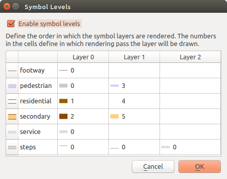
Symbol levels dialog
Catatan
If symbols levels are deactivated, the complete symbols will be drawn according to their respective features order. Overlapping symbols will simply obfuscate to other below. Besides, similar symbols won’t “merge” with each other.
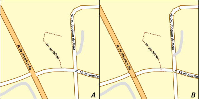
Symbol levels activated (A) and deactivated (B) difference
Draw effects
In order to improve layer rendering and avoid (or at least reduce)
the resort to other software for final rendering of maps, QGIS provides another
powerful functionality: the  Draw Effects options,
which adds paint effects for customizing the visualization of vector layers.
Draw Effects options,
which adds paint effects for customizing the visualization of vector layers.
The option is available in the Layer Properties –> Style dialog, under the Layer rendering group (applying to the whole layer) or in symbol layer properties (applying to corresponding features). You can combine both usage.
Paint effects can be activated by checking the Draw effects option
and clicking the Customize effects button, that will open
the Effect Properties Dialog (see figure_effects_source). The following
effect types, with custom options are available:
Source: Draws the feature’s original style according to the configuration of the layer’s properties. The transparency of its style can be adjusted.
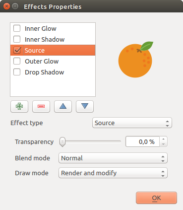
Draw Effects: Source dialog
Blur: Adds a blur effect on the vector layer. The options that someone can change are the Blur type (Stack or Gaussian blur), the strength and transparency of the blur effect.
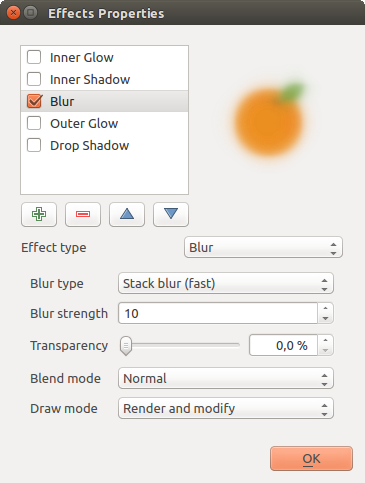
Draw Effects: Blur dialog
Colorize: This effect can be used to make a version of the style using one single hue. The base will always be a grayscale version of the symbol and you can use the
 Grayscale to select how to create it
(options are: ‘lightness’, ‘luminosity’ and ‘average’). If
Colorise is selected, it will be possible to mix another color
and choose how strong it should be. You can also control the
Brightness, contrast and
saturation levels of the resulting symbol.
Grayscale to select how to create it
(options are: ‘lightness’, ‘luminosity’ and ‘average’). If
Colorise is selected, it will be possible to mix another color
and choose how strong it should be. You can also control the
Brightness, contrast and
saturation levels of the resulting symbol.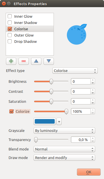
Draw Effects: Colorize dialog
Drop Shadow: Using this effect adds a shadow on the feature, which looks like adding an extra dimension. This effect can be customized by changing the offset degrees and radius, determining where the shadow shifts towards to and the proximity to the source object. Drop Shadow also has the option to change the blur radius, the transparency and the color of the effect.
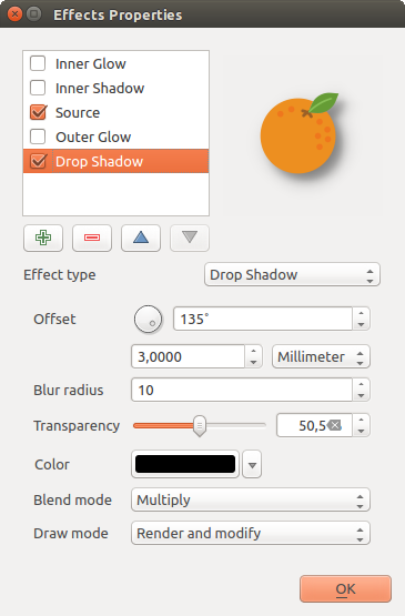
Draw Effects: Drop Shadow dialog
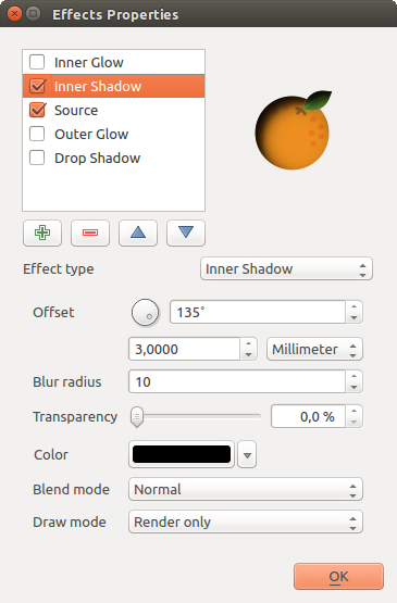
Inner Shadow: This effect is similar to the Drop Shadow effect, but it adds the shadow effect on the inside of the edges of the feature. The available options for customization are the same as the Drop Shadow effect.
Draw Effects: Inner Shadow dialog
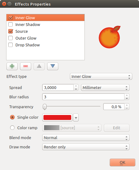
Inner Glow: Adds a glow effect inside the feature. This effect can be customized by adjusting the spread (width) of the glow, or the Blur radius. The latter specifies the proximity from the edge of the feature where you want any blurring to happen. Additionally, there are options to customize the color of the glow, with a single color or a color ramp.
Draw Effects: Inner Glow dialog
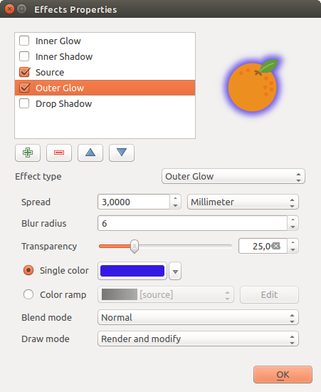
Outer Glow: This effect is similar to the Inner Glow effect, but it adds the glow effect on the outside of the edges of the feature. The available options for customization are the same as the Inner Glow effect.
Draw Effects: Outer Glow dialog
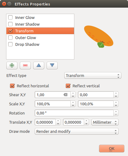
Transform: Adds the possibility of transforming the shape of the symbol. The first options available for customization are the Reflect horizontal and Reflect vertical, which actually create a reflection on the horizontal and/or vertical axes. The 4 other options are:
- Shear: slants the feature along the x and/or y axis
- Scale: enlarges or minimizes the feature along the x and/or y axis by the given percentage
- Rotation: turns the feature around its center point
- and Translate changes the position of the item based on a distance given on the x and/or the y axis.
Draw Effects: Transform dialog
There are some common options available for all draw effect types. Transparency and Blend mode options work similar to the ones described in Layer rendering and can be used in all draw effects except for the transform one.
One or more draw effects can used at the same time. You activate/deactivate an effect
using its checkbox in the effects list. You can change the selected effect type by
using the Effect type option. You can reorder the effects
using  Move up and
  Move down
buttons, and also add/remove effects using the
Move down
buttons, and also add/remove effects using the  Add effect
and
Add effect
and  Remove effect buttons.
There is also a Draw mode option available for
every draw effect, and you can choose whether to render and/or to modify the
symbol. Effects render from top to bottom.’Render only’ mode means that the
effect will be visible while the ‘Modify only’ mode means that the effect will
not be visible but the changes that it applies will be passed to the next effect
(the one immediately below). The ‘Render and Modify’ mode will make the
effect visible and pass any changes to the next effect. If the effect is in the
top of the effects list or if the immediately above effect is not in modify
mode, then it will use the original source symbol from the layers properties
(similar to source).
Labels Properties
The  Labels properties provides you with all the needed
and appropriate capabilities to configure smart labeling on vector layers. This
dialog can also be accessed from the Layer Styling panel, or using
the Layer Labeling Options icon of the Labels toolbar.
Labels properties provides you with all the needed
and appropriate capabilities to configure smart labeling on vector layers. This
dialog can also be accessed from the Layer Styling panel, or using
the Layer Labeling Options icon of the Labels toolbar.
Setting a label
The first step is to choose the labeling method from the drop-down list. There are four options available:
- No labels
- Show labels for this layer
- Rule-based labeling
- and Blocking: allows to set a layer as just an obstacle for other layer’s labels without rendering any labels of its own.
The next steps assume you select the Show labels for this layer option, enabling following tabs that help you configure the labeling:
It also enables the Label with drop-down list, from which you can select an
attribute column to use. Click if you want to define
labels based on expressions - See Define labels based on expressions.
The following steps describe simple labeling without using the Data defined override functions, which are situated next to the drop-down menus - see Using data-defined override for labeling for a use case.
Layer labeling settings - Text tab
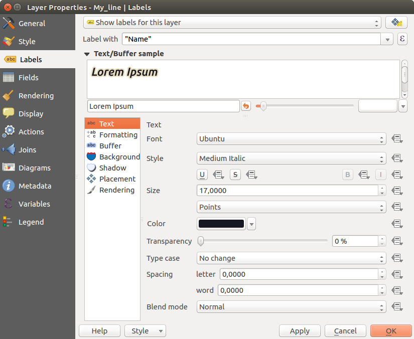
Text tab
In the Text tab, you can define the Font, Style, and Size of your labels’ text (see Figure_labels). There are options available to set the labels’ Color and Transparency. Use the Type case option to change the capitalization style of the text. You have the possibility to render the text as ‘All uppercase’, ‘All lowercase’ or ‘Capitalize first letter’. In Spacing, you can change the space between words and between individual letters. Finally, use the Blend mode option to determine how your labels will mix with the map features below them (see more about it in Blending Modes).
The Apply label text substitutes option gives you ability to specify a list of texts to substitute to texts in feature labels (e.g., abbreviating street types). Replacement texts are thus used to display labels in the map canvas. Users can also export and import lists of substitutes to make reuse and sharing easier.
Formatting tab
In the Formatting tab, you can define a character for a line break in the labels with the Wrap on character option. You can also format the Line Height and the alignment. For the latter, typical values are available (left, right, and center), plus Follow label placement for point layers. When set to this mode, text alignment for labels will be dependent on the final placement of the label relative to the point. E.g., if the label is placed to the left of the point, then the label will be right aligned, while if it is placed to the right, it will be left aligned.
For line vector layers you can include Line directions symbols to help determine the lines directions. They work particularly well when used with the curved or Parallel placement options from the Placement tab. There are options to set the symbols position, and to reverse direction.
Use the Formatted numbers option to format numeric
labels. You can set the number of Decimal places. By default, 3
decimal places will be used. Use the Show plus sign if
you want to show the plus sign in positive numbers.
Buffer tab
To create a buffer around the labels, activate the
Draw text buffer checkbox in the Buffer tab. You can
set the buffer’s Size, color, and
Transparency. The buffer expands from the label’s outline
, so, if the color buffer’s fill checkbox is
activated, the buffer interior is filled. This may be relevant when
using partially transparent labels or with non-normal blending
modes, which will allow seeing behind the label’s text. Deactivating
color buffer’s fill checkbox (while using totally
transparent labels) will allow you to create outlined text labels.
Background tab
In the Background tab, you can define with Size X and Size Y the shape of your background. Use Size type to insert an additional ‘Buffer’ into your background. The buffer size is set by default here. The background then consists of the buffer plus the background in Size X and Size Y. You can set a Rotation where you can choose between ‘Sync with label’, ‘Offset of label’ and ‘Fixed’. Using ‘Offset of label’ and ‘Fixed’, you can rotate the background. Define an Offset X,Y with X and Y values, and the background will be shifted. When applying Radius X,Y, the background gets rounded corners. Again, it is possible to mix the background with the underlying layers in the map canvas using the Blend mode (see Blending Modes).
Shadow tab
Use the Shadow tab for a user-defined Drop shadow.
The drawing of the background is very variable.
Choose between ‘Lowest label component’, ‘Text’, ‘Buffer’ and ‘Background’.
The Offset angle depends on the orientation
of the label. If you choose the Use global shadow checkbox,
then the zero point of the angle is
always oriented to the north and doesn’t depend on the orientation of the label.
You can influence the appearance of the shadow with the Blur radius.
The higher the number, the softer the shadows. The appearance of the drop shadow
can also be altered by choosing a blend mode.
Placement tab
Choose the Placement tab for configuring label placement and labeling priority. Note that the placement options differ according to the type of vector layer, namely point, line or polygon.
Placement for point layers
With the  Cartographic placement mode,
point labels are generated with a better visual relationship with the
point feature, following ideal cartographic placement rules. Labels can be
placed at a set Distance either from the point feature itself
or from the bounds of the symbol used to represent the feature.
The latter option is especially useful when the symbol size isn’t fixed,
e.g. if it’s set by a data defined size or when using different symbols
in a categorized renderer.
Cartographic placement mode,
point labels are generated with a better visual relationship with the
point feature, following ideal cartographic placement rules. Labels can be
placed at a set Distance either from the point feature itself
or from the bounds of the symbol used to represent the feature.
The latter option is especially useful when the symbol size isn’t fixed,
e.g. if it’s set by a data defined size or when using different symbols
in a categorized renderer.
By default, placements are prioritised in the following order:
- top right
- top left
- bottom right
- bottom left
- middle right
- middle left
- top, slightly right
- bottom, slightly left.
Placement priority can, however, be customized or set for an individual feature using a data defined list of prioritised positions. This also allows only certain placements to be used, so e.g. for coastal features you can prevent labels being placed over the land.
The Around point setting places the label in an
equal radius (set in Distance) circle around the feature. The
placement of the label can even be constrained using the Quadrant
option.
With the Offset from point, labels are
placed at a fixed offset from the point feature. You can select the
Quadrant in which to place your label. You are also able to set
the Offset X,Y distances between the points and their labels and
can alter the angle of the label placement with the Rotation
setting. Thus, placement in a selected quadrant with a defined rotation is
possible.
Placement for line layers
Label options for line layers include Parallel,
 Curved or Horizontal.
For the Parallel and
Curved options, you can set the position to
Above line, On line and
Below line. It’s possible to select several options at once. In
that case, QGIS will look for the optimal label position. For Parallel and
curved placement options, you can also use the line orientation for the
position of the label. Additionally, you can define a Maximum
angle between curved characters when selecting the
Curved option (see Figure_labels_placement_line).
Curved or Horizontal.
For the Parallel and
Curved options, you can set the position to
Above line, On line and
Below line. It’s possible to select several options at once. In
that case, QGIS will look for the optimal label position. For Parallel and
curved placement options, you can also use the line orientation for the
position of the label. Additionally, you can define a Maximum
angle between curved characters when selecting the
Curved option (see Figure_labels_placement_line).
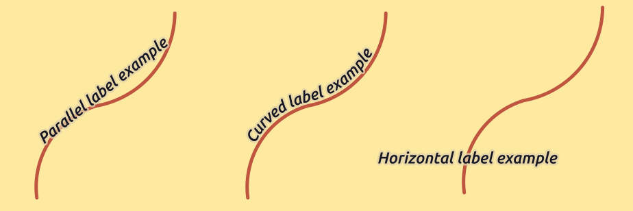
Label placement examples in lines
For all three placement options, in Repeat, you can set up a minimum distance for repeating labels. The distance can be in mm or in map units.
Placement for polygon layers
You can choose one of the following options for placing labels in polygons (see figure_labels_placement_polygon):
- Offset from centroid,
- Horizontal (slow),
- Around centroid,
- Free (slow),
- Using perimeter,
- and Using perimeter (curved).
In the Offset from centroid settings you can
specify if the centroid is of the visible
polygon or whole polygon. That means that
either the centroid is used for the polygon you can see on the map or the
centroid is determined for the whole polygon, no matter if you can see the
whole feature on the map. You can place your label within a specific
quadrant, and define offset and rotation.
The Around centroid setting places the label at a specified
distance around the centroid. Again, you can define
visible polygon or whole polygon
for the centroid.
With the Horizontal (slow) or Free (slow) options, QGIS places at the best position either a horizontal or a rotated label inside the polygon.
With the Using perimeter option, the label
will be drawn next to the polygon boundary. The label will behave like the
parallel option for lines. You can define a position and a distance for the
label. For the position, Above line,
On line, Below line and
Line orientation dependent position are possible. You can
specify the distance between the label and the polygon outline, as well as
the repeat interval for the label.
The Using perimeter (curved) option helps you draw the label along the polygon boundary, using a curved labeling. In addition to the parameters available with Using perimeter setting, you can set the Maximum angle between curved characters polygon, either inside or outside.
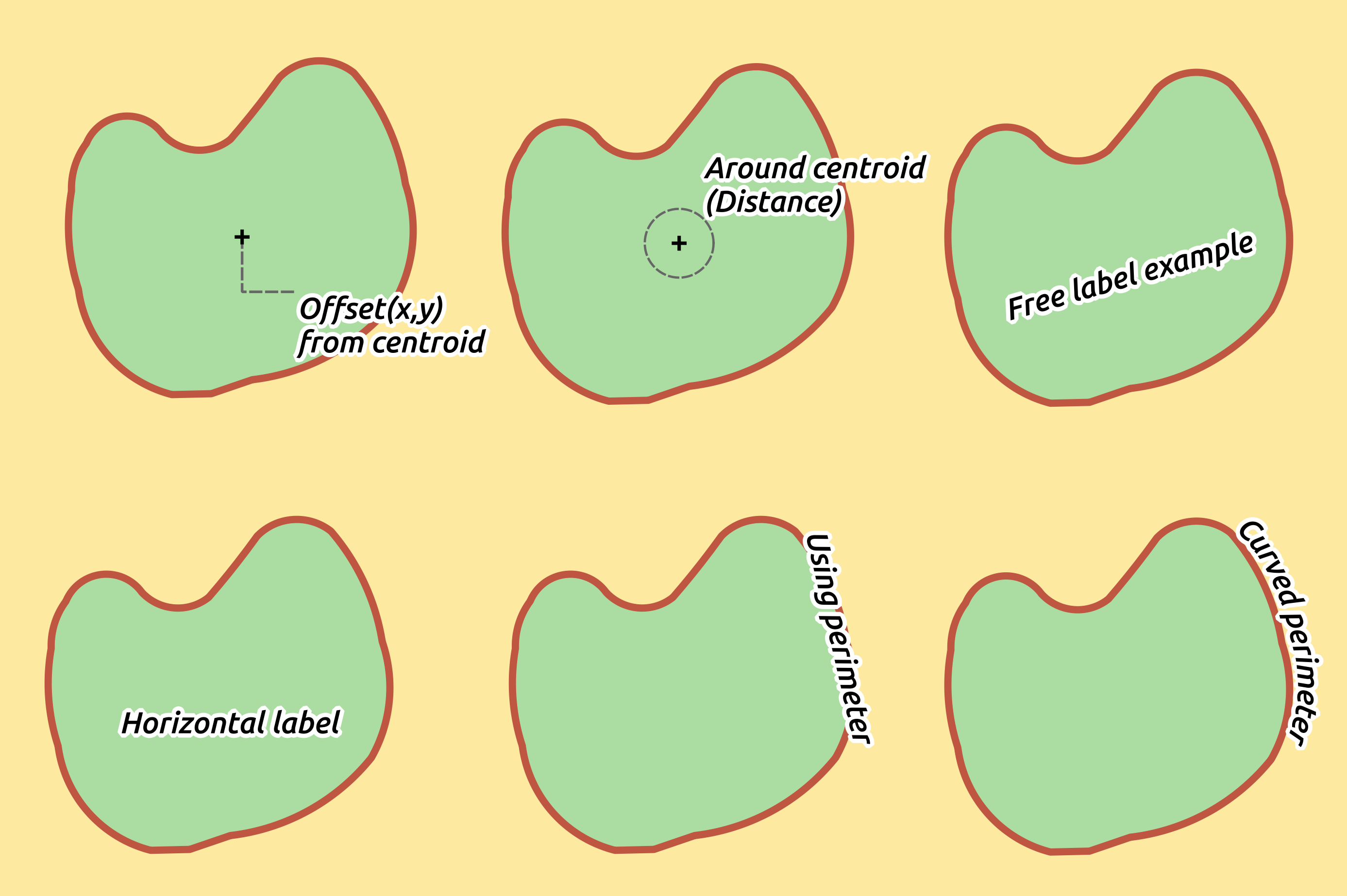
Label placement examples in polygons
In the priority section you can define the priority with which labels are rendered for all three vector layer types (point, line, polygon). This placement option interacts with the labels from other vector layers in the map canvas. If there are labels from different layers in the same location, the label with the higher priority will be displayed and the others will be left out.
Rendering tab
In the Rendering tab, you can tune when the labels can be rendered and their interaction with other labels and features.
Under Label options, you find the scale-based and the Pixel size-based visibility settings.
The Label z-index determines the order in which labels are rendered, as well in relation with other feature labels in the layer (using data-defined override expression), as with labels from other layers. Labels with a higher z-index are rendered on top of labels (from any layer) with lower z-index.
Additionally, the logic has been tweaked so that if 2 labels have matching z-indexes, then:
- if they are from the same layer, the smaller label will be drawn above the larger label
- if they are from different layers, the labels will be drawn in the same order as their layers themselves (ie respecting the order set in the map legend).
Note that this setting doesn’t make labels to be drawn below the features from other layers, it just controls the order in which labels are drawn on top of all the layer’s features.
While rendering labels and in order to display readable labels,
QGIS automatically evaluates the position of the labels and can hide some of them
in case of collision. You can however choose to Show all
labels for this layer (including colliding labels) in order to manually fix
their placement.
With data-defined expressions in Show label and Always Show you can fine tune which labels should be rendered.
Under Feature options, you can choose to label every part of a multi-part feature and limit the number of features to be labeled. Both line and polygon layers offer the option to set a minimum size for the features to be labeled, using Suppress labeling of features smaller than. For polygon features, you can also filter the labels to show according to whether they completely fit within the feature or not. For line features, you can choose to Merge connected lines to avoid duplicate labels, rendering a quite airy map in conjunction with the Distance or Repeat options in Placement tab.
From the Obstacles frame, you can manage the covering relation between
labels and features. Activate the Discourage labels from
covering features option to decide whether features of the layer should act as
obstacles for any label (including labels from other features in the same layer).
An obstacle is a feature QGIS tries as far as possible to not place labels over.
Instead of the whole layer, you can define a subset of features to use as obstacles,
using the data-defined override control next to the option.
The priority control slider for obstacles allows you to make labels
prefer to overlap features from certain layers rather than others.
A Low weight obstacle priority means that features of the layer are less
considered as obstacles and thus more likely to be covered by labels.
This priority can also be data-defined, so that within the same layer,
certain features are more likely to be covered than others.
For polygon layers, you can choose the type of obstacle features could be by minimising the labels placement:
- over the feature’s interior: avoids placing labels over the interior of the polygon (prefers placing labels totally outside or just slightly inside the polygon)
- or over the feature’s boundary: avoids placing labels over boundary of the polygon (prefers placing labels outside or completely inside the polygon). E.g., it can be useful for regional boundary layers, where the features cover an entire area. In this case, it’s impossible to avoid placing labels within these features, and it looks much better to avoid placing them over the boundaries between features.
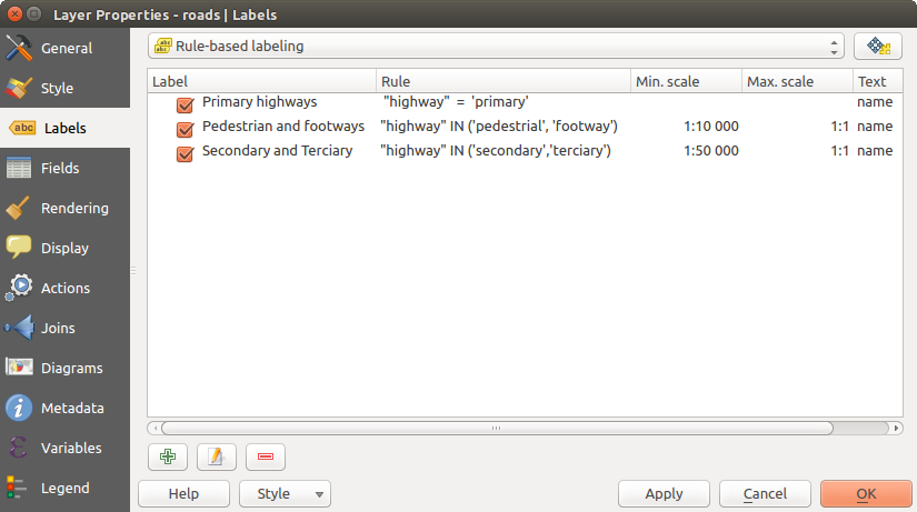
Rule-based labeling
With rule-based labeling multiple label configurations can be defined and applied selectively on the base of expression filters and scale range, as in Rule-based rendering.
To create a rule, select the Rule-based labeling option in the main
drop-down list from the Labels tab and click the button
at the bottom of the dialog. Then fill the new dialog with a description and an
expression to filter features. You can also set a scale range in which the label rule should be applied. The other
options available in this dialog are the common settings
seen beforehand.
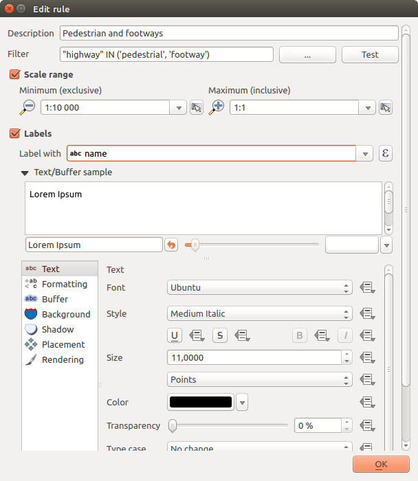
Rule settings
A summary of existing rules is shown in the main dialog (see figure_labels_rule_based).
You can add multiple rules, reorder or imbricate them with a drag-and-drop.
You can as well remove them with the button or edit them with
 button or a double-click.
Rule based labeling panel
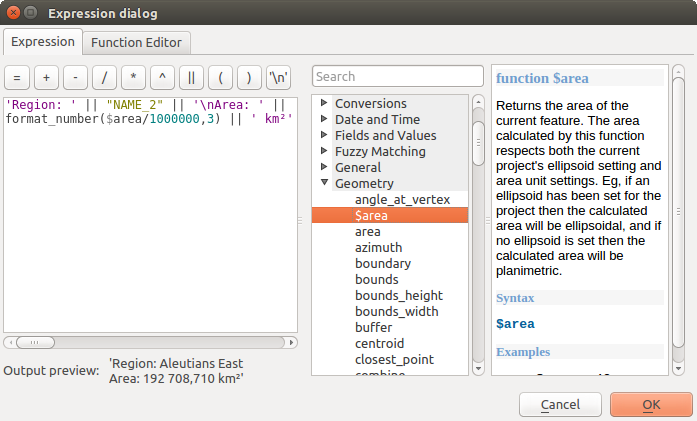
Define labels based on expressions
Whether you choose simple or rule-based labeling type, QGIS allows using
expressions to label features. Click the icon near the
Label with drop-down list in the Labels tab
of the properties dialog. In figure_labels_expression, you see a sample
expression to label the alaska regions with name and area size, based on the
field ‘NAME_2’, some descriptive text, and the function $area in combination
with format_number() to make it look nicer.
Using expressions for labeling
Expression based labeling is easy to work with. All you have to take care of is that:
- You need to combine all elements (strings, fields, and functions) with a string concatenation function such as concat, + or ||. Be aware that in some situations (when null or numeric value are involved) not all of these tools will fit your need.
- Strings are written in ‘single quotes’.
- Fields are written in “double quotes” or without any quote.
Let’s have a look at some examples:
Label based on two fields ‘name’ and ‘place’ with a comma as separator:
"name" || ', ' || "place"
Returns:
John Smith, Paris
Label based on two fields ‘name’ and ‘place’ with other texts:
'My name is ' + "name" + 'and I live in ' + "place"
'My name is ' || "name" || 'and I live in ' || "place"
concat('My name is ', name, ' and I live in ', "place")
Returns:
My name is John Smith and I live in Paris
Label based on two fields ‘name’ and ‘place’ with other texts combining different concatenation functions:
concat('My name is ', name, ' and I live in ' || place)Returns:
My name is John Smith and I live in Paris
Or, if the field ‘place’ is NULL, returns:
My name is John Smith
Multi-line label based on two fields ‘name’ and ‘place’ with a descriptive text:
concat('My name is ', "name", '\n' , 'I live in ' , "place")Returns:
My name is John Smith
I live in Paris
Label based on a field and the $area function to show the place’s name and its rounded area size in a converted unit:
'The area of ' || "place" || ' has a size of '
|| round($area/10000) || ' ha'
Returns:
The area of Paris has a size of 10500 ha
Create a CASE ELSE condition. If the population value in field population is <= 50000 it is a town, otherwise it is a city:
concat('This place is a ',
CASE WHEN "population <= 50000" THEN 'town' ELSE 'city' END)
Returns:
This place is a town
As you can see in the expression builder, you have hundreds of functions available to create simple and very complex expressions to label your data in QGIS. See Expressions chapter for more information and examples on expressions.
Using data-defined override for labeling
With the Data defined override functions, the settings for
the labeling are overridden by entries in the attribute table. It can be used to
set values for most of the labeling options described above. See the widget’s
description and manipulation in Data defined override setup section.
The Label Toolbar
The Label Toolbar provides some tools to manipulate
label or  diagram
properties, but only if the corresponding data-defined option is indicated
(otherwise, buttons are disabled). Layer might also need to be in edit mode.
diagram
properties, but only if the corresponding data-defined option is indicated
(otherwise, buttons are disabled). Layer might also need to be in edit mode.
The Label toolbar
While for readability, label has been used below to describe the Label toolbar, note that when mentioned in their name, the tools work almost the same way with diagrams:
 Pin/Unpin Labels And Diagrams that has data-defined
position. By clicking or draging an area, you pin label(s). If you click or
drag an area holding Shift, label(s) are unpinned. Finally, you can
also click or drag an area holding Ctrl to toggle the pin status of
label(s).
Pin/Unpin Labels And Diagrams that has data-defined
position. By clicking or draging an area, you pin label(s). If you click or
drag an area holding Shift, label(s) are unpinned. Finally, you can
also click or drag an area holding Ctrl to toggle the pin status of
label(s). Highlight Pinned Labels And Diagrams. If the
vector layer of the label is editable, then the highlighting is green,
otherwise it’s blue.
Highlight Pinned Labels And Diagrams. If the
vector layer of the label is editable, then the highlighting is green,
otherwise it’s blue. Move Label And Diagram that has data-defined
position. You just have to drag the label to the desired place.
Move Label And Diagram that has data-defined
position. You just have to drag the label to the desired place. Show/Hide Labels And Diagrams that has
data-defined visbility. If you click or drag an area holding Shift,
then label(s) are hidden. When a label is hidden, you just have to click
or drag an area around the feature’s point to restore its visibility.
Show/Hide Labels And Diagrams that has
data-defined visbility. If you click or drag an area holding Shift,
then label(s) are hidden. When a label is hidden, you just have to click
or drag an area around the feature’s point to restore its visibility. Rotate Label. Click the label and move around and
you get the text rotated.
Rotate Label. Click the label and move around and
you get the text rotated. Change Label. It opens a dialog to change the
clicked label properties; it can be the label itself, its coordinates, angle,
font, size... as long as this property has been mapped to a field.
Change Label. It opens a dialog to change the
clicked label properties; it can be the label itself, its coordinates, angle,
font, size... as long as this property has been mapped to a field.
Peringatan
Label tools overwrite current field values
Using the Label toolbar to customize the labeling actually writes the new value of the property in the mapped field. Hence, be careful to not inadvertently replace data you may need later!
Customize the labels from the map canvas
Combined with the Label Toolbar, the data defined override setting
helps you manipulate labels in the map canvas (move, edit, rotate).
We now describe an example using the data-defined override function for the
Move label function (see figure_labels_data_defined).
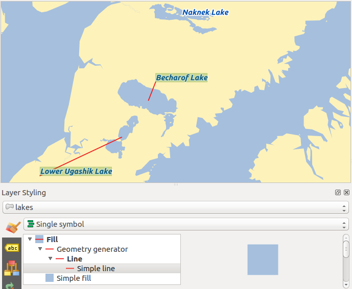
Import lakes.shp from the QGIS sample dataset.
Double-click the layer to open the Layer Properties. Click on Labels and Placement. Select
Offset from centroid.Look for the Data defined entries. Click the
icon
to define the field type for the Coordinate. Choose xlabel
for X and ylabel for Y. The icons are now highlighted in yellow.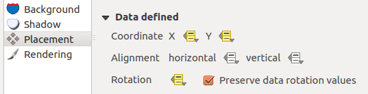
Labeling of vector polygon layers with data-defined override
Zoom into a lake.
Set editable the layer using the
 Toggle Editing button.
Go to the Label toolbar and click the
icon.
Now you can shift the label manually to another position (see figure_labels_move).
The new position of the label is saved in the xlabel and ylabel columns
of the attribute table.Using The Geometry Generator with the expression below, you can also add a linestring symbol layer to connect each lake to its moved label:
make_line( centroid( $geometry ), make_point( "xlabel", "ylabel" ) )
Moved labels
Fields Properties
 The Fields tab helps you organize the fields of
the selected dataset and the way you can interact with
the feature’s attributes. The buttons
The Fields tab helps you organize the fields of
the selected dataset and the way you can interact with
the feature’s attributes. The buttons  New field and
  Delete field
can be used when the dataset is in Editing mode.
Delete field
can be used when the dataset is in Editing mode.
You can rename fields by double-clicking in the fields name (note that you should switch to editing mode to edit the field name). This is only supported for data providers like PostgreSQL, Oracle, Memory layer and some OGR layer depending the OGR data format and version.
You can define some alias to display human readable fields in the feature form or the attribute table. In this case, you don’t need to switch to editing mode. Alias are saved in project file.
Comments can be added by clicking in the comment field of the column but if you are using a PostgreSQL layer, comment of the column could be the one in the PostgreSQL table if set. Comments are saved in the QGIS project file as for the alias.
The dialog also lists read-only characteristics of the field such as its type, type name, length and precision. When serving the layer as WMS or WFS, you can also check here which fields could be retrieved.
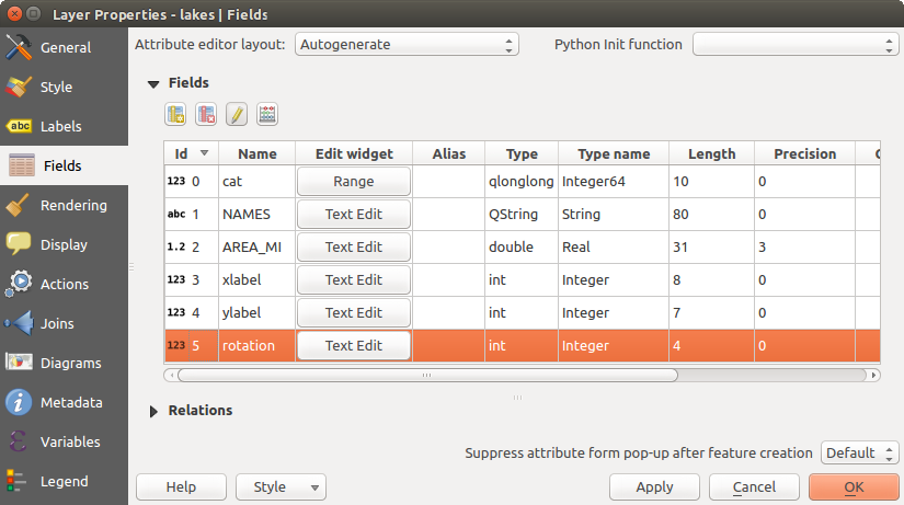
Field properties tab
Configure the field behavior
Within the Fields tab, you also find an Edit widget column. This column can be used to define values or a range of values that are allowed to be added to the specific attribute table column. It also helps to set the type of widget used to fill or display values of the field, in the attribute table or the feature form. If you click on the [Edit widget] button, a dialog opens, where you can define different widgets.
Dialog to select an edit widget for an attribute column
Common settings
Regardless the type of widget applied to the field, there are some common properties you can set to control whether and how a field can be edited:
Editable: uncheck this to set the field read-only (not manually modifiable) when the layer is in edit mode. Note that checking this setting doesn’t override any edit limitation from the provider.
Label on top: places the field name above or beside the widget in the feature form
Default value: for new features, automatically populates by default the field with a predefined value or an expression-based one. For example, you can:
- use $x, $length, $area to populate a field with the feature’s x coordinate, length, area or any geometric information at its creation;
- incremente a field by 1 for each new feature using maximum("field")+1;
- save the feature creation datetime using now();
- use variables in expressions, making it easier to e.g. insert the operator name (@user_full_name), the project file path (@project_path), ...
A preview of the resulting default value is displayed at the bottom of the widget.
Catatan
The Default value option is not aware of the values in any other field of the feature being created so it won’t be possible to use an expression combining any of those values i.e using an expression like concat(field1, field2) may not work.
Constraints: you can constrain the value to insert in the field. This constraint can be:
- Not null: force the user to provide a value
based on a custom expression: e.g. regexp_match(col0,'A-Za-z') to ensure that the value of the field col0 has only alphabetical letter.
A short description of the constraint can be added and will be displayed at the top of the form as a warning message when the value supplied does not match the constraint.
Edit widgets
The available widgets are:
- Checkbox: Displays a checkbox, and you can define what attribute is added to the column when the checkbox is activated or not.
- Classification: Displays a combo box with the values used for classification, if you have chosen ‘unique value’ as legend type in the Style tab of the properties dialog.
- Color: Displays a color button allowing user to choose a color from the color dialog window.
- Date/Time: Displays a line field which can open a calendar widget to enter a date, a time or both. Column type must be text. You can select a custom format, pop-up a calendar, etc.
- Enumeration: Opens a combo box with values that can be used within the columns type. This is currently only supported by the PostgreSQL provider.
- External Resource: Uses a “Open file” dialog to store file path in a relative or absolute mode. It can also be used to display a hyperlink (to document path), a picture or a web page.
- File Name: Simplifies the selection by adding a file chooser dialog.
- Hidden: A hidden attribute column is invisible. The user is not able to see its contents.
- Photo: Field contains a filename for a picture. The width and height of the field can be defined.
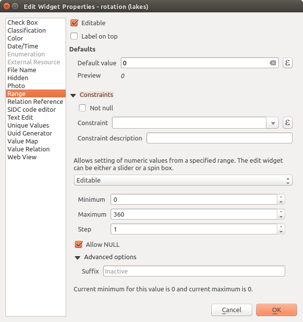
- Range: Allows you to set numeric values from a specific range. The edit widget can be either a slider or a spin box.
- Relation Reference: This widget lets you embed the feature form of the referenced layer on the feature form of the actual layer. See Creating one or many to many relations.
- Text Edit (default): This opens a text edit field that allows simple text or multiple lines to be used. If you choose multiple lines you can also choose html content.
- Unique Values: You can select one of the values already used in the attribute table. If ‘Editable’ is activated, a line edit is shown with autocompletion support, otherwise a combo box is used.
- UUID Generator: Generates a read-only UUID (Universally Unique Identifiers) field, if empty.
- Value Map: A combo box with predefined items. The value is stored in the attribute, the description is shown in the combo box. You can define values manually or load them from a layer or a CSV file.
- Value Relation: Offers values from a related table in a combobox. You can select layer, key column and value column. Several options are available to change the standard behaviours: allow null value, order by value, allow multiple selections and use of autocompleter. The forms will display either a drop-down list or a line edit field when completer checkbox is enabled.
- Web View: Field contains a URL. The width and height of the field is variable.
Tip
Relative Path in widgets
If the path which is selected with the file browser is located in the same directory as the .qgs project file or below, paths are converted to relative paths. This increases portability of a .qgs project with multimedia information attached. This is enabled only for File Name, Photo and Web View at this moment.
Customize a form for your data
By default, when you click on a feature with the  Identify
Features tool or switch the attribute table to the form view mode, QGIS
displays a form with tabulated textboxes (one per field). This rendering is
the result of the default Autogenerate value of the Layer
properties ‣ Fields ‣ Attribute editor layout setting. Thanks to the
widget setting, you can improve this dialog.
Identify
Features tool or switch the attribute table to the form view mode, QGIS
displays a form with tabulated textboxes (one per field). This rendering is
the result of the default Autogenerate value of the Layer
properties ‣ Fields ‣ Attribute editor layout setting. Thanks to the
widget setting, you can improve this dialog.
You can furthermore define built-in forms (see figure_fields_form), e.g. when you have objects with many attributes, you can create an editor with several tabs and named groups to present the attribute fields.
Resulting built-in form with tabs and named groups
The drag and drop designer
Choose Drag and drop designer from the Attribute editor layout combobox to layout the features form within QGIS. Then, drag and drop rows from the Fields frame to the Label panel to have fields added to your custom form.
You can also use categories (tab or group frames) to better structure the form.
The first step is to use the icon to create a tab in which fields
and groups will be displayed (see figure_fields_layout). You can create as many
categories as you want.
The next step will be to assign to each category the relevant fields, using the
 icon. You’d need to select the targeted category beforehand.
You can use the same fields many times.
icon. You’d need to select the targeted category beforehand.
You can use the same fields many times.
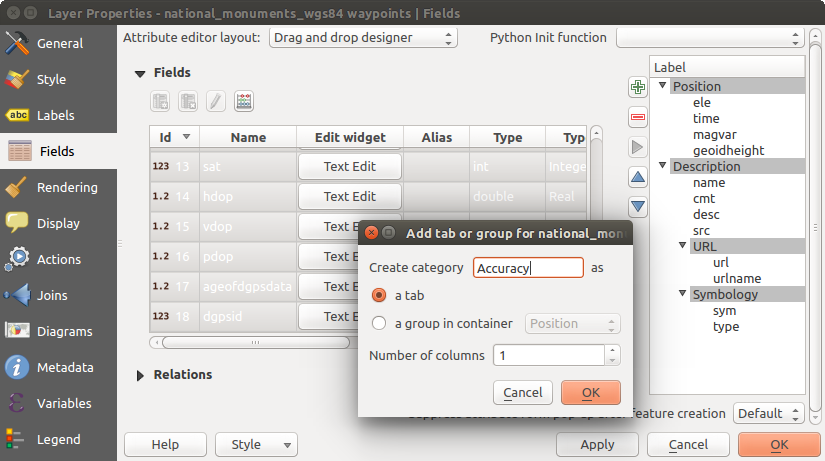
Dialog to create categories with the Attribute editor layout
You can configure tabs or groups with a double-click. QGIS opens a form in which you can:
- choose to hide or show the item label
- rename the category
- set over how many columns the fields under the category should be distributed
- enter an expression to control the category visibility. The expression will be re-evaluated everytime values in the form change and the tab or groupbox shown/hidden accordingly.
- show the category as a group box (only available for tabs)
With a double-click on a field label, you can also specify whether the label of its widget should be visible or not in the form.
In case the layer is involved in one to many relations (see Creating one or many to many relations), referencing layers are listed in the Relations frame and their form can be embedded in the current layer form by drag-and-drop. Like the other items, double-click the relation label to configure some options:
- choose to hide or show the item label
- show the link button
- show the unlink button
Provide an ui-file
The Provide ui-file option allows you to use complex dialogs made with Qt-Designer. Using a UI-file allows a great deal of freedom in creating a dialog. Note that, in order to link the graphical objects (textbox, combobox...) to the layer’s fields, you need to give them the same name.
Use the Edit UI to define the path to the file to use.
You’ll find some example in the Creating a new form lesson of the Panduan Pelatihan QGIS. For more advanced information, see http://nathanw.net/2011/09/05/qgis-tips-custom-feature-forms-with-python-logic/.
Enhance your form with custom functions
QGIS forms can have a Python function that is called when the dialog is opened. Use this function to add extra logic to your dialogs. The form code can be specified in three different ways:
- load from the environment: use a function, for example in startup.py or from an installed plugin)
- load from an external file: a file chooser will appear in that case to allow you to select a Python file from your filesystem
- provide code in this dialog: a Python editor will appear where you can directly type the function to use.
In all cases you must enter the name of the function that will be called (open in the example below).
An example is (in module MyForms.py):
def open(dialog,layer,feature):
    geom = feature.geometry()
    control = dialog.findChild(QWidged,"My line edit")
Reference in Python Init Function like so: open
Joins Properties
 The Joins tab allows you to join a loaded attribute
table to a loaded vector layer. After clicking , the
Add vector join dialog appears. As key columns, you have to define a
join layer you want to connect with the target vector layer.
Then, you have to specify the join field that is common to both the join layer
and the target layer. Now you can also specify a subset of fields from the joined
layer based on the checkbox Choose which fields are joined.
As a result of the join, all information from the join layer and the target layer
are displayed in the attribute table of the target layer as joined information.
If you specified a subset of fields only these fields are displayed in the attribute
table of the target layer.
The Joins tab allows you to join a loaded attribute
table to a loaded vector layer. After clicking , the
Add vector join dialog appears. As key columns, you have to define a
join layer you want to connect with the target vector layer.
Then, you have to specify the join field that is common to both the join layer
and the target layer. Now you can also specify a subset of fields from the joined
layer based on the checkbox Choose which fields are joined.
As a result of the join, all information from the join layer and the target layer
are displayed in the attribute table of the target layer as joined information.
If you specified a subset of fields only these fields are displayed in the attribute
table of the target layer.
QGIS currently has support for joining non-spatial table formats supported by OGR (e.g., CSV, DBF and Excel), delimited text and the PostgreSQL provider (see figure_joins).
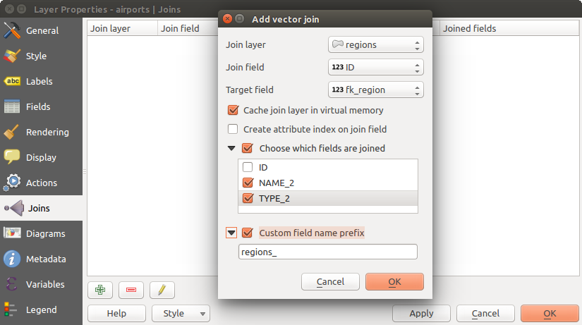
Join an attribute table to an existing vector layer
Additionally, the add vector join dialog allows you to:
- Cache join layer in virtual memory
- Create attribute index on the join field
- Choose which fields are joined
- Create a Custom field name prefix
Diagrams Properties
The Diagrams tab allows you to add a graphic overlay to
a vector layer (see figure_diagrams_attributes).
The current core implementation of diagrams provides support for:
- pie charts, a circular statistical graphic divided into slices to illustrate numerical proportion. The arc length of each slice is proportional to the quantity it represents,
- text diagrams, a horizontaly divided circle showing statistics values inside
- and histograms.
Tip
Switch quickly between types of diagrams
Given that the settings are almost common to the different types of diagram, when designing your diagram, you can easily change the diagram type and check which one is more appropriate to your data without any loss.
For each type of diagram, the properties are divided into several tabs:
Attributes
Attributes defines which variables to display in the diagram.
Use add item button to select the desired fields into
the ‘Assigned Attributes’ panel. Generated attributes with Expressions
can also be used.
You can move up and down any row with click and drag, sorting how attributes are displayed. You can also change the label in the ‘Legend’ column or the attribute color by double-clicking the item.
This label is the default text displayed in the legend of the print composer or of the layer tree.
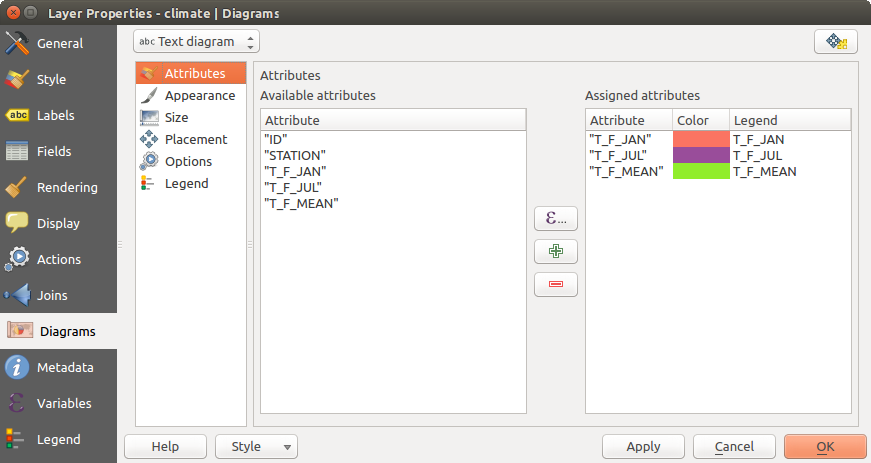
Diagram properties - Attributes tab
Appearance
Appearance defines how the diagram looks like. It provides general settings that do not interfere with the statistic values such as:
- the graphic transparency, its outline width and color
- the width of the bar in case of histogram
- the circle background color in case of text diagram, and the font used for texts
- the orientation of the left line of the first slice represented in pie chart. Note that slices are displayed clockwise.
In this tab, you can also manage the diagram visibility:
- by removing diagrams that overlap others or Show all diagrams even if they overlap each other
- by selecting a field with Data defined visibility to precisely tune which diagrams should be rendered
- by setting the scale visibility
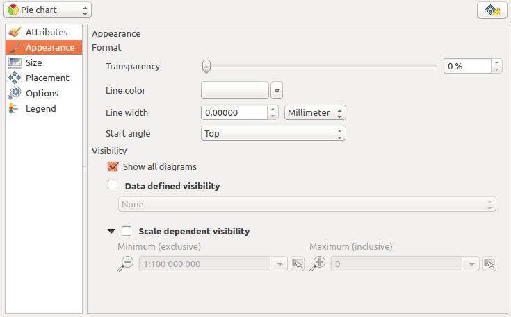
Diagram properties - Appearance tab
Size
Size is the main tab to set how the selected statistics are represented. The diagram size units can be ‘Map Units’ or ‘Millimeters’. You can use :
- Fixed size, an unique size to represent the graphic of all the features, except when displaying histogram
- or Scaled size, based on an expression using layer attributes.
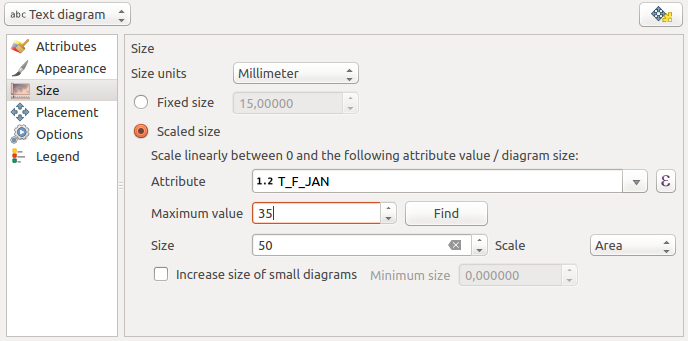
Diagram properties - Size tab
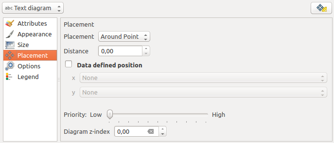
Placement
Placement helps to define diagram position. According to the layer geometry type, it offers different options for the placement:
- ‘Over the point’ or ‘Around the point’ for point geometry. The latter variable requires a radius to follow.
- ‘Over the line’ or ‘Around the line’ for line geometry. Like point feature, the last variable requires a distance to respect and user can specify the diagram placement relative to the feature (‘above’, ‘on’ and/or ‘below’ the line) It’s possible to select several options at once. In that case, QGIS will look for the optimal position of the diagram. Remember that here you can also use the line orientation for the position of the diagram.
- ‘Over the centroid’, ‘Around the centroid’ (with a distance set), ‘Perimeter’ and anywhere ‘Inside polygon’ are the options for polygon features.
The diagram can also be placed using feature data by filling the X and Y fields with an attribute of the feature.
The placement of the diagrams can interact with the labeling, so you can detect and solve position conflicts between diagrams and labels by setting the Priority slider or the z-index value.
Vector properties dialog with diagram properties, Placement tab
Options
The Options tab has settings only in case of histogram. You can choose whether the bar orientation should be ‘Up’, ‘Down’, ‘Right’ and ‘Left’.
Legend
From the Legend tab, you can choose to display items of the diagram in the Layers Panel, besides the layer symbology. It can be:
- the represented attributes: color and legend text set in Attributes tab
- and if applicable, the diagram size, whose symbol you can customize.
When set, the diagram legend items are also available in the print composer legend, besides the layer symbology.
Case Study
We will demonstrate an example and overlay on the Alaska boundary layer a text diagram showing temperature data from a climate vector layer. Both vector layers are part of the QGIS sample dataset (see section Sample Data).
- First, click on the
 Load Vector icon, browse
to the QGIS sample dataset folder, and load the two vector shape layers
alaska.shp and climate.shp.
Load Vector icon, browse
to the QGIS sample dataset folder, and load the two vector shape layers
alaska.shp and climate.shp. - Double click the climate layer in the map legend to open the Layer Properties dialog.
- Click on the Diagrams tab and from the Diagram type
combo box, select ‘Text diagram’.
- In the Appearance tab, we choose a light blue as background color, and in the Size tab, we set a fixed size to 18 mm.
- In the Position tab, placement could be set to ‘Around Point’.
- In the diagram, we want to display the values of the three columns
T_F_JAN, T_F_JUL and T_F_MEAN. So, in the Attributes tab
first select T_F_JAN and click the button, then repeat with
T_F_JUL and finally T_F_MEAN.
- Now click [Apply] to display the diagram in the QGIS main window.
- You can adapt the chart size in the Size tab. Activate the
Scaled size and set the size of the diagrams on
the basis of the maximum value of an attribute and the
Size option.
If the diagrams appear too small on the screen, you can activate the
Increase size of small diagrams checkbox and define
the minimum size of the diagrams.
- Change the attribute colors by double clicking on the color values in the Assigned attributes field. Figure_diagrams_mapped gives an idea of the result.
- Finally, click [Ok].
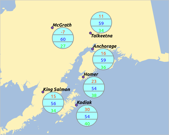
Diagram from temperature data overlayed on a map
Remember that in the Position tab, a Data
defined position of the diagrams is possible. Here, you can use attributes
to define the position of the diagram.
You can also set a scale-dependent visibility in the Appearance tab.
The size and the attributes can also be an expression.
Use the button to add an expression.
See Expressions chapter for more information and example.
Using data-defined override
As mentioned above, you can use some custom data-defined to tune the diagrams rendering:
- position in Placement tab by filling X and Y fields
- visibility in Appearance tab by filling the Visibility field
See Using data-defined override for labeling for more information.
Actions Properties
 QGIS provides the ability to perform an action based on the attributes
of a feature. This can be used to perform any number of actions, for example,
running a program with arguments built from the attributes of a feature or
passing parameters to a web reporting tool.
QGIS provides the ability to perform an action based on the attributes
of a feature. This can be used to perform any number of actions, for example,
running a program with arguments built from the attributes of a feature or
passing parameters to a web reporting tool.
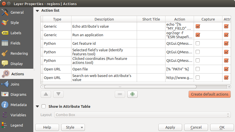
Overview action dialog with some sample actions
Actions are useful when you frequently want to run an external application or view a web page based on one or more values in your vector layer. They are divided into six types and can be used like this:
- Generic, Mac, Windows and Unix actions start an external process.
- Python actions execute a Python expression.
- Generic and Python actions are visible everywhere.
- Mac, Windows and Unix actions are visible only on the respective platform (i.e., you can define three ‘Edit’ actions to open an editor and the users can only see and execute the one ‘Edit’ action for their platform to run the editor).
There are several examples included in the dialog. You can load them by clicking on [Create default actions]. To edit any of the examples, double-click its row. One example is performing a search based on an attribute value. This concept is used in the following discussion.
Defining Actions
To define an attribute action, open the vector Layer
Properties dialog and click on the Actions tab. In the
Actions tab, click the Add a new action
to open the Edit Action dialog.
Select the action Type and provide a descriptive name for the action. The action itself must contain the name of the application that will be executed when the action is invoked. You can add one or more attribute field values as arguments to the application. When the action is invoked, any set of characters that start with a % followed by the name of a field will be replaced by the value of that field. The special characters %% will be replaced by the value of the field that was selected from the identify results or attribute table (see using_actions below). Double quote marks can be used to group text into a single argument to the program, script or command. Double quotes will be ignored if preceded by a backslash.
If you have field names that are substrings of other field names (e.g., col1 and col10), you should indicate that by surrounding the field name (and the % character) with square brackets (e.g., [%col10]). This will prevent the %col10 field name from being mistaken for the %col1 field name with a 0 on the end. The brackets will be removed by QGIS when it substitutes in the value of the field. If you want the substituted field to be surrounded by square brackets, use a second set like this: [[%col10]].
Using the Identify Features tool, you can open the Identify Results dialog. It includes a (Derived) item that contains information relevant to the layer type. The values in this item can be accessed in a similar way to the other fields by proceeding the derived field name with (Derived).. For example, a point layer has an X and Y field, and the values of these fields can be used in the action with %(Derived).X and %(Derived).Y. The derived attributes are only available from the Identify Results dialog box, not the Attribute Table dialog box.
Two example actions are shown below:
- konqueror http://www.google.com/search?q=%nam
- konqueror http://www.google.com/search?q=%%
In the first example, the web browser konqueror is invoked and passed a URL to open. The URL performs a Google search on the value of the nam field from our vector layer. Note that the application or script called by the action must be in the path, or you must provide the full path. To be certain, we could rewrite the first example as: /opt/kde3/bin/konqueror http://www.google.com/search?q=%nam. This will ensure that the konqueror application will be executed when the action is invoked.
The second example uses the %% notation, which does not rely on a particular field for its value. When the action is invoked, the %% will be replaced by the value of the selected field in the identify results or attribute table.
Using Actions
Actions can be invoked from either the Identify Results dialog,
an Attribute Table dialog or from Run Feature Action
(recall that these dialogs can be opened by clicking
Identify Features or  Open Attribute Table or
 Run Feature Action). To invoke an action, right
click on the feature and choose the action from the pop-up menu (they should
have been enabled to be displayed in the attribute table). Actions are
listed in the popup menu by the name you assigned when defining the action.
Click on the action you wish to invoke.
Run Feature Action). To invoke an action, right
click on the feature and choose the action from the pop-up menu (they should
have been enabled to be displayed in the attribute table). Actions are
listed in the popup menu by the name you assigned when defining the action.
Click on the action you wish to invoke.
If you are invoking an action that uses the %% notation, right-click on the field value in the Identify Results dialog or the Attribute Table dialog that you wish to pass to the application or script.
Here is another example that pulls data out of a vector layer and inserts
it into a file using bash and the echo command (so it will only work on
 or perhaps
  ). The layer in question has fields for a species name
taxon_name, latitude lat and longitude long. We would like to be
able to make a spatial selection of localities and export these field values
to a text file for the selected record (shown in yellow in the QGIS map area).
Here is the action to achieve this:
). The layer in question has fields for a species name
taxon_name, latitude lat and longitude long. We would like to be
able to make a spatial selection of localities and export these field values
to a text file for the selected record (shown in yellow in the QGIS map area).
Here is the action to achieve this:
bash -c "echo \"%taxon_name %lat %long\" >> /tmp/species_localities.txt"
After selecting a few localities and running the action on each one, opening the output file will show something like this:
Acacia mearnsii -34.0800000000 150.0800000000
Acacia mearnsii -34.9000000000 150.1200000000
Acacia mearnsii -35.2200000000 149.9300000000
Acacia mearnsii -32.2700000000 150.4100000000
As an exercise, we can create an action that does a Google search on the lakes layer. First, we need to determine the URL required to perform a search on a keyword. This is easily done by just going to Google and doing a simple search, then grabbing the URL from the address bar in your browser. From this little effort, we see that the format is http://google.com/search?q=qgis, where QGIS is the search term. Armed with this information, we can proceed:
Make sure the lakes layer is loaded.
Open the Layer Properties dialog by double-clicking on the layer in the legend, or right-click and choose Properties from the pop-up menu.
Click on the Actions tab.
click
Add a new action.Enter a name for the action, for example Google Search.
For the action, we need to provide the name of the external program to run. In this case, we can use Firefox. If the program is not in your path, you need to provide the full path.
Following the name of the external application, add the URL used for doing a Google search, up to but not including the search term: http://google.com/search?q=
The text in the Action field should now look like this: firefox http://google.com/search?q=
Click on the drop-down box containing the field names for the lakes layer. It’s located just to the left of the [Insert] button.
From the drop-down box, select ‘NAMES’ and click [Insert].
Your action text now looks like this:
firefox http://google.com/search?q=%NAMES
To finalize and add the action, click the [OK] button.
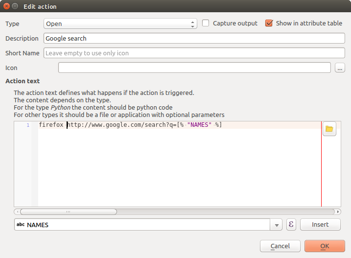
Edit action dialog configured with the example
This completes the action, and it is ready to use. The final text of the action should look like this:
firefox http://google.com/search?q=%NAMES
We can now use the action. Close the Layer Properties dialog and zoom in to an area of interest. Make sure the lakes layer is active and identify a lake. In the result box you’ll now see that our action is visible:
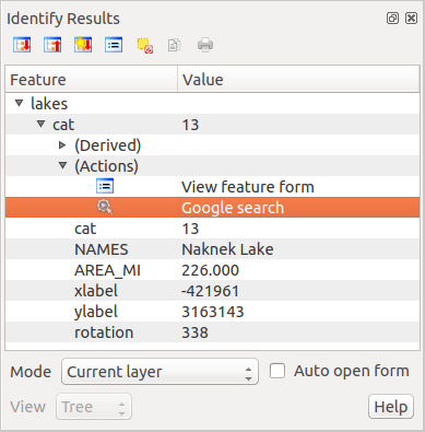
Select feature and choose action
When we click on the action, it brings up Firefox and navigates to the URL http://www.google.com/search?q=Tustumena. It is also possible to add further attribute fields to the action. Therefore, you can add a + to the end of the action text, select another field and click on [Insert Field]. In this example, there is just no other field available that would make sense to search for.
You can define multiple actions for a layer, and each will show up in the Identify Results dialog.
You can also invoke actions from the attribute table by selecting a row and right-clicking, then choosing the action from the pop-up menu.
There are all kinds of uses for actions. For example, if you have a point layer containing locations of images or photos along with a file name, you could create an action to launch a viewer to display the image. You could also use actions to launch web-based reports for an attribute field or combination of fields, specifying them in the same way we did in our Google search example.
We can also make more complex examples, for instance, using Python actions.
Usually, when we create an action to open a file with an external application, we can use absolute paths, or eventually relative paths. In the second case, the path is relative to the location of the external program executable file. But what about if we need to use relative paths, relative to the selected layer (a file-based one, like a shapefile or SpatiaLite)? The following code will do the trick:
command = "firefox"
imagerelpath = "images_test/test_image.jpg"
layer = qgis.utils.iface.activeLayer()
import os.path
layerpath = layer.source() if layer.providerType() == 'ogr'
  else (qgis.core.QgsDataSourceURI(layer.source()).database()
    if layer.providerType() == 'spatialite' else None)
path = os.path.dirname(str(layerpath))
image = os.path.join(path,imagerelpath)
import subprocess
subprocess.Popen( [command, image ] )
We just have to remember that the action is one of type Python and the command and imagerelpath variables must be changed to fit our needs.
But what about if the relative path needs to be relative to the (saved) project file? The code of the Python action would be:
command = "firefox"
imagerelpath = "images/test_image.jpg"
projectpath = qgis.core.QgsProject.instance().fileName()
import os.path
path = os.path.dirname(str(projectpath)) if projectpath != '' else None
image = os.path.join(path, imagerelpath)
import subprocess
subprocess.Popen( [command, image ] )
Another Python action example is the one that allows us to add new layers to the project. For instance, the following examples will add to the project respectively a vector and a raster. The names of the files to be added to the project and the names to be given to the layers are data driven (filename and layername are column names of the table of attributes of the vector where the action was created):
qgis.utils.iface.addVectorLayer('/yourpath/[% "filename" %].shp',
  '[% "layername" %]', 'ogr')
To add a raster (a TIF image in this example), it becomes:
qgis.utils.iface.addRasterLayer('/yourpath/[% "filename" %].tif',
  '[% "layername" %]')
Display Properties
 This tab is specifically created for map tips: display a message in
the map canvas when hovering over a feature of the active layer.
This message can either be the value of a Field
or a more complex and full HTML text mixing fields,
expressions and html tags (multiline, fonts, images,
hyperlink ...).
This tab is specifically created for map tips: display a message in
the map canvas when hovering over a feature of the active layer.
This message can either be the value of a Field
or a more complex and full HTML text mixing fields,
expressions and html tags (multiline, fonts, images,
hyperlink ...).
To activate Map Tips, select the menu option View ‣ Map Tips
or click on the Map Tips icon. Map tip is a cross-session feature
meaning that once activated, it stays on and apply to any set layer in any project,
even in future QGIS sessions until it’s toggled off.
Figures Display Code and Mapped show an example of HTML code and how it behaves in map canvas.
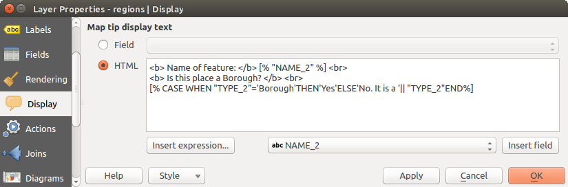
HTML code for map tip
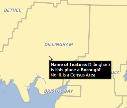
Map tip made with HTML code
Rendering Properties
 QGIS offers support for on-the-fly feature generalisation. This can
improve rendering times when drawing many complex features at small scales.
This feature can be enabled or disabled in the layer settings using the
Simplify geometry option. There is also a global
setting that enables generalisation by default for newly added layers (see
global simplification for more information).
QGIS offers support for on-the-fly feature generalisation. This can
improve rendering times when drawing many complex features at small scales.
This feature can be enabled or disabled in the layer settings using the
Simplify geometry option. There is also a global
setting that enables generalisation by default for newly added layers (see
global simplification for more information).
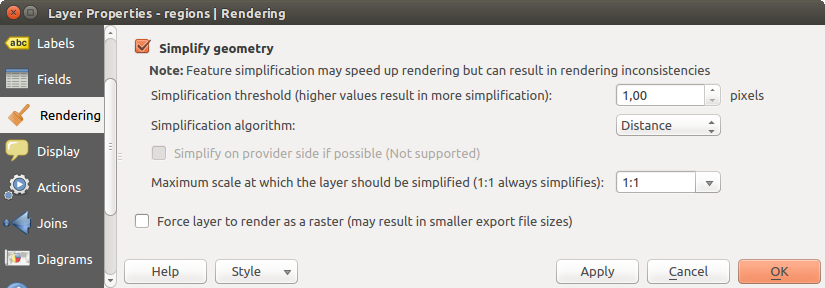
Layer Geometry Simplification dialog
Catatan
Feature generalisation may introduce artefacts into your rendered output in some cases. These may include slivers between polygons and inaccurate rendering when using offset-based symbol layers.
While rendering extremely detailed layers (e.g. polygon layers with a huge number of nodes), this can cause composer exports in PDF/SVG format to be huge as all nodes are included in the exported file. This can also make the resultant file very slow to work with/open in other programs.
Checking Force layer to render as raster forces these
layers to be rasterised so that the exported files won’t have to include all
the nodes contained in these layers and the rendering is therefore sped up.
You can also do this by forcing the composer to export as a raster, but that is an all-or-nothing solution, given that the rasterisation is applied to all layers.
Metadata Properties
 The Metadata tab consists of Description,
Attribution, MetadataURL, LegendUrl
and Properties sections.
The Metadata tab consists of Description,
Attribution, MetadataURL, LegendUrl
and Properties sections.
In the Properties section, you get general information about the layer, including specifics about the type and location, number of features, feature type, and editing capabilities. The Extents table provides you with information on the layer extent and the Layer Spatial Reference System, which is information about the CRS of the layer. This can provide a quick way to get useful information about the layer.
Additionally, you can add or edit a title and abstract for the layer in the Description section. It’s also possible to define a Keyword list here. These keyword lists can be used in a metadata catalog. If you want to use a title from an XML metadata file, you have to fill in a link in the DataUrl field.
Use Attribution to get attribute data from an XML metadata catalog.
In MetadataUrl, you can define the general path to the XML metadata catalog. This information will be saved in the QGIS project file for subsequent sessions and will be used for QGIS server.
In the LegendUrl section, you can provide the url of a legend image in the url field. You can use the Format drop-down option to apply the appropriate format of the image. Currently png, jpg and jpeg image formats are supported.
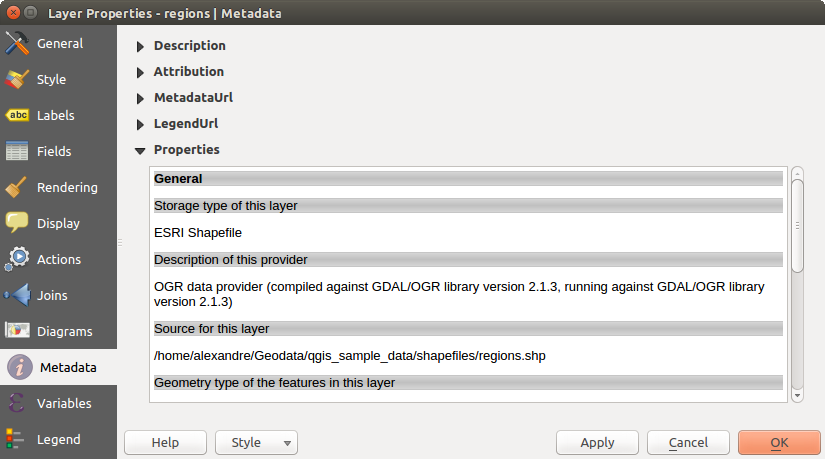
Metadata tab in vector layers properties dialog
Tip
Switch quickly between different layer representations
Using the Styles ‣ Add combobox at the bottom of the Layer Properties dialog, you can save as many combinations of layer properties settings (symbology, labeling, diagram, fields form, actions...) as you want. Then, simply switch between styles from the context menu of the layer in Layers Panel to automatically get different representations of your data.
Variables Properties
The Variables tab lists all the variables available at
the layer’s level (which includes all global and project’s variables).
It also allows the user to manage layer-level variables. Click the
button to add a new custom layer-level variable. Likewise, select a custom
layer-level variable from the list and click the button to remove
it.
More information on variables usage in the General Tools Variables section.
Legend Properties
 The Legend tab provides you with a list of widgets you
can embed within the layer tree in the Layers panel. The idea is to have a
way to quickly access some actions that are often used with the layer (setup
transparency, filtering, selection, style or other stuff...).
The Legend tab provides you with a list of widgets you
can embed within the layer tree in the Layers panel. The idea is to have a
way to quickly access some actions that are often used with the layer (setup
transparency, filtering, selection, style or other stuff...).
By default, QGIS provides transparency widget but this can be extended by plugins registering their own widgets and assign custom actions to layers they manage.