` `
A Biblioteca de Símbolos
O Gerenciador de Estilos
The Style Manager is the place where users can manage and create generic symbols to be used in several QGIS projects. You can open it with the Settings ‣ Style Manager or from the Style tab in the vector layer’s Properties. It allows users to:
- create, edit and remove symbols
- organize symbols in custom groups
- export and import symbols.
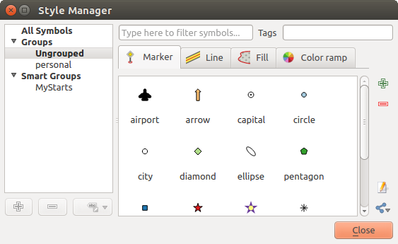
O Gerenciador de Estilos
Groups and smart groups
You can organize symbols into different categories. These categories, listed in the panel at the left, can be static (called Group) or dynamic (named Smart Group). A group is smart when its symbols are dynamically fetched according to conditions set. See figure_smart_group:
To create a group, right click on an existing group or on the main Groups
directory in the left of the dialog.
You can also select a group and click the  Add Group
button. The new group will be a sub-group of the selected one.
Add Group
button. The new group will be a sub-group of the selected one.
Create Smart Group is similar to creating group, but instead select Smart Groups. The dialog box allows user to choose the expression to select symbols in order to appear in the smart group (contains some tags, member of a group, have a string in its name, etc.). Any symbol that satisfies the entered condition(s) is automatically added to the smart group.
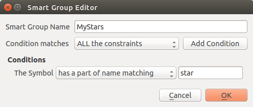
Creating a Smart Group
To remove a group or a smart group, right click on the group and select
Remove Group or select it and push
 Remove Group button.
Unlike the smart groups that automatically fetch their belonged symbols,
simple groups are filled by the user.
To add a symbol into a group, you can either right click on a symbol, choose
Apply Group and then the group name. There is a second
way to add several symbols into a group: just select the group, click
 and choose Group Symbols. All
symbols display a checkbox that allows you to add the symbol into the selected
groups. When selection is finished, you can click the same button, and
choose Finish Grouping.
and choose Group Symbols. All
symbols display a checkbox that allows you to add the symbol into the selected
groups. When selection is finished, you can click the same button, and
choose Finish Grouping.
All the symbols that are not placed under a custom group belong to a default group named Ungrouped.
Add, Edit, Remove Symbol
Selecting a group returns in the right panel, if applicable, the list of symbols of the group (including its subgroups). These symbols are organized in four different tabs:
- Marker for point symbols
- Line for linear symbols
- Fill for surface symbols
- and Color Ramp.
To delete a symbol you no longer need, just select it and click
Remove item (also available through right-click).
The symbol will be deleted from the local symbols database.
The symbol list can be modified by adding new symbols with
Add item button or modifying existing ones with  Edit item.
See The Symbol Selector for further information.
Edit item.
See The Symbol Selector for further information.
Share symbols
The  Share item tool, at the right bottom of the Style
Library dialog, offers options to easily share symbols with others: users can
indeed export their symbols and import symbols to their library.
Share item tool, at the right bottom of the Style
Library dialog, offers options to easily share symbols with others: users can
indeed export their symbols and import symbols to their library.
Exporting symbols
You can export the selected symbols to PNG, SVG or XML file formats. Exporting to PNG or SVG (both not available for color ramp symbols) creates a file for each selected symbol, and the SVG folder can be added to SVG Paths in Settings ‣ Options to e.g. share these symbols on a network. The XML format generates a single file containing all the selected symbols. This file can then be imported in another user’s style library.
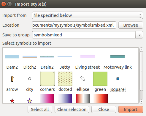
Importing symbols
You can extend your symbols library by importing new symbols. Just select
Import from the drop-down list at the right bottom of the dialog.
In the new dialog, you’ll need to :
- indicate the source of the symbols (it can be a .xml file on the disk or an url),
- give the name of the group under which the symbols will be put
- select the symbols you want to add to your library
- and press Import.
Note that import and export options are also available through right-click.
Importing symbols
Color Ramp
The Color ramp tab in the Style Manager presents different types of color ramps you can use to style layers.
To create a custom color ramp, activate the Color ramp tab and click the
Add item button. The button reveals a drop-down list to
choose the ramp type:
- Gradient: given a start and end colors, generate a color ramp which can be continuous or discrete. With double-clicking the ramp preview, you can add as many intermediate color stops as you want.
- Random: creates a random set of colors based on range of values for hue, saturation, value and opacity and a number of colors (classes)
- ColorBrewer: a set of predefined discrete color gradients you can custom the number of colors in the ramp
- or cpt-city: an access to a whole catalog of color gradients to locally save as gradient color.
Dica
Easily custom the color stops of the gradient color ramp
Double-clicking the ramp preview or drag-and-drop a color from the color spot onto the ramp preview adds a new color stop. Each color stop can be tweaked using the Color Selector widgets or by plotting each of its parameters. You can also reposition it using the mouse, the arrow keys (combine with Shift key for a larger move) or the Relative position spinbox. Pressing Delete stop as well as DEL key removes the selected color stop.
You can use the  Invert option while
classifying the data with a color ramp. See figure_color_custom_ramp for an
example of a custom color ramp and figure_color_cpt_city for the cpt-city Colors dialog.
Invert option while
classifying the data with a color ramp. See figure_color_custom_ramp for an
example of a custom color ramp and figure_color_cpt_city for the cpt-city Colors dialog.
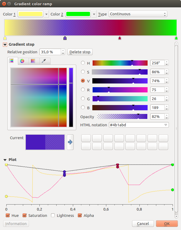
Example of custom gradient color ramp with multiple stops
The cpt-city option opens a new dialog with hundreds of themes included ‘out of the box’.
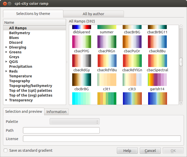
cpt-city dialog with hundreds of color ramps
The Symbol Selector
The Symbol selector is the main dialog to design a symbol. You can create or edit Marker, Line or Fill Symbols.
Designing a Marker symbol
Two main components structure the symbol selector dialog:
- the symbol tree, showing symbol layers that are combined afterwards to shape a new global symbol
- and settings to configure the selected symbol layer in the tree.
The symbol layer tree
A symbol can consist of several Symbol layers. The symbol tree shows the overlay of these symbol layers that are combined afterwards to shape a new global symbol. Besides, a dynamic symbol representation is updated as soon as symbol properties change.
A set of tools is available to manage the symbol tree items and according to the level selected, you’ll get enabled different tools at the bottom of the dialog to:
- add new symbol layer: you can stack as many symbols as you want
- remove the selected symbol layer
- lock colors of symbol layer: a
 locked color stays unchanged when
user changes the color at the global (or upper) symbol level
locked color stays unchanged when
user changes the color at the global (or upper) symbol level  duplicate a (group of) symbol layer(s)
- move up or down the symbol layer
Configuring a symbol
In QGIS, configuring a symbol is done in two steps: the symbol and then the symbol layer.
The symbol
At the top level of the tree, it depends on the layer geometry and can be of Marker, Line or Fill type. Each symbol can embed one or more symbols (including, of any other type) or symbol layers.
You can setup some parameters that apply to the global symbol:
- Unit: it can be Millimeter, Pixels or Map unit
- Transparency
- Color: when this parameter is changed by the user, its value is echoed to all unlocked sub-symbols color
- Size and Rotation for marker symbols
- Width for line symbols
Nota
The Data-defined override button beside the last layer-related parameters is inactive when setting the symbol from the Style manager dialog. When the symbol is connected to a map layer, this button offers access to the size assistant dialog which helps to create proportional or multivariate analysis rendering.
The symbols used at this level are items you can pick from the symbols library. A list of available symbols of the same type from your symbol library is shown and can be filtered by selecting a group in the drop-down list just above. Click the Save button to add the designed symbol to your symbol library.
With the Advanced  option, you can:
- set the symbol levels: defining the way symbol layers are connected to each other in the map canvas (see Symbols levels for more information)
- and for line and fill symbols, clip features to canvas extent.
Dica
Note that once you have set the size in the lower levels of the Symbol layers dialog, the size of the whole symbol can be changed with the Size (for marker symbols) or the Width (for line symbols) menu in the first level again. The size of the lower levels changes accordingly, while the size ratio is maintained.
The symbol layer
At a lower level of the tree, you can customize the symbol layers. The available
symbol layer types depend on the upper symbol type. You can apply on the symbol
layer  paint effects to enhance its rendering.
Because describing all the options of all the symbol layer types would not be possible, only particular and significative ones are mentioned below.
Common parameters
Some common options and widgets are available to build a symbol layer, regardless it’s of marker, line or fill sub-type:
- the color selector widget to ease color manipulation
- Units: it can be Millimeter, Pixels or Map unit
- the
 data-defined override widget near almost all options,
extending capabilities of customizing each symbol (see Data defined override setup for
more information)
data-defined override widget near almost all options,
extending capabilities of customizing each symbol (see Data defined override setup for
more information)
Nota
While the description below assumes that the symbol layer type is bound to the feature geometry, keep in mind that you can embed symbol layers in each others. In that case, the lower level symbol layer parameter (placement, offset...) might be bound to the upper-level symbol, and not to the feature geometry itself.
Marcador de Símbolos
Appropriate for point geometry features, marker symbols have several Symbol layer types:
- Simple marker (default);
- Ellipse marker: a simple marker symbol layer, with customizable width and height;
- Filled marker: similar to the simple marker symbol layer, except that it uses a fill sub symbol to render the marker. This allows use of all the existing QGIS fill (and outline) styles for rendering markers, e.g. gradient or shapeburst fills;
- Font marker: use installed fonts as marker symbols;
- Geometry generator (see The Geometry Generator);
- Vector Field marker (see The Vector Field Marker);
SVG marker: provides you with images from your SVG paths (set in Settings ‣ Options ‣ System menu) to render as marker symbol. Each SVG file colors and outline can be adapted.
Nota
Requirements for a customizable SVG marker symbol
To have the possibility to change the colors of a SVG marker, you have to add the placeholders param(fill) for fill color, param(outline) for outline color and param(outline-width) for stroke width. These placeholders can optionally be followed by a default value, e.g.:
<svg width="100%" height="100%">
<rect fill="param(fill) #ff0000" stroke="param(outline) #00ff00" stroke-width="param(stroke-width) 10" width="100" height="100">
</rect>
</svg>
For each marker symbol layer type, you can set some of the following properties:
- Color for the fill and/or stroke, using all the capabilities of the Color Selector widget;
Tamanho
- Outline style
- Outline width
Estilo da união
- Rotation
- Offset X,Y: You can shift the symbol in the x- or y- direction;
- Anchor point.
In most of the marker symbols dialog, you also have a frame with previews of predefined symbols you can choose from.
Símbolos de linha
Appropriate for line geometry features, line symbols have following symbol layer types:
- Simple line (default): available settings are:
- Color
- Pen width
- Pen style
Estilo da união
Estilo da capa
Deslocamento
- Use custom dash pattern: overrides the Pen
style setting with a custom dash.
- Arrow: draws lines as curved (or not) arrows with a single or a double head with configurable width, length and thickness. To create a curved arrow the line feature must have at least three vertices. It also uses a fill symbol such as gradients or shapeburst to render the arrow body. Combined with the geometry generator, this type of layer symbol helps you representing flow maps;
- Geometry generator (see The Geometry Generator);
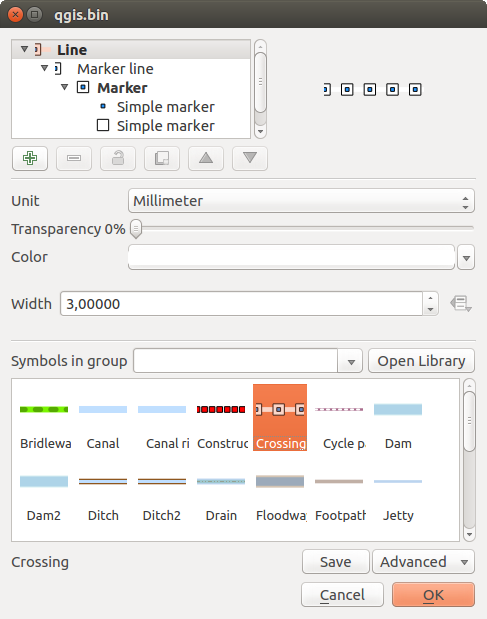
- Marker line: displays a marker symbol along the line. It can be at a regular distance or based on its geometry: first, last or each vertex, on central point or on every curve point. You can set an offset along the line for the marker symbol, or offset the line itself. The Rotate marker option allows you to set whether the marker symbol should follow the line orientation or not.
Fill Symbols
Appropriate for polygon geometry features, fill symbols have also several symbol layer types:
Simple fill (default): the following settings are available:
- Fill color
- Outline color
Estilo de preenchimento
- Outline style
- Outline width
Estilo da união
- Offset X,Y
Centroid fill: places a marker symbol at the centroid of the visible feature. The position of the marker may however not be the real centroid of the feature because calculation takes into account the polygon(s) clipped to area visible in map canvas for rendering and ignores holes. Use The Geometry Generator if you want the exact centroid.
The marker can be placed on every part of a multi-part feature or only on its biggest part, and forced to be inside the polygon;
Geometry generator (see geometry_generator_symbol);
Gradient fill: uses a radial, linear or conical gradient, based on either simple two color gradients or a predefined gradient color ramp to fill polygon layers. Gradient can be rotated and applied on a single feature basis or across the whole map extent. Also start and end points can be set via coordinates or using the centroid (of feature or map);
Line pattern fill: fills the polygon with a hatching pattern of line symbol layer. You can set the spacing between lines and an offset from the feature boundary;
Point pattern fill: fills the polygon with a hatching pattern of marker symbol layer. You can set the spacing between lines and an offset from the feature boundary;
Raster image fill: you can fill polygons with a tiled raster image. Options include (data defined) file name, opacity, image size (in pixels, mm or map units), coordinate mode (feature or view) and rotation;
SVG fill: fills the polygon using SVG markers;
Shapeburst fill: this option buffered a gradient fill, where a gradient is drawn from the boundary of a polygon towards the polygon’s centre. Configurable parameters include distance from the boundary to shade, use of color ramps or simple two color gradients, optional blurring of the fill and offsets;
Outline: Arrow: uses a line arrow symbol layer to represent the polygon boundary;
Outline: Marker line: uses a marker line symbol layer to represent the polygon boundary;
Outline: simple line: uses a simple line symbol layer to represent the polygon boundary. The Draw line only inside polygon option helps polygon borders inside the polygon and can be useful to clearly represent adjacent polygon boundaries.
Nota
When geometry type is polygon, you can choose to disable the automatic clipping of lines/polygons to the canvas extent. In some cases this clipping results in unfavourable symbology (e.g. centroid fills where the centroid must always be the actual feature’s centroid).
The Geometry Generator
Available with all types of symbols, the geometry generator symbol layer allows to use expression syntax to generate a geometry on the fly during the rendering process. The resulting geometry does not have to match with the original geometry type and you can add several differently modified symbol layers on top of each other.
Some examples:
-- render the centroid of a feature
centroid( $geometry )

-- visually overlap features within a 100 map units distance from a point
-- feature, i.e generate a 100m buffer around the point
buffer( $geometry, 100 )

-- Given polygon layer1( id1, layer2_id, ...) and layer2( id2, fieldn...)
-- render layer1 with a line joining centroids of both where layer2_id = id2
make_line( centroid( $geometry ),
           centroid( geometry( get_feature( 'layer2', 'id2', attribute(
               $currentfeature, 'layer2_id') ) )
         )
The Vector Field Marker
The vector field marker is used to display vector field data such as earth deformation, tidal flows, and the like. It displays the vectors as lines (preferably arrows) that are scaled and oriented according to selected attributes of data points. It can only be used to render point data; line and polygon layers are not drawn by this symbology.
The vector field is defined by attributes in the data, which can represent the field either by:
- cartesian components (x and y components of the field)
- or polar coordinates: in this case, attributes define Length and Angle. The angle may be measured either clockwise from north, or Counterclockwise from east, and may be either in degrees or radians.
- or as height only data, which displays a vertical arrow scaled using an attribute of the data. This is appropriate for displaying the vertical component of deformation, for example.
The magnitude of field can be scaled up or down to an appropriate size for viewing the field.