8.2. Lesson: Changing Raster Symbology
Not all raster data consists of aerial photographs. There are many other forms of raster data, and in many of those cases, it’s essential to symbolize the data properly so that it becomes properly visible and useful.
The goal for this lesson: To change the symbology for a raster layer.
8.2.1.  Try Yourself
Use the Browser Panel to load the new raster dataset;
Load the dataset
srtm_41_19_4326.tif, found under the directoryexercise_data/raster/SRTM/;Once it appears in the Layers Panel, rename it to
DEM;Zoom to the extent of this layer by right-clicking on it in the Layer List and selecting Zoom to Layer.
This dataset is a Digital Elevation Model (DEM). It’s a map of the elevation (altitude) of the terrain, allowing us to see where the mountains and valleys are, for example.
While each pixel of dataset of the previous section contained color information, in a DEM file, each pixel contains elevation values.
Once it’s loaded, you’ll notice that it’s a basic stretched grayscale representation of the DEM:
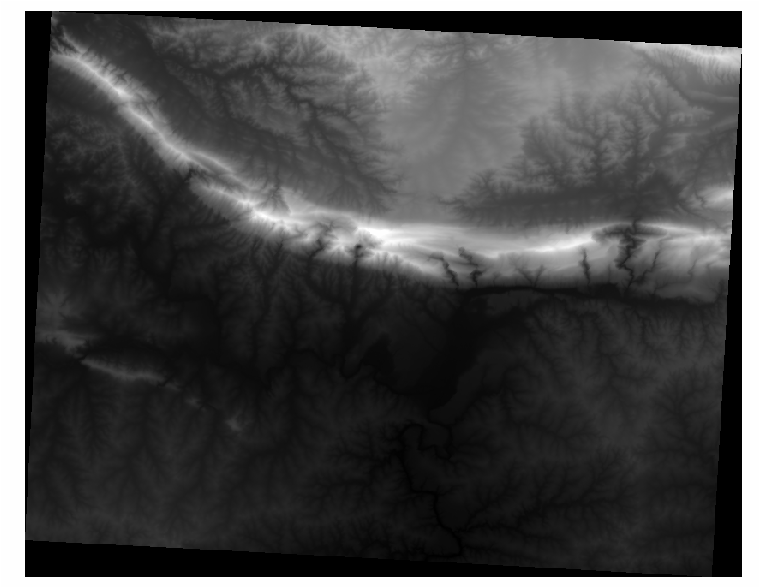
QGIS has automatically applied a stretch to the image for visualization purposes, and we will learn more about how this works as we continue.
8.2.2. Follow Along: Changing Raster Layer Symbology
You have basically two different options to change the raster symbology:
Within the Layer Properties dialog for the DEM layer by right-clicking on the layer in the Layer tree and selecting Properties option. Then switch to the Symbology tab;
By clicking on the
 button right above the Layers Panel.
This will open the Layer Styling anel where you can switch to the
Symbology tab.
button right above the Layers Panel.
This will open the Layer Styling anel where you can switch to the
Symbology tab.
Choose the method you prefer to work with.
8.2.3. Follow Along: Singleband gray
When you load a raster file, if it is not a photo image like the ones of the previous section, the default style is set to a grayscale gradient.
Let’s explore some of the features of this renderer.
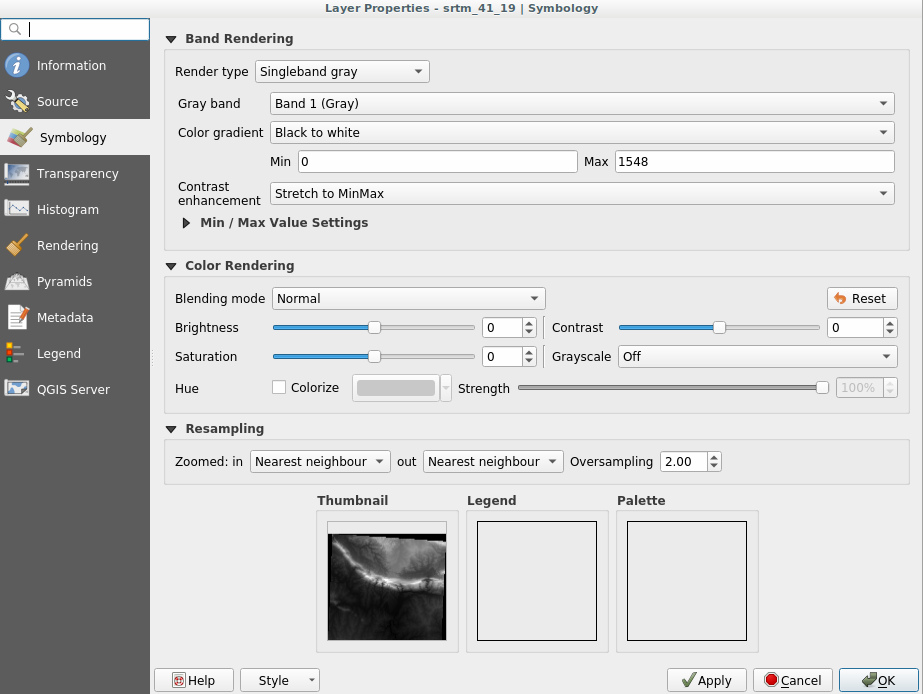
The default Color gradient is set to Black to white, meaning
that low pixel values are black and while high values are white. Try to invert
this setting to White to black and see the results.
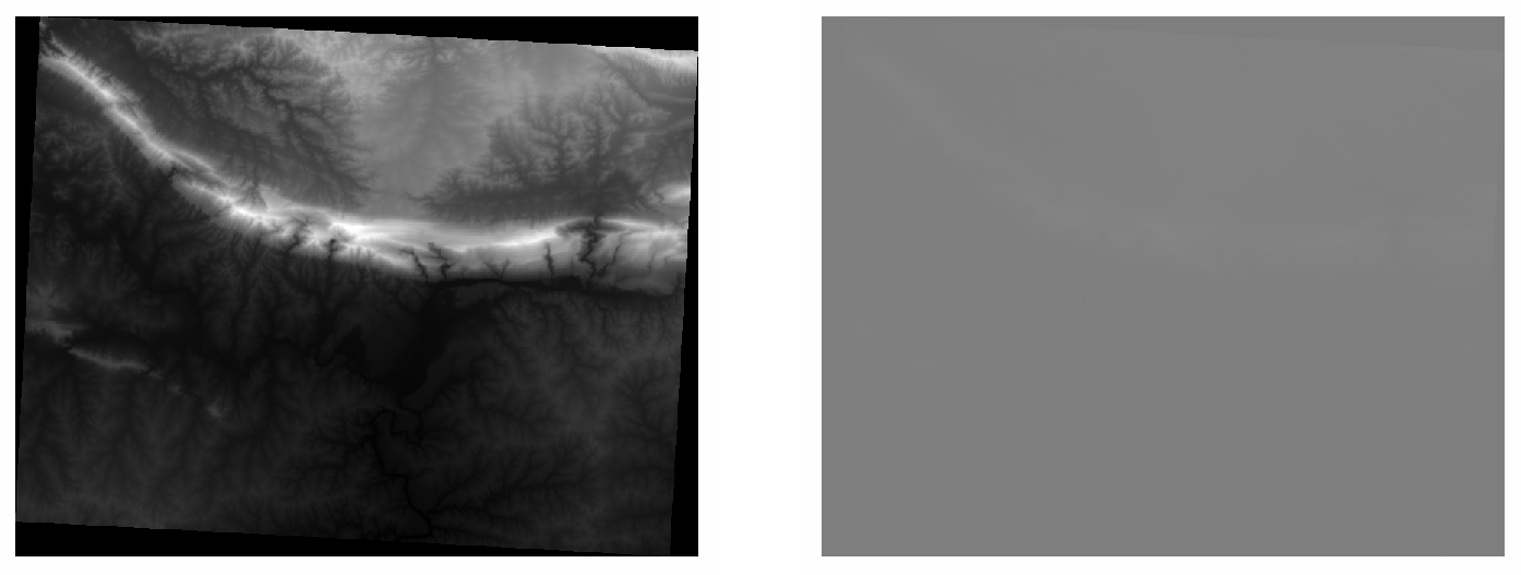
Very important is the Contrast enhancement parameter: by default it
is set to Stretch to MinMax meaning that the grayscale is stretched to the
minimum and maximum values.
Look at the difference with the enhancement (left) and without (right):
But what are the minimum and maximum values that should be used for the stretch? The ones that are currently under Min / Max Value Settings. There are many ways that you can use to calculate the minimum and maximum values and use them for the stretch:
User Defined: you choose both minimum and maximum values manually;
Cumulative count cut: this is useful when you have few extreme low or high values. It cuts the
2%(or the value you choose) of these values;Min / max: the real minimum and maximum values of the raster;
Mean +/- standard deviation: the values will be calculated according to the mean value and the standard deviation.
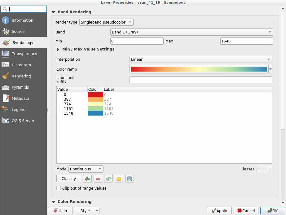
8.2.4. Follow Along: Singleband pseudocolor
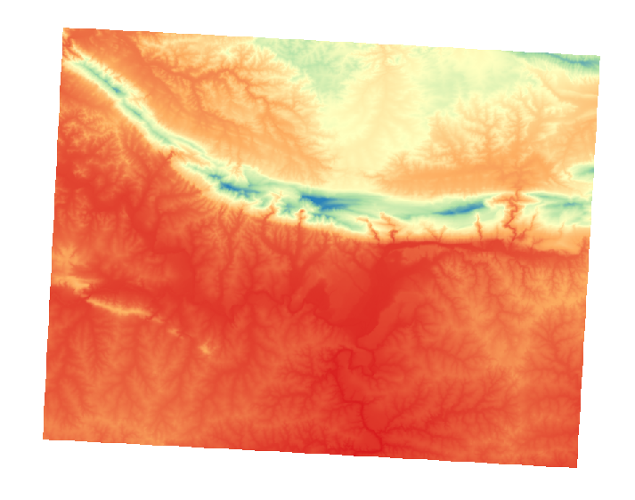
Grayscales are not always great styles for raster layers. Let’s try to make the DEM layer more colorful.
Change the Render type to Singleband pseudocolor: if you don’t like the default colors loaded, click on Color ramp and change them;
Click the Classify button to generate a new color classification;
If it is not generated automatically click on the OK button to apply this classification to the DEM.
You’ll see the raster looking like this:
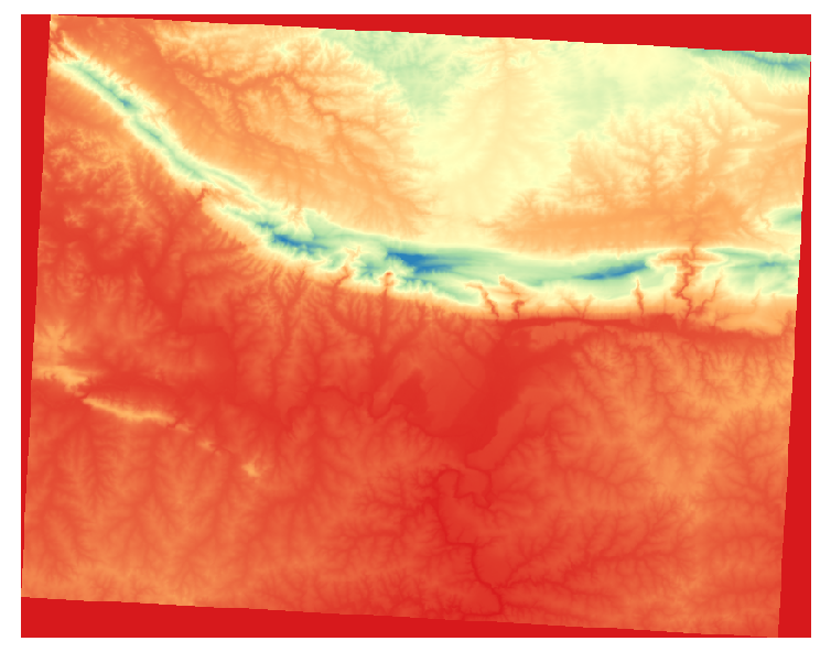
This is an interesting way of looking at the DEM. You’ll now see that the values of the raster are again properly displayed, with the darker colors representing valleys and the lighter ones, mountains.
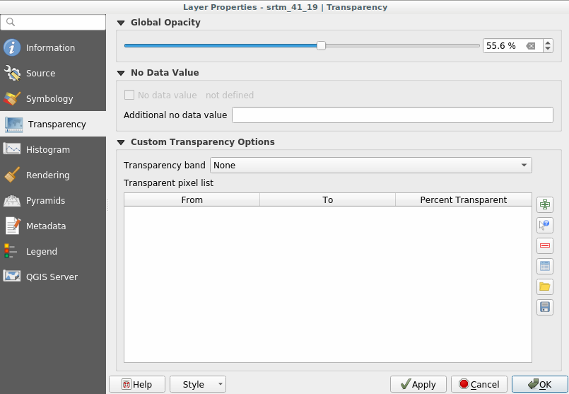
8.2.5. Follow Along: Changing the transparency
Sometimes changing the transparency of the whole raster layer can help you to see other layers covered by the raster itself and better understand the study area.
To change the transparency of the whole raster switch to the Transparency tab and use the slider of the Global Opacity to lower the opacity:
More interesting is changing the transparency of single pixels. For example in the raster we used you can see an homogeneous color at the corners:
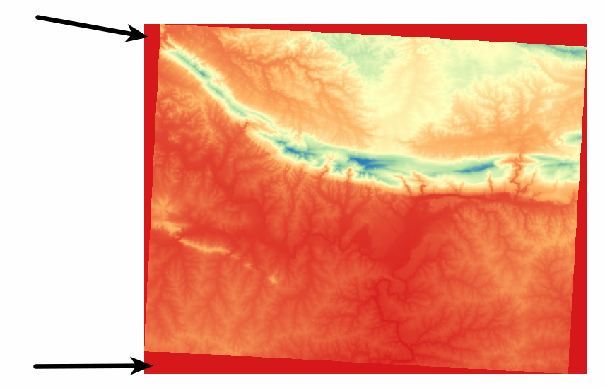
To set this values as transparent, the Custom Transparency Options menu in Transparency has some useful methods:
By clicking on the
 button you can add a range of values and set the
transparency percentage of each range chosen;
button you can add a range of values and set the
transparency percentage of each range chosen;For single values the
 button is more useful;
Click on the
button. The dialog disappearing and you can
interact with the map;Click on a corner of the raster file;
You will see that the transparency table will be automatically filled with the clicked values:
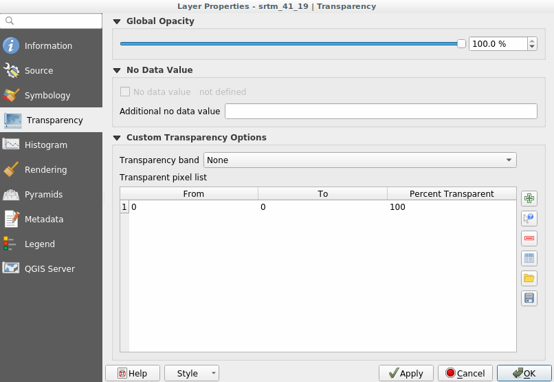
Click on OK to close the dialog and see the changes.
See? The corners are now 100% transparent.
8.2.6. In Conclusion
These are only the basic functions to get you started with raster symbology. QGIS also allows you many other options, such as symbolizing a layer using paletted/unique values, representing different bands with different colors in a multispectral image or making an automatic hillshade effect (useful only with DEM raster files).
8.2.7. Reference
The SRTM dataset was obtained from http://srtm.csi.cgiar.org/
8.2.8. What’s Next?
Now that we can see our data displayed properly, let’s investigate how we can analyze it further.