Setting a label
Labels are textual information you can display on vector features. They add details you could not necessarily represent using symbols.
The Style Manager dialog allows you to create a set of labels or
text formats (ie the appearance of the text, including font, size, colors,
shadow, background…). Each of these items could later be applied to layers in
the  Labels tab of the vector Layer Properties
dialog or Layer Styling panel or using the Layer
Labeling Options button of the Labels toolbar. You can also directly
configure them in the abovementioned dialogs.
Labels tab of the vector Layer Properties
dialog or Layer Styling panel or using the Layer
Labeling Options button of the Labels toolbar. You can also directly
configure them in the abovementioned dialogs.
The Label Settings dialog allows you to configure smart labeling for vector layers. Setting a label includes configuring the text format, and how the label relates with the features or other labels (through placement, rendering and callout).
Formatting the label text
To create text formats, you can:
Open the
 Style Manager dialog
Activate the Text format tab
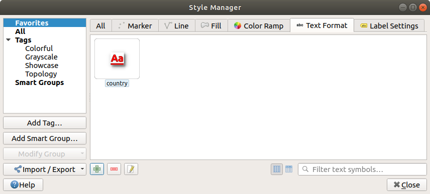
Text formats in Style Manager dialog
Press the
 Add item button. The Text Settings
dialog opens with the following properties. As usual, these properties
are data-definable.
Add item button. The Text Settings
dialog opens with the following properties. As usual, these properties
are data-definable.
Text tab
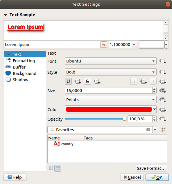
Text settings - Text tab
In the  Text tab, you can set:
the Font, from the ones available on your machine
the Style: along with the common styles of the font, you can set whether the text should be underlined or striked through
the Size in any supported unit
the Color
and the Opacity.
At the bottom, a text formats list widget shows a filterable list of text formats stored within your style manager database. This allows you to easily set text formats to match styles saved in the local style database, and also to add a new text format to the style database based on the current settings. Press the Save format… button to store the current text format in the Style Manager, providing a name and tag(s).
Likewise, a label settings list widget is shown when configuring labels, allowing
you to pick from the Style Manager widget or to add new
styles to it.
Formatting tab
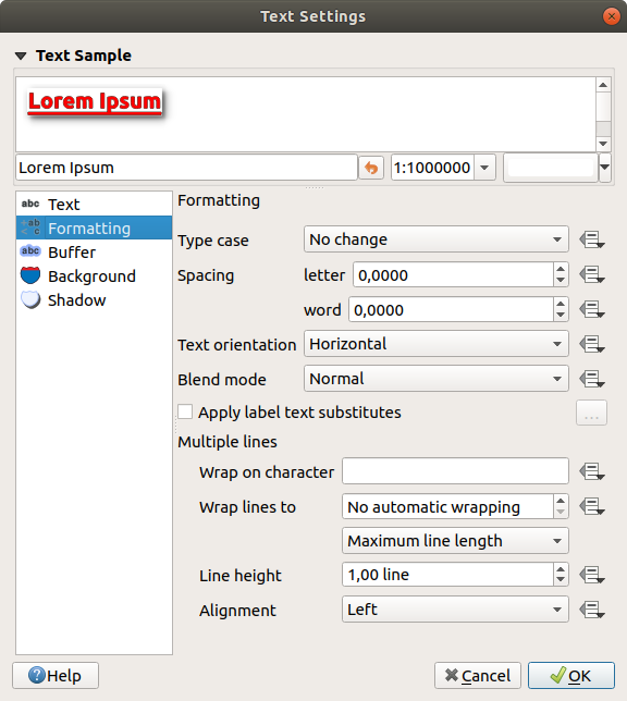
Text settings - Formatting tab
In the  Formatting tab, you can:
Use the Type case option to change the capitalization style of the text. You have the possibility to render the text as All uppercase, All lowercase or Capitalize first letter. Note that the last option modifies only the first letter of each word and leaves the other letters in the text untouched.
Under Spacing, change the space between words and between individual letters.
 Enable kerning of the text font
Set the Text orientation which can be Horizontal or Vertical. It can also be Rotation-based when setting a label.
Use the Blend mode option to determine how your labels will mix with the map features below them (more details at Blending Modes).
The
 Apply label text substitutes option allows you
to specify a list of texts to substitute to texts in feature labels (e.g.,
abbreviating street types). Replacement texts are used when displaying
labels on the map. Users can also export and import lists of
substitutes to make reuse and sharing easier.
Apply label text substitutes option allows you
to specify a list of texts to substitute to texts in feature labels (e.g.,
abbreviating street types). Replacement texts are used when displaying
labels on the map. Users can also export and import lists of
substitutes to make reuse and sharing easier.Configure Multiple lines:
Set a character that will force a line break in the text with the Wrap on character option
Set an ideal line size for auto-wrapping using the Wrap lines to option. The size can represent either the Maximum line length or the Minimum line length.
Decide the Line Height
Format the Alignment: typical values available are Left, Right and Center.
When setting point labels properties, the text alignment can also be Follow label placement. In that case, the alignment will depend on the final placement of the label relative to the point. E.g., if the label is placed to the left of the point, then the label will be right aligned, while if it is placed to the right, it will be left aligned.
For line labels you can include Line direction symbol to help determine the line directions, with symbols to use to indicate the Left or Right. They work particularly well when used with the curved or Parallel placement options from the Placement tab. There are options to set the symbols position, and to
Reverse direction.Use the
Formatted numbers option to format numeric
texts. You can set the number of Decimal places. By default, 3decimal places will be used. Use the Show plus sign if
you want to show the plus sign for positive numbers.
Buffer tab
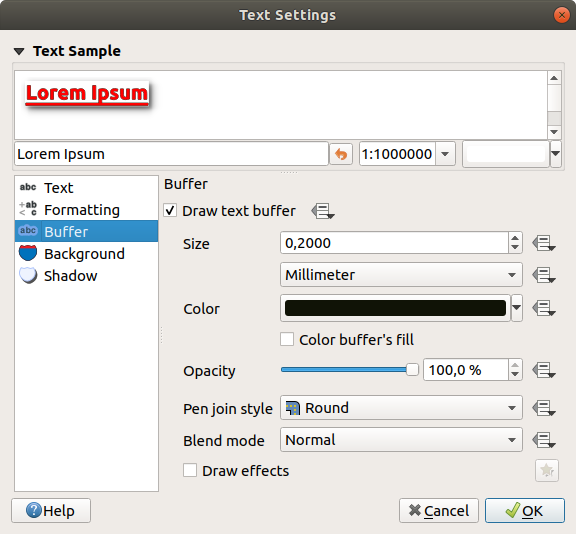
Text settings - Buffer tab
To create a buffer around the label, activate the Draw
text buffer checkbox in the  Buffer tab. Then you can:
Set the buffer’s Size in any supported unit
Select the buffer’s Color
- Color buffer’s fill: The buffer expands from the
label’s outline, so, if the option is activated, the label’s interior is
filled. This may be relevant when using partially transparent labels or with
non-normal blending modes, which will allow seeing behind the label’s text.
Unchecking the option (while using totally transparent labels) will allow you
to create outlined text labels.
Define the buffer’s Opacity
Apply a Pen join style: it can be Round, Miter or Bevel
Use the Blend mode option to determine how your label’s buffer will mix with the map components below them (more details at Blending Modes).
Check
Draw effects to add advanced  paint effects for improving text readability,
eg through outer glows and blurs.
paint effects for improving text readability,
eg through outer glows and blurs.
Background tab
The  Background tab allows you to configure a
shape that stays below each label. To add a background, activate
the Draw Background checkbox and select
the Shape type. It can be:
Background tab allows you to configure a
shape that stays below each label. To add a background, activate
the Draw Background checkbox and select
the Shape type. It can be:
a regular shape such as Rectangle, Square, Circle or Ellipse
an SVG symbol from a file, a URL or embedded in the project or style database (more details)
or a Marker Symbol you can create or select from the symbol library.
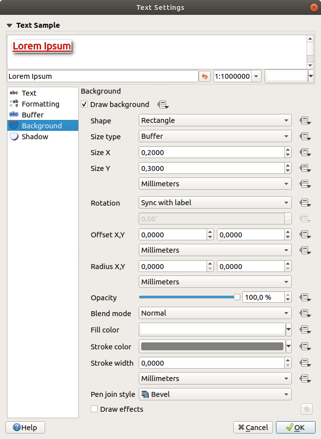
Text settings - Background tab
Depending on the selected shape, you need to configure some of the following properties:
The Size type of the frame, which can be:
Fixed: using the same size for all the labels, regardless the size of the text
or a Buffer over the text’s bounding box
The Size of the frame in X and Y directions, using any supported units
A Rotation of the background, between Sync with label, Offset of label and Fixed. The last two require an angle in degrees.
An Offset X,Y to shift the background item in the X and/or Y directions
A Radius X,Y to round the corners of the background shape (applies to rectangle and square shapes only)
An Opacity of the background
A Blend mode to mix the background with the other items in the rendering (see Blending Modes).
The Fill color, Stroke color and Stroke width for shape types other than the marker symbol. Use the Load symbol parameters to revert changes on an SVG symbol to its default settings.
A Pen join style: it can be Round, Miter or Bevel (applies to rectangle and square shapes only)
- Draw effects to add advanced
paint effects for improving text readability,
eg through outer glows and blurs.
Shadow tab
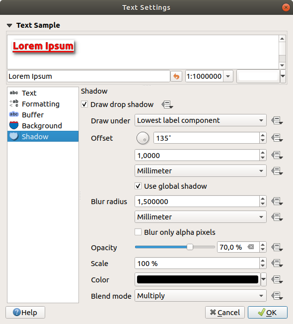
Text settings - Shadow tab
To add a shadow to the text, enable the  Shadow
tab and activate the Draw drop shadow. Then you can:
Shadow
tab and activate the Draw drop shadow. Then you can:
Indicate the item used to generate the shadow with Draw under. It can be the Lowest label component or a particular component such as the Text itself, the Buffer or the Background.
Set the shadow’s Offset from the item being shadowded, ie:
The angle: clockwise, it depends on the underlying item orientation
The distance of offset from the item being shadowded
The units of the offset
If you tick the
Use global shadow checkbox,
then the zero point of the angle is always oriented to the north and
doesn’t depend on the orientation of the label’s item.Influence the appearance of the shadow with the Blur radius. The higher the number, the softer the shadows, in the units of your choice.
Define the shadow’s Opacity
Rescale the shadow’s size using the Scale factor
Choose the shadow’s Color
Use the Blend mode option to determine how your label’s shadow will mix with the map components below them (more details at Blending Modes).
Callouts tab
A common practice when placing labels on a crowded map is to use callouts - labels which are placed outside (or displaced from) their associated feature are identified with a dynamic line connecting the label and the feature. If one of the two endings (either the label or the feature) is moved, the shape of the connector is recomputed.
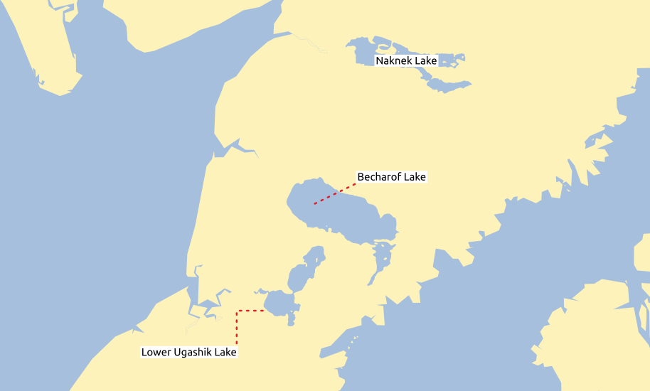
Labels with various callouts settings
To add a callout to a label, enable the  Callouts
tab and activate the Draw callouts. Then you can:
Callouts
tab and activate the Draw callouts. Then you can:
Select the Style of connector, one of:
Simple lines: a straight line, the shortest path
Manhattan style: a 90° broken line
Select the Line style with full capabilities of a line symbol including layer effects, and data-defined settings
Set the Minimum length of callout lines
Set the Offset from feature option: controls the distance from the feature (or its anchor point if a polygon) where callout lines end. Eg, this avoids drawing lines right up against the edges of the features.
Set the Offset from label area option: controls the distance from the label anchor point (where the callout line ends). This avoids drawing lines right up against the text.
- Draw lines to all feature parts from the feature’s
label
Set the Anchor point for the (polygon) feature (the end point of the connector line). Available options:
Pole of inaccessibility
Point on exterior
Point on surface
Centroid
Set the Label anchor point: controls where the connector line should join to the label text. Available options:
Closest point
Label centroid
Fixed position at the edge (Top left, Top center, Top right, Left middle, Right middle, Bottom left, Bottom center and Bottom right).
Placement tab
Choose the  Placement tab for configuring label placement
and labeling priority. Note that the placement options differ according to the
type of vector layer, namely point, line or polygon, and are affected by
the global PAL setting.
Placement tab for configuring label placement
and labeling priority. Note that the placement options differ according to the
type of vector layer, namely point, line or polygon, and are affected by
the global PAL setting.
Placement for point layers
With the  Cartographic placement mode,
point labels are generated with a better visual relationship with the
point feature, following ideal cartographic placement rules. Labels can be
placed at a set Distance either from the point feature itself
or from the bounds of the symbol used to represent the feature.
The latter option is especially useful when the symbol size isn’t fixed,
e.g. if it’s set by a data defined size or when using different symbols
in a categorized renderer.
Cartographic placement mode,
point labels are generated with a better visual relationship with the
point feature, following ideal cartographic placement rules. Labels can be
placed at a set Distance either from the point feature itself
or from the bounds of the symbol used to represent the feature.
The latter option is especially useful when the symbol size isn’t fixed,
e.g. if it’s set by a data defined size or when using different symbols
in a categorized renderer.
By default, placements are prioritised in the following order:
top right
top left
bottom right
bottom left
middle right
middle left
top, slightly right
bottom, slightly left.
Placement priority can, however, be customized or set for an individual feature using a data defined list of prioritised positions. This also allows only certain placements to be used, so e.g. for coastal features you can prevent labels being placed over the land.
The Around point setting places the label in an
equal radius (set in Distance) circle around the feature. The
placement of the label can even be constrained using the Quadrant
option.
With the Offset from point, labels are
placed at a fixed offset from the point feature. You can select the
Quadrant in which to place your label. You are also able to set
the Offset X,Y distances between the points and their labels and
can alter the angle of the label placement with the Rotation
setting. Thus, placement in a selected quadrant with a defined rotation is
possible.
Placement for line layers
Label options for line layers include Parallel,
 Curved or Horizontal.
For the Parallel and
Curved options, you can set the position to
Above line, On line and
Below line. It’s possible to select several options at once. In
that case, QGIS will look for the optimal label position. For Parallel and
curved placement options, you can also use the line orientation for the
position of the label. Additionally, you can define a Maximum
angle between curved characters when selecting the
Curved option (see Figure_labels_placement_line).
Curved or Horizontal.
For the Parallel and
Curved options, you can set the position to
Above line, On line and
Below line. It’s possible to select several options at once. In
that case, QGIS will look for the optimal label position. For Parallel and
curved placement options, you can also use the line orientation for the
position of the label. Additionally, you can define a Maximum
angle between curved characters when selecting the
Curved option (see Figure_labels_placement_line).
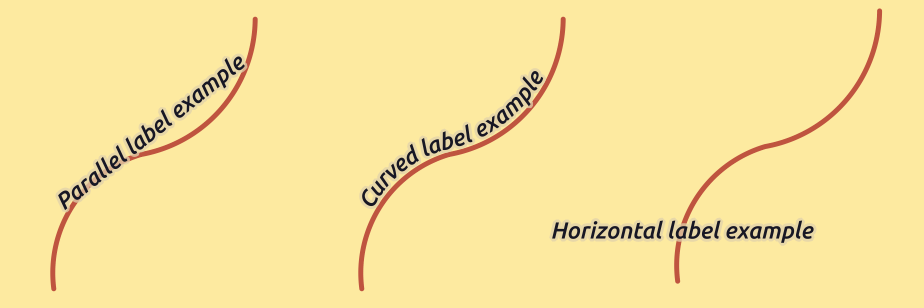
Label placement examples in lines
For all three placement options, in Repeat, you can set up a
minimum distance for repeating labels. The distance can be in mm or in
map units.
Placement for polygon layers
You can choose one of the following options for placing labels in polygons (see figure_labels_placement_polygon):
- Offset from centroid,
- Horizontal (slow),
- Around centroid,
- Free (slow),
- Using perimeter,
and
Using perimeter (curved).
In the Offset from centroid settings you can
specify if the centroid is of the visible
polygon or whole polygon. That means that
either the centroid is used for the polygon you can see on the map or the
centroid is determined for the whole polygon, no matter if you can see the
whole feature on the map. You can place your label within a specific
quadrant, and define offset and rotation.
The Around centroid setting places the label at a specified
distance around the centroid. Again, you can define
visible polygon or whole polygon
for the centroid.
With the Horizontal (slow) or Free (slow) options, QGIS places at the best position either a horizontal or a rotated label inside the polygon.
With the Using perimeter option, the label
will be drawn next to the polygon boundary. The label will behave like the
parallel option for lines. You can define a position and a distance for the
label. For the position, Above line,
On line, Below line and
Line orientation dependent position are possible. You can
specify the distance between the label and the polygon outline, as well as
the repeat interval for the label.
The Using perimeter (curved) option helps you draw the label along the polygon boundary, using a curved labeling. In addition to the parameters available with Using perimeter setting, you can set the Maximum angle between curved characters polygon, either inside or outside.
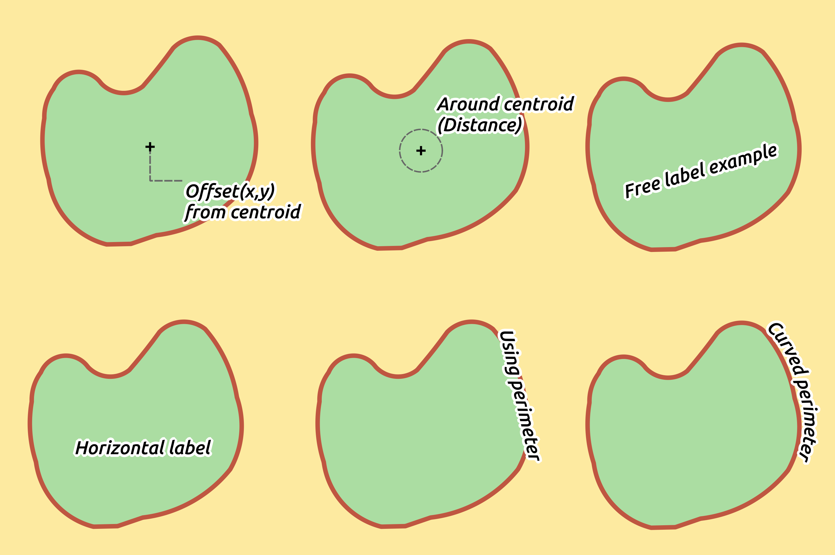
Label placement examples in polygons
Common placement settings
Some label placement settings are available for all layer geometry types:
Data Defined
The Data Defined group provides direct control on labels placement, on a feature-by-feature basis. It relies on their attributes or an expression to set:
the X and Y coordinate
the text alignment over the custom position set above:
Horizontal: it can be Left, Center or Right
the text Vertical: it can be Bottom, Base, Half, Cap or Top
the text Rotation. Check the Preserve data rotation values entry if you want to keep the rotation value in the associated field and apply it to the label, whether the label is pinned or not. If unchecked, unpinning the label rotation is reset and its value cleared from the attribute table.
Note
Data-defined rotation with polygon features is currently supported only with the Around centroid placement mode.
Note
Expressions can not be used in combination with the labels map tools (ie the Rotate label and Move label tools) to data-define labels placement. The widget will be reset to the corresponding auxiliary storage field.
Priority
In the Priority section you can define the placement priority rank of each label, ie if there are different labels candidates for the same location, the label with the higher priority will be displayed and the others could be left out. The priority rank is also used to evaluate whether a label could be omitted due to a greater weighted obstacle feature.
Obstacles
In some contexts (eg, high density labels, overlapping features…), the labels placement can result in labels being placed over unrelated features.
An obstacle is a feature over which QGIS avoids placing other features’ labels or diagrams. This can be controlled from the Obstacles section:
Activate the
Discourage labels from covering features
option to decide whether features of the layer should act as obstacles for
any label (including labels from other features in the same layer).Instead of the whole layer, you can select a subset of features to use as obstacles, using the
 data-defined override control next
to the option.
data-defined override control next
to the option.Use the Settings button to tweak the obstacle’s weighting.
For every potential obstacle feature you can assign an Obstacle weight: any label or diagram whose placement priority rank is greater than this value can be placed over. Labels or diagrams with lower rank will be omitted if no other placement is possible.
This weighting can also be data-defined, so that within the same layer, certain features are more likely to be covered than others.
For polygon layers, you can choose the kind of obstacle the feature is:
over the feature’s interior: avoids placing labels over the interior of the polygon (prefers placing labels totally outside or just slightly inside the polygon)
or over the feature’s boundary: avoids placing labels over the boundary of the polygon (prefers placing labels outside or completely inside the polygon). This can be useful for layers where the features cover the whole area (administrative units, categorical coverages, …). In this case, it is impossible to avoid placing labels within these features, and it looks much better when placing them over the boundaries between features is avoided.
Rendering tab
In the  Rendering tab, you can tune when the labels can
be rendered and their interaction with other labels and features.
Rendering tab, you can tune when the labels can
be rendered and their interaction with other labels and features.
Label options
Under Label options:
You find the scale-based and the Pixel size-based visibility settings.
The Label z-index determines the order in which labels are rendered, as well in relation with other feature labels in the layer (using data-defined override expression), as with labels from other layers. Labels with a higher z-index are rendered on top of labels (from any layer) with lower z-index.
Additionally, the logic has been tweaked so that if two labels have matching z-indexes, then:
if they are from the same layer, the smaller label will be drawn above the larger label
if they are from different layers, the labels will be drawn in the same order as their layers themselves (ie respecting the order set in the map legend).
Note
This setting doesn’t make labels to be drawn below the features from other layers, it just controls the order in which labels are drawn on top of all the layers’ features.
While rendering labels and in order to display readable labels, QGIS automatically evaluates the position of the labels and can hide some of them in case of collision. You can however choose to
Show all
labels for this layer (including colliding labels) in order to manually fix
their placement (see The Label Toolbar).With data-defined expressions in Show label and Always Show you can fine tune which labels should be rendered.
Allow to Show upside-down labels: alternatives are Never, when rotation defined or always.
Feature options
Under Feature options:
You can choose to label every part of a multi-part feature and limit the number of features to be labeled.
Both line and polygon layers offer the option to set a minimum size for the features to be labeled, using Suppress labeling of features smaller than.
For polygon features, you can also filter the labels to show according to whether they completely fit within their feature or not.
For line features, you can choose to Merge connected lines to avoid duplicate labels, rendering a quite airy map in conjunction with the Distance or Repeat options in the Placement tab.