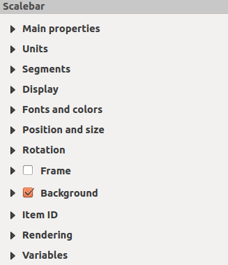
The Main properties dialog of the scale bar
Item Properties panel provides the following functionalities
(see figure_composer_scalebar_ppt):
Primeiro, escolha o mapa ao qual a barra de escala será ligada.
Em seguida, escolha o estilo da barra de escala. Seis estilos estão disponíveis:
- Single box and Double box styles, which contain one or two lines of
boxes alternating colors.
- Middle, Up or Down line ticks.
- Numeric, where the scale ratio is printed (i.e., 1:50000).
The Units and Segments dialogs of the scale bar
Item Properties panel provide the following functionalities
(see figure_composer_scalebar_units):
In these two dialogs, you can set how the scale bar will be represented.
- Select the units you want to use with Scalebar units.
There are four possible choices: Map Units, the default one and Meters,
Feet or Nautical Miles which may force unit conversions.
- The Label unit multiplier specifies how many scalebar units per
labeled unit. Eg, if your scalebar units are set to “meters”, a multiplier of
1000 will result in the scale bar labels in “kilometers”.
- The Label for units field defines the text used to describe the
units of the scale bar, eg “m” or “km”. This should be matched to reflect the
multiplier above.
- You can define how many Segments will be drawn on the left and on
the right side of the scale bar.
- You can set how long each segment will be (fixed width), or limit
the scale bar size in mm with Fit segment width option. In the
latter case, each time the map scale changes, the scale bar is resized (and
its label updated) to fit the range set.
- Height is used to define the height of the bar.
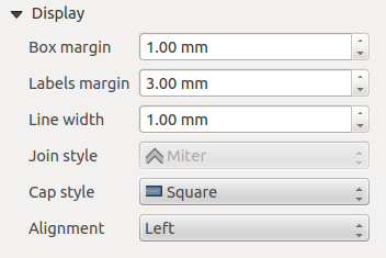
The Display dialog of the scale bar Item Properties
panel provides the following functionalities (see
figure_composer_scalebar_display):
You can define how the scale bar will be displayed in its frame.
- Box margin : space between text and frame borders
- Labels margin : space between text and scale bar drawing
- Line width : line width of the scale bar drawing
- Join style : Corners at the end of scalebar in style Bevel,
Rounded or Square (only available for Scale bar style Single Box & Double Box)
- Cap style : End of all lines in style Square, Round or Flat
(only available for Scale bar style Line Ticks Up, Down and Middle)
- Alignment : Puts text on the left, middle or right side of the
frame (works only for Scale bar style Numeric)
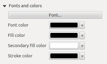
The Fonts and colors dialog of the scale bar
Item Properties panel provides the following functionalities
(see figure_composer_scalebar_fonts):
You can define the fonts and colors used for the scale bar.
- Use the [Font] button to set the font of scale bar label
- Font color: set the font color
- Fill color: set the first fill color
- Secondary fill color: set the second fill color
- Stroke color: set the color of the lines of the Scale Bar
Fill colors are only used for scale box styles Single Box and Double Box.
To select a color you can use the list option using the dropdown arrow to open
a simple color selection option or the more advanced color selection option,
that is started when you click in the colored box in the dialog.


