8.2. Lesson: 래스터 심볼 변경
모든 래스터 데이터가 항공사진인 것은 아닙니다. 다른 형식의 래스터 데이터도 많이 있으며, 대부분의 경우, 데이터를 적절히 심볼화해서 제대로 활용할 수 있도록 표출하는 작업이 필요합니다.
이 강의의 목표: 래스터 레이어를 위해 심볼을 변경하기.
8.2.1.  Try Yourself
- Start with the current map which you should have created during the previous exercise: analysis.qgs.
- Use the Add Raster Layer button to load the new raster dataset.
- Load the dataset srtm_41_19.tif, found under the directory exercise_data/raster/SRTM/.
- Once it appears in the Layers list, rename it to DEM.
- Zoom to the extent of this layer by right-clicking on it in the Layer List and selecting Zoom to Layer Extent.
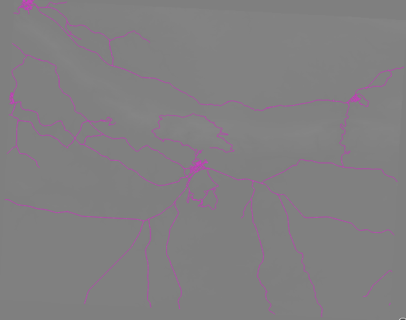
이 데이터셋은 수치 표고 모델(Digital Elevation Model, DEM) 입니다. 지형의 표고(고도)를 표현하는 맵으로, 예를 들면 산과 계곡의 위치를 볼 수 있게 해줍니다.
Once it’s loaded, you’ll notice that it’s a basic stretched grayscale representation of the DEM. It’s seen here with the vector layers on top:
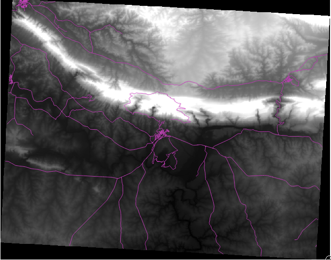
QGIS는 시각화 목적을 위해 자동적으로 이미지에 구간을 적용합니다. 이번 실습을 계속하면서 이것이 어떻게 작용하는지 배우게 될 것입니다.
8.2.2. Follow Along: 래스터 레이어 심볼 변경
- Open the Layer Properties dialog for the SRTM layer by right-clicking on the layer in the Layer tree and selecting Properties option.
- Switch to the Style tab.
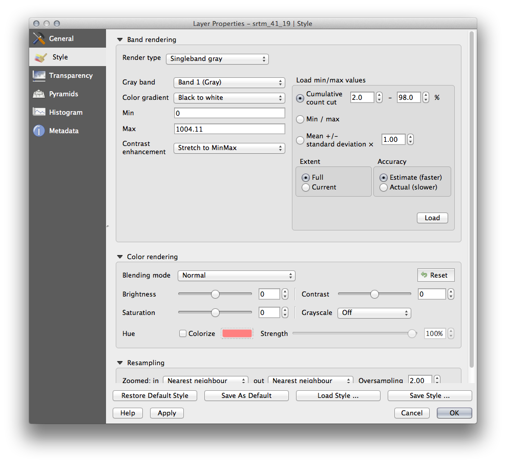
These are the current settings that QGIS applied for us by default. Its just one way to look at a DEM, so lets explore some others.
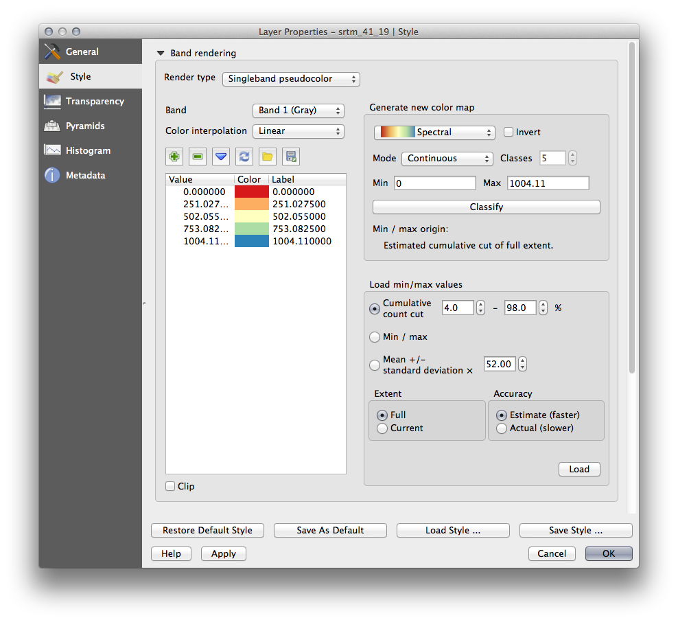
- Change the Render type to Singleband pseudocolor, and use the default options presented.
- Click the Classify button to generate a new color classification, and click OK to apply this classification to the DEM.
래스터가 다음과 같이 보이게 됩니다.
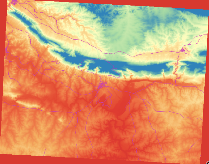
This is an interesting way of looking at the DEM, but maybe we don’t want to symbolize it using these colors.
- Open Layer Properties dialog again.
- Switch the Render Type back to Singleband gray.
- Click OK to apply this setting to the raster.
You will now see a totally gray rectangle that isn’t very useful at all.
This is because we have lost the default settings which “stretch” the color values to show them contrast.
Let’s tell QGIS to again “stretch” the color values based on the range of data in the DEM. This will make QGIS use all of the available colors (in Grayscale, this is black, white and all shades of gray in between).
- Specify the Min and Max values as shown below.
- Set the value Contrast enhancement to Stretch To MinMax:

But what are the minimum and maximum values that should be used for the stretch? The ones that are currently under Min and Max values are the same values that just gave us a gray rectangle before. Instead, we should be using the minimum and maximum values that are actually in the image, right? Fortunately, you can determine those values easily by loading the minimum and maximum values of the raster.
- Under Load min / max values, select Min / Max option.
- Click the Load button:
Notice how the Custom min / max values have changed to reflect the actual values in our DEM:
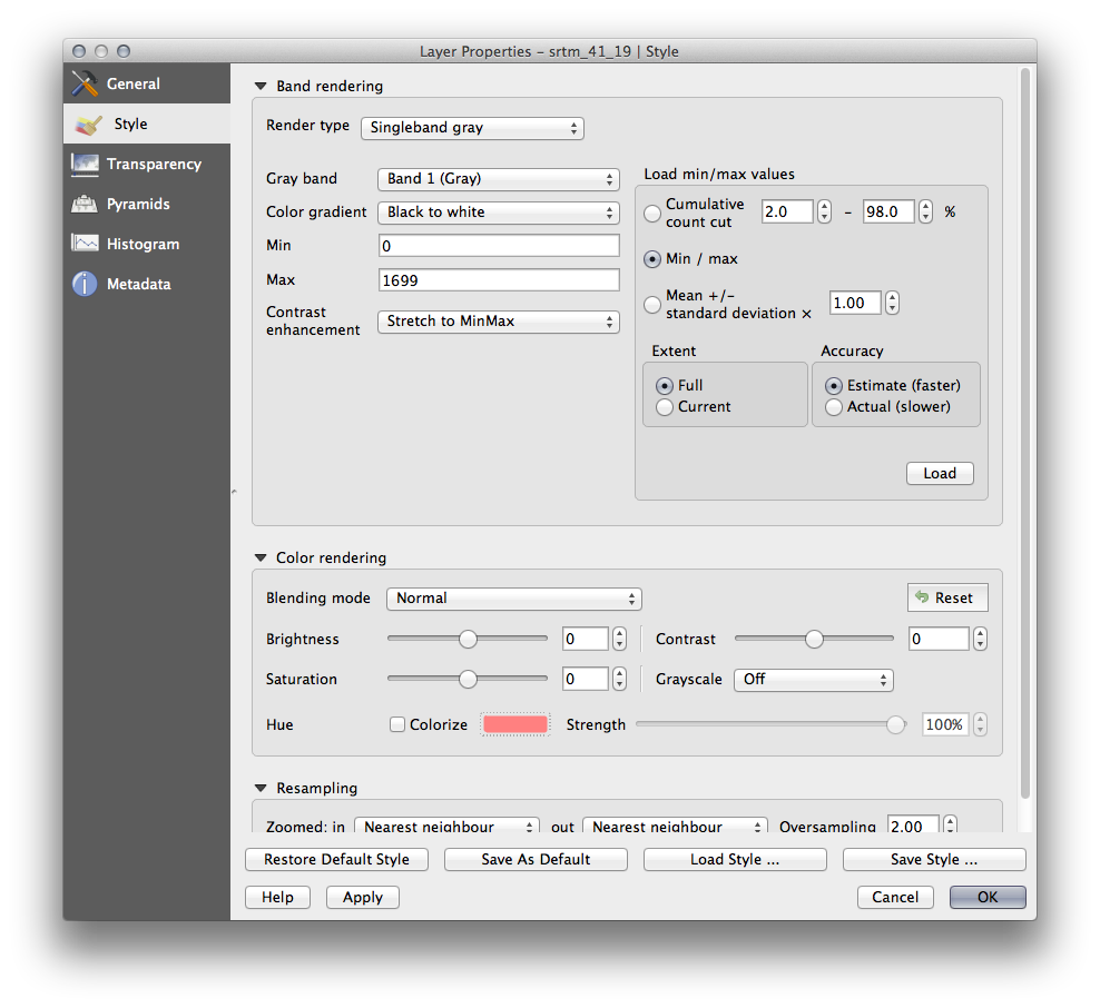
- Click OK to apply these settings to the image.
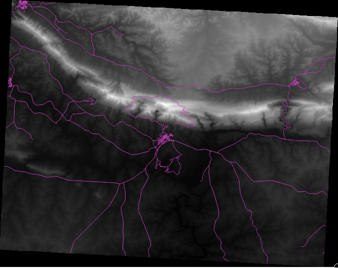
You’ll now see that the values of the raster are again properly displayed, with the darker colors representing valleys and the lighter ones, mountains:
8.2.2.1. But isn’t there a better or easier way?
Yes, there is. Now that you understand what needs to be done, you’ll be glad to know that there’s a tool for doing all of this easily.
Remove the current DEM from the Layers list.
Load the raster in again, renaming it to DEM as before. It’s a gray rectangle again...
Enable the tool you’ll need by enabling View ‣ Toolbars ‣ Raster. These icons will appear in the interface:
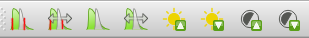
The third button from the left Local Histogram Stretch will automatically stretch the minimum and maximum values to give you the best contrast in the local area that you’re zoomed into. It’s useful for large datasets. The button on the left Local Cumulative Cut Stretch ... will stretch the minimum and maximum values to constant values across the whole image.
- Click the fourth button from the left (Stretch Histogram to Full Dataset). You’ll see the data is now correctly represented as before.
You can try the other buttons in this toolbar and see how they alter the stretch of the image when zoomed in to local areas or when fully zoomed out.
8.2.3. In Conclusion
These are only the basic functions to get you started with raster symbology. QGIS also allows you many other options, such as symbolizing a layer using standard deviations, or representing different bands with different colors in a multispectral image.
8.2.4. 참조
SRTM 데이터셋의 출처는 http://srtm.csi.cgiar.org/ 입니다.
8.2.5. What’s Next?
이제 데이터를 제대로 표출할 수 있게 됐으니, 어떻게 더 심도 있게 분석할 수 있을지 알아보겠습니다.