8.2. Lesson: Changing Raster Symbology
Not all raster data consists of aerial photographs. There are many other forms of raster data, and in many of those cases, it’s essential to symbolize the data properly so that it becomes properly visible and useful.
The goal for this lesson: To change the symbology for a raster layer.
8.2.1.  Try Yourself
- Start with the current map which you should have created during the previous exercise: analysis.qgs.
- Use the Add Raster Layer button to load the new raster dataset.
- Load the dataset srtm_41_19.tif, found under the directory exercise_data/raster/SRTM/.
- Once it appears in the Layers list, rename it to DEM.
- Zoom to the extent of this layer by right-clicking on it in the Layer List and selecting Zoom to Layer Extent.
This dataset is a Digital Elevation Model (DEM). It’s a map of the elevation (altitude) of the terrain, allowing us to see where the mountains and valleys are, for example.
Once it’s loaded, you’ll notice that it’s a basic stretched grayscale representation of the DEM. It’s seen here with the vector layers on top:
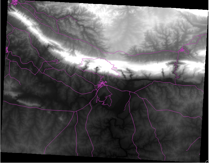
QGIS has automatically applied a stretch to the image for visualization purposes, and we will learn more about how this works as we continue.
8.2.2. Follow Along: Changing Raster Layer Symbology
- Open the Layer Properties dialog for the SRTM layer by right-clicking on the layer in the Layer tree and selecting Properties option.
- Switch to the Style tab.
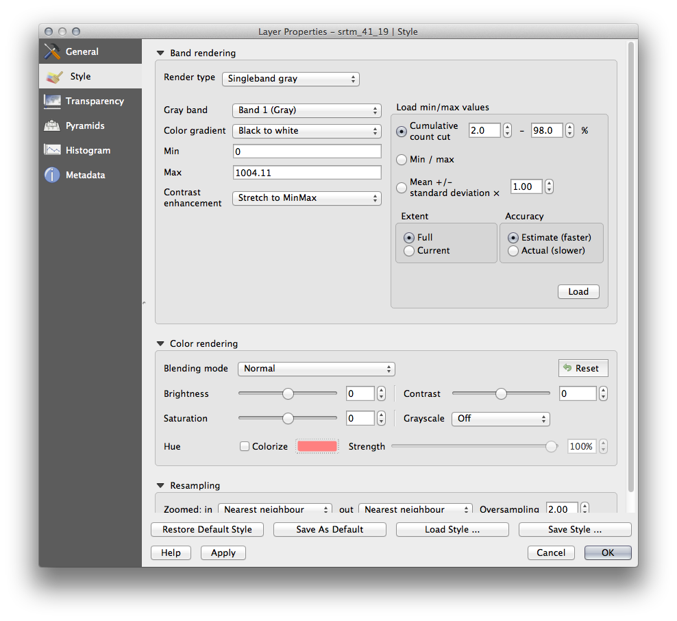
These are the current settings that QGIS applied for us by default. Its just one way to look at a DEM, so lets explore some others.
- Change the Render type to Singleband pseudocolor, and use the default options presented.
- Click the Classify button to generate a new color classification, and click OK to apply this classification to the DEM.

You’ll see the raster looking like this:
This is an interesting way of looking at the DEM, but maybe we don’t want to symbolize it using these colors.
- Open Layer Properties dialog again.
- Switch the Render Type back to Singleband gray.
- Click OK to apply this setting to the raster.
You will now see a totally gray rectangle that isn’t very useful at all.
This is because we have lost the default settings which “stretch” the color values to show them contrast.
Let’s tell QGIS to again “stretch” the color values based on the range of data in the DEM. This will make QGIS use all of the available colors (in Grayscale, this is black, white and all shades of gray in between).
- Specify the Min and Max values as shown below.
- Set the value Contrast enhancement to Stretch To MinMax:
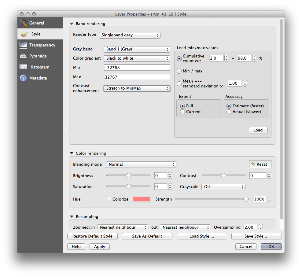
But what are the minimum and maximum values that should be used for the stretch? The ones that are currently under Min and Max values are the same values that just gave us a gray rectangle before. Instead, we should be using the minimum and maximum values that are actually in the image, right? Fortunately, you can determine those values easily by loading the minimum and maximum values of the raster.
- Under Load min / max values, select Min / Max option.
- Click the Load button:
Notice how the Custom min / max values have changed to reflect the actual values in our DEM:

- Click OK to apply these settings to the image.
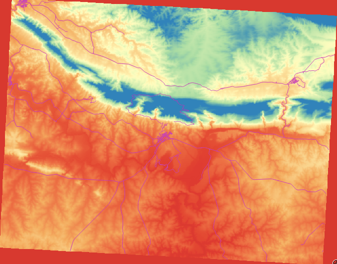
You’ll now see that the values of the raster are again properly displayed, with the darker colors representing valleys and the lighter ones, mountains:

8.2.2.1. But isn’t there a better or easier way?
Yes, there is. Now that you understand what needs to be done, you’ll be glad to know that there’s a tool for doing all of this easily.
Remove the current DEM from the Layers list.
Load the raster in again, renaming it to DEM as before. It’s a gray rectangle again...
Enable the tool you’ll need by enabling View ‣ Toolbars ‣ Raster. These icons will appear in the interface:
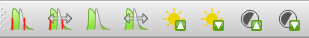
The third button from the left Local Histogram Stretch will automatically stretch the minimum and maximum values to give you the best contrast in the local area that you’re zoomed into. It’s useful for large datasets. The button on the left Local Cumulative Cut Stretch ... will stretch the minimum and maximum values to constant values across the whole image.
- Click the fourth button from the left (Stretch Histogram to Full Dataset). You’ll see the data is now correctly represented as before.
You can try the other buttons in this toolbar and see how they alter the stretch of the image when zoomed in to local areas or when fully zoomed out.
8.2.3. In Conclusion
These are only the basic functions to get you started with raster symbology. QGIS also allows you many other options, such as symbolizing a layer using standard deviations, or representing different bands with different colors in a multispectral image.
8.2.4. Reference
The SRTM dataset was obtained from http://srtm.csi.cgiar.org/
8.2.5. What’s Next?
Now that we can see our data displayed properly, let’s investigate how we can analyze it further.