The Label Item
To add a label, click the  Add label icon, place the element
with the left mouse button on the Print Composer canvas and position and
customize its appearance in the label Item Properties panel.
Add label icon, place the element
with the left mouse button on the Print Composer canvas and position and
customize its appearance in the label Item Properties panel.
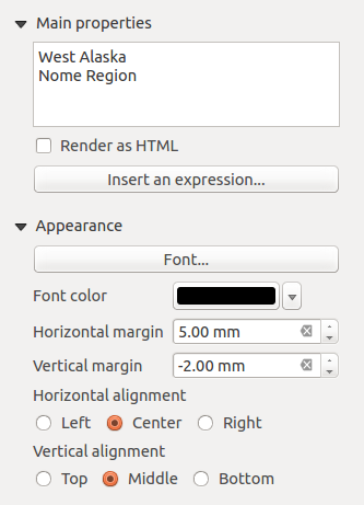
The Item Properties panel of a label item provides the following
functionality for the label item (see Figure_composer_label):
- The main properties dialog is where the text (HTML or not) or the expression
needed to fill the label is added to the Composer canvas.
- Labels can be interpreted as HTML code: check
 Render as HTML. You can now insert a URL, a clickable image that
links to a web page or something more complex.
Render as HTML. You can now insert a URL, a clickable image that
links to a web page or something more complex.
- You can also insert an expression. Click on [Insert an expression] to open
a new dialog. Build an expression by clicking the functions available in the
left side of the panel. Two special categories can be useful, particularly
associated with the atlas functionality: geometry and records
functions. At the bottom, a preview of the expression is shown.
- Define Font by clicking on the [Font...] button or a
Font color selecting a color using the color selection tool.
- You can specify different horizontal and vertical margins in mm. This is
the margin from the edge of the composer item. The label can be positioned
outside the bounds of the label e.g. to align label items with other items.
In this case you have to use negative values for the margin.
- Using the Alignment is another way to position your label. Note
that when e.g. using the Horizontal alignment in
 Center Position the Horizontal margin feature is
disabled.
Center Position the Horizontal margin feature is
disabled.