` `
ラスターのプロパティダイアログ
To view and set the properties for a raster layer, double click on the layer name in the map legend, or right click on the layer name and choose Properties from the context menu. This will open the Raster Layer Properties dialog (see figure_raster_properties).
このダイアログには多くのタブがあります:
- General
- Style
- Transparency
- Pyramids
- Histogram
- Metadata
- Legend
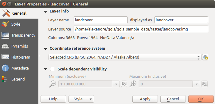
Raster Layers Properties Dialog
ちなみに
ライブアップデートレンダリング
レイヤースタイル設定パネル は、レイヤーのプロパティダイアログの一般的な機能の一部をご提供し、レイヤースタイルの設定をスピードアップし、自動的に地図キャンバスでの変更内容を表示するために使用できる良いモードレスウィジェットです。
ノート
埋め込まれたレイヤーのプロパティ(シンボル、ラベル、アクション、デフォルト値、フォーム...)( プロジェクトを入れ子にする を参照)は元のプロジェクトファイルから引き出されているため、またこの動作を壊す可能性のある変更を避けるために、これらのレイヤーについてはレイヤーのプロパティダイアログが利用できなくします。
General Properties
Layer Info
The General tab displays basic information about the selected raster, including the layer source path, the display name in the legend (which can be modified), and the number of columns, rows and no-data values of the raster.
Coordinate Reference System
Displays the layer’s Coordinate Reference System (CRS) as a PROJ.4 string. You
can change the layer’s CRS, selecting a recently used one in the drop-down list
or clicking on  Select CRS button (see 座標系選択).
Use this process only if the CRS applied to the layer is a wrong one or if none
was applied. If you wish to reproject your data into another CRS, rather use
layer reprojection algorithms from Processing or Save it into another
layer.
Select CRS button (see 座標系選択).
Use this process only if the CRS applied to the layer is a wrong one or if none
was applied. If you wish to reproject your data into another CRS, rather use
layer reprojection algorithms from Processing or Save it into another
layer.
Scale dependent visibility
最大(含む) と 最小(含まない) 縮尺を設定できます。これはレイヤーが表示される縮尺の範囲を定義します。この範囲の外ではそれらは非表示になります。  現在のキャンバス縮尺 ボタンに設定を使用すると、範囲の可視性の境界として、現在の地図キャンバスの縮尺を使用できます。詳細は 縮尺依存レンダリング 参照。
Style Properties
バンドレンダリング
QGISでは4つの異なる レンダリングタイプ を提供しています。選択されるレンダラーはデータ型に依存します。
- Multiband color - if the file comes as a multiband with several bands (e.g., used with a satellite image with several bands)
- Paletted - if a single band file comes with an indexed palette (e.g., used with a digital topographic map)
- Singleband gray - (one band of) the image will be rendered as gray; QGIS will choose this renderer if the file has neither multibands nor an indexed palette nor a continuous palette (e.g., used with a shaded relief map)
- Singleband pseudocolor - this renderer is possible for files with a continuous palette, or color map (e.g., used with an elevation map)
Multiband color
With the multiband color renderer, three selected bands from the image will be rendered, each band representing the red, green or blue component that will be used to create a color image. You can choose several Contrast enhancement methods: ‘No enhancement’, ‘Stretch to MinMax’, ‘Stretch and clip to MinMax’ and ‘Clip to min max’.
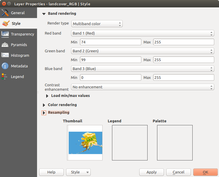
Raster Style - Multiband color rendering
This selection offers you a wide range of options to modify the appearance
of your raster layer. First of all, you have to get the data range from your
image. This can be done by choosing the Extent and pressing
[Load]. QGIS can  Estimate (faster) the
Min and Max values of the bands or use the
Estimate (faster) the
Min and Max values of the bands or use the
 Actual (slower) Accuracy.
Now you can scale the colors with the help of the Load min/max values
section. A lot of images have a few very low and high data. These outliers can be
eliminated using the Cumulative count cut setting.
The standard data range is set from 2% to 98% of the data values and can be adapted
manually. With this setting, the gray character of the image can disappear.
With the scaling option Min/max, QGIS creates a color
table with all of the data included in the original image (e.g., QGIS creates
a color table with 256 values, given the fact that you have 8 bit bands).
You can also calculate your color table using the Mean
+/- standard deviation x  .
Then, only the values within the standard deviation or within multiple standard deviations
are considered for the color table. This is useful when you have one or two cells
with abnormally high values in a raster grid that are having a negative impact on
the rendering of the raster.
.
Then, only the values within the standard deviation or within multiple standard deviations
are considered for the color table. This is useful when you have one or two cells
with abnormally high values in a raster grid that are having a negative impact on
the rendering of the raster.
All calculations can also be made for the Current extent.
ちなみに
マルチバンドラスターの単バンドを表示する
If you want to view a single band of a multiband image (for example, Red), you might think you would set the Green and Blue bands to “Not Set”. But this is not the correct way. To display the Red band, set the image type to ‘Singleband gray’, then select Red as the band to use for Gray.
Paletted
これは、既に画素値が特定の色に割り当てられたカラーテーブルを含む単バンドファイルに対する標準のレンダリングオプションです。この場合、パレットは自動的にレンダリングされます。特定の値に割り当てられた色を変更したい場合は、単にその色をダブルクリックすれば 色を選択 ダイアログが表示されます。またQGISでは、色の値にラベルを割り当てることが可能です。ラベルは、ラスターレイヤーの凡例に表示されます。
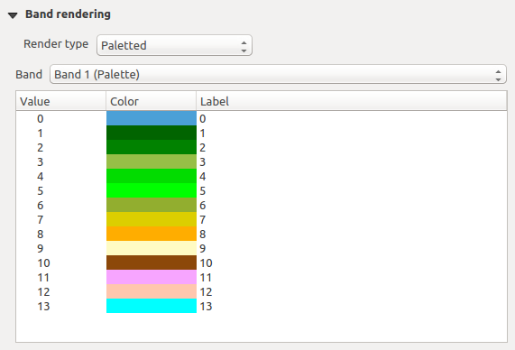
Raster Style - Paletted Rendering
コントラスト強調
ノート
GRASSラスターを追加する場合は、オプション コントラスト強調 は、これがQGIS一般オプションで別の値に設定されている場合かどうかにかかわらず、常に 最小最大に引き延ばし に自動的に設定されます。
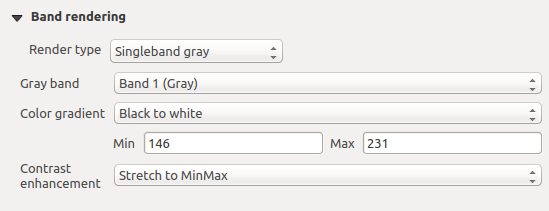
Singleband gray
This renderer allows you to render a single band layer with a Color gradient:
‘Black to white’ or ‘White to black’. You can define a Min
and a Max value by choosing the Extent first and
then pressing [Load]. QGIS can Estimate (faster)
the Min and Max values of the bands or use the
Actual (slower) Accuracy.
Raster Style - Singleband gray rendering
With the Load min/max values section, scaling of the color table
is possible. Outliers can be eliminated using the Cumulative
count cut setting.
The standard data range is set from 2% to 98% of the data values and can
be adapted manually. With this setting, the gray character of the image can disappear.
Further settings can be made with Min/max and
Mean +/- standard deviation x .
While the first one creates a color table with all of the data included in the
original image, the second creates a color table that only considers values
within the standard deviation or within multiple standard deviations.
This is useful when you have one or two cells with abnormally high values in
a raster grid that are having a negative impact on the rendering of the raster.
Singleband pseudocolor
これは、連続的なパレットを含む、単バンドファイルのためのレンダリングオプションです。単バンドのための個々のカラーマップもここで作成できます。
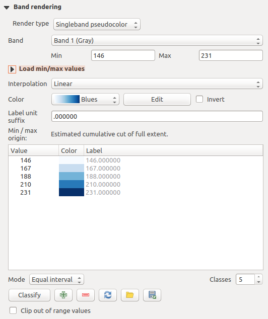
Raster Style - Singleband pseudocolor rendering
Three types of color interpolation are available:
- Discrete
線形
- Exact
In the left block, the button  Add values manually adds a value
to the individual color table. The button
Add values manually adds a value
to the individual color table. The button  Remove selected row
deletes a value from the individual color table, and the
Remove selected row
deletes a value from the individual color table, and the
 Sort colormap items button sorts the color table according
to the pixel values in the value column. Double clicking on the value column
lets you insert a specific value. Double clicking on the color column opens the dialog
Change color, where you can select a color to apply on that value.
Further, you can also add labels for each color, but this value won’t be displayed
when you use the identify feature tool.
You can also click on the button
Sort colormap items button sorts the color table according
to the pixel values in the value column. Double clicking on the value column
lets you insert a specific value. Double clicking on the color column opens the dialog
Change color, where you can select a color to apply on that value.
Further, you can also add labels for each color, but this value won’t be displayed
when you use the identify feature tool.
You can also click on the button  Load color map from band,
which tries to load the table from the band (if it has any). And you can use the
buttons
Load color map from band,
which tries to load the table from the band (if it has any). And you can use the
buttons  Load color map from file or
  Export color map to file to load an existing color table or to save the
defined color table for other sessions.
Export color map to file to load an existing color table or to save the
defined color table for other sessions.
In the right block, Generate new color map allows you to create newly
categorized color maps. For the Classification mode  ‘Equal interval’, you only need to select the number of classes
and press the button Classify. You can invert the colors
of the color map by clicking the
‘Equal interval’, you only need to select the number of classes
and press the button Classify. You can invert the colors
of the color map by clicking the  Invert
checkbox. In the case of the Mode ‘Continuous’, QGIS creates
classes automatically depending on the Min and Max.
Defining Min/Max values can be done with the help of the Load min/max values section.
A lot of images have a few very low and high data. These outliers can be eliminated
using the Cumulative count cut setting. The standard
data range is set from 2% to 98% of the data values and can be adapted manually.
With this setting, the gray character of the image can disappear.
With the scaling option Min/max, QGIS creates a color
table with all of the data included in the original image (e.g., QGIS creates a
color table with 256 values, given the fact that you have 8 bit bands).
You can also calculate your color table using the Mean +/-
standard deviation x .
Then, only the values within the standard deviation or within multiple standard deviations
are considered for the color table.
Invert
checkbox. In the case of the Mode ‘Continuous’, QGIS creates
classes automatically depending on the Min and Max.
Defining Min/Max values can be done with the help of the Load min/max values section.
A lot of images have a few very low and high data. These outliers can be eliminated
using the Cumulative count cut setting. The standard
data range is set from 2% to 98% of the data values and can be adapted manually.
With this setting, the gray character of the image can disappear.
With the scaling option Min/max, QGIS creates a color
table with all of the data included in the original image (e.g., QGIS creates a
color table with 256 values, given the fact that you have 8 bit bands).
You can also calculate your color table using the Mean +/-
standard deviation x .
Then, only the values within the standard deviation or within multiple standard deviations
are considered for the color table.
カラーレンダリング
それぞれについて Band rendering, Color rendering が利用可能です.
ブレンドモードのいずれかを使用することでも、ラスターファイル(複数可)に対する特別なレンダリング効果が得られます( 描画モード 参照)。
輝度、 彩度 と コントラスト を変更する中でさらに設定を行うことができます。 グレースケール オプションも使用できます、「明るさで」、「光度で」と「平均値で」のどれかを選択できます。カラーテーブル内の1つの色相のために、「強さ」を変更できます。
リサンプリング
リサンプリング オプションでは画像のズームイン、ズームアウトをするときにその外観を作ります。リサンプリングモードでは地図の見栄えを最適化できます。それらは、幾何学的変換を介して新しいグレー値の行列を計算します。
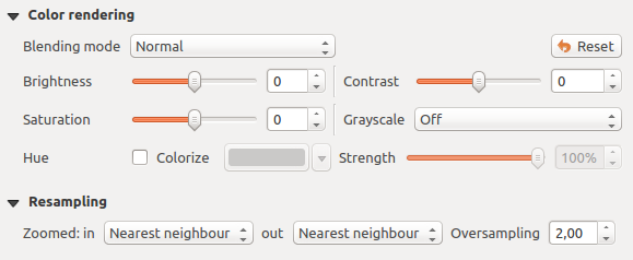
Raster Style - Color rendering and Resampling settings
「最近傍」法を適用していると、ズームするときに地図がピクセル化された構造を有することがあります。この外観は「双線形」または鋭い地物を不鮮明にする「キュービック」法を使用することによって改善できます。効果は画像がより滑らかになることです。この方法は、例えばデジタル地形ラスター地図に適用できます。
At the bottom of the Style tab, you can see a thumbnail of the layer, its legend symbol, and the palette.
透明度
QGIS has the ability to display each raster layer at a different transparency level.
Use the transparency slider  to indicate to what extent the underlying layers
(if any) should be visible though the current raster layer. This is very useful
if you like to overlay more than one raster layer (e.g., a shaded relief map
overlayed by a classified raster map). This will make the look of the map more
three dimensional.
to indicate to what extent the underlying layers
(if any) should be visible though the current raster layer. This is very useful
if you like to overlay more than one raster layer (e.g., a shaded relief map
overlayed by a classified raster map). This will make the look of the map more
three dimensional.
また、 追加のデータなし[値] オプションに NODATA として扱われるべきラスター値を入力できます。
An even more flexible way to customize the transparency can be done in the Custom transparency options section. The transparency of every pixel can be set here.
As an example, we want to set the water of our example raster file landcover.tif to a transparency of 20%. The following steps are necessary:
- Load the raster file landcover.tif.
- Open the Properties dialog by double-clicking on the raster name in the legend, or by right-clicking and choosing Properties from the pop-up menu.
- Select the Transparency tab.
- From the Transparency band drop-down menu, choose ‘None’.
- 値を手動で追加 ボタンをクリックします。新しい行は、ピクセルのリストに表示されます。
- Enter the raster value in the ‘From’ and ‘To’ column (we use 0 here), and adjust the transparency to 20%.
- Press the [Apply] button and have a look at the map.
You can repeat steps 5 and 6 to adjust more values with custom transparency.
おわかりのように、カスタム透明度を設定するのはとても簡単ですが、それはかなりの作業になることがあります。そのため、  ファイルに書き出し ボタンを使用してファイルに透明度のリストを保存できます。ボタン ファイルからインポート は、透明度の設定をロードし、現在のラスターレイヤーに適用します。
ピラミッドプロパティ
大きな解像度のラスターレイヤーはQGISでのナビゲーションを遅くすることがあります。データの低解像度コピー(ピラミッド)を作成すると、QGISでズームのレベルに応じて最も適した解像度を使用することを選択するので、性能が大幅に上がることがあります。
ピラミッドを作成するには、オリジナル画像があるディレクトリへの書き込み権限を持っている必要があります。
解像度 リストから、ピラミッドを作成する解像度をクリックして選択します。
オーバービューのフォーマット ドロップダウンメニューから 内部的(可能であれば) を選択すると、QGISは内部的にピラミッドを構築しようとします。
ノート
ピラミッドを構築すると元のデータファイルを変更することがあり、一度作成したらそれらは削除できませんのでご注意ください。ラスターの「非ピラミッド」バージョンを保持したい場合は、ピラミッドを構築する前にバックアップコピーを作成してください。
外部 と 外部(Erdas Imagine) を選択した場合、ピラミッドは元のラスターの隣に、同じ名前の .ovr 拡張子で作成されます。
ピラミッドの計算には多くの リサンプリングメソッド を利用できます:
最近傍
平均
ガウス
キュービック
モード
なし
Finally, click [Build pyramids] to start the process.
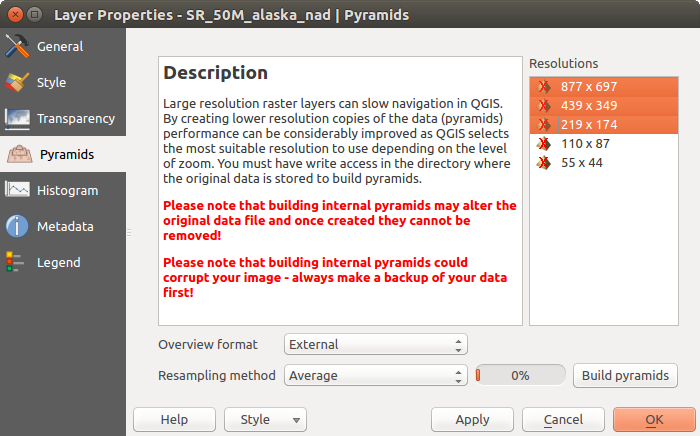
ラスターピラミッド
ヒストグラムプロパティ
The Histogram tab allows you to view the distribution of the bands
or colors in your raster. The histogram is generated automatically when you open the
Histogram tab. All existing bands will be displayed together. You
can save the histogram as an image with the button.
With the Visibility option in the  Prefs/Actions menu,
you can display histograms of the individual bands. You will need to select the option
Show selected band.
The Min/max options allow you to ‘Always show min/max markers’, to ‘Zoom
to min/max’ and to ‘Update style to min/max’.
With the Actions option, you can ‘Reset’ and ‘Recompute histogram’ after
you have chosen the Min/max options.
Prefs/Actions menu,
you can display histograms of the individual bands. You will need to select the option
Show selected band.
The Min/max options allow you to ‘Always show min/max markers’, to ‘Zoom
to min/max’ and to ‘Update style to min/max’.
With the Actions option, you can ‘Reset’ and ‘Recompute histogram’ after
you have chosen the Min/max options.
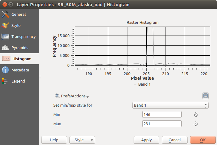
ラスターヒストグラム
メタデータプロパティ
The Metadata tab displays a wealth of information about the raster layer, including statistics about each band in the current raster layer. From this tab, entries may be made for the Description, Attribution, MetadataUrl and Properties. In Properties, statistics are gathered on a ‘need to know’ basis, so it may well be that a given layer’s statistics have not yet been collected.
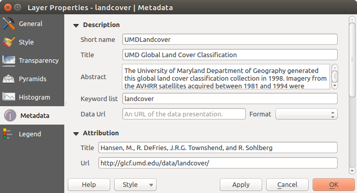
Raster Metadata
凡例プロパティ
The Legend tab provides you with a list of widgets you can embed within the layer tree in the Layers panel. The idea is to have a way to quickly access some actions that are often used with the layer (setup transparency, filtering, selection, style or other stuff...).
デフォルトで、QGISには透明ウィジェットがありますが、これは独自のウィジェットを登録するプラグインによって拡張して、それらが管理するレイヤーにカスタムアクションを割り当てることができます。