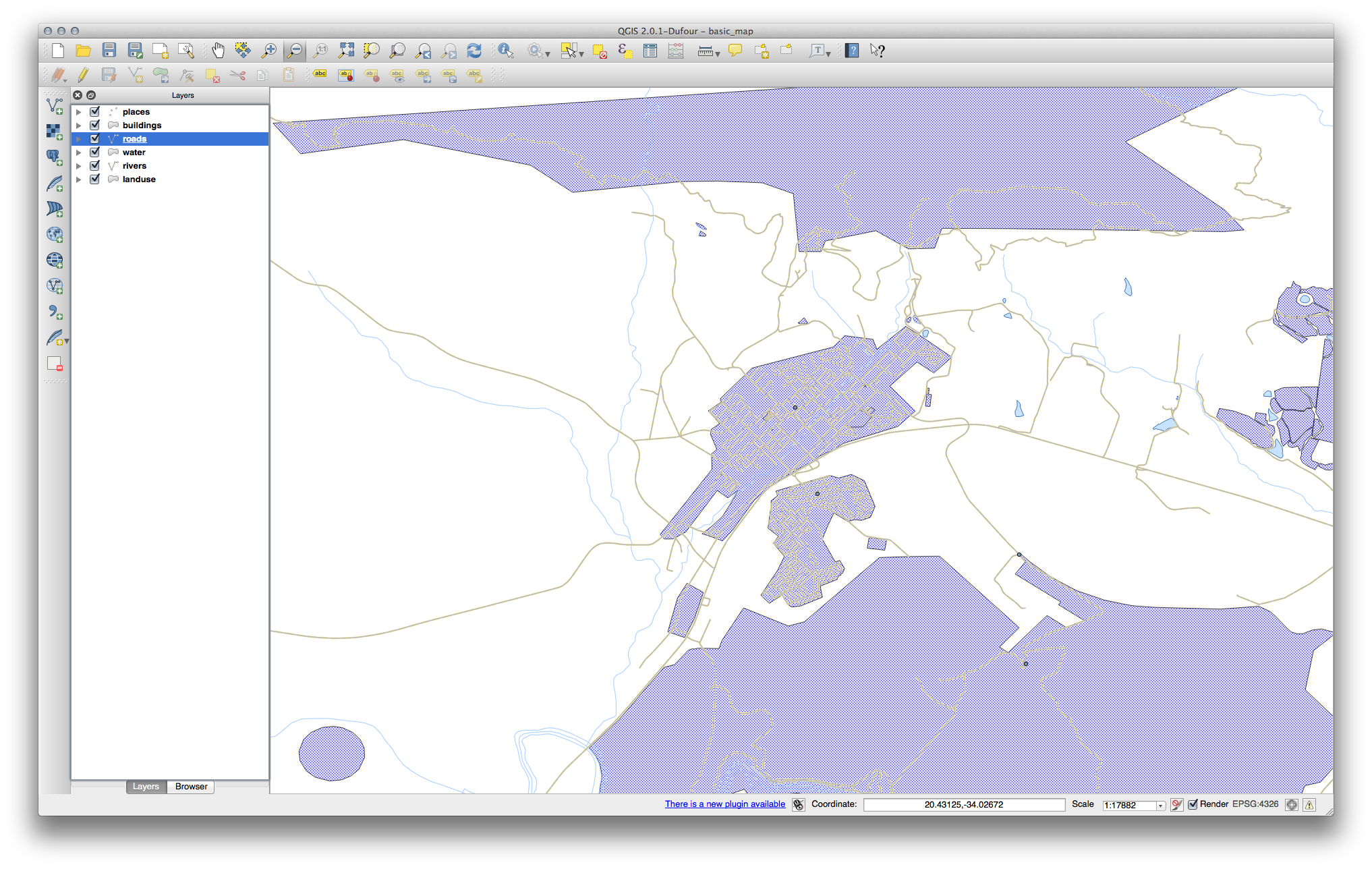
3.2. Lesson: シンボル体系
レイヤーのシンボルは、地図上の外観です。空間的な側面を持つデータを表現する他の方法に勝るGISの基本的な強みは、GISを使用すると、作業データの動的な視覚表現ができることです。
したがって、(個々のレイヤーのシンボルに依存する)地図の外観は非常に重要です。作成した地図のエンドユーザーに地図が何を表現するかが簡単にわかるようにする必要があります。同様に重要なこととして、データはそれで作業しながら探索できる必要があり、優れたシンボルは大きな助けになります。
つまり、適切なシンボルを持つことは、高級でもなくまたは単に素晴らしいことではありません。実際には、適切にGISを使用して、地図や、人々が使用できる情報を生成するためにそれが不可欠です。
このレッスンの目標: ベクターレイヤーに対して、望むとおりのシンボル体系を作成できるようになる
3.2.1.  Follow Along: 色を変更する
レイヤーのシンボル体系を変更するには、そのレイヤーの レイヤーのプロパティ を表示します。 landuse レイヤーの色を変更するのを始めましょう。
- Right-click on the landuse layer in the Layers list.
- Select the menu item Properties in the menu that appears.
ノート
デフォルトでは、レイヤーリストでリスト上でダブルクリックすることで、レイヤーのプロパティにアクセスできます。
In the Properties window:
- Select the Style tab at the extreme left:
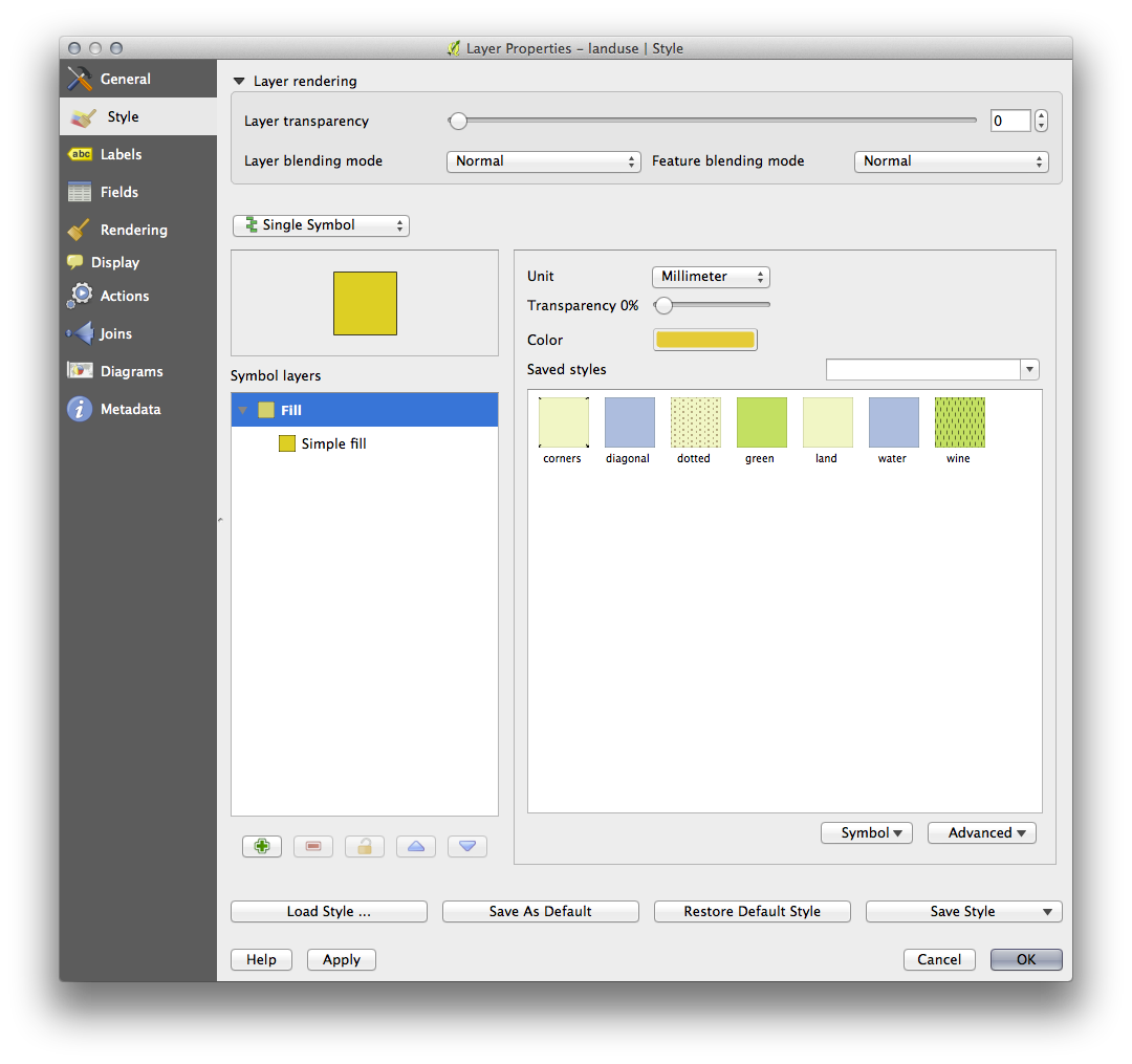
- Click the color select button next to the Color label.
A standard color dialog will appear.
グレーを選択して、 OK をクリックします。
レイヤープロパティ ウィンドウで再度 OK をクリックし、色の変更がレイヤーに適用されたことを確認するでしょう。
3.2.3. Follow Along: シンボル構造を変更する
これはこれまでのところ良いものですが、ちょうどその色よりも、レイヤーのシンボルに適したものがあります。次に、視覚的に雑然となるように様々な土地利用エリア間のラインを削除したいと思います。
landuse レイヤーの レイヤーのプロパティ ウィンドウを開きます。
Under the Style tab, you will see the same kind of dialog as before. This time, however, you’re doing more than just quickly changing the color.
- In the Symbol Layers panel, expand the Fill dropdown (if necessary) and select the Simple fill option:
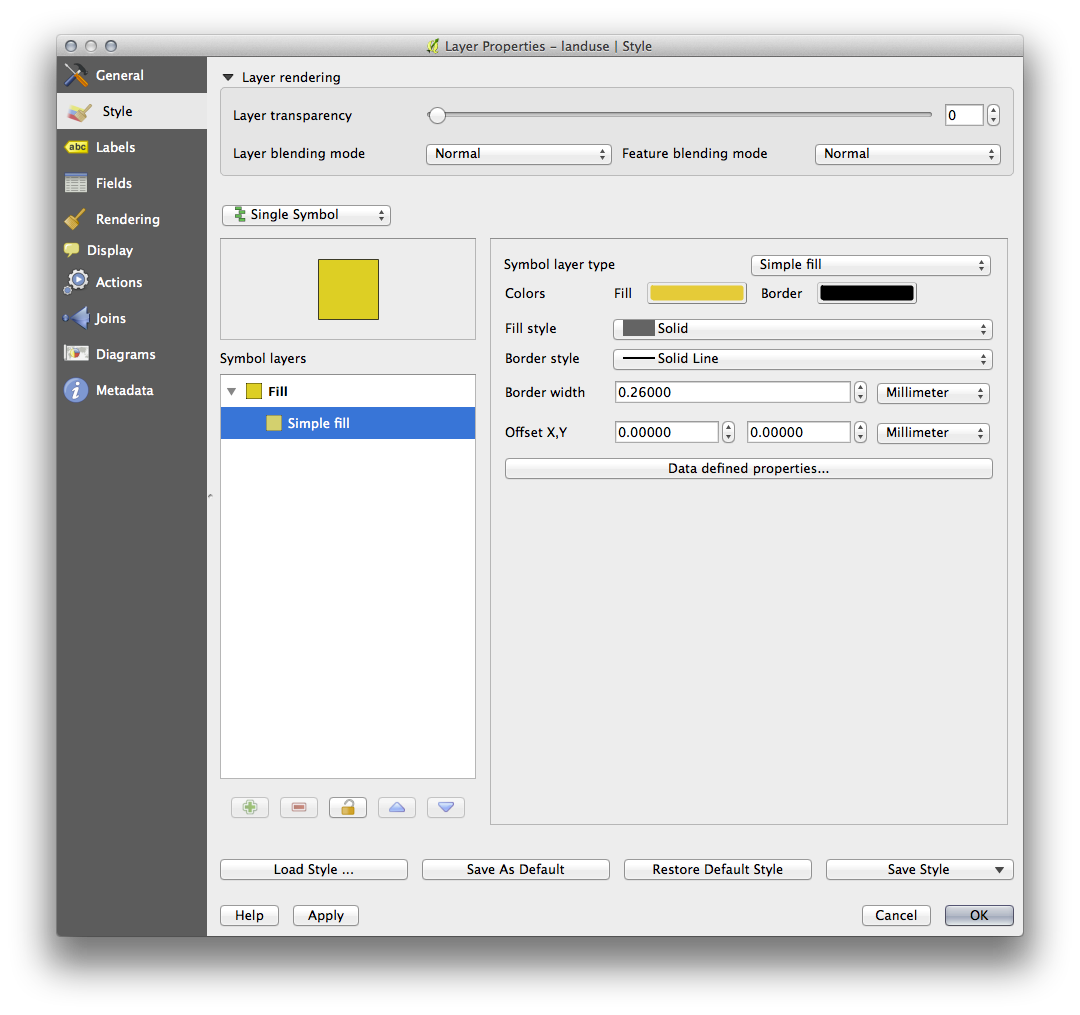
- Click on the Border style dropdown. At the moment, it should be showing a short line and the words Solid Line.
これを ペンなし に変更します。
OK をクリックします。
今、 landuse レイヤーでは、エリアの間に何もラインがありません。
3.2.4. Try Yourself
- Change the water layer’s symbology again so that it is has a darker blue outline.
水路の表示を明確に表現するため rivers レイヤーのシンボル体系を変更します。
3.2.5.  Follow Along: 縮尺に基づく表示
時には、レイヤーが与えられた縮尺に適していないとわかることもあります。例えば、すべての大陸のデータセットは、詳細さが低く、街区レベルではあまり正確ではないかもしれません。それが起こると、不適切な縮尺でデータセットを非表示できるようにしたくなります。
In our case, we may decide to hide the buildings from view at small scales. This map, for example ...
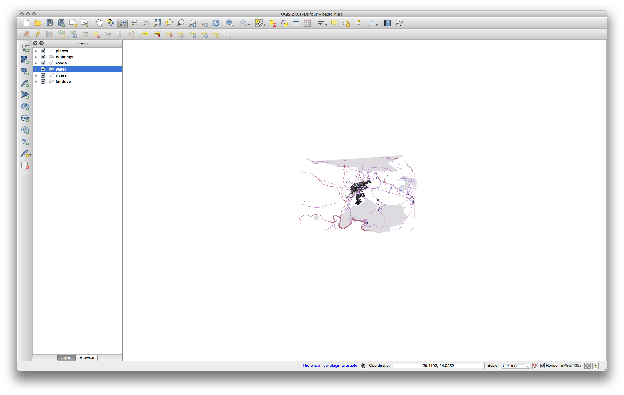
…あまり便利ではありません。その縮尺で建物を区別するのは難しいです。
縮尺に基づくレンダリングを有効にするには:
buildings レイヤーの レイヤーのプロパティ ダイアログを開きます。
- Activate the General tab.
- Enable scale-based rendering by clicking on the checkbox labelled Scale dependent visibility:
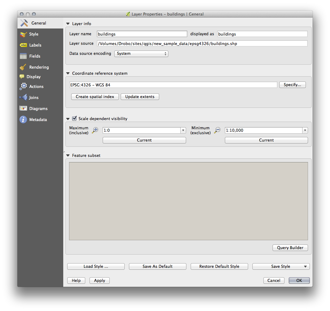
- Change the Minimum value to 1:10,000.
OK をクリックします。
buildings レイヤーがいつ現れたり消えるかに注目しながら、地図で拡大・縮小する効果をテストします。
ノート
インクリメントにズームインするために、マウスホイールを使用できます。あるいは、ウインドウにズームするために、ズーム・ツールを使用してください:


3.2.6. Follow Along: シンボルレイヤーを追加する
これでレイヤーに対する単純なシンボルを変更する方法はわかりましたので、次のステップは、より複雑なシンボルを作成することです。QGISでは、シンボルレイヤーを使用して、これを行うことができます。
- Go back to the landuse layer’s symbol properties panel (by clicking Simple fill in the Symbol layers panel).
この例では、現在のシンボルは何のアウトラインを持っていません(すなわち、それは ペンなし の境界スタイルを使用しています)。
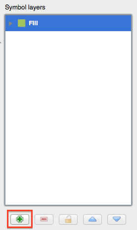
Select the Fill in the Symbol layers panel. Then click the Add symbol layer button:
- Click on it and the dialog will change to look somewhat like this:
(It may appear somewhat different in color, for example, but you’re going to change that anyway.)
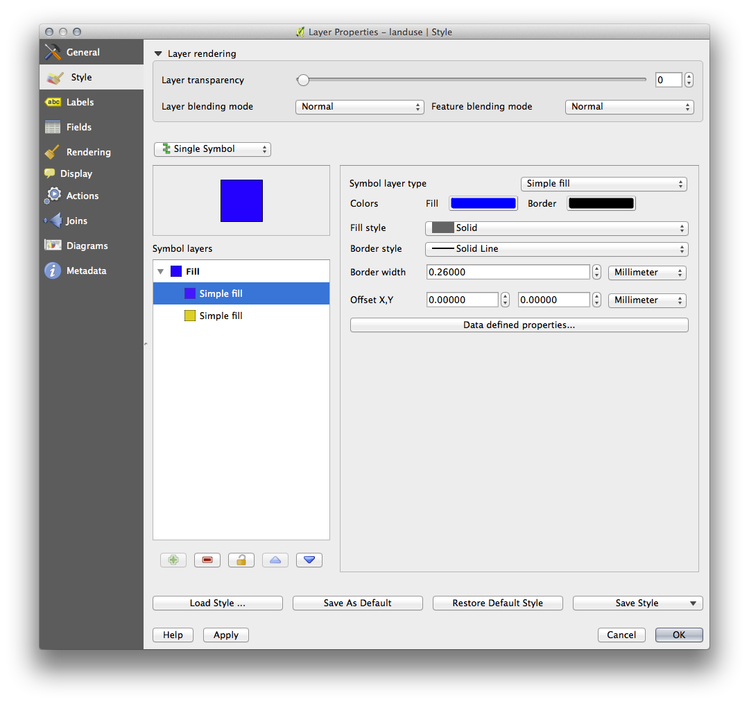
今、第2のシンボルレイヤーがあります。ソリッドカラーなので、それは当然のことながら、完全にシンボルの前のようなものを非表示になります。 実線 の境界スタイル、プラス、それは持っています、これは望ましくない。明らかに、この記号は、変更する必要があります。
ノート
地図レイヤーとシンボルレイヤーを混同しないことが重要です。地図レイヤーは地図にロードされているベクター(またはラスター)です。シンボルレイヤーは、地図レイヤーを表すために使用されるシンボルの一部です。このコースでは、たいていは地図レイヤーを単にレイヤーと言いますが、シンボルレイヤーは、混乱を防ぐために、シンボルレイヤーと呼びます。
With the new Simple Fill layer selected:
以前のように、境界スタイルを ペンなし へ設定します。
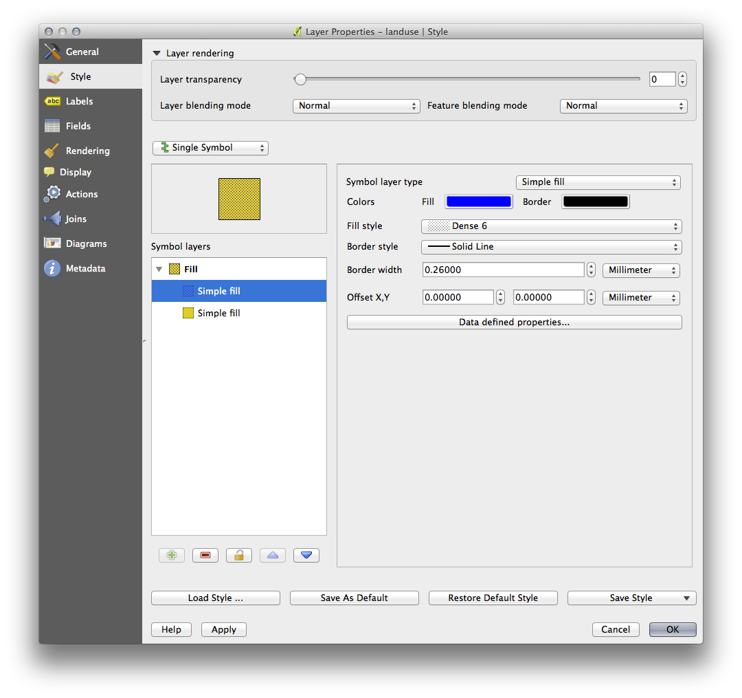
塗りつぶしスタイルを ソリッド か ブラシなし 以外に変更します。例えば:
- Click OK. Now you can see your results and tweak them as needed.
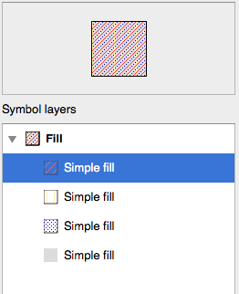
You can even add multiple extra symbol layers and create a kind of texture for your layer that way.
これは楽しいです!しかし、おそらく、実際の地図に使用するためにあまりにも色が多すぎ...
3.2.7. Try Yourself
シンプルに、必要に応じて、ズームイン作成するために覚えて、しかしためのテクスチャをそらさない buildings レイヤーが上記の方法を使用して。
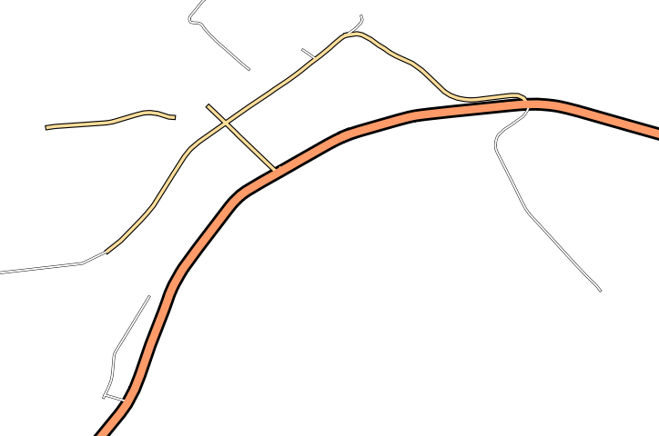
3.2.8. Follow Along: シンボルレベルの順序
シンボルレイヤーがレンダリングされるとき、それらは、異なる地図レイヤーがレンダリングされる方法と同様の順列でレンダリングされます。これは、場合によっては、一つのシンボルに多くのシンボルレイヤーを有することは予期しない結果を引き起こす可能性があることを意味します。
roads レイヤーに余分なシンボルレイヤー与えます(上記実証シンボルレイヤーを追加するためのメソッドを使用して)。
- Give the base line a Pen width of 0.3, a white color and select Dashed Line from the Pen Style dropdown.
- Give the new, uppermost layer a thickness of 1.3 and ensure that it is a Solid Line.
あなたはこれが発生したことがわかります。
Well that’s not what we want at all!
これを防ぐには、シンボルレベルを並べ替えることにより、異なるシンボルレイヤーがレンダリングされる順序を制御できます。
To change the order of the symbol layers, select the Line layer in the Symbol layers panel, then click Advanced ‣ Symbol levels... in the bottom right-hand corner of the window. This will open a dialog like this:
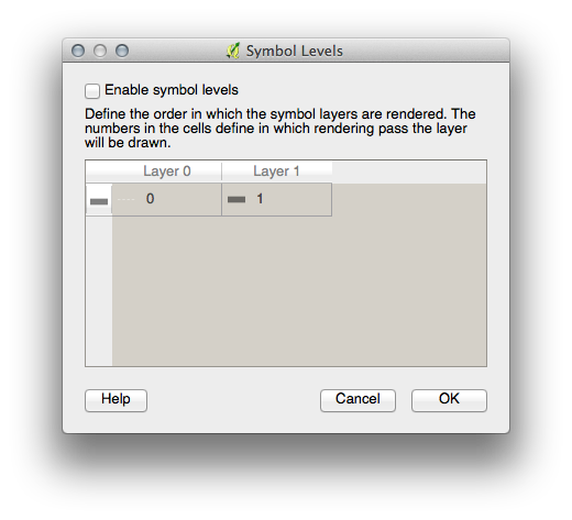
Select Enable symbol levels. You can then set the layer ordering of each symbol by entering the corresponding level number. 0 is the bottom layer.
In our case, we want to reverse the ordering, like this:
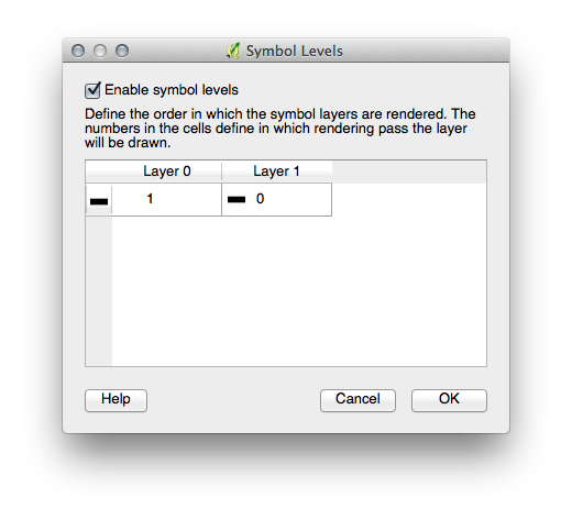
This will render the dashed, white line above the thick black line.
OK を2回クリックし、地図に戻ります。
地図はこのように見えるでしょう:
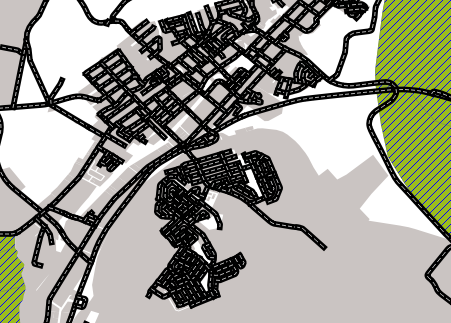
Also note that the meeting points of roads are now “merged”, so that one road is not rendered above another.
When you’re done, remember to save the symbol itself so as not to lose your work if you change the symbol again in the future. You can save your current symbol style by clicking the Save Style ... button under the Style tab of the Layer Properties dialog. Generally, you should save as QGIS Layer Style File.
Save your style under exercise_data/styles. You can load a previously saved style at any time by clicking the Load Style ... button. Before you change a style, keep in mind that any unsaved style you are replacing will be lost.
3.2.9. Try Yourself
もう一度 roads レイヤーの外観を変更します。
The roads must be narrow and mid-gray, with a thin, pale yellow outline. Remember that you may need to change the layer rendering order via the Advanced ‣ Symbol levels... dialog.
3.2.10.  Try Yourself
Symbol levels also work for classified layers (i.e., layers having multiple symbols). Since we haven’t covered classification yet, you will work with some rudimentary pre-classified data.
新しい地図を作成し、 roads データセットだけ追加します。
- Apply the style advanced_levels_demo.qml provided in exercise_data/styles.
Swellendam のエリアにズームします。
シンボルレイヤーを使用して、レイヤーの輪郭線は、以下の画像に従って互いに流入することを確認してください:
3.2.11. Follow Along: シンボルレイヤータイプ
In addition to setting fill colors and using predefined patterns, you can use different symbol layer types entirely. The only type we’ve been using up to now was the Simple Fill type. The more advanced symbol layer types allow you to customize your symbols even further.
ベクターの各種類(ポイント、ライン、ポリゴン)は、シンボルレイヤータイプの独自のセットを有しています。まず、ポイントのために利用可能なタイプを見ていきます。
3.2.11.1. ポイントシンボルレイヤータイプ
- Open your basic_map project.
places レイヤーのシンボルプロパティを変更します。
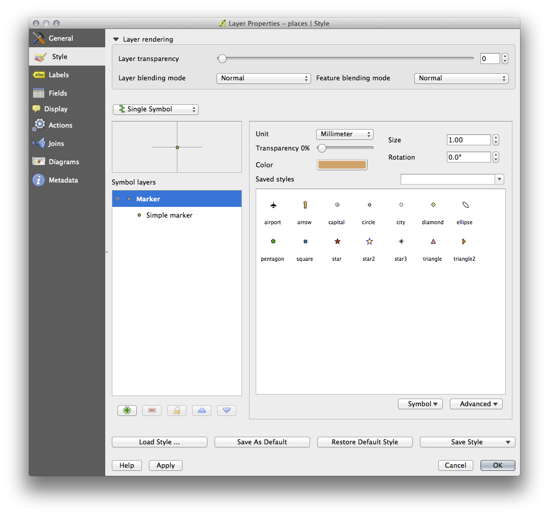
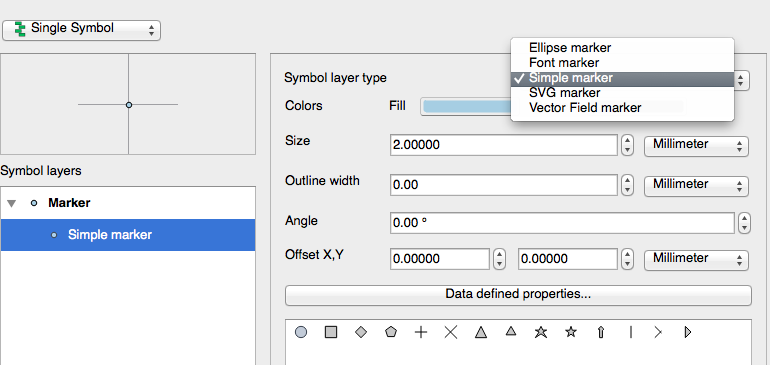
- You can access the various symbol layer types by selecting the Simple marker layer in the Symbol layers panel, then click the Symbol layer type dropdown:
利用できるさまざまなオプションを調査し、適切だとお思いのスタイルでシンボルを選択してください。
- If in doubt, use a round Simple marker with a white border and pale green fill, with a size of 3,00 and an Outline width of 0.5.
3.2.11.2. ラインシンボルレイヤータイプ
ラインデータのために利用できるさまざまなオプションを表示するには:
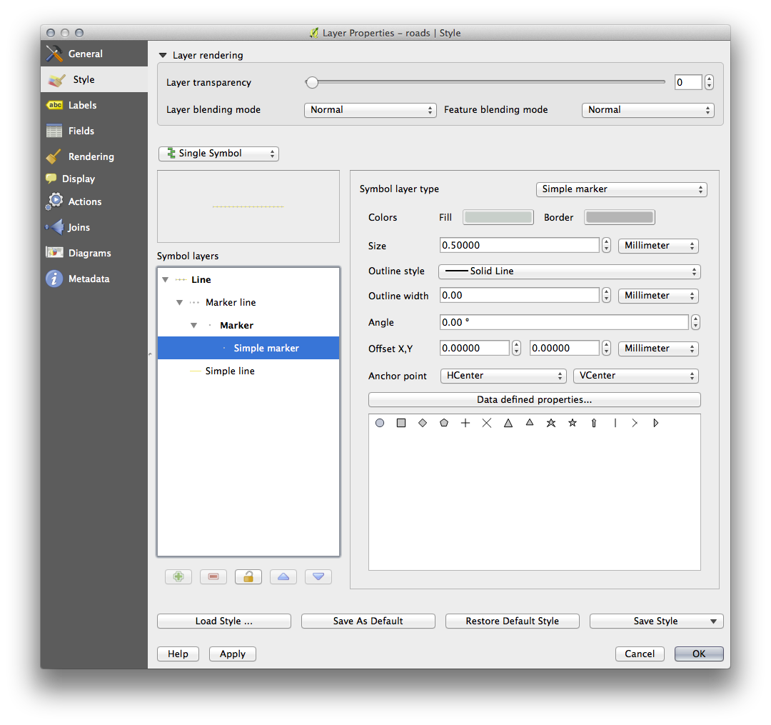
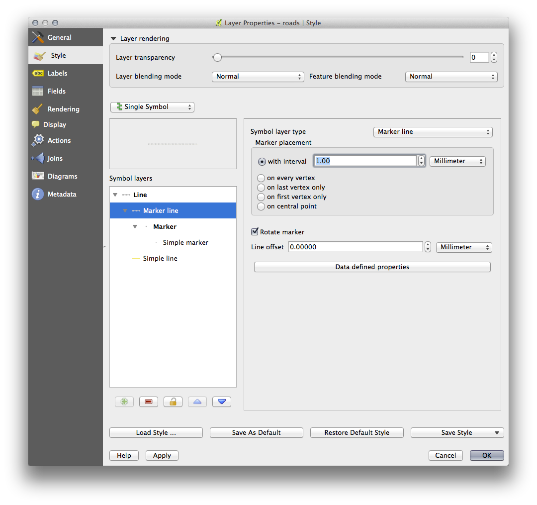
- Change the symbol layer type for the roads layer’s topmost symbol layer to Marker line:
- Select the Simple marker layer in the Symbol layers panel. Change the symbol properties to match this dialog:
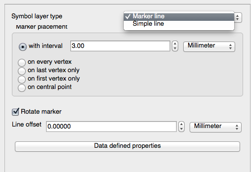
- Change the interval to 1,00:
スタイルを適用する前に、シンボルレベルが正しいことを(以前に使用した 高度な ‣ シンボルレベル ダイアログ経由で)確認してください。
スタイルを適用したら、地図上でその結果を見てみましょう。おわかりのように、これらのシンボルは道路と一緒に向きを変えるが、常にそれに沿って曲げないでください。これは、いくつかの目的には有用ですが、他の目的には有用ではありません。ご希望の場合は、前にした方法に戻って、問題のシンボルレイヤーを変更できます。
3.2.11.3. ポリゴンシンボルレイヤータイプ
ポリゴンデータのために利用できるさまざまなオプションを表示するには:
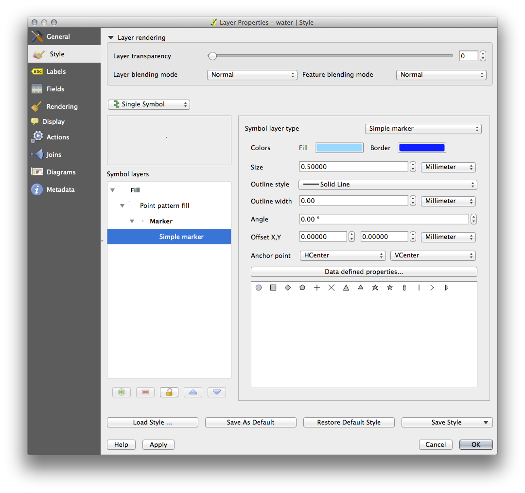
- Change the symbol layer type for the water layer, as before for the other layers.
リスト上の異なるオプションが何ができるかを調べます。
これらのうち、適した1つを選択します。
次のオプションを使用して、 ポイントパターン塗り 疑問がある場合は、使用します。
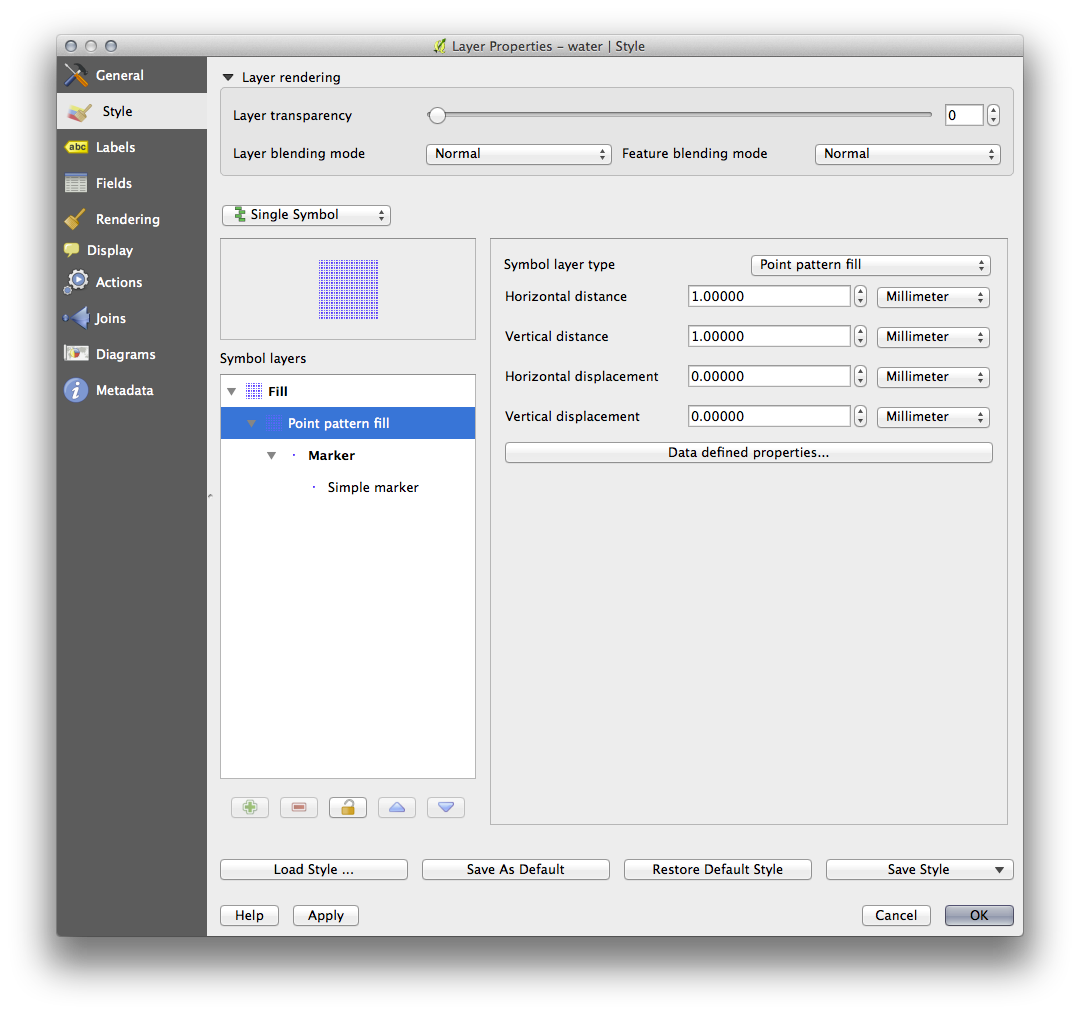
単純塗り 通常で新しいシンボルレイヤーを追加します。
それを暗青の境界を持つ水色にします。
下に移動 ボタンで点パターンシンボルレイヤーの下に移動させます。

その結果、テクスチャを構成する個々のドットの大きさ、形状や距離を変えることができるという利点があり、水のレイヤーのためのテクスチャシンボルを持っています。
3.2.12. Follow Along: カスタムSVG塗りつぶしを作成する
ノート
この演習を行うには、無料のベクター編集ソフトウェア Inkscape がインストールされている必要があります。
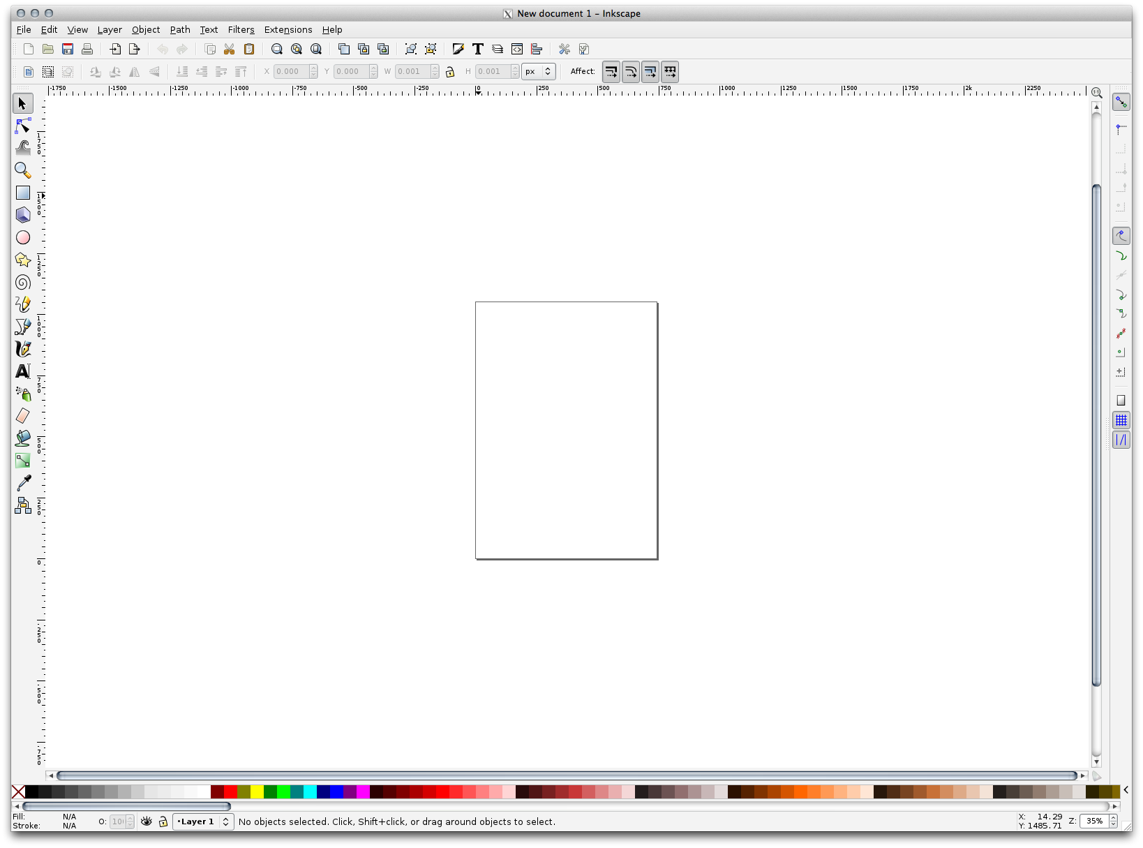
- Start the Inkscape program.
You will see the following interface:
コーレルのような、他のベクター画像編集プログラムを使用している方は、これがなじみ深いと思うはずです。
まず、小さなテクスチャに適したサイズにキャンバスを変更します。
メニュー項目 ファイル ‣ 文書のプロパティ をクリックします。これは 文書のプロパティ ダイアログを表示するでしょう。
単位 を px に変更します。
- Change the Width and Height to 100.
実行後はダイアログを閉じます。
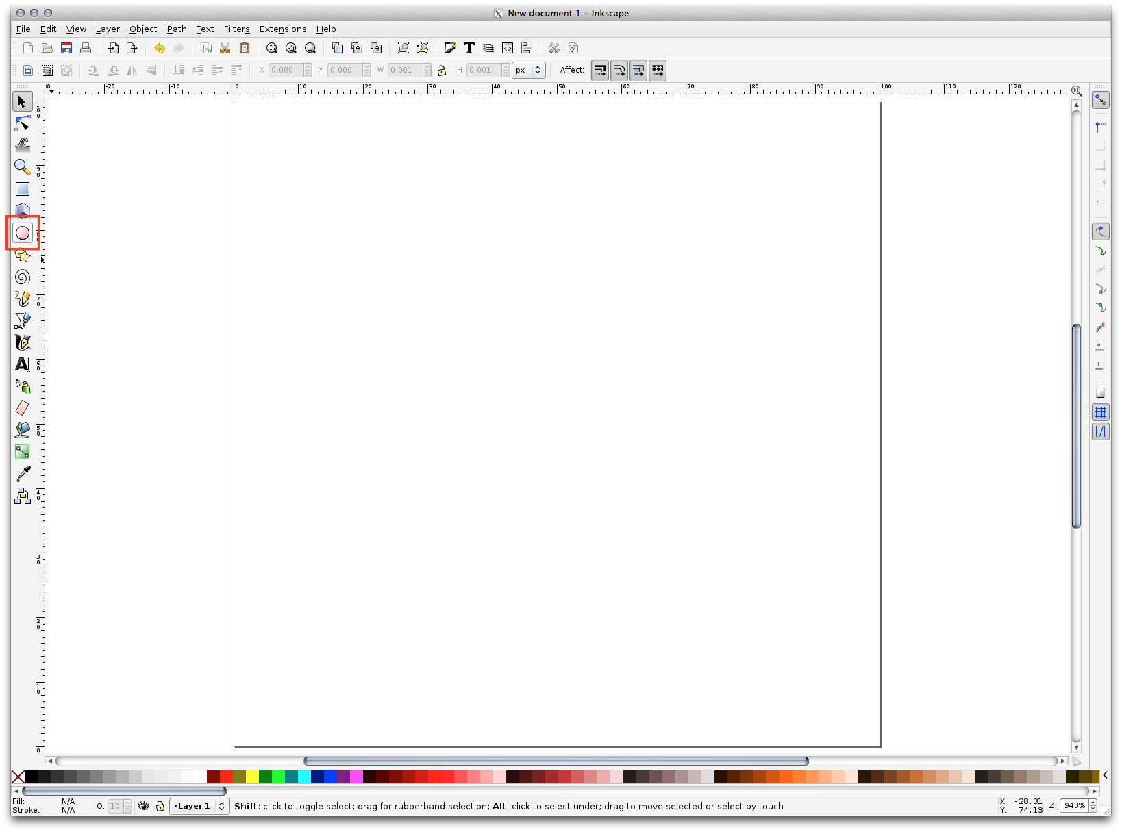
ビュー ‣ ズーム ‣ ページ メニュー項目をクリックして、作業しているページを参照してください。
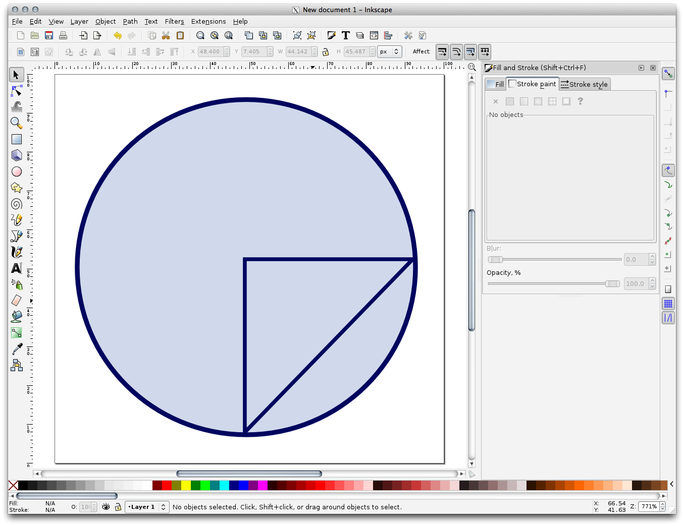
円 ツールを選択します。
楕円を描画するためにクリックして、ページ上でドラッグします。楕円が円に変わるようにするには、描いている間 Ctrl ボタンを押し続けます。
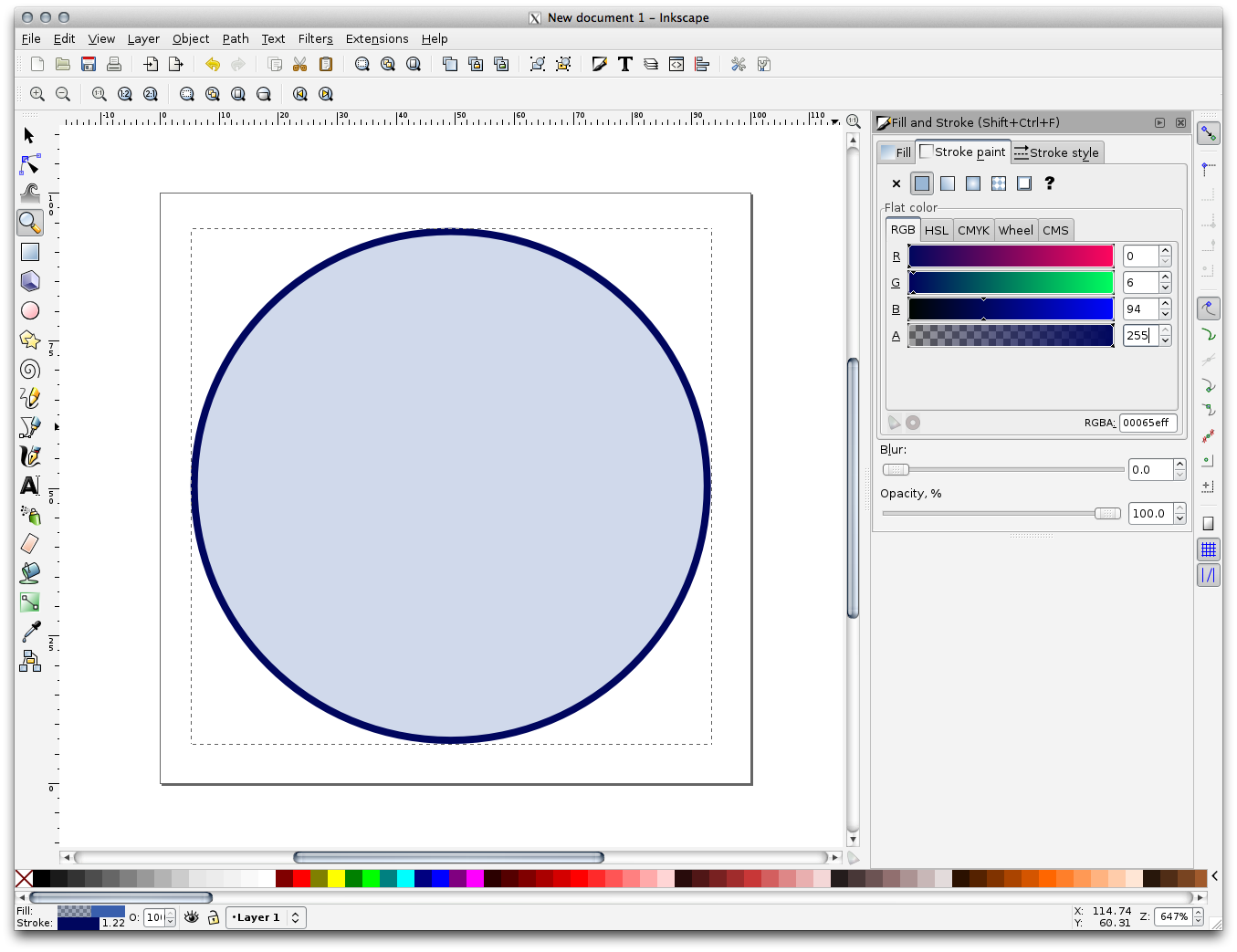
先ほど作成した円を右クリックし、その 塗りとストローク オプションを開きます。このように、そのレンダリングを変更できます:
塗り 色を何とか淡灰青に変更し、
ストロークの塗り タブの中で国境に暗い色の割り当て]、
ストロークのスタイル タブと下の境界の太さを減らします。
鉛筆 ツール使って線を引きます:
- Click once to start the line. Hold ctrl to make it snap to increments of 15 degrees.
水平方向にポインタを移動し、クリックするだけでポイントを置きます。
クリックして、ラインの頂点にスナップし、クリックするだけで終わる垂直線を、トレースします。
今、二つの端の頂点に参加。
このようなシンボルで終わるように、円のストロークに合わせ、必要に応じて、それを周りに移動するには三角形のシンボルの色と幅を変更します。
- If the symbol you get satisfies you, then save it as landuse_symbol under the directory that the course is in, under exercise_data/symbols, as SVG file.
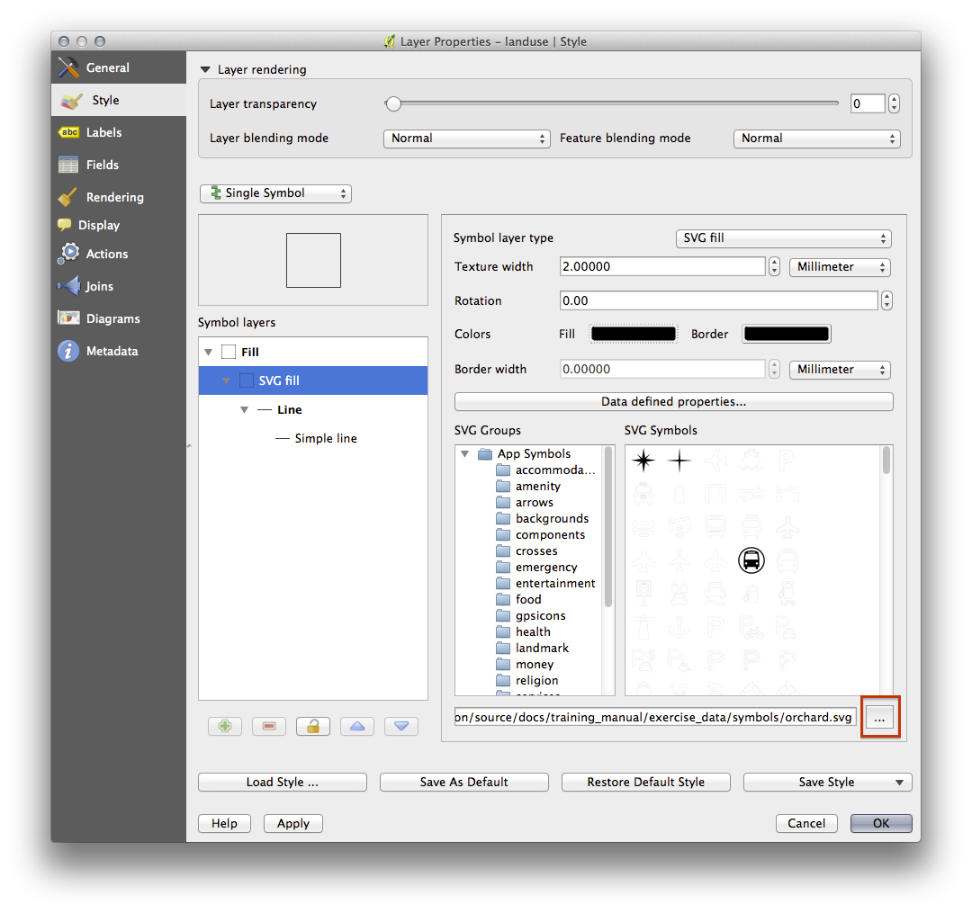
QGISでは:
landuse レイヤーに レイヤーのプロパティ を開きます。
- In the Style tab, change the symbol structure by selecting SVG Fill as Symbol Layer Type option, as shown below.
- Click the
 Browse button to select your SVG image.
It’s added to the symbol tree and you can now customize its different
characteristics (colors, angle, effects, units...).
Browse button to select your SVG image.
It’s added to the symbol tree and you can now customize its different
characteristics (colors, angle, effects, units...).
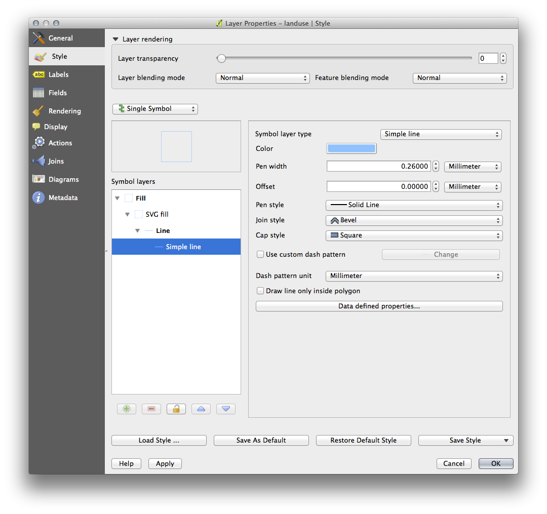
You may also wish to update the svg layer’s border (see below):
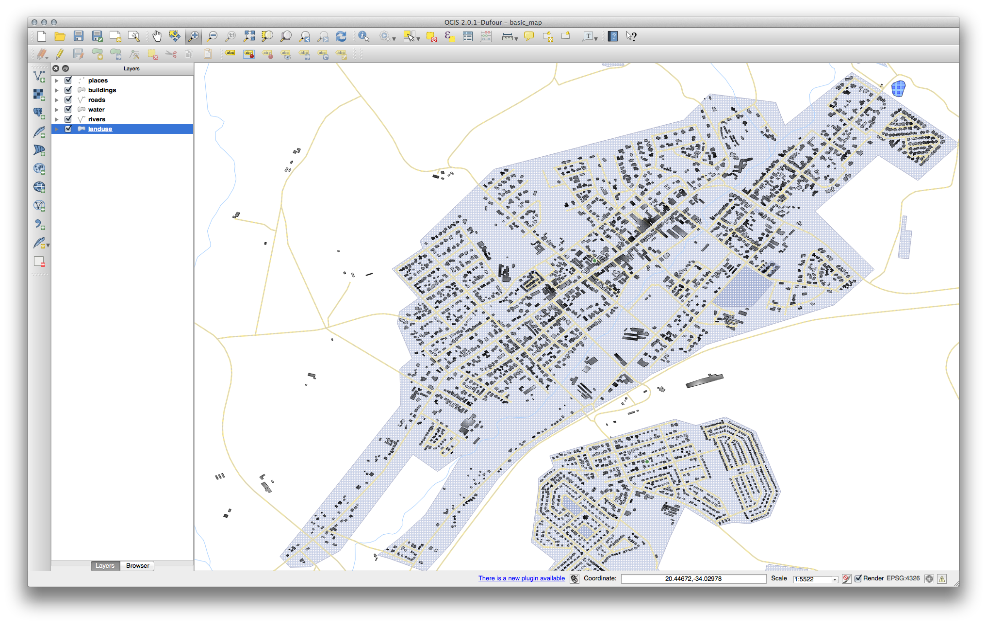
Once you validate the dialog, features in landuse layer should now be covered by a set of symbols, showing a texture like the one on the following map. If textures are not visible, you may need to zoom in the map canvas or set in the layer properties a bigger Texture width.
3.2.13. In Conclusion
異なるレイヤーのためにシンボルを変更することで、ベクターファイルの集まりを読みやすい地図に変えてきました。何が起こっているか見ることができるだけでなく、それを見るのはうれしくもあります!
3.2.14. Further Reading
3.2.15. What’s Next?
レイヤー全体のためのシンボルを変更することは便利ですが、それぞれのレイヤーの中に含まれている情報は、まだこれらの地図を読んでいる誰かには利用できません。街路が何と呼ばれていますか?ある領域がどの行政地域に属していますか?農場の相対的な表面積は何ですか?この情報のすべてがまだ隠されています。次のレッスンでは、地図上にデータを表現する方法を説明します。
ノート
最近の忘れずに地図を保存しましたか?