` `
Composer Items Common Options
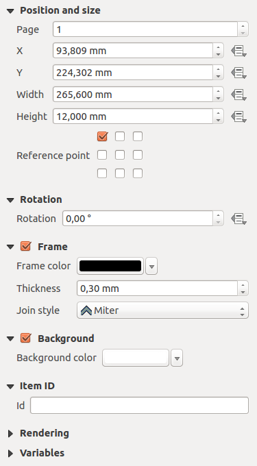
Composer items have a set of common properties you will find at the bottom of the Item Properties panel: Position and size, Rotation, Frame, Background, Item ID, Variables and Rendering (See figure_composer_common).
Common Item Properties Dialogs
- The Position and size dialog lets you define the size and position of the frame which contains the item. You can also choose which Reference point will be set at the X and Y coordinates previously defined.
Rotation permet de définir un angle de rotation (en degrés) pour l’élément.
- The
 Frame shows or hides the frame around the item.
Click on the [Color] and [Thickness] buttons to adjust those properties.
Frame shows or hides the frame around the item.
Click on the [Color] and [Thickness] buttons to adjust those properties. - Use the Background color menu for setting a background color. Click on the [Color...] button to display a dialog where you can pick a color or choose from a custom setting. Transparency can be adjusted through atlering the alpha field settings.
- Use the Item ID to create a relationship to other Print Composer items. This is used with QGIS server and other potential web clients. You can set an ID on an item (for example, a map or a label), and then the web client can send data to set a property (e.g., label text) for that specific item. The GetProjectSettings command will list the items and IDs which are available in a layout.
- Rendering mode helps you set whether and how the item can be displayed.
Note
- If you checked Use live-updating color chooser dialogs
in the QGIS general options, the color button will update as soon as you
choose a new color from Color Dialog windows. If not, you need to
close the Color Dialog.
- The
 Data defined override icon next to a field
means that you can associate the field with data in the map item or use
expressions. These are particularly helpful with atlas generation
(See Data Defined Override Buttons).
Data defined override icon next to a field
means that you can associate the field with data in the map item or use
expressions. These are particularly helpful with atlas generation
(See Data Defined Override Buttons).
Mode de rendu
QGIS now allows advanced rendering for Composer items just like vector and raster layers.
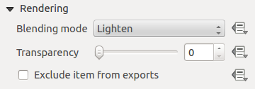
Mode de rendu
Mode de fusion : avec cet outil vous pouvez donner des effets qui, autrement, ne sont réalisables qu’avec des logiciels de dessin. Les pixels des éléments situés au-dessous et au-dessus sont fusionnés selon le mode choisi (voir Modes de fusion pour une description de chaque mode).
- Transparency
 : You can make the underlying item in the
Composer visible with this tool.
Use the slider to adapt the visibility of your item to your needs.
You can also make a precise definition of the percentage of visibility in the
menu beside the slider.
: You can make the underlying item in the
Composer visible with this tool.
Use the slider to adapt the visibility of your item to your needs.
You can also make a precise definition of the percentage of visibility in the
menu beside the slider. - Exclure cet élément des exports : Vous pouvez décider de rendre un élément invisible dans tous les exports. Après avoir activé cette option, l’élément ne sera pas inclus dans les exports PDF, impressions, etc.
Size and position
Each item inside the Composer can be moved and resized to create a perfect
layout.For both operations the first step is to activate the  Select/Move item tool and to click on the item; you can then move it
using the mouse while holding the left button. If you need to constrain the
movements to the horizontal or the vertical axis, just hold the Shift
button on the keyboard while moving the mouse. If you need better precision,
you can move a selected item using the Arrow keys on the keyboard;
if the movement is too slow, you can speed up it by holding Shift.
Select/Move item tool and to click on the item; you can then move it
using the mouse while holding the left button. If you need to constrain the
movements to the horizontal or the vertical axis, just hold the Shift
button on the keyboard while moving the mouse. If you need better precision,
you can move a selected item using the Arrow keys on the keyboard;
if the movement is too slow, you can speed up it by holding Shift.
A selected item will show squares on its boundaries; moving one of them with the mouse, will resize the item in the corresponding direction. While resizing, holding Shift will maintain the aspect ratio. Holding Alt will resize from the item center.
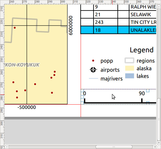
The correct position for an item can be obtained using the grid snapping or smart guides. Guides are set by clicking and dragging within the ruler area. To move a guide, click on the ruler, level with the guide and drag it to a new position. To delete a guide move it off the canvas. If you need to disable the snap on the fly, hold Ctrl while moving the mouse.
You can choose multiple items with the Select/Move item button.
Just hold the Shift button and click on all the items you need.
You can then resize/move this group like a single item.
Once you have found the correct position for an item, you can lock it by using the items on the toolbar or ticking the box next to the item in the Items panel. Locked items are not selectable on the canvas.
Les éléments verrouillés peuvent être déverrouillés en sélectionnant l’élément dans l’onglet Éléments et décochés dans la case à cocher, ou vous pouvez utiliser les boutons dans la barre d’outils.
To unselect an item, just click on it holding the Shift button.
Inside the Edit menu, you can find actions to select all the items, to clear all selections or to invert the current selection.
Alignement
Raising or lowering the visual hierarchy for elements are inside the  Raise selected items pull-down menu. Choose an element on the Print Composer
canvas and select the matching functionality to raise or lower the selected
element compared to the other elements. This order is
shown in the Items panel. You can also raise or lower objects
in the Items panel by clicking and dragging an object’s label
in this list.
Raise selected items pull-down menu. Choose an element on the Print Composer
canvas and select the matching functionality to raise or lower the selected
element compared to the other elements. This order is
shown in the Items panel. You can also raise or lower objects
in the Items panel by clicking and dragging an object’s label
in this list.
Alignment helper lines in the Print Composer
There are several alignment options available within the  Align selected items pull-down menu (see figure_composer_common_align).
To use an alignment function, you first select the elements then click on the
matching alignment icon. All selected elements will then be aligned to their
common bounding box. When moving items on the Composer canvas, alignment helper
lines appear when borders, centers or corners are aligned.
Align selected items pull-down menu (see figure_composer_common_align).
To use an alignment function, you first select the elements then click on the
matching alignment icon. All selected elements will then be aligned to their
common bounding box. When moving items on the Composer canvas, alignment helper
lines appear when borders, centers or corners are aligned.
Variables
The Variables lists all the variables available at the composer item’s level (which includes all global, project and composition’s variables). Map items also include Map settings variables that provide easy access to values like the map’s scale, extent, and so on.
Sous la section guilabel:Variables, il est aussi possible de gérer les variables liées à l’élément. Cliquez sur le bouton  afin d’ajouter une variable personnalisée. De même, sélectionnez n’importe quelle variable personnalisée associée à l’élément en cours et cliquez sur le bouton
  pour le supprimer.
More information on variables usage in the General Tools Variables section.